7. Feed back 1
Do you like the style of the fanzine? And why?
I think that the style of the fanzine is spot on as it gives a very retro vibe to the fanzine and I think
that this works well with the content as it is about the past and the use of backgrounds that are
faded and have an old look works very well.
Would you read this if you saw it online? And why?
To be honest if I saw this online I probably wouldn’t read this as this isn’t really the content that I
like to read/consume but if someone has the interest in the content they would be more likely to
read it. I would be more likely to look through the magazine to look at the style of the fanzine more
than anything because the pages have a lot of character and this would interest me.
What do you think I could improve on?
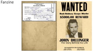
I think that the only thing that sticks out to me is the front cover, the colour and background of the
cover don’t match the rest of the magazine as it is so much lighter than the rest of the pages. I think
that the font really works but the style of the fanzine makes me think that it is meant to be like a
police crime folder and you could look at some other fonts that look a little bit more like
handwriting to help convey this, if it is what you were going for.
8. Feed back 2
Do you like the style of the fanzine? And why?
I like the style of the fanzine because its old fashioned which links into the use of black and white
photos used through out. I also feel like the style makes the overall fanzine easily identified as a
crime fanzine.
Would you read this if you saw it online? And why?
I would because it has broken down the information about John and simplified the information. This
is because you have clearly labeled what each page in on.
What do you think I could improve on?
I think you could improve your work with font. This is because the text is a bit boring and I feel it
doesn't link to the theme too well. However, the title for each page works great.
I also feel like you could have positioned the font better on the pages where it looks torn up. This is
because you have left gaps which makes the work look uncomplete.
9. Feed back 3
Do you like the style of the fanzine? And why?
I think this fanzine is very effective, the style is very old fashioned which brings more life into the story. The different design
elements of each page make it more realistic and interesting. The fact that most of the photos are black and white also give it
a retro old fashioned theme.
Overall did you enjoy my fanzine? And why?
I think this fanzine is something which is very interesting, I personally have never heard of this man so its nice to know a bit
about what he did- the way you have simplified the information and made it much more easier to read is very effective. The
page tears give the effect of a new paragraph which is much more appealing to read than just a whole page of text and a few
images. From the first few pages it is very clear of the genre. The title font looks as though it is handwritten which is even
more effective as it makes it more realistic. If I saw this online I would most likely read this because it is a subject which I am
interested in.
What do you think I could improve on?
I don’t think there is anything which needs improving. The only thing I would have liked to see is a interview of some kind
(this would have been tricky considering the subject of your fanzine though). Another thing is the front cover not really
matching the other pages- it would have looked more professional and effective with the background to be the same as the
other pages. However, it is still a good fanzine.