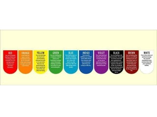
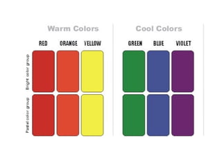
Subject: Merchandising Session: 12 Content: Color concepts. Use of color concepts for merchandise development Jagriti Mishra, NIFT, Gandhinagar
Colors Color is the biggest motivation for shopping and people buy colors before they buy size, fit, or price. New color schemes / color coordination bring customers on floor  Subtle? daring? sophisticated? inviting?
Physical and psychological reactions to color Effect of colors on people and their mood while shopping Colors can make up the mood or can calm Also colors can make us feel physically hotter or colder Effects of colors vary due to cultural and regional differences, also over a period of time
Yellow Sunshine and Gold, Happy, Bright, Cheerful, Vital, Fun filled, Alive Daisies, Marigold, Lemon Optimism, Relaxation, Wide open armed acceptance of world, Suggestive of change, challenge and innovation Spring, Summer, Easter
Orange Friendly, Sociable color Agreeable, overt, glowing and incandescent Exciting, vibrant and filled with anticipation Fire and Flame A rising sun in tropics or a setting sun in desert Halloween and autumn leaves
Red Exciting, Stimulating Loving, Powerful, Sexy Assertive, demanding, obvious, or cheap and vulgar Valentine’s day, Christmas, Father’s Day, Patriotism, Sale Warning, fear , fire, popular
Purple Royalty And Wisdom Nobility, Envy, Sensuality, Spirituality, Creativity, Wealth, Royalty, Ceremony, Mystery, Wisdom, Enlightenment, Arrogance, Flamboyance, Gaudiness,  Exaggeration,  Sexuality, Confusion, Pride, Riches, Romanticism  Delicacy
Pink Spring,  Gratitude,  Appreciation, Admiration, Sympathy, Socialism, Feminity, Health, Love, Romance, Marriage, Joy,  Flirtatiousness,  Innocence  Child-like
Brown Earthy,  Environmental  Comforting  Calm, Depth, Nature,  Stability, Tradition,  Roughness, October, Simplicity Dependability
Green Nature Initiative Wealth Rebirth And Renewal.  Rejuvenation And Energy  Nature Spring Fertility Vigor Generosity,
Blue Stable Depression Sea, Sky,  Peace, Unity,  Harmony, Tranquility,  Calmness, Trust,  Cool  Confidence Water, Ice  Dependability Winter,
White Purity, Neutrality Youth Sterility Light Purity Truth, Snow Peace,  Innocence, Simplicity Winter, Coldness,  Fearfulness Hope Empty
Black Death Intelligence  Rebellion  Mystery  Power Sophistication Formality, Elegance, Wealth, Style,  Mystery, Evil, Fear Seriousness, Sorrow
Gray Elegance Stability Subtlety Wisdom Old Age Pessimism Boredom, Decay, Decrepitude, Dullness Pollution, Urban Sprawl Balance, Neutrality Mourning, Formality
 
 
The Color Wheel
Primary Colors Red, yellow and blue In traditional color theory, these are the 3 pigment colors that can not be mixed or formed by any combination of other colors. All other colors are derived from these 3 hues
SECONDARY COLORS Green, orange and purple These are the colors formed by mixing the primary colors.
TERTIARY COLORS Yellow-orange, red-orange, red-purple, blue-purple, blue-green and yellow-green. These are the colors formed by mixing a primary and a secondary color. That's why the hue is a two word name, such as blue-green, red-violet, and yellow-orange. 
Analogous color scheme Analogous colors are colors that are adjacent to each other on the color wheel. Some examples are green, yellow green, orange and yellow. The combination of these colors give a bright and cheery effect in the area, and are able to accommodate many changing moods. When using the analogous color scheme, one should make sure there is one hue as the main color.
Monochromatic color scheme The monochromatic color scheme uses variations in lightness and saturation of a single color.  This scheme looks clean and elegant.  Monochromatic colors go well together, producing a soothing effect.  The monochromatic scheme is easy to manage, and always looks balanced and visually appealing. This scheme lacks color contrast. It is not as vibrant as the complementary scheme.
Complementary color scheme Colors that are opposite each other on the color wheel, such as blue and orange, red and green, purple and yellow.  Complementary color schemes have a more energetic feel The high contrast between the colors creates a vibrant look, especially when used at full saturation. The complementary color scheme offers stronger contrast than any other color scheme, and draws maximum attention.  This scheme is harder to balance than monochromatic and analogous schemes, especially when desaturated warm colors are used.
Triadic color scheme The triadic color scheme uses three colors equally spaced around the color wheel.  This scheme is popular among artists because it offers strong visual contrast while retaining balance, and color richness.
Neutral color scheme A color scheme that includes only colors not found on the color wheel, called neutrals, such as beige, brown, white, black, and gray
Warm and cool colors .  Warm colors  are vivid and energetic, and tend to advance in space.  Cool colors  give an impression of calm, and create a soothing impression. White, black and gray are considered to be neutral.
Tints  - adding white to a pure hue Tones  - adding gray to a pure hue Shades  - adding black to a pure hue Tints, Shades, and Tones
COLOR HARMONY Harmony can be defined as a pleasing arrangement of parts It engages the viewer and it creates an inner sense of order, a balance in the visual experience. When something is not harmonious, it's either boring or chaotic.  The human brain will reject under-stimulating information.  At the other extreme is a visual experience that is so overdone, so chaotic that the viewer can't stand to look at it.  The human brain rejects what it can not organize, what it can not understand.  The visual task requires that we present a logical structure.
 
 
Analogous colors are any three colors which are side by side on a 12 part color wheel, such as yellow-green, yellow, and yellow-orange. Usually one of the three colors predominates. A color scheme based on analogous colors
A color scheme based on complementary colors Complementary colors are any two colors which are directly opposite each other, such as red and green and red-purple and yellow-green.
A color scheme based on nature Nature provides a perfect departure point for color harmony.
Color Context How color behaves in relation to other colors and shapes is a complex area of color theory
 
Different readings of the same color
Dimensions of the color story Selection of a color palette Color story combined with prints, yarn-dyed fabrics, etc. Right color story to sell the products Color forecasters work 18-24 months in advance Gauge the tastes and preferences of the customers.
Fashion leaders Majority Laggards Color loyal Color prudent Color forwards
Color cycles Periodic shifts in color preferences Patterns of repetitions in colors


Merchandising 12

  • 1.
    Subject: Merchandising Session:12 Content: Color concepts. Use of color concepts for merchandise development Jagriti Mishra, NIFT, Gandhinagar
  • 2.
    Colors Color isthe biggest motivation for shopping and people buy colors before they buy size, fit, or price. New color schemes / color coordination bring customers on floor Subtle? daring? sophisticated? inviting?
  • 3.
    Physical and psychologicalreactions to color Effect of colors on people and their mood while shopping Colors can make up the mood or can calm Also colors can make us feel physically hotter or colder Effects of colors vary due to cultural and regional differences, also over a period of time
  • 4.
    Yellow Sunshine andGold, Happy, Bright, Cheerful, Vital, Fun filled, Alive Daisies, Marigold, Lemon Optimism, Relaxation, Wide open armed acceptance of world, Suggestive of change, challenge and innovation Spring, Summer, Easter
  • 5.
    Orange Friendly, Sociablecolor Agreeable, overt, glowing and incandescent Exciting, vibrant and filled with anticipation Fire and Flame A rising sun in tropics or a setting sun in desert Halloween and autumn leaves
  • 6.
    Red Exciting, StimulatingLoving, Powerful, Sexy Assertive, demanding, obvious, or cheap and vulgar Valentine’s day, Christmas, Father’s Day, Patriotism, Sale Warning, fear , fire, popular
  • 7.
    Purple Royalty AndWisdom Nobility, Envy, Sensuality, Spirituality, Creativity, Wealth, Royalty, Ceremony, Mystery, Wisdom, Enlightenment, Arrogance, Flamboyance, Gaudiness, Exaggeration, Sexuality, Confusion, Pride, Riches, Romanticism Delicacy
  • 8.
    Pink Spring, Gratitude, Appreciation, Admiration, Sympathy, Socialism, Feminity, Health, Love, Romance, Marriage, Joy, Flirtatiousness, Innocence Child-like
  • 9.
    Brown Earthy, Environmental Comforting Calm, Depth, Nature, Stability, Tradition, Roughness, October, Simplicity Dependability
  • 10.
    Green Nature InitiativeWealth Rebirth And Renewal. Rejuvenation And Energy Nature Spring Fertility Vigor Generosity,
  • 11.
    Blue Stable DepressionSea, Sky, Peace, Unity, Harmony, Tranquility, Calmness, Trust, Cool Confidence Water, Ice Dependability Winter,
  • 12.
    White Purity, NeutralityYouth Sterility Light Purity Truth, Snow Peace, Innocence, Simplicity Winter, Coldness, Fearfulness Hope Empty
  • 13.
    Black Death Intelligence Rebellion Mystery Power Sophistication Formality, Elegance, Wealth, Style, Mystery, Evil, Fear Seriousness, Sorrow
  • 14.
    Gray Elegance StabilitySubtlety Wisdom Old Age Pessimism Boredom, Decay, Decrepitude, Dullness Pollution, Urban Sprawl Balance, Neutrality Mourning, Formality
  • 15.
  • 16.
  • 17.
  • 18.
    Primary Colors Red,yellow and blue In traditional color theory, these are the 3 pigment colors that can not be mixed or formed by any combination of other colors. All other colors are derived from these 3 hues
  • 19.
    SECONDARY COLORS Green,orange and purple These are the colors formed by mixing the primary colors.
  • 20.
    TERTIARY COLORS Yellow-orange,red-orange, red-purple, blue-purple, blue-green and yellow-green. These are the colors formed by mixing a primary and a secondary color. That's why the hue is a two word name, such as blue-green, red-violet, and yellow-orange. 
  • 21.
    Analogous color schemeAnalogous colors are colors that are adjacent to each other on the color wheel. Some examples are green, yellow green, orange and yellow. The combination of these colors give a bright and cheery effect in the area, and are able to accommodate many changing moods. When using the analogous color scheme, one should make sure there is one hue as the main color.
  • 22.
    Monochromatic color schemeThe monochromatic color scheme uses variations in lightness and saturation of a single color. This scheme looks clean and elegant. Monochromatic colors go well together, producing a soothing effect. The monochromatic scheme is easy to manage, and always looks balanced and visually appealing. This scheme lacks color contrast. It is not as vibrant as the complementary scheme.
  • 23.
    Complementary color schemeColors that are opposite each other on the color wheel, such as blue and orange, red and green, purple and yellow. Complementary color schemes have a more energetic feel The high contrast between the colors creates a vibrant look, especially when used at full saturation. The complementary color scheme offers stronger contrast than any other color scheme, and draws maximum attention. This scheme is harder to balance than monochromatic and analogous schemes, especially when desaturated warm colors are used.
  • 24.
    Triadic color schemeThe triadic color scheme uses three colors equally spaced around the color wheel. This scheme is popular among artists because it offers strong visual contrast while retaining balance, and color richness.
  • 25.
    Neutral color schemeA color scheme that includes only colors not found on the color wheel, called neutrals, such as beige, brown, white, black, and gray
  • 26.
    Warm and coolcolors . Warm colors are vivid and energetic, and tend to advance in space. Cool colors give an impression of calm, and create a soothing impression. White, black and gray are considered to be neutral.
  • 27.
    Tints -adding white to a pure hue Tones - adding gray to a pure hue Shades - adding black to a pure hue Tints, Shades, and Tones
  • 28.
    COLOR HARMONY Harmonycan be defined as a pleasing arrangement of parts It engages the viewer and it creates an inner sense of order, a balance in the visual experience. When something is not harmonious, it's either boring or chaotic. The human brain will reject under-stimulating information. At the other extreme is a visual experience that is so overdone, so chaotic that the viewer can't stand to look at it. The human brain rejects what it can not organize, what it can not understand. The visual task requires that we present a logical structure.
  • 29.
  • 30.
  • 31.
    Analogous colors areany three colors which are side by side on a 12 part color wheel, such as yellow-green, yellow, and yellow-orange. Usually one of the three colors predominates. A color scheme based on analogous colors
  • 32.
    A color schemebased on complementary colors Complementary colors are any two colors which are directly opposite each other, such as red and green and red-purple and yellow-green.
  • 33.
    A color schemebased on nature Nature provides a perfect departure point for color harmony.
  • 34.
    Color Context Howcolor behaves in relation to other colors and shapes is a complex area of color theory
  • 35.
  • 36.
    Different readings ofthe same color
  • 37.
    Dimensions of thecolor story Selection of a color palette Color story combined with prints, yarn-dyed fabrics, etc. Right color story to sell the products Color forecasters work 18-24 months in advance Gauge the tastes and preferences of the customers.
  • 38.
    Fashion leaders MajorityLaggards Color loyal Color prudent Color forwards
  • 39.
    Color cycles Periodicshifts in color preferences Patterns of repetitions in colors
  • 40.
  • 41.
  • 42.
  • 43.
  • 44.
  • 45.