Downloaded 264 times
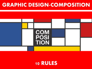


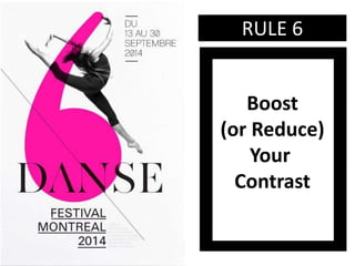


The document provides 10 rules for graphic design composition: 1. Find your focal point 2. Use leading lines to guide the eye 3. Employ scale and hierarchy to emphasize important elements 4. Balance your design elements 5. Ensure elements complement each other 6. Boost or reduce contrast to draw attention 7. Repeat design elements for consistency 8. Leverage white space to improve clarity 9. Align elements for visual cohesion 10. Divide the design space into thirds for focal point placement


![Introduction to Graphic Design PDF [slideshare]](https://cdn.slidesharecdn.com/ss_thumbnails/prologuegraphicdesignslideshare-190815200118-thumbnail.jpg?width=640&height=640&fit=bounds)


