Download to read offline
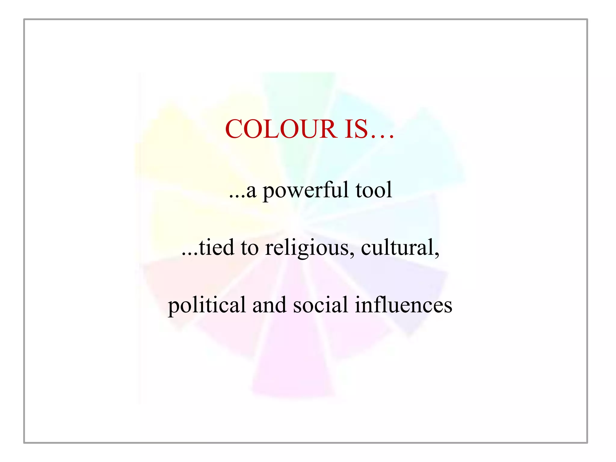

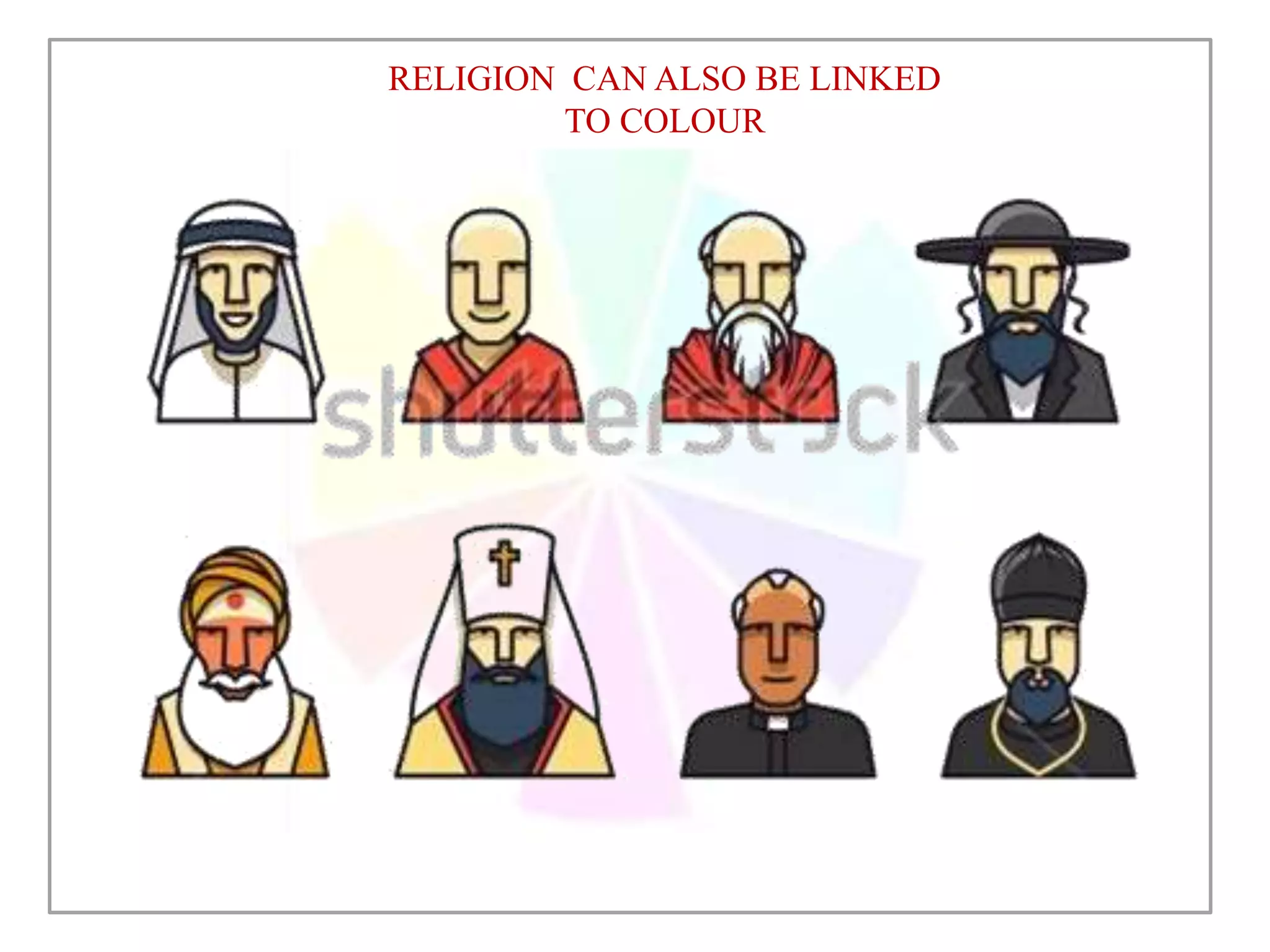


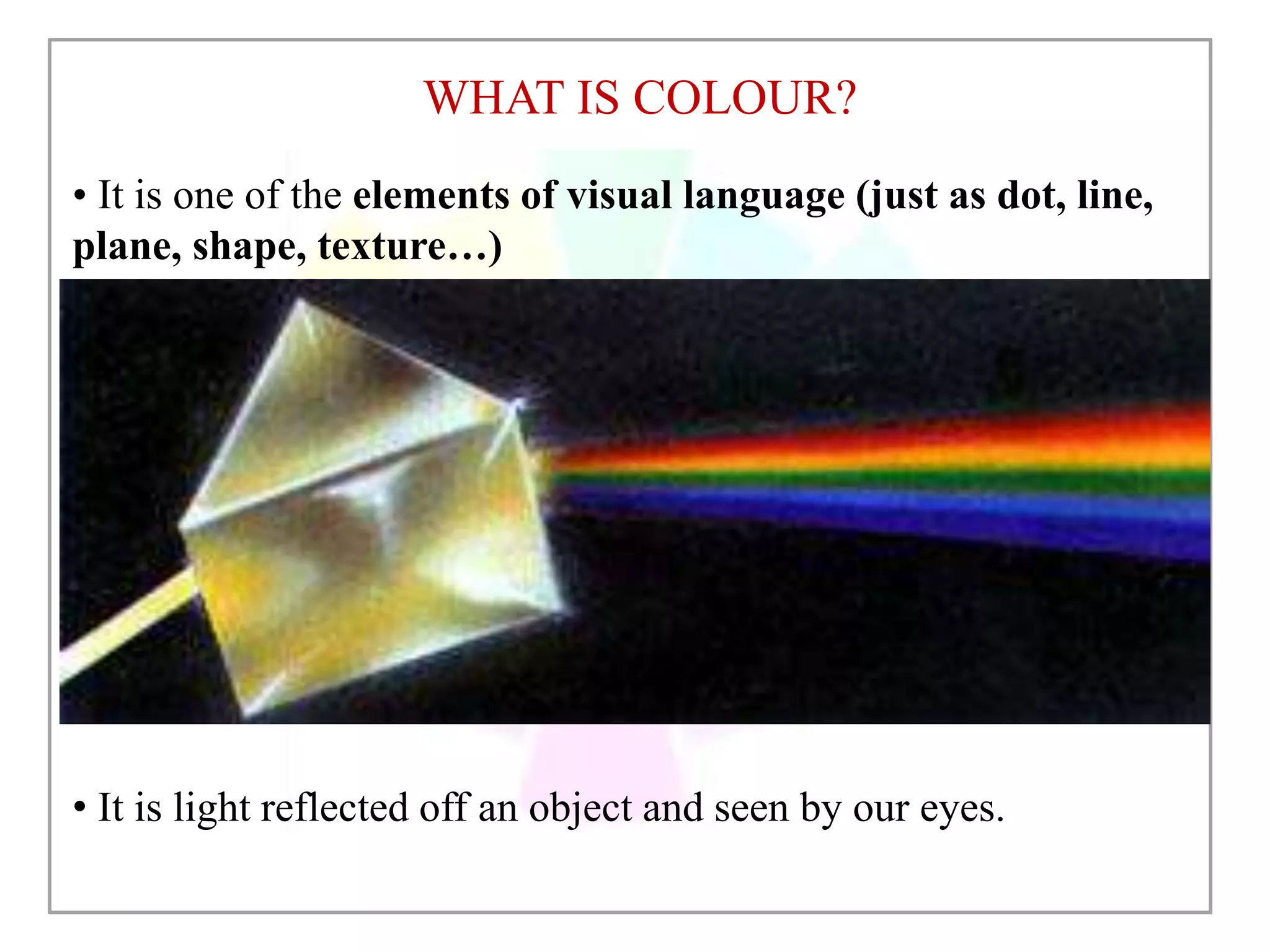


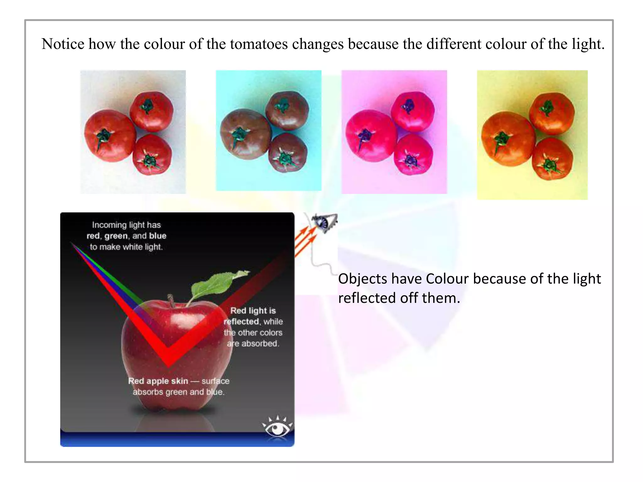
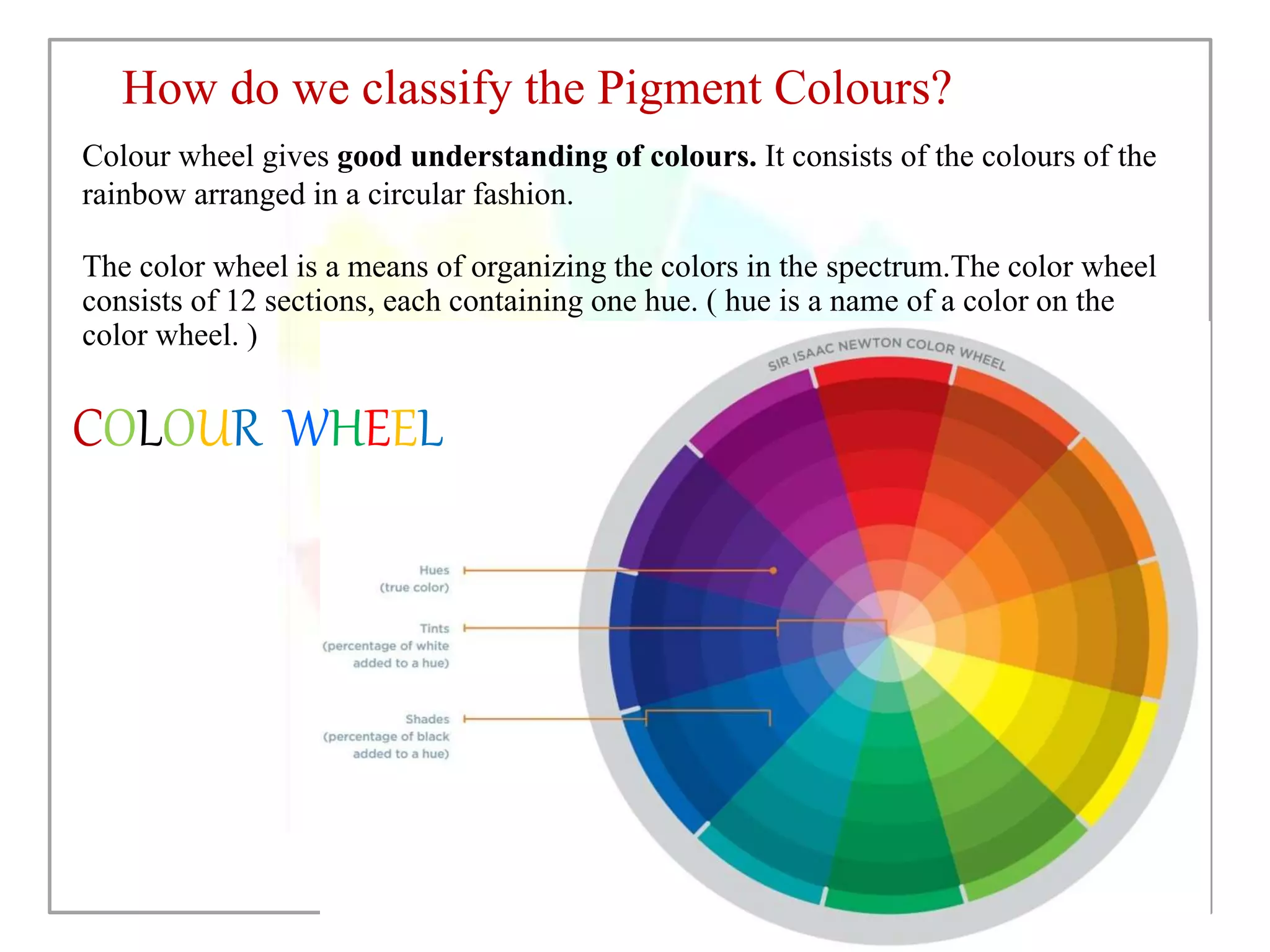

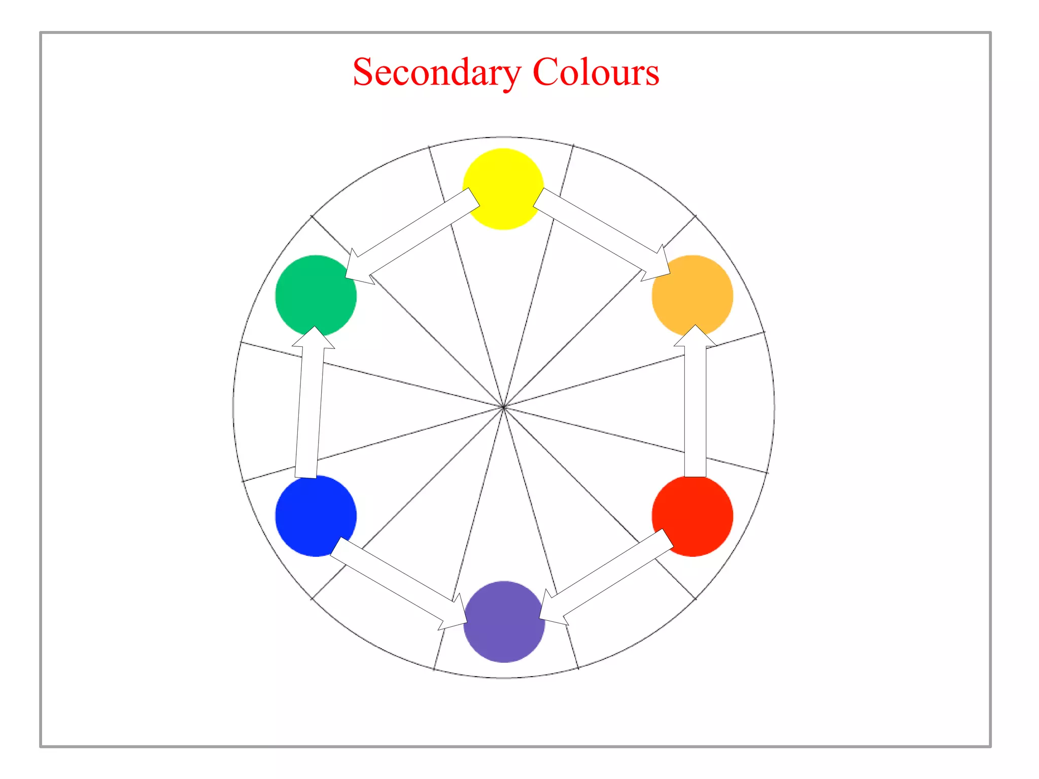
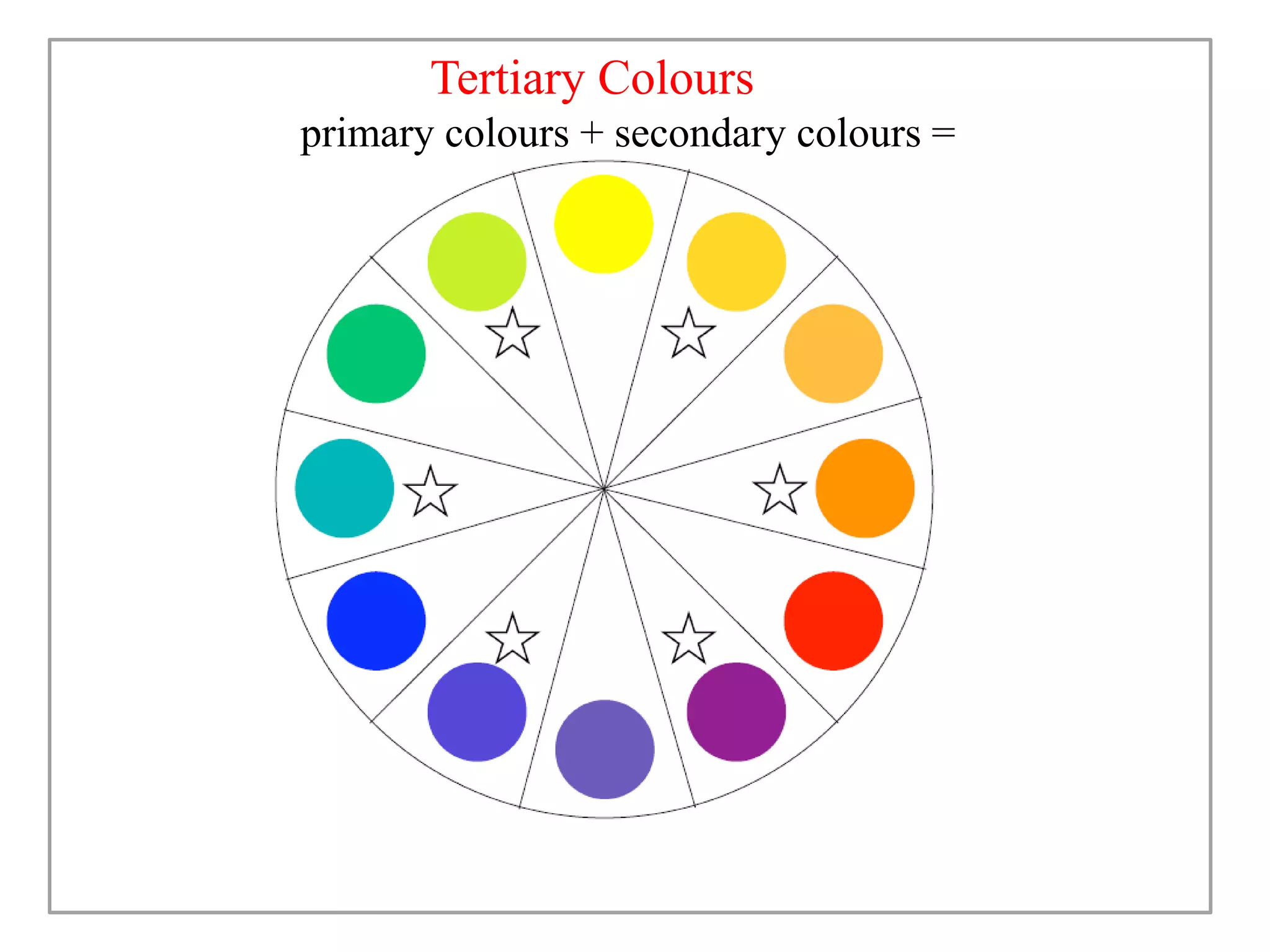

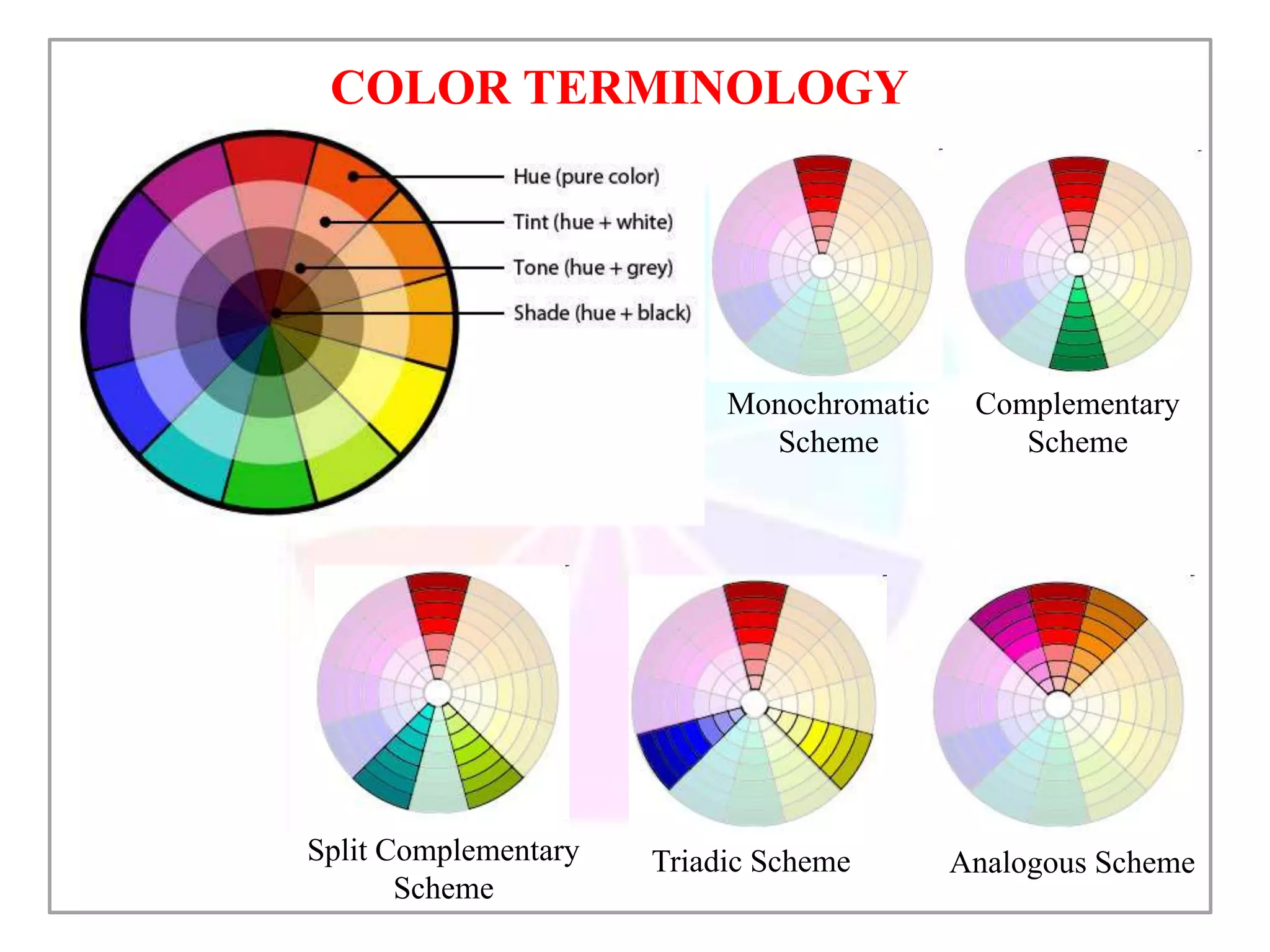


This document discusses color and how it is perceived. It begins by noting that color is influenced by religious, cultural, political and social factors and can communicate meanings and have symbolic significance. It then explains how color is perceived based on light, surfaces, and human sight. Different classifications of color are also outlined, including primary/secondary colors and color wheels. Various color schemes and combinations are defined, such as complementary, analogous, monochromatic and how different colors generally have different symbolic meanings and associations.


