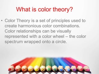
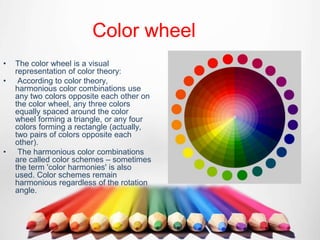
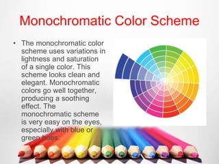
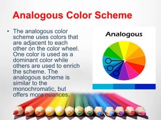
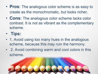
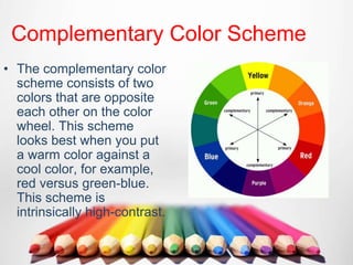
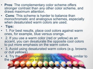
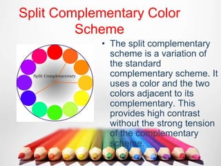
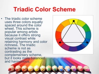
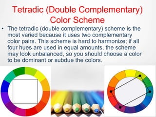
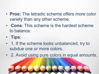
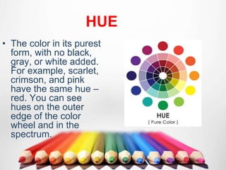
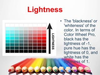
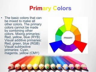
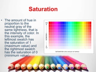
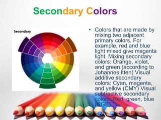
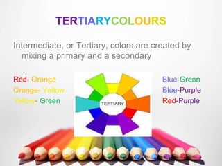
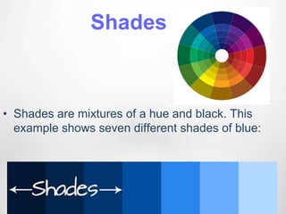
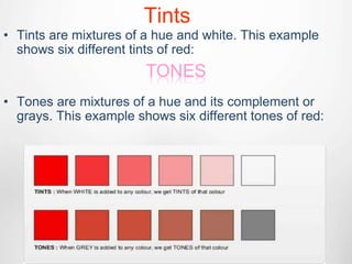
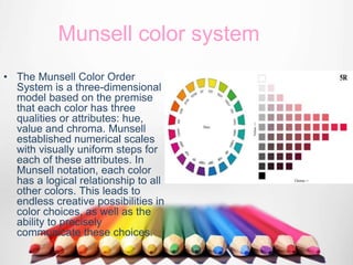
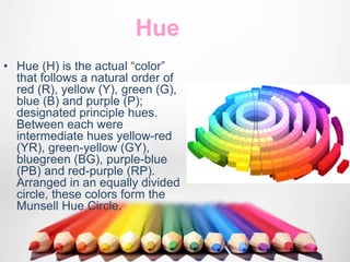
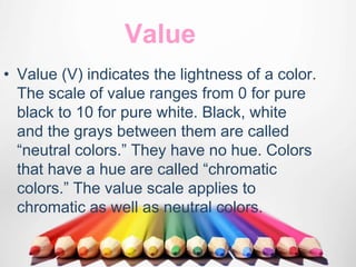
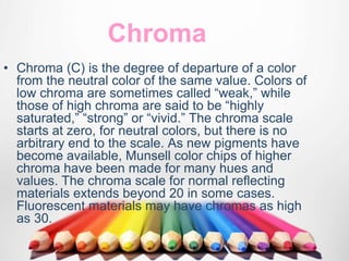
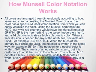
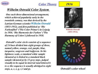
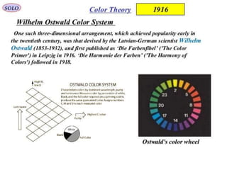
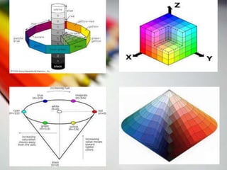
SlideShare a Scribd company logo
COLOUR FUNDAMENTALS
PRESENTED BY
Sarika Aggarwal
Shivam Bhushan
B.ARCH(2nd sem)
• Color Theory is a set of principles used to
create harmonious color combinations.
Color relationships can be visually
represented with a color wheel – the color
spectrum wrapped onto a circle.
What is color theory?
Color wheel
• The color wheel is a visual
representation of color theory:
• According to color theory,
harmonious color combinations use
any two colors opposite each other on
the color wheel, any three colors
equally spaced around the color
wheel forming a triangle, or any four
colors forming a rectangle (actually,
two pairs of colors opposite each
other).
• The harmonious color combinations
are called color schemes – sometimes
the term 'color harmonies' is also
used. Color schemes remain
harmonious regardless of the rotation
angle.
COLOUR
SCHEMES
Monochromatic Color Scheme
• The monochromatic color
scheme uses variations in
lightness and saturation
of a single color. This
scheme looks clean and
elegant. Monochromatic
colors go well together,
producing a soothing
effect. The
monochromatic scheme
is very easy on the eyes,
especially with blue or
green hues.
• Pros: The monochromatic scheme is easy to
manage, and always looks balanced and
visually appealing.
• Cons: This scheme lacks color contrast. It is
not as vibrant as the complementary
scheme.
• Tips:
• 1. Use tints, shades, and tones of the key
color to enhance the scheme.
• 2. Try the analogous scheme; it offers more
nuances while retaining the simplicity and
elegance of the monochromatic scheme.
Analogous Color Scheme
• The analogous color
scheme uses colors that
are adjacent to each
other on the color wheel.
One color is used as a
dominant color while
others are used to enrich
the scheme. The
analogous scheme is
similar to the
monochromatic, but
offers more nuances.
• Pros: The analogous color scheme is as easy to
create as the monochromatic, but looks richer.
• Cons: The analogous color scheme lacks color
contrast. It is not as vibrant as the complementary
scheme.
• Tips:
• 1. Avoid using too many hues in the analogous
scheme, because this may ruin the harmony.
• 2. Avoid combining warm and cool colors in this
scheme.
Complementary Color Scheme
• The complementary color
scheme consists of two
colors that are opposite
each other on the color
wheel. This scheme
looks best when you put
a warm color against a
cool color, for example,
red versus green-blue.
This scheme is
intrinsically high-contrast.
• Pros: The complementary color scheme offers
stronger contrast than any other color scheme, and
draws maximum attention.
• Cons: This scheme is harder to balance than
monochromatic and analogous schemes, especially
when desaturated warm colors are used.
• Tips:
• 1. For best results, place cool colors against warm
ones, for example, blue versus orange.
• 2. If you use a warm color (red or yellow) as an
accent, you can desaturate the opposite cool colors
to put more emphasis on the warm colors.
• 3. Avoid using desaturated warm colors (e.g. browns
or dull yellows).
• 4. Try the split complementary scheme; it is similar to
the complementary scheme but offers more
Split Complementary Color
Scheme
• The split complementary
scheme is a variation of
the standard
complementary scheme. It
uses a color and the two
colors adjacent to its
complementary. This
provides high contrast
without the strong tension
of the complementary
scheme.
• Pros: The split complementary scheme offers
more nuances than the complementary scheme
while retaining strong visual contrast.
• Cons: The split complementary scheme is harder
to balance than monochromatic and analogous
color schemes.
• Tips:
• 1. Use a single warm color against a range of cool
colors to put an emphasis on the warm color (red
versus blues and blue-greens, or orange versus
blues and blue-violets).
• 2. Avoid using desaturated warm colors (e.g.
browns or dull yellows), because this may ruin the
scheme.
Triadic Color Scheme
• The triadic color scheme
uses three colors equally
spaced around the color
wheel. This scheme is
popular among artists
because it offers strong
visual contrast while
retaining harmony and color
richness. The triadic
scheme is not as
contrasting as the
complementary scheme,
but it looks more balanced
and harmonious.
• Pros: The triadic color scheme offers high
contrast while retaining harmony.
• Cons: The triadic color scheme is not as
contrasting as the complementary scheme.
• Tips:
• 1. Choose one color to be used in larger
amounts than others.
• 2. If the colors look gaudy, try to subdue
them.
Tetradic (Double Complementary)
Color Scheme
• The tetradic (double complementary) scheme is the
most varied because it uses two complementary
color pairs. This scheme is hard to harmonize; if all
four hues are used in equal amounts, the scheme
may look unbalanced, so you should choose a color
to be dominant or subdue the colors.
• Pros: The tetradic scheme offers more color
variety than any other scheme.
• Cons: This scheme is the hardest scheme
to balance.
• Tips:
• 1. If the scheme looks unbalanced, try to
subdue one or more colors.
• 2. Avoid using pure colors in equal amounts.
HUE
• The color in its purest
form, with no black,
gray, or white added.
For example, scarlet,
crimson, and pink
have the same hue –
red. You can see
hues on the outer
edge of the color
wheel and in the
spectrum.
Lightness
• The 'blackness' or
'whiteness' of the
color. In terms of
Color Wheel Pro,
black has the
lightness of -1,
pure hue has the
lightness of 0, and
white has the
lightness of 1.
Primary Colors
• The basic colors that can
be mixed to make all
other colors. The primary
colors cannot be made
by combining other
colors. Mixing primaries:
Red, yellow, blue (RYB)
Visual additive primaries:
Red, green, blue (RGB)
Visual subtractive
primaries: Cyan,
magenta, yellow (CMY)
Saturation
• The amount of hue in
proportion to the
neutral gray of the
same lightness, that is
the intensity of color. In
this example, the
leftmost swatch has
the saturation of 1
(maximum value) and
the rightmost swatch
has the saturation of 0
(minimum value).
Secondary Colors
• Colors that are made by
mixing two adjacent
primary colors. For
example, red and blue
light mixed give magenta
light. Mixing secondary
colors: Orange, violet,
and green (according to
Johannes Itten) Visual
additive secondary
colors: Cyan, magenta,
and yellow (CMY) Visual
subtractive secondary
colors: Red, green, blue
(RGB)
TERTIARYCOLOURS
Intermediate, or Tertiary, colors are created by
mixing a primary and a secondary
Red- Orange Blue-Green
Orange- Yellow Blue-Purple
Yellow- Green Red-Purple
Shades
• Shades are mixtures of a hue and black. This
example shows seven different shades of blue:
Tints
• Tints are mixtures of a hue and white. This example
shows six different tints of red:
• Tones are mixtures of a hue and its complement or
grays. This example shows six different tones of red:
TONES
MUNSHELL
COLOUR THEORY
Munsell color system
• The Munsell Color Order
System is a three-dimensional
model based on the premise
that each color has three
qualities or attributes: hue,
value and chroma. Munsell
established numerical scales
with visually uniform steps for
each of these attributes. In
Munsell notation, each color
has a logical relationship to all
other colors. This leads to
endless creative possibilities in
color choices, as well as the
ability to precisely
communicate these choices.
Hue
• Hue (H) is the actual “color”
that follows a natural order of
red (R), yellow (Y), green (G),
blue (B) and purple (P);
designated principle hues.
Between each were
intermediate hues yellow-red
(YR), green-yellow (GY),
bluegreen (BG), purple-blue
(PB) and red-purple (RP).
Arranged in an equally divided
circle, these colors form the
Munsell Hue Circle.
Value
• Value (V) indicates the lightness of a color.
The scale of value ranges from 0 for pure
black to 10 for pure white. Black, white
and the grays between them are called
“neutral colors.” They have no hue. Colors
that have a hue are called “chromatic
colors.” The value scale applies to
chromatic as well as neutral colors.
Chroma
• Chroma (C) is the degree of departure of a color
from the neutral color of the same value. Colors of
low chroma are sometimes called “weak,” while
those of high chroma are said to be “highly
saturated,” “strong” or “vivid.” The chroma scale
starts at zero, for neutral colors, but there is no
arbitrary end to the scale. As new pigments have
become available, Munsell color chips of higher
chroma have been made for many hues and
values. The chroma scale for normal reflecting
materials extends beyond 20 in some cases.
Fluorescent materials may have chromas as high
as 30.
How Munsell Color Notation
Works
• All colors are arranged three-dimensionally according to hue,
value and chroma creating the Munsell Color Space. Each
color has a specific Munsell color notation from which you can
easily visualize the color. Using the Munsell nomenclature
HV/C, our vivid red example would have the Munsell notation
5R 6/14. 5R is the hue (red), 6 is the value (moderately light),
and a 14 chroma indicates a highly chromatic color. When a
finer division is needed for any of the attributes, decimals are
used. For example, 5.3R 6.1/14.4. When the hues of the
primary hue circle are used, the notation is written in the same
way, for example 2B’ 5/4. The notation for a neutral color is
written: NV/. The chroma of a neutral color is zero, but it is
customary to omit the zero in the notation. The notation N 1/
denotes a black, a very dark neutral, while N 9/ denotes a
white, a very light neutral. This notation for a middle gray is N
5/.
OSTWALD
COLOUR THEORY
Psychology of
colors
♦ What’s your favorite color? ♦
Let’s see how colors affect on your life.
How do they define your personality?
Black
• Black is the color of authority and power, stability and
strength. It is also the color associated with intelligence. Black
clothes make people appear thinner. It's a somber color
sometimes associated with evil (the cowboy in the black hat
was almost always the "bad guy"). In the western hemisphere
black is associated with grieving. Black is a serious color that
evokes strong emotions; it is easy to overwhelm people with
too much black.
Red
• If you want to draw attention, use red. It is often where the eye looks first. Red is the color
of energy. It's associated with movement and excitement. People surrounded by red find
their heart beating a little faster and often report feeling a bit out of breath. It's the absolute
wrong color for a baby's room but perfect to get people excited. Wearing red clothes will
make you appear a bit heavier and certainly more noticeable (some studies show red cars
get more tickets but that may be because the red car owners drive faster or the ticket giver
notices the movement of the red car more prominently).
• Red is not a good color to over use but using a spot of red in just the right place is smart in
some cases (one red accent in an otherwise neutral room draws the eye; a red tie with a
navy blue suit and a white shirt adds just the right amount of energy to draw the eye.
• Red is the symbol of life (red blooded life!) and, for this reason,
it's the color worn by brides in China. Red is used at holidays
that are about love and giving (red roses, Valentines hearts,
Christmas, etc.) but the true color of love is pink. Pink is the
most calming of all colors -- often our most dangerous criminals
are housed in pink cells as studies show that the color drains
energy and calms aggression.
Blue
• Ask people their favorite color and a clear majority will say blue. Much of the world is
blue (skies, seas). Seeing the color blue actually causes the body to produce chemicals
that are calming; but that isn't true of all shades of blue. Some shades (or too much
blue) can send a cold and uncaring message. Many bedrooms are blue because it's
calm, restful color. Over the ages blue has become associated with steadfastness,
dependability, wisdom and loyalty (note how many uniforms are blue). People tend to
be more productive in a blue room because they are calm and focused on the task at
hand. Some studies are showing that weight lifters can lift more weight in a blue gym -
in fact, nearly all sports are enhanced in blue surroundings.
Yellow
• Cheerful yellow is the color of the sun, associated with laughter, happiness and
good times. A person surrounded by yellow feels optimistic because the brain
actually releases more seratonin (the feel good chemical in the brain) when
around this color. It is the color associated with optimism but be careful with
yellow; when intense, it is the color of flames and studies show babies cry more
in (bright) yellow rooms and tempers flare more around that color too. It has the
power to speed up our metabolism and bring out some creative thoughts (legal
tablets are yellow for good reason!). Yellow can be quickly overpowering if over-
used, but used sparingly in the just the right place it can be an effective tool in
marketing to greater sales.
Green
• The color of growth, nature, and money. A calming color also
that's very pleasing to the senses. Dark forest green is associated
with terms like conservative, masculine and wealth. Hospitals use
light green rooms because they are found to be calming to
patients. It is also the color associated with envy, good luck,
generosity and fertility. It is the traditional color of peace,
harmony, comfortable nurturing, support and well paced energy.
Violet (
purple )
• What color were the robes of kings and queens? Yes, they were
purple, our most royal color that is associated with wealth,
prosperity, rich sophistication. This color stimulates the brain
activity used in problem solving. However, when overused in a
common setting it is associated with putting on airs and being
artificial. Use purple most carefully to lend an air of mystery,
wisdom, and respect. Young adolescent girls are most likely to
select nearly all shades of purple as their favorite color.
Orange
• The most flamboyant color on the planet! It's the
color tied most this fun times, happy and energetic
days, warmth and organic products. It is also
associated with ambition. There is nothing even
remotely calm associated with this color. Orange is
associated with a new dawn in attitude.
RADAINT ENERGY
Introduction
• Radiant energy is the energy of electromagnetic
waves
• The term is most commonly used in the fields of
radiometry, solar energy, heating and lighting,
but is also used less frequently in other fields
(such as telecommunications).
• The quantity of radiant energy may be
calculated by integrating radiant flux (or power)
with respect to time and, like all forms of energy,
its SI unit is the joule.
• In applications involving transmission of power
from one location to another, "radiant energy" is
sometimes used to refer to the electromagnetic
waves themselves, rather than their energy (a
property of the waves).
• Because electromagnetic (EM) radiation can be
considered to be a stream of photons, radiant
energy can be viewed as the energy carried by
these photons.
• Alternatively, EM radiation can be viewed as an
electromagnetic wave, which carries energy in
its oscillating electric and magnetic fields
.
COLOUR
SPECTRUM
Light and Sound
• To understand spectra you need a little
primer on light first
• It is helpful to think of light and sound
together
• They are both wave phenomena
– Sound is a mechanical wave
– Light is a electromagnetic wave
• You can think of color as pitch and
brightness as loudness
Issac Newton
Showed with a prism* that white
light is a continuous band made of
all colors
Spectral lines
A spectral line is a dark or bright line in an otherwise
uniform and continuous spectrum, resulting from
emission or absorption of light in a narrow frequency
range, compared with the nearby frequencies
THANK YOU

More Related Content

What's hot

Color Theory
Color TheoryColor Theory
Color Theory
Kabir Malkani
 
Color Theory
Color TheoryColor Theory
Color Theoryslhallman
 
color-theory for beginners
color-theory for beginnerscolor-theory for beginners
color-theory for beginners
Dipjoy Routh
 
Color theory
Color theoryColor theory
Color theory
Anuradha Kachare
 
Color wheel
Color wheelColor wheel
Color theory
Color theoryColor theory
AHSArt: Color theory Drawing + Painting
AHSArt:  Color theory Drawing + Painting AHSArt:  Color theory Drawing + Painting
AHSArt: Color theory Drawing + Painting
Appoquinimink High School
 
Elements of design colour
Elements of design   colourElements of design   colour
Elements of design colourjamieandlianne
 
Understanding Color
Understanding ColorUnderstanding Color
Understanding Color
Jennifer Janviere
 
Color theory
Color theoryColor theory
Color theory
hojungiee
 
Ppt Of Color Theory
Ppt Of Color TheoryPpt Of Color Theory
Ppt Of Color Theory
Mustafa Ali
 
Elements of Design
Elements of DesignElements of Design
Elements of Design
Jennifer Janviere
 
Color Theory
Color TheoryColor Theory
Color Theory
Sai Kiran Reddy
 
Color power point
Color power pointColor power point
Color power point
msbarczyk
 
Color
ColorColor
Color
hmazzuto
 
A Brief Introduction to Color Theory
A Brief Introduction to Color TheoryA Brief Introduction to Color Theory
A Brief Introduction to Color Theory
Susan Newberry
 

What's hot (20)

Color Theory
Color TheoryColor Theory
Color Theory
 
Color Theory
Color TheoryColor Theory
Color Theory
 
color-theory for beginners
color-theory for beginnerscolor-theory for beginners
color-theory for beginners
 
Color theory
Color theoryColor theory
Color theory
 
Color wheel
Color wheelColor wheel
Color wheel
 
Color theory
Color theoryColor theory
Color theory
 
Colour Theory
Colour TheoryColour Theory
Colour Theory
 
Color schemes ppt
Color schemes pptColor schemes ppt
Color schemes ppt
 
AHSArt: Color theory Drawing + Painting
AHSArt:  Color theory Drawing + Painting AHSArt:  Color theory Drawing + Painting
AHSArt: Color theory Drawing + Painting
 
Elements of design colour
Elements of design   colourElements of design   colour
Elements of design colour
 
Understanding Color
Understanding ColorUnderstanding Color
Understanding Color
 
Color theory
Color theoryColor theory
Color theory
 
Ppt Of Color Theory
Ppt Of Color TheoryPpt Of Color Theory
Ppt Of Color Theory
 
Color theory
Color theoryColor theory
Color theory
 
Elements of Design
Elements of DesignElements of Design
Elements of Design
 
Color Theory
Color TheoryColor Theory
Color Theory
 
Color power point
Color power pointColor power point
Color power point
 
Color
ColorColor
Color
 
Colour
ColourColour
Colour
 
A Brief Introduction to Color Theory
A Brief Introduction to Color TheoryA Brief Introduction to Color Theory
A Brief Introduction to Color Theory
 

Similar to COLOR FUNDAMENTALS

Color Theory
Color TheoryColor Theory
Color Theory
Yen Voogt
 
colour theory ppt- animated ppt
colour theory ppt- animated pptcolour theory ppt- animated ppt
colour theory ppt- animated ppt
SarahKhais
 
Color theory
Color theoryColor theory
Color theory
HIMANSHURajak2
 
ColorWheel.ppt
ColorWheel.pptColorWheel.ppt
ColorWheel.ppt
Ritac17
 
ColorWheel.ppt
ColorWheel.pptColorWheel.ppt
ColorWheel.ppt
JericTedAlfanta1
 
ColorWheel.ppt
ColorWheel.pptColorWheel.ppt
ColorWheel.ppt
Ranu Agarwal
 
Image Processing - Color Science.pptx
Image Processing - Color Science.pptxImage Processing - Color Science.pptx
Image Processing - Color Science.pptx
Developer Net
 
Digital Color Theory
Digital Color TheoryDigital Color Theory
Digital Color Theory
ManamiIshimura
 
wk 4 Psychology of Colors.pptx
wk 4 Psychology of Colors.pptxwk 4 Psychology of Colors.pptx
wk 4 Psychology of Colors.pptx
MelvinOchinang7
 
Introduction to color theory for Multimedia Students
Introduction to color  theory  for Multimedia StudentsIntroduction to color  theory  for Multimedia Students
Introduction to color theory for Multimedia Students
SEO SKills
 
color theory 1.pptx
color theory 1.pptxcolor theory 1.pptx
color theory 1.pptx
Kanishka Das
 
Colortheory
ColortheoryColortheory
Colortheory
cisenberg2
 
PPT - Psychology of Color.pptx
PPT - Psychology of Color.pptxPPT - Psychology of Color.pptx
PPT - Psychology of Color.pptx
MelvinOchinang6
 
Color scheme
Color schemeColor scheme
Color scheme
DaedeepyaYangala
 
Colour
Colour Colour
Colour
CarolinaPeral
 
colortheory-1217362675462023-8.pdf
colortheory-1217362675462023-8.pdfcolortheory-1217362675462023-8.pdf
colortheory-1217362675462023-8.pdf
Marven Basinang
 
Colour 1 theory 2014
Colour 1 theory 2014Colour 1 theory 2014
Colour 1 theory 2014
Virtu Institute
 
Principals and elements of design.
Principals and elements of design.Principals and elements of design.

Similar to COLOR FUNDAMENTALS (20)

Color Theory
Color TheoryColor Theory
Color Theory
 
colour theory ppt- animated ppt
colour theory ppt- animated pptcolour theory ppt- animated ppt
colour theory ppt- animated ppt
 
Color theory
Color theoryColor theory
Color theory
 
ColorWheel.ppt
ColorWheel.pptColorWheel.ppt
ColorWheel.ppt
 
ColorWheel.ppt
ColorWheel.pptColorWheel.ppt
ColorWheel.ppt
 
ColorWheel.ppt
ColorWheel.pptColorWheel.ppt
ColorWheel.ppt
 
Colorschemes
ColorschemesColorschemes
Colorschemes
 
Image Processing - Color Science.pptx
Image Processing - Color Science.pptxImage Processing - Color Science.pptx
Image Processing - Color Science.pptx
 
Digital Color Theory
Digital Color TheoryDigital Color Theory
Digital Color Theory
 
wk 4 Psychology of Colors.pptx
wk 4 Psychology of Colors.pptxwk 4 Psychology of Colors.pptx
wk 4 Psychology of Colors.pptx
 
Introduction to color theory for Multimedia Students
Introduction to color  theory  for Multimedia StudentsIntroduction to color  theory  for Multimedia Students
Introduction to color theory for Multimedia Students
 
color theory 1.pptx
color theory 1.pptxcolor theory 1.pptx
color theory 1.pptx
 
Colortheory
ColortheoryColortheory
Colortheory
 
PPT - Psychology of Color.pptx
PPT - Psychology of Color.pptxPPT - Psychology of Color.pptx
PPT - Psychology of Color.pptx
 
Color scheme
Color schemeColor scheme
Color scheme
 
Color
ColorColor
Color
 
Colour
Colour Colour
Colour
 
colortheory-1217362675462023-8.pdf
colortheory-1217362675462023-8.pdfcolortheory-1217362675462023-8.pdf
colortheory-1217362675462023-8.pdf
 
Colour 1 theory 2014
Colour 1 theory 2014Colour 1 theory 2014
Colour 1 theory 2014
 
Principals and elements of design.
Principals and elements of design.Principals and elements of design.
Principals and elements of design.
 

Recently uploaded

How libraries can support authors with open access requirements for UKRI fund...
How libraries can support authors with open access requirements for UKRI fund...How libraries can support authors with open access requirements for UKRI fund...
How libraries can support authors with open access requirements for UKRI fund...
Jisc
 
aaaaaaaaaaaaaaaaaaaaaaaaaaaaaaaaaaaaaaaaa
aaaaaaaaaaaaaaaaaaaaaaaaaaaaaaaaaaaaaaaaaaaaaaaaaaaaaaaaaaaaaaaaaaaaaaaaaaaaaaaaaa
aaaaaaaaaaaaaaaaaaaaaaaaaaaaaaaaaaaaaaaaa
siemaillard
 
Language Across the Curriculm LAC B.Ed.
Language Across the  Curriculm LAC B.Ed.Language Across the  Curriculm LAC B.Ed.
Language Across the Curriculm LAC B.Ed.
Atul Kumar Singh
 
Cambridge International AS A Level Biology Coursebook - EBook (MaryFosbery J...
Cambridge International AS  A Level Biology Coursebook - EBook (MaryFosbery J...Cambridge International AS  A Level Biology Coursebook - EBook (MaryFosbery J...
Cambridge International AS A Level Biology Coursebook - EBook (MaryFosbery J...
AzmatAli747758
 
Polish students' mobility in the Czech Republic
Polish students' mobility in the Czech RepublicPolish students' mobility in the Czech Republic
Polish students' mobility in the Czech Republic
Anna Sz.
 
Overview on Edible Vaccine: Pros & Cons with Mechanism
Overview on Edible Vaccine: Pros & Cons with MechanismOverview on Edible Vaccine: Pros & Cons with Mechanism
Overview on Edible Vaccine: Pros & Cons with Mechanism
DeeptiGupta154
 
TESDA TM1 REVIEWER FOR NATIONAL ASSESSMENT WRITTEN AND ORAL QUESTIONS WITH A...
TESDA TM1 REVIEWER  FOR NATIONAL ASSESSMENT WRITTEN AND ORAL QUESTIONS WITH A...TESDA TM1 REVIEWER  FOR NATIONAL ASSESSMENT WRITTEN AND ORAL QUESTIONS WITH A...
TESDA TM1 REVIEWER FOR NATIONAL ASSESSMENT WRITTEN AND ORAL QUESTIONS WITH A...
EugeneSaldivar
 
Introduction to Quality Improvement Essentials
Introduction to Quality Improvement EssentialsIntroduction to Quality Improvement Essentials
Introduction to Quality Improvement Essentials
Excellence Foundation for South Sudan
 
GIÁO ÁN DẠY THÊM (KẾ HOẠCH BÀI BUỔI 2) - TIẾNG ANH 8 GLOBAL SUCCESS (2 CỘT) N...
GIÁO ÁN DẠY THÊM (KẾ HOẠCH BÀI BUỔI 2) - TIẾNG ANH 8 GLOBAL SUCCESS (2 CỘT) N...GIÁO ÁN DẠY THÊM (KẾ HOẠCH BÀI BUỔI 2) - TIẾNG ANH 8 GLOBAL SUCCESS (2 CỘT) N...
GIÁO ÁN DẠY THÊM (KẾ HOẠCH BÀI BUỔI 2) - TIẾNG ANH 8 GLOBAL SUCCESS (2 CỘT) N...
Nguyen Thanh Tu Collection
 
MARUTI SUZUKI- A Successful Joint Venture in India.pptx
MARUTI SUZUKI- A Successful Joint Venture in India.pptxMARUTI SUZUKI- A Successful Joint Venture in India.pptx
MARUTI SUZUKI- A Successful Joint Venture in India.pptx
bennyroshan06
 
special B.ed 2nd year old paper_20240531.pdf
special B.ed 2nd year old paper_20240531.pdfspecial B.ed 2nd year old paper_20240531.pdf
special B.ed 2nd year old paper_20240531.pdf
Special education needs
 
Additional Benefits for Employee Website.pdf
Additional Benefits for Employee Website.pdfAdditional Benefits for Employee Website.pdf
Additional Benefits for Employee Website.pdf
joachimlavalley1
 
1.4 modern child centered education - mahatma gandhi-2.pptx
1.4 modern child centered education - mahatma gandhi-2.pptx1.4 modern child centered education - mahatma gandhi-2.pptx
1.4 modern child centered education - mahatma gandhi-2.pptx
JosvitaDsouza2
 
Unit 8 - Information and Communication Technology (Paper I).pdf
Unit 8 - Information and Communication Technology (Paper I).pdfUnit 8 - Information and Communication Technology (Paper I).pdf
Unit 8 - Information and Communication Technology (Paper I).pdf
Thiyagu K
 
CLASS 11 CBSE B.St Project AIDS TO TRADE - INSURANCE
CLASS 11 CBSE B.St Project AIDS TO TRADE - INSURANCECLASS 11 CBSE B.St Project AIDS TO TRADE - INSURANCE
CLASS 11 CBSE B.St Project AIDS TO TRADE - INSURANCE
BhavyaRajput3
 
Supporting (UKRI) OA monographs at Salford.pptx
Supporting (UKRI) OA monographs at Salford.pptxSupporting (UKRI) OA monographs at Salford.pptx
Supporting (UKRI) OA monographs at Salford.pptx
Jisc
 
Unit 2- Research Aptitude (UGC NET Paper I).pdf
Unit 2- Research Aptitude (UGC NET Paper I).pdfUnit 2- Research Aptitude (UGC NET Paper I).pdf
Unit 2- Research Aptitude (UGC NET Paper I).pdf
Thiyagu K
 
Home assignment II on Spectroscopy 2024 Answers.pdf
Home assignment II on Spectroscopy 2024 Answers.pdfHome assignment II on Spectroscopy 2024 Answers.pdf
Home assignment II on Spectroscopy 2024 Answers.pdf
Tamralipta Mahavidyalaya
 
Sectors of the Indian Economy - Class 10 Study Notes pdf
Sectors of the Indian Economy - Class 10 Study Notes pdfSectors of the Indian Economy - Class 10 Study Notes pdf
Sectors of the Indian Economy - Class 10 Study Notes pdf
Vivekanand Anglo Vedic Academy
 
Chapter 3 - Islamic Banking Products and Services.pptx
Chapter 3 - Islamic Banking Products and Services.pptxChapter 3 - Islamic Banking Products and Services.pptx
Chapter 3 - Islamic Banking Products and Services.pptx
Mohd Adib Abd Muin, Senior Lecturer at Universiti Utara Malaysia
 

Recently uploaded (20)

How libraries can support authors with open access requirements for UKRI fund...
How libraries can support authors with open access requirements for UKRI fund...How libraries can support authors with open access requirements for UKRI fund...
How libraries can support authors with open access requirements for UKRI fund...
 
aaaaaaaaaaaaaaaaaaaaaaaaaaaaaaaaaaaaaaaaa
aaaaaaaaaaaaaaaaaaaaaaaaaaaaaaaaaaaaaaaaaaaaaaaaaaaaaaaaaaaaaaaaaaaaaaaaaaaaaaaaaa
aaaaaaaaaaaaaaaaaaaaaaaaaaaaaaaaaaaaaaaaa
 
Language Across the Curriculm LAC B.Ed.
Language Across the  Curriculm LAC B.Ed.Language Across the  Curriculm LAC B.Ed.
Language Across the Curriculm LAC B.Ed.
 
Cambridge International AS A Level Biology Coursebook - EBook (MaryFosbery J...
Cambridge International AS  A Level Biology Coursebook - EBook (MaryFosbery J...Cambridge International AS  A Level Biology Coursebook - EBook (MaryFosbery J...
Cambridge International AS A Level Biology Coursebook - EBook (MaryFosbery J...
 
Polish students' mobility in the Czech Republic
Polish students' mobility in the Czech RepublicPolish students' mobility in the Czech Republic
Polish students' mobility in the Czech Republic
 
Overview on Edible Vaccine: Pros & Cons with Mechanism
Overview on Edible Vaccine: Pros & Cons with MechanismOverview on Edible Vaccine: Pros & Cons with Mechanism
Overview on Edible Vaccine: Pros & Cons with Mechanism
 
TESDA TM1 REVIEWER FOR NATIONAL ASSESSMENT WRITTEN AND ORAL QUESTIONS WITH A...
TESDA TM1 REVIEWER  FOR NATIONAL ASSESSMENT WRITTEN AND ORAL QUESTIONS WITH A...TESDA TM1 REVIEWER  FOR NATIONAL ASSESSMENT WRITTEN AND ORAL QUESTIONS WITH A...
TESDA TM1 REVIEWER FOR NATIONAL ASSESSMENT WRITTEN AND ORAL QUESTIONS WITH A...
 
Introduction to Quality Improvement Essentials
Introduction to Quality Improvement EssentialsIntroduction to Quality Improvement Essentials
Introduction to Quality Improvement Essentials
 
GIÁO ÁN DẠY THÊM (KẾ HOẠCH BÀI BUỔI 2) - TIẾNG ANH 8 GLOBAL SUCCESS (2 CỘT) N...
GIÁO ÁN DẠY THÊM (KẾ HOẠCH BÀI BUỔI 2) - TIẾNG ANH 8 GLOBAL SUCCESS (2 CỘT) N...GIÁO ÁN DẠY THÊM (KẾ HOẠCH BÀI BUỔI 2) - TIẾNG ANH 8 GLOBAL SUCCESS (2 CỘT) N...
GIÁO ÁN DẠY THÊM (KẾ HOẠCH BÀI BUỔI 2) - TIẾNG ANH 8 GLOBAL SUCCESS (2 CỘT) N...
 
MARUTI SUZUKI- A Successful Joint Venture in India.pptx
MARUTI SUZUKI- A Successful Joint Venture in India.pptxMARUTI SUZUKI- A Successful Joint Venture in India.pptx
MARUTI SUZUKI- A Successful Joint Venture in India.pptx
 
special B.ed 2nd year old paper_20240531.pdf
special B.ed 2nd year old paper_20240531.pdfspecial B.ed 2nd year old paper_20240531.pdf
special B.ed 2nd year old paper_20240531.pdf
 
Additional Benefits for Employee Website.pdf
Additional Benefits for Employee Website.pdfAdditional Benefits for Employee Website.pdf
Additional Benefits for Employee Website.pdf
 
1.4 modern child centered education - mahatma gandhi-2.pptx
1.4 modern child centered education - mahatma gandhi-2.pptx1.4 modern child centered education - mahatma gandhi-2.pptx
1.4 modern child centered education - mahatma gandhi-2.pptx
 
Unit 8 - Information and Communication Technology (Paper I).pdf
Unit 8 - Information and Communication Technology (Paper I).pdfUnit 8 - Information and Communication Technology (Paper I).pdf
Unit 8 - Information and Communication Technology (Paper I).pdf
 
CLASS 11 CBSE B.St Project AIDS TO TRADE - INSURANCE
CLASS 11 CBSE B.St Project AIDS TO TRADE - INSURANCECLASS 11 CBSE B.St Project AIDS TO TRADE - INSURANCE
CLASS 11 CBSE B.St Project AIDS TO TRADE - INSURANCE
 
Supporting (UKRI) OA monographs at Salford.pptx
Supporting (UKRI) OA monographs at Salford.pptxSupporting (UKRI) OA monographs at Salford.pptx
Supporting (UKRI) OA monographs at Salford.pptx
 
Unit 2- Research Aptitude (UGC NET Paper I).pdf
Unit 2- Research Aptitude (UGC NET Paper I).pdfUnit 2- Research Aptitude (UGC NET Paper I).pdf
Unit 2- Research Aptitude (UGC NET Paper I).pdf
 
Home assignment II on Spectroscopy 2024 Answers.pdf
Home assignment II on Spectroscopy 2024 Answers.pdfHome assignment II on Spectroscopy 2024 Answers.pdf
Home assignment II on Spectroscopy 2024 Answers.pdf
 
Sectors of the Indian Economy - Class 10 Study Notes pdf
Sectors of the Indian Economy - Class 10 Study Notes pdfSectors of the Indian Economy - Class 10 Study Notes pdf
Sectors of the Indian Economy - Class 10 Study Notes pdf
 
Chapter 3 - Islamic Banking Products and Services.pptx
Chapter 3 - Islamic Banking Products and Services.pptxChapter 3 - Islamic Banking Products and Services.pptx
Chapter 3 - Islamic Banking Products and Services.pptx
 

COLOR FUNDAMENTALS

  • 1. COLOUR FUNDAMENTALS PRESENTED BY Sarika Aggarwal Shivam Bhushan B.ARCH(2nd sem)
  • 2. • Color Theory is a set of principles used to create harmonious color combinations. Color relationships can be visually represented with a color wheel – the color spectrum wrapped onto a circle. What is color theory?
  • 3. Color wheel • The color wheel is a visual representation of color theory: • According to color theory, harmonious color combinations use any two colors opposite each other on the color wheel, any three colors equally spaced around the color wheel forming a triangle, or any four colors forming a rectangle (actually, two pairs of colors opposite each other). • The harmonious color combinations are called color schemes – sometimes the term 'color harmonies' is also used. Color schemes remain harmonious regardless of the rotation angle.
  • 5. Monochromatic Color Scheme • The monochromatic color scheme uses variations in lightness and saturation of a single color. This scheme looks clean and elegant. Monochromatic colors go well together, producing a soothing effect. The monochromatic scheme is very easy on the eyes, especially with blue or green hues.
  • 6. • Pros: The monochromatic scheme is easy to manage, and always looks balanced and visually appealing. • Cons: This scheme lacks color contrast. It is not as vibrant as the complementary scheme. • Tips: • 1. Use tints, shades, and tones of the key color to enhance the scheme. • 2. Try the analogous scheme; it offers more nuances while retaining the simplicity and elegance of the monochromatic scheme.
  • 7. Analogous Color Scheme • The analogous color scheme uses colors that are adjacent to each other on the color wheel. One color is used as a dominant color while others are used to enrich the scheme. The analogous scheme is similar to the monochromatic, but offers more nuances.
  • 8. • Pros: The analogous color scheme is as easy to create as the monochromatic, but looks richer. • Cons: The analogous color scheme lacks color contrast. It is not as vibrant as the complementary scheme. • Tips: • 1. Avoid using too many hues in the analogous scheme, because this may ruin the harmony. • 2. Avoid combining warm and cool colors in this scheme.
  • 9. Complementary Color Scheme • The complementary color scheme consists of two colors that are opposite each other on the color wheel. This scheme looks best when you put a warm color against a cool color, for example, red versus green-blue. This scheme is intrinsically high-contrast.
  • 10. • Pros: The complementary color scheme offers stronger contrast than any other color scheme, and draws maximum attention. • Cons: This scheme is harder to balance than monochromatic and analogous schemes, especially when desaturated warm colors are used. • Tips: • 1. For best results, place cool colors against warm ones, for example, blue versus orange. • 2. If you use a warm color (red or yellow) as an accent, you can desaturate the opposite cool colors to put more emphasis on the warm colors. • 3. Avoid using desaturated warm colors (e.g. browns or dull yellows). • 4. Try the split complementary scheme; it is similar to the complementary scheme but offers more
  • 11. Split Complementary Color Scheme • The split complementary scheme is a variation of the standard complementary scheme. It uses a color and the two colors adjacent to its complementary. This provides high contrast without the strong tension of the complementary scheme.
  • 12. • Pros: The split complementary scheme offers more nuances than the complementary scheme while retaining strong visual contrast. • Cons: The split complementary scheme is harder to balance than monochromatic and analogous color schemes. • Tips: • 1. Use a single warm color against a range of cool colors to put an emphasis on the warm color (red versus blues and blue-greens, or orange versus blues and blue-violets). • 2. Avoid using desaturated warm colors (e.g. browns or dull yellows), because this may ruin the scheme.
  • 13. Triadic Color Scheme • The triadic color scheme uses three colors equally spaced around the color wheel. This scheme is popular among artists because it offers strong visual contrast while retaining harmony and color richness. The triadic scheme is not as contrasting as the complementary scheme, but it looks more balanced and harmonious.
  • 14. • Pros: The triadic color scheme offers high contrast while retaining harmony. • Cons: The triadic color scheme is not as contrasting as the complementary scheme. • Tips: • 1. Choose one color to be used in larger amounts than others. • 2. If the colors look gaudy, try to subdue them.
  • 15. Tetradic (Double Complementary) Color Scheme • The tetradic (double complementary) scheme is the most varied because it uses two complementary color pairs. This scheme is hard to harmonize; if all four hues are used in equal amounts, the scheme may look unbalanced, so you should choose a color to be dominant or subdue the colors.
  • 16. • Pros: The tetradic scheme offers more color variety than any other scheme. • Cons: This scheme is the hardest scheme to balance. • Tips: • 1. If the scheme looks unbalanced, try to subdue one or more colors. • 2. Avoid using pure colors in equal amounts.
  • 17. HUE • The color in its purest form, with no black, gray, or white added. For example, scarlet, crimson, and pink have the same hue – red. You can see hues on the outer edge of the color wheel and in the spectrum.
  • 18. Lightness • The 'blackness' or 'whiteness' of the color. In terms of Color Wheel Pro, black has the lightness of -1, pure hue has the lightness of 0, and white has the lightness of 1.
  • 19. Primary Colors • The basic colors that can be mixed to make all other colors. The primary colors cannot be made by combining other colors. Mixing primaries: Red, yellow, blue (RYB) Visual additive primaries: Red, green, blue (RGB) Visual subtractive primaries: Cyan, magenta, yellow (CMY)
  • 20. Saturation • The amount of hue in proportion to the neutral gray of the same lightness, that is the intensity of color. In this example, the leftmost swatch has the saturation of 1 (maximum value) and the rightmost swatch has the saturation of 0 (minimum value).
  • 21. Secondary Colors • Colors that are made by mixing two adjacent primary colors. For example, red and blue light mixed give magenta light. Mixing secondary colors: Orange, violet, and green (according to Johannes Itten) Visual additive secondary colors: Cyan, magenta, and yellow (CMY) Visual subtractive secondary colors: Red, green, blue (RGB)
  • 22. TERTIARYCOLOURS Intermediate, or Tertiary, colors are created by mixing a primary and a secondary Red- Orange Blue-Green Orange- Yellow Blue-Purple Yellow- Green Red-Purple
  • 23. Shades • Shades are mixtures of a hue and black. This example shows seven different shades of blue:
  • 24. Tints • Tints are mixtures of a hue and white. This example shows six different tints of red: • Tones are mixtures of a hue and its complement or grays. This example shows six different tones of red: TONES
  • 26. Munsell color system • The Munsell Color Order System is a three-dimensional model based on the premise that each color has three qualities or attributes: hue, value and chroma. Munsell established numerical scales with visually uniform steps for each of these attributes. In Munsell notation, each color has a logical relationship to all other colors. This leads to endless creative possibilities in color choices, as well as the ability to precisely communicate these choices.
  • 27. Hue • Hue (H) is the actual “color” that follows a natural order of red (R), yellow (Y), green (G), blue (B) and purple (P); designated principle hues. Between each were intermediate hues yellow-red (YR), green-yellow (GY), bluegreen (BG), purple-blue (PB) and red-purple (RP). Arranged in an equally divided circle, these colors form the Munsell Hue Circle.
  • 28. Value • Value (V) indicates the lightness of a color. The scale of value ranges from 0 for pure black to 10 for pure white. Black, white and the grays between them are called “neutral colors.” They have no hue. Colors that have a hue are called “chromatic colors.” The value scale applies to chromatic as well as neutral colors.
  • 29. Chroma • Chroma (C) is the degree of departure of a color from the neutral color of the same value. Colors of low chroma are sometimes called “weak,” while those of high chroma are said to be “highly saturated,” “strong” or “vivid.” The chroma scale starts at zero, for neutral colors, but there is no arbitrary end to the scale. As new pigments have become available, Munsell color chips of higher chroma have been made for many hues and values. The chroma scale for normal reflecting materials extends beyond 20 in some cases. Fluorescent materials may have chromas as high as 30.
  • 30. How Munsell Color Notation Works • All colors are arranged three-dimensionally according to hue, value and chroma creating the Munsell Color Space. Each color has a specific Munsell color notation from which you can easily visualize the color. Using the Munsell nomenclature HV/C, our vivid red example would have the Munsell notation 5R 6/14. 5R is the hue (red), 6 is the value (moderately light), and a 14 chroma indicates a highly chromatic color. When a finer division is needed for any of the attributes, decimals are used. For example, 5.3R 6.1/14.4. When the hues of the primary hue circle are used, the notation is written in the same way, for example 2B’ 5/4. The notation for a neutral color is written: NV/. The chroma of a neutral color is zero, but it is customary to omit the zero in the notation. The notation N 1/ denotes a black, a very dark neutral, while N 9/ denotes a white, a very light neutral. This notation for a middle gray is N 5/.
  • 31.
  • 33.
  • 34.
  • 35.
  • 37.
  • 38. ♦ What’s your favorite color? ♦ Let’s see how colors affect on your life. How do they define your personality?
  • 39. Black
  • 40. • Black is the color of authority and power, stability and strength. It is also the color associated with intelligence. Black clothes make people appear thinner. It's a somber color sometimes associated with evil (the cowboy in the black hat was almost always the "bad guy"). In the western hemisphere black is associated with grieving. Black is a serious color that evokes strong emotions; it is easy to overwhelm people with too much black.
  • 41. Red
  • 42. • If you want to draw attention, use red. It is often where the eye looks first. Red is the color of energy. It's associated with movement and excitement. People surrounded by red find their heart beating a little faster and often report feeling a bit out of breath. It's the absolute wrong color for a baby's room but perfect to get people excited. Wearing red clothes will make you appear a bit heavier and certainly more noticeable (some studies show red cars get more tickets but that may be because the red car owners drive faster or the ticket giver notices the movement of the red car more prominently). • Red is not a good color to over use but using a spot of red in just the right place is smart in some cases (one red accent in an otherwise neutral room draws the eye; a red tie with a navy blue suit and a white shirt adds just the right amount of energy to draw the eye.
  • 43. • Red is the symbol of life (red blooded life!) and, for this reason, it's the color worn by brides in China. Red is used at holidays that are about love and giving (red roses, Valentines hearts, Christmas, etc.) but the true color of love is pink. Pink is the most calming of all colors -- often our most dangerous criminals are housed in pink cells as studies show that the color drains energy and calms aggression.
  • 44. Blue
  • 45. • Ask people their favorite color and a clear majority will say blue. Much of the world is blue (skies, seas). Seeing the color blue actually causes the body to produce chemicals that are calming; but that isn't true of all shades of blue. Some shades (or too much blue) can send a cold and uncaring message. Many bedrooms are blue because it's calm, restful color. Over the ages blue has become associated with steadfastness, dependability, wisdom and loyalty (note how many uniforms are blue). People tend to be more productive in a blue room because they are calm and focused on the task at hand. Some studies are showing that weight lifters can lift more weight in a blue gym - in fact, nearly all sports are enhanced in blue surroundings.
  • 47. • Cheerful yellow is the color of the sun, associated with laughter, happiness and good times. A person surrounded by yellow feels optimistic because the brain actually releases more seratonin (the feel good chemical in the brain) when around this color. It is the color associated with optimism but be careful with yellow; when intense, it is the color of flames and studies show babies cry more in (bright) yellow rooms and tempers flare more around that color too. It has the power to speed up our metabolism and bring out some creative thoughts (legal tablets are yellow for good reason!). Yellow can be quickly overpowering if over- used, but used sparingly in the just the right place it can be an effective tool in marketing to greater sales.
  • 48. Green
  • 49. • The color of growth, nature, and money. A calming color also that's very pleasing to the senses. Dark forest green is associated with terms like conservative, masculine and wealth. Hospitals use light green rooms because they are found to be calming to patients. It is also the color associated with envy, good luck, generosity and fertility. It is the traditional color of peace, harmony, comfortable nurturing, support and well paced energy.
  • 51. • What color were the robes of kings and queens? Yes, they were purple, our most royal color that is associated with wealth, prosperity, rich sophistication. This color stimulates the brain activity used in problem solving. However, when overused in a common setting it is associated with putting on airs and being artificial. Use purple most carefully to lend an air of mystery, wisdom, and respect. Young adolescent girls are most likely to select nearly all shades of purple as their favorite color.
  • 53. • The most flamboyant color on the planet! It's the color tied most this fun times, happy and energetic days, warmth and organic products. It is also associated with ambition. There is nothing even remotely calm associated with this color. Orange is associated with a new dawn in attitude.
  • 55. Introduction • Radiant energy is the energy of electromagnetic waves • The term is most commonly used in the fields of radiometry, solar energy, heating and lighting, but is also used less frequently in other fields (such as telecommunications). • The quantity of radiant energy may be calculated by integrating radiant flux (or power) with respect to time and, like all forms of energy, its SI unit is the joule.
  • 56. • In applications involving transmission of power from one location to another, "radiant energy" is sometimes used to refer to the electromagnetic waves themselves, rather than their energy (a property of the waves). • Because electromagnetic (EM) radiation can be considered to be a stream of photons, radiant energy can be viewed as the energy carried by these photons. • Alternatively, EM radiation can be viewed as an electromagnetic wave, which carries energy in its oscillating electric and magnetic fields .
  • 57.
  • 59. Light and Sound • To understand spectra you need a little primer on light first • It is helpful to think of light and sound together • They are both wave phenomena – Sound is a mechanical wave – Light is a electromagnetic wave • You can think of color as pitch and brightness as loudness
  • 60. Issac Newton Showed with a prism* that white light is a continuous band made of all colors
  • 61. Spectral lines A spectral line is a dark or bright line in an otherwise uniform and continuous spectrum, resulting from emission or absorption of light in a narrow frequency range, compared with the nearby frequencies