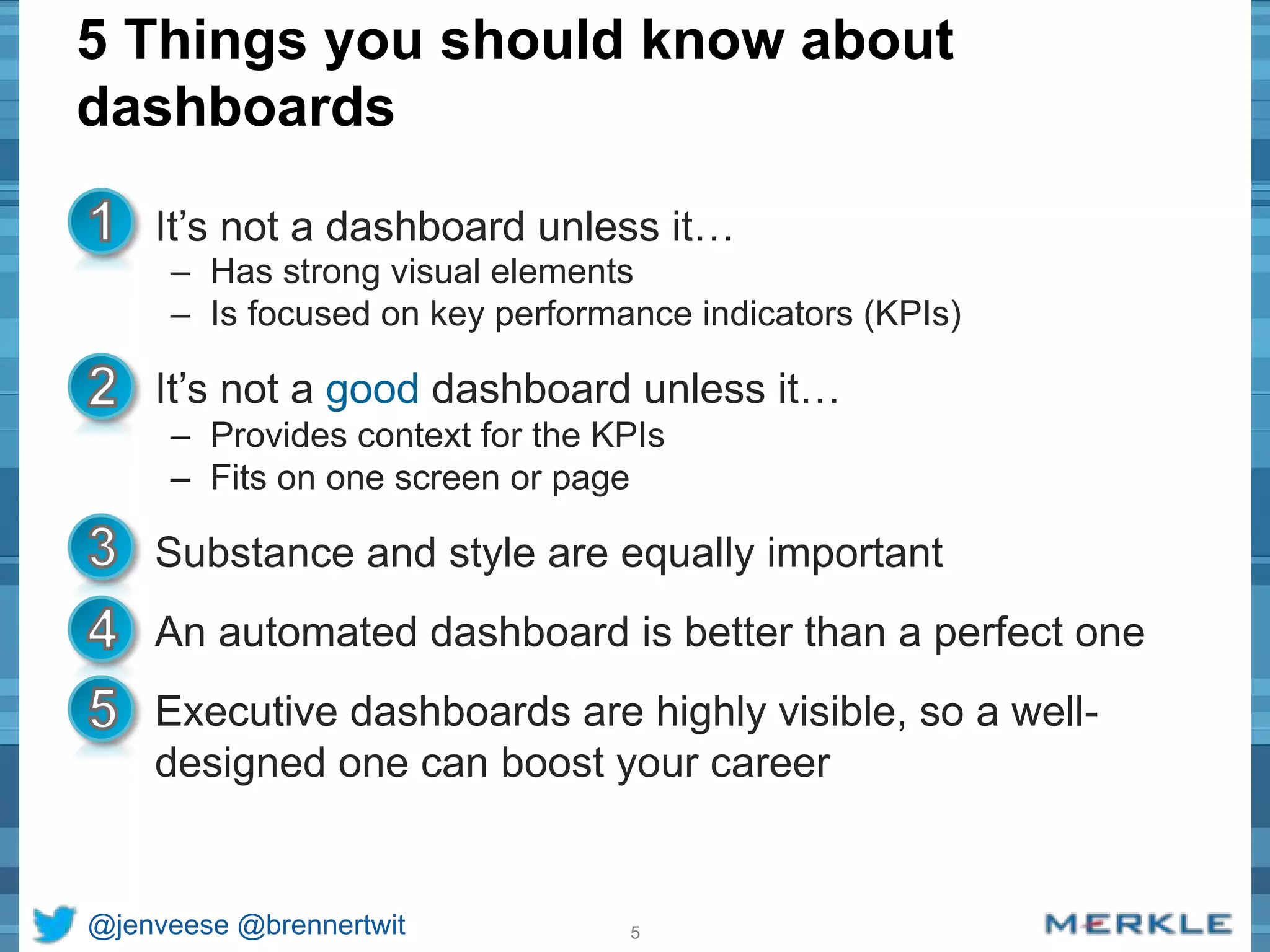
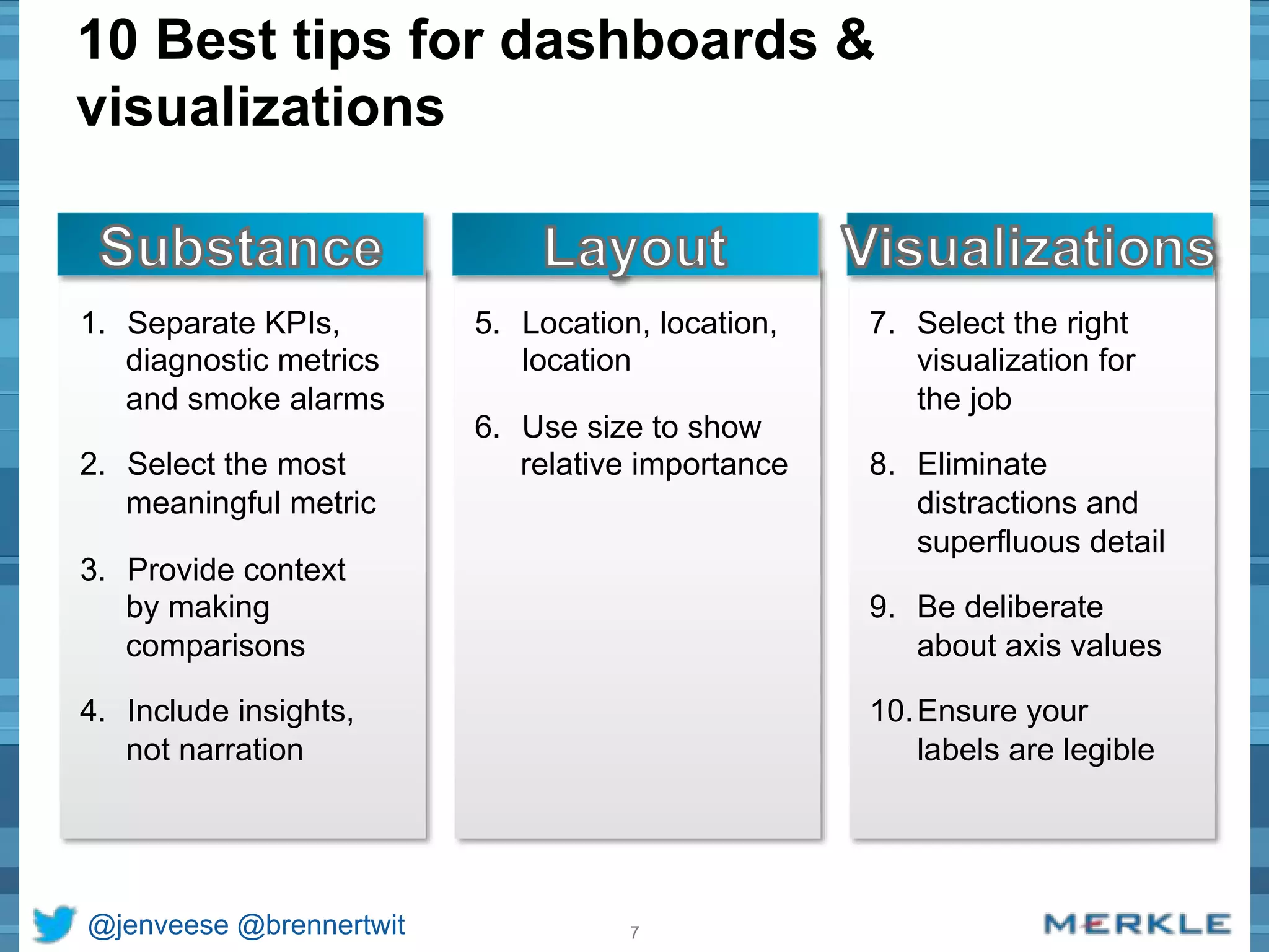
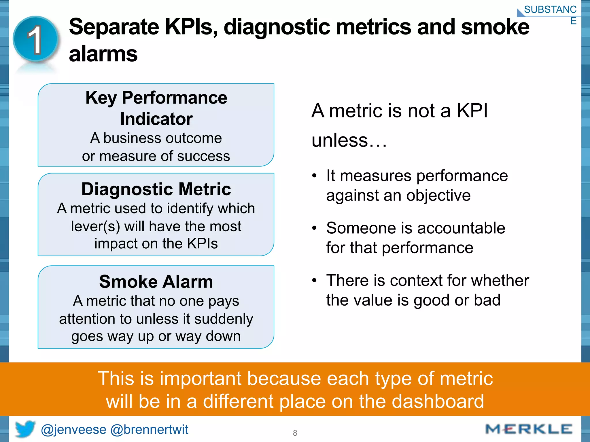
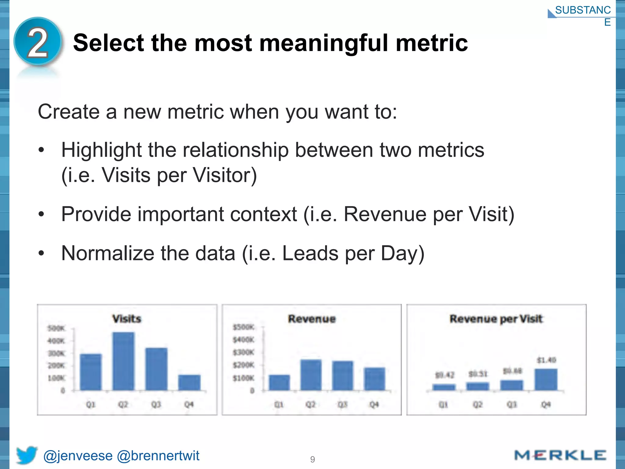
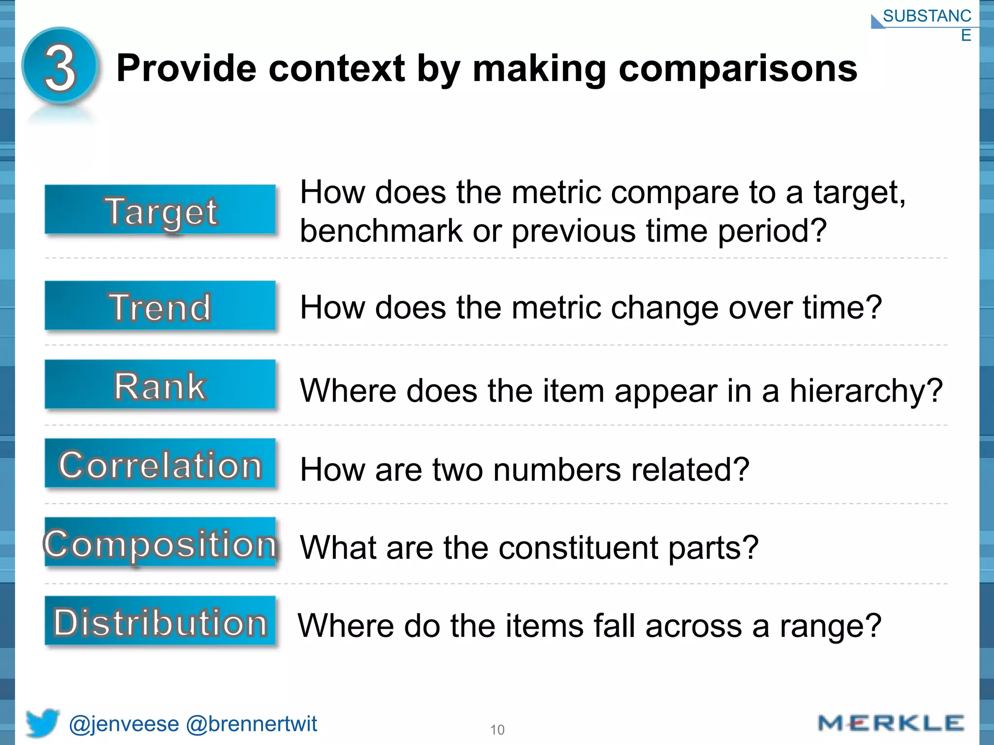
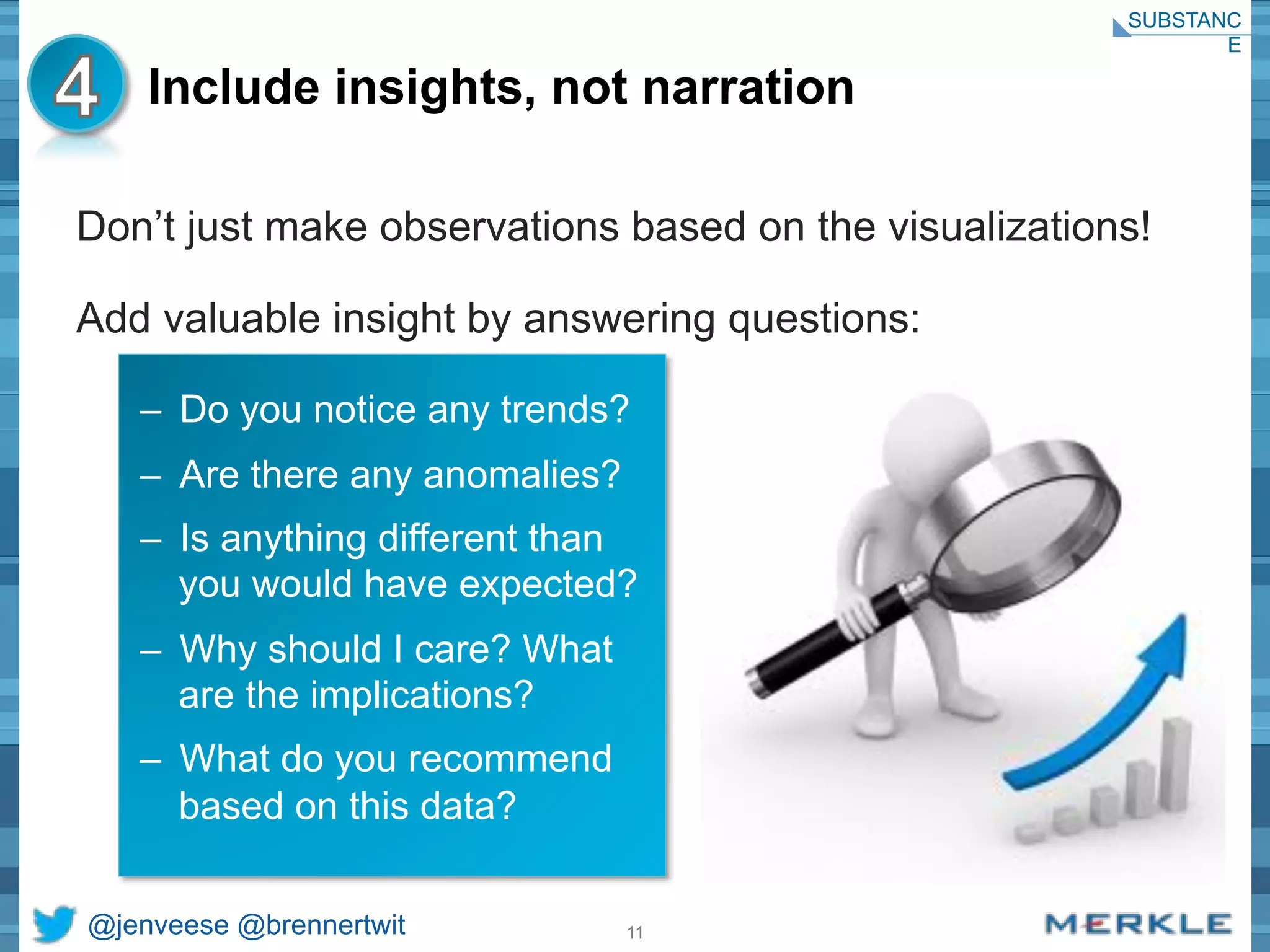
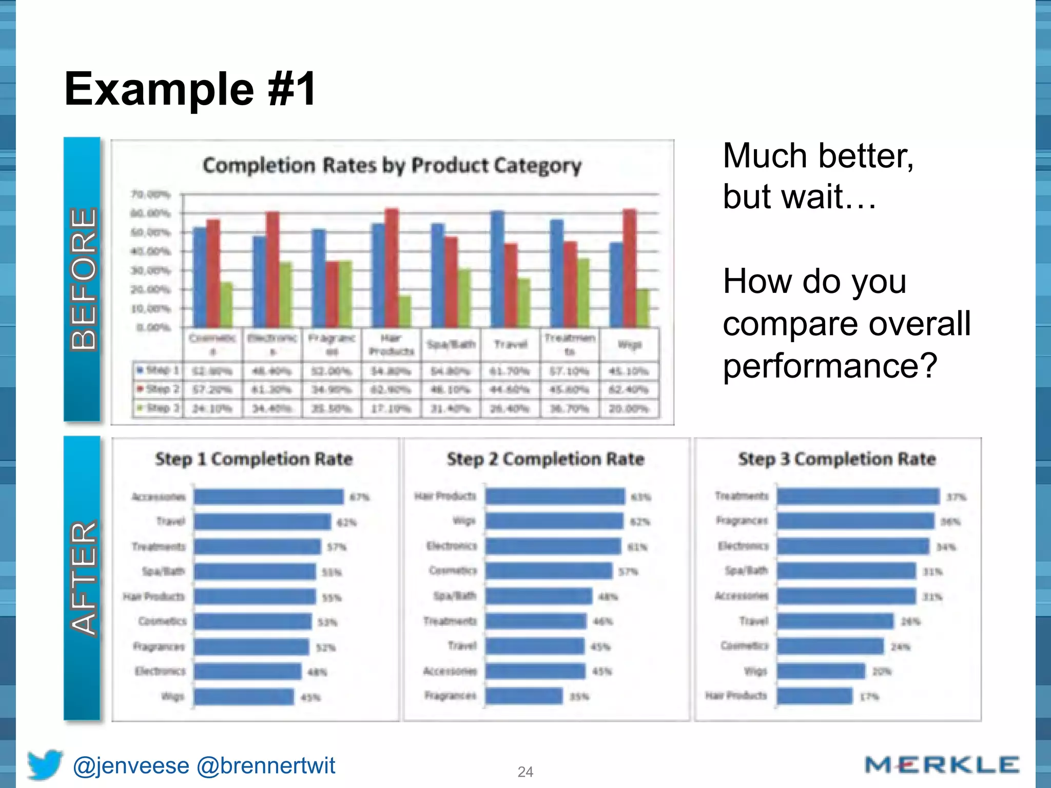
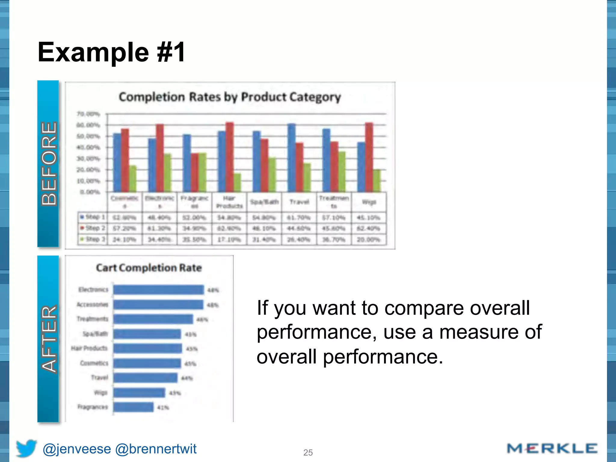
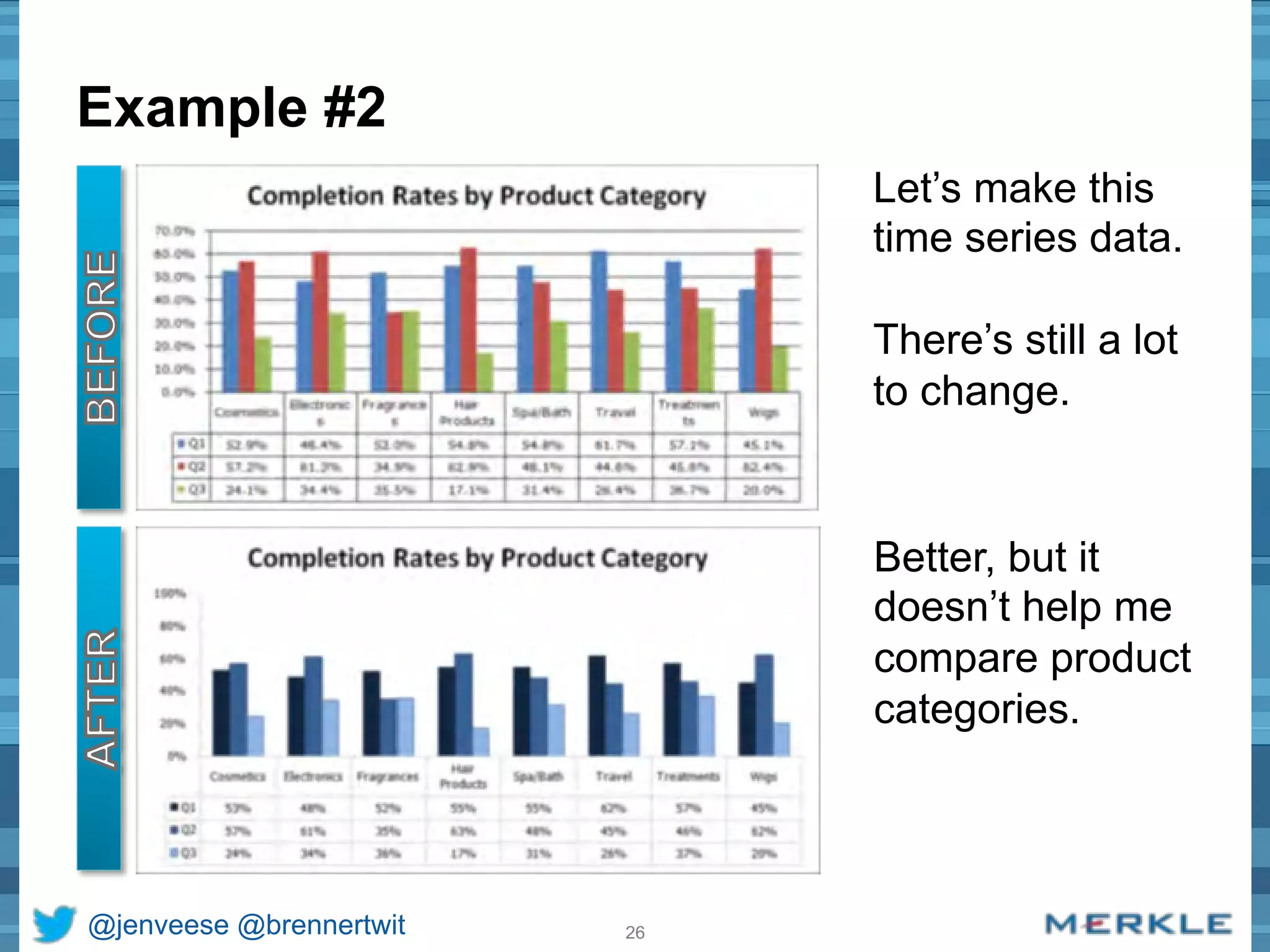
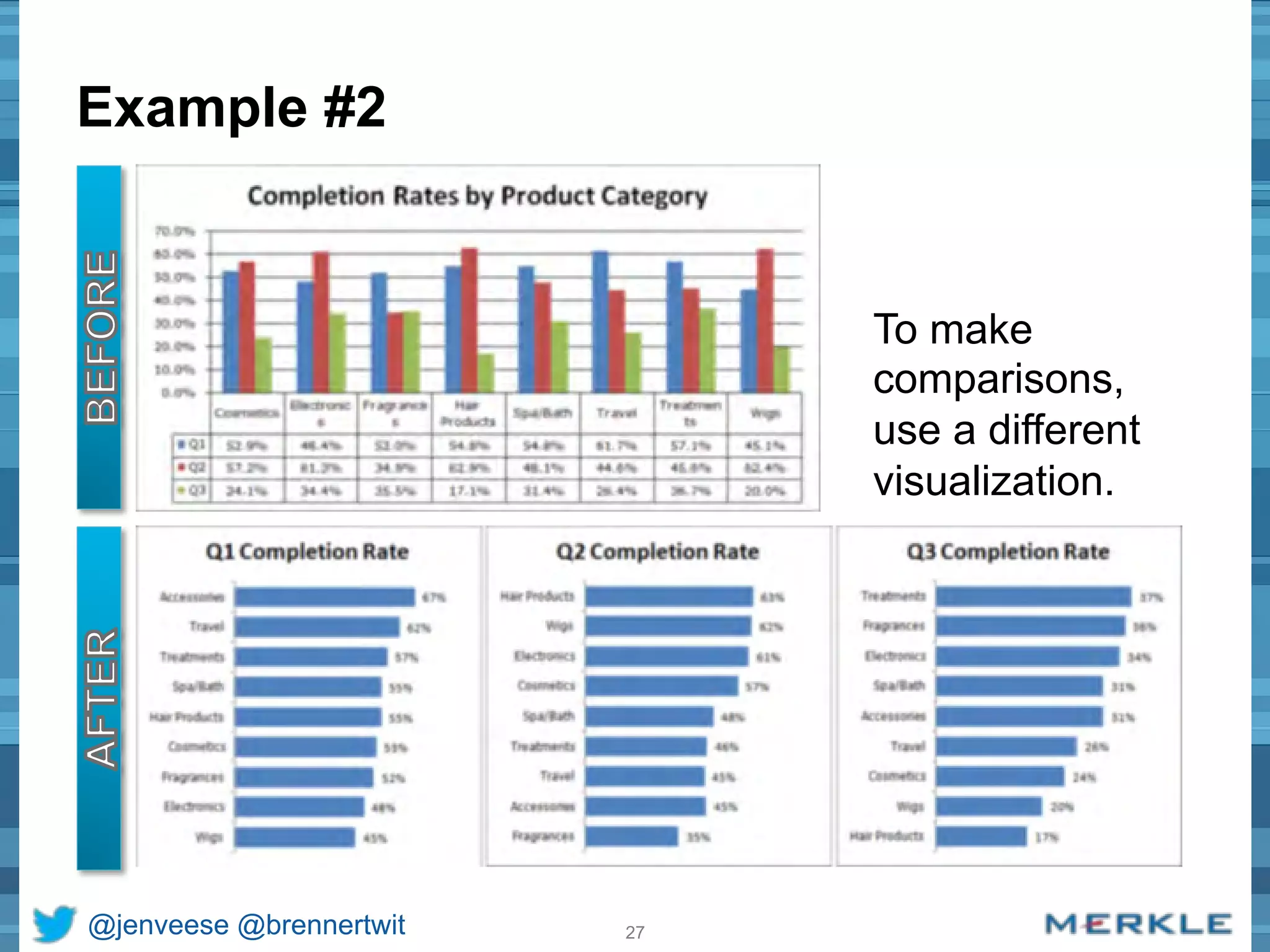
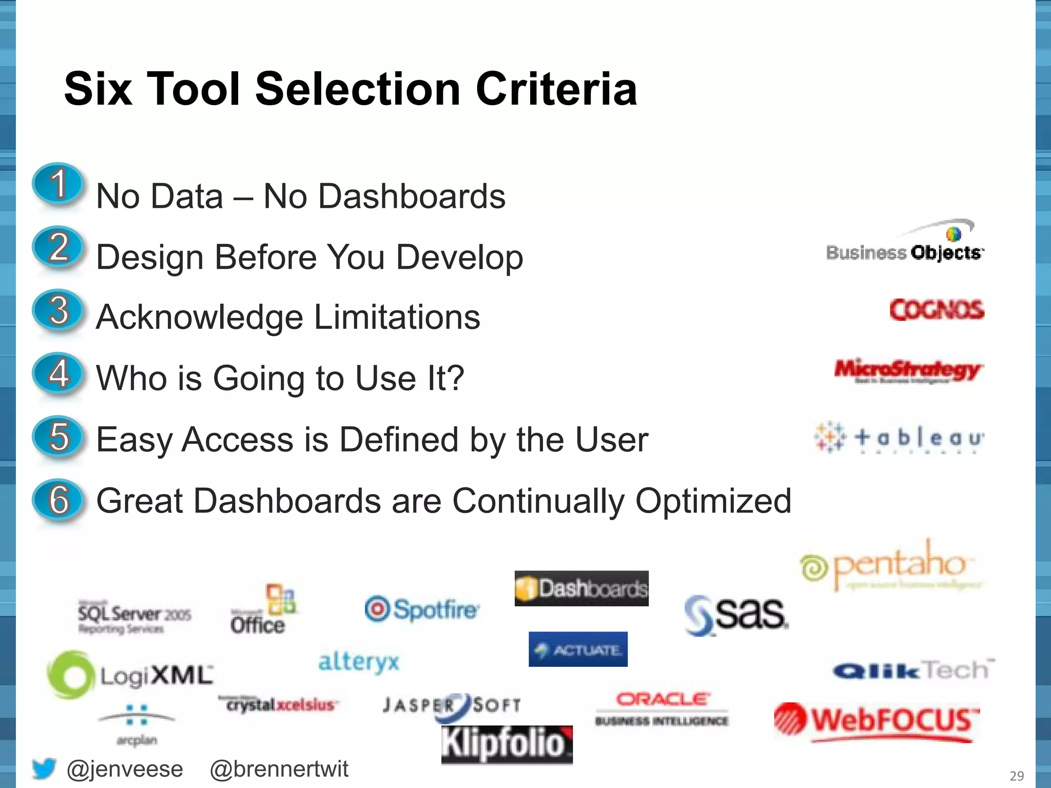
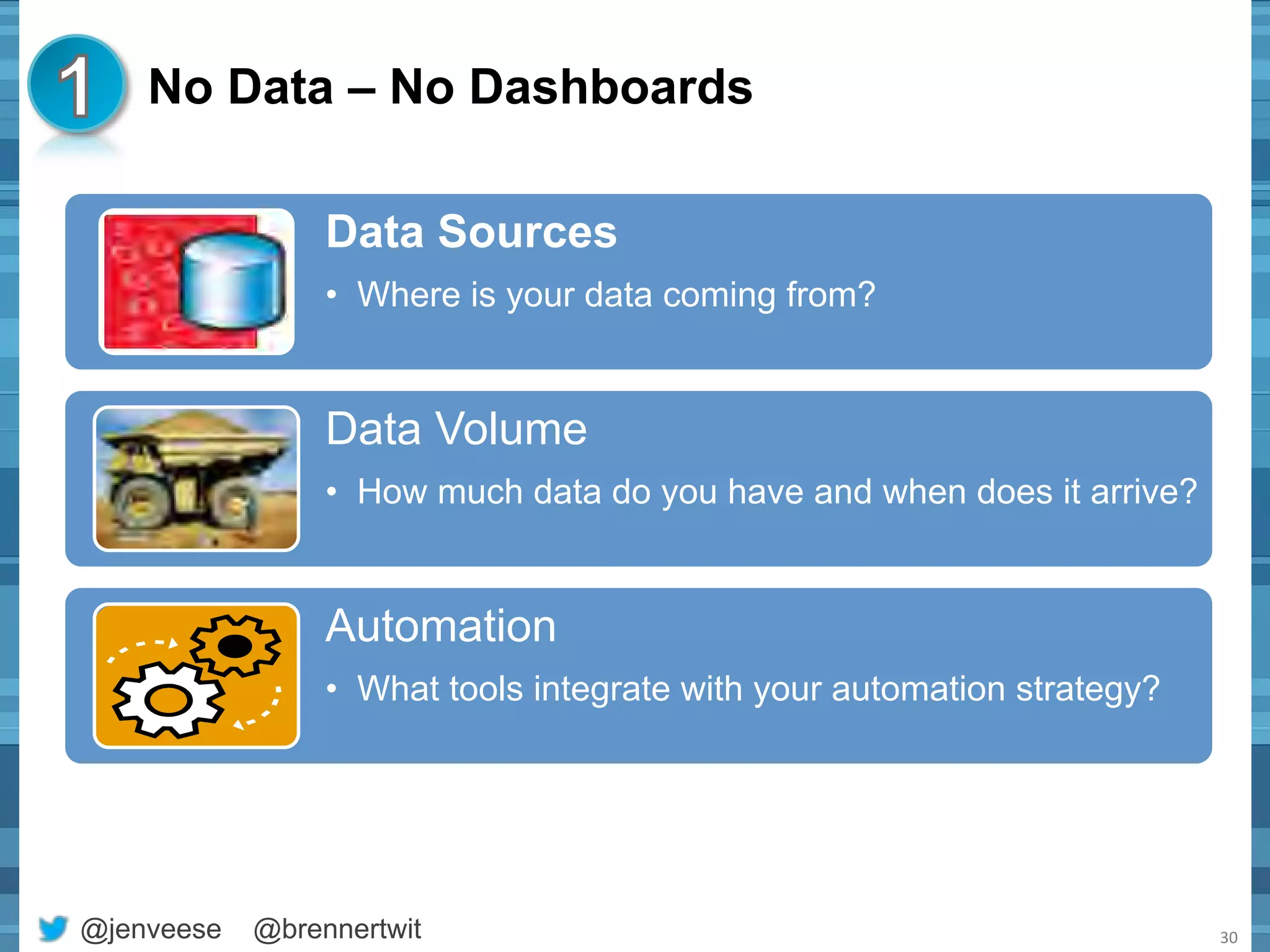
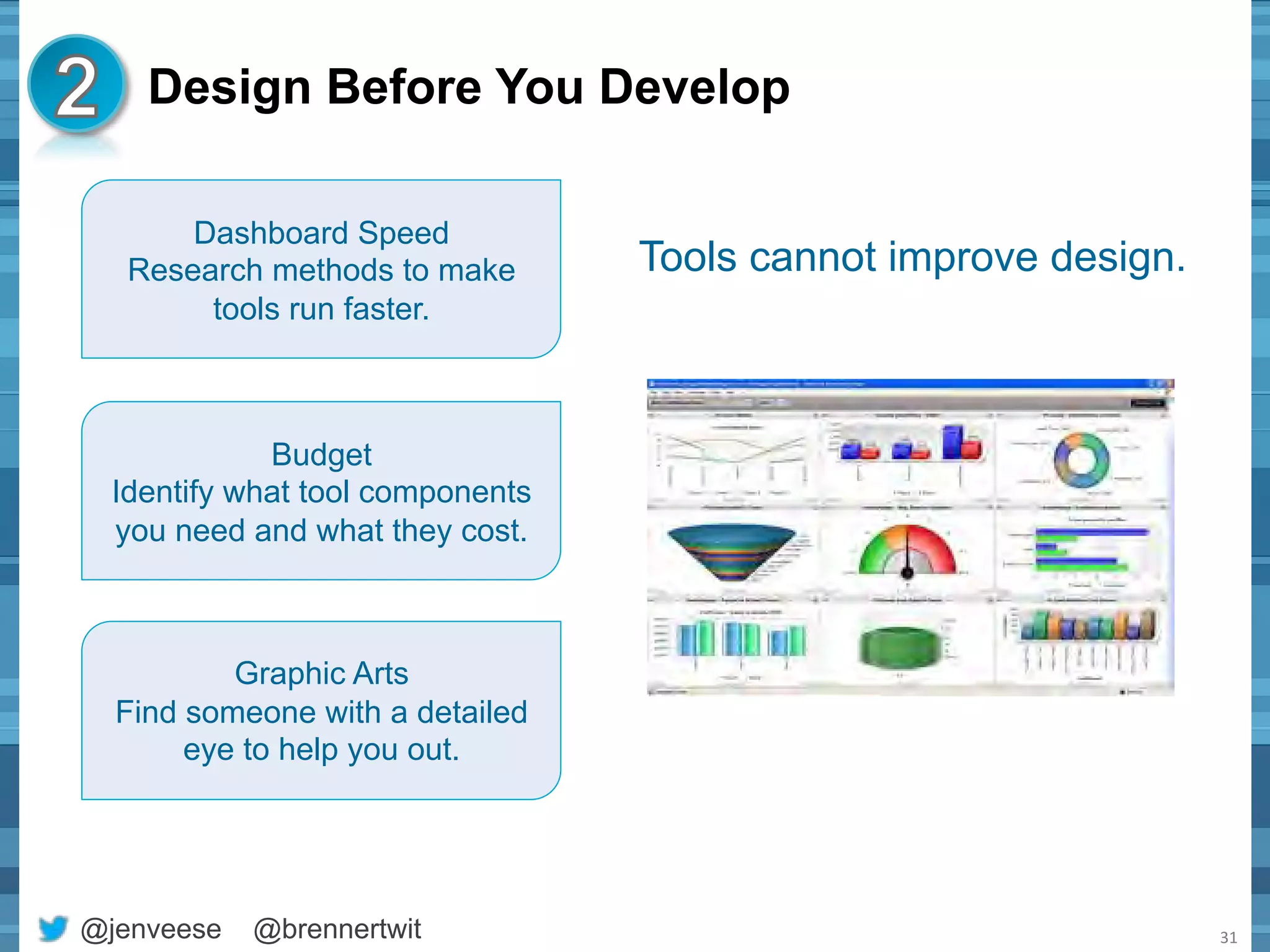
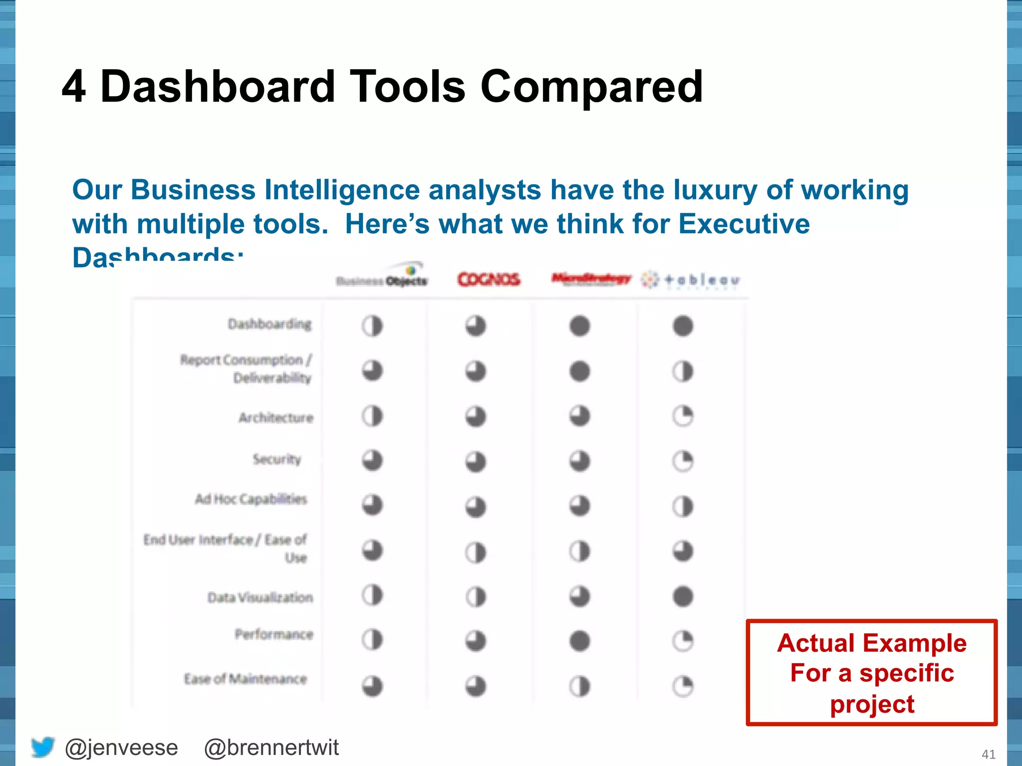
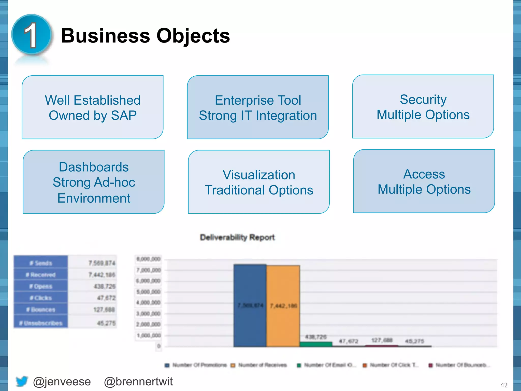
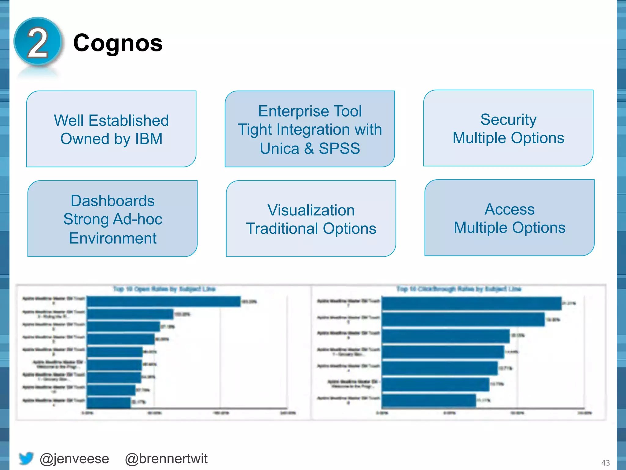
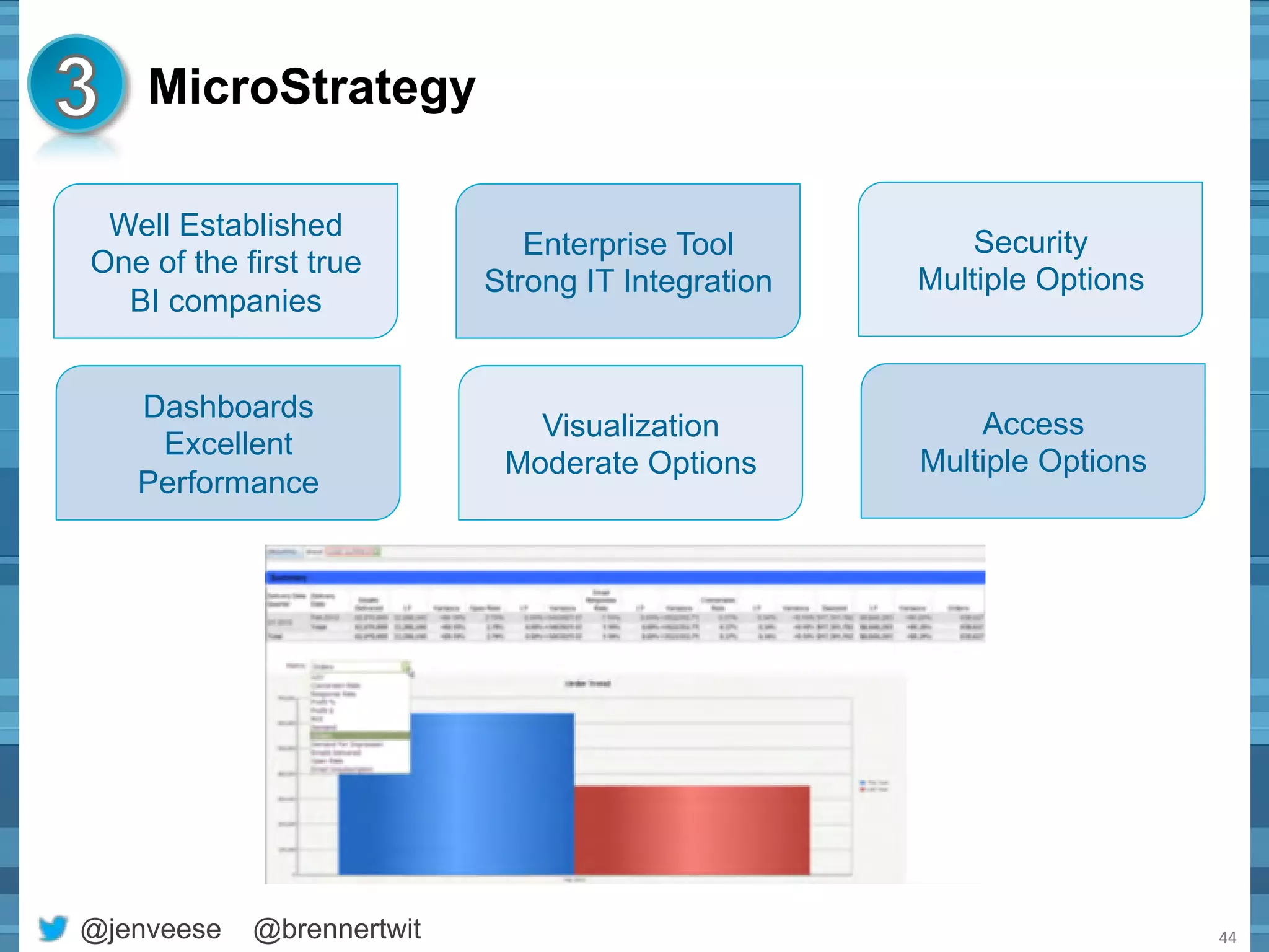
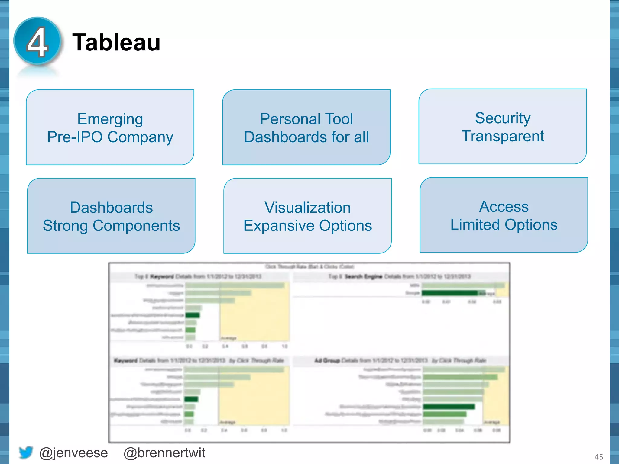
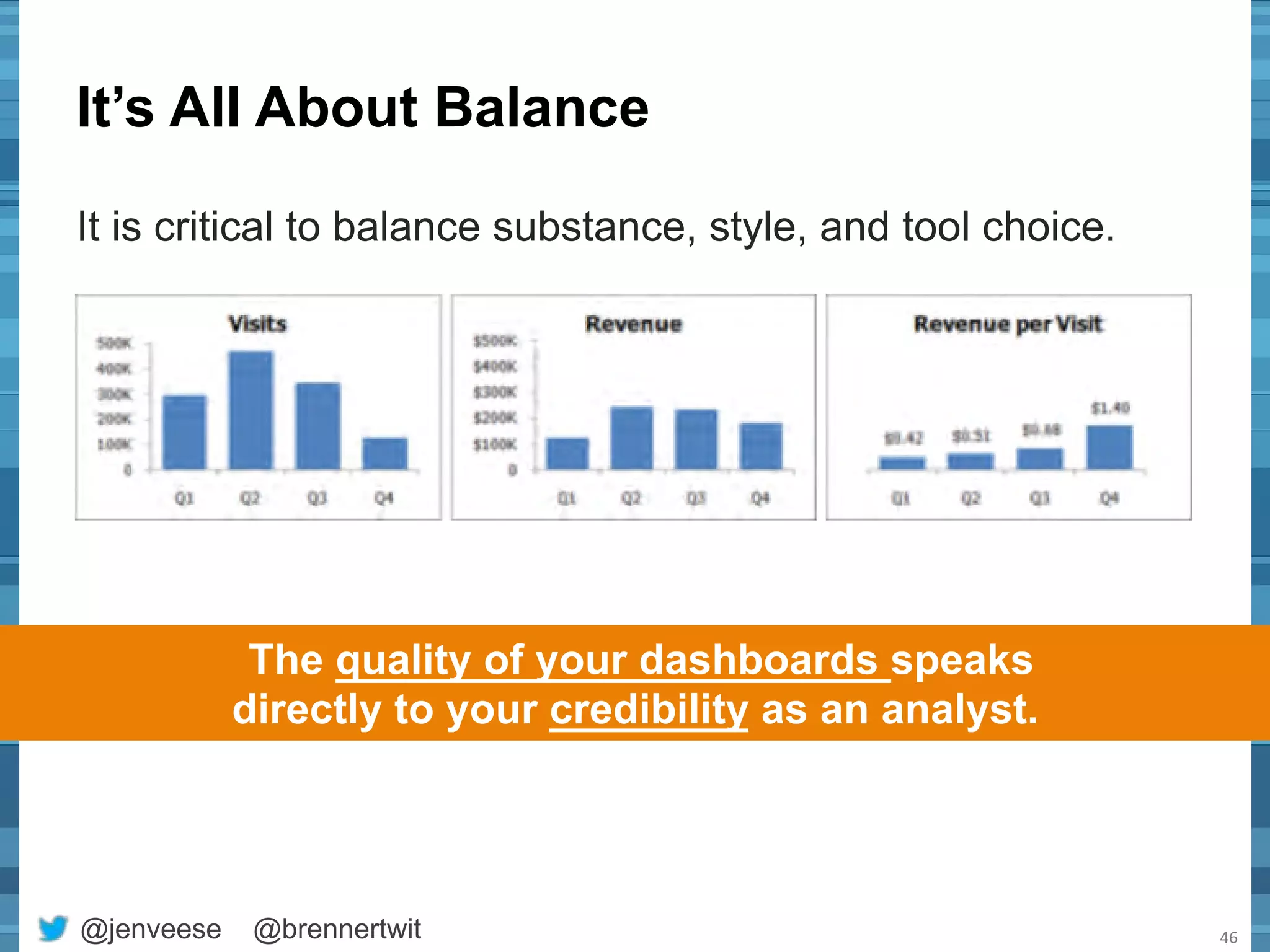
SlideShare a Scribd company logo
HOW TO MASTER THE ART 
OF DASHBOARD DESIGN 
APRIL 2013 
@jenveese @brennertwit
About Merkle 
• A customer relationship marketing agency 
• Largest privately-held agency in the US 
• 1,800 employees, including ~300 statisticians and analysts 
• Manage 1.6+ petabytes of customer data 
@jenveese @brennertwit 2
What we’ll cover today 
Best 
&ps 
for 
dashboards 
and 
visualiza&ons 
Things 
you 
should 
know 
about 
dashboards 
@jenveese @brennertwit 3 
Criteria 
for 
selec&ng 
a 
dashboard 
tool 
Dashboard 
tools 
compared
FIVE THINGS YOU SHOULD KNOW 
ABOUT DASHBOARDS 
@jenveese @brennertwit
5 Things you should know about 
dashboards 
• It’s not a dashboard unless it… 
– Has strong visual elements 
– Is focused on key performance indicators (KPIs) 
• It’s not a good dashboard unless it… 
– Provides context for the KPIs 
– Fits on one screen or page 
• Substance and style are equally important 
• An automated dashboard is better than a perfect one 
• Executive dashboards are highly visible, so a well-designed 
one can boost your career 
@jenveese @brennertwit 5
TEN BEST TIPS FOR DASHBOARD 
DESIGN 
@jenveese @brennertwit
10 Best tips for dashboards & 
visualizations 
1. Separate KPIs, 
diagnostic metrics 
and smoke alarms 
2. Select the most 
meaningful metric 
3. Provide context 
by making 
comparisons 
4. Include insights, 
not narration 
5. Location, location, 
location 
6. Use size to show 
relative importance 
@jenveese @brennertwit 7 
7. Select the right 
visualization for 
the job 
8. Eliminate 
distractions and 
superfluous detail 
9. Be deliberate 
about axis values 
10. Ensure your 
labels are legible
Separate KPIs, diagnostic metrics and smoke 
alarms 
Key Performance 
Indicator 
A business outcome 
or measure of success 
Diagnostic Metric 
A metric used to identify which 
lever(s) will have the most 
impact on the KPIs 
Smoke Alarm 
A metric that no one pays 
attention to unless it suddenly 
goes way up or way down 
@jenveese @brennertwit 8 
SUBSTANC 
E 
A metric is not a KPI 
unless… 
• It measures performance 
against an objective 
• Someone is accountable 
for that performance 
• There is context for whether 
the value is good or bad 
This is important because each type of metric 
will be in a different place on the dashboard
Select the most meaningful metric 
Create a new metric when you want to: 
• Highlight the relationship between two metrics 
(i.e. Visits per Visitor) 
• Provide important context (i.e. Revenue per Visit) 
• Normalize the data (i.e. Leads per Day) 
@jenveese @brennertwit 9 
SUBSTANC 
E
Provide context by making comparisons 
How does the metric compare to a target, 
benchmark or previous time period? 
How does the metric change over time? 
Where does the item appear in a hierarchy? 
How are two numbers related? 
What are the constituent parts? 
@jenveese @brennertwit 10 
SUBSTANC 
E 
Where do the items fall across a range?
Include insights, not narration 
Don’t just make observations based on the visualizations! 
Add valuable insight by answering questions: 
– Do you notice any trends? 
– Are there any anomalies? 
– Is anything different than 
you would have expected? 
– Why should I care? What 
are the implications? 
– What do you recommend 
based on this data? 
@jenveese @brennertwit 11 
SUBSTANC 
E
Location, location, location 
@jenveese @brennertwit 12 
Sample Dashboard Layout 
LAYOUT
Location, location, location 
• Place your KPIs at 
the top 
• Place your least 
important 
information in the 
bottom right 
Most important metrics 
@jenveese @brennertwit 13 
LAYOUT 
Least important metrics
Location, location, location 
• Place your KPIs at 
the top 
• Place your least 
important 
information in the 
bottom right 
• Group related 
metrics together 
Traffic-related Conversion -related 
@jenveese @brennertwit 14 
LAYOUT
Location, location, location 
• Place your KPIs at 
the top 
• Place your least 
important 
information in the 
bottom right 
• Group related 
metrics together 
• Align to a grid 
@jenveese @brennertwit 15 
LAYOUT
Use size to show relative importance 
• KPIs should use a larger font size than diagnostic 
metrics or smoke alarms 
• Similar graphs should be a similar size 
• Font size should follow a hierarchy: 
– Dashboard name 
– Objectives or section titles 
– Chart titles 
– Axis values 
– Chart subtitles 
@jenveese @brennertwit 16 
LAYOUT 
Sample KPI Block
Select the right visualization for the job 
@jenveese @brennertwit 17 
BAR 
Comparisons & Rankings 
PIE 
Composition 
SCATTER 
Distribution & Correlation 
COLUMN 
Comparisons 
LINE 
Trends 
STACKED AREA 
Alt to stacked column 
VISUALIZATION 
S
Eliminate distractions & superfluous detail 
@jenveese @brennertwit 18 
VISUALIZATION 
S 
• Colored backgrounds 
• Garrish color (use a 
neutral palette instead) 
• Third dimension 
• Excessive axis values 
• Zeros and decimals 
places 
• Gap width (eg, columns 
should be wider than the 
space between them) 
• Gridlines (usually) 
• Don’t use decimal points 
unless the difference is 
statistically significant 
• Don’t be afraid to create an 
“other” category 
• Don’t use stacked columns 
unless composition is 
important to know 
• Don’t use a large graph 
when a sparkline will do
A few tips about color… 
• Things that are the same should be the same color 
• Use a neutral color palette 
• Use variations in saturation rather than 
in color (light to dark) 
• Don’t rely solely on stoplight colors 
(red/yellow/green) to show bad/caution/good 
• Don’t use stoplight colors unless you intend to send 
a message about bad/caution/good 
We use color to make our visualizations more meaningful, 
not to make them pretty! 
@jenveese @brennertwit 19
Be deliberate about axis values 
• Set maximum value high enough that it won’t change 
from period to period 
– Guideline - 25% larger than your best guess at the highest 
value over time 
• Usually set minimum value at 0 to avoid giving the 
appearance that the difference between values is more 
significant than it really is 
• Visualizations that will be compared 
should have the same axis values 
• Increment axis units by numbers 
that people commonly count by 
(2, 5, 10, 25, etc.) 
@jenveese @brennertwit 20 
VISUALIZATION 
S
Ensure your labels can be read easily 
• Don’t make them smaller than 8 pt (usually) 
• Don’t rotate them at an angle 
• Always use a sans serif font 
• Select a font that is legible at a small size 
• Increase legibility in a table 
by reducing font size and 
increasing row height 
@jenveese @brennertwit 21 
VISUALIZATION 
S
Example #1 
@jenveese @brennertwit 22 
If the analyst 
wanted to 
compare 
completion 
rates by product 
category, this is 
the wrong 
visualization. 
A bar graph 
would be more 
effective.
Example #1 
@jenveese @brennertwit 23 
The values in a bar graph 
should be sorted. 
Now, clean it up and 
duplicate for each step.
Example #1 
@jenveese @brennertwit 24 
Much better, 
but wait… 
How do you 
compare overall 
performance?
Example #1 
If you want to compare overall 
performance, use a measure of 
overall performance. 
@jenveese @brennertwit 25
Example #2 
@jenveese @brennertwit 26 
Let’s make this 
time series data. 
There’s still a lot 
to change. 
Better, but it 
doesn’t help me 
compare product 
categories.
Example #2 
@jenveese @brennertwit 27 
To make 
comparisons, 
use a different 
visualization.
SIX CRITERIA FOR SELECTING 
A DASHBOARD TOOL 
@jenveese @brennertwit
Six Tool Selection Criteria 
No Data – No Dashboards 
Design Before You Develop 
Acknowledge Limitations 
Who is Going to Use It? 
Easy Access is Defined by the User 
Great Dashboards are Continually Optimized 
@jenveese @brennertwit 
29
No Data – No Dashboards 
Data Sources 
• Where is your data coming from? 
Data Volume 
• How much data do you have and when does it arrive? 
Automation 
• What tools integrate with your automation strategy? 
@jenveese @brennertwit 
30
Design Before You Develop 
@jenveese @brennertwit 
31 
Dashboard Speed 
Research methods to make 
tools run faster. 
Graphic Arts 
Find someone with a detailed 
eye to help you out. 
Tools cannot improve design. 
Budget 
Identify what tool components 
you need and what they cost.
Acknowledge Limitations 
Honestly inventory and review your constraints. 
@jenveese @brennertwit 
32 
Skill Set 
• What tools constrain your creativity? 
IT Architecture 
• What company tool standards are negotiable? 
Don’t guess: Try before you buy
Who Is Going to Use It? 
@jenveese @brennertwit 
33 
Executive Support 
Daily Meetings 
Quarterly Sessions 
Operational Decisions 
Tactical Planning 
Global Reach 
Which Tools Support 
Multiple Languages? 
What Cultural Aspects 
Must You Respect? 
Aspiring Executives 
They May Actually 
Use It the Most
Easy Access is Defined by the User 
@jenveese @brennertwit 
34 
List 
of 
Users 
Tool Use 
Mac PC 
Phone 
Tablet 
Email Alerts 
NON -Tool Use 
Printed Copies 
Executive Summaries 
Security: 
Who Can See it? 
How do they login?
Great Dashboards are Continually 
Optimized 
What might be 
coming next? 
@jenveese @brennertwit 
35 
Idea 
Design 
Create 
Discuss 
How are ideas 
prioritized? 
Who will 
enhance the 
dashboards? 
Who will 
validate the 
changes?
List Your Secrets to Success 
@jenveese @brennertwit 
36 
Element Item Tool A Tool B Tool C 
Data 
Teradata Link 
Real Time 
Frequency 
Design List of Design 
Elements 
Creation & 
Enhancements 
Non-Technical 
Authors 
Access 
LDAP Security 
PC & Mac 
Mobile 
Online 
Email Alerts
Find Your Best Match for Your Unique Needs 
@jenveese @brennertwit 
37 
Element Item Tool A Tool B Tool C 
Data 
Teradata Link ● 
● 
○ 
Real Time 
Frequency ◑ 
◕ 
◕ 
Design List of Design 
Elements ◑ 
● 
● 
Creation & 
Enhancements 
Non-Technical 
Authors ● 
● 
◕ 
Access 
LDAP Security ◔ 
● 
● 
PC & Mac ● 
● 
● 
Mobile ◑ 
◔ 
● 
Online ● 
● 
● 
Email Alerts ◕ 
● 
◕
Often, What You Already Have 
Use What’s Available 
Knowledgeable Authors 
Established Training 
Use What’s Familiar 
Executives may already be 
used to something. 
IT Coordination 
Already Approved 
Likely Low Costs 
It is OK to select something different. 
It is all about the User Experience. 
@jenveese @brennertwit 38
FOUR DASHBOARD TOOLS 
COMPARED 
@jenveese @brennertwit
Everyone has an Opinion 
• Some are formal: 
– Gartner Quadrant 
• Some are informal: 
– Someone is updating their BI blog 
right now. 
• The market constantly 
changes 
– New Versions 
– New Products 
– New Companies 
@jenveese @brennertwit 
40
4 Dashboard Tools Compared 
@jenveese @brennertwit 
41 
Our Business Intelligence analysts have the luxury of working 
with multiple tools. Here’s what we think for Executive 
Dashboards: 
Actual Example 
For a specific 
project
Business Objects 
@jenveese @brennertwit 
42 
Well Established 
Owned by SAP 
Security 
Multiple Options 
Enterprise Tool 
Strong IT Integration 
Dashboards 
Strong Ad-hoc 
Environment 
Access 
Multiple Options 
Visualization 
Traditional Options
Cognos 
@jenveese @brennertwit 
43 
Well Established 
Owned by IBM 
Security 
Multiple Options 
Enterprise Tool 
Tight Integration with 
Unica & SPSS 
Dashboards 
Strong Ad-hoc 
Environment 
Access 
Multiple Options 
Visualization 
Traditional Options
MicroStrategy 
@jenveese @brennertwit 
44 
Well Established 
One of the first true 
BI companies 
Security 
Multiple Options 
Enterprise Tool 
Strong IT Integration 
Dashboards 
Excellent 
Performance 
Access 
Multiple Options 
Visualization 
Moderate Options
Tableau 
@jenveese @brennertwit 
45 
Emerging 
Pre-IPO Company 
Security 
Transparent 
Personal Tool 
Dashboards for all 
Dashboards 
Strong Components 
Access 
Limited Options 
Visualization 
Expansive Options
It’s All About Balance 
It is critical to balance substance, style, and tool choice. 
@jenveese @brennertwit 
46 
The quality of your dashboards speaks 
directly to your credibility as an analyst.
JENNIFER VEESENMEYER 
Vice President, Digital 
Analytics 
443.542.4611 
612.356.4191 (cell) 
@jenveese 
jveesenmeyer@merkleinc.com 
@jenveese @brennertwit 47 
CARL BRENNER 
Director, Business 
Intelligence 
208.597.3991 (cell) 
@brennertwit 
cbrenner@merkleinc.com

More Related Content

What's hot

ALTERYX TOOL
ALTERYX TOOLALTERYX TOOL
ALTERYX TOOL
Sagnik Banerjee
 
How to Visualize Data Like a Pro
How to Visualize Data Like a ProHow to Visualize Data Like a Pro
How to Visualize Data Like a Pro
24Slides
 
Introduction to Tableau
Introduction to TableauIntroduction to Tableau
Introduction to Tableau
Kanika Nagpal
 
Data Visualization With Tableau | Edureka
Data Visualization With Tableau | EdurekaData Visualization With Tableau | Edureka
Data Visualization With Tableau | Edureka
Edureka!
 
Data Visualization Design Best Practices Workshop
Data Visualization Design Best Practices WorkshopData Visualization Design Best Practices Workshop
Data Visualization Design Best Practices Workshop
JSI
 
Data visualization
Data visualizationData visualization
Data visualization
Maheshwor Shrestha
 
Data Visualisation.pdf
Data Visualisation.pdfData Visualisation.pdf
Data Visualisation.pdf
Thiyagu K
 
Learning Tableau - Data, Graphs, Filters, Dashboards and Advanced features
Learning Tableau -  Data, Graphs, Filters, Dashboards and Advanced featuresLearning Tableau -  Data, Graphs, Filters, Dashboards and Advanced features
Learning Tableau - Data, Graphs, Filters, Dashboards and Advanced features
Venkata Reddy Konasani
 
Data Analaytics.04. Data visualization
Data Analaytics.04. Data visualizationData Analaytics.04. Data visualization
Data Analaytics.04. Data visualization
Alex Rayón Jerez
 
Business Intelligence tools comparison
Business Intelligence tools comparisonBusiness Intelligence tools comparison
Business Intelligence tools comparison
Stratebi
 
Data visualization
Data visualizationData visualization
Data visualization
Christian Stade-Schuldt
 
How to Improve Data Analysis Through Visualization in Tableau
How to Improve Data Analysis Through Visualization in TableauHow to Improve Data Analysis Through Visualization in Tableau
How to Improve Data Analysis Through Visualization in Tableau
Edureka!
 
Introduction to DAX - Part 1
Introduction to DAX - Part 1Introduction to DAX - Part 1
Introduction to DAX - Part 1
Alan Koo
 
Data visualization in a nutshell
Data visualization in a nutshellData visualization in a nutshell
Data visualization in a nutshell
David Alayón
 
Power query
Power queryPower query
Power query
Sagnik Banerjee
 
design principles for visualization
design principles for visualizationdesign principles for visualization
design principles for visualization
PrernaMishra62
 
Data Analysis with Excel & TEST4U
Data Analysis with Excel & TEST4UData Analysis with Excel & TEST4U
Data Analysis with Excel & TEST4U
infolearn - TEST4U
 
Art and Science of Dashboard Design
Art and Science of Dashboard DesignArt and Science of Dashboard Design
Art and Science of Dashboard Design
SavvyData
 
3 data visualization
3 data visualization3 data visualization
3 data visualization
ThilinaWanshathilaka
 
Storytelling with Data - See | Show | Tell | Engage
Storytelling with Data - See | Show | Tell | EngageStorytelling with Data - See | Show | Tell | Engage
Storytelling with Data - See | Show | Tell | Engage
Amit Kapoor
 

What's hot (20)

ALTERYX TOOL
ALTERYX TOOLALTERYX TOOL
ALTERYX TOOL
 
How to Visualize Data Like a Pro
How to Visualize Data Like a ProHow to Visualize Data Like a Pro
How to Visualize Data Like a Pro
 
Introduction to Tableau
Introduction to TableauIntroduction to Tableau
Introduction to Tableau
 
Data Visualization With Tableau | Edureka
Data Visualization With Tableau | EdurekaData Visualization With Tableau | Edureka
Data Visualization With Tableau | Edureka
 
Data Visualization Design Best Practices Workshop
Data Visualization Design Best Practices WorkshopData Visualization Design Best Practices Workshop
Data Visualization Design Best Practices Workshop
 
Data visualization
Data visualizationData visualization
Data visualization
 
Data Visualisation.pdf
Data Visualisation.pdfData Visualisation.pdf
Data Visualisation.pdf
 
Learning Tableau - Data, Graphs, Filters, Dashboards and Advanced features
Learning Tableau -  Data, Graphs, Filters, Dashboards and Advanced featuresLearning Tableau -  Data, Graphs, Filters, Dashboards and Advanced features
Learning Tableau - Data, Graphs, Filters, Dashboards and Advanced features
 
Data Analaytics.04. Data visualization
Data Analaytics.04. Data visualizationData Analaytics.04. Data visualization
Data Analaytics.04. Data visualization
 
Business Intelligence tools comparison
Business Intelligence tools comparisonBusiness Intelligence tools comparison
Business Intelligence tools comparison
 
Data visualization
Data visualizationData visualization
Data visualization
 
How to Improve Data Analysis Through Visualization in Tableau
How to Improve Data Analysis Through Visualization in TableauHow to Improve Data Analysis Through Visualization in Tableau
How to Improve Data Analysis Through Visualization in Tableau
 
Introduction to DAX - Part 1
Introduction to DAX - Part 1Introduction to DAX - Part 1
Introduction to DAX - Part 1
 
Data visualization in a nutshell
Data visualization in a nutshellData visualization in a nutshell
Data visualization in a nutshell
 
Power query
Power queryPower query
Power query
 
design principles for visualization
design principles for visualizationdesign principles for visualization
design principles for visualization
 
Data Analysis with Excel & TEST4U
Data Analysis with Excel & TEST4UData Analysis with Excel & TEST4U
Data Analysis with Excel & TEST4U
 
Art and Science of Dashboard Design
Art and Science of Dashboard DesignArt and Science of Dashboard Design
Art and Science of Dashboard Design
 
3 data visualization
3 data visualization3 data visualization
3 data visualization
 
Storytelling with Data - See | Show | Tell | Engage
Storytelling with Data - See | Show | Tell | EngageStorytelling with Data - See | Show | Tell | Engage
Storytelling with Data - See | Show | Tell | Engage
 

Viewers also liked

Business Intelligence Dashboard Design Best Practices
Business Intelligence Dashboard Design Best PracticesBusiness Intelligence Dashboard Design Best Practices
Business Intelligence Dashboard Design Best Practices
Mark Ginnebaugh
 
The Art of Data Visualization
The Art of Data VisualizationThe Art of Data Visualization
The Art of Data Visualization
Gramener
 
The Art of Data Science - event slides
The Art of Data Science - event slidesThe Art of Data Science - event slides
The Art of Data Science - event slides
RedPixie
 
GraphConnect 2015 - Managing Connect Big Data in Art with Neo4j Graph Database
GraphConnect 2015 - Managing Connect Big Data in Art with Neo4j Graph DatabaseGraphConnect 2015 - Managing Connect Big Data in Art with Neo4j Graph Database
GraphConnect 2015 - Managing Connect Big Data in Art with Neo4j Graph Database
LARUS Business Automation
 
Google Analytics- Start Turning Data Into Actionable Insights
Google Analytics- Start Turning Data Into Actionable InsightsGoogle Analytics- Start Turning Data Into Actionable Insights
Google Analytics- Start Turning Data Into Actionable InsightsBjarne Viken
 
My Life with Data
My Life with DataMy Life with Data
My Life with Data
Gramener
 
Data as Art
Data as ArtData as Art
Data as Art
J.J. Toothman
 
Identifying and Managing Sources of Business Growth
Identifying and Managing Sources of Business GrowthIdentifying and Managing Sources of Business Growth
Identifying and Managing Sources of Business Growth
Tom Hood, CPA,CITP,CGMA
 
Best Practices for Killer Data Visualization
Best Practices for Killer Data VisualizationBest Practices for Killer Data Visualization
Best Practices for Killer Data Visualization
Qualtrics
 
The art of data visualization slideset
The art of data visualization slidesetThe art of data visualization slideset
The art of data visualization slideset
Andrés Fortino, PhD
 
10 Best Practices for Tableau Dashboard Design: Data Exploration and Actionab...
10 Best Practices for Tableau Dashboard Design: Data Exploration and Actionab...10 Best Practices for Tableau Dashboard Design: Data Exploration and Actionab...
10 Best Practices for Tableau Dashboard Design: Data Exploration and Actionab...
Senturus
 
Data Visualization and Dashboard Design: Make Your Analytics Really Impactful
Data Visualization and Dashboard Design: Make Your Analytics Really ImpactfulData Visualization and Dashboard Design: Make Your Analytics Really Impactful
Data Visualization and Dashboard Design: Make Your Analytics Really Impactful
AT Internet
 
Executive Dashboard Design on Tableau
Executive Dashboard Design on TableauExecutive Dashboard Design on Tableau
Executive Dashboard Design on Tableau
Method360
 
A Step by Step Approach to Actionable Website KPIs
A Step by Step Approach to Actionable Website KPIsA Step by Step Approach to Actionable Website KPIs
A Step by Step Approach to Actionable Website KPIs
Unilytics
 
Kpi Executive Dashboard
Kpi Executive DashboardKpi Executive Dashboard
Kpi Executive Dashboard
inflow
 
Visualizing Healthcare Data with Tableau (Toronto Central LHIN Presentation)
Visualizing Healthcare Data with Tableau (Toronto Central LHIN Presentation)Visualizing Healthcare Data with Tableau (Toronto Central LHIN Presentation)
Visualizing Healthcare Data with Tableau (Toronto Central LHIN Presentation)
Stefan Popowycz
 
Leveraging Healthcare Analytics to Reduce Heart Failure Readmission Rates
Leveraging Healthcare Analytics to Reduce Heart Failure Readmission Rates   Leveraging Healthcare Analytics to Reduce Heart Failure Readmission Rates
Leveraging Healthcare Analytics to Reduce Heart Failure Readmission Rates
Health Catalyst
 
From KPIs to dashboards
From KPIs to dashboardsFrom KPIs to dashboards
From KPIs to dashboards
Ani Lopez
 
Developing Metrics and KPI (Key Performance Indicators
Developing Metrics and KPI (Key Performance IndicatorsDeveloping Metrics and KPI (Key Performance Indicators
Developing Metrics and KPI (Key Performance Indicators
Victor Holman
 
Project Management KPIs
Project Management KPIsProject Management KPIs
Project Management KPIs
Tom Tsongas, PMP, CSM
 

Viewers also liked (20)

Business Intelligence Dashboard Design Best Practices
Business Intelligence Dashboard Design Best PracticesBusiness Intelligence Dashboard Design Best Practices
Business Intelligence Dashboard Design Best Practices
 
The Art of Data Visualization
The Art of Data VisualizationThe Art of Data Visualization
The Art of Data Visualization
 
The Art of Data Science - event slides
The Art of Data Science - event slidesThe Art of Data Science - event slides
The Art of Data Science - event slides
 
GraphConnect 2015 - Managing Connect Big Data in Art with Neo4j Graph Database
GraphConnect 2015 - Managing Connect Big Data in Art with Neo4j Graph DatabaseGraphConnect 2015 - Managing Connect Big Data in Art with Neo4j Graph Database
GraphConnect 2015 - Managing Connect Big Data in Art with Neo4j Graph Database
 
Google Analytics- Start Turning Data Into Actionable Insights
Google Analytics- Start Turning Data Into Actionable InsightsGoogle Analytics- Start Turning Data Into Actionable Insights
Google Analytics- Start Turning Data Into Actionable Insights
 
My Life with Data
My Life with DataMy Life with Data
My Life with Data
 
Data as Art
Data as ArtData as Art
Data as Art
 
Identifying and Managing Sources of Business Growth
Identifying and Managing Sources of Business GrowthIdentifying and Managing Sources of Business Growth
Identifying and Managing Sources of Business Growth
 
Best Practices for Killer Data Visualization
Best Practices for Killer Data VisualizationBest Practices for Killer Data Visualization
Best Practices for Killer Data Visualization
 
The art of data visualization slideset
The art of data visualization slidesetThe art of data visualization slideset
The art of data visualization slideset
 
10 Best Practices for Tableau Dashboard Design: Data Exploration and Actionab...
10 Best Practices for Tableau Dashboard Design: Data Exploration and Actionab...10 Best Practices for Tableau Dashboard Design: Data Exploration and Actionab...
10 Best Practices for Tableau Dashboard Design: Data Exploration and Actionab...
 
Data Visualization and Dashboard Design: Make Your Analytics Really Impactful
Data Visualization and Dashboard Design: Make Your Analytics Really ImpactfulData Visualization and Dashboard Design: Make Your Analytics Really Impactful
Data Visualization and Dashboard Design: Make Your Analytics Really Impactful
 
Executive Dashboard Design on Tableau
Executive Dashboard Design on TableauExecutive Dashboard Design on Tableau
Executive Dashboard Design on Tableau
 
A Step by Step Approach to Actionable Website KPIs
A Step by Step Approach to Actionable Website KPIsA Step by Step Approach to Actionable Website KPIs
A Step by Step Approach to Actionable Website KPIs
 
Kpi Executive Dashboard
Kpi Executive DashboardKpi Executive Dashboard
Kpi Executive Dashboard
 
Visualizing Healthcare Data with Tableau (Toronto Central LHIN Presentation)
Visualizing Healthcare Data with Tableau (Toronto Central LHIN Presentation)Visualizing Healthcare Data with Tableau (Toronto Central LHIN Presentation)
Visualizing Healthcare Data with Tableau (Toronto Central LHIN Presentation)
 
Leveraging Healthcare Analytics to Reduce Heart Failure Readmission Rates
Leveraging Healthcare Analytics to Reduce Heart Failure Readmission Rates   Leveraging Healthcare Analytics to Reduce Heart Failure Readmission Rates
Leveraging Healthcare Analytics to Reduce Heart Failure Readmission Rates
 
From KPIs to dashboards
From KPIs to dashboardsFrom KPIs to dashboards
From KPIs to dashboards
 
Developing Metrics and KPI (Key Performance Indicators
Developing Metrics and KPI (Key Performance IndicatorsDeveloping Metrics and KPI (Key Performance Indicators
Developing Metrics and KPI (Key Performance Indicators
 
Project Management KPIs
Project Management KPIsProject Management KPIs
Project Management KPIs
 

Similar to How to Master the Art of Dashboard Design

Seatug Presentation (Excel to Data Viz culture) Seattle Tableau User Group
Seatug Presentation (Excel to Data Viz culture) Seattle Tableau User GroupSeatug Presentation (Excel to Data Viz culture) Seattle Tableau User Group
Seatug Presentation (Excel to Data Viz culture) Seattle Tableau User Group
Russell Spangler
 
Lean Analytics & Analytics Dashboards
Lean Analytics & Analytics DashboardsLean Analytics & Analytics Dashboards
Lean Analytics & Analytics Dashboards
Yves Ferket
 
Storytelling with Data with Power BI
Storytelling with Data with Power BIStorytelling with Data with Power BI
Storytelling with Data with Power BI
Ike Ellis
 
Visual guidance calgary user group
Visual guidance calgary user groupVisual guidance calgary user group
Visual guidance calgary user group
Berkovich Consulting
 
Building Effective Dashboards
Building Effective DashboardsBuilding Effective Dashboards
Building Effective Dashboards
Apttus
 
Webinar: Why Marketers Need Dashboards
Webinar: Why Marketers Need DashboardsWebinar: Why Marketers Need Dashboards
Webinar: Why Marketers Need Dashboards
Klipfolio
 
Best_Practices_for_Effective_Dashboards (1).pptx
Best_Practices_for_Effective_Dashboards (1).pptxBest_Practices_for_Effective_Dashboards (1).pptx
Best_Practices_for_Effective_Dashboards (1).pptx
Ahmad Arib Alfarisy
 
The five essential steps to building a data product
The five essential steps to building a data productThe five essential steps to building a data product
The five essential steps to building a data product
Birst
 
Forget your feelings: How to actually quantify your buyer personas - SaaSFest...
Forget your feelings: How to actually quantify your buyer personas - SaaSFest...Forget your feelings: How to actually quantify your buyer personas - SaaSFest...
Forget your feelings: How to actually quantify your buyer personas - SaaSFest...
Price Intelligently
 
eMetrics London 2015: Getting data visualisation to work
eMetrics London 2015: Getting data visualisation to workeMetrics London 2015: Getting data visualisation to work
eMetrics London 2015: Getting data visualisation to work
Sean Burton
 
eMetrics London 2015 - Getting data visualisation to work
eMetrics London 2015 - Getting data visualisation to workeMetrics London 2015 - Getting data visualisation to work
eMetrics London 2015 - Getting data visualisation to work
Sean Burton
 
Advanced Analysis Presentation
Advanced Analysis PresentationAdvanced Analysis Presentation
Advanced Analysis Presentation
Semphonic
 
Dashboards Too Much Information
Dashboards Too Much InformationDashboards Too Much Information
Dashboards Too Much Information
Spectrum
 
I Simply Excel
I Simply ExcelI Simply Excel
I Simply Excel
Eric Couch
 
CaseStudy.pptx
CaseStudy.pptxCaseStudy.pptx
CaseStudy.pptx
XimenaBustamante14
 
WebVisions2016 Presumptive Design Workshop
WebVisions2016 Presumptive Design WorkshopWebVisions2016 Presumptive Design Workshop
WebVisions2016 Presumptive Design Workshop
Leo Frishberg
 
Content Measurement and Analytics: Making Positive Change on the Web by Rick ...
Content Measurement and Analytics: Making Positive Change on the Web by Rick ...Content Measurement and Analytics: Making Positive Change on the Web by Rick ...
Content Measurement and Analytics: Making Positive Change on the Web by Rick ...
Blend Interactive
 
Week 4 - Data Dashboard
Week 4 -  Data DashboardWeek 4 -  Data Dashboard
Week 4 - Data DashboardRich Parker
 
Visual guidance for power bi toronto pbi tour (1)
Visual guidance for power bi toronto pbi tour (1)Visual guidance for power bi toronto pbi tour (1)
Visual guidance for power bi toronto pbi tour (1)
Berkovich Consulting
 
Analytics Tune Up! Google Analytics workshop for beginners, intermediates
Analytics Tune Up! Google Analytics workshop for beginners, intermediatesAnalytics Tune Up! Google Analytics workshop for beginners, intermediates
Analytics Tune Up! Google Analytics workshop for beginners, intermediates
Brian Alpert
 

Similar to How to Master the Art of Dashboard Design (20)

Seatug Presentation (Excel to Data Viz culture) Seattle Tableau User Group
Seatug Presentation (Excel to Data Viz culture) Seattle Tableau User GroupSeatug Presentation (Excel to Data Viz culture) Seattle Tableau User Group
Seatug Presentation (Excel to Data Viz culture) Seattle Tableau User Group
 
Lean Analytics & Analytics Dashboards
Lean Analytics & Analytics DashboardsLean Analytics & Analytics Dashboards
Lean Analytics & Analytics Dashboards
 
Storytelling with Data with Power BI
Storytelling with Data with Power BIStorytelling with Data with Power BI
Storytelling with Data with Power BI
 
Visual guidance calgary user group
Visual guidance calgary user groupVisual guidance calgary user group
Visual guidance calgary user group
 
Building Effective Dashboards
Building Effective DashboardsBuilding Effective Dashboards
Building Effective Dashboards
 
Webinar: Why Marketers Need Dashboards
Webinar: Why Marketers Need DashboardsWebinar: Why Marketers Need Dashboards
Webinar: Why Marketers Need Dashboards
 
Best_Practices_for_Effective_Dashboards (1).pptx
Best_Practices_for_Effective_Dashboards (1).pptxBest_Practices_for_Effective_Dashboards (1).pptx
Best_Practices_for_Effective_Dashboards (1).pptx
 
The five essential steps to building a data product
The five essential steps to building a data productThe five essential steps to building a data product
The five essential steps to building a data product
 
Forget your feelings: How to actually quantify your buyer personas - SaaSFest...
Forget your feelings: How to actually quantify your buyer personas - SaaSFest...Forget your feelings: How to actually quantify your buyer personas - SaaSFest...
Forget your feelings: How to actually quantify your buyer personas - SaaSFest...
 
eMetrics London 2015: Getting data visualisation to work
eMetrics London 2015: Getting data visualisation to workeMetrics London 2015: Getting data visualisation to work
eMetrics London 2015: Getting data visualisation to work
 
eMetrics London 2015 - Getting data visualisation to work
eMetrics London 2015 - Getting data visualisation to workeMetrics London 2015 - Getting data visualisation to work
eMetrics London 2015 - Getting data visualisation to work
 
Advanced Analysis Presentation
Advanced Analysis PresentationAdvanced Analysis Presentation
Advanced Analysis Presentation
 
Dashboards Too Much Information
Dashboards Too Much InformationDashboards Too Much Information
Dashboards Too Much Information
 
I Simply Excel
I Simply ExcelI Simply Excel
I Simply Excel
 
CaseStudy.pptx
CaseStudy.pptxCaseStudy.pptx
CaseStudy.pptx
 
WebVisions2016 Presumptive Design Workshop
WebVisions2016 Presumptive Design WorkshopWebVisions2016 Presumptive Design Workshop
WebVisions2016 Presumptive Design Workshop
 
Content Measurement and Analytics: Making Positive Change on the Web by Rick ...
Content Measurement and Analytics: Making Positive Change on the Web by Rick ...Content Measurement and Analytics: Making Positive Change on the Web by Rick ...
Content Measurement and Analytics: Making Positive Change on the Web by Rick ...
 
Week 4 - Data Dashboard
Week 4 -  Data DashboardWeek 4 -  Data Dashboard
Week 4 - Data Dashboard
 
Visual guidance for power bi toronto pbi tour (1)
Visual guidance for power bi toronto pbi tour (1)Visual guidance for power bi toronto pbi tour (1)
Visual guidance for power bi toronto pbi tour (1)
 
Analytics Tune Up! Google Analytics workshop for beginners, intermediates
Analytics Tune Up! Google Analytics workshop for beginners, intermediatesAnalytics Tune Up! Google Analytics workshop for beginners, intermediates
Analytics Tune Up! Google Analytics workshop for beginners, intermediates
 

More from Evgeny Tsarkov

Тренды в мобильных UX / UI
Тренды в мобильных UX / UIТренды в мобильных UX / UI
Тренды в мобильных UX / UI
Evgeny Tsarkov
 
Mobile UI / UX Trends
Mobile UI / UX TrendsMobile UI / UX Trends
Mobile UI / UX Trends
Evgeny Tsarkov
 
New CMO Guide - Handbook for Marketing Leaders
New CMO Guide - Handbook for Marketing LeadersNew CMO Guide - Handbook for Marketing Leaders
New CMO Guide - Handbook for Marketing Leaders
Evgeny Tsarkov
 
Guide to Predictive Lead Scoring
Guide to Predictive Lead ScoringGuide to Predictive Lead Scoring
Guide to Predictive Lead Scoring
Evgeny Tsarkov
 
How to 10x Your Content Marketing Team's Productivity
How to 10x Your Content Marketing Team's ProductivityHow to 10x Your Content Marketing Team's Productivity
How to 10x Your Content Marketing Team's Productivity
Evgeny Tsarkov
 
LinkedIn Tips for the Social Marketer Cheatsheet
LinkedIn Tips for the Social Marketer CheatsheetLinkedIn Tips for the Social Marketer Cheatsheet
LinkedIn Tips for the Social Marketer Cheatsheet
Evgeny Tsarkov
 
Decoupling Global Digital Marketing Services
Decoupling Global Digital Marketing ServicesDecoupling Global Digital Marketing Services
Decoupling Global Digital Marketing Services
Evgeny Tsarkov
 
Winning at Social - 4 Steps to Enhance Your Social Media Strategy
Winning at Social - 4 Steps to Enhance Your Social Media StrategyWinning at Social - 4 Steps to Enhance Your Social Media Strategy
Winning at Social - 4 Steps to Enhance Your Social Media Strategy
Evgeny Tsarkov
 
Data-Driven Content Marketing
Data-Driven Content MarketingData-Driven Content Marketing
Data-Driven Content Marketing
Evgeny Tsarkov
 
Guide to Influencer Marketing
Guide to Influencer MarketingGuide to Influencer Marketing
Guide to Influencer Marketing
Evgeny Tsarkov
 
Ultimate Guide to the New Buyers Journey
Ultimate Guide to the New Buyers JourneyUltimate Guide to the New Buyers Journey
Ultimate Guide to the New Buyers Journey
Evgeny Tsarkov
 
The 2015 App Marketing Guide
The 2015 App Marketing GuideThe 2015 App Marketing Guide
The 2015 App Marketing Guide
Evgeny Tsarkov
 
Millennial Mind - How Content Drives Brand Loyalty
Millennial Mind - How Content Drives Brand LoyaltyMillennial Mind - How Content Drives Brand Loyalty
Millennial Mind - How Content Drives Brand Loyalty
Evgeny Tsarkov
 
Listen Publish Analyze - Intelligent Guide to Social Media Management Platforms
Listen Publish Analyze - Intelligent Guide to Social Media Management PlatformsListen Publish Analyze - Intelligent Guide to Social Media Management Platforms
Listen Publish Analyze - Intelligent Guide to Social Media Management Platforms
Evgeny Tsarkov
 
Ultimate Guide to App User Engagement
Ultimate Guide to App User EngagementUltimate Guide to App User Engagement
Ultimate Guide to App User Engagement
Evgeny Tsarkov
 
Ultimate Guide to Moblie App A/B Testing
Ultimate Guide to Moblie App A/B TestingUltimate Guide to Moblie App A/B Testing
Ultimate Guide to Moblie App A/B Testing
Evgeny Tsarkov
 
Future of Advertising
Future of AdvertisingFuture of Advertising
Future of Advertising
Evgeny Tsarkov
 
52 Things You Didn’t Know About Buzzfeed
52 Things You Didn’t Know About Buzzfeed52 Things You Didn’t Know About Buzzfeed
52 Things You Didn’t Know About Buzzfeed
Evgeny Tsarkov
 
Digital StatShot
Digital StatShotDigital StatShot
Digital StatShot
Evgeny Tsarkov
 
10 Ways to Better Engage App Users in 10 Seconds
10 Ways to Better Engage App Users in 10 Seconds10 Ways to Better Engage App Users in 10 Seconds
10 Ways to Better Engage App Users in 10 Seconds
Evgeny Tsarkov
 

More from Evgeny Tsarkov (20)

Тренды в мобильных UX / UI
Тренды в мобильных UX / UIТренды в мобильных UX / UI
Тренды в мобильных UX / UI
 
Mobile UI / UX Trends
Mobile UI / UX TrendsMobile UI / UX Trends
Mobile UI / UX Trends
 
New CMO Guide - Handbook for Marketing Leaders
New CMO Guide - Handbook for Marketing LeadersNew CMO Guide - Handbook for Marketing Leaders
New CMO Guide - Handbook for Marketing Leaders
 
Guide to Predictive Lead Scoring
Guide to Predictive Lead ScoringGuide to Predictive Lead Scoring
Guide to Predictive Lead Scoring
 
How to 10x Your Content Marketing Team's Productivity
How to 10x Your Content Marketing Team's ProductivityHow to 10x Your Content Marketing Team's Productivity
How to 10x Your Content Marketing Team's Productivity
 
LinkedIn Tips for the Social Marketer Cheatsheet
LinkedIn Tips for the Social Marketer CheatsheetLinkedIn Tips for the Social Marketer Cheatsheet
LinkedIn Tips for the Social Marketer Cheatsheet
 
Decoupling Global Digital Marketing Services
Decoupling Global Digital Marketing ServicesDecoupling Global Digital Marketing Services
Decoupling Global Digital Marketing Services
 
Winning at Social - 4 Steps to Enhance Your Social Media Strategy
Winning at Social - 4 Steps to Enhance Your Social Media StrategyWinning at Social - 4 Steps to Enhance Your Social Media Strategy
Winning at Social - 4 Steps to Enhance Your Social Media Strategy
 
Data-Driven Content Marketing
Data-Driven Content MarketingData-Driven Content Marketing
Data-Driven Content Marketing
 
Guide to Influencer Marketing
Guide to Influencer MarketingGuide to Influencer Marketing
Guide to Influencer Marketing
 
Ultimate Guide to the New Buyers Journey
Ultimate Guide to the New Buyers JourneyUltimate Guide to the New Buyers Journey
Ultimate Guide to the New Buyers Journey
 
The 2015 App Marketing Guide
The 2015 App Marketing GuideThe 2015 App Marketing Guide
The 2015 App Marketing Guide
 
Millennial Mind - How Content Drives Brand Loyalty
Millennial Mind - How Content Drives Brand LoyaltyMillennial Mind - How Content Drives Brand Loyalty
Millennial Mind - How Content Drives Brand Loyalty
 
Listen Publish Analyze - Intelligent Guide to Social Media Management Platforms
Listen Publish Analyze - Intelligent Guide to Social Media Management PlatformsListen Publish Analyze - Intelligent Guide to Social Media Management Platforms
Listen Publish Analyze - Intelligent Guide to Social Media Management Platforms
 
Ultimate Guide to App User Engagement
Ultimate Guide to App User EngagementUltimate Guide to App User Engagement
Ultimate Guide to App User Engagement
 
Ultimate Guide to Moblie App A/B Testing
Ultimate Guide to Moblie App A/B TestingUltimate Guide to Moblie App A/B Testing
Ultimate Guide to Moblie App A/B Testing
 
Future of Advertising
Future of AdvertisingFuture of Advertising
Future of Advertising
 
52 Things You Didn’t Know About Buzzfeed
52 Things You Didn’t Know About Buzzfeed52 Things You Didn’t Know About Buzzfeed
52 Things You Didn’t Know About Buzzfeed
 
Digital StatShot
Digital StatShotDigital StatShot
Digital StatShot
 
10 Ways to Better Engage App Users in 10 Seconds
10 Ways to Better Engage App Users in 10 Seconds10 Ways to Better Engage App Users in 10 Seconds
10 Ways to Better Engage App Users in 10 Seconds
 

Recently uploaded

Kseniya Leshchenko: Shared development support service model as the way to ma...
Kseniya Leshchenko: Shared development support service model as the way to ma...Kseniya Leshchenko: Shared development support service model as the way to ma...
Kseniya Leshchenko: Shared development support service model as the way to ma...
Lviv Startup Club
 
Bài tập - Tiếng anh 11 Global Success UNIT 1 - Bản HS.doc.pdf
Bài tập - Tiếng anh 11 Global Success UNIT 1 - Bản HS.doc.pdfBài tập - Tiếng anh 11 Global Success UNIT 1 - Bản HS.doc.pdf
Bài tập - Tiếng anh 11 Global Success UNIT 1 - Bản HS.doc.pdf
daothibichhang1
 
ModelingMarketingStrategiesMKS.CollumbiaUniversitypdf
ModelingMarketingStrategiesMKS.CollumbiaUniversitypdfModelingMarketingStrategiesMKS.CollumbiaUniversitypdf
ModelingMarketingStrategiesMKS.CollumbiaUniversitypdf
fisherameliaisabella
 
Mastering B2B Payments Webinar from BlueSnap
Mastering B2B Payments Webinar from BlueSnapMastering B2B Payments Webinar from BlueSnap
Mastering B2B Payments Webinar from BlueSnap
Norma Mushkat Gaffin
 
FINAL PRESENTATION.pptx12143241324134134
FINAL PRESENTATION.pptx12143241324134134FINAL PRESENTATION.pptx12143241324134134
FINAL PRESENTATION.pptx12143241324134134
LR1709MUSIC
 
Exploring Patterns of Connection with Social Dreaming
Exploring Patterns of Connection with Social DreamingExploring Patterns of Connection with Social Dreaming
Exploring Patterns of Connection with Social Dreaming
Nicola Wreford-Howard
 
Business Valuation Principles for Entrepreneurs
Business Valuation Principles for EntrepreneursBusiness Valuation Principles for Entrepreneurs
Business Valuation Principles for Entrepreneurs
Ben Wann
 
Authentically Social Presented by Corey Perlman
Authentically Social Presented by Corey PerlmanAuthentically Social Presented by Corey Perlman
Authentically Social Presented by Corey Perlman
Corey Perlman, Social Media Speaker and Consultant
 
Set off and carry forward of losses and assessment of individuals.pptx
Set off and carry forward of losses and assessment of individuals.pptxSet off and carry forward of losses and assessment of individuals.pptx
Set off and carry forward of losses and assessment of individuals.pptx
HARSHITHV26
 
Training my puppy and implementation in this story
Training my puppy and implementation in this storyTraining my puppy and implementation in this story
Training my puppy and implementation in this story
WilliamRodrigues148
 
Event Report - SAP Sapphire 2024 Orlando - lots of innovation and old challenges
Event Report - SAP Sapphire 2024 Orlando - lots of innovation and old challengesEvent Report - SAP Sapphire 2024 Orlando - lots of innovation and old challenges
Event Report - SAP Sapphire 2024 Orlando - lots of innovation and old challenges
Holger Mueller
 
Auditing study material for b.com final year students
Auditing study material for b.com final year  studentsAuditing study material for b.com final year  students
Auditing study material for b.com final year students
narasimhamurthyh4
 
amptalk_RecruitingDeck_english_2024.06.05
amptalk_RecruitingDeck_english_2024.06.05amptalk_RecruitingDeck_english_2024.06.05
amptalk_RecruitingDeck_english_2024.06.05
marketing317746
 
Bài tập - Tiếng anh 11 Global Success UNIT 1 - Bản HS.doc
Bài tập - Tiếng anh 11 Global Success UNIT 1 - Bản HS.docBài tập - Tiếng anh 11 Global Success UNIT 1 - Bản HS.doc
Bài tập - Tiếng anh 11 Global Success UNIT 1 - Bản HS.doc
daothibichhang1
 
Search Disrupted Google’s Leaked Documents Rock the SEO World.pdf
Search Disrupted Google’s Leaked Documents Rock the SEO World.pdfSearch Disrupted Google’s Leaked Documents Rock the SEO World.pdf
Search Disrupted Google’s Leaked Documents Rock the SEO World.pdf
Arihant Webtech Pvt. Ltd
 
Sustainability: Balancing the Environment, Equity & Economy
Sustainability: Balancing the Environment, Equity & EconomySustainability: Balancing the Environment, Equity & Economy
Sustainability: Balancing the Environment, Equity & Economy
Operational Excellence Consulting
 
3.0 Project 2_ Developing My Brand Identity Kit.pptx
3.0 Project 2_ Developing My Brand Identity Kit.pptx3.0 Project 2_ Developing My Brand Identity Kit.pptx
3.0 Project 2_ Developing My Brand Identity Kit.pptx
tanyjahb
 
Call 8867766396 Satta Matka Dpboss Matka Guessing Satta batta Matka 420 Satta...
Call 8867766396 Satta Matka Dpboss Matka Guessing Satta batta Matka 420 Satta...Call 8867766396 Satta Matka Dpboss Matka Guessing Satta batta Matka 420 Satta...
Call 8867766396 Satta Matka Dpboss Matka Guessing Satta batta Matka 420 Satta...
bosssp10
 
ikea_woodgreen_petscharity_dog-alogue_digital.pdf
ikea_woodgreen_petscharity_dog-alogue_digital.pdfikea_woodgreen_petscharity_dog-alogue_digital.pdf
ikea_woodgreen_petscharity_dog-alogue_digital.pdf
agatadrynko
 
Premium MEAN Stack Development Solutions for Modern Businesses
Premium MEAN Stack Development Solutions for Modern BusinessesPremium MEAN Stack Development Solutions for Modern Businesses
Premium MEAN Stack Development Solutions for Modern Businesses
SynapseIndia
 

Recently uploaded (20)

Kseniya Leshchenko: Shared development support service model as the way to ma...
Kseniya Leshchenko: Shared development support service model as the way to ma...Kseniya Leshchenko: Shared development support service model as the way to ma...
Kseniya Leshchenko: Shared development support service model as the way to ma...
 
Bài tập - Tiếng anh 11 Global Success UNIT 1 - Bản HS.doc.pdf
Bài tập - Tiếng anh 11 Global Success UNIT 1 - Bản HS.doc.pdfBài tập - Tiếng anh 11 Global Success UNIT 1 - Bản HS.doc.pdf
Bài tập - Tiếng anh 11 Global Success UNIT 1 - Bản HS.doc.pdf
 
ModelingMarketingStrategiesMKS.CollumbiaUniversitypdf
ModelingMarketingStrategiesMKS.CollumbiaUniversitypdfModelingMarketingStrategiesMKS.CollumbiaUniversitypdf
ModelingMarketingStrategiesMKS.CollumbiaUniversitypdf
 
Mastering B2B Payments Webinar from BlueSnap
Mastering B2B Payments Webinar from BlueSnapMastering B2B Payments Webinar from BlueSnap
Mastering B2B Payments Webinar from BlueSnap
 
FINAL PRESENTATION.pptx12143241324134134
FINAL PRESENTATION.pptx12143241324134134FINAL PRESENTATION.pptx12143241324134134
FINAL PRESENTATION.pptx12143241324134134
 
Exploring Patterns of Connection with Social Dreaming
Exploring Patterns of Connection with Social DreamingExploring Patterns of Connection with Social Dreaming
Exploring Patterns of Connection with Social Dreaming
 
Business Valuation Principles for Entrepreneurs
Business Valuation Principles for EntrepreneursBusiness Valuation Principles for Entrepreneurs
Business Valuation Principles for Entrepreneurs
 
Authentically Social Presented by Corey Perlman
Authentically Social Presented by Corey PerlmanAuthentically Social Presented by Corey Perlman
Authentically Social Presented by Corey Perlman
 
Set off and carry forward of losses and assessment of individuals.pptx
Set off and carry forward of losses and assessment of individuals.pptxSet off and carry forward of losses and assessment of individuals.pptx
Set off and carry forward of losses and assessment of individuals.pptx
 
Training my puppy and implementation in this story
Training my puppy and implementation in this storyTraining my puppy and implementation in this story
Training my puppy and implementation in this story
 
Event Report - SAP Sapphire 2024 Orlando - lots of innovation and old challenges
Event Report - SAP Sapphire 2024 Orlando - lots of innovation and old challengesEvent Report - SAP Sapphire 2024 Orlando - lots of innovation and old challenges
Event Report - SAP Sapphire 2024 Orlando - lots of innovation and old challenges
 
Auditing study material for b.com final year students
Auditing study material for b.com final year  studentsAuditing study material for b.com final year  students
Auditing study material for b.com final year students
 
amptalk_RecruitingDeck_english_2024.06.05
amptalk_RecruitingDeck_english_2024.06.05amptalk_RecruitingDeck_english_2024.06.05
amptalk_RecruitingDeck_english_2024.06.05
 
Bài tập - Tiếng anh 11 Global Success UNIT 1 - Bản HS.doc
Bài tập - Tiếng anh 11 Global Success UNIT 1 - Bản HS.docBài tập - Tiếng anh 11 Global Success UNIT 1 - Bản HS.doc
Bài tập - Tiếng anh 11 Global Success UNIT 1 - Bản HS.doc
 
Search Disrupted Google’s Leaked Documents Rock the SEO World.pdf
Search Disrupted Google’s Leaked Documents Rock the SEO World.pdfSearch Disrupted Google’s Leaked Documents Rock the SEO World.pdf
Search Disrupted Google’s Leaked Documents Rock the SEO World.pdf
 
Sustainability: Balancing the Environment, Equity & Economy
Sustainability: Balancing the Environment, Equity & EconomySustainability: Balancing the Environment, Equity & Economy
Sustainability: Balancing the Environment, Equity & Economy
 
3.0 Project 2_ Developing My Brand Identity Kit.pptx
3.0 Project 2_ Developing My Brand Identity Kit.pptx3.0 Project 2_ Developing My Brand Identity Kit.pptx
3.0 Project 2_ Developing My Brand Identity Kit.pptx
 
Call 8867766396 Satta Matka Dpboss Matka Guessing Satta batta Matka 420 Satta...
Call 8867766396 Satta Matka Dpboss Matka Guessing Satta batta Matka 420 Satta...Call 8867766396 Satta Matka Dpboss Matka Guessing Satta batta Matka 420 Satta...
Call 8867766396 Satta Matka Dpboss Matka Guessing Satta batta Matka 420 Satta...
 
ikea_woodgreen_petscharity_dog-alogue_digital.pdf
ikea_woodgreen_petscharity_dog-alogue_digital.pdfikea_woodgreen_petscharity_dog-alogue_digital.pdf
ikea_woodgreen_petscharity_dog-alogue_digital.pdf
 
Premium MEAN Stack Development Solutions for Modern Businesses
Premium MEAN Stack Development Solutions for Modern BusinessesPremium MEAN Stack Development Solutions for Modern Businesses
Premium MEAN Stack Development Solutions for Modern Businesses
 

How to Master the Art of Dashboard Design

  • 1. HOW TO MASTER THE ART OF DASHBOARD DESIGN APRIL 2013 @jenveese @brennertwit
  • 2. About Merkle • A customer relationship marketing agency • Largest privately-held agency in the US • 1,800 employees, including ~300 statisticians and analysts • Manage 1.6+ petabytes of customer data @jenveese @brennertwit 2
  • 3. What we’ll cover today Best &ps for dashboards and visualiza&ons Things you should know about dashboards @jenveese @brennertwit 3 Criteria for selec&ng a dashboard tool Dashboard tools compared
  • 4. FIVE THINGS YOU SHOULD KNOW ABOUT DASHBOARDS @jenveese @brennertwit
  • 5. 5 Things you should know about dashboards • It’s not a dashboard unless it… – Has strong visual elements – Is focused on key performance indicators (KPIs) • It’s not a good dashboard unless it… – Provides context for the KPIs – Fits on one screen or page • Substance and style are equally important • An automated dashboard is better than a perfect one • Executive dashboards are highly visible, so a well-designed one can boost your career @jenveese @brennertwit 5
  • 6. TEN BEST TIPS FOR DASHBOARD DESIGN @jenveese @brennertwit
  • 7. 10 Best tips for dashboards & visualizations 1. Separate KPIs, diagnostic metrics and smoke alarms 2. Select the most meaningful metric 3. Provide context by making comparisons 4. Include insights, not narration 5. Location, location, location 6. Use size to show relative importance @jenveese @brennertwit 7 7. Select the right visualization for the job 8. Eliminate distractions and superfluous detail 9. Be deliberate about axis values 10. Ensure your labels are legible
  • 8. Separate KPIs, diagnostic metrics and smoke alarms Key Performance Indicator A business outcome or measure of success Diagnostic Metric A metric used to identify which lever(s) will have the most impact on the KPIs Smoke Alarm A metric that no one pays attention to unless it suddenly goes way up or way down @jenveese @brennertwit 8 SUBSTANC E A metric is not a KPI unless… • It measures performance against an objective • Someone is accountable for that performance • There is context for whether the value is good or bad This is important because each type of metric will be in a different place on the dashboard
  • 9. Select the most meaningful metric Create a new metric when you want to: • Highlight the relationship between two metrics (i.e. Visits per Visitor) • Provide important context (i.e. Revenue per Visit) • Normalize the data (i.e. Leads per Day) @jenveese @brennertwit 9 SUBSTANC E
  • 10. Provide context by making comparisons How does the metric compare to a target, benchmark or previous time period? How does the metric change over time? Where does the item appear in a hierarchy? How are two numbers related? What are the constituent parts? @jenveese @brennertwit 10 SUBSTANC E Where do the items fall across a range?
  • 11. Include insights, not narration Don’t just make observations based on the visualizations! Add valuable insight by answering questions: – Do you notice any trends? – Are there any anomalies? – Is anything different than you would have expected? – Why should I care? What are the implications? – What do you recommend based on this data? @jenveese @brennertwit 11 SUBSTANC E
  • 12. Location, location, location @jenveese @brennertwit 12 Sample Dashboard Layout LAYOUT
  • 13. Location, location, location • Place your KPIs at the top • Place your least important information in the bottom right Most important metrics @jenveese @brennertwit 13 LAYOUT Least important metrics
  • 14. Location, location, location • Place your KPIs at the top • Place your least important information in the bottom right • Group related metrics together Traffic-related Conversion -related @jenveese @brennertwit 14 LAYOUT
  • 15. Location, location, location • Place your KPIs at the top • Place your least important information in the bottom right • Group related metrics together • Align to a grid @jenveese @brennertwit 15 LAYOUT
  • 16. Use size to show relative importance • KPIs should use a larger font size than diagnostic metrics or smoke alarms • Similar graphs should be a similar size • Font size should follow a hierarchy: – Dashboard name – Objectives or section titles – Chart titles – Axis values – Chart subtitles @jenveese @brennertwit 16 LAYOUT Sample KPI Block
  • 17. Select the right visualization for the job @jenveese @brennertwit 17 BAR Comparisons & Rankings PIE Composition SCATTER Distribution & Correlation COLUMN Comparisons LINE Trends STACKED AREA Alt to stacked column VISUALIZATION S
  • 18. Eliminate distractions & superfluous detail @jenveese @brennertwit 18 VISUALIZATION S • Colored backgrounds • Garrish color (use a neutral palette instead) • Third dimension • Excessive axis values • Zeros and decimals places • Gap width (eg, columns should be wider than the space between them) • Gridlines (usually) • Don’t use decimal points unless the difference is statistically significant • Don’t be afraid to create an “other” category • Don’t use stacked columns unless composition is important to know • Don’t use a large graph when a sparkline will do
  • 19. A few tips about color… • Things that are the same should be the same color • Use a neutral color palette • Use variations in saturation rather than in color (light to dark) • Don’t rely solely on stoplight colors (red/yellow/green) to show bad/caution/good • Don’t use stoplight colors unless you intend to send a message about bad/caution/good We use color to make our visualizations more meaningful, not to make them pretty! @jenveese @brennertwit 19
  • 20. Be deliberate about axis values • Set maximum value high enough that it won’t change from period to period – Guideline - 25% larger than your best guess at the highest value over time • Usually set minimum value at 0 to avoid giving the appearance that the difference between values is more significant than it really is • Visualizations that will be compared should have the same axis values • Increment axis units by numbers that people commonly count by (2, 5, 10, 25, etc.) @jenveese @brennertwit 20 VISUALIZATION S
  • 21. Ensure your labels can be read easily • Don’t make them smaller than 8 pt (usually) • Don’t rotate them at an angle • Always use a sans serif font • Select a font that is legible at a small size • Increase legibility in a table by reducing font size and increasing row height @jenveese @brennertwit 21 VISUALIZATION S
  • 22. Example #1 @jenveese @brennertwit 22 If the analyst wanted to compare completion rates by product category, this is the wrong visualization. A bar graph would be more effective.
  • 23. Example #1 @jenveese @brennertwit 23 The values in a bar graph should be sorted. Now, clean it up and duplicate for each step.
  • 24. Example #1 @jenveese @brennertwit 24 Much better, but wait… How do you compare overall performance?
  • 25. Example #1 If you want to compare overall performance, use a measure of overall performance. @jenveese @brennertwit 25
  • 26. Example #2 @jenveese @brennertwit 26 Let’s make this time series data. There’s still a lot to change. Better, but it doesn’t help me compare product categories.
  • 27. Example #2 @jenveese @brennertwit 27 To make comparisons, use a different visualization.
  • 28. SIX CRITERIA FOR SELECTING A DASHBOARD TOOL @jenveese @brennertwit
  • 29. Six Tool Selection Criteria No Data – No Dashboards Design Before You Develop Acknowledge Limitations Who is Going to Use It? Easy Access is Defined by the User Great Dashboards are Continually Optimized @jenveese @brennertwit 29
  • 30. No Data – No Dashboards Data Sources • Where is your data coming from? Data Volume • How much data do you have and when does it arrive? Automation • What tools integrate with your automation strategy? @jenveese @brennertwit 30
  • 31. Design Before You Develop @jenveese @brennertwit 31 Dashboard Speed Research methods to make tools run faster. Graphic Arts Find someone with a detailed eye to help you out. Tools cannot improve design. Budget Identify what tool components you need and what they cost.
  • 32. Acknowledge Limitations Honestly inventory and review your constraints. @jenveese @brennertwit 32 Skill Set • What tools constrain your creativity? IT Architecture • What company tool standards are negotiable? Don’t guess: Try before you buy
  • 33. Who Is Going to Use It? @jenveese @brennertwit 33 Executive Support Daily Meetings Quarterly Sessions Operational Decisions Tactical Planning Global Reach Which Tools Support Multiple Languages? What Cultural Aspects Must You Respect? Aspiring Executives They May Actually Use It the Most
  • 34. Easy Access is Defined by the User @jenveese @brennertwit 34 List of Users Tool Use Mac PC Phone Tablet Email Alerts NON -Tool Use Printed Copies Executive Summaries Security: Who Can See it? How do they login?
  • 35. Great Dashboards are Continually Optimized What might be coming next? @jenveese @brennertwit 35 Idea Design Create Discuss How are ideas prioritized? Who will enhance the dashboards? Who will validate the changes?
  • 36. List Your Secrets to Success @jenveese @brennertwit 36 Element Item Tool A Tool B Tool C Data Teradata Link Real Time Frequency Design List of Design Elements Creation & Enhancements Non-Technical Authors Access LDAP Security PC & Mac Mobile Online Email Alerts
  • 37. Find Your Best Match for Your Unique Needs @jenveese @brennertwit 37 Element Item Tool A Tool B Tool C Data Teradata Link ● ● ○ Real Time Frequency ◑ ◕ ◕ Design List of Design Elements ◑ ● ● Creation & Enhancements Non-Technical Authors ● ● ◕ Access LDAP Security ◔ ● ● PC & Mac ● ● ● Mobile ◑ ◔ ● Online ● ● ● Email Alerts ◕ ● ◕
  • 38. Often, What You Already Have Use What’s Available Knowledgeable Authors Established Training Use What’s Familiar Executives may already be used to something. IT Coordination Already Approved Likely Low Costs It is OK to select something different. It is all about the User Experience. @jenveese @brennertwit 38
  • 39. FOUR DASHBOARD TOOLS COMPARED @jenveese @brennertwit
  • 40. Everyone has an Opinion • Some are formal: – Gartner Quadrant • Some are informal: – Someone is updating their BI blog right now. • The market constantly changes – New Versions – New Products – New Companies @jenveese @brennertwit 40
  • 41. 4 Dashboard Tools Compared @jenveese @brennertwit 41 Our Business Intelligence analysts have the luxury of working with multiple tools. Here’s what we think for Executive Dashboards: Actual Example For a specific project
  • 42. Business Objects @jenveese @brennertwit 42 Well Established Owned by SAP Security Multiple Options Enterprise Tool Strong IT Integration Dashboards Strong Ad-hoc Environment Access Multiple Options Visualization Traditional Options
  • 43. Cognos @jenveese @brennertwit 43 Well Established Owned by IBM Security Multiple Options Enterprise Tool Tight Integration with Unica & SPSS Dashboards Strong Ad-hoc Environment Access Multiple Options Visualization Traditional Options
  • 44. MicroStrategy @jenveese @brennertwit 44 Well Established One of the first true BI companies Security Multiple Options Enterprise Tool Strong IT Integration Dashboards Excellent Performance Access Multiple Options Visualization Moderate Options
  • 45. Tableau @jenveese @brennertwit 45 Emerging Pre-IPO Company Security Transparent Personal Tool Dashboards for all Dashboards Strong Components Access Limited Options Visualization Expansive Options
  • 46. It’s All About Balance It is critical to balance substance, style, and tool choice. @jenveese @brennertwit 46 The quality of your dashboards speaks directly to your credibility as an analyst.
  • 47. JENNIFER VEESENMEYER Vice President, Digital Analytics 443.542.4611 612.356.4191 (cell) @jenveese jveesenmeyer@merkleinc.com @jenveese @brennertwit 47 CARL BRENNER Director, Business Intelligence 208.597.3991 (cell) @brennertwit cbrenner@merkleinc.com