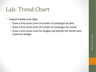
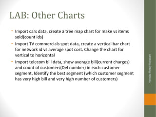
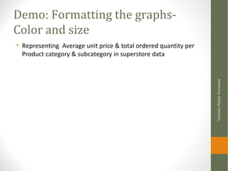
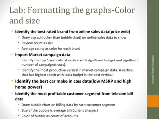
Downloaded 4,753 times
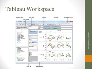
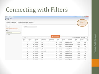
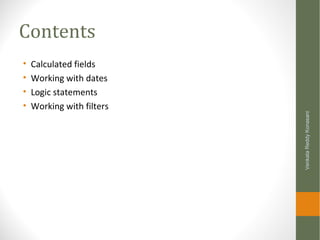
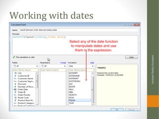
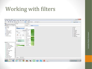
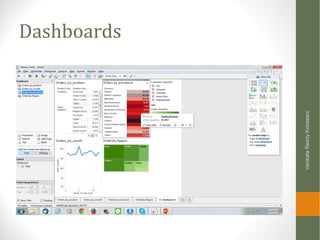
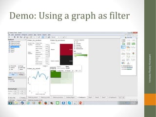
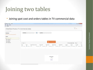
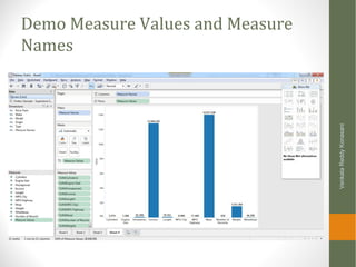
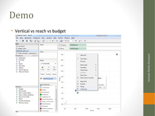
![Demo: Working with dates
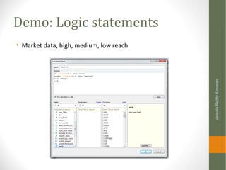
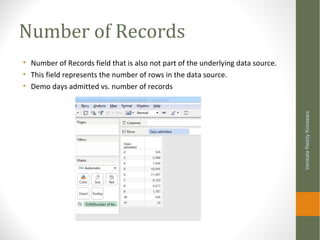
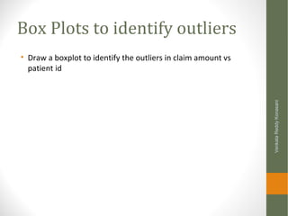
• Delay indicator in Super store data [Ship Date]-[Order Date]
VenkataReddyKonasani](https://image.slidesharecdn.com/learningtableau-setpbystep-150107130818-conversion-gate01/85/Learning-Tableau-Data-Graphs-Filters-Dashboards-and-Advanced-features-63-320.jpg)


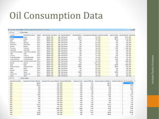
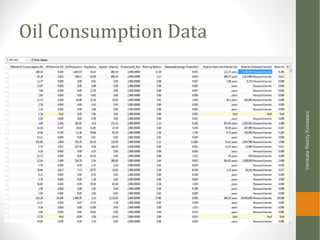
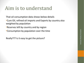
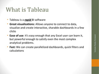
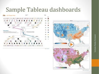
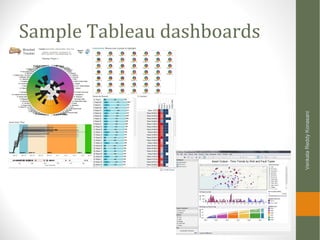
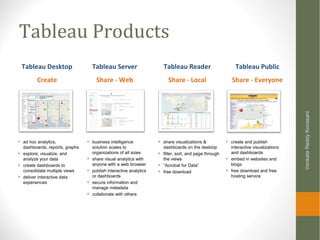
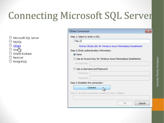
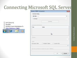
The document is a step-by-step guide to learning Tableau, covering topics such as connecting to data, building visualizations, creating dashboards, and using advanced data options. It provides prerequisites for learning, outlines the functionalities of Tableau, and details various types of files and data manipulations. Additionally, it includes practical demos and labs to reinforce learning through hands-on activities.


![[DSC Europe 25] Ivan Lukovic & Marija Djukic - From Data to Value: Why Maturi...](https://cdn.slidesharecdn.com/ss_thumbnails/ahrfps8xr6knowwhacxh-1-ivan-marija-dsc-2025-ld-v1-presentation-260115093812-be21adfc-thumbnail.jpg?width=640&height=640&fit=bounds)
![[DSC Europe 25] Andrzej Kowalczyk - AI - how to start small and grow in the f...](https://cdn.slidesharecdn.com/ss_thumbnails/oy1zmo94qv6vpcqjvno2-andrzej-kowalczyk-ai-how-to-start-small-and-grow-in-the-future-1-260119121559-cf093b23-thumbnail.jpg?width=640&height=640&fit=bounds)


