Download as PDF, PPTX


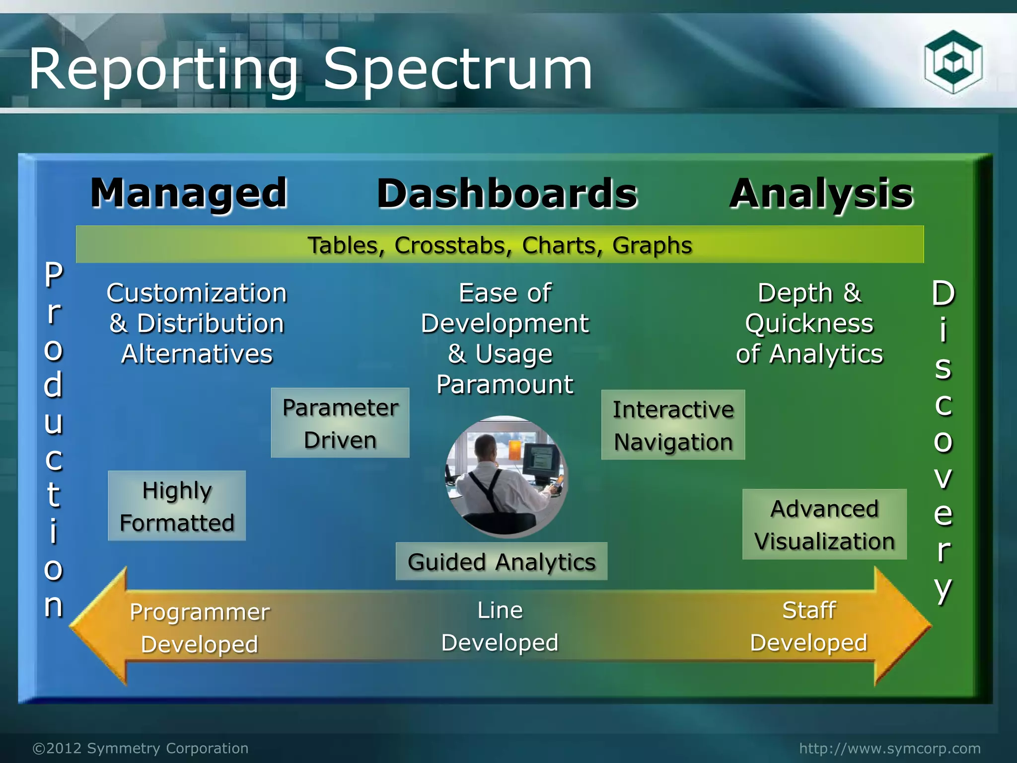
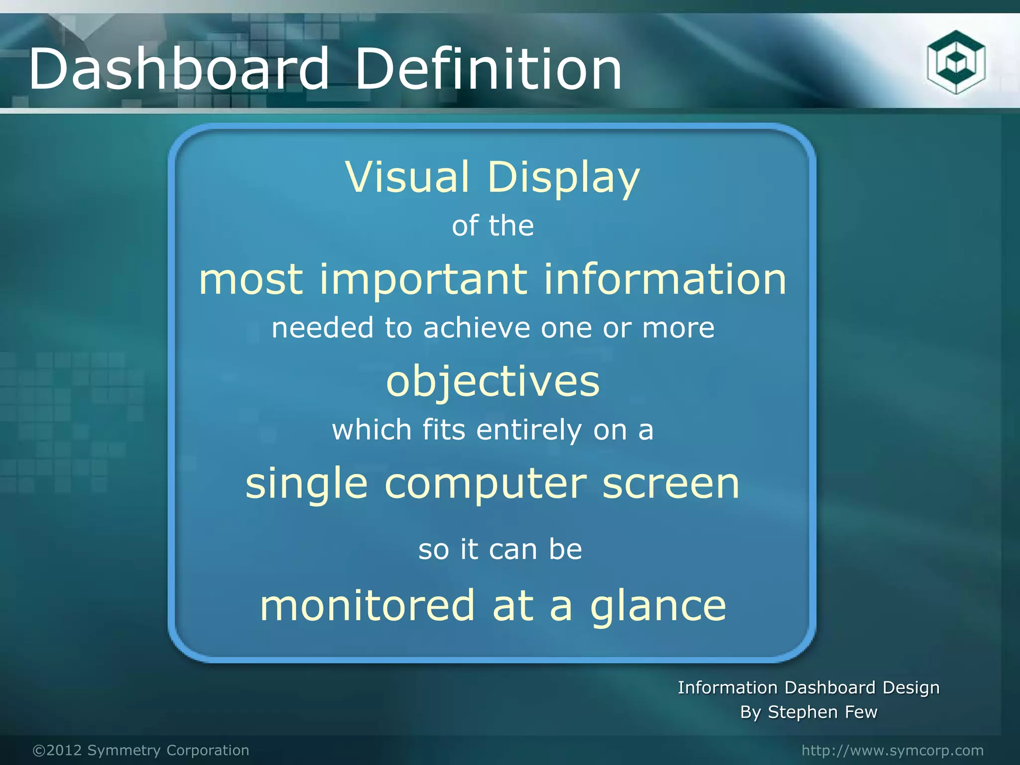
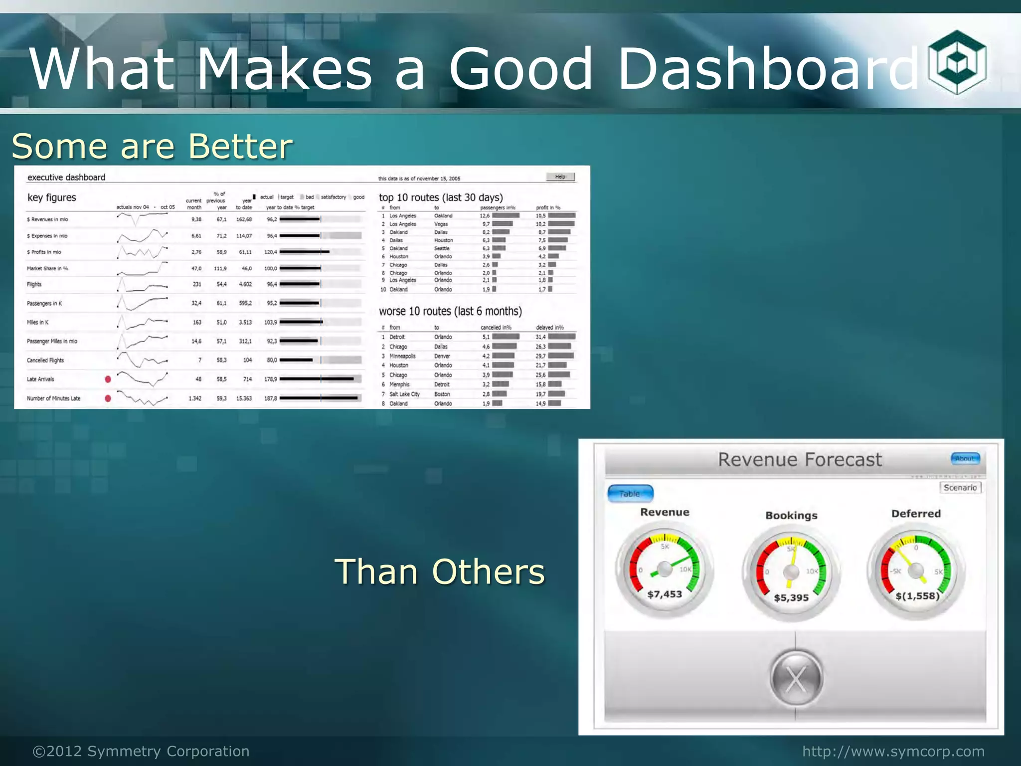
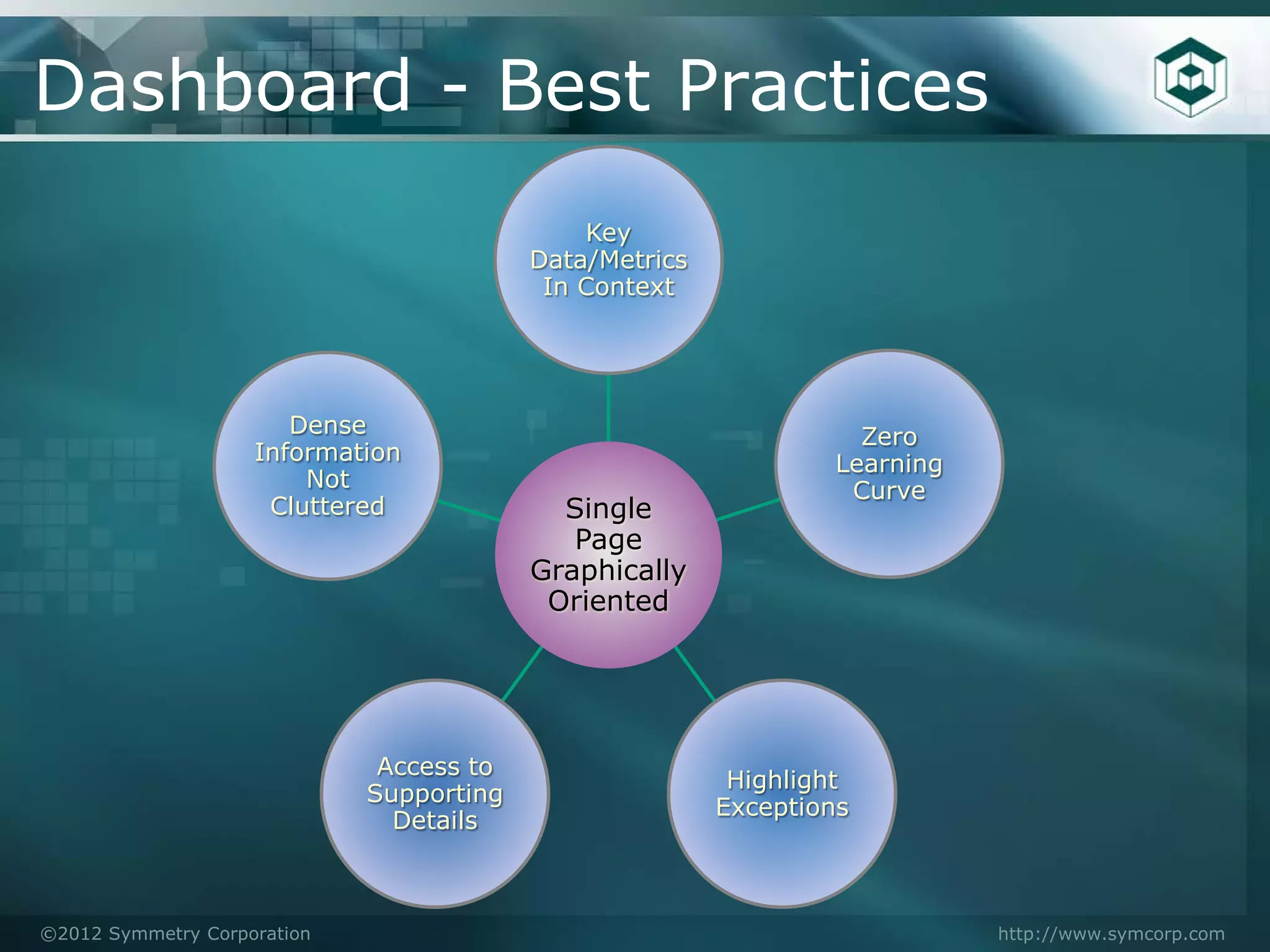
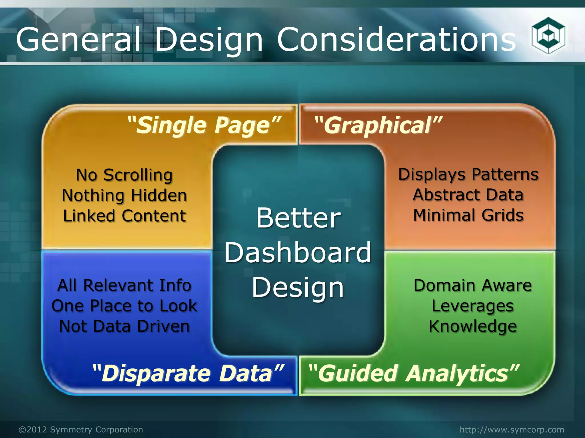
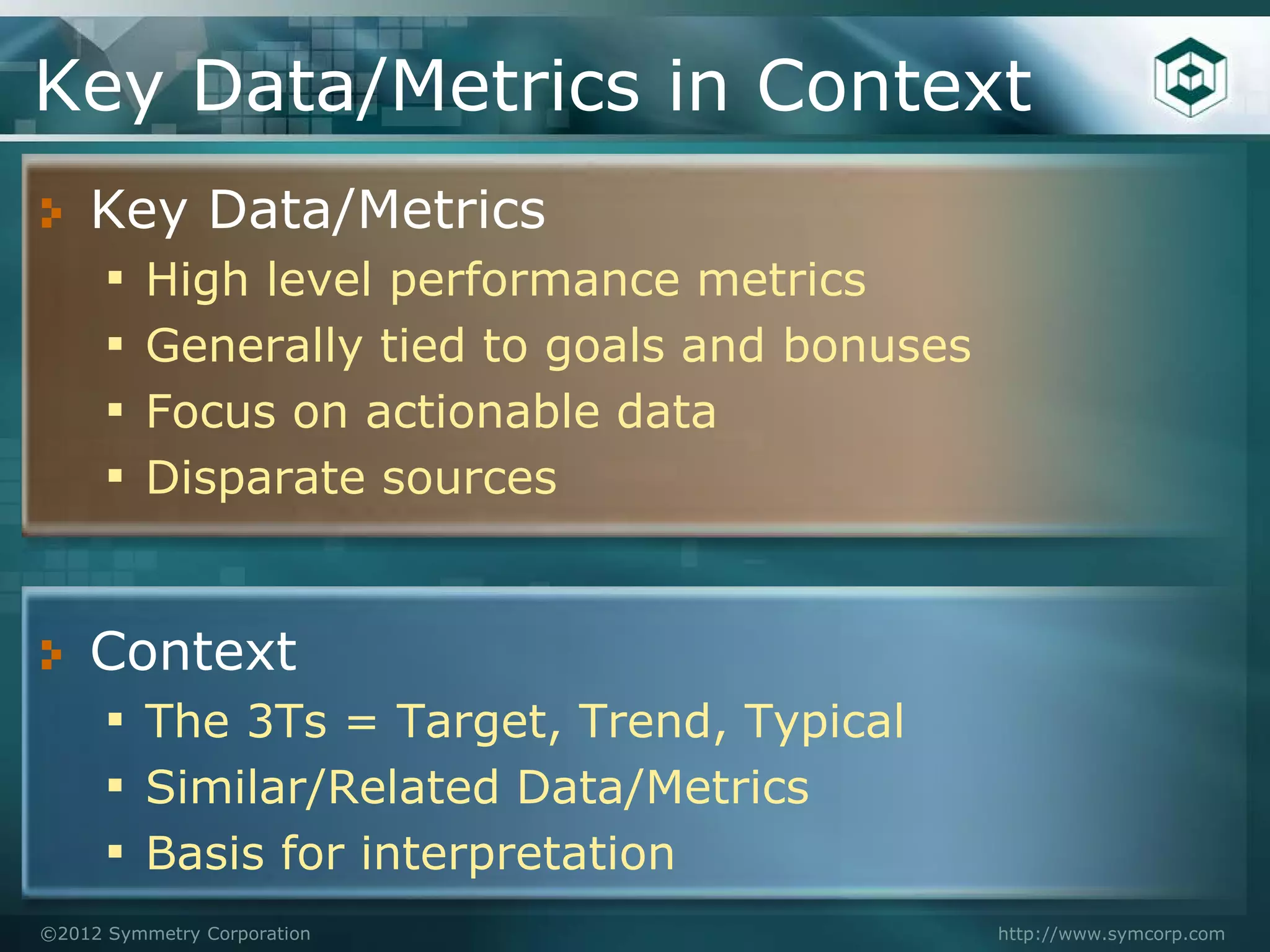
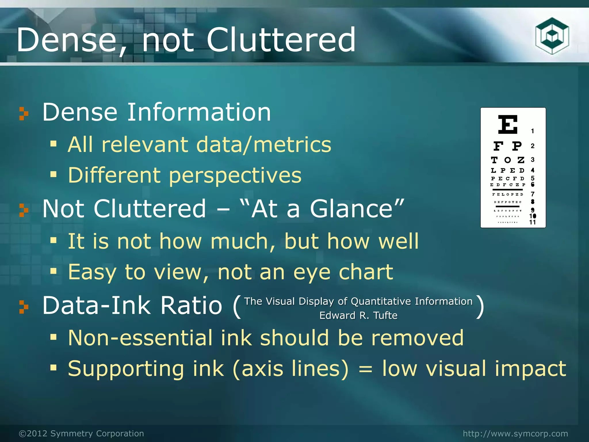


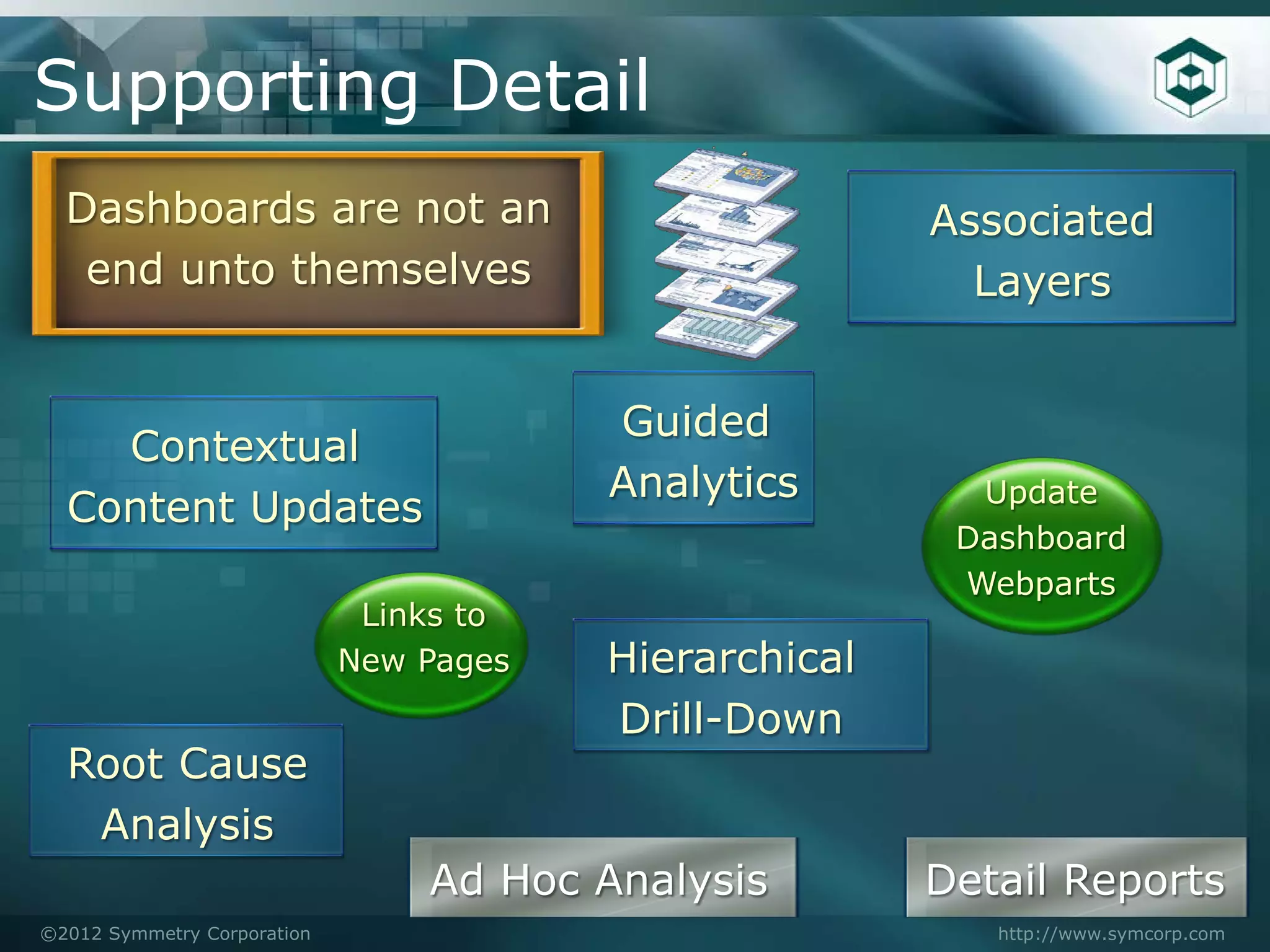
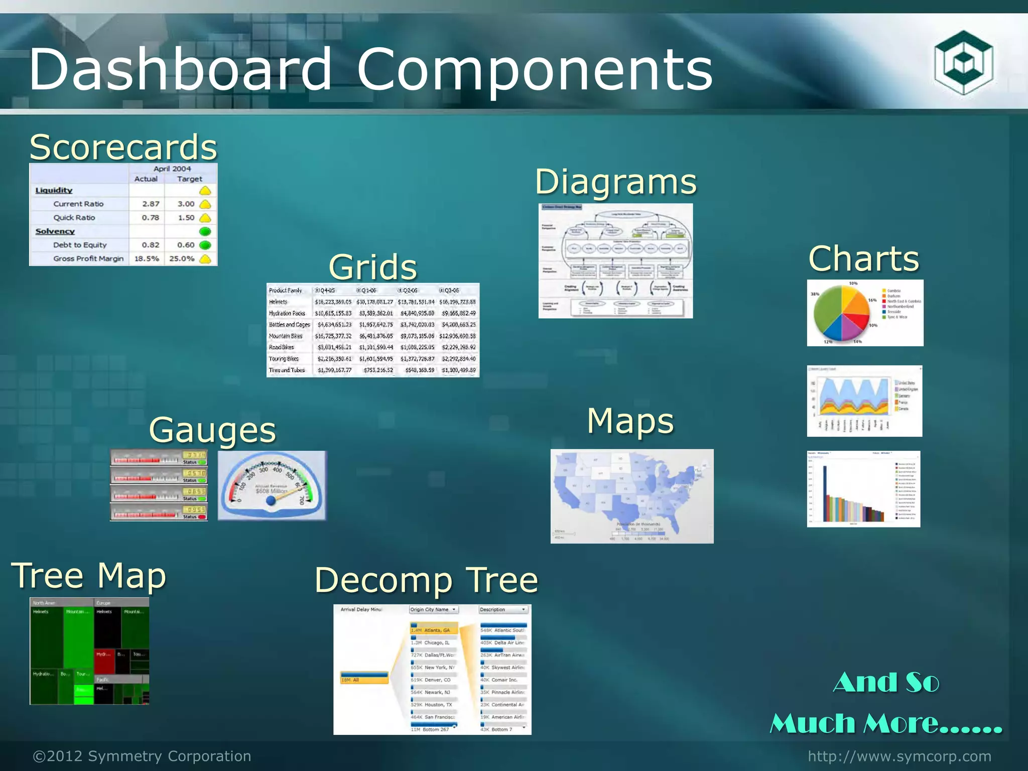

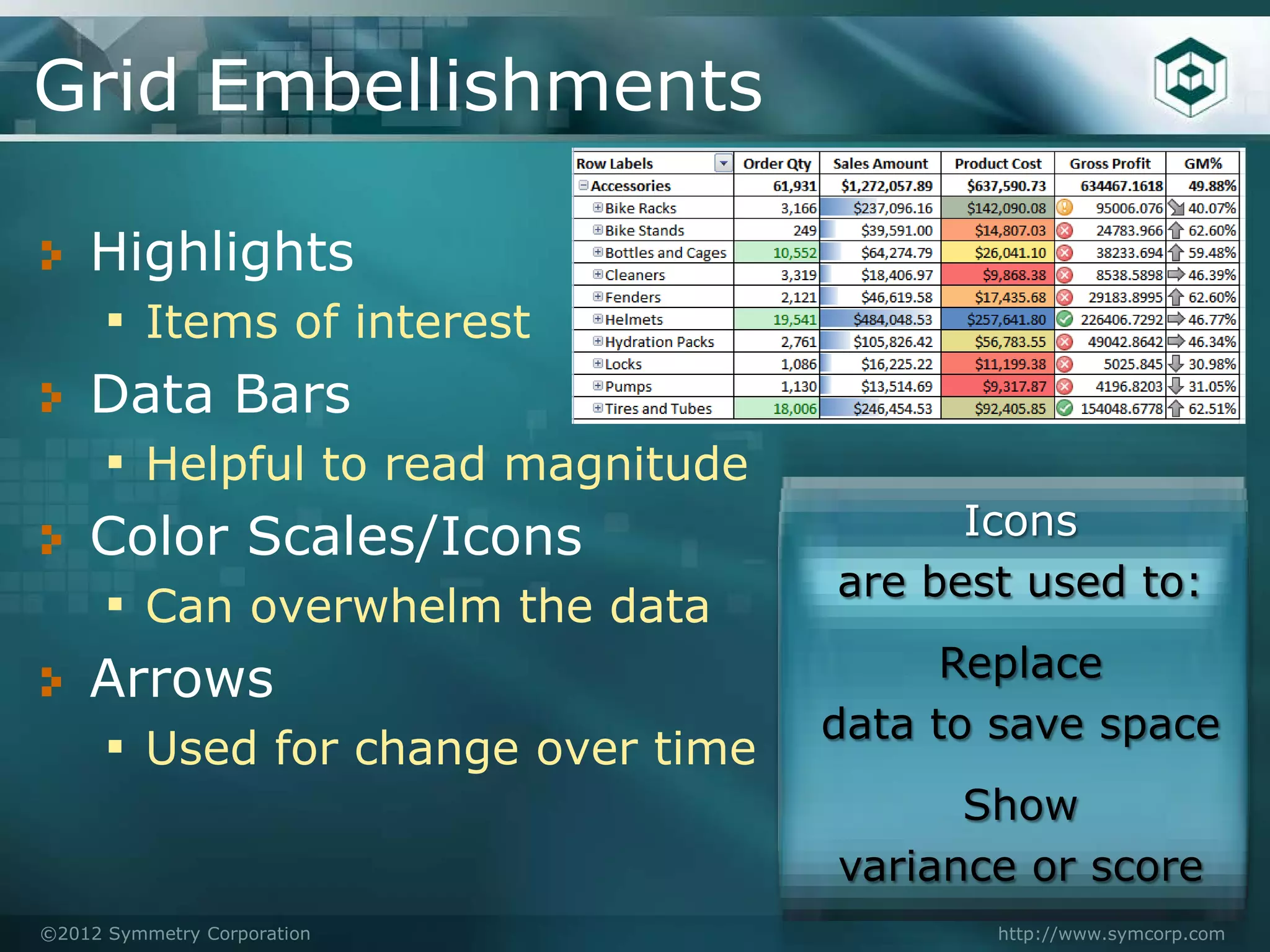

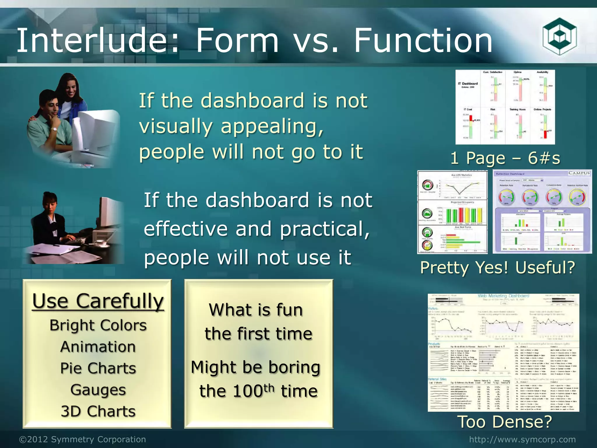
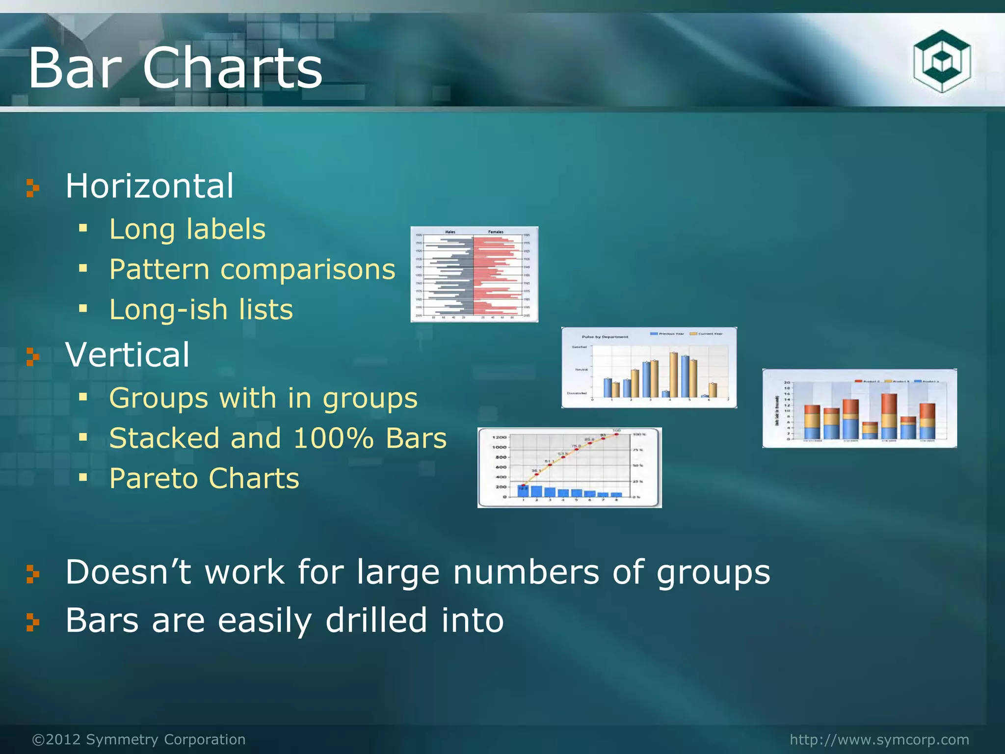
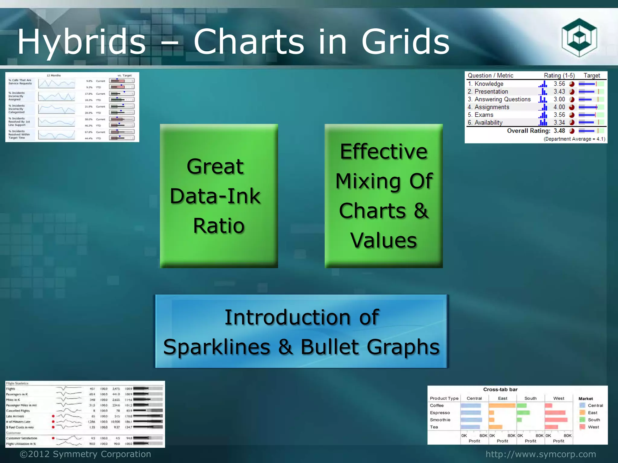


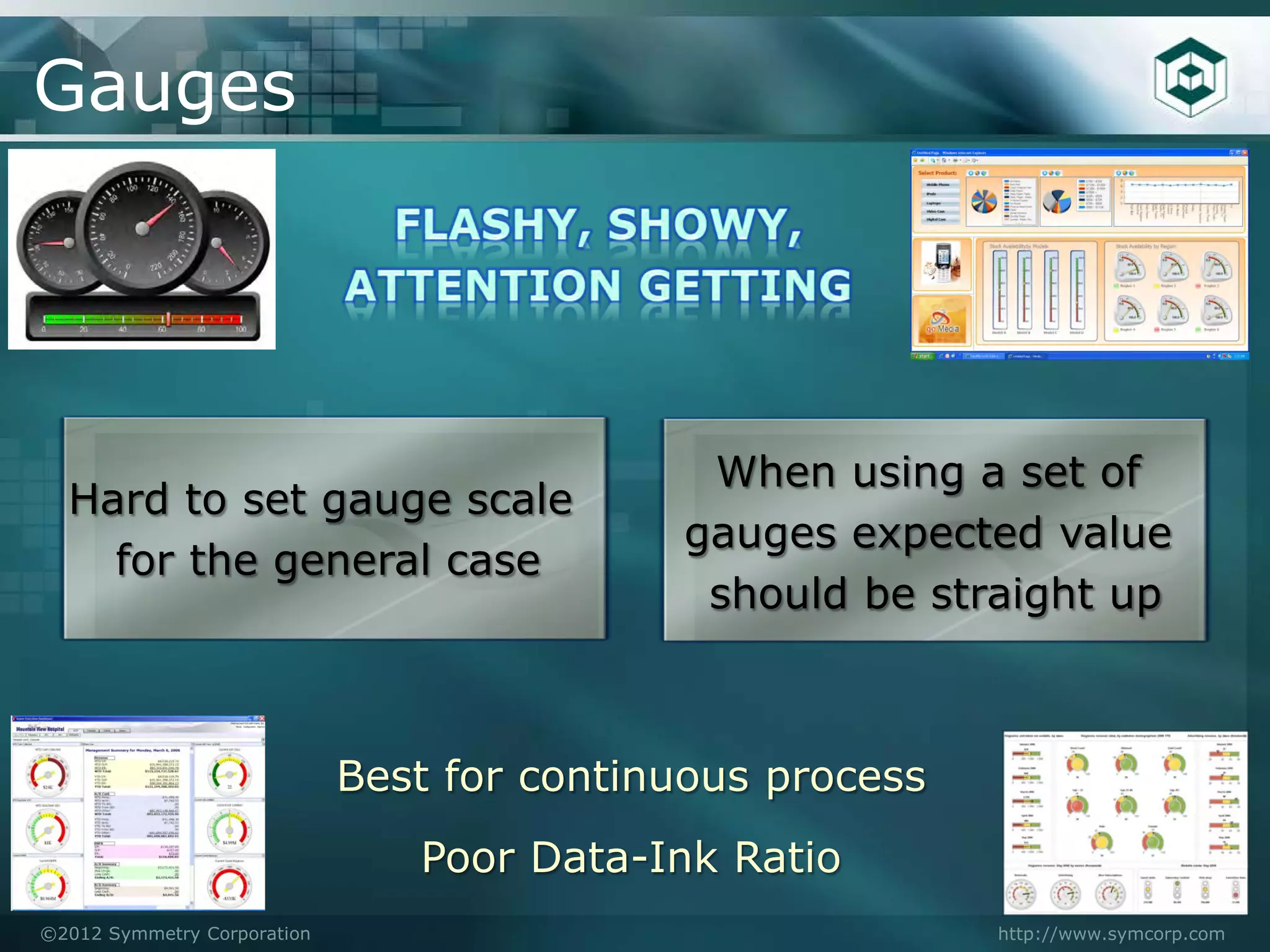


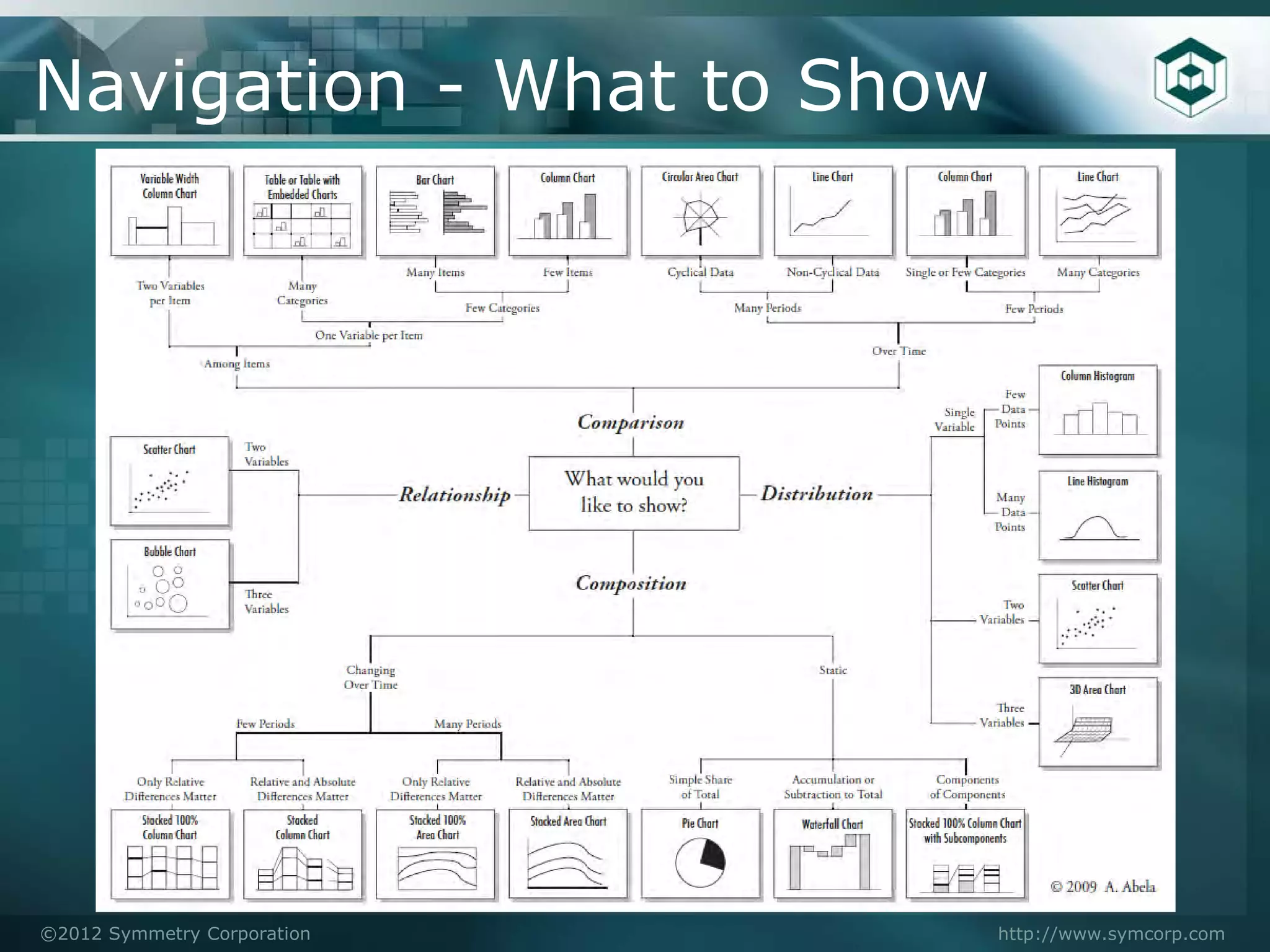


The document outlines best practices for dashboard design, emphasizing the importance of clarity, usability, and effective data visualization. Key elements include presenting high-level metrics on a single screen, avoiding clutter, and ensuring that the dashboard is intuitive for casual users. It also discusses various components and design considerations, such as color use, layout, and navigation frameworks to enhance the user's experience and interpretation of data.