Download as PDF, PPTX

![“[...] people almost universally use story
narratives to represent, reason about, and make
sense of contexts involving multiple interacting
agents, using motivations and goals to explain
both observed and possible future actions. With
regard to learning analytics, I’m seeing this as how
it can contribute to the retrospective
understanding and sharing of what transpired
within the operational contexts”
[Zachary2013]](https://image.slidesharecdn.com/da-140718103501-phpapp01/85/Data-Analaytics-04-Data-visualization-4-320.jpg)


![Concepts
Data visualization
The use of computer-supported,
interactive, visual
representations of abstract
elements to amplify cognition
[Card1999]](https://image.slidesharecdn.com/da-140718103501-phpapp01/85/Data-Analaytics-04-Data-visualization-30-320.jpg)
![Concepts
Information visualization
● Also known as InfoVis
● Focuses on visualizing non-physical, abstract
data such as financial data, business
information, document collections and
abstract conceptions
● However, inadequately supported decision
making [AmarStasko2004]
○ Limited affordances
○ Predetermined representations
○ Decline of determinism in decision-making](https://image.slidesharecdn.com/da-140718103501-phpapp01/85/Data-Analaytics-04-Data-visualization-31-320.jpg)
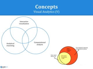
![Concepts
Visual Analytics
The science of analytical
reasoning facilitated by
interactive visual interfaces
[ThomasCook2005]](https://image.slidesharecdn.com/da-140718103501-phpapp01/85/Data-Analaytics-04-Data-visualization-33-320.jpg)
![Concepts
Visual Analytics (II)
[Keim2006]](https://image.slidesharecdn.com/da-140718103501-phpapp01/85/Data-Analaytics-04-Data-visualization-34-320.jpg)
![Concepts
Visual Analytics (III)
[Keim2006]
“Visual analytics is more than just visualization and
can rather be seen as an integrated approach
combining visualization, human factors and data
analysis. [...]integrates methodology from information
analytics, geospatial analytics, and scientific analytics.
Especially human factors (e.g., interaction, cognition,
perception, collaboration, presentation, and
dissemination) play a key role in the communication
between human and computer, as well as in the
decisionmaking process.”](https://image.slidesharecdn.com/da-140718103501-phpapp01/85/Data-Analaytics-04-Data-visualization-35-320.jpg)
![Concepts
Visual Analytics (IV)
● [Shneiderman2002] suggests combining
computational analysis approaches such as
data mining with information visualization
● People use visual analytics tools and
techniques to
○ Synthesize information and derive insight from
massive, dynamic, ambiguous and often conflicting
data
○ Detect the expected and discover the unexpected
○ Provide timely, defensible, and understandable
assessments
○ Communicate assessment effectively for action](https://image.slidesharecdn.com/da-140718103501-phpapp01/85/Data-Analaytics-04-Data-visualization-36-320.jpg)
![Concepts
Visual Analytics (VI)
● Combine strengths of both human and
electronic data processing [Keim2008]
○ Gives a semi-automated analytical process
○ Use strengths from each](https://image.slidesharecdn.com/da-140718103501-phpapp01/85/Data-Analaytics-04-Data-visualization-38-320.jpg)
![Concepts
Visual Analytics (VII)
[Verbert2014]](https://image.slidesharecdn.com/da-140718103501-phpapp01/85/Data-Analaytics-04-Data-visualization-39-320.jpg)
![Process
Data Visualization Reference Model
[Chi2000]](https://image.slidesharecdn.com/da-140718103501-phpapp01/85/Data-Analaytics-04-Data-visualization-48-320.jpg)
![Process
1) Data transformation (III)
[Shneiderman1996]](https://image.slidesharecdn.com/da-140718103501-phpapp01/85/Data-Analaytics-04-Data-visualization-51-320.jpg)
![Process
1) Data transformation (IV)
Data Visualization [Jarvainen2013]
Univariate data](https://image.slidesharecdn.com/da-140718103501-phpapp01/85/Data-Analaytics-04-Data-visualization-52-320.jpg)
![Process
1) Data transformation (V)
Data Visualization [Jarvainen2013]
Bivariate data](https://image.slidesharecdn.com/da-140718103501-phpapp01/85/Data-Analaytics-04-Data-visualization-53-320.jpg)
![Process
1) Data transformation (VII)
Data Visualization [Jarvainen2013]
Multivariate data](https://image.slidesharecdn.com/da-140718103501-phpapp01/85/Data-Analaytics-04-Data-visualization-55-320.jpg)
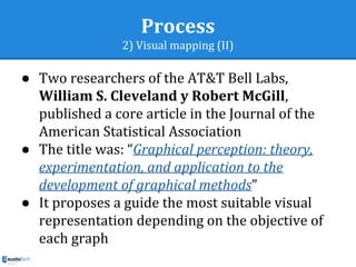
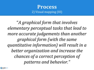
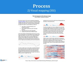
![Process
2) Visual mapping
Ranking of elementary perceptual tasks [ClevelandMcGill1985]](https://image.slidesharecdn.com/da-140718103501-phpapp01/85/Data-Analaytics-04-Data-visualization-64-320.jpg)
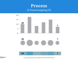
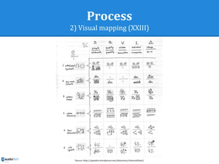
![Process
2) Visual mapping (X)
Ranking of perceptual tasks
[ClevelandMcGill1985]](https://image.slidesharecdn.com/da-140718103501-phpapp01/85/Data-Analaytics-04-Data-visualization-73-320.jpg)
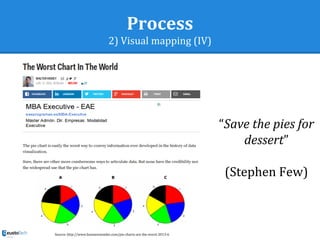
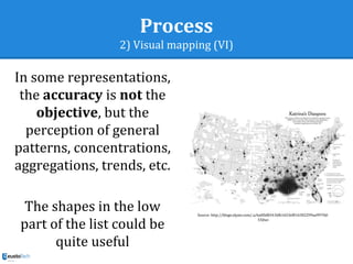
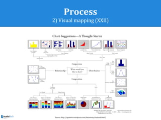
![Process
2) Visual mapping (XVII)
Source: http://www.excelcharts.com/blog/uncommon-knowledge-about-pie-charts/#prettyPhoto[gallery]/0/](https://image.slidesharecdn.com/da-140718103501-phpapp01/85/Data-Analaytics-04-Data-visualization-80-320.jpg)
![Process
3) View Transformations
Classification of Visual Data Exploration Techniques [Keim2002]](https://image.slidesharecdn.com/da-140718103501-phpapp01/85/Data-Analaytics-04-Data-visualization-88-320.jpg)
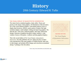
![Process
Principles
● Summary of Tufte’s principles
○ Tell the truth
■ Graphical integrity
○ Do it effectively with clarity, precision, etc.
■ Design aesthetics
“The success of a visualization is based on deep
knowledge and care about the substance, and the
quality, relevance and integrity of the content”
[Tufte1983]](https://image.slidesharecdn.com/da-140718103501-phpapp01/85/Data-Analaytics-04-Data-visualization-89-320.jpg)
![Dashboard
Definition
“A dashboard is a visual display of the
most important information needed to
achieve one or more objectives;
consolidated and arranged on a single
screen so the information can be
monitored at a glance”
[Few2007]](https://image.slidesharecdn.com/da-140718103501-phpapp01/85/Data-Analaytics-04-Data-visualization-127-320.jpg)
![References
[AmarStasko2005] Amar, R. A., & Stasko, J. T. (2005). Knowledge precepts for design and evaluation of information visualizations. Visualization and
Computer Graphics, IEEE Transactions on, 11(4), 432-442.
[Cairo] Alberto Cairo [Online]. URL: https://twitter.com/albertocairo
[Chi2000] Chi, Ed H. "A taxonomy of visualization techniques using the data state reference model." Information Visualization, 2000. InfoVis 2000.
IEEE Symposium on. IEEE, 2000.
[ClevelandMcGill1985] Cleveland, William S., and Robert McGill. "Graphical perception and graphical methods for analyzing scientific data." Science
229.4716 (1985): 828-833.
[Few2004] Few, Stephen. "Show me the numbers." Analytics Pres (2004).
[Few2007] Few, Stephen. "Dashboard confusion revisited." Perceptual Edge (2007).
[Fry] Ben Fry [Online]. URL: http://benfry.com/
[Jarvinen2013] Data visualization [Online]. URL: http://lib.tkk.fi/Lic/2013/urn100763.pdf
[Keim2006] Keim, D.A.; Mansmann, F. and Schneidewind, J. and Ziegler, H., Challenges in Visual Data Analysis, Proceedings of Information
Visualization (IV 2006), IEEE, p. 9-16, 2006.
[Kosslyn] Kosslyn Laboratory [Online]. URL: http://isites.harvard.edu/icb/icb.do?keyword=kosslynlab&pageid=icb.page250946
[Malamed] Visual Language for Designers: Principles for Creating Graphics that People Understand [Online]. URL: http://www.amazon.com/Visual-
Language-Designers-Principles-Understand/dp/1592535151
[Shneiderman1996] Shneiderman, Ben. "The eyes have it: A task by data type taxonomy for information visualizations." Visual Languages, 1996.
Proceedings., IEEE Symposium on. IEEE, 1996.
[Shneiderman2002] Shneiderman, B. (2002) Inventing discovery tools: combining information visualization with data mining1. Information
visualization, 1(1), 5-12.
[ThomasCook2005] J.J. Thomas and K.A. Cook, "A Visual Analytics Agenda," IEEE Computer Graphics & Applications, vol. 26, pp. 10-13, 2006.
[Verbert2014a] Visual Analytics [Online]. URL: http://www.slideshare.net/kverbert/in-34471961
[Yau] Nathan Yau [Online]. URL: http://flowingdata.com/about-nathan/
[Zachary2013] Zachary, W., Rosoff, A., Miller, L. C., & Read, S. J. (2013). Context as a Cognitive Process: An Integrative Framework for Supporting
Decision Making. Paper presented at the STIDS.](https://image.slidesharecdn.com/da-140718103501-phpapp01/85/Data-Analaytics-04-Data-visualization-167-320.jpg)
![Courses
KU Leuven [Online]. URL: http://ariadne.cs.kuleuven.be/wiki/index.php/MM-Course1314
Berkeley [Online]. URL: http://blogs.ischool.berkeley.edu/i247s13/
Columbia university [Online]. URL: http://columbiadataviz.wordpress.com/student-work/
Information Visualization MOOC [Online]. URL: http://ivmooc.cns.iu.edu/](https://image.slidesharecdn.com/da-140718103501-phpapp01/85/Data-Analaytics-04-Data-visualization-168-320.jpg)


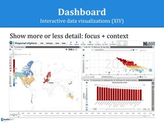
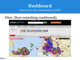
This document discusses the process of data visualization. It begins with data transformation, which involves encoding values and relationships in data through visual mappings like charts, graphs, and diagrams. Next is visual mapping, where the appropriate visualization technique is selected based on the data and thinking task. Rankings of perceptual tasks can guide technique selection. Finally, view transformations allow interactive exploration of data through filtering, zooming, etc. The goal throughout is effective visual communication to support analytical thinking about evidence.


