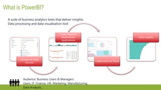
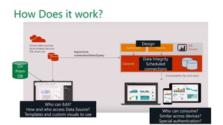
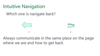
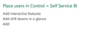
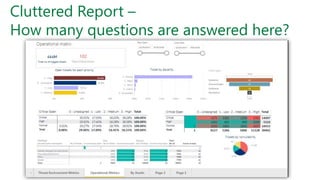
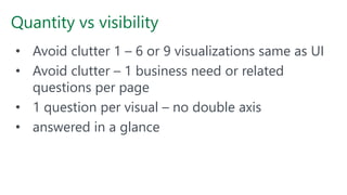
Calgary PASS
User Group
Visual Guidance for PowerBI
Yana Berkovich Data Platform MVP
Please Thank our Sponsors:
Calgary PASS
User Group
Yana Berkovich
BI Analyst & DEV, Data Platform MVP
Consultant, Product Manager
Reporting Stream Lead Consultant - PHSA
Love sharing my insights
https://www.linkedin.com/in/yanaberkovich
http://yanaberkovich.com
@Yana_Berkovich
Agenda
PowerBI
Visual Guidance
Design Principals
UI / UX for Reporting
Guidance specific for PowerBI
Intro
What is PowerBI?
Connect to Data
sources
Create Reports/
dashboards/
Applications
Collaborate and Share
Data Insights
A suite of business analytics tools that deliver insights.
Data processing and data visualization tool
Audience: Business Users & Managers
Users: IT, Finance, HR, Marketing, Manufacturing,
Data Analysts…
How Does it work?
Who can Edit?
How and who access Data Source?
Templates and custom visuals to use
On
Prem
DB
Who can consume?
Similar across devices?
Special authentication?
Design
Data Integrity
Scheduled
connections
What is currently part of PowerBI
Power BI desktop
Power BI Desktop is the report authoring tool - https://powerbi.microsoft.com/en-us/desktop
Access data from various data sources and transform them for your reporting needs
Power BI Service – Pro/ Premium (Capacity, Licensing and Monitoring)
Browser based portal - https://app.powerbi.com
Share and collaborate with your collogues and wider audience
PowerBI Report Server
On premise solution for organizational reporting
PowerBI Mobile
Mobile Application, can be connected to your PowerBI on pemise or the cloud
PowerBI Data Gateway
Install in your organization, to enablesecure data connection (same as for PowerApps)
Embeded Analytics
PowerBI in Azure, set powerBI when needed, in the Azure portal
Use PowerBI REST API & JS to embed in your applications
PowerPlatform AI builder
Why is Visual Guidance needed?
Governance != Guidance
Organizational Culture & Brand
Intuitive UI - A report in a glance
Data Driven Decision support
Minimize clutter maximize interaction
It is Self Service BI… everyone can do
everything?
Take a look at the story gallery
Worst PowerBI report…
Yeah that’s a thing
Self Service BI…Why guide?
From: ADOBE Blog
UI UX in Reports
Recommendations for Successful UI
There is a Whitepaper! LINK
• Place users in control of the interface
• Easy Navigation
• Be predictable - consistency
• Be acknowledging
• Clear concise fonts, titles etc.
• Avoid clutter – clean design
• Be intuitive
Clear insight
What are those reports telling us? Which
Business Problem do they solve?
Report Structure guidance for
PowerBI
Navigation
• Tabs
• Bookmarks and buttons
• Tooltips
Intuitive Navigation
Always communicate in the same place on the page
where we are and how to get back
Which one is navigate back?
1 2
Layout
How to divide your canvas?
Once decided, Consistency between reports
Alignment (LTR unless middle East) , order, and
proximity
Consistency
This cannot be page 1 and page 2 of your report
Branding
• Templates - Reports colors, Color scheme, fonts, frame sizes…
• Corporate Layouts – in report server
• Corporate backgrounds and guides
• Corporate Theme can be added
Anime Watching Trends Report Car Dealership Customers Engagement Report
Colors and Titles
• Custom Expression based formatting LINK
(tutorial)
• Expression based formatting
How to match colors & Theme?
Report Theme Generator
for the UI Designers LINK
Place users in Control = Self Service BI
Add interactive features
Add drill downs in a glance
Add
Cluttered Report –
How many questions are answered here?
Quantity vs visibility
• Avoid clutter 1 – 6 or 9 visualizations same as UI
• Avoid clutter – 1 business need or related
questions per page
• 1 question per visual – no double axis
• answered in a glance
Size and Font
Font Size – 3 max per report
PowerBI has different sizes for titles, text boxes and charts – pay
attention what looks the same
Preferable 1 font type per report play with indent instead
Arial always looks great when in doubt
16pt in titles or 12pt in graphs and tables
10pt for mobile
Mobile Basic rules
• Goal Driven Design – Who are the mobile users?
(Construction technician vs BA during a meeting)
• Usability – Rank your visuals and don’t drag all of
them automatically
• Signifiers – Identify the critical measure and
emphasize, text might be too small to read
• Performance –
Complicated calculation in the background, maybe
add a calculated column or think cashed data set
Mobile – Different colors and screen
Sources:
LINK (Medium UX Planet)
Prototype.IO
https://developer.apple.com/design/tips/
Place the active items in the active zone:
Finger Friendly – too small filter to select?
Screens are lightened differently –
choose more contrasting colors
How to pick my visualization?
Data Visualization
Do not use pie Charts (Storytelling with data)
Use the 9 gestalt principles
Add Tooltip
Add Data Labels
Avoid not necessary lines / colors
One glance
Data Visualization - Color
Not only Bar Chart – Use a Heat map!
Use familiar and intuitive visuals
Most of the people on our industry
knows the Gartner Quadrant
use it to describe your business
problem
• Classify competitors
• Group tickets by type
• Compare performance
Scattered?
Discover outlawyers, clear insights
Use color in scatter to emphasize the clusters
Custom Visuals the good and
the better?
What are the custom visuals and
where can we find them?
Custom visual gallery
What can go wrong?
The visual is not added as a default – new report?
Upload visuals from scratch
Filters -Not always filtering and reversing correctly
Usually Themes are not effective
Code might not be updated
Maps support different coordinates
Mobile display
R Scrip installation
Dashboard crashing…
Visuals about visuals
Currently there are 106 visuals in the visual gallery
2 Dashboards in the data Story Gallery describe and classify them
Compare Custom visuals
Comparing Timelines – Sales Report Time page
Picture Name Functionality Usage Design limitations
Countdown Counts down the time until a
date
Project
management /
Product
Management
till the next
event
No Theme support
Limited design options
Bci Calendar Display 1 measure per date,
can contain more measures
on tooltip, colors according to
kpi’s
Manufacture
calendar,
performance
per day track
No Theme support
Good design options
Timeline Display time hierarchy Any time
filtering needs
No Theme support
Custom
Calendar
Display many measures to
compare in a day
Limited Theme support
Good design
Resets colors when
restarting
TimeBrush Display columns by time
hierarchy similar to time play
and columns chart
Stock prices,
sales, tracking
usage &
usability data
Comparing the dreaded Pies - Sales Report
Drill Down Donut Chart
Display time hierarchy, other
hierarchy
Any time filtering needs
Preferably Never…
Ring Chart
Display 2 Measures – primary &
Secondary
Great for
• Filtering and drilling down for
complex hierarchy
• Product breakdown
Sun Burst
Display 1 measure for
grouped values
• Manufacture calendar
• performance per time
• Color palate….
Area Maps
Drill Down Donut Chart
Display several measures for
each category, to compare
the results in table
• Compare sales
• Gantt Charts
• Compare Tasks duration
Brick chart
Colors area according
to percentage value
Easier to “count bricks”
• sales of product
• stock revenue from
total
Treemap
Colors area according
to percentage value
• sales of product
• stock revenue from
total
Drill Down Donut Chart
Displays percentage from
the total value of each
layer
• Scan population
• describe many layers of
different sample
• Compare metric size
If we are not using the donut what should we consider instead to compare area or quantity?
Bubble & Clusters
Scatter Plot
Display the scatter of dots
between 2 measures
• Look for groups
• Look which observation
belong to which group
• Compare performance
• Compare populations
Cluster Map
Display 1 measure for
grouped values
• Detect and review
cluster sizes
• Ratings by
demography
• Compare group
sizes
Dot Plot by MAC
Display several Categories
for the bubbles to vary by
color and size in each –
multiple plots/axis data
• sales by country
• Different population in
different BIN’s
Scatter with prediction
line
Displays line or lines of
correlation between the 2
measures for 1 or multiple
populations
• Scan population
• describe 2 measures of
different sample
• Basic prediction model
of future behavior of
observations
Clustering is one of the best ways to group & explore population
Slicers
Enlighten Slicer
Create tiles instead of simple
filter values, great for
mobile, can contain pictures
• Tiles Diplay
• Choose a product from a
catalogue
Hierarchy Slicers
Choose hierarchy even
without connection,
same functionality as
filter for hierarchy, can
be colored by function
• Categories filtering
• Adding filter on
page
Smart Filter
The OOTB filter experience
Has option to be unselected
and key display features, can
be linked to specific visuals
only
• Filter Data on page/
visual or in the entire
report
Play Slicer
Play the timeline / Any
other filed or hierarchy to
display all the reports in
filter
• Story telling with data
• Behavior via time
• Adding dimension to
the visualizations
Mostly replaced by the new filter pane experience
Newest Visuals
Synoptic Visual – needs an animation file SVG
How to build my own?
PowerBI custom visual designer has retired.
There is a whole repository in GitHub that has the visuals library
https://github.com/Microsoft/PowerBI-visuals
A readme file there and you can install VS and try to implement
The user binds data from any of the sources to the visualization
Can build with a specific .json data
There are built in tools (the color menus etc.) that help
Visualization can cross filter and highlight – visuals that meet the users needs
API is exposed
Integration with data and formatting properties
Fork the repo use gulp to build it – JS with D3
Write the visualizations in type script and allows to build unit tests
Performance Reports
Premium Capacity Advanced Governance Portal
Users
Access
Capacity
Data – Datasets, refresh, measures efficiency, visuals usage
Premium Capacity Metrics
Use as a layout for your performance reports
(All pictures from
Microsoft site
PowerBI.com
not customer data)
Premium capacity – Monitoring AI
AI metrics are
available – full
health and
monitoring support
directly
Number of AI
functions executed
depends on
number of cores
Allows to identify
data Flow which
consumes the most
Summary
Summary – did we really get here?
We have scanned only 20 or so custom
visuals…that’s like 20 fish in a sea!
Visuals are great! Try to use and reuse
Add to existing missing functionalities
Theme
Drill Down
Navigation
Performance…
There is so much more to explore…
• Build me a pretty (sexy) report is not a spec!
• Use simplicity as your guidance
• Choose the right visual to your business question
• Always think what is the decision you want to
support with your data?
Q & A

Visual guidance calgary user group

  • 1.
    Calgary PASS User Group VisualGuidance for PowerBI Yana Berkovich Data Platform MVP
  • 2.
    Please Thank ourSponsors: Calgary PASS User Group
  • 3.
    Yana Berkovich BI Analyst& DEV, Data Platform MVP Consultant, Product Manager Reporting Stream Lead Consultant - PHSA Love sharing my insights https://www.linkedin.com/in/yanaberkovich http://yanaberkovich.com @Yana_Berkovich
  • 4.
    Agenda PowerBI Visual Guidance Design Principals UI/ UX for Reporting Guidance specific for PowerBI
  • 5.
  • 6.
    What is PowerBI? Connectto Data sources Create Reports/ dashboards/ Applications Collaborate and Share Data Insights A suite of business analytics tools that deliver insights. Data processing and data visualization tool Audience: Business Users & Managers Users: IT, Finance, HR, Marketing, Manufacturing, Data Analysts…
  • 7.
    How Does itwork? Who can Edit? How and who access Data Source? Templates and custom visuals to use On Prem DB Who can consume? Similar across devices? Special authentication? Design Data Integrity Scheduled connections
  • 8.
    What is currentlypart of PowerBI Power BI desktop Power BI Desktop is the report authoring tool - https://powerbi.microsoft.com/en-us/desktop Access data from various data sources and transform them for your reporting needs Power BI Service – Pro/ Premium (Capacity, Licensing and Monitoring) Browser based portal - https://app.powerbi.com Share and collaborate with your collogues and wider audience PowerBI Report Server On premise solution for organizational reporting PowerBI Mobile Mobile Application, can be connected to your PowerBI on pemise or the cloud PowerBI Data Gateway Install in your organization, to enablesecure data connection (same as for PowerApps) Embeded Analytics PowerBI in Azure, set powerBI when needed, in the Azure portal Use PowerBI REST API & JS to embed in your applications PowerPlatform AI builder
  • 9.
    Why is VisualGuidance needed? Governance != Guidance Organizational Culture & Brand Intuitive UI - A report in a glance Data Driven Decision support Minimize clutter maximize interaction
  • 10.
    It is SelfService BI… everyone can do everything? Take a look at the story gallery Worst PowerBI report… Yeah that’s a thing
  • 11.
    Self Service BI…Whyguide? From: ADOBE Blog
  • 12.
    UI UX inReports
  • 13.
    Recommendations for SuccessfulUI There is a Whitepaper! LINK • Place users in control of the interface • Easy Navigation • Be predictable - consistency • Be acknowledging • Clear concise fonts, titles etc. • Avoid clutter – clean design • Be intuitive
  • 14.
    Clear insight What arethose reports telling us? Which Business Problem do they solve?
  • 15.
  • 16.
    Navigation • Tabs • Bookmarksand buttons • Tooltips
  • 17.
    Intuitive Navigation Always communicatein the same place on the page where we are and how to get back Which one is navigate back? 1 2
  • 18.
    Layout How to divideyour canvas? Once decided, Consistency between reports Alignment (LTR unless middle East) , order, and proximity
  • 19.
    Consistency This cannot bepage 1 and page 2 of your report
  • 20.
    Branding • Templates -Reports colors, Color scheme, fonts, frame sizes… • Corporate Layouts – in report server • Corporate backgrounds and guides • Corporate Theme can be added Anime Watching Trends Report Car Dealership Customers Engagement Report
  • 21.
    Colors and Titles •Custom Expression based formatting LINK (tutorial) • Expression based formatting
  • 22.
    How to matchcolors & Theme? Report Theme Generator for the UI Designers LINK
  • 23.
    Place users inControl = Self Service BI Add interactive features Add drill downs in a glance Add
  • 24.
    Cluttered Report – Howmany questions are answered here?
  • 25.
    Quantity vs visibility •Avoid clutter 1 – 6 or 9 visualizations same as UI • Avoid clutter – 1 business need or related questions per page • 1 question per visual – no double axis • answered in a glance
  • 26.
    Size and Font FontSize – 3 max per report PowerBI has different sizes for titles, text boxes and charts – pay attention what looks the same Preferable 1 font type per report play with indent instead Arial always looks great when in doubt 16pt in titles or 12pt in graphs and tables 10pt for mobile
  • 27.
    Mobile Basic rules •Goal Driven Design – Who are the mobile users? (Construction technician vs BA during a meeting) • Usability – Rank your visuals and don’t drag all of them automatically • Signifiers – Identify the critical measure and emphasize, text might be too small to read • Performance – Complicated calculation in the background, maybe add a calculated column or think cashed data set
  • 28.
    Mobile – Differentcolors and screen Sources: LINK (Medium UX Planet) Prototype.IO https://developer.apple.com/design/tips/ Place the active items in the active zone: Finger Friendly – too small filter to select? Screens are lightened differently – choose more contrasting colors
  • 29.
    How to pickmy visualization?
  • 30.
    Data Visualization Do notuse pie Charts (Storytelling with data) Use the 9 gestalt principles Add Tooltip Add Data Labels Avoid not necessary lines / colors One glance
  • 31.
  • 32.
    Not only BarChart – Use a Heat map!
  • 33.
    Use familiar andintuitive visuals Most of the people on our industry knows the Gartner Quadrant use it to describe your business problem • Classify competitors • Group tickets by type • Compare performance
  • 34.
    Scattered? Discover outlawyers, clearinsights Use color in scatter to emphasize the clusters
  • 35.
    Custom Visuals thegood and the better?
  • 36.
    What are thecustom visuals and where can we find them? Custom visual gallery What can go wrong? The visual is not added as a default – new report? Upload visuals from scratch Filters -Not always filtering and reversing correctly Usually Themes are not effective Code might not be updated Maps support different coordinates Mobile display R Scrip installation Dashboard crashing…
  • 37.
    Visuals about visuals Currentlythere are 106 visuals in the visual gallery 2 Dashboards in the data Story Gallery describe and classify them
  • 38.
  • 39.
    Comparing Timelines –Sales Report Time page Picture Name Functionality Usage Design limitations Countdown Counts down the time until a date Project management / Product Management till the next event No Theme support Limited design options Bci Calendar Display 1 measure per date, can contain more measures on tooltip, colors according to kpi’s Manufacture calendar, performance per day track No Theme support Good design options Timeline Display time hierarchy Any time filtering needs No Theme support Custom Calendar Display many measures to compare in a day Limited Theme support Good design Resets colors when restarting TimeBrush Display columns by time hierarchy similar to time play and columns chart Stock prices, sales, tracking usage & usability data
  • 40.
    Comparing the dreadedPies - Sales Report Drill Down Donut Chart Display time hierarchy, other hierarchy Any time filtering needs Preferably Never… Ring Chart Display 2 Measures – primary & Secondary Great for • Filtering and drilling down for complex hierarchy • Product breakdown Sun Burst Display 1 measure for grouped values • Manufacture calendar • performance per time • Color palate….
  • 41.
    Area Maps Drill DownDonut Chart Display several measures for each category, to compare the results in table • Compare sales • Gantt Charts • Compare Tasks duration Brick chart Colors area according to percentage value Easier to “count bricks” • sales of product • stock revenue from total Treemap Colors area according to percentage value • sales of product • stock revenue from total Drill Down Donut Chart Displays percentage from the total value of each layer • Scan population • describe many layers of different sample • Compare metric size If we are not using the donut what should we consider instead to compare area or quantity?
  • 42.
    Bubble & Clusters ScatterPlot Display the scatter of dots between 2 measures • Look for groups • Look which observation belong to which group • Compare performance • Compare populations Cluster Map Display 1 measure for grouped values • Detect and review cluster sizes • Ratings by demography • Compare group sizes Dot Plot by MAC Display several Categories for the bubbles to vary by color and size in each – multiple plots/axis data • sales by country • Different population in different BIN’s Scatter with prediction line Displays line or lines of correlation between the 2 measures for 1 or multiple populations • Scan population • describe 2 measures of different sample • Basic prediction model of future behavior of observations Clustering is one of the best ways to group & explore population
  • 43.
    Slicers Enlighten Slicer Create tilesinstead of simple filter values, great for mobile, can contain pictures • Tiles Diplay • Choose a product from a catalogue Hierarchy Slicers Choose hierarchy even without connection, same functionality as filter for hierarchy, can be colored by function • Categories filtering • Adding filter on page Smart Filter The OOTB filter experience Has option to be unselected and key display features, can be linked to specific visuals only • Filter Data on page/ visual or in the entire report Play Slicer Play the timeline / Any other filed or hierarchy to display all the reports in filter • Story telling with data • Behavior via time • Adding dimension to the visualizations Mostly replaced by the new filter pane experience
  • 44.
    Newest Visuals Synoptic Visual– needs an animation file SVG
  • 45.
    How to buildmy own? PowerBI custom visual designer has retired. There is a whole repository in GitHub that has the visuals library https://github.com/Microsoft/PowerBI-visuals A readme file there and you can install VS and try to implement The user binds data from any of the sources to the visualization Can build with a specific .json data There are built in tools (the color menus etc.) that help Visualization can cross filter and highlight – visuals that meet the users needs API is exposed Integration with data and formatting properties Fork the repo use gulp to build it – JS with D3 Write the visualizations in type script and allows to build unit tests
  • 46.
  • 47.
    Premium Capacity AdvancedGovernance Portal Users Access Capacity Data – Datasets, refresh, measures efficiency, visuals usage Premium Capacity Metrics Use as a layout for your performance reports (All pictures from Microsoft site PowerBI.com not customer data)
  • 48.
    Premium capacity –Monitoring AI AI metrics are available – full health and monitoring support directly Number of AI functions executed depends on number of cores Allows to identify data Flow which consumes the most
  • 49.
  • 50.
    Summary – didwe really get here? We have scanned only 20 or so custom visuals…that’s like 20 fish in a sea! Visuals are great! Try to use and reuse Add to existing missing functionalities Theme Drill Down Navigation Performance… There is so much more to explore…
  • 51.
    • Build mea pretty (sexy) report is not a spec! • Use simplicity as your guidance • Choose the right visual to your business question • Always think what is the decision you want to support with your data?
  • 52.

Editor's Notes

  • #9 How to design reports in Power Bi Desktop How to publish to Power BI Service
  • #12 Show reports and see if people get what they are about The fish report Vs Performance report for tickets
  • #33 We are used to think in squares and spaces Map and location is always a great intuitive feature if needed