This is the presentation I gave to the Toronto Central LHIN about using Tableau to visualizing healthcare metrics (April 16 2013). I also have a section on how Information Design best practices can be leveraged in order to effectively communicate your key messages to your end users.
Storytelling with Data - See | Show | Tell | EngageAmit Kapoor
Stories have been recognized for their power of communication & persuasion for centuries and we need to operate at that intersection of data, visual and stories to fully harness the power of data.
I take your through a short tour of the science and the art of visualization and storytelling. Then give you an introduction through examples and exemplar on the four different layers in a data-story: See - Show - Tell - Engage.
Used in the session on Business Analytics and Intelligence at IIM Bangalore in July 2014.
It is an introduction to Data Analytics, its applications in different domains, the stages of Analytics project and the different phases of Data Analytics life cycle.
I deeply acknowledge the sources from which I could consolidate the material.
Forecasting demand for new product launches has been a major challenge for industries and cost of error has been high. Multiple research suggests that new product contributes to one-third of the organization sales across the various industry. The blog highlights on use of deep Learning / Machine Learning for effective new product forecast.
Data Analytics For Beginners | Introduction To Data Analytics | Data Analytic...Edureka!
Data Analytics for R Course: https://www.edureka.co/r-for-analytics
This Edureka Tutorial on Data Analytics for Beginners will help you learn the various parameters you need to consider while performing data analysis.
The following are the topics covered in this session:
Introduction To Data Analytics
Statistics
Data Cleaning and Manipulation
Data Visualization
Machine Learning
Roles, Responsibilities and Salary of Data Analyst
Need of R
Hands-On
Statistics for Data Science: https://youtu.be/oT87O0VQRi8
Follow us to never miss an update in the future.
Instagram: https://www.instagram.com/edureka_learning/
Facebook: https://www.facebook.com/edurekaIN/
Twitter: https://twitter.com/edurekain
LinkedIn: https://www.linkedin.com/company/edureka
This presentation introduces big data and explains how to generate actionable insights using analytics techniques. The deck explains general steps involved in a typical analytics project and provides a brief overview of the most commonly used predictive analytics methods and their business applications.
Vijay Adamapure is a Data Science Enthusiast with extensive experience in the field of data mining, predictive modeling and machine learning. He has worked on numerous analytics projects ranging from healthcare, business analytics, renewable energy to IoT.
Vijay presented these slides during the Internet of Everything Meetup event 'Predictive Analytics - An Overview' that took place on Jan. 9, 2015 in Mumbai. To join the Meetup group, register here: http://bit.ly/1A7T0A1
Big Data, Data-Driven Decision Making and Statistics Towards Data-Informed Po...Prof. Dr. Diego Kuonen
Presentation given by Dr. Diego Kuonen, CStat PStat CSci, on October 20, 2015, at the Swiss Statistical Society's celebration of the `World Statistics Day 2015' in Olten, Switzerland.
Further information are available at https://worldstatisticsday.org/blog.html?c=CHE
The presentation is also available at http://www.statoo.com/BigDataDataScience/.
Data visualizations make huge amounts of data more accessible and understandable. Data visualization, or "data viz," is becoming largely important as the amount of data generated is increasing and big data tools are helping to create meaning behind all of that data.
This SlideShare presentation takes you through more details around data visualization and includes examples of some great data visualization pieces.
A Brief History of Information Technology
Databases for Decision Support
OLTP vs. OLAP
Why OLAP & OLTP don’t mix (1)
Organizational Data Flow and Data Storage Components
Loading the Data Warehouse
Characteristics of a Data Warehouse
A Data Warehouse is Subject Oriented
For more visit : http://jsbi.blogspot.com
Visualizing Healthcare Data: Information Design Best Practices (eHealth 2012 ...Stefan Popowycz
This is my eHealth 2012 presentation will focuse on the principles behind information design and how visualization best practices can be leveraged within context of healthcare data. It illustrates theory in action, by drawing specific attention to the successful public facing solution, the 2012 Canadian Hospital Reporting Project (CHRP). The CHRP tool is a pan-Canadian external facing solution with an audience of over 3000+ users; it received over 25,000 impressions in the first 24 hours, and was called by the Toronto Star as “an innovative online tool that is being heralded as the most advanced of its kind in the world.”
10 Best Practices for Tableau Dashboard Design: Data Exploration and Actionab...Senturus
Top 10 best practices for building dashboards w/ Tableau Desktop. View the webinar video recording and download this deck. http://www.senturus.com/resources/10-best-practices-for-tableau-dashboard-design/.
This webinar provides tips for effective dashboard design, better approaches for creating user interfaces and new ideas on what dashboards can do to drive actionable insights. The following best practices are discussed: 1) How to design a dashboard with a goal in mind, 2) How the overall dashboard layout impacts effectiveness, 3) How to design for best performance, 4) Which chart type works best for a specific goal, 5) How to use the three color types effectively, 6) How to get the most impact from text, 7) How to minimize dashboard objects while maximizing actionable insights, 8) When to use any of the three basic types of navigation, 9) Some things to (almost) never do and 10) Two guiding principles for all dashboards.
Senturus, a business analytics consulting firm, has a resource library with hundreds of free recorded webinars, trainings, demos and unbiased product reviews. Take a look and share them with your colleagues and friends: http://www.senturus.com/resources/.
Many key performance indicators on healthcare dashboards fail to drive real results or are missing key organizational improvement indicators. Microsoft SQL Server 2012 and SharePoint 2013 provide the perfect combination for creating compelling dashboards and scorecards, especially for healthcare organizations working to lower costs, improve productivity and meet regulatory reporting demands.
In this slideshare, we look at the business side of key performance indicators:
How to convert your critical success factors and annual strategic plan into meaningful dashboards for real change in your organization
How your KPIs have the potential to make a significant, positive impact on the business
Method360’s Senior BI Consultant, Jeremy Alper, explores the process of building out executive level Tableau dashboards from beginning to end. From gathering requirements, to UI/UX design, this webinar will cover everything needed to create dashboards your executives will love! Make sure you watch this webinar on our YouTube channel.
Why No One Reads Your Annual Report: Data Visualization for NonprofitsHere's My Chance
If a 40-page annual report is created and no one reads it...does it even exist?
How can nonprofits utilize exciting graphics to transform boring "programs and services" descriptions into likeable, shareable social media memes?
Learn how to change data points into shareable visuals with this slideshow.
Open Data in the Newsroom: What's the story? (Talk from OK Con 2011 in Berlin)Mirko Lorenz
Data-driven journalism: Data in the newsroom
These are the slides from my talk at OK Con 2011. It provides a brief overview, then discussess barriers and challenges for data-journalism.
NOTE: This version is slightly edited, I primarily cleaned up missing image credits, etc. The message is the same.
CC-BY 3.0
The data sets you are about to analyze are only as good and valid as the methodology used to gather the data and create the data set. The presentation by Tom Johnson and Cheryl Phillips was made at the 2012 meeting of the National Institute for Computer-Assisted Reporting, Feb. 2012, in St. Louis.
Data Visualization 101: How to Design Charts and GraphsVisage
Learn to design effective charts and graphs.
Your data is only as good as your ability to understand and communicate it. The right visualization is essential to incite a desired action, whether from customers or colleagues. But most marketers aren’t mathematicians or adept at data visualization. Fortunately, you don’t need a PhD in statistics to crack the data visualization code.
How Celtra Optimizes its Advertising Platformwith DatabricksGrega Kespret
Leading brands such as Pepsi and Macy’s use Celtra’s technology platform for brand advertising. To inform better product design and resolve issues faster, Celtra relies on Databricks to gather insights from large-scale, diverse, and complex raw event data. Learn how Celtra uses Databricks to simplify their Spark deployment, achieve faster project turnaround time, and empower people to make data-driven decisions.
In this webinar, you will learn how Databricks helps Celtra to:
- Utilize Apache Spark to power their production analytics pipeline.
- Build a “Just-in-Time” data warehouse to analyze diverse data sources such as Elastic Load Balancer access logs, raw tracking events, operational data, and reportable metrics.
- Go beyond simple counting and group events into sequences (i.e., sessionization) and perform more complex analysis such as funnel analytics.
Data Visualization Trends - Next Steps for TableauArunima Gupta
Want answers to:
- What is data visualization?
- Why is it deemed disruptive in the field of analytics?
- What is Tableau?
Come view the slide deck!
Concludes with:
- Digital strategy recommendations for Tableau to become the winner in a winner-take-all-market
This publication seeks to explain what business intelligence is, its history, usage in modern business operations and prospects into the future of BI.
The publication also mentions relevant software tool that help deliver business intelligence solutions.
Analytics & Data Strategy 101 by Deko DimeskiDeko Dimeski
- Understand why each company needs solid analytics and data strategy & capabilities
- Typical data problems each company experiences, regardless of the scale
- Core competences and roles
- Analytics products and artefacts
- Analytics Usecases
Slides from a recent Big Data Warehousing Meetup titled, Big Data Analytics with Microsoft.
See Power Pivot/ Power Query/ Power View/ Power Maps and Azure Machine Learning be used to analyze Big Data.
One challenge of dealing with Big Data project is to acquire both structured and instructed information in order to find the right correlation. During the event, we explained all the steps to build your model and enhance your existing data through Microsoft's Power BI.
We had an in-depth discussion about the innovations built into the latest stack of Microsoft Business Intelligence, and practical tips from Technology Specialist’s from Microsoft.
The session also featured demos to help you see the technology as an end-to-end solution.
For more information, visit www.casertaconcepts.com
Jan 2017 Investment Recommendation for Tableaupaulchenuva
Buy Tableau was one of my stock pitches in 2017. I was predicting a 2x return. Instead, Tableau's stock increased over 4x since. Great to see Salesforce's acquisition today. Would love to hear your comments and feedback.
My talk in the technical meeting "Global Burden of Diseases and Scientific Computation in Health". 25-26 September 2015. FIOCRUZ, Rio de Janeiro, Brazil
Where does Data Democracy begin? [Segment-Synapse, 2019]aj_cache
Data Democracy is a global vision. This talk explores what this means within the context of large businesses with examples from the restructuring of Sun Basket's Data Science & Engineering team.
Data-Ed Online: Trends in Data ModelingDATAVERSITY
Businesses cannot compete without data. Every organization produces and consumes it. Data trends are hitting the mainstream and businesses are adopting buzzwords such as Big Data, data vault, data scientist, etc., to seek solutions for their fundamental data issues. Few realize that the importance of any solution, regardless of platform or technology, relies on the data model supporting it. Data modeling is not an optional task for an organization’s data remediation effort. Instead, it is a vital activity that supports the solution driving your business.
This webinar will address emerging trends around data model application methodology, as well as trends around the practice of data modeling itself. We will discuss abstract models and entity frameworks, as well as the general shift from data modeling being segmented to becoming more integrated with business practices.
Takeaways:
How are anchor modeling, data vault, etc. different and when should I apply them?
Integrating data models to business models and the value this creates
Application development (Data first, code first, object first)
Agile Data Science is a lean methodology that is adopted from Agile Software Development. At the core it centers around people, interactions, and building minimally viable products to ship fast and often to solicit customer feedback. In this presentation, I describe how this work was done in the past with examples. Get started today with our help by visiting http://www.alpinenow.com
This presentation was given to the Tech Change Technology for Monitoring and Evaluation Diploma course on 25th September 2015. It covers:
Why visualise data?
Where to start?
Which tools to use?
It ends with an overview of Kwantu's approach to this area and the technology choices that we've made.
La importancia de los datos para el mejor aprovechamiento de los conocimientos, es poder compartirlo con otros y maximizar el impacto de los descubrimientos.
Conozca más a trav
Can AI do good? at 'offtheCanvas' India HCI preludeAlan Dix
Invited talk at 'offtheCanvas' IndiaHCI prelude, 29th June 2024.
https://www.alandix.com/academic/talks/offtheCanvas-IndiaHCI2024/
The world is being changed fundamentally by AI and we are constantly faced with newspaper headlines about its harmful effects. However, there is also the potential to both ameliorate theses harms and use the new abilities of AI to transform society for the good. Can you make the difference?
Visual Style and Aesthetics: Basics of Visual Design
Visual Design for Enterprise Applications
Range of Visual Styles.
Mobile Interfaces:
Challenges and Opportunities of Mobile Design
Approach to Mobile Design
Patterns
White wonder, Work developed by Eva TschoppMansi Shah
White Wonder by Eva Tschopp
A tale about our culture around the use of fertilizers and pesticides visiting small farms around Ahmedabad in Matar and Shilaj.
PDF SubmissionDigital Marketing Institute in NoidaPoojaSaini954651
https://www.safalta.com/online-digital-marketing/advance-digital-marketing-training-in-noidaTop Digital Marketing Institute in Noida: Boost Your Career Fast
[3:29 am, 30/05/2024] +91 83818 43552: Safalta Digital Marketing Institute in Noida also provides advanced classes for individuals seeking to develop their expertise and skills in this field. These classes, led by industry experts with vast experience, focus on specific aspects of digital marketing such as advanced SEO strategies, sophisticated content creation techniques, and data-driven analytics.
Between Filth and Fortune- Urban Cattle Foraging Realities by Devi S Nair, An...Mansi Shah
This study examines cattle rearing in urban and rural settings, focusing on milk production and consumption. By exploring a case in Ahmedabad, it highlights the challenges and processes in dairy farming across different environments, emphasising the need for sustainable practices and the essential role of milk in daily consumption.
Decormart Studio is widely recognized as one of the best interior designers in Bangalore, known for their exceptional design expertise and ability to create stunning, functional spaces. With a strong focus on client preferences and timely project delivery, Decormart Studio has built a solid reputation for their innovative and personalized approach to interior design.
Visualizing Healthcare Data with Tableau (Toronto Central LHIN Presentation)
1. Visualizing Healthcare Data with Tableau
Stefan Popowycz, BSc, BAH, MA
Senior Information Designer
Senior Business Systems Analyst
Canadian Institute for Health Information
April 16 2012 at Toronto Central LHIN
2. Presentation Overview
• Who I am, what I do, what CIHI
does, and why our work is
important.
• Explain the CHRP solution, the
data, the challenges we faced,
and detailed examples.
• Why we used Tableau Desktop
and Public Premium.
• Information design principles.
• Things to remember, authors to
read, questions.
4. Who am I
• Stefan Popowycz, BSc, BAH, MA
• Trained as a Medical Sociologist,
Statistician, Researcher
• Senior Information Designer / Senior
Business Systems Analyst
• Lead Design and Information Architect
for the Canadian Hospital Reporting
Project 2012 Custom Public Reports.
• Information Access & Delivery Team,
Canadian Institute for Health
Information
5. CIHI
• The Canadian Institute for Health Information
(CIHI) is an independent, not-for-profit
corporation that aims to contribute to the
improvement of the health of Canadians and
the health care system by disseminating
quality health information.
• Additionally, CIHI's data and reports are
provided to help inform health policies,
support the effective delivery of health
services and to raise awareness among
Canadians in general on current research and
trends in the healthcare industry that
contribute to better health outcomes.
6. Why is our work important?
• Healthcare is extremely
important for all Canadians.
• Healthcare data is used to inform
decision makers on progress,
overall comparison, and most
importantly best practice.
• Traditionally, CIHI has had a clear
obligation to analyze these data,
and communicate the results to
all Canadians (vision & mandate).
7. Why is our work important?
• However, there is a clear
shift in the way people are
organizing, sharing, and
consuming data.
• Proper data visualizations
facilitates the
comprehension of complex
analyses and patterns.
• But, data visualizations do
not need to be boring and
uninviting.
8. Challenges
• We needed to design a
solution that was sexy, fast,
inviting and easily accessible
to all Canadians.
• Most importantly, the
solution needed to be public
facing.
9. Challenges
• Added bonus, if it was functional
on a mobile platform with social
media capabilities.
• Aside from great visualizations,
there was a critical requirement
that detailed contextual metadata
(tooltips) be available for end
users.
10. Tool Agnostic
• I consider myself to be
tool agnostic, adhering
the principles of
information design.
• I want to be able to tell
the data's complete
story, and not be
limited by the tool
being used to analyze or
display metrics.
11. Why Tableau?
• Tableau was the only tool that allowed
us to quickly create and publish data
visualizations with many best practice
features already inherent within the
software.
• Strong belief in better communication
through visualization
• Never done before: cloud computing
and aggregated health care metrics.
12. Behind the Scenes
• Needed to convince
senior management
that this was the right
thing to do.
• Levels of approval:
Privacy and legal, SMG,
IT Operational
Committee, VPs.
• Needed to create proof
of concept projects.
13. Behind the Scenes
• Extremely beneficial
that I was able to
rapidly create an
interactive prototype to
share.
• Pretty, fast, and mobile
ready (iPad POC).
14. Why Tableau Public Premium?
• The Tableau Public Premium
environment has the capacity to
sustain tens of thousands of
simultaneous hits.
• Proved invaluable as 10K
impressions within 24 hours, 40K
within 4 months.
• The 99% SLA was an important
selling feature.
15. Why Tableau Public Premium?
• Some might question, why no
server?
• Purchasing Tableau Server
was too cost prohibitive at
the time and Public Premium
proved to be a relatively
inexpensive solution for
public reporting.
• Easier to convince a VP of
$10K vs $180k-$220K.
• Stepping stone analysis.
16. Data
• Created and analytical
datamart (denormalized
data).
• ETL coded in SAS and
exported to Excel.
• We also had the
requirement of not
permitting the end user
to download the
underlying dataset.
17. Data
• So why aggregate the
data? It guaranteed
performance within the
Tableau Public Premium
environment.
• Unknown architecture,
taking a risk.
18. What is CHRP?
• The Canadian Hospital
Reporting Project (CHRP) is a
national quality improvement
initiative providing hospital
decision makers, policy makers
and Canadians with access to
clinical and financial indicator
results for more than 600
facilities, from every province
and territory in Canada.
19. What is CHRP?
• The public data visualizations
of the CHRP project were
designed with the intent to
visually and interactively
communicate key messages to
end users using a web-based
business intelligence solution.
• In essence, we wanted to
create interactive infographics.
• We create two (2) categories of
data visualizations.
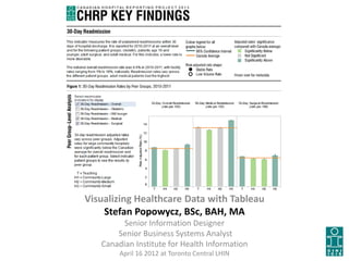
20. CHRP Key Findings
• The first category of visualization
we created we called “Key
Findings”. Nuggets of information.
• It's summary level data, at 2-3
different levels of analysis for a
specific indicator of interest, and
represents an interactive
approach to data presentation.
• We created two (2) clinical and
two (2) financial key findings, but
also French.
21. CHRP Key Findings
• These follow information design
best practice with regards to
content, colour, typography,
interactivity, and design.
• Things to note: 4 key findings in
total; 4 vizs in each dashboard;
increasing hierarchy; all titles and
heading done in Adobe Illustrator
at 300 dpi; all embedding within
our web ECM.
22. CHRP Stand Alone Solution
• The second category of data
visualizations created we called
“Stand Alone Interactive Solution”.
• These consist of more complex
data visualizations that combine
several types of data within an
interactive real-estate.
• Contains guided analysis, allowing
the end user to focus in on
information of interest.
23. CHRP Stand Alone Solutions
• Layered views of the same data
provides better contextual
understanding of the whole
message being communicated.
• Things to note: 2 complete
solutions; 2 tabs, first tabs have
around 5 vizs, second tab
around 9; all headings and titles
done in Adobe Illustrator; all
embedded within our web ECM.
24. Advantages Disadvantages
• Easy to use (Interface, Importing Data)
• Inherent best practice (Colour, Graphs)
• Easy to publish online (Public)
• Tableau Digital (99% SLA)
• Analytical Engine (Tableau Server)
• Allows you tweak the data
• Visualizations are pretty
• Pixel perfect PDFs
• JavaScript embed function (Ipad)
• Social Media (Twitter and Facebook)
• Can use denormalized, 3NF structures
• Wide variety for input formats
• Wide range of graphing formats
• JS API complicated
• Some functionality is not perfect (public
reporting).
• Tableau server can become expensive
(you may require an administrator)
• Some inherent functionality (auto sort
button) may be confusing for end users
• Using Digital, you are at the mercy of
Tableau regarding uptime. Server?
• Sometimes the data exports generated
(crosstabs) are confusing for end users
• SAS file type is not an import option
• Layout boxes are finicky, and sometimes
need to be coerced into place
28. Information Design
• Information design
represents the clean and
effective presentation of
information, and involves a
multi-disciplinary approach to
communication. Jen & Ken O’Grady
• Combines graphic design,
communications theory,
technical and non-technical
practices, cultural studies and
psychology.
29. Data Visualization
• Data visualization is a visual
representation of data that has
a main goal to communicate
quantitative information
clearly and effectively through
graphical means.
• Objects/components/artefacts
generated during the
Information Design process.
• More analytical in nature, and
can be static, animated, or
interactive.
30. Infographics
• Infographics are graphic visual
representations of information,
data or knowledge, and present
complex information quickly
and clearly, such as in signs,
maps, journalism, technical
writing, and education.
• Static and less analytic in
nature. Also an artefact of the
information design process.
• Currently very popular with
media and are published almost
on a weekly basis.
32. Content, Function, Form
• The essential elements for
information design are
content, function and form.
• A delicate balance needs to
be maintained between all
three in order to achieve an
effective data visualization.
33. Form Follows Function
• Content: the information that you
want to communicate
• Function: the intended actions
associated with the object you are
designing.
• Form: the size, shape, dimension and
other distinct parameters of the
object you are designing.
34. Negotiation
• Preconceived notions of what
type of data visualizations are
appropriate hinder the overall
information design process.
• Developers need to participate
in gentle negotiation between
the business and all three
elements.
• Ex: academic vs.. graphic art
(boxplots vs. data variability).
35. Five Design Components
• Key messages (critical analysis)
• Types of underlying data
• Typography (fonts)
• Colour selection
• Design and layout
37. Key Messages
• It is important to clearly define
3-5 key messages that you
want to communicate?
• This requires that you distill
the various components of
your critical analysis into
nuggets of information.
• What are they key metrics?
38. Key Messages
• Important to be explicit when
defining your key messages, and
try to contextualize them as much
as possible.
• Maybe arrange them
hierarchically, as it will allow you
to get a better understanding of
the overall message you want to
communicate.
40. Types of Data
• Important to assess the types of
data available for development.
• Compare data to the key messages
in order to assess if all necessary
fields are available or if additional
data collection is necessary.
• Why? The data visualization
techniques for one data type may
not be appropriate for another type
of data.
41. Types of Data
• Time series analysis (trends, variability,
rate of change)
• Part to whole and ranking analysis (bar,
pie, Pareto)
• Deviation analysis (categorical,
comparative, thresholds)
• Distribution analysis (histogram, box
plots, categorical)
• Correlation analysis (scatter plot)
• Multivariate analysis (heat, multiple line)
• Each type has an appropriate graphic
technique associate with it.
42. Types of Data
Some best practices:
• Select the appropriate chart type
and units of measurement.
• Include a reference line (if
possible).
• Optimize the aspect ratio of the
graph (zero line).
• Maintain consistency throughout
the graph: fonts, colours, design.
• Avoid 3D graphs.
44. Typography
• Font selection is extremely
important when thinking about
information design and
communication.
• Rule of thumb, keep it simple
and ensure the legibility of your
design.
• Aesthetics vs. communicability.
45. Typography
• Compromise between visual
impact and the richness of data.
• Try not to use all caps, stylized
fonts, or angled fonts. Different
types of fonts can be mixed, but
be careful.
• Adjust the size, weight, colour of
the font for additional impact.
• Integrating Corporate standards
and design.
• Donna Wong
47. Colour
• Selecting a colour scheme is
also very important when
designing data visualizations.
• Allows the designer to set the
tone of the data visualization.
• Colours used as categorical
highlight (performance
allocation)
• Corporate colours?
48. Colour
• Try to keep the representation
consistent across your data
visualizations.
• Altering the hues and
intensity are a good way to
draw distinctions and make
comparisons.
• Do not use distracting colours.
• Print everything in black and
white.
50. Design and Layout
• Selecting the proper design and
layout for your data
visualization is also very
important.
• Adhering to simplicity and
being aware of narrative flow,
will greatly aid in
communicating.
• The information should flow
with ease for the consumer.
51. Design and Layout
• Designing the data visualization
environment requires some key
features: comparing, sorting,
filtering, highlighting,
aggregating, re-expressions, re-
visualization, zooming and
panning, re-scaling, access to
details on demand, annotation
and bookmarking
52. Design and Layout
• Trellises and cross tabs:
provides more contextual
view of the data you would
like to present.
• Web and social media
integration.
• Designed with printing in
mind.
53. Things to Remember
• Look at your data: what
story do you want to tell?
• Who is your audience.
• How will people consume
this information?
• Remember that a chart is
always more memorable
than a table.
• Keep it simple. Less is more.
• Design, don't decorate.
54. Authors to Read
• David McCandless
• Manuel Lima
• Stephen Few
• Jen and Ken O'Grady
• Donna Wong
• Edward Tufte
• Nathan Yaw
• Jason Lankow, Josh
Ritchie and Ross Crooks
55. Websites to See
• good.is
• visual.ly
• visualnews.com
• columnfivemedia.com
• thedailyviz.com
• datavisualization.ch
• pinterest.com
• printmag.com