Download as PDF, PPTX
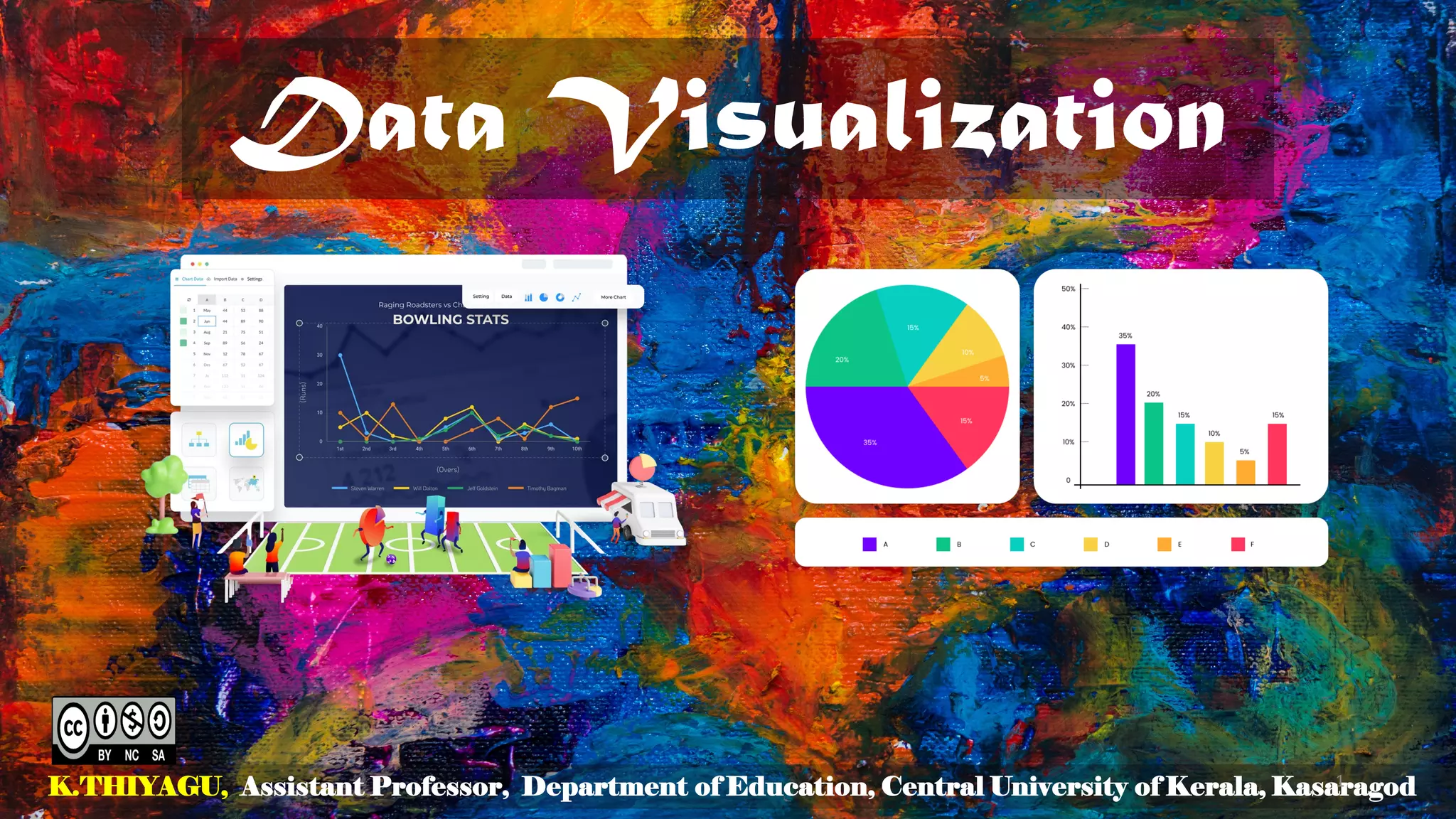
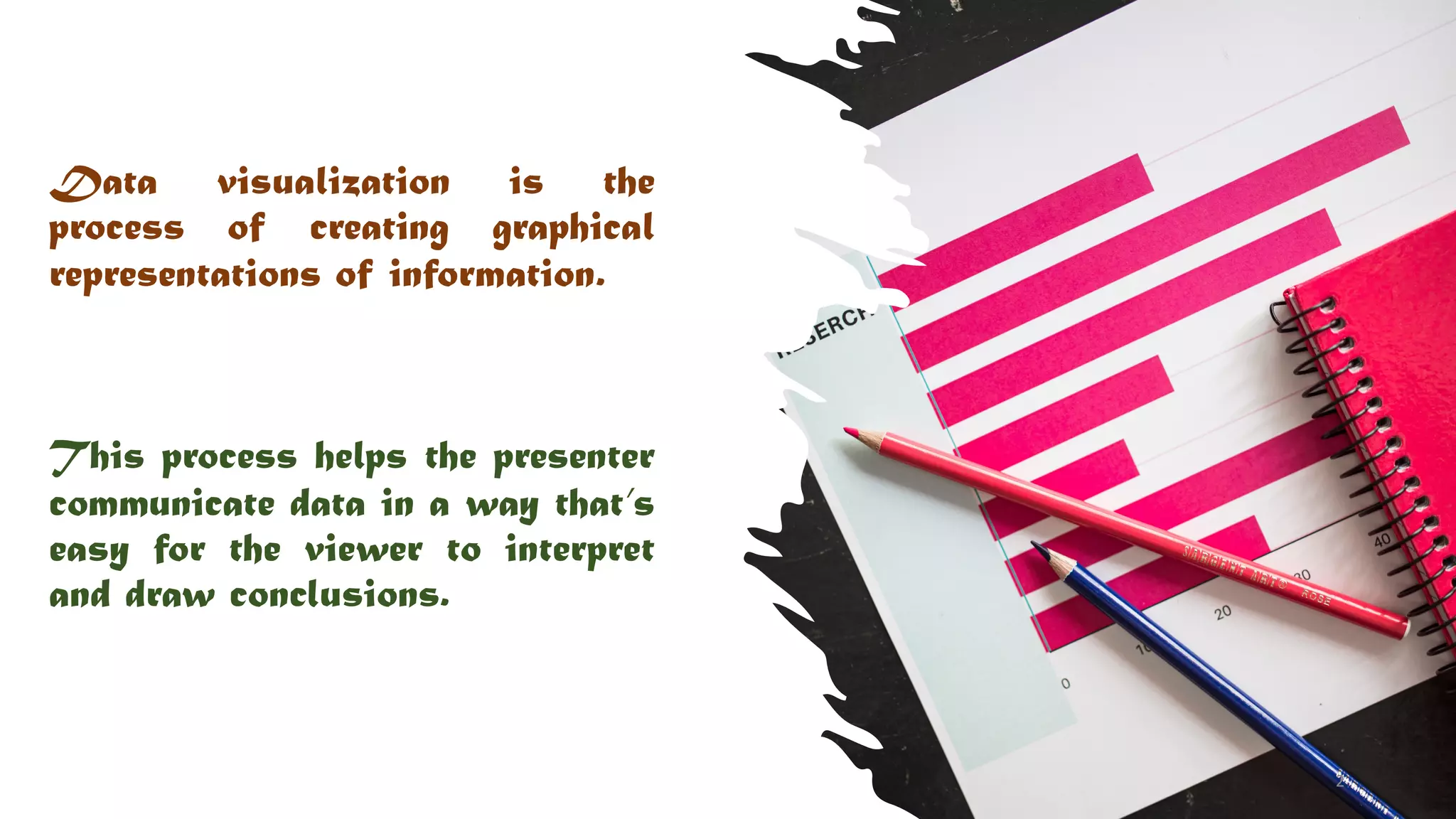
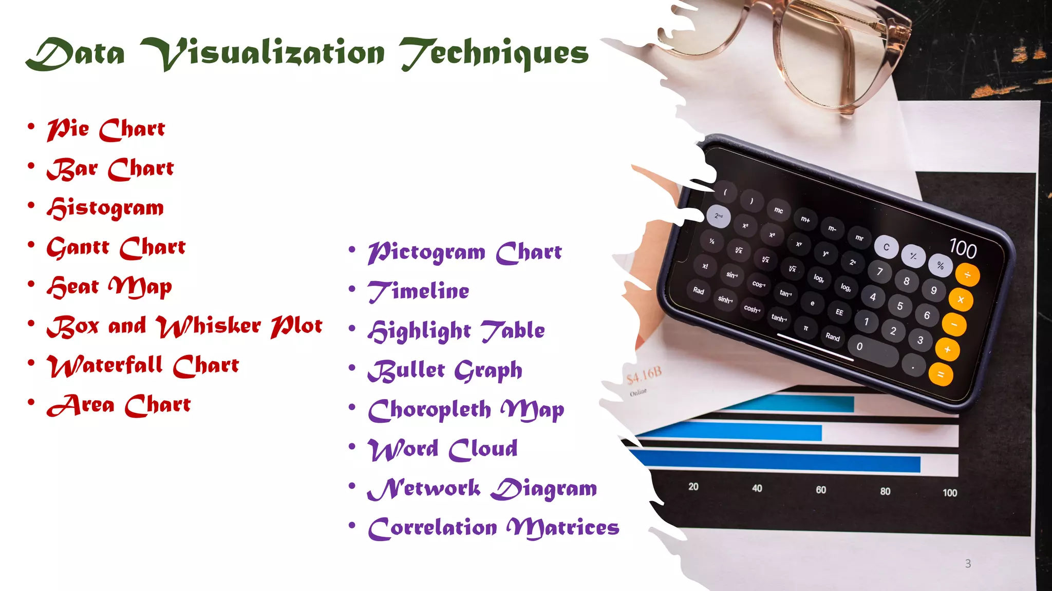
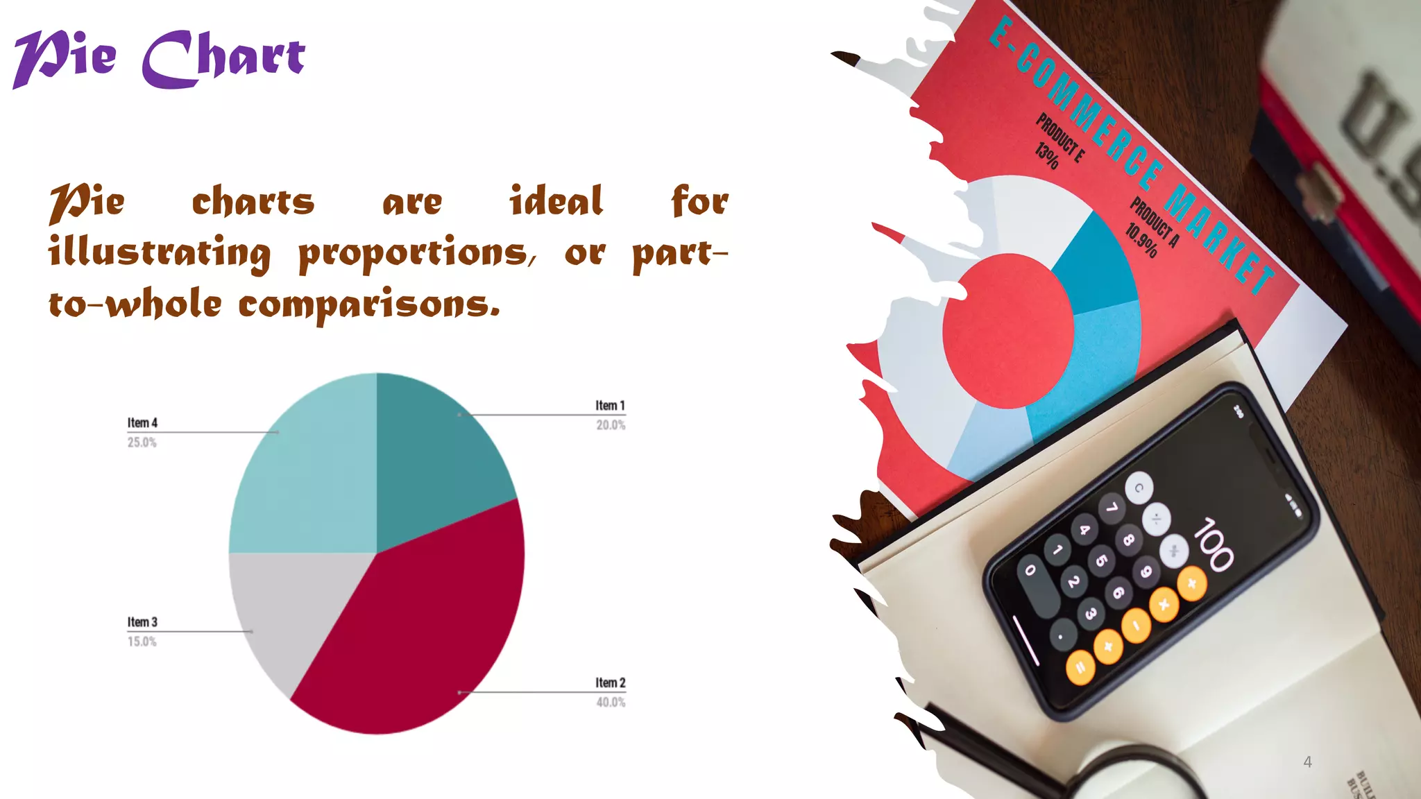
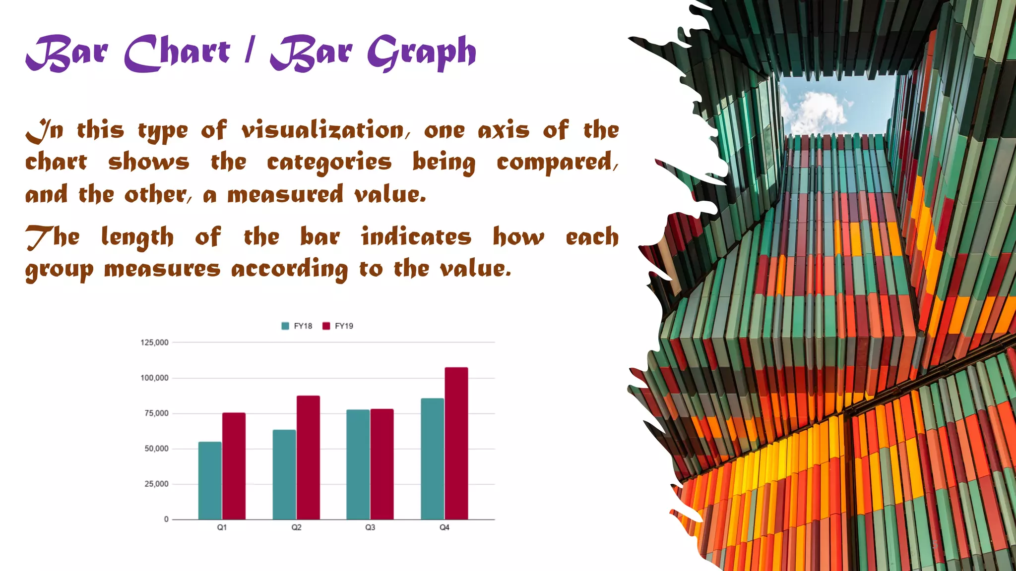
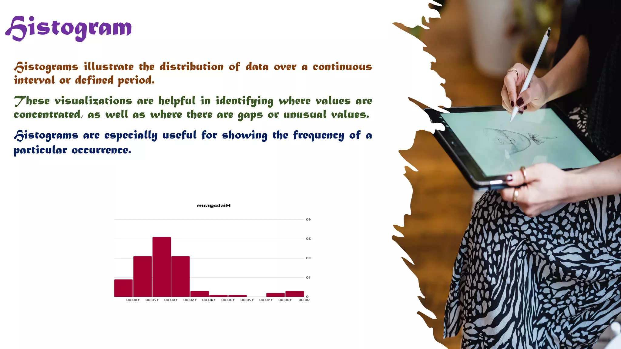


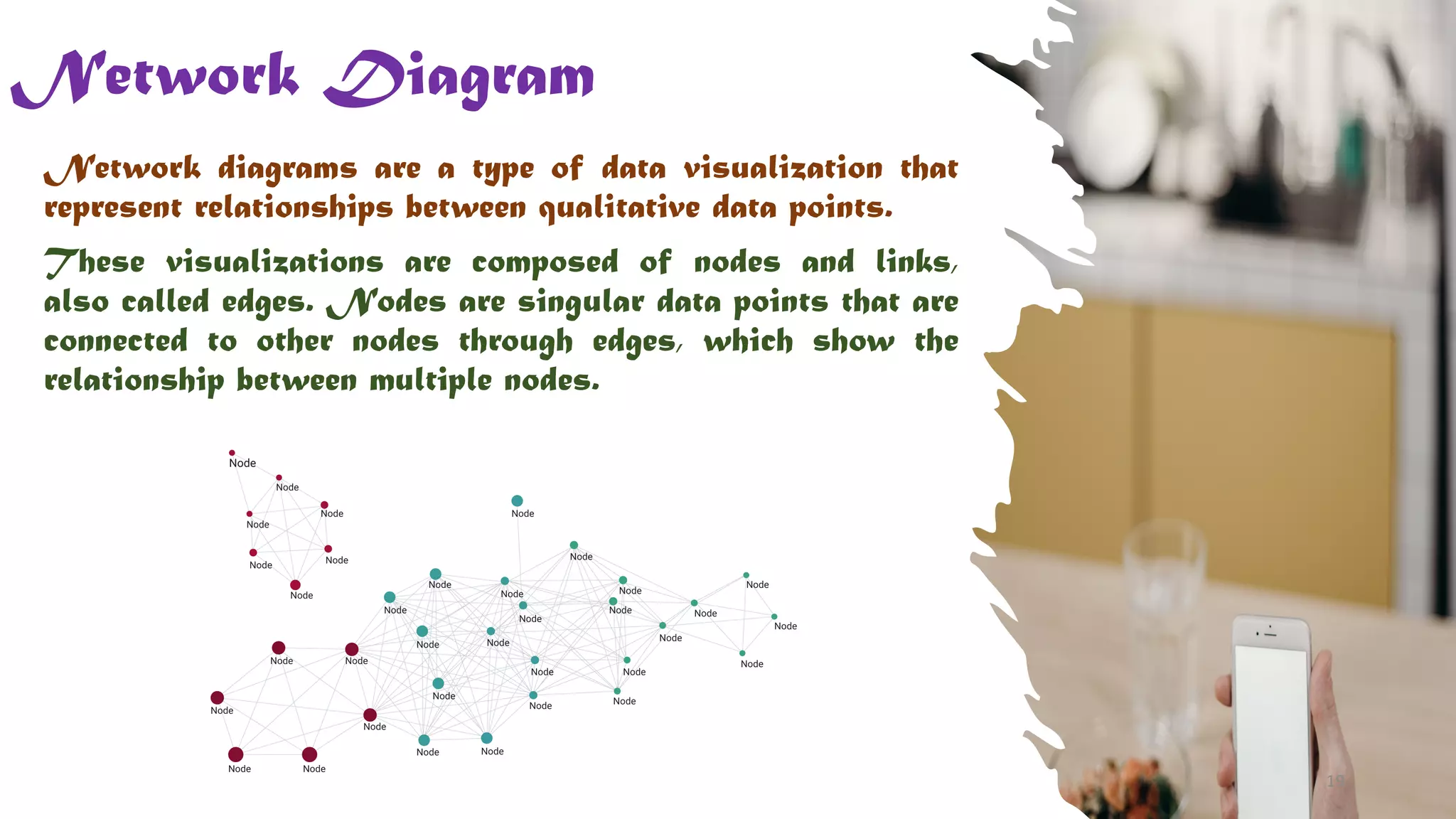
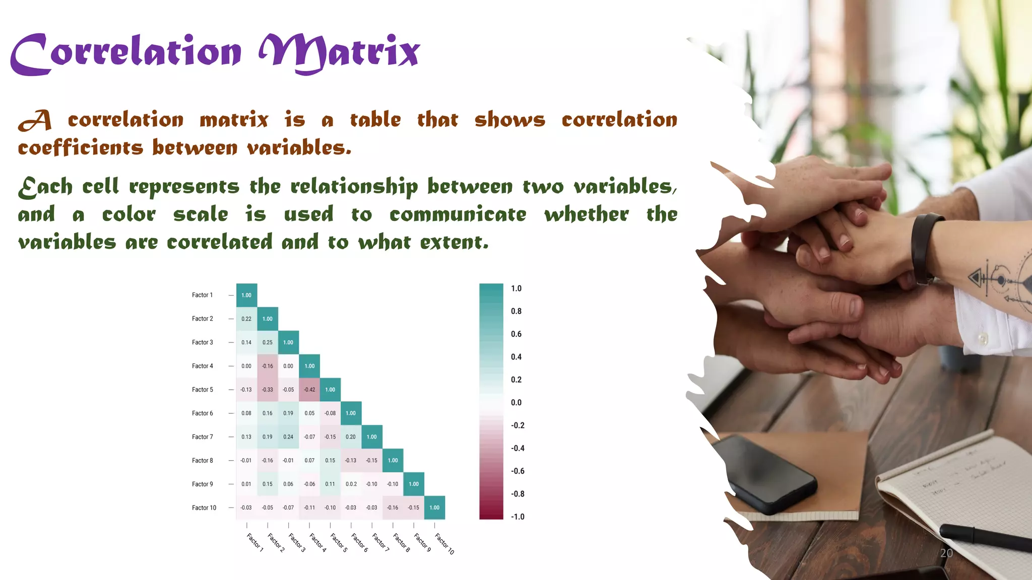


The document outlines various data visualization techniques, including pie charts, bar graphs, histograms, and heat maps, among others. Each technique is described in terms of its purpose and functionality, with specific examples of how they can be used to effectively represent data. It serves as a useful guide for educators and professionals looking to enhance their data presentation skills.