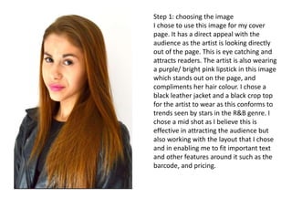
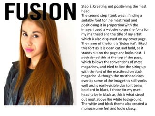
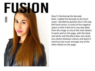
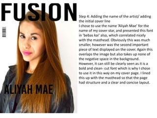
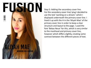
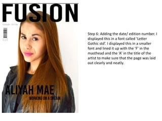
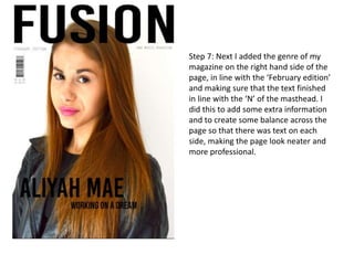
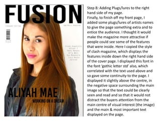
The document describes the 8 steps taken to create a magazine cover page. Step 1 involved choosing an eye-catching image of an artist looking directly at the viewer in purple lipstick. Step 2 created a bold masthead font positioned above the image. Step 3 added a barcode in the top left corner. Step 4 displayed the artist's name below the masthead. Step 5 added the secondary headline below the artist name. Steps 6 and 7 positioned additional text blocks. Finally, Step 8 added plugs for interior features down the right side. The cover page design uses a variety of fonts sized and positioned to create a neat and enticing layout representing the target audience.
Why +grouping is designed just for #teachers, #parents #educationGrouping
Teachers and Parents have six distinct needs while communicating in their group
1. create instant groups on mobile between teachers and parents to talk on subject
2. parents can dynamically join or unjoin the discussion group based on subjects
3. The massive need to maintain privacy of phone numbers while maintaining identity
4. Ability to work across mobile devices including tablets
5. Need to be able to talk even identities exist in different social networks
6. Need to avoid image and video based spams and forwards
Grouping addresses these challenges and helps create a community instantly.
thGAP - BAbyss in Moderno!! Transgenic Human Germline Alternatives ProjectMarc Dusseiller Dusjagr
thGAP - Transgenic Human Germline Alternatives Project, presents an evening of input lectures, discussions and a performative workshop on artistic interventions for future scenarios of human genetic and inheritable modifications.
To begin our lecturers, Marc Dusseiller aka "dusjagr" and Rodrigo Martin Iglesias, will give an overview of their transdisciplinary practices, including the history of hackteria, a global network for sharing knowledge to involve artists in hands-on and Do-It-With-Others (DIWO) working with the lifesciences, and reflections on future scenarios from the 8-bit computer games of the 80ies to current real-world endeavous of genetically modifiying the human species.
We will then follow up with discussions and hands-on experiments on working with embryos, ovums, gametes, genetic materials from code to slime, in a creative and playful workshop setup, where all paticipant can collaborate on artistic interventions into the germline of a post-human future.
The Legacy of Breton In A New Age by Master Terrance LindallBBaez1
Brave Destiny 2003 for the Future for Technocratic Surrealmageddon Destiny for Andre Breton Legacy in Agenda 21 Technocratic Great Reset for Prison Planet Earth Galactica! The Prophecy of the Surreal Blasphemous Desires from the Paradise Lost Governments!
The perfect Sundabet Slot mudah menang Promo new member Animated PDF for your conversation. Discover and Share the best GIFs on Tenor
Admin Ramah Cantik Aktif 24 Jam Nonstop siap melayani pemain member Sundabet login via apk sundabet rtp daftar slot gacor daftar
Explore the multifaceted world of Muntadher Saleh, an Iraqi polymath renowned for his expertise in visual art, writing, design, and pharmacy. This SlideShare delves into his innovative contributions across various disciplines, showcasing his unique ability to blend traditional themes with modern aesthetics. Learn about his impactful artworks, thought-provoking literary pieces, and his vision as a Neo-Pop artist dedicated to raising awareness about Iraq's cultural heritage. Discover why Muntadher Saleh is celebrated as "The Last Polymath" and how his multidisciplinary talents continue to inspire and influence.
2137ad - Characters that live in Merindol and are at the center of main storiesluforfor
Kurgan is a russian expatriate that is secretly in love with Sonia Contado. Henry is a british soldier that took refuge in Merindol Colony in 2137ad. He is the lover of Sonia Contado.
2137ad Merindol Colony Interiors where refugee try to build a seemengly norm...luforfor
This are the interiors of the Merindol Colony in 2137ad after the Climate Change Collapse and the Apocalipse Wars. Merindol is a small Colony in the Italian Alps where there are around 4000 humans. The Colony values mainly around meritocracy and selection by effort.
2. Step 1: choosing the image
I chose to use this image for my cover
page. It has a direct appeal with the
audience as the artist is looking directly
out of the page. This is eye catching and
attracts readers. The artist is also wearing
a purple/ bright pink lipstick in this image
which stands out on the page, and
compliments her hair colour. I chose a
black leather jacket and a black crop top
for the artist to wear as this conforms to
trends seen by stars in the R&B genre. I
chose a mid shot as I believe this is
effective in attracting the audience but
also working with the layout that I chose
and in enabling me to fit important text
and other features around it such as the
barcode, and pricing.
3. Step 2: Creating and positioning the mast
head.
The second step I took was in finding a
suitable font for the mast head and
positioning it in proportion with the
image. I used a website to get the fonts for
my masthead and the title of my artist
which is also displayed on my cover page.
The name of the font is ‘Bebas Kai’. I liked
this font as it is clean cut and bold, so it
stands out on the page and looks neat. I
posistioned this at the top of the page,
which follows the conventions of most
magazines, and tried to line the sizing up
with the font of the masthead on clash
magazine. Although the masthead does
overlap some of the image this still works
well and is easily visible due to it being
bold and in black. I chose for my mast
head to be in black as this is what stood
out most above the white background.
The white and black theme also created a
monochrome feel and looks classy.
4. Step 3: Positioning the barcode.
Next, I added the barcode to the front
cover. I decided to position this in the top
left hand corner, in some of the negative
space so that it did not in any way deter
from the image or any of the main details.
It works well on the page, with the black
and white and therefore does not create
any clashes between colours and doesn’t
stand out too much amongst any of the
other details on the page.
5. Step 4: Adding the name of the artist/ adding
the initial cover line
I chose to use the name ‘Aliyah Mae’ for the
name of my cover star, and presented this font
in ‘bebas kai’ also, which correlated nicely
with the masthead. Obviously this was much
smaller, however was the second important
piece of text displayed on the cover. Again this
overlaps the image but also takes up none of
the negative space in the background.
However, it can still be clearly seen as it is a
bold and clean- cut font which is why I chose
to use it in this way on my cover page. I lined
this up with the masthead so that the page
had structure and a clear and concise layout.
6. Step 5: Adding the secondary cover line.
For the secondary cover line/ plug I decided to
use the text ‘working on a dream.’ which I
displayed underneath the primary cover line. I
lined it up with the H in the ‘Aliyah Mae’ of the
primary cover line in order to keep a clear
structure and layout to the page. I used the
font ‘Bebas Neue’ for this, which is very similar
to the masthead and primary cover line,
however which differs slightly, creating some
contrast between the different pieces of text.
7. Step 6: Adding the date/ edition number. I
displayed this in a font called ‘Letter
Gothic std’. I displayed this in a smaller
font and lined it up with the ‘F’ in the
masthead and the ‘A’ in the title of the
artist to make sure that the page was laid
out clearly and neatly.
8. Step 7: Next I added the genre of my
magazine on the right hand side of the
page, in line with the ‘February edition’
and making sure that the text finished
in line with the ‘N’ of the masthead. I
did this to add some extra information
and to create some balance across the
page so that there was text on each
side, making the page look neater and
more professional.
9. Step 8: Adding Plugs/lures to the right
hand side of my page.
Finally, to finish off my front page, I
added some plugs/lures of artists names
to give the page something extra and to
entice the audience. I thought it would
make the magazine more attractive if
people could see some of the features
that were inside. Here I copied the style
of clash magazine, which displays the
features inside down the right hand side
of the cover page. I displayed this font in
the font ‘gothic letter std’ also, which
correlated with the text used above and
so gave some continuity to the page. I
displayed it slightly above the centre, in
the negative space surrounding the main
image so that the text could be clearly
seen and read and so that it would not
distract the buyers attention from the
main centre of visual interest (the image)
and the main & most important text
displayed on the page.
10. Overall I was happy with the design of my front cover. I think that it has a good image, which
stands out and represents my audience and the social groups that my magazine is aimed at well.
It uses a good range of fonts and sizes and I believe that the colour palette gives it a classy and
neat look. I think that there are several improvements from my draft front cover which make the
final draft of a much better quality.