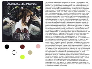
I find it interesting that
everything is aligned centrally.
The image, and lyrics are all
aligned very similarly, with the
legal information central too.
When analysing the lexis used
on the digipak we can see that
a long of the song titles
incorporate elements of
language that are inclusive in
the field of nature. Examples
of this can be seen by the use
of words such as ‘dog, rabbit,
hurricane’ and ‘bird’ which are
all included in the song titles.
The text is kept relatively small
but still of an appropriate size
so that they are clear and
easily visible to the audience.
The text also seems very
conventional of the style and is
nothing too bold or brash.
The colour scheme of this back
cover is kept in black and white,
simple but effective. The white
clearly stands out above the
background, which makes the
image and the lyrics easy to see,
which are the main bits the artist
wants you to see. The black and
white design creates a sort of
vintage and retro design,
something conventional of the
Indie genre. It also ensures that
the cover is kept minimalist, which
ensures that attention is not
focussed on the superficial
elements of the album but
focusses on the music.
The text that includes the legal information is kept very small on the page ensuring that it doesn’t not
distract the audiences attention however making sure that the vital information is still provided.
The image on the
back cover is very
quirky. Again it
incorporates an
element of nature
with there picture
being of a human
heart. It then very
interestingly labels
structures of the
heart and links
these to songs.
Again, the heart is
drawn in white to
ensure that it
stands out over the
black background..
Interestingly, the
barcode on this
panel so quite
large. It is normally
kept much smaller
so that it is easily
visible but does
not distract
attention from the
rest of the panel.
They may have
chosen to make
this slightly larger
as it fits in with the
black and white
colour schemes.
This is the front of a digipak by Florence and the Machine, a British Indie rock band.
Firstly, we can see many elements of nature incorporated into the digipack cover. For
example, in the background we can see a pattern of what appears to be leaves and
flowers, with birds resting on the branches. This is something conventional of the
Indie genre, as more often than not it is somehow linked to the natural environment.
However instead of making this background to the image bright and colourful they
have used quite dark colours, such as dark greens and yellows which seem to in a way
blend into the black background. This means that the centre of visual interest is kept
focussed on Florence and not distracted by from bright colours in the background
which submerge the image. Furthermore, the image strongly links to the album title
‘lungs’. As we can see on the picture it appears that there is a pair of lungs resting on
Florence's chest above the skin. This also creates a link between the music and the
natural world, as lungs are partly responsible for the air we breath. This element of
the photograph also means the image is very eye catching as it is very unusual. The
artists makeup is kept very subtle in this image, with a pale skin tone, and natural
makeup complimenting the background. Fine attention to detail is paid, for example
Florence’s nails match the colour of the lungs and some of the background, showing
that the image has been very carefully constructed. The artists pose, is very serious
and sultry. Interestingly, she is not addressing the audience by creating direct eye
contact with the camera, but instead shot looking away and down to the ground. This
might suggest that she is very thoughtful, which could represent the lyrics and music
in the album. This feeling of wonder and thought that she creates, entices the
audience and encourages us to want to know more about the album. Another
interesting feature of this panel is the way two different fonts are used for the album
title and the artist. On the majority of covers I have seen they are used in the same
font to create consistency and a feeling of professionalism. The artists name is
written in quite a subtle font, something which seems to represent the artist as quite
delicate and bubbly, however the album title is presented in more of a bold font, one
that creates a stern connotation. This may suggest that more emphasis is intended to
be put on the title of the album and the connotations the audience may get from this.
The image on the front very clearly shows and represents the artist and therefore the
designer of this digipak may have thought that less emphasis needed to be placed on
the artists name as this may have totally overpowered the title of the album
especially with the combination of the striking image. I think this works quite
effectively as we can see a clear divide between the two labels. It prevents confusion
from which text is telling you what. I also like the border around the image which is
created using a very thin white line which ceases at the Artist title. I think it prevents
the image from becoming too overpowering, by keeping a small area of black
negative space around the edges. It also allows the artist title to stand out more by
separating an area of black space for the image to be presented instead of over the
image, where it may not have gained much attention and where it may have blended
in and become submerged into the image.

Analysis furthrr

  • 1.
    I find itinteresting that everything is aligned centrally. The image, and lyrics are all aligned very similarly, with the legal information central too. When analysing the lexis used on the digipak we can see that a long of the song titles incorporate elements of language that are inclusive in the field of nature. Examples of this can be seen by the use of words such as ‘dog, rabbit, hurricane’ and ‘bird’ which are all included in the song titles. The text is kept relatively small but still of an appropriate size so that they are clear and easily visible to the audience. The text also seems very conventional of the style and is nothing too bold or brash. The colour scheme of this back cover is kept in black and white, simple but effective. The white clearly stands out above the background, which makes the image and the lyrics easy to see, which are the main bits the artist wants you to see. The black and white design creates a sort of vintage and retro design, something conventional of the Indie genre. It also ensures that the cover is kept minimalist, which ensures that attention is not focussed on the superficial elements of the album but focusses on the music. The text that includes the legal information is kept very small on the page ensuring that it doesn’t not distract the audiences attention however making sure that the vital information is still provided. The image on the back cover is very quirky. Again it incorporates an element of nature with there picture being of a human heart. It then very interestingly labels structures of the heart and links these to songs. Again, the heart is drawn in white to ensure that it stands out over the black background.. Interestingly, the barcode on this panel so quite large. It is normally kept much smaller so that it is easily visible but does not distract attention from the rest of the panel. They may have chosen to make this slightly larger as it fits in with the black and white colour schemes.
  • 2.
    This is thefront of a digipak by Florence and the Machine, a British Indie rock band. Firstly, we can see many elements of nature incorporated into the digipack cover. For example, in the background we can see a pattern of what appears to be leaves and flowers, with birds resting on the branches. This is something conventional of the Indie genre, as more often than not it is somehow linked to the natural environment. However instead of making this background to the image bright and colourful they have used quite dark colours, such as dark greens and yellows which seem to in a way blend into the black background. This means that the centre of visual interest is kept focussed on Florence and not distracted by from bright colours in the background which submerge the image. Furthermore, the image strongly links to the album title ‘lungs’. As we can see on the picture it appears that there is a pair of lungs resting on Florence's chest above the skin. This also creates a link between the music and the natural world, as lungs are partly responsible for the air we breath. This element of the photograph also means the image is very eye catching as it is very unusual. The artists makeup is kept very subtle in this image, with a pale skin tone, and natural makeup complimenting the background. Fine attention to detail is paid, for example Florence’s nails match the colour of the lungs and some of the background, showing that the image has been very carefully constructed. The artists pose, is very serious and sultry. Interestingly, she is not addressing the audience by creating direct eye contact with the camera, but instead shot looking away and down to the ground. This might suggest that she is very thoughtful, which could represent the lyrics and music in the album. This feeling of wonder and thought that she creates, entices the audience and encourages us to want to know more about the album. Another interesting feature of this panel is the way two different fonts are used for the album title and the artist. On the majority of covers I have seen they are used in the same font to create consistency and a feeling of professionalism. The artists name is written in quite a subtle font, something which seems to represent the artist as quite delicate and bubbly, however the album title is presented in more of a bold font, one that creates a stern connotation. This may suggest that more emphasis is intended to be put on the title of the album and the connotations the audience may get from this. The image on the front very clearly shows and represents the artist and therefore the designer of this digipak may have thought that less emphasis needed to be placed on the artists name as this may have totally overpowered the title of the album especially with the combination of the striking image. I think this works quite effectively as we can see a clear divide between the two labels. It prevents confusion from which text is telling you what. I also like the border around the image which is created using a very thin white line which ceases at the Artist title. I think it prevents the image from becoming too overpowering, by keeping a small area of black negative space around the edges. It also allows the artist title to stand out more by separating an area of black space for the image to be presented instead of over the image, where it may not have gained much attention and where it may have blended in and become submerged into the image.