
Recommended
More Related Content
What's hot
What's hot (18)
Viewers also liked
Viewers also liked (15)
Similar to Double page spread_analysis (1)
Similar to Double page spread_analysis (1) (20)
More from laurenamyharriman
Double page spread_analysis (1)
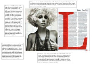
- 1. The image on the left hand page and the large red ‘L’ sign on this page are the two main centres of visual interest on this page. The image used is edited in black and white, which matches the small print font and white background on the recto page. Lady gaga is pulling a very sultry pose in this photo, and using a necklace and her hands to cover up her body. This is stereotypical of the male gaze, for example from the way her lips are slightly parted and she is wearing minimal clothing. This may be done to lure the reader in and draw attention to the image. The image is placed central of the page and is taken from a low angle, so that it looks like Lady Gaga is looking down on us looking at the image. There is quite a lot of negative space in the background of this photo which creates a minimalistic design but which also allows our full attention to be drawn to the image (CVI). The double page spread has no main title. The only information presented is the A4 picture of lady Gaga on the left hand page and her name which is displayed in the right hand top corner of the recto page. This is effective as it creates some intrigue for the readers. It does not give away any information unless the reader reads on. However the large picture suggests that there may be some sexual content in the writing which may entice readers without having to use a title. Again, this adds to the minimalistic design of the page. The large ‘L’ covers a large proportion of the right hand page of the double page spread. The colour compliments the image in the fact that it could represent the idea of danger and women’s sexuality. It also matches with the general colour scheme of ‘Q’ magazine and is a way of reinforcing the brand of the magazine through each of the pages. Without this on the page, it would be quite dull and boring to look at but the use of a vibrant read catches the readers eye and draws them into the text which is displayed over the ‘L’. A drop cap is also used within the main body of the text. The alleys between the columns of writing are quite narrow and therefore it helps to arrange the text and allows the reader to follow the text more clearly. It is also another feature used to help to draw the readers eye to the page, it stands out in what is otherwise quite a lot of small and clustered writing on the page.
- 2. This double page spread is slightly different to the other two I have looked at. Whereas the others have had one main image located on the left hand page, this has the main image on the right hand page, along with several other images in the top half, spread across both pages and across the gutter of the two pages. The centre of visual interest would be mainly the image on the right hand page as this image is in colour, for example the dress Solange is wearing is a vibrant red. Whereas the images that are distributed across the two pages and gutter have been edited to a black and white effect, which matches with the text and negative space in white which surrounds the images. The text is also distributed across the two pages. There is also a block quote which is displayed in a bold black font, which differs from the small print font. This stands out to the reader and immediately draws in our attention. It also gives the reader a flavour of what the rest of the article may be about. There are lines which separate the images at the top from the text at the bottom are also interesting. They create contrast on the page and make the page more interesting for the reader to look at. They also compliment the pictures at the top which are in black and white and the negative white space in the background of these photos.
- 3. This double page spread fits the conventions of vibe magazine by presenting the image on the left hand page of the double page spread. The colours used in the image are reciprocated in the text on the right hand page. The image also fits the conventions of the magazine, as it does not make up the whole background of the left hand page, but has a coloured background behind the main image, like on the cover page for Vibe that I analysed. The colours that Bruno Mars is wearing means that he almost becomes part of the background. It also draws our main focus of attention to his face, where the green background fades into a lighter colour. This page has a minimalistic design, the right hand page is kept very simple, the text has a formal layout which is arranged into columns, and the colours used match those in the image on the left hand page. There is no additional images on the page or anything that immediately catches our attention, but instead the layout is kept simple and is easy to follow. The main headline of the double page spread is presented in a different font to the rest of the text on the page. It also seen in colours which match those used in the image and background of the image on the left hand page of the double page spread. This adds to the minimalistic design of the magazine, there is no colour clashes which make the page look really brash or bold. The alleys between the columns of writing are kept quite short so that space for possible text is not wasted; however they are still kept large enough so that different sections of the writing can be distinguished between.