The document discusses different color palettes that could be used for the cover of an R&B music magazine. It analyzes color schemes used successfully by other magazines, focusing on ones incorporating black, white, and a bold accent color. Specifically, it examines palettes using blue, red, orange, and pink as the bold colors. These accent colors are said to add edginess or daring qualities that match the urban and boundary-pushing nature of the R&B genre. Examples of magazines employing similar palettes, such as Vibe and NME, are provided.
This is the first section of my evaluation, I have chosen to use slideshare as it presents information in a creative and clear way and is in a useful presentation format.
This is the first section of my evaluation, I have chosen to use slideshare as it presents information in a creative and clear way and is in a useful presentation format.
I have analysed the magazine adverts of my favorite artists which are: Meek Mill (Dreams and Nightmares), Jay-Z (Blueprint 3) and Rihanna (Russian Roulette & Hard). I have gone deeply in explaining why the artists used such thing in their magazine adverts and backed it up with examples. The quality of my writing clearly shows that I have a greater understanding of both of the adverts.
2137ad Merindol Colony Interiors where refugee try to build a seemengly norm...luforfor
This are the interiors of the Merindol Colony in 2137ad after the Climate Change Collapse and the Apocalipse Wars. Merindol is a small Colony in the Italian Alps where there are around 4000 humans. The Colony values mainly around meritocracy and selection by effort.
2137ad - Characters that live in Merindol and are at the center of main storiesluforfor
Kurgan is a russian expatriate that is secretly in love with Sonia Contado. Henry is a british soldier that took refuge in Merindol Colony in 2137ad. He is the lover of Sonia Contado.
Explore the multifaceted world of Muntadher Saleh, an Iraqi polymath renowned for his expertise in visual art, writing, design, and pharmacy. This SlideShare delves into his innovative contributions across various disciplines, showcasing his unique ability to blend traditional themes with modern aesthetics. Learn about his impactful artworks, thought-provoking literary pieces, and his vision as a Neo-Pop artist dedicated to raising awareness about Iraq's cultural heritage. Discover why Muntadher Saleh is celebrated as "The Last Polymath" and how his multidisciplinary talents continue to inspire and influence.
Hadj Ounis's most notable work is his sculpture titled "Metamorphosis." This piece showcases Ounis's mastery of form and texture, as he seamlessly combines metal and wood to create a dynamic and visually striking composition. The juxtaposition of the two materials creates a sense of tension and harmony, inviting viewers to contemplate the relationship between nature and industry.
Fed by curiosity and beauty - Remembering Myrsine Zorba
Colour palettes (1)
1. Colour Palettes
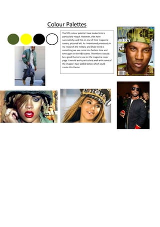
The fifth colour palette I have looked into is
particularly risqué. However, vibe have
successfully used this on one of their magazine
covers, pictured left. As I mentioned previously in
my research the military and khaki trend is
something we see come into fashion time and
time again in the R&B scene. Therefore it would
be a good theme to use on the magazine cover
page. It would work particularly well with some of
the images I have added below which could
create this theme.
2. This is one of my favourite colour pallets after
looking at several magazines for inspiration. One
of my favourite covers is a Vibe edition with
Rihanna featuring on the front. I think that this
would be effective on my cover page as the
colours when used in the right way and with the
right image are quite urban and seem to match
the R&B genre. Especially with the black and
white after doing some research into R&B style
and fashion. For example, white and black leather
shirts, white sheer lace dresses, black snapbacks
and slick white and black suits are the current
trend on the R&B scene. The blue also adds a bit
of edginess which fits in with R&B style.
The second colour palette I have chosen to
look at uses red, white and black. An
example of a magazine which has
successfully used this colour palette is
NME, who frequently sport this on their
cover and contents pages, as well as
throughout their double page spreads. I
like the way that the red adds something
bold to the page, however you can still
create a minimalistic design with the black
and white. The research I have done into
my genre of music magazine has shown
me that the R&B genre is daring and
pushes the boundaries. Therefore using
red could be a way of representing this,
for example by showing some danger and
mystery and perhaps showing the sexual
and risqué side of the R&B genre.
The third colour palette I have looked at uses
black, white and orange. This is quite similar to the
last palette I looked at in the sense that the orange
creates the contrast and boldness on the page,
compared to the black and white which help to
keep a minimalistic look by avoiding colour clashes
or anything too brash. Vibe has also used this
colour palette for one of their cover pages which
features Nicki Minaj on the front. Again, this
colour palette has an urban feel and the orange
creates the daring and bold features that can relate
to the R&B genre.
The fourth colour pallet I have chosen to
look at includes black , white and pink. The
pink will create contrast on the page and
will work well with the conventional black
and white colours.