Logo
Experimentation
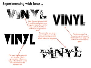
Experimenting with fonts...


                                      I like this font because I think
                                      it would be well suited to my
                                      magazine. It also has a kind of
                                         ‘pop art’ feel which fits in
                                        with the music genre even
                                                    more.
                                                        This is another one of my
                                                       favourites because it really       This font is one of my
                                                      represents the whole music       favourites mainly because I
                                                      theme behind my magazine.       think that it fits in really well
                                                                                       with the music and fashion
                                                                                                  genre.


   This is yet another example
       of a font that I like. It
    represents the indie theme
   really well and I think it suits
      the actual name of the
           masthead too.
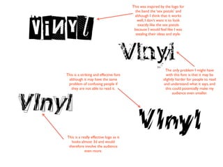
This was inspired by the logo for
                                         the band the ‘sex pistols’ and
                                         although I think that it works
                                           well, I don’t want it to look
                                           exactly like the sex pistols
                                         because I would feel like I was
                                          stealing their ideas and style.


                                                             The only problem I might have
This is a striking and effective font                        with this font is that it may be
 although it may have the same                             slightly harder for people to read
 problem of confusing people if                            and understand what it says, and
   they are not able to read it.                             this could potentially make my
                                                                  audience even smaller.


This is a really effective logo as it
   looks almost 3d and would
 therefore involve the audience
            even more.
My final decision was between
    two of my fonts. My original
 favourite was the one at the top
of the page because it really has a
strong music vibe but I didn’t feel
     that it catered for both my
musical and fashion aspect of my
     magazine. For this reason, I
 decided to select the one at the
   bottom of the page because I
  appeals to both aspects of the
      genre that I’m aiming for.
Changing the Colour...
                            Vinyl
   Vinyl
                         Vinyl
                               After looking into many different
                             colour palettes and different tones of
                              individual tones I have decided that
                             having a white font on top of a black


           Vinyl
                              background because it’s so striking
                                   and makes an impression.


                           Vinyl
 Vinyl
Experimenting with backgrounds...


                     Vinyl
                                         This is my final decision on which
                                         background that I want. I love the
                                          scrapbook style that it displays.


                                       Vinyl
                 Vinyl
  I did really like this as another
 background although I felt that
 the effect of the font compared
with the effect of the background
    call result in it looking too
                                      Vinyl
  commercial and over the top.
The final logo
that will appear
on my magazine!


Vinyl
  I think that the decision to go with the font was
really effective because as I mentioned before, it ties
    in both my chosen subjects of a music/fashion
genre. Originally I wasn’t planning on incorporating a
      background although when I saw how the
  scrapbook effect worked alongside the edgy and
 modern feel of the font, I thought that it composed
                   an intriguing logo.

Logo experimentation

  • 1.
  • 2.
    Experimenting with fonts... I like this font because I think it would be well suited to my magazine. It also has a kind of ‘pop art’ feel which fits in with the music genre even more. This is another one of my favourites because it really This font is one of my represents the whole music favourites mainly because I theme behind my magazine. think that it fits in really well with the music and fashion genre. This is yet another example of a font that I like. It represents the indie theme really well and I think it suits the actual name of the masthead too.
  • 3.
    This was inspiredby the logo for the band the ‘sex pistols’ and although I think that it works well, I don’t want it to look exactly like the sex pistols because I would feel like I was stealing their ideas and style. The only problem I might have This is a striking and effective font with this font is that it may be although it may have the same slightly harder for people to read problem of confusing people if and understand what it says, and they are not able to read it. this could potentially make my audience even smaller. This is a really effective logo as it looks almost 3d and would therefore involve the audience even more.
  • 4.
    My final decisionwas between two of my fonts. My original favourite was the one at the top of the page because it really has a strong music vibe but I didn’t feel that it catered for both my musical and fashion aspect of my magazine. For this reason, I decided to select the one at the bottom of the page because I appeals to both aspects of the genre that I’m aiming for.
  • 5.
    Changing the Colour... Vinyl Vinyl Vinyl After looking into many different colour palettes and different tones of individual tones I have decided that having a white font on top of a black Vinyl background because it’s so striking and makes an impression. Vinyl Vinyl
  • 6.
    Experimenting with backgrounds... Vinyl This is my final decision on which background that I want. I love the scrapbook style that it displays. Vinyl Vinyl I did really like this as another background although I felt that the effect of the font compared with the effect of the background call result in it looking too Vinyl commercial and over the top.
  • 7.
    The final logo thatwill appear on my magazine! Vinyl I think that the decision to go with the font was really effective because as I mentioned before, it ties in both my chosen subjects of a music/fashion genre. Originally I wasn’t planning on incorporating a background although when I saw how the scrapbook effect worked alongside the edgy and modern feel of the font, I thought that it composed an intriguing logo.