SlideShare a Scribd company logo
The mast head on this page compromises of just one
letter. This is shown in the top left hand side of the page.
It is very clear that this is the masthead of the cover page
as the letter is sectioned off with its own red background.
This makes is stand out in front of the image behind. The
white and red colours are very striking. Also the use of
the larger font size for the letter ‘Q’ makes it stand out
amongst the rest of the text.
The barcode on this cover page is displayed in the bottom
right hand corner of the page; here it does not distract the
readers from the main image and text on the page. Other
techniques are also used on this cover page to ensure that
the barcode does not spoil the general and overall design of
the page. For example, there is a white, circular text box in
the bottom left hand corner, which contains some small
black writing. This helps the barcode to blend in as a part of
the page, which is also helped by the several pieces of white
text on the page.
The colour scheme for this cover page uses a selection of
colours, but nothing which is too brash or extravagant. For
example the page uses a variety of black and whites, which
create contrast on the page. For example, blacks are used in
the image, such as hair, and eye makeup. As well as in some
of the clothing that Amy is wearing and in the font. White is
used in some of the text, such as in the mast head. Amy’s
skin tone is also quite pale, which compliments the whites
used. There are also the use of some more bold colours, such
as red and orange, which can be seen as text, as text boxes,
and in the background image (such as in the red love heart
tattoos). The combined use of all of these colours makes sure
that the text can be seen and that the image and cover in
general are eye catching and noticeable.
The image in this page makes up
the background of the cover
page, however the majority of
the image (Amy Winehouse) can
be seen on the right hand side of
the page. This keeps the
masthead and some of the other
important text separate and
stops it from blending into the
image. The pale skin tone of Amy
Winehouse in this picture makes
the picture striking. It
compliments with the white font
used (lighter tones), and makes
the red stand out more. She is
also looking directly at the reader
in the photograph. This makes
the aim of the magazine more
effective, as we see in the text
above that the magazine will be
covering a tribute towards Amy
after her death. Therefore the
way she is looking directly out of
the page towards the reader
creates more direct appeal and
makes the image more capturing
and heart-felt for the reader. This
is a picture boost which is
promoting a feature later in the
magazine.
The red love heart tattoos on the side of Amy’s arm match the
red colours used on the cover page, for example in the
background of the mast head and for several other pieces of
text.
There are also several small boxes with texts in on this cover page. These separate the pieces of text. For example there is
one in the top right hand corner of the page, which is white with red text. Furthermore, there is also an orange text box at
the bottom. This gives a clearer layout and structure to the page and groups information, which makes it clearer for the
reader to understand. It also adds to the design features of the page, in the respect that it adds more colour and variety,
which will make it more interesting for the reader to look at.
The image used on this cover page makes up
the whole background of the page. The image
is very striking and quite sultry, the facial
expression that she is pulling and the way she
has positioned her hands and the jewellery it
looks like she is holding fits that of the male
gaze. She almost appears to be quite
dangerous, like she is trying to lure someone
in, possibly the readers in this case. This is
possibly why the image is used, to try and
attract and lure in the readers. The colour
tones used in the photo are all very
complimentary of each other. For example,
golden colours and browns make up the
majority of the image. For example the colour
of her hair, the colour of her eyes, the
necklace she is holding and even her skin tone.
Her nails are also painted red, which adds to
the sultry appearance of the image. This use of
colour also matches the red used in the mast
head and the colour used on her lips and eyes,
which is red and red/ browns. The use of
colours in this image is very clever, it is very
striking and stands out, but does not use bold
colours to do this; instead the different tones
are used to make the image noticeable. This is
a picture boost which is promoting a feature
inside the magazine.
The barcode on this page is presented in the
left bottom hand corner of the page. This is
done so that it does not detract the reader’s
attention from the main image and mast-head
(and other text) on the page. It does not ruin
the design of the page, as It actually
compliments the white fonts which have been
used.
The mast head is bold and has a white outline.
Some of the letters are filled with different colours
to add some contrast and to make the title stand
out more over the background. All of the text on
this cover page is in white, therefore the use of
colours in the mast head may be used to create a
difference between the mast head and the rest of
the text, so that there is no confusion between the
purposes of the text on the cover.
Different types of font are used on
this cover page. For example the font
at the bottoms which says ‘Live at
Roseland, Elements of 4’ is very
different to the text on the middle left
hand side. This may be done to
separate the different pieces of text
on this page and also to create some
contrast on the page. This may be
done instead of using different colours
on the page and to create some
variety, which will make the piece
more attractive to readers.
The masthead is very bold, white and
takes up almost a quarter of the length of
the page which makes it stand out. The
name of the magazine is kept short, so the
graphology can be made eye catching and
exciting. The text which is more important
is in black, this colour immediately stands
out on the blue background. The less
important information is presented in a
navy blue colour, this blends more into the
blue background which makes it clear to
us looking at the magazine that the black
is the more interesting and important
information. v
The image used is very striking, as it is a close
up which includes only a shot of the shoulders
and head. It has been presented in a black and
white effect, this matches the colour scheme
used on the masthead and other writing on
the page which is in black and white. The
image is displayed in the middle of the page
which makes it stand out and catch the
reader’s eye. Furthermore, Rihanna is looking
straight ahead, which creates a direct appeal
towards the person looking at the cover page.
The use of makeup in the image is also
interesting. For example the use of eye
makeup which contrasts with the white text,
but compliments the black text on the page.
Also the use of jewellery and colours make the
image stand out more, for example the use of
the silver/ white earrings which matches the
white text on the page and creates a contrast
with the rest of the image. This is a picture
boost which is promoting a feature later in the
magazine. The image is the centre of visual
interest on this page alongside the masthead.
Often in vibe magazine we see a lot of negative space. For example they often use a coloured
background instead of using the image to make up the background. We can see quite a lot of
negative space in the blue background on this cover page.
The barcode on this cover page is put
in the bottom corner of this page, so
that it doesn’t detract the reader’s
attention from the rest of the page. It
does not interrupt the basic layout of
this cover page as it actually
compliments the black and white text
used.
Colour Palette:
The main colours used in this cover
page are blue, black and white. The
colours used in this magazine cover
make the image stand out, due to
the simple, lone colour
background. The blacks used match
with the colour of Rihanna’s hair
and the whites compliment the
silver earrings that she is wearing.
The choice of presenting the image
in black and white also matches the
black and whites used in the text.
The eye makeup (darker shades on
the bottom of the eyes) used in the
photo also compliments the black
used in the text, with the white
shades used on the top of the eye
complementing the masthead
above.

More Related Content

What's hot

Music magazine Analysis
Music magazine Analysis Music magazine Analysis
Music magazine Analysis
izzyrowland
 
Tasks 1 4 and hwk 2
Tasks 1 4 and hwk 2Tasks 1 4 and hwk 2
Tasks 1 4 and hwk 2
charlie__97
 
Contents page analysis
Contents page analysisContents page analysis
Contents page analysis
laurenamyharriman
 
Analysis of professional contents pages
Analysis of professional contents pages Analysis of professional contents pages
Analysis of professional contents pages
katepownall
 
Research into codes and conventions
Research into codes and conventionsResearch into codes and conventions
Research into codes and conventions
Katherynclare
 
Magazine front cover analysis
Magazine front cover analysisMagazine front cover analysis
Magazine front cover analysis
megan_brockwell
 
Task 8 tabloid
Task 8  tabloidTask 8  tabloid
Task 8 tabloidchamahan
 
Font analysis
Font analysisFont analysis
Font analysis
DaisyBirchall14
 
Magazine cover analysis
Magazine cover analysisMagazine cover analysis
Magazine cover analysis
noreenmumtaz123
 
NME analysis
NME analysisNME analysis
NME analysis
beckyt95
 
Music magazine analysis
Music magazine analysisMusic magazine analysis
Music magazine analysis
Kaylee Heckford
 
Front Cover analysis
Front Cover analysisFront Cover analysis
Front Cover analysis
FlipDexHD1
 
Contents, cover and double page analysis
Contents, cover and double page analysisContents, cover and double page analysis
Contents, cover and double page analysis
DaisyBirchall14
 
Contents analysis
Contents analysisContents analysis
Contents analysis
jackahern11
 
Magazine analysis
Magazine analysisMagazine analysis
Magazine analysis
Alice Bates
 
Magazine Textual Analysis
Magazine Textual AnalysisMagazine Textual Analysis
Magazine Textual AnalysisJwbread
 
Textual analysis
Textual analysisTextual analysis
Textual analysisJwbread
 
Analysis of Double Page Spread
Analysis of Double Page SpreadAnalysis of Double Page Spread
Analysis of Double Page Spread
Nikita-Jade Grouvel
 
Magazines 1
Magazines 1Magazines 1
Magazines 1
Steph2000
 

What's hot (20)

Music magazine Analysis
Music magazine Analysis Music magazine Analysis
Music magazine Analysis
 
Tasks 1 4 and hwk 2
Tasks 1 4 and hwk 2Tasks 1 4 and hwk 2
Tasks 1 4 and hwk 2
 
Contents page analysis
Contents page analysisContents page analysis
Contents page analysis
 
Analysis of professional contents pages
Analysis of professional contents pages Analysis of professional contents pages
Analysis of professional contents pages
 
Research into codes and conventions
Research into codes and conventionsResearch into codes and conventions
Research into codes and conventions
 
Magazine front cover analysis
Magazine front cover analysisMagazine front cover analysis
Magazine front cover analysis
 
Task 8 tabloid
Task 8  tabloidTask 8  tabloid
Task 8 tabloid
 
Font analysis
Font analysisFont analysis
Font analysis
 
Magazine cover analysis
Magazine cover analysisMagazine cover analysis
Magazine cover analysis
 
NME analysis
NME analysisNME analysis
NME analysis
 
Music magazine analysis
Music magazine analysisMusic magazine analysis
Music magazine analysis
 
Front Cover analysis
Front Cover analysisFront Cover analysis
Front Cover analysis
 
Contents, cover and double page analysis
Contents, cover and double page analysisContents, cover and double page analysis
Contents, cover and double page analysis
 
Contents analysis
Contents analysisContents analysis
Contents analysis
 
Magazine analysis
Magazine analysisMagazine analysis
Magazine analysis
 
Magazine Textual Analysis
Magazine Textual AnalysisMagazine Textual Analysis
Magazine Textual Analysis
 
Textual analysis
Textual analysisTextual analysis
Textual analysis
 
Analysis of Double Page Spread
Analysis of Double Page SpreadAnalysis of Double Page Spread
Analysis of Double Page Spread
 
F:\Magazine Radials
F:\Magazine RadialsF:\Magazine Radials
F:\Magazine Radials
 
Magazines 1
Magazines 1Magazines 1
Magazines 1
 

Viewers also liked

Buffett
BuffettBuffett
Buffett
Sambit Behera
 
Jamie Culture Part 2
Jamie Culture Part 2Jamie Culture Part 2
Jamie Culture Part 2Jamie Salazar
 
Stages in digipak
Stages in digipakStages in digipak
Stages in digipak
laurenamyharriman
 
Progression 4 digipak
Progression 4 digipakProgression 4 digipak
Progression 4 digipak
laurenamyharriman
 
Tugas radeva
Tugas radevaTugas radeva
Tugas radeva
radevaosteoy
 
Digipack and advert research
Digipack and advert researchDigipack and advert research
Digipack and advert research
laurenamyharriman
 
Www
WwwWww
Analysis further
Analysis furtherAnalysis further
Analysis further
laurenamyharriman
 
Jamie culture
Jamie cultureJamie culture
Jamie culture
Jamie Salazar
 
Aborígenes
AborígenesAborígenes
Aborígenesluance
 
นำเสนอหลักสูตรธุรกิจและคอมพิวเตอร์ศึกษา
นำเสนอหลักสูตรธุรกิจและคอมพิวเตอร์ศึกษานำเสนอหลักสูตรธุรกิจและคอมพิวเตอร์ศึกษา
นำเสนอหลักสูตรธุรกิจและคอมพิวเตอร์ศึกษา
noohameena
 
Classified catalogue
Classified  catalogueClassified  catalogue
Classified catalogue
tonyviamll89
 
Classified catalogue (Tony Vimal)
Classified  catalogue (Tony Vimal)Classified  catalogue (Tony Vimal)
Classified catalogue (Tony Vimal)
tonyviamll89
 
Book Selection Tools
Book Selection Tools Book Selection Tools
Book Selection Tools
tonyviamll89
 

Viewers also liked (16)

Buffett
BuffettBuffett
Buffett
 
Jamie Culture Part 2
Jamie Culture Part 2Jamie Culture Part 2
Jamie Culture Part 2
 
Stages in digipak
Stages in digipakStages in digipak
Stages in digipak
 
Progression 4 digipak
Progression 4 digipakProgression 4 digipak
Progression 4 digipak
 
Tugas radeva
Tugas radevaTugas radeva
Tugas radeva
 
Digipack and advert research
Digipack and advert researchDigipack and advert research
Digipack and advert research
 
Www
WwwWww
Www
 
Analysis further
Analysis furtherAnalysis further
Analysis further
 
Jamie culture
Jamie cultureJamie culture
Jamie culture
 
Aborígenes
AborígenesAborígenes
Aborígenes
 
นำเสนอหลักสูตรธุรกิจและคอมพิวเตอร์ศึกษา
นำเสนอหลักสูตรธุรกิจและคอมพิวเตอร์ศึกษานำเสนอหลักสูตรธุรกิจและคอมพิวเตอร์ศึกษา
นำเสนอหลักสูตรธุรกิจและคอมพิวเตอร์ศึกษา
 
Lana del ray
Lana del rayLana del ray
Lana del ray
 
укр чтение
укр чтениеукр чтение
укр чтение
 
Classified catalogue
Classified  catalogueClassified  catalogue
Classified catalogue
 
Classified catalogue (Tony Vimal)
Classified  catalogue (Tony Vimal)Classified  catalogue (Tony Vimal)
Classified catalogue (Tony Vimal)
 
Book Selection Tools
Book Selection Tools Book Selection Tools
Book Selection Tools
 

Similar to Cover page analysis

Double page spread_analysis (1)
Double page spread_analysis (1)Double page spread_analysis (1)
Double page spread_analysis (1)laurenamyharriman
 
Magazine analysis
Magazine analysisMagazine analysis
Magazine analysis
Becca Martin
 
Music magazine analysis
Music magazine analysisMusic magazine analysis
Music magazine analysis
BethanyPhilippa
 
Music magazine analysation
Music magazine analysationMusic magazine analysation
Music magazine analysationBethanyPhilippa
 
Music magazine analysation
Music magazine analysationMusic magazine analysation
Music magazine analysationBethanyPhilippa
 
Textual analysis
Textual analysisTextual analysis
Textual analysis
Liselotte Gortz
 
Textual Analysis
Textual AnalysisTextual Analysis
Textual Analysispinogo
 
Contents Page Research
Contents Page ResearchContents Page Research
Contents Page Researchbeckyjay26
 
Student magazine contents analysis
Student magazine contents analysis Student magazine contents analysis
Student magazine contents analysis
kiranb99
 
Deconstructing 3 dps
Deconstructing 3 dpsDeconstructing 3 dps
Deconstructing 3 dpsAbbie Smith
 
Contents page analysis
Contents page analysisContents page analysis
Contents page analysis
MaxSunnar
 
Kerrang
KerrangKerrang
Review Of A Kerrang Cover
Review Of A Kerrang Cover Review Of A Kerrang Cover
Review Of A Kerrang Cover
CharlotteW123
 
Analysing music magazine front covers kerrang
Analysing music magazine front covers   kerrangAnalysing music magazine front covers   kerrang
Analysing music magazine front covers kerrangernest16
 
Analysing music magazine q
Analysing music magazine   qAnalysing music magazine   q
Analysing music magazine qernest16
 
Magazine Analysis
Magazine AnalysisMagazine Analysis
Magazine Analysis
Alex Wilman
 
Samantha etridge music magazine front cover analysis
Samantha etridge music magazine front cover analysisSamantha etridge music magazine front cover analysis
Samantha etridge music magazine front cover analysisbir
 
Contents analysid[1]
Contents analysid[1]Contents analysid[1]
Contents analysid[1]Charis Creber
 

Similar to Cover page analysis (20)

Double page spread_analysis (1)
Double page spread_analysis (1)Double page spread_analysis (1)
Double page spread_analysis (1)
 
Magazine analysis
Magazine analysisMagazine analysis
Magazine analysis
 
Music magazine analysis
Music magazine analysisMusic magazine analysis
Music magazine analysis
 
Music Magazine Analysis
Music Magazine AnalysisMusic Magazine Analysis
Music Magazine Analysis
 
Music magazine analysation
Music magazine analysationMusic magazine analysation
Music magazine analysation
 
Music magazine analysation
Music magazine analysationMusic magazine analysation
Music magazine analysation
 
Textual analysis
Textual analysisTextual analysis
Textual analysis
 
Textual Analysis
Textual AnalysisTextual Analysis
Textual Analysis
 
Contents Page Research
Contents Page ResearchContents Page Research
Contents Page Research
 
Student magazine contents analysis
Student magazine contents analysis Student magazine contents analysis
Student magazine contents analysis
 
DPS
DPSDPS
DPS
 
Deconstructing 3 dps
Deconstructing 3 dpsDeconstructing 3 dps
Deconstructing 3 dps
 
Contents page analysis
Contents page analysisContents page analysis
Contents page analysis
 
Kerrang
KerrangKerrang
Kerrang
 
Review Of A Kerrang Cover
Review Of A Kerrang Cover Review Of A Kerrang Cover
Review Of A Kerrang Cover
 
Analysing music magazine front covers kerrang
Analysing music magazine front covers   kerrangAnalysing music magazine front covers   kerrang
Analysing music magazine front covers kerrang
 
Analysing music magazine q
Analysing music magazine   qAnalysing music magazine   q
Analysing music magazine q
 
Magazine Analysis
Magazine AnalysisMagazine Analysis
Magazine Analysis
 
Samantha etridge music magazine front cover analysis
Samantha etridge music magazine front cover analysisSamantha etridge music magazine front cover analysis
Samantha etridge music magazine front cover analysis
 
Contents analysid[1]
Contents analysid[1]Contents analysid[1]
Contents analysid[1]
 

More from laurenamyharriman

Questions 1 a & 1b
Questions 1 a & 1bQuestions 1 a & 1b
Questions 1 a & 1b
laurenamyharriman
 
Analysis of posters.
Analysis of posters.Analysis of posters.
Analysis of posters.
laurenamyharriman
 
Analysis furthrr
Analysis furthrrAnalysis furthrr
Analysis furthrr
laurenamyharriman
 
Lana del ray
Lana del rayLana del ray
Lana del ray
laurenamyharriman
 
Progression of double page spread
Progression of double page spreadProgression of double page spread
Progression of double page spread
laurenamyharriman
 
Progression of contents page
Progression of contents pageProgression of contents page
Progression of contents page
laurenamyharriman
 
Cover page progression
Cover page progressionCover page progression
Cover page progression
laurenamyharriman
 
Mood board media coursework
Mood board media courseworkMood board media coursework
Mood board media coursework
laurenamyharriman
 
Colour palettes
Colour palettesColour palettes
Colour palettes
laurenamyharriman
 
Colour palettes (1)
Colour palettes (1)Colour palettes (1)
Colour palettes (1)
laurenamyharriman
 
Fonts for media coursework
Fonts for media courseworkFonts for media coursework
Fonts for media coursework
laurenamyharriman
 
Representation in glue
Representation in glueRepresentation in glue
Representation in glue
laurenamyharriman
 

More from laurenamyharriman (13)

Questions 1 a & 1b
Questions 1 a & 1bQuestions 1 a & 1b
Questions 1 a & 1b
 
Analysis of posters.
Analysis of posters.Analysis of posters.
Analysis of posters.
 
Analysis furthrr
Analysis furthrrAnalysis furthrr
Analysis furthrr
 
Lana del ray
Lana del rayLana del ray
Lana del ray
 
Progression of double page spread
Progression of double page spreadProgression of double page spread
Progression of double page spread
 
Progression of contents page
Progression of contents pageProgression of contents page
Progression of contents page
 
Cover page progression
Cover page progressionCover page progression
Cover page progression
 
Mood board media coursework
Mood board media courseworkMood board media coursework
Mood board media coursework
 
Contents page analysis
Contents page analysisContents page analysis
Contents page analysis
 
Colour palettes
Colour palettesColour palettes
Colour palettes
 
Colour palettes (1)
Colour palettes (1)Colour palettes (1)
Colour palettes (1)
 
Fonts for media coursework
Fonts for media courseworkFonts for media coursework
Fonts for media coursework
 
Representation in glue
Representation in glueRepresentation in glue
Representation in glue
 

Recently uploaded

Codes n Conventionss copy (2).pptx new new
Codes n Conventionss copy (2).pptx new newCodes n Conventionss copy (2).pptx new new
Codes n Conventionss copy (2).pptx new new
ZackSpencer3
 
一比一原版(qut毕业证)昆士兰科技大学毕业证如何办理
一比一原版(qut毕业证)昆士兰科技大学毕业证如何办理一比一原版(qut毕业证)昆士兰科技大学毕业证如何办理
一比一原版(qut毕业证)昆士兰科技大学毕业证如何办理
taqyed
 
一比一原版(DU毕业证)迪肯大学毕业证成绩单
一比一原版(DU毕业证)迪肯大学毕业证成绩单一比一原版(DU毕业证)迪肯大学毕业证成绩单
一比一原版(DU毕业证)迪肯大学毕业证成绩单
zvaywau
 
一比一原版(QUT毕业证)昆士兰科技大学毕业证成绩单如何办理
一比一原版(QUT毕业证)昆士兰科技大学毕业证成绩单如何办理一比一原版(QUT毕业证)昆士兰科技大学毕业证成绩单如何办理
一比一原版(QUT毕业证)昆士兰科技大学毕业证成绩单如何办理
zeyhe
 
A Brief Introduction About Hadj Ounis
A Brief  Introduction  About  Hadj OunisA Brief  Introduction  About  Hadj Ounis
A Brief Introduction About Hadj Ounis
Hadj Ounis
 
Memory Rental Store - The Ending(Storyboard)
Memory Rental Store - The Ending(Storyboard)Memory Rental Store - The Ending(Storyboard)
Memory Rental Store - The Ending(Storyboard)
SuryaKalyan3
 
Memory Rental Store - The Chase (Storyboard)
Memory Rental Store - The Chase (Storyboard)Memory Rental Store - The Chase (Storyboard)
Memory Rental Store - The Chase (Storyboard)
SuryaKalyan3
 
一比一原版(GU毕业证)格里菲斯大学毕业证成绩单
一比一原版(GU毕业证)格里菲斯大学毕业证成绩单一比一原版(GU毕业证)格里菲斯大学毕业证成绩单
一比一原版(GU毕业证)格里菲斯大学毕业证成绩单
zvaywau
 
一比一原版(UniSA毕业证)南澳大学毕业证成绩单如何办理
一比一原版(UniSA毕业证)南澳大学毕业证成绩单如何办理一比一原版(UniSA毕业证)南澳大学毕业证成绩单如何办理
一比一原版(UniSA毕业证)南澳大学毕业证成绩单如何办理
zeyhe
 
Inter-Dimensional Girl Boards Segment (Act 3)
Inter-Dimensional Girl Boards Segment (Act 3)Inter-Dimensional Girl Boards Segment (Act 3)
Inter-Dimensional Girl Boards Segment (Act 3)
CristianMestre
 
ashokathegreat project class 12 presentation
ashokathegreat project class 12 presentationashokathegreat project class 12 presentation
ashokathegreat project class 12 presentation
aditiyad2020
 
acting board rough title here lolaaaaaaa
acting board rough title here lolaaaaaaaacting board rough title here lolaaaaaaa
acting board rough title here lolaaaaaaa
angelicafronda7
 
The Last Polymath: Muntadher Saleh‎‎‎‎‎‎‎‎‎‎‎‎
The Last Polymath: Muntadher Saleh‎‎‎‎‎‎‎‎‎‎‎‎The Last Polymath: Muntadher Saleh‎‎‎‎‎‎‎‎‎‎‎‎
The Last Polymath: Muntadher Saleh‎‎‎‎‎‎‎‎‎‎‎‎
iraqartsandculture
 
ART FORMS OF KERALA: TRADITIONAL AND OTHERS
ART FORMS OF KERALA: TRADITIONAL AND OTHERSART FORMS OF KERALA: TRADITIONAL AND OTHERS
ART FORMS OF KERALA: TRADITIONAL AND OTHERS
Sandhya J.Nair
 
Caffeinated Pitch Bible- developed by Claire Wilson
Caffeinated Pitch Bible- developed by Claire WilsonCaffeinated Pitch Bible- developed by Claire Wilson
Caffeinated Pitch Bible- developed by Claire Wilson
ClaireWilson398082
 
Fed by curiosity and beauty - Remembering Myrsine Zorba
Fed by curiosity and beauty - Remembering Myrsine ZorbaFed by curiosity and beauty - Remembering Myrsine Zorba
Fed by curiosity and beauty - Remembering Myrsine Zorba
mariavlachoupt
 
IrishWritersCtrsPersonalEssaysMay29.pptx
IrishWritersCtrsPersonalEssaysMay29.pptxIrishWritersCtrsPersonalEssaysMay29.pptx
IrishWritersCtrsPersonalEssaysMay29.pptx
Aine Greaney Ellrott
 
2137ad Merindol Colony Interiors where refugee try to build a seemengly norm...
2137ad  Merindol Colony Interiors where refugee try to build a seemengly norm...2137ad  Merindol Colony Interiors where refugee try to build a seemengly norm...
2137ad Merindol Colony Interiors where refugee try to build a seemengly norm...
luforfor
 
2137ad - Characters that live in Merindol and are at the center of main stories
2137ad - Characters that live in Merindol and are at the center of main stories2137ad - Characters that live in Merindol and are at the center of main stories
2137ad - Characters that live in Merindol and are at the center of main stories
luforfor
 

Recently uploaded (19)

Codes n Conventionss copy (2).pptx new new
Codes n Conventionss copy (2).pptx new newCodes n Conventionss copy (2).pptx new new
Codes n Conventionss copy (2).pptx new new
 
一比一原版(qut毕业证)昆士兰科技大学毕业证如何办理
一比一原版(qut毕业证)昆士兰科技大学毕业证如何办理一比一原版(qut毕业证)昆士兰科技大学毕业证如何办理
一比一原版(qut毕业证)昆士兰科技大学毕业证如何办理
 
一比一原版(DU毕业证)迪肯大学毕业证成绩单
一比一原版(DU毕业证)迪肯大学毕业证成绩单一比一原版(DU毕业证)迪肯大学毕业证成绩单
一比一原版(DU毕业证)迪肯大学毕业证成绩单
 
一比一原版(QUT毕业证)昆士兰科技大学毕业证成绩单如何办理
一比一原版(QUT毕业证)昆士兰科技大学毕业证成绩单如何办理一比一原版(QUT毕业证)昆士兰科技大学毕业证成绩单如何办理
一比一原版(QUT毕业证)昆士兰科技大学毕业证成绩单如何办理
 
A Brief Introduction About Hadj Ounis
A Brief  Introduction  About  Hadj OunisA Brief  Introduction  About  Hadj Ounis
A Brief Introduction About Hadj Ounis
 
Memory Rental Store - The Ending(Storyboard)
Memory Rental Store - The Ending(Storyboard)Memory Rental Store - The Ending(Storyboard)
Memory Rental Store - The Ending(Storyboard)
 
Memory Rental Store - The Chase (Storyboard)
Memory Rental Store - The Chase (Storyboard)Memory Rental Store - The Chase (Storyboard)
Memory Rental Store - The Chase (Storyboard)
 
一比一原版(GU毕业证)格里菲斯大学毕业证成绩单
一比一原版(GU毕业证)格里菲斯大学毕业证成绩单一比一原版(GU毕业证)格里菲斯大学毕业证成绩单
一比一原版(GU毕业证)格里菲斯大学毕业证成绩单
 
一比一原版(UniSA毕业证)南澳大学毕业证成绩单如何办理
一比一原版(UniSA毕业证)南澳大学毕业证成绩单如何办理一比一原版(UniSA毕业证)南澳大学毕业证成绩单如何办理
一比一原版(UniSA毕业证)南澳大学毕业证成绩单如何办理
 
Inter-Dimensional Girl Boards Segment (Act 3)
Inter-Dimensional Girl Boards Segment (Act 3)Inter-Dimensional Girl Boards Segment (Act 3)
Inter-Dimensional Girl Boards Segment (Act 3)
 
ashokathegreat project class 12 presentation
ashokathegreat project class 12 presentationashokathegreat project class 12 presentation
ashokathegreat project class 12 presentation
 
acting board rough title here lolaaaaaaa
acting board rough title here lolaaaaaaaacting board rough title here lolaaaaaaa
acting board rough title here lolaaaaaaa
 
The Last Polymath: Muntadher Saleh‎‎‎‎‎‎‎‎‎‎‎‎
The Last Polymath: Muntadher Saleh‎‎‎‎‎‎‎‎‎‎‎‎The Last Polymath: Muntadher Saleh‎‎‎‎‎‎‎‎‎‎‎‎
The Last Polymath: Muntadher Saleh‎‎‎‎‎‎‎‎‎‎‎‎
 
ART FORMS OF KERALA: TRADITIONAL AND OTHERS
ART FORMS OF KERALA: TRADITIONAL AND OTHERSART FORMS OF KERALA: TRADITIONAL AND OTHERS
ART FORMS OF KERALA: TRADITIONAL AND OTHERS
 
Caffeinated Pitch Bible- developed by Claire Wilson
Caffeinated Pitch Bible- developed by Claire WilsonCaffeinated Pitch Bible- developed by Claire Wilson
Caffeinated Pitch Bible- developed by Claire Wilson
 
Fed by curiosity and beauty - Remembering Myrsine Zorba
Fed by curiosity and beauty - Remembering Myrsine ZorbaFed by curiosity and beauty - Remembering Myrsine Zorba
Fed by curiosity and beauty - Remembering Myrsine Zorba
 
IrishWritersCtrsPersonalEssaysMay29.pptx
IrishWritersCtrsPersonalEssaysMay29.pptxIrishWritersCtrsPersonalEssaysMay29.pptx
IrishWritersCtrsPersonalEssaysMay29.pptx
 
2137ad Merindol Colony Interiors where refugee try to build a seemengly norm...
2137ad  Merindol Colony Interiors where refugee try to build a seemengly norm...2137ad  Merindol Colony Interiors where refugee try to build a seemengly norm...
2137ad Merindol Colony Interiors where refugee try to build a seemengly norm...
 
2137ad - Characters that live in Merindol and are at the center of main stories
2137ad - Characters that live in Merindol and are at the center of main stories2137ad - Characters that live in Merindol and are at the center of main stories
2137ad - Characters that live in Merindol and are at the center of main stories
 

Cover page analysis

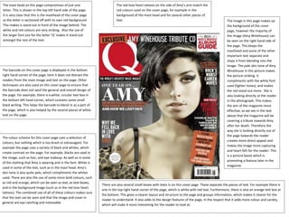
  • 1. The mast head on this page compromises of just one letter. This is shown in the top left hand side of the page. It is very clear that this is the masthead of the cover page as the letter is sectioned off with its own red background. This makes is stand out in front of the image behind. The white and red colours are very striking. Also the use of the larger font size for the letter ‘Q’ makes it stand out amongst the rest of the text. The barcode on this cover page is displayed in the bottom right hand corner of the page; here it does not distract the readers from the main image and text on the page. Other techniques are also used on this cover page to ensure that the barcode does not spoil the general and overall design of the page. For example, there is a white, circular text box in the bottom left hand corner, which contains some small black writing. This helps the barcode to blend in as a part of the page, which is also helped by the several pieces of white text on the page. The colour scheme for this cover page uses a selection of colours, but nothing which is too brash or extravagant. For example the page uses a variety of black and whites, which create contrast on the page. For example, blacks are used in the image, such as hair, and eye makeup. As well as in some of the clothing that Amy is wearing and in the font. White is used in some of the text, such as in the mast head. Amy’s skin tone is also quite pale, which compliments the whites used. There are also the use of some more bold colours, such as red and orange, which can be seen as text, as text boxes, and in the background image (such as in the red love heart tattoos). The combined use of all of these colours makes sure that the text can be seen and that the image and cover in general are eye catching and noticeable. The image in this page makes up the background of the cover page, however the majority of the image (Amy Winehouse) can be seen on the right hand side of the page. This keeps the masthead and some of the other important text separate and stops it from blending into the image. The pale skin tone of Amy Winehouse in this picture makes the picture striking. It compliments with the white font used (lighter tones), and makes the red stand out more. She is also looking directly at the reader in the photograph. This makes the aim of the magazine more effective, as we see in the text above that the magazine will be covering a tribute towards Amy after her death. Therefore the way she is looking directly out of the page towards the reader creates more direct appeal and makes the image more capturing and heart-felt for the reader. This is a picture boost which is promoting a feature later in the magazine. The red love heart tattoos on the side of Amy’s arm match the red colours used on the cover page, for example in the background of the mast head and for several other pieces of text. There are also several small boxes with texts in on this cover page. These separate the pieces of text. For example there is one in the top right hand corner of the page, which is white with red text. Furthermore, there is also an orange text box at the bottom. This gives a clearer layout and structure to the page and groups information, which makes it clearer for the reader to understand. It also adds to the design features of the page, in the respect that it adds more colour and variety, which will make it more interesting for the reader to look at.
  • 2. The image used on this cover page makes up the whole background of the page. The image is very striking and quite sultry, the facial expression that she is pulling and the way she has positioned her hands and the jewellery it looks like she is holding fits that of the male gaze. She almost appears to be quite dangerous, like she is trying to lure someone in, possibly the readers in this case. This is possibly why the image is used, to try and attract and lure in the readers. The colour tones used in the photo are all very complimentary of each other. For example, golden colours and browns make up the majority of the image. For example the colour of her hair, the colour of her eyes, the necklace she is holding and even her skin tone. Her nails are also painted red, which adds to the sultry appearance of the image. This use of colour also matches the red used in the mast head and the colour used on her lips and eyes, which is red and red/ browns. The use of colours in this image is very clever, it is very striking and stands out, but does not use bold colours to do this; instead the different tones are used to make the image noticeable. This is a picture boost which is promoting a feature inside the magazine. The barcode on this page is presented in the left bottom hand corner of the page. This is done so that it does not detract the reader’s attention from the main image and mast-head (and other text) on the page. It does not ruin the design of the page, as It actually compliments the white fonts which have been used. The mast head is bold and has a white outline. Some of the letters are filled with different colours to add some contrast and to make the title stand out more over the background. All of the text on this cover page is in white, therefore the use of colours in the mast head may be used to create a difference between the mast head and the rest of the text, so that there is no confusion between the purposes of the text on the cover. Different types of font are used on this cover page. For example the font at the bottoms which says ‘Live at Roseland, Elements of 4’ is very different to the text on the middle left hand side. This may be done to separate the different pieces of text on this page and also to create some contrast on the page. This may be done instead of using different colours on the page and to create some variety, which will make the piece more attractive to readers.
  • 3. The masthead is very bold, white and takes up almost a quarter of the length of the page which makes it stand out. The name of the magazine is kept short, so the graphology can be made eye catching and exciting. The text which is more important is in black, this colour immediately stands out on the blue background. The less important information is presented in a navy blue colour, this blends more into the blue background which makes it clear to us looking at the magazine that the black is the more interesting and important information. v The image used is very striking, as it is a close up which includes only a shot of the shoulders and head. It has been presented in a black and white effect, this matches the colour scheme used on the masthead and other writing on the page which is in black and white. The image is displayed in the middle of the page which makes it stand out and catch the reader’s eye. Furthermore, Rihanna is looking straight ahead, which creates a direct appeal towards the person looking at the cover page. The use of makeup in the image is also interesting. For example the use of eye makeup which contrasts with the white text, but compliments the black text on the page. Also the use of jewellery and colours make the image stand out more, for example the use of the silver/ white earrings which matches the white text on the page and creates a contrast with the rest of the image. This is a picture boost which is promoting a feature later in the magazine. The image is the centre of visual interest on this page alongside the masthead. Often in vibe magazine we see a lot of negative space. For example they often use a coloured background instead of using the image to make up the background. We can see quite a lot of negative space in the blue background on this cover page. The barcode on this cover page is put in the bottom corner of this page, so that it doesn’t detract the reader’s attention from the rest of the page. It does not interrupt the basic layout of this cover page as it actually compliments the black and white text used. Colour Palette: The main colours used in this cover page are blue, black and white. The colours used in this magazine cover make the image stand out, due to the simple, lone colour background. The blacks used match with the colour of Rihanna’s hair and the whites compliment the silver earrings that she is wearing. The choice of presenting the image in black and white also matches the black and whites used in the text. The eye makeup (darker shades on the bottom of the eyes) used in the photo also compliments the black used in the text, with the white shades used on the top of the eye complementing the masthead above.