SlideShare a Scribd company logo
I find it interesting that
everything is aligned centrally.
The image, and lyrics are all
aligned very similarly, with the
legal information central too.
When analysing the lexis used
on the digipak we can see that
a long of the song titles
incorporate elements of
language that are inclusive in
the field of nature. Examples
of this can be seen by the use
of words such as ‘dog, rabbit,
hurricane’ and ‘bird’ which are
all included in the song titles.
The text is kept relatively small
but still of an appropriate size
so that they are clear and
easily visible to the audience.
The text also seems very
conventional of the style and is
nothing too bold or brash.
The colour scheme of this back
cover is kept in black and white,
simple but effective. The white
clearly stands out above the
background, which makes the
image and the lyrics easy to see,
which are the main bits the artist
wants you to see. The black and
white design creates a sort of
vintage and retro design,
something conventional of the
Indie genre. It also ensures that
the cover is kept minimalist, which
ensures that attention is not
focussed on the superficial
elements of the album but
focusses on the music.
The text that includes the legal information is kept very small on the page ensuring that it doesn’t not
distract the audiences attention however making sure that the vital information is still provided.
The image on the
back cover is very
quirky. Again it
incorporates an
element of nature
with there picture
being of a human
heart. It then very
interestingly labels
structures of the
heart and links
these to songs.
Again, the heart is
drawn in white to
ensure that it
stands out over the
black background..
Interestingly, the
barcode on this
panel so quite
large. It is normally
kept much smaller
so that it is easily
visible but does
not distract
attention from the
rest of the panel.
They may have
chosen to make
this slightly larger
as it fits in with the
black and white
colour schemes.
This is the front of a digipak by Florence and the Machine, a British Indie rock band.
Firstly, we can see many elements of nature incorporated into the digipack cover. For
example, in the background we can see a pattern of what appears to be leaves and
flowers, with birds resting on the branches. This is something conventional of the
Indie genre, as more often than not it is somehow linked to the natural environment.
However instead of making this background to the image bright and colourful they
have used quite dark colours, such as dark greens and yellows which seem to in a way
blend into the black background. This means that the centre of visual interest is kept
focussed on Florence and not distracted by from bright colours in the background
which submerge the image. Furthermore, the image strongly links to the album title
‘lungs’. As we can see on the picture it appears that there is a pair of lungs resting on
Florence's chest above the skin. This also creates a link between the music and the
natural world, as lungs are partly responsible for the air we breath. This element of
the photograph also means the image is very eye catching as it is very unusual. The
artists makeup is kept very subtle in this image, with a pale skin tone, and natural
makeup complimenting the background. Fine attention to detail is paid, for example
Florence’s nails match the colour of the lungs and some of the background, showing
that the image has been very carefully constructed. The artists pose, is very serious
and sultry. Interestingly, she is not addressing the audience by creating direct eye
contact with the camera, but instead shot looking away and down to the ground. This
might suggest that she is very thoughtful, which could represent the lyrics and music
in the album. This feeling of wonder and thought that she creates, entices the
audience and encourages us to want to know more about the album. Another
interesting feature of this panel is the way two different fonts are used for the album
title and the artist. On the majority of covers I have seen they are used in the same
font to create consistency and a feeling of professionalism. The artists name is
written in quite a subtle font, something which seems to represent the artist as quite
delicate and bubbly, however the album title is presented in more of a bold font, one
that creates a stern connotation. This may suggest that more emphasis is intended to
be put on the title of the album and the connotations the audience may get from this.
The image on the front very clearly shows and represents the artist and therefore the
designer of this digipak may have thought that less emphasis needed to be placed on
the artists name as this may have totally overpowered the title of the album
especially with the combination of the striking image. I think this works quite
effectively as we can see a clear divide between the two labels. It prevents confusion
from which text is telling you what. I also like the border around the image which is
created using a very thin white line which ceases at the Artist title. I think it prevents
the image from becoming too overpowering, by keeping a small area of black
negative space around the edges. It also allows the artist title to stand out more by
separating an area of black space for the image to be presented instead of over the
image, where it may not have gained much attention and where it may have blended
in and become submerged into the image.
This digipak is by Adele, a British recording artist. This digipak is largely
dominated by an image of the artist. As was also observed in the digipak of
Florence and The Machine, she is not directly addressing the audience by
looking directly into the camera. Instead the shot is taken where Adele is
shown resting her head on her hand. Again, the image seems very
thoughtful as was observed in the F&TM digipak. This may entice the
audience to gain more of an insight into what the album includes. Naturally,
an album that has a lot of thought gone into it tends to be of a higher
quality. It also represents the artist as a classy woman, as she looks very
natural with subtle makeup and a soft skin tone. It is kept in black and white
so that the image does not become overpowering. I like the font in this
digipak as it a nice a thin font, I think that this can look equally as bold as
chunky fonts went in the right size and colour and when placed above the
right background. Interestingly, the artist title and album title are placed
next to each other, but are separated by the use of different colours. The
artists name is presented in white, however the album title is presented in
green, something which is different from the rest of the digipak. This could
have been done purposely to show its different function on the panel.
The back cover of this digipak keeps the black and white colour scheme,
creating consistency throughout it. Another image of Adele is used, this
time with direct eye contact, addressing the audience and creating synthetic
personalisation. The track titles are displayed down the left hand side of the
page in a central alignment. The font is kept not too small neither to large
which allows the digipak to look professional, whilst still being visible and
clear to read. Again here the barcode is quite large, but presented at the
bottom of the page. They may have chosen to keep it quite large as it
matches the colour scheme, so somehow blends in and also for its practical
uses. Again, the image used here is very simple, and shows a natural and
pretty shot of Adele. However, it again is quite sultry, which could be used
as part of the male gaze to attract an audience, especially as the majority of
Adele’s fans are probably female. This may be done to increase the male
audience, whilst keeping a female audience by presenting an approachable
and relatable image of Adele. This is done by keeping her appearance
natural and like the everyday woman's. The image here is also placed in
black and white which matches the rest of the digipak and which ensures
that not too much attention is focussed on the image but also the
information displayed on this page.

More Related Content

What's hot

Cd cover analyse [autosaved]
Cd cover analyse [autosaved]Cd cover analyse [autosaved]
Cd cover analyse [autosaved]Adella1
 
Analysis of student digipak
Analysis of student digipakAnalysis of student digipak
Analysis of student digipakellyshakular
 
Digipack and advert research
Digipack and advert researchDigipack and advert research
Digipack and advert research
laurenamyharriman
 
Digipaks Analysis
Digipaks Analysis Digipaks Analysis
Digipaks Analysis
2033x
 
DigiPak Analysis
DigiPak AnalysisDigiPak Analysis
DigiPak Analysis
Jess Greenfield
 
Research Into Ancillary Products
Research Into Ancillary ProductsResearch Into Ancillary Products
Research Into Ancillary Productscallansmi
 
Research Into Ancillary Products
Research Into Ancillary ProductsResearch Into Ancillary Products
Research Into Ancillary Productscallansmi
 
Digipak and magazine advert analysis
Digipak and magazine advert analysis Digipak and magazine advert analysis
Digipak and magazine advert analysis
godsell1999
 
Analysis albums[1]
Analysis albums[1]Analysis albums[1]
Analysis albums[1]Eddie Guy
 
Ancillary Research
Ancillary ResearchAncillary Research
Ancillary ResearchAmyBoardman
 
Analysis albums[1]
Analysis albums[1]Analysis albums[1]
Analysis albums[1]Eddie Guy
 
Research case studies - Album art work and inserts
Research case studies - Album art work and insertsResearch case studies - Album art work and inserts
Research case studies - Album art work and insertsadinachante
 
Digipacks
DigipacksDigipacks
Digipacks
Amelia Ofiarska
 
Catfish and the bottlemen
Catfish and the bottlemenCatfish and the bottlemen
Catfish and the bottlemen
Taggar97
 
Digipak analysis
Digipak analysisDigipak analysis
Digipak analysis
jackfowler24
 
Digipak analysis
Digipak analysisDigipak analysis
Digipak analysis
jackfowler16
 
Digipak anil
Digipak anilDigipak anil
Digipak anil
Joe Carroll
 

What's hot (20)

Digipak analysis
Digipak analysisDigipak analysis
Digipak analysis
 
Cd cover analyse [autosaved]
Cd cover analyse [autosaved]Cd cover analyse [autosaved]
Cd cover analyse [autosaved]
 
Analysis of student digipak
Analysis of student digipakAnalysis of student digipak
Analysis of student digipak
 
Digipack and advert research
Digipack and advert researchDigipack and advert research
Digipack and advert research
 
Digipaks Analysis
Digipaks Analysis Digipaks Analysis
Digipaks Analysis
 
DigiPak Analysis
DigiPak AnalysisDigiPak Analysis
DigiPak Analysis
 
Research Into Ancillary Products
Research Into Ancillary ProductsResearch Into Ancillary Products
Research Into Ancillary Products
 
Presentation1
Presentation1Presentation1
Presentation1
 
Research Into Ancillary Products
Research Into Ancillary ProductsResearch Into Ancillary Products
Research Into Ancillary Products
 
Digipak and magazine advert analysis
Digipak and magazine advert analysis Digipak and magazine advert analysis
Digipak and magazine advert analysis
 
Analysis albums[1]
Analysis albums[1]Analysis albums[1]
Analysis albums[1]
 
Ancillary Research
Ancillary ResearchAncillary Research
Ancillary Research
 
Analysis albums[1]
Analysis albums[1]Analysis albums[1]
Analysis albums[1]
 
Research case studies - Album art work and inserts
Research case studies - Album art work and insertsResearch case studies - Album art work and inserts
Research case studies - Album art work and inserts
 
Digipacks
DigipacksDigipacks
Digipacks
 
Catfish and the bottlemen
Catfish and the bottlemenCatfish and the bottlemen
Catfish and the bottlemen
 
Digipak analysis
Digipak analysisDigipak analysis
Digipak analysis
 
Digipak analysis
Digipak analysisDigipak analysis
Digipak analysis
 
Digipak analysis ½
Digipak analysis ½Digipak analysis ½
Digipak analysis ½
 
Digipak anil
Digipak anilDigipak anil
Digipak anil
 

Viewers also liked

Analysis of posters.
Analysis of posters.Analysis of posters.
Analysis of posters.
laurenamyharriman
 
Actor Release
Actor ReleaseActor Release
Actor Release
bethgilbert15
 
Brand Guidelines
Brand GuidelinesBrand Guidelines
Brand Guidelines
bethgilbert15
 
Family Cars: Zafira 2012
Family Cars: Zafira 2012Family Cars: Zafira 2012
Family Cars: Zafira 2012
Vauxhall
 
Vintage galatians 4.10.16
Vintage galatians 4.10.16Vintage galatians 4.10.16
Vintage galatians 4.10.16
Vintage Church
 
M McGuigan Resume 2016
M  McGuigan Resume 2016M  McGuigan Resume 2016
M McGuigan Resume 2016Mark McGuigan
 
Christopher Costigan - Partnering With Employers
Christopher Costigan - Partnering With EmployersChristopher Costigan - Partnering With Employers
Christopher Costigan - Partnering With Employers
Association of University Administrators
 
Engaging the workforce
Engaging the workforceEngaging the workforce
Engaging the workforce
Mandeep Singh
 

Viewers also liked (12)

FDIC Mission Award 8-12
FDIC Mission Award 8-12FDIC Mission Award 8-12
FDIC Mission Award 8-12
 
Analysis of posters.
Analysis of posters.Analysis of posters.
Analysis of posters.
 
Actor Release
Actor ReleaseActor Release
Actor Release
 
Brand Guidelines
Brand GuidelinesBrand Guidelines
Brand Guidelines
 
Test
TestTest
Test
 
FDIC Star Award 08-11
FDIC Star Award 08-11FDIC Star Award 08-11
FDIC Star Award 08-11
 
Family Cars: Zafira 2012
Family Cars: Zafira 2012Family Cars: Zafira 2012
Family Cars: Zafira 2012
 
Vintage galatians 4.10.16
Vintage galatians 4.10.16Vintage galatians 4.10.16
Vintage galatians 4.10.16
 
Galatians 2010
Galatians 2010Galatians 2010
Galatians 2010
 
M McGuigan Resume 2016
M  McGuigan Resume 2016M  McGuigan Resume 2016
M McGuigan Resume 2016
 
Christopher Costigan - Partnering With Employers
Christopher Costigan - Partnering With EmployersChristopher Costigan - Partnering With Employers
Christopher Costigan - Partnering With Employers
 
Engaging the workforce
Engaging the workforceEngaging the workforce
Engaging the workforce
 

Similar to Analysis further

Analysis furthrr
Analysis furthrrAnalysis furthrr
Analysis furthrr
laurenamyharriman
 
Analysis of album covers and magazine adverts
Analysis of album covers and magazine advertsAnalysis of album covers and magazine adverts
Analysis of album covers and magazine adverts
Charlottehull
 
DIGIPAK ANALYSIS
DIGIPAK ANALYSISDIGIPAK ANALYSIS
DIGIPAK ANALYSIS
Tyler Bishop-Harris
 
DIGIPAK ANALYSIS
DIGIPAK ANALYSISDIGIPAK ANALYSIS
DIGIPAK ANALYSIS
Tyler Bishop-Harris
 
Digipack analysis
Digipack analysisDigipack analysis
Digipack analysis
Bethan Tinker
 
Digipak analysis for five video's
Digipak analysis for five video'sDigipak analysis for five video's
Digipak analysis for five video's
Bethan Tinker
 
A2 Media Coursework - Research - DigiPak Analysis 6X
A2 Media Coursework - Research - DigiPak Analysis 6XA2 Media Coursework - Research - DigiPak Analysis 6X
A2 Media Coursework - Research - DigiPak Analysis 6X
TAwojobi
 
Digipack analysis no1 improved
Digipack analysis no1 improvedDigipack analysis no1 improved
Digipack analysis no1 improved
DrSips
 
Digipak analysis- Florence and the machine 'Lungs'
Digipak analysis- Florence and the machine 'Lungs'Digipak analysis- Florence and the machine 'Lungs'
Digipak analysis- Florence and the machine 'Lungs'
lauracoggin
 
Album cover and magazine adverts for album releases analysis
Album cover and magazine adverts for album releases analysisAlbum cover and magazine adverts for album releases analysis
Album cover and magazine adverts for album releases analysisKerry
 
Digipak analysis
Digipak analysisDigipak analysis
Digipak analysis
MediaEdWright
 
Digipak analysis
Digipak analysisDigipak analysis
Digipak analysis
MediaEdWright
 
Digipak Analysis
Digipak AnalysisDigipak Analysis
Digipak Analysis
Steph2000
 
Digipak Analysis
Digipak AnalysisDigipak Analysis
Digipak Analysis
Steph2000
 
Digipak analysis
Digipak analysisDigipak analysis
Digipak analysis
MediaEdWright
 
Digipak & poster analysis
Digipak & poster analysisDigipak & poster analysis
Digipak & poster analysis
Top_Boy
 
Digipak and magazine advert
Digipak and magazine advert Digipak and magazine advert
Digipak and magazine advert
EDavoile13
 
Adele digipak
Adele digipakAdele digipak
Adele digipak
Emma9702
 

Similar to Analysis further (20)

Analysis furthrr
Analysis furthrrAnalysis furthrr
Analysis furthrr
 
Analysis of album covers and magazine adverts
Analysis of album covers and magazine advertsAnalysis of album covers and magazine adverts
Analysis of album covers and magazine adverts
 
Digipaks.
Digipaks.Digipaks.
Digipaks.
 
DIGIPAK ANALYSIS
DIGIPAK ANALYSISDIGIPAK ANALYSIS
DIGIPAK ANALYSIS
 
DIGIPAK ANALYSIS
DIGIPAK ANALYSISDIGIPAK ANALYSIS
DIGIPAK ANALYSIS
 
Digipack analysis
Digipack analysisDigipack analysis
Digipack analysis
 
Digipak analysis for five video's
Digipak analysis for five video'sDigipak analysis for five video's
Digipak analysis for five video's
 
A2 Media Coursework - Research - DigiPak Analysis 6X
A2 Media Coursework - Research - DigiPak Analysis 6XA2 Media Coursework - Research - DigiPak Analysis 6X
A2 Media Coursework - Research - DigiPak Analysis 6X
 
Digipack analysis no1 improved
Digipack analysis no1 improvedDigipack analysis no1 improved
Digipack analysis no1 improved
 
Digipak analysis- Florence and the machine 'Lungs'
Digipak analysis- Florence and the machine 'Lungs'Digipak analysis- Florence and the machine 'Lungs'
Digipak analysis- Florence and the machine 'Lungs'
 
Album cover and magazine adverts for album releases analysis
Album cover and magazine adverts for album releases analysisAlbum cover and magazine adverts for album releases analysis
Album cover and magazine adverts for album releases analysis
 
Digipak analysis
Digipak analysisDigipak analysis
Digipak analysis
 
Digipaks
DigipaksDigipaks
Digipaks
 
Digipak analysis
Digipak analysisDigipak analysis
Digipak analysis
 
Digipak Analysis
Digipak AnalysisDigipak Analysis
Digipak Analysis
 
Digipak Analysis
Digipak AnalysisDigipak Analysis
Digipak Analysis
 
Digipak analysis
Digipak analysisDigipak analysis
Digipak analysis
 
Digipak & poster analysis
Digipak & poster analysisDigipak & poster analysis
Digipak & poster analysis
 
Digipak and magazine advert
Digipak and magazine advert Digipak and magazine advert
Digipak and magazine advert
 
Adele digipak
Adele digipakAdele digipak
Adele digipak
 

More from laurenamyharriman

Questions 1 a & 1b
Questions 1 a & 1bQuestions 1 a & 1b
Questions 1 a & 1b
laurenamyharriman
 
Stages in digipak
Stages in digipakStages in digipak
Stages in digipak
laurenamyharriman
 
Progression 4 digipak
Progression 4 digipakProgression 4 digipak
Progression 4 digipak
laurenamyharriman
 
Lana del ray
Lana del rayLana del ray
Lana del ray
laurenamyharriman
 
Progression of double page spread
Progression of double page spreadProgression of double page spread
Progression of double page spread
laurenamyharriman
 
Progression of contents page
Progression of contents pageProgression of contents page
Progression of contents page
laurenamyharriman
 
Cover page progression
Cover page progressionCover page progression
Cover page progression
laurenamyharriman
 
Contents page analysis
Contents page analysisContents page analysis
Contents page analysis
laurenamyharriman
 
Mood board media coursework
Mood board media courseworkMood board media coursework
Mood board media coursework
laurenamyharriman
 
Double page spread_analysis (1)
Double page spread_analysis (1)Double page spread_analysis (1)
Double page spread_analysis (1)laurenamyharriman
 
Colour palettes
Colour palettesColour palettes
Colour palettes
laurenamyharriman
 
Colour palettes (1)
Colour palettes (1)Colour palettes (1)
Colour palettes (1)
laurenamyharriman
 
Cover page analysis
Cover page analysis Cover page analysis
Cover page analysis
laurenamyharriman
 
Fonts for media coursework
Fonts for media courseworkFonts for media coursework
Fonts for media coursework
laurenamyharriman
 
Representation in glue
Representation in glueRepresentation in glue
Representation in glue
laurenamyharriman
 

More from laurenamyharriman (16)

Questions 1 a & 1b
Questions 1 a & 1bQuestions 1 a & 1b
Questions 1 a & 1b
 
Stages in digipak
Stages in digipakStages in digipak
Stages in digipak
 
Progression 4 digipak
Progression 4 digipakProgression 4 digipak
Progression 4 digipak
 
Lana del ray
Lana del rayLana del ray
Lana del ray
 
Progression of double page spread
Progression of double page spreadProgression of double page spread
Progression of double page spread
 
Progression of contents page
Progression of contents pageProgression of contents page
Progression of contents page
 
Cover page progression
Cover page progressionCover page progression
Cover page progression
 
Contents page analysis
Contents page analysisContents page analysis
Contents page analysis
 
Mood board media coursework
Mood board media courseworkMood board media coursework
Mood board media coursework
 
Double page spread_analysis (1)
Double page spread_analysis (1)Double page spread_analysis (1)
Double page spread_analysis (1)
 
Contents page analysis
Contents page analysisContents page analysis
Contents page analysis
 
Colour palettes
Colour palettesColour palettes
Colour palettes
 
Colour palettes (1)
Colour palettes (1)Colour palettes (1)
Colour palettes (1)
 
Cover page analysis
Cover page analysis Cover page analysis
Cover page analysis
 
Fonts for media coursework
Fonts for media courseworkFonts for media coursework
Fonts for media coursework
 
Representation in glue
Representation in glueRepresentation in glue
Representation in glue
 

Recently uploaded

一比一原版(qut毕业证)昆士兰科技大学毕业证如何办理
一比一原版(qut毕业证)昆士兰科技大学毕业证如何办理一比一原版(qut毕业证)昆士兰科技大学毕业证如何办理
一比一原版(qut毕业证)昆士兰科技大学毕业证如何办理
taqyed
 
Caffeinated Pitch Bible- developed by Claire Wilson
Caffeinated Pitch Bible- developed by Claire WilsonCaffeinated Pitch Bible- developed by Claire Wilson
Caffeinated Pitch Bible- developed by Claire Wilson
ClaireWilson398082
 
ART FORMS OF KERALA: TRADITIONAL AND OTHERS
ART FORMS OF KERALA: TRADITIONAL AND OTHERSART FORMS OF KERALA: TRADITIONAL AND OTHERS
ART FORMS OF KERALA: TRADITIONAL AND OTHERS
Sandhya J.Nair
 
The Last Polymath: Muntadher Saleh‎‎‎‎‎‎‎‎‎‎‎‎
The Last Polymath: Muntadher Saleh‎‎‎‎‎‎‎‎‎‎‎‎The Last Polymath: Muntadher Saleh‎‎‎‎‎‎‎‎‎‎‎‎
The Last Polymath: Muntadher Saleh‎‎‎‎‎‎‎‎‎‎‎‎
iraqartsandculture
 
一比一原版(GU毕业证)格里菲斯大学毕业证成绩单
一比一原版(GU毕业证)格里菲斯大学毕业证成绩单一比一原版(GU毕业证)格里菲斯大学毕业证成绩单
一比一原版(GU毕业证)格里菲斯大学毕业证成绩单
zvaywau
 
acting board rough title here lolaaaaaaa
acting board rough title here lolaaaaaaaacting board rough title here lolaaaaaaa
acting board rough title here lolaaaaaaa
angelicafronda7
 
thGAP - BAbyss in Moderno!! Transgenic Human Germline Alternatives Project
thGAP - BAbyss in Moderno!!  Transgenic Human Germline Alternatives ProjectthGAP - BAbyss in Moderno!!  Transgenic Human Germline Alternatives Project
thGAP - BAbyss in Moderno!! Transgenic Human Germline Alternatives Project
Marc Dusseiller Dusjagr
 
Codes n Conventionss copy (2).pptx new new
Codes n Conventionss copy (2).pptx new newCodes n Conventionss copy (2).pptx new new
Codes n Conventionss copy (2).pptx new new
ZackSpencer3
 
ashokathegreat project class 12 presentation
ashokathegreat project class 12 presentationashokathegreat project class 12 presentation
ashokathegreat project class 12 presentation
aditiyad2020
 
CLASS XII- HISTORY-THEME 4-Thinkers, Bes
CLASS XII- HISTORY-THEME 4-Thinkers, BesCLASS XII- HISTORY-THEME 4-Thinkers, Bes
CLASS XII- HISTORY-THEME 4-Thinkers, Bes
aditiyad2020
 
Inter-Dimensional Girl Boards Segment (Act 3)
Inter-Dimensional Girl Boards Segment (Act 3)Inter-Dimensional Girl Boards Segment (Act 3)
Inter-Dimensional Girl Boards Segment (Act 3)
CristianMestre
 
The Legacy of Breton In A New Age by Master Terrance Lindall
The Legacy of Breton In A New Age by Master Terrance LindallThe Legacy of Breton In A New Age by Master Terrance Lindall
The Legacy of Breton In A New Age by Master Terrance Lindall
BBaez1
 
IrishWritersCtrsPersonalEssaysMay29.pptx
IrishWritersCtrsPersonalEssaysMay29.pptxIrishWritersCtrsPersonalEssaysMay29.pptx
IrishWritersCtrsPersonalEssaysMay29.pptx
Aine Greaney Ellrott
 
Memory Rental Store - The Chase (Storyboard)
Memory Rental Store - The Chase (Storyboard)Memory Rental Store - The Chase (Storyboard)
Memory Rental Store - The Chase (Storyboard)
SuryaKalyan3
 
Sundabet | Slot gacor dan terpercaya mudah menang
Sundabet | Slot gacor dan terpercaya mudah menangSundabet | Slot gacor dan terpercaya mudah menang
Sundabet | Slot gacor dan terpercaya mudah menang
Sundabet | Situs Slot gacor dan terpercaya
 
2137ad - Characters that live in Merindol and are at the center of main stories
2137ad - Characters that live in Merindol and are at the center of main stories2137ad - Characters that live in Merindol and are at the center of main stories
2137ad - Characters that live in Merindol and are at the center of main stories
luforfor
 
一比一原版UPenn毕业证宾夕法尼亚大学毕业证成绩单如何办理
一比一原版UPenn毕业证宾夕法尼亚大学毕业证成绩单如何办理一比一原版UPenn毕业证宾夕法尼亚大学毕业证成绩单如何办理
一比一原版UPenn毕业证宾夕法尼亚大学毕业证成绩单如何办理
beduwt
 
Memory Rental Store - The Ending(Storyboard)
Memory Rental Store - The Ending(Storyboard)Memory Rental Store - The Ending(Storyboard)
Memory Rental Store - The Ending(Storyboard)
SuryaKalyan3
 
2137ad Merindol Colony Interiors where refugee try to build a seemengly norm...
2137ad  Merindol Colony Interiors where refugee try to build a seemengly norm...2137ad  Merindol Colony Interiors where refugee try to build a seemengly norm...
2137ad Merindol Colony Interiors where refugee try to build a seemengly norm...
luforfor
 

Recently uploaded (20)
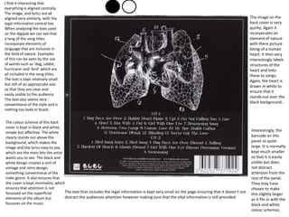
一比一原版(qut毕业证)昆士兰科技大学毕业证如何办理
一比一原版(qut毕业证)昆士兰科技大学毕业证如何办理一比一原版(qut毕业证)昆士兰科技大学毕业证如何办理
一比一原版(qut毕业证)昆士兰科技大学毕业证如何办理
 
Caffeinated Pitch Bible- developed by Claire Wilson
Caffeinated Pitch Bible- developed by Claire WilsonCaffeinated Pitch Bible- developed by Claire Wilson
Caffeinated Pitch Bible- developed by Claire Wilson
 
ART FORMS OF KERALA: TRADITIONAL AND OTHERS
ART FORMS OF KERALA: TRADITIONAL AND OTHERSART FORMS OF KERALA: TRADITIONAL AND OTHERS
ART FORMS OF KERALA: TRADITIONAL AND OTHERS
 
The Last Polymath: Muntadher Saleh‎‎‎‎‎‎‎‎‎‎‎‎
The Last Polymath: Muntadher Saleh‎‎‎‎‎‎‎‎‎‎‎‎The Last Polymath: Muntadher Saleh‎‎‎‎‎‎‎‎‎‎‎‎
The Last Polymath: Muntadher Saleh‎‎‎‎‎‎‎‎‎‎‎‎
 
一比一原版(GU毕业证)格里菲斯大学毕业证成绩单
一比一原版(GU毕业证)格里菲斯大学毕业证成绩单一比一原版(GU毕业证)格里菲斯大学毕业证成绩单
一比一原版(GU毕业证)格里菲斯大学毕业证成绩单
 
acting board rough title here lolaaaaaaa
acting board rough title here lolaaaaaaaacting board rough title here lolaaaaaaa
acting board rough title here lolaaaaaaa
 
thGAP - BAbyss in Moderno!! Transgenic Human Germline Alternatives Project
thGAP - BAbyss in Moderno!!  Transgenic Human Germline Alternatives ProjectthGAP - BAbyss in Moderno!!  Transgenic Human Germline Alternatives Project
thGAP - BAbyss in Moderno!! Transgenic Human Germline Alternatives Project
 
Codes n Conventionss copy (2).pptx new new
Codes n Conventionss copy (2).pptx new newCodes n Conventionss copy (2).pptx new new
Codes n Conventionss copy (2).pptx new new
 
ashokathegreat project class 12 presentation
ashokathegreat project class 12 presentationashokathegreat project class 12 presentation
ashokathegreat project class 12 presentation
 
CLASS XII- HISTORY-THEME 4-Thinkers, Bes
CLASS XII- HISTORY-THEME 4-Thinkers, BesCLASS XII- HISTORY-THEME 4-Thinkers, Bes
CLASS XII- HISTORY-THEME 4-Thinkers, Bes
 
Inter-Dimensional Girl Boards Segment (Act 3)
Inter-Dimensional Girl Boards Segment (Act 3)Inter-Dimensional Girl Boards Segment (Act 3)
Inter-Dimensional Girl Boards Segment (Act 3)
 
The Legacy of Breton In A New Age by Master Terrance Lindall
The Legacy of Breton In A New Age by Master Terrance LindallThe Legacy of Breton In A New Age by Master Terrance Lindall
The Legacy of Breton In A New Age by Master Terrance Lindall
 
IrishWritersCtrsPersonalEssaysMay29.pptx
IrishWritersCtrsPersonalEssaysMay29.pptxIrishWritersCtrsPersonalEssaysMay29.pptx
IrishWritersCtrsPersonalEssaysMay29.pptx
 
Memory Rental Store - The Chase (Storyboard)
Memory Rental Store - The Chase (Storyboard)Memory Rental Store - The Chase (Storyboard)
Memory Rental Store - The Chase (Storyboard)
 
Sundabet | Slot gacor dan terpercaya mudah menang
Sundabet | Slot gacor dan terpercaya mudah menangSundabet | Slot gacor dan terpercaya mudah menang
Sundabet | Slot gacor dan terpercaya mudah menang
 
2137ad - Characters that live in Merindol and are at the center of main stories
2137ad - Characters that live in Merindol and are at the center of main stories2137ad - Characters that live in Merindol and are at the center of main stories
2137ad - Characters that live in Merindol and are at the center of main stories
 
一比一原版UPenn毕业证宾夕法尼亚大学毕业证成绩单如何办理
一比一原版UPenn毕业证宾夕法尼亚大学毕业证成绩单如何办理一比一原版UPenn毕业证宾夕法尼亚大学毕业证成绩单如何办理
一比一原版UPenn毕业证宾夕法尼亚大学毕业证成绩单如何办理
 
European Cybersecurity Skills Framework Role Profiles.pdf
European Cybersecurity Skills Framework Role Profiles.pdfEuropean Cybersecurity Skills Framework Role Profiles.pdf
European Cybersecurity Skills Framework Role Profiles.pdf
 
Memory Rental Store - The Ending(Storyboard)
Memory Rental Store - The Ending(Storyboard)Memory Rental Store - The Ending(Storyboard)
Memory Rental Store - The Ending(Storyboard)
 
2137ad Merindol Colony Interiors where refugee try to build a seemengly norm...
2137ad  Merindol Colony Interiors where refugee try to build a seemengly norm...2137ad  Merindol Colony Interiors where refugee try to build a seemengly norm...
2137ad Merindol Colony Interiors where refugee try to build a seemengly norm...
 

Analysis further

  • 1. I find it interesting that everything is aligned centrally. The image, and lyrics are all aligned very similarly, with the legal information central too. When analysing the lexis used on the digipak we can see that a long of the song titles incorporate elements of language that are inclusive in the field of nature. Examples of this can be seen by the use of words such as ‘dog, rabbit, hurricane’ and ‘bird’ which are all included in the song titles. The text is kept relatively small but still of an appropriate size so that they are clear and easily visible to the audience. The text also seems very conventional of the style and is nothing too bold or brash. The colour scheme of this back cover is kept in black and white, simple but effective. The white clearly stands out above the background, which makes the image and the lyrics easy to see, which are the main bits the artist wants you to see. The black and white design creates a sort of vintage and retro design, something conventional of the Indie genre. It also ensures that the cover is kept minimalist, which ensures that attention is not focussed on the superficial elements of the album but focusses on the music. The text that includes the legal information is kept very small on the page ensuring that it doesn’t not distract the audiences attention however making sure that the vital information is still provided. The image on the back cover is very quirky. Again it incorporates an element of nature with there picture being of a human heart. It then very interestingly labels structures of the heart and links these to songs. Again, the heart is drawn in white to ensure that it stands out over the black background.. Interestingly, the barcode on this panel so quite large. It is normally kept much smaller so that it is easily visible but does not distract attention from the rest of the panel. They may have chosen to make this slightly larger as it fits in with the black and white colour schemes.
  • 2. This is the front of a digipak by Florence and the Machine, a British Indie rock band. Firstly, we can see many elements of nature incorporated into the digipack cover. For example, in the background we can see a pattern of what appears to be leaves and flowers, with birds resting on the branches. This is something conventional of the Indie genre, as more often than not it is somehow linked to the natural environment. However instead of making this background to the image bright and colourful they have used quite dark colours, such as dark greens and yellows which seem to in a way blend into the black background. This means that the centre of visual interest is kept focussed on Florence and not distracted by from bright colours in the background which submerge the image. Furthermore, the image strongly links to the album title ‘lungs’. As we can see on the picture it appears that there is a pair of lungs resting on Florence's chest above the skin. This also creates a link between the music and the natural world, as lungs are partly responsible for the air we breath. This element of the photograph also means the image is very eye catching as it is very unusual. The artists makeup is kept very subtle in this image, with a pale skin tone, and natural makeup complimenting the background. Fine attention to detail is paid, for example Florence’s nails match the colour of the lungs and some of the background, showing that the image has been very carefully constructed. The artists pose, is very serious and sultry. Interestingly, she is not addressing the audience by creating direct eye contact with the camera, but instead shot looking away and down to the ground. This might suggest that she is very thoughtful, which could represent the lyrics and music in the album. This feeling of wonder and thought that she creates, entices the audience and encourages us to want to know more about the album. Another interesting feature of this panel is the way two different fonts are used for the album title and the artist. On the majority of covers I have seen they are used in the same font to create consistency and a feeling of professionalism. The artists name is written in quite a subtle font, something which seems to represent the artist as quite delicate and bubbly, however the album title is presented in more of a bold font, one that creates a stern connotation. This may suggest that more emphasis is intended to be put on the title of the album and the connotations the audience may get from this. The image on the front very clearly shows and represents the artist and therefore the designer of this digipak may have thought that less emphasis needed to be placed on the artists name as this may have totally overpowered the title of the album especially with the combination of the striking image. I think this works quite effectively as we can see a clear divide between the two labels. It prevents confusion from which text is telling you what. I also like the border around the image which is created using a very thin white line which ceases at the Artist title. I think it prevents the image from becoming too overpowering, by keeping a small area of black negative space around the edges. It also allows the artist title to stand out more by separating an area of black space for the image to be presented instead of over the image, where it may not have gained much attention and where it may have blended in and become submerged into the image.
  • 3. This digipak is by Adele, a British recording artist. This digipak is largely dominated by an image of the artist. As was also observed in the digipak of Florence and The Machine, she is not directly addressing the audience by looking directly into the camera. Instead the shot is taken where Adele is shown resting her head on her hand. Again, the image seems very thoughtful as was observed in the F&TM digipak. This may entice the audience to gain more of an insight into what the album includes. Naturally, an album that has a lot of thought gone into it tends to be of a higher quality. It also represents the artist as a classy woman, as she looks very natural with subtle makeup and a soft skin tone. It is kept in black and white so that the image does not become overpowering. I like the font in this digipak as it a nice a thin font, I think that this can look equally as bold as chunky fonts went in the right size and colour and when placed above the right background. Interestingly, the artist title and album title are placed next to each other, but are separated by the use of different colours. The artists name is presented in white, however the album title is presented in green, something which is different from the rest of the digipak. This could have been done purposely to show its different function on the panel. The back cover of this digipak keeps the black and white colour scheme, creating consistency throughout it. Another image of Adele is used, this time with direct eye contact, addressing the audience and creating synthetic personalisation. The track titles are displayed down the left hand side of the page in a central alignment. The font is kept not too small neither to large which allows the digipak to look professional, whilst still being visible and clear to read. Again here the barcode is quite large, but presented at the bottom of the page. They may have chosen to keep it quite large as it matches the colour scheme, so somehow blends in and also for its practical uses. Again, the image used here is very simple, and shows a natural and pretty shot of Adele. However, it again is quite sultry, which could be used as part of the male gaze to attract an audience, especially as the majority of Adele’s fans are probably female. This may be done to increase the male audience, whilst keeping a female audience by presenting an approachable and relatable image of Adele. This is done by keeping her appearance natural and like the everyday woman's. The image here is also placed in black and white which matches the rest of the digipak and which ensures that not too much attention is focussed on the image but also the information displayed on this page.