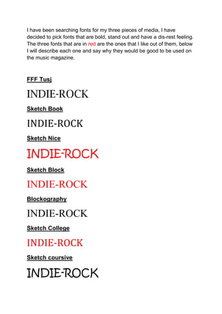
1. I have been searching fonts for my three pieces of media, I have
decided to pick fonts that are bold, stand out and have a dis-rest feeling.
The three fonts that are in red are the ones that I like out of them, below
I will describe each one and say why they would be good to be used on
the music magazine.
FFF Tusj
INDIE-ROCK
Sketch Book
INDIE-ROCK
Sketch Nice
INDIE-ROCK
Sketch Block
INDIE-ROCK
Blockography
INDIE-ROCK
Sketch College
INDIE-ROCK
Sketch coursive
INDIE-ROCK
2. Sketch nothing
INDIE-ROCK
Sketch pad
INDIE-ROCK
Hard rock
INDIE-ROCK
The three choices:
Sketch Nice
INDIE-ROCK
Sketch Block
INDIE-ROCK
FFF Tusj
INDIE-ROCK
After reseaching many font style the above three are my
final choices, the reasons why I have chosen these
three instead of the others is because, these have a
dark disrest feeling, the cross hatching across the
3. wording stands out and will attract the audiences
attention as is unusual to other font styles.