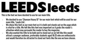
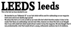
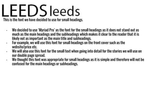
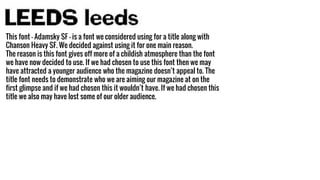
2. - We decided to use ‘Chanson Heavy SF’ for our main font which will be used for our
main title, ‘Leeds Life’.
- We chose this font as our main font as it is bold and stands out on the page which
is vital for a title. We felt like this font was important as it grabs the reader’s
attention which may persuade the reader to buy the magazine.
- We also wanted the title to be bold and to stand out as we felt like this would
attract a younger audience, preferably students aged 18-25 who are enthusiastic
and would therefore be attracted to stand out fonts like the one we have chosen.
This is the font we have decided to use for our main title.
3. This is the font we have decided to use
- We decided to use ‘Balloonist SF’ as our font which will be used for subheadings on our magazine
front cover and on our double page spread.
- We chose this font as it is not as bold as our main title font which therefore makes it clear to the
reader that these are subheadings and not main titles, however we chose this font as we thought
that it was still a bold font which would attract readers to buy the magazine. We also thought that it
was predominantly a font that would attract a young, enthusiastic audience due to its boldness.
4. This is the font we have decided to use for small headings.
- We decided to use ‘Myriad Pro’ as the font for the small headings as it does not stand out as
much as the main headings and the subheadings which makes it clear to the reader that it is
likely not as important as the main title and subheadings.
- For example, we will use this font for small headings on the front cover such as the
website/price etc.
- We will also use this font for the small text when going into detail for the stories we will use on
our double page spread.
- We thought this font was appropriate for small headings as it is simple and therefore will not be
confused for the main headings or subheadings.
5. This font - Adamsky SF - is a font we considered using for a title along with
Chanson Heavy SF. We decided against using it for one main reason.
The reason is this font gives off more of a childish atmosphere than the font
we have now decided to use. If we had chosen to use this font then we may
have attracted a younger audience who the magazine doesn’t appeal to. The
title font needs to demonstrate who we are aiming our magazine at on the
first glimpse and if we had chosen this it wouldn’t have. If we had chosen this
title we also may have lost some of our older audience.
6. Here is another example of a font - Brush Script Std - we considered using
when testing with fonts but decided against. We thought we could use this
font for the copy in our magazine but decided against this idea for two
reasons:
1) Firstly, because of the design of the font it may have made the
magazine difficult to read and if the reader struggles to read the stories
the magazine features they are less likely to continue reading the
magazine in the future.
2) Secondly, the design of the font connotes that the magazine is for a
more upper class reader and as we are focusing our audience on the
younger residents of Leeds than a specific class this wouldn't have been
an effect font to use in our magazine.