Download to read offline
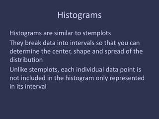
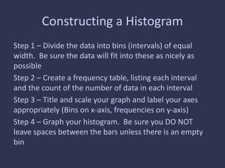
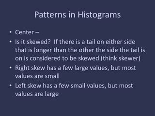
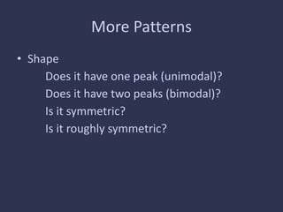
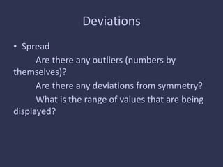
Histograms are used to graphically represent the distribution of data by dividing it into intervals and counting the frequency of data points within each interval. To construct a histogram, the data is divided into bins of equal width and a frequency table is made listing the count in each bin. The bins are then graphed on the x-axis with their corresponding frequencies on the y-axis. Patterns in histograms can reveal the center, shape, spread and skewness of the distribution through characteristics like peaks, symmetry, outliers and the range of values.