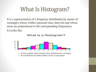
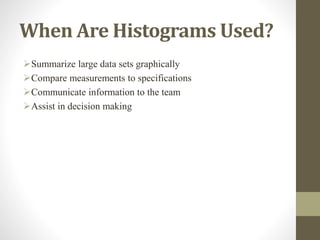
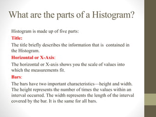
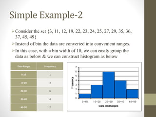
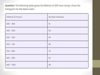
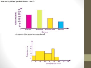
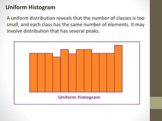
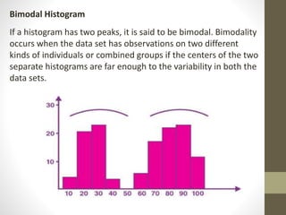
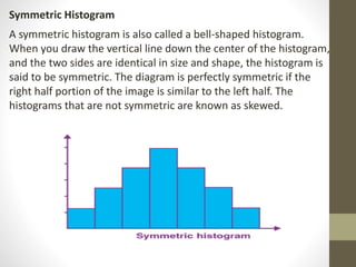
Histogram
What Is Histogram?
It is a representation of a frequency distribution by means of
rectangles whose widths represent class intervals and whose
areas are proportional to the corresponding frequencies.
It Looks like
Mathematical Definition
In a more general mathematical sense, a histogram is a
function mi that counts the number of observations that fall
into each of the disjoint categories (known as bins).
let n be the total number of observations and k be the total
number of bins, the histogram mi meets the following
conditions:
When Are Histograms Used?
Summarize large data sets graphically
Compare measurements to specifications
Communicate information to the team
Assist in decision making
What are the parts of a Histogram?
Histogram is made up of five parts:
Title:
The title briefly describes the information that is contained in
the Histogram.
Horizontal or X-Axis:
The horizontal or X-axis shows you the scale of values into
which the measurements fit.
Bars:
The bars have two important characteristics—height and width.
The height represents the number of times the values within an
interval occurred. The width represents the length of the interval
covered by the bar. It is the same for all bars.
Continue.
Vertical or Y-Axis:
The vertical or Y-axis is the scale that shows you the number of
times the values within an interval occurred. The number of
times is also referred to as "frequency.“
Legend:
The legend provides additional information that documents
where the data came from and how the measurements were
gathered
Steps of Histogram
Step 1 - Count number of data points
Step 2 - Summarize on a tally sheet
Step 3 - Compute the range
Step 4 - Determine number of intervals
Step 5 - Compute interval width
Step 6 - Determine interval starting points
Step 7 - Count number of points in each interval
Step 8 - Plot the data
Step 9 - Add title and legend
Simple Example-1
 Consider the following set for example
{1,2,2,3,3,3,3,4,4,5,6}
 we can graph them like this:
Simple Example-2
Consider the set {3, 11, 12, 19, 22, 23, 24, 25, 27, 29, 35, 36,
37, 45, 49}
Instead of bin the data are converted into convenient ranges.
In this case, with a bin width of 10, we can easily group the
data as below & we can construct histogram as below
Data Range Frequency
0-10 1
10-20 3
20-30 6
30-40 4
40-50 2
Histogram Bar Graph
It is a two-dimensional
figure
It is a one-dimensional figure
The frequency is shown
by the area of each
rectangle
The height shows the frequency and the
width has no significance.
It shows rectangles
touching each other
It consists of rectangles separated from each
other with equal spaces.
Difference Between Bar Graph and Histogram
A histogram is one of the most commonly used graphs to show the frequency
distribution. As we know that the frequency distribution defines how often each
different value occurs in the data set. The histogram looks more similar to the
bar graph, but there is a difference between them. The list of differences
between the bar graph and the histogram is given below:
Types of Histogram
The histogram can be classified into different types based on the
frequency distribution of the data. There are different types of
distributions, such as normal distribution, skewed distribution,
bimodal distribution, multimodal distribution, comb distribution,
edge peak distribution, dog food distribution, heart cut
distribution, and so on. The histogram can be used to represent
these different types of distributions.
The different types of a histogram are:
Uniform histogram
Symmetric histogram
Bimodal histogram
Probability histogram
Uniform Histogram
A uniform distribution reveals that the number of classes is too
small, and each class has the same number of elements. It may
involve distribution that has several peaks.
Bimodal Histogram
If a histogram has two peaks, it is said to be bimodal. Bimodality
occurs when the data set has observations on two different
kinds of individuals or combined groups if the centers of the two
separate histograms are far enough to the variability in both the
data sets.
Symmetric Histogram
A symmetric histogram is also called a bell-shaped histogram.
When you draw the vertical line down the center of the histogram,
and the two sides are identical in size and shape, the histogram is
said to be symmetric. The diagram is perfectly symmetric if the
right half portion of the image is similar to the left half. The
histograms that are not symmetric are known as skewed.
Probability Histogram
A Probability Histogram shows a pictorial representation of a
discrete probability distribution. It consists of a rectangle
centered on every value of x, and the area of each rectangle is
proportional to the probability of the corresponding value. The
probability histogram diagram is begun by selecting the classes.
The probabilities of each outcome are the heights of the bars of
the histogram.
Thank You

Visual Representation with Histogram ...

  • 1.
  • 2.
    What Is Histogram? Itis a representation of a frequency distribution by means of rectangles whose widths represent class intervals and whose areas are proportional to the corresponding frequencies. It Looks like
  • 3.
    Mathematical Definition In amore general mathematical sense, a histogram is a function mi that counts the number of observations that fall into each of the disjoint categories (known as bins). let n be the total number of observations and k be the total number of bins, the histogram mi meets the following conditions:
  • 4.
    When Are HistogramsUsed? Summarize large data sets graphically Compare measurements to specifications Communicate information to the team Assist in decision making
  • 5.
    What are theparts of a Histogram? Histogram is made up of five parts: Title: The title briefly describes the information that is contained in the Histogram. Horizontal or X-Axis: The horizontal or X-axis shows you the scale of values into which the measurements fit. Bars: The bars have two important characteristics—height and width. The height represents the number of times the values within an interval occurred. The width represents the length of the interval covered by the bar. It is the same for all bars.
  • 6.
    Continue. Vertical or Y-Axis: Thevertical or Y-axis is the scale that shows you the number of times the values within an interval occurred. The number of times is also referred to as "frequency.“ Legend: The legend provides additional information that documents where the data came from and how the measurements were gathered
  • 8.
    Steps of Histogram Step1 - Count number of data points Step 2 - Summarize on a tally sheet Step 3 - Compute the range Step 4 - Determine number of intervals Step 5 - Compute interval width Step 6 - Determine interval starting points Step 7 - Count number of points in each interval Step 8 - Plot the data Step 9 - Add title and legend
  • 9.
    Simple Example-1  Considerthe following set for example {1,2,2,3,3,3,3,4,4,5,6}  we can graph them like this:
  • 10.
    Simple Example-2 Consider theset {3, 11, 12, 19, 22, 23, 24, 25, 27, 29, 35, 36, 37, 45, 49} Instead of bin the data are converted into convenient ranges. In this case, with a bin width of 10, we can easily group the data as below & we can construct histogram as below Data Range Frequency 0-10 1 10-20 3 20-30 6 30-40 4 40-50 2
  • 13.
    Histogram Bar Graph Itis a two-dimensional figure It is a one-dimensional figure The frequency is shown by the area of each rectangle The height shows the frequency and the width has no significance. It shows rectangles touching each other It consists of rectangles separated from each other with equal spaces. Difference Between Bar Graph and Histogram A histogram is one of the most commonly used graphs to show the frequency distribution. As we know that the frequency distribution defines how often each different value occurs in the data set. The histogram looks more similar to the bar graph, but there is a difference between them. The list of differences between the bar graph and the histogram is given below:
  • 15.
    Types of Histogram Thehistogram can be classified into different types based on the frequency distribution of the data. There are different types of distributions, such as normal distribution, skewed distribution, bimodal distribution, multimodal distribution, comb distribution, edge peak distribution, dog food distribution, heart cut distribution, and so on. The histogram can be used to represent these different types of distributions. The different types of a histogram are: Uniform histogram Symmetric histogram Bimodal histogram Probability histogram
  • 16.
    Uniform Histogram A uniformdistribution reveals that the number of classes is too small, and each class has the same number of elements. It may involve distribution that has several peaks.
  • 17.
    Bimodal Histogram If ahistogram has two peaks, it is said to be bimodal. Bimodality occurs when the data set has observations on two different kinds of individuals or combined groups if the centers of the two separate histograms are far enough to the variability in both the data sets.
  • 18.
    Symmetric Histogram A symmetrichistogram is also called a bell-shaped histogram. When you draw the vertical line down the center of the histogram, and the two sides are identical in size and shape, the histogram is said to be symmetric. The diagram is perfectly symmetric if the right half portion of the image is similar to the left half. The histograms that are not symmetric are known as skewed.
  • 19.
    Probability Histogram A ProbabilityHistogram shows a pictorial representation of a discrete probability distribution. It consists of a rectangle centered on every value of x, and the area of each rectangle is proportional to the probability of the corresponding value. The probability histogram diagram is begun by selecting the classes. The probabilities of each outcome are the heights of the bars of the histogram.
  • 20.