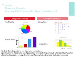
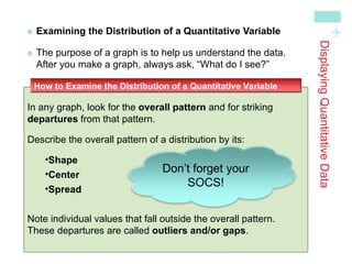
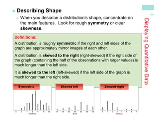
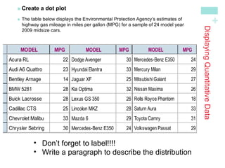
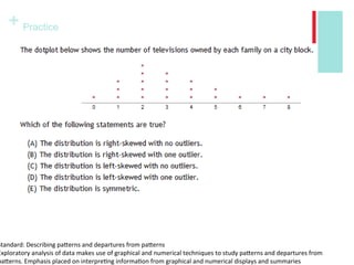
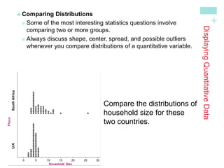
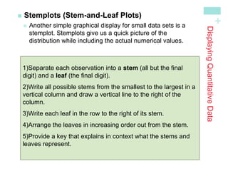
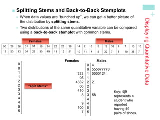
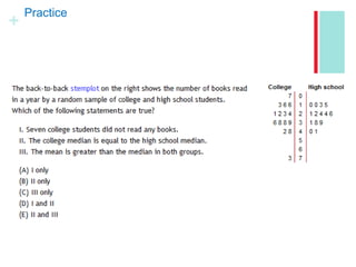
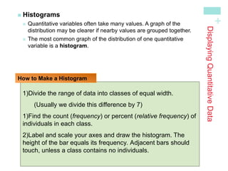
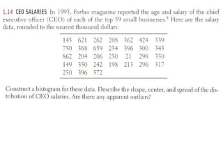
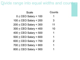
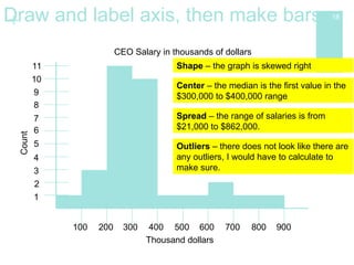
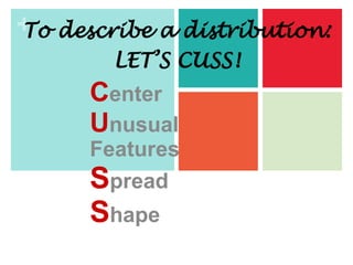
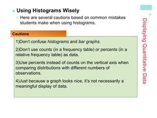
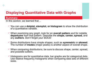
The document discusses how to display distributions using various graphical methods such as dot plots, stem plots, histograms, and box plots, emphasizing the importance of interpreting the overall shape, center, spread, and outliers in quantitative data. It provides guidelines for creating these graphs, examining distributions, and comparing two or more groups using visual techniques. Additionally, it highlights common mistakes and offers cautions for using these graphical methods effectively.