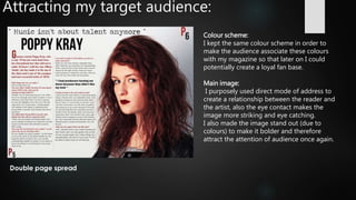
Evaluation
questions 4 &5 
WHO WOULD BE THE AUDIENCE FOR YOUR MEDIA PRODUCT?
HOW DID YOU ATTRACT/ADDRESS YOUR AUDIENCE?
My target audience:
 Both females and males
 Between the ages of 16 to 25
 From working class/middle class
 Interested in Indie rock alternative music
I know who my audience would be for my media product as I had a focus
group which consisted of people who fit my target audience. With the help
of this focus group I was able to get information and opinions on what would
attract them in a magazine such as mine.
This would be the audience for my
media product.
Attracting my target audience:
 During my the ‘planning and research’ part of my work, I had done some
research about what my target audience would be interested in/attracted
to. This is what I found out:
Minimalist
Neutral
Chilled/layed back expression
Black Leather jacket
Guitar
Drums
70’s look
Black and white
Vintage photography
Polaroid
Urban location
Records/vinyl
Festivals
Simple
Eye contact with audience
This information I got from my focus group helped me
know what kind of things to include in my magazine in
order to attract my target audience. In addition to this I
also made a mood board which is currently on my blog
so that I had a clear idea of what I was aiming for.
How I attracted my target audience:
Colour scheme:
 Since my focus group said they liked black and white (monochrome) and
simple/neutral colours, and also since my target audience consists of males
and females I wanted to include neutral colours (eg: black, white, red) and
in particular no gender specific colours in order to attract both genders
equally.
Colours that I used in my
final production.
I purposely used colours (house style) similar to NME’s and Q’s because I
wanted my magazine to look similar to them as it would instantly catch the
attention of that specific target audience .
How I attracted my target audience:
Direct mode of address:
 I established direct mode of address in order to create a personal
relationship between the reader/audience and the model.
 I also did it for the model (female) to be the subject and not the object
(which is unconventional).
 What is did was radical/pluralistic (ie: broke down stereotypes and
challenged the hegemonic perspective) therefore I knew it was going to
catch the attention of both females and males.
 This could also be seen as empowering for the female audience as the model
(female) looks fierce/ confident, therefore this would definitely attract the
female audience.
Main image:
 I made the main image look imposing.
 I made it the focus of the front cover by having the colours stand out (eg:
the model’s hair and lipstick next to the black and white (plain) colours of
the font/text.
 This would catch the attention/attract my audience.
Front cover
How I attracted my target audience:
Features – Pull quotes & buzz words:
 I used pull quotes to attract my target audience as they
create hermeneutic questions and therefore entices the
reader.
 In addition to this I used buzz words such as ‘exclusive’
to attract the audience as it suggests that it will be
something that can solely be seen in my magazine.
 As well as that I made the featured artist name stand out
by putting it in a bolder/bigger font and by making it red
in order to attract my target audience immediately when
they look at the front cover.
Attracting my target audience:
 Contents page not completed
Attracting my target audience:
Pull quote:
 I used a pull quotes to entice my
target audience to read the article
on the double page spread and
create hermeneutic questions.
 I purposely made both of the pull
quotes controversial and
interesting to create even more
questioning (hypodermic needle).
Anchorage text:
 I made the name of the artist into
anchorage text in order to make
it eye-catching and get the
attention of my audience.
Double page spread
Attracting my target audience:
Colour scheme:
I kept the same colour scheme in order to
make the audience associate these colours
with my magazine so that later on I could
potentially create a loyal fan base.
Main image:
I purposely used direct mode of address to
create a relationship between the reader and
the artist, also the eye contact makes the
image more striking and eye catching.
I also made the image stand out (due to
colours) to make it bolder and therefore
attract the attention of audience once again.

Evaluation4 and 5

  • 1.
    Evaluation questions 4 &5 WHO WOULD BE THE AUDIENCE FOR YOUR MEDIA PRODUCT? HOW DID YOU ATTRACT/ADDRESS YOUR AUDIENCE?
  • 2.
    My target audience: Both females and males  Between the ages of 16 to 25  From working class/middle class  Interested in Indie rock alternative music I know who my audience would be for my media product as I had a focus group which consisted of people who fit my target audience. With the help of this focus group I was able to get information and opinions on what would attract them in a magazine such as mine. This would be the audience for my media product.
  • 3.
    Attracting my targetaudience:  During my the ‘planning and research’ part of my work, I had done some research about what my target audience would be interested in/attracted to. This is what I found out: Minimalist Neutral Chilled/layed back expression Black Leather jacket Guitar Drums 70’s look Black and white Vintage photography Polaroid Urban location Records/vinyl Festivals Simple Eye contact with audience This information I got from my focus group helped me know what kind of things to include in my magazine in order to attract my target audience. In addition to this I also made a mood board which is currently on my blog so that I had a clear idea of what I was aiming for.
  • 4.
    How I attractedmy target audience: Colour scheme:  Since my focus group said they liked black and white (monochrome) and simple/neutral colours, and also since my target audience consists of males and females I wanted to include neutral colours (eg: black, white, red) and in particular no gender specific colours in order to attract both genders equally. Colours that I used in my final production. I purposely used colours (house style) similar to NME’s and Q’s because I wanted my magazine to look similar to them as it would instantly catch the attention of that specific target audience .
  • 5.
    How I attractedmy target audience: Direct mode of address:  I established direct mode of address in order to create a personal relationship between the reader/audience and the model.  I also did it for the model (female) to be the subject and not the object (which is unconventional).  What is did was radical/pluralistic (ie: broke down stereotypes and challenged the hegemonic perspective) therefore I knew it was going to catch the attention of both females and males.  This could also be seen as empowering for the female audience as the model (female) looks fierce/ confident, therefore this would definitely attract the female audience. Main image:  I made the main image look imposing.  I made it the focus of the front cover by having the colours stand out (eg: the model’s hair and lipstick next to the black and white (plain) colours of the font/text.  This would catch the attention/attract my audience. Front cover
  • 6.
    How I attractedmy target audience: Features – Pull quotes & buzz words:  I used pull quotes to attract my target audience as they create hermeneutic questions and therefore entices the reader.  In addition to this I used buzz words such as ‘exclusive’ to attract the audience as it suggests that it will be something that can solely be seen in my magazine.  As well as that I made the featured artist name stand out by putting it in a bolder/bigger font and by making it red in order to attract my target audience immediately when they look at the front cover.
  • 7.
    Attracting my targetaudience:  Contents page not completed
  • 8.
    Attracting my targetaudience: Pull quote:  I used a pull quotes to entice my target audience to read the article on the double page spread and create hermeneutic questions.  I purposely made both of the pull quotes controversial and interesting to create even more questioning (hypodermic needle). Anchorage text:  I made the name of the artist into anchorage text in order to make it eye-catching and get the attention of my audience. Double page spread
  • 9.
    Attracting my targetaudience: Colour scheme: I kept the same colour scheme in order to make the audience associate these colours with my magazine so that later on I could potentially create a loyal fan base. Main image: I purposely used direct mode of address to create a relationship between the reader and the artist, also the eye contact makes the image more striking and eye catching. I also made the image stand out (due to colours) to make it bolder and therefore attract the attention of audience once again.