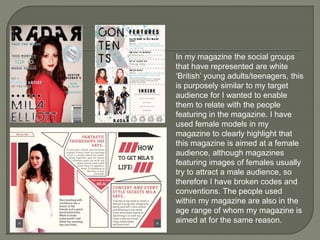
How does your media product
represent particular social groups?
In my magazine the social groups
that have represented are white
‘British’ young adults/teenagers, this
is purposely similar to my target
audience for I wanted to enable
them to relate with the people
featuring in the magazine. I have
used female models in my
magazine to clearly highlight that
this magazine is aimed at a female
audience, although magazines
featuring images of females usually
try to attract a male audience, so
therefore I have broken codes and
conventions. The people used
within my magazine are also in the
age range of whom my magazine is
aimed at for the same reason.
On the front cover is the female young adult who is arguably
representing a hegemonic view of a stereotypical woman of this
age due to the more mature expression on her face, however it
could be pluralistic in that it is not presented in a negative way
but presents the target audience with a positive role model of
their own social group.
The model is wearing clothes of a stereotypical young adult with
bright red lipstick on to attract and it means the mise en scene
reflects the target audience allowing them to relate to the subject
and see her as perhaps inspirational. However it could also be
viewed as hegemonic to a contrasting negative stereotype as
red is a colour associated with danger and rebel.
From research I had found that front covers had mainly women
on the front covers over men and they were usually sexualised
in the way that they are positioned/dressed – therefore they’re
objectified (Mulvey male gaze theory) I have decided to use the
convention of having a female on the front due to my target
audience being female based.
In all of my images I have used eye-
line shots, the subject is looking into
the camera, creating direct mode of
address meaning the audience can
personally relate themselves with
the artist and a relationship can be
formed (uses and gratifications).
Direct mode of address also makes
the female more of a subject
opposed to object as their facial
expressions are visual therefore
they’re not being objectified. As I am
targeting my magazine at a female
audience I have chosen to make the
females subjects over objects as it is
more effective towards a female
audience for they do not want to feel
objectified or male dominated.
On the front cover, double page
spread and contents page I used
females allowing the audience to
relate to them more.
In the double page spread image I am again representing a
British, female young-adult I have done this by mise en scene of
her wavy hair and natural lipstick with a fun and natural coloured
style of clothing to represent a youthful character. She has a
slightly mysterious expression on her face but the direct mode of
address prevents her being seen as an object rather than subject.
The expression on her face and use of mise en scene is
hegemonic of young adult stereotypes for it is mature and
examples a positive role model to the target audience meaning
they can relate to her for they will be on a similar age group.
They are looking directly at the camera which again creates direct
mode of address, which allows them not to be objectified. They
are wearing dark ‘fashionable’ clothing typical of a band however
this could go against the conventions of a typical young-adult for it
conveys a rebellious nature due to the dark edgy like clothing.
However this could still appeal to the target audience.
The layout is representative of a female young
adult audience in the way that there is a
sophisticated yet quirky layout to the page with a
couple of images and not heavily detailed sections
of complex text, I have put all my text in large fonts
as opposed to the usual conventions of magazine
fonts which are usually reasonably small, so it
could appeal to my target audience. The structure
is easily read followed and well organised. By
using a well structured layout I have eliminated any
discomfort for the reader in that they may not have
been able to easily read, by not over crowding the
page with text or images (e.g. like the music
magazine Q). The text is to the point aiming to
keep capture and keep the audiences attention.
Finally in my production I have prioritised the reception theory with the
ability to relate between the audience and similar aged models
featured within the magazine. This allows the reader to create one to
one relationships between themselves and the artists who are
inspirational to them, where by these artists intrigue and entice fans
creating potential loyalty for the magazine. The fact the teenage
artists represent other youths suggests this is what makes the
audience want to read about their own potential, this is done by the
positioning of the shot and using poses which reflected confidence
and direct mode of address as well as easily read text. This is similar
to magazines such as Billboard, who grab audiences attention by
relating to them. By doing this it means that the audience is in the
right place to get the preferred reading from the media text.

Evaluation question 2

  • 1.
    How does yourmedia product represent particular social groups?
  • 2.
    In my magazinethe social groups that have represented are white ‘British’ young adults/teenagers, this is purposely similar to my target audience for I wanted to enable them to relate with the people featuring in the magazine. I have used female models in my magazine to clearly highlight that this magazine is aimed at a female audience, although magazines featuring images of females usually try to attract a male audience, so therefore I have broken codes and conventions. The people used within my magazine are also in the age range of whom my magazine is aimed at for the same reason.
  • 3.
    On the frontcover is the female young adult who is arguably representing a hegemonic view of a stereotypical woman of this age due to the more mature expression on her face, however it could be pluralistic in that it is not presented in a negative way but presents the target audience with a positive role model of their own social group. The model is wearing clothes of a stereotypical young adult with bright red lipstick on to attract and it means the mise en scene reflects the target audience allowing them to relate to the subject and see her as perhaps inspirational. However it could also be viewed as hegemonic to a contrasting negative stereotype as red is a colour associated with danger and rebel. From research I had found that front covers had mainly women on the front covers over men and they were usually sexualised in the way that they are positioned/dressed – therefore they’re objectified (Mulvey male gaze theory) I have decided to use the convention of having a female on the front due to my target audience being female based.
  • 4.
    In all ofmy images I have used eye- line shots, the subject is looking into the camera, creating direct mode of address meaning the audience can personally relate themselves with the artist and a relationship can be formed (uses and gratifications). Direct mode of address also makes the female more of a subject opposed to object as their facial expressions are visual therefore they’re not being objectified. As I am targeting my magazine at a female audience I have chosen to make the females subjects over objects as it is more effective towards a female audience for they do not want to feel objectified or male dominated. On the front cover, double page spread and contents page I used females allowing the audience to relate to them more.
  • 5.
    In the doublepage spread image I am again representing a British, female young-adult I have done this by mise en scene of her wavy hair and natural lipstick with a fun and natural coloured style of clothing to represent a youthful character. She has a slightly mysterious expression on her face but the direct mode of address prevents her being seen as an object rather than subject. The expression on her face and use of mise en scene is hegemonic of young adult stereotypes for it is mature and examples a positive role model to the target audience meaning they can relate to her for they will be on a similar age group. They are looking directly at the camera which again creates direct mode of address, which allows them not to be objectified. They are wearing dark ‘fashionable’ clothing typical of a band however this could go against the conventions of a typical young-adult for it conveys a rebellious nature due to the dark edgy like clothing. However this could still appeal to the target audience.
  • 6.
    The layout isrepresentative of a female young adult audience in the way that there is a sophisticated yet quirky layout to the page with a couple of images and not heavily detailed sections of complex text, I have put all my text in large fonts as opposed to the usual conventions of magazine fonts which are usually reasonably small, so it could appeal to my target audience. The structure is easily read followed and well organised. By using a well structured layout I have eliminated any discomfort for the reader in that they may not have been able to easily read, by not over crowding the page with text or images (e.g. like the music magazine Q). The text is to the point aiming to keep capture and keep the audiences attention.
  • 7.
    Finally in myproduction I have prioritised the reception theory with the ability to relate between the audience and similar aged models featured within the magazine. This allows the reader to create one to one relationships between themselves and the artists who are inspirational to them, where by these artists intrigue and entice fans creating potential loyalty for the magazine. The fact the teenage artists represent other youths suggests this is what makes the audience want to read about their own potential, this is done by the positioning of the shot and using poses which reflected confidence and direct mode of address as well as easily read text. This is similar to magazines such as Billboard, who grab audiences attention by relating to them. By doing this it means that the audience is in the right place to get the preferred reading from the media text.