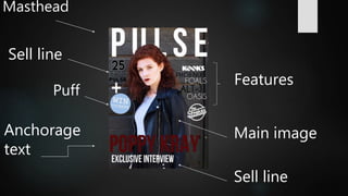
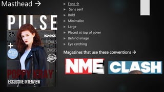
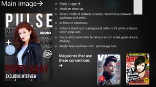
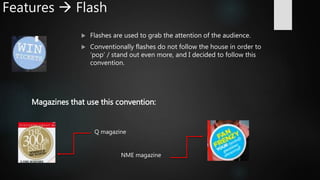
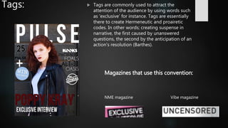
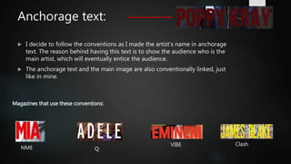
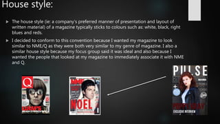
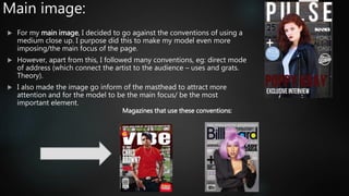
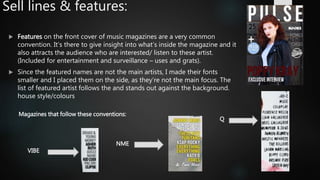
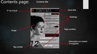
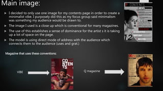
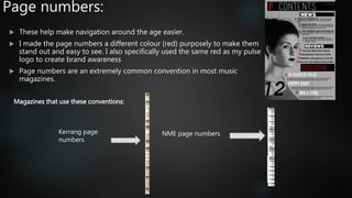
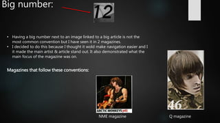
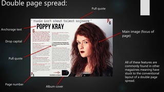
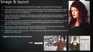
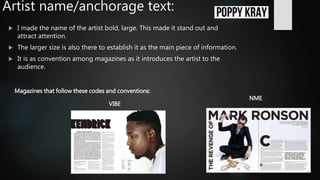
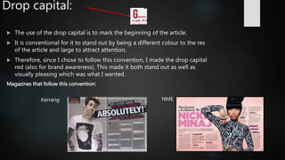
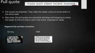
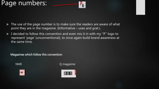
Evaluation
Question 1
IN WHAT WAYS DOES YOUR MEDIA PRODUCT USE, DEVELOP OR CHALLENGE
FORMS AND CONVENTIONS OF REAL MEDIA PRODUCTS?
Masthead
Puff
Features
Main imageAnchorage
text
Sell line
Sell line
Masthead   Font 
 Sans serif
 Bold
 Minimalist
 Large
 Placed at top of cover
 Behind image
 Eye catching
Magazines that use these conventions 
Main image  Main image 
 Medium close up.
 Direct mode of address (creates relationship between
audience and artist).
 In front of masthead.
 Colours stand out (background colours VS photo colours
which pop out).
 Fierce and passionate facial expression (male gaze –Laura
Mulvey).
 Model featured links with anchorage text.
Magazines that use
these conventions

Features  Flash
 Flashes are used to grab the attention of the audience.
 Conventionally flashes do not follow the house in order to
‘pop’ / stand out even more, and I decided to follow this
convention.
Magazines that use this convention:
Q magazine
NME magazine
Tags:  Tags are commonly used to attract the
attention of the audience by using words such
as ‘exclusive’ for instance. Tags are essentially
there to create Hermeneutic and proairetic
codes. In other words; creating suspense in
narrative, the first caused by unanswered
questions, the second by the anticipation of an
action's resolution (Barthes).
NME magazine Vibe magazine
Magazines that use this convention:
Anchorage text:
 I decide to follow the conventions as I made the artist’s name in anchorage
text. The reason behind having this text is to show the audience who is the
main artist, which will eventually entice the audience.
 The anchorage text and the main image are also conventionally linked, just
like in mine.
Magazines that use these conventions:
NME Q
VIBE Clash
House style:
 The house style (ie: a company's preferred manner of presentation and layout of
written material) of a magazine typically sticks to colours such as: white, black, right
blues and reds.
 I decided to conform to this convention because I wanted my magazine to look
similar to NME/Q as they were both very similar to my genre of magazine. I also a
similar house style because my focus group said it was ideal and also because I
wanted the people that looked at my magazine to immediately associate it with NME
and Q.
Main image:
 For my main image, I decided to go against the conventions of using a
medium close up. I purpose did this to make my model even more
imposing/the main focus of the page.
 However, apart from this, I followed many conventions, eg: direct mode
of address (which connect the artist to the audience – uses and grats.
Theory).
 I also made the image go inform of the masthead to attract more
attention and for the model to be the main focus/ be the most
important element.
Magazines that use these conventions:
Sell lines & features:
 Features on the front cover of music magazines are a very common
convention. It’s there to give insight into what’s inside the magazine and it
also attracts the audience who are interested/ listen to these artist.
(Included for entertainment and surveillance – uses and grats).
 Since the featured names are not the main artists, I made their fonts
smaller and I placed them on the side, as they’re not the main focus. The
list of featured artist follows the and stands out against the background.
house style/colours
Magazines that follow these conventions:
Q
NME
VIBE
Contents page: Contents title
‘’P’’ for PULSE
Page numbers
Image
Big number
Issue date
Information on content
of magazine
Headings
Main image:
 I decided to only use one image for my contents page in order to create a
minimalist vibe. I purposely did this as my focus group said minimalism
was something my audience would be drawn to.
 The image I used is a close up which is conventional for many magazines.
 The use of this establishes a sense of dominance for the artist s it is taking
up a lot of space on the page.
 The model is using direct mode of address with the audience which
connects them to the audience (uses and grat.)
Magazine that uses these conventions:
Q magazineVIBE
Issue date:
• The issue date follows the conventions. Its there to make the
audience feel as though they are receiving the most recent news
(informative – uses and grats.).
• I decide to be conventional, and copy what Q magazine does
with their issue date, meaning I placed it at the same level as the
‘’contents’’ heading. I also made it in a discrete and thin font as
its not the most important piece of information.
Magazines that use these conventions:
Q magazine Kerrang magazine
Contents title:
 I decided to be slightly unconventional and use a thin font for my contents page,
but I followed the convention of having it in a colour which stands out against the
background.
 Usually, many magazines use the same font for the masthead of their front cover
and the contents title. Also, many tend to use a thick/ bold font that stands out.
Examples:
NME Kerrang
 However, I wanted my contents page’s focus to be more on the picture than
anything else. So I decided to get inspiration from Q’s content page. I preferred
the smaller/thinner font for my type of magazine and so did my focus group.
Logo:
 I decided to be unconventional and add a logo in my contents page. I
wanted to remind the reader/audience about the magazine so that I could
potentially create a loyal fan base, as they would be more familiar with the
logo of ‘’PULSE’’.
 I have seen this in only 1 magazine which was Q magazine:
 This would build brand awareness, as it would instantly remind the reader
that they’re reading PULSE magazine.
Features list & headings:
 The headings are purposely larger and in a bolder font in
order to be noticeable and eye-catching to the reader.
 The colour scheme I used for the font/text is following the
house style. I occasionally put important things in red, eg:
the ‘’exclusive’’ heading, Or I out text in white for the main
articles.
 This makes navigation a lot easier and enjoyable for the
reader/audience.
 The informative text below each heading, is in smaller as it’s
the not the main info.
 Headings are made to make the reader want to find about
what’s inside the magazine itself, (eg: win tickets),
(Hypodermic needle )
Magazines that use these conventions:
Q magazine
NME magazine
Page numbers:
 These help make navigation around the age easier.
 I made the page numbers a different colour (red) purposely to make them
stand out and easy to see. I also specifically used the same red as my pulse
logo to create brand awareness
 Page numbers are an extremely common convention in most music
magazines.
Magazines that use these conventions:
NME page numbersKerrang page
numbers
Big number:
Magazines that follow these conventions:
Q magazineNME magazine
• Having a big number next to an image linked to a big article is not the
most common convention but I have seen it in 2 magazines.
• I decided to do this because I thought it wold make navigation easier and I
it made the main artist & article stand out. It also demonstrated what the
main focus of the magazine was on.
Double page spread:
Main image (focus of
page)
Page number
Pull quote
Anchorage text
Drop capital
Pull quote
All of these features are
commonly found in other
magazines meaning have
stuck to the conventional
layout of a double page
spread.
Album cover
Image & layout:
 I decided to be conventional and place the image on the right side of the page.
 I also made the image take up a significant amount of the double page spread in order
to make it more eye catching/ the focus of the pages. This also puts emphasis on the
artist which is one of my objectives.
 I also followed the convention of having my model have direct mode of address which
creates a personal link between the artist and the audience.(Personal Relationship –
uses & grats theory).
 The makeup and clothes also follow the conventions of my type of magazine as its like
a visual representation of what my audience finds appealing and also what social
group the featured artist belongs to.
 The colours in the image also remind the audience of the house style which builds
brand awareness and potentially creates a loyal fan base.
 I decided to have a close up shot so that the audience feels like they're getting close an
personal with the artist.
Magazine that uses these conventions:
NME
Artist name/anchorage text:
 I made the name of the artist bold, large. This made it stand out and
attract attention.
 The larger size is also there to establish it as the main piece of information.
 It is as convention among magazines as it introduces the artist to the
audience.
Magazines that follow these codes and conventions:
NME
VIBE
Drop capital:
 The use of the drop capital is to mark the beginning of the article.
 It is conventional for it to stand out by being a different colour to the res
of the article and large to attract attention.
 Therefore, since I chose to follow this convention, I made the drop capital
red (also for brand awareness). This made it both stand out as well as
visually pleasing which was what I wanted.
Magazines that follow this convention:
NMEKerrang
Pull quote:
 Pull quotes are enigmatic. They make the reader curious to know what's in
the article itself.
 May times, the pull quotes are voluntarily shocking and intriguing to entice
the reader to find out what is said in the article. (Hypodermic need).
Magazines that use these conventions:
Kerrang NME
Page numbers:
 The use of the page number is to make sure the readers are aware of what
point they are in the magazine. (Informative – uses and grat.).
 I decided to follow this convention and even mix it in with my ‘’P’’ logo to
represent ‘page’ (unconventional), to once again build brand awareness at
the same time.
Magazines which follow this convention:
NME Q magazine

Evaluationmedia

  • 1.
    Evaluation Question 1 IN WHATWAYS DOES YOUR MEDIA PRODUCT USE, DEVELOP OR CHALLENGE FORMS AND CONVENTIONS OF REAL MEDIA PRODUCTS?
  • 2.
  • 3.
    Masthead  Font   Sans serif  Bold  Minimalist  Large  Placed at top of cover  Behind image  Eye catching Magazines that use these conventions 
  • 4.
    Main image Main image   Medium close up.  Direct mode of address (creates relationship between audience and artist).  In front of masthead.  Colours stand out (background colours VS photo colours which pop out).  Fierce and passionate facial expression (male gaze –Laura Mulvey).  Model featured links with anchorage text. Magazines that use these conventions 
  • 5.
    Features  Flash Flashes are used to grab the attention of the audience.  Conventionally flashes do not follow the house in order to ‘pop’ / stand out even more, and I decided to follow this convention. Magazines that use this convention: Q magazine NME magazine
  • 6.
    Tags:  Tagsare commonly used to attract the attention of the audience by using words such as ‘exclusive’ for instance. Tags are essentially there to create Hermeneutic and proairetic codes. In other words; creating suspense in narrative, the first caused by unanswered questions, the second by the anticipation of an action's resolution (Barthes). NME magazine Vibe magazine Magazines that use this convention:
  • 7.
    Anchorage text:  Idecide to follow the conventions as I made the artist’s name in anchorage text. The reason behind having this text is to show the audience who is the main artist, which will eventually entice the audience.  The anchorage text and the main image are also conventionally linked, just like in mine. Magazines that use these conventions: NME Q VIBE Clash
  • 8.
    House style:  Thehouse style (ie: a company's preferred manner of presentation and layout of written material) of a magazine typically sticks to colours such as: white, black, right blues and reds.  I decided to conform to this convention because I wanted my magazine to look similar to NME/Q as they were both very similar to my genre of magazine. I also a similar house style because my focus group said it was ideal and also because I wanted the people that looked at my magazine to immediately associate it with NME and Q.
  • 9.
    Main image:  Formy main image, I decided to go against the conventions of using a medium close up. I purpose did this to make my model even more imposing/the main focus of the page.  However, apart from this, I followed many conventions, eg: direct mode of address (which connect the artist to the audience – uses and grats. Theory).  I also made the image go inform of the masthead to attract more attention and for the model to be the main focus/ be the most important element. Magazines that use these conventions:
  • 10.
    Sell lines &features:  Features on the front cover of music magazines are a very common convention. It’s there to give insight into what’s inside the magazine and it also attracts the audience who are interested/ listen to these artist. (Included for entertainment and surveillance – uses and grats).  Since the featured names are not the main artists, I made their fonts smaller and I placed them on the side, as they’re not the main focus. The list of featured artist follows the and stands out against the background. house style/colours Magazines that follow these conventions: Q NME VIBE
  • 11.
    Contents page: Contentstitle ‘’P’’ for PULSE Page numbers Image Big number Issue date Information on content of magazine Headings
  • 12.
    Main image:  Idecided to only use one image for my contents page in order to create a minimalist vibe. I purposely did this as my focus group said minimalism was something my audience would be drawn to.  The image I used is a close up which is conventional for many magazines.  The use of this establishes a sense of dominance for the artist s it is taking up a lot of space on the page.  The model is using direct mode of address with the audience which connects them to the audience (uses and grat.) Magazine that uses these conventions: Q magazineVIBE
  • 13.
    Issue date: • Theissue date follows the conventions. Its there to make the audience feel as though they are receiving the most recent news (informative – uses and grats.). • I decide to be conventional, and copy what Q magazine does with their issue date, meaning I placed it at the same level as the ‘’contents’’ heading. I also made it in a discrete and thin font as its not the most important piece of information. Magazines that use these conventions: Q magazine Kerrang magazine
  • 14.
    Contents title:  Idecided to be slightly unconventional and use a thin font for my contents page, but I followed the convention of having it in a colour which stands out against the background.  Usually, many magazines use the same font for the masthead of their front cover and the contents title. Also, many tend to use a thick/ bold font that stands out. Examples: NME Kerrang  However, I wanted my contents page’s focus to be more on the picture than anything else. So I decided to get inspiration from Q’s content page. I preferred the smaller/thinner font for my type of magazine and so did my focus group.
  • 15.
    Logo:  I decidedto be unconventional and add a logo in my contents page. I wanted to remind the reader/audience about the magazine so that I could potentially create a loyal fan base, as they would be more familiar with the logo of ‘’PULSE’’.  I have seen this in only 1 magazine which was Q magazine:  This would build brand awareness, as it would instantly remind the reader that they’re reading PULSE magazine.
  • 16.
    Features list &headings:  The headings are purposely larger and in a bolder font in order to be noticeable and eye-catching to the reader.  The colour scheme I used for the font/text is following the house style. I occasionally put important things in red, eg: the ‘’exclusive’’ heading, Or I out text in white for the main articles.  This makes navigation a lot easier and enjoyable for the reader/audience.  The informative text below each heading, is in smaller as it’s the not the main info.  Headings are made to make the reader want to find about what’s inside the magazine itself, (eg: win tickets), (Hypodermic needle ) Magazines that use these conventions: Q magazine NME magazine
  • 17.
    Page numbers:  Thesehelp make navigation around the age easier.  I made the page numbers a different colour (red) purposely to make them stand out and easy to see. I also specifically used the same red as my pulse logo to create brand awareness  Page numbers are an extremely common convention in most music magazines. Magazines that use these conventions: NME page numbersKerrang page numbers
  • 18.
    Big number: Magazines thatfollow these conventions: Q magazineNME magazine • Having a big number next to an image linked to a big article is not the most common convention but I have seen it in 2 magazines. • I decided to do this because I thought it wold make navigation easier and I it made the main artist & article stand out. It also demonstrated what the main focus of the magazine was on.
  • 19.
    Double page spread: Mainimage (focus of page) Page number Pull quote Anchorage text Drop capital Pull quote All of these features are commonly found in other magazines meaning have stuck to the conventional layout of a double page spread. Album cover
  • 20.
    Image & layout: I decided to be conventional and place the image on the right side of the page.  I also made the image take up a significant amount of the double page spread in order to make it more eye catching/ the focus of the pages. This also puts emphasis on the artist which is one of my objectives.  I also followed the convention of having my model have direct mode of address which creates a personal link between the artist and the audience.(Personal Relationship – uses & grats theory).  The makeup and clothes also follow the conventions of my type of magazine as its like a visual representation of what my audience finds appealing and also what social group the featured artist belongs to.  The colours in the image also remind the audience of the house style which builds brand awareness and potentially creates a loyal fan base.  I decided to have a close up shot so that the audience feels like they're getting close an personal with the artist. Magazine that uses these conventions: NME
  • 21.
    Artist name/anchorage text: I made the name of the artist bold, large. This made it stand out and attract attention.  The larger size is also there to establish it as the main piece of information.  It is as convention among magazines as it introduces the artist to the audience. Magazines that follow these codes and conventions: NME VIBE
  • 22.
    Drop capital:  Theuse of the drop capital is to mark the beginning of the article.  It is conventional for it to stand out by being a different colour to the res of the article and large to attract attention.  Therefore, since I chose to follow this convention, I made the drop capital red (also for brand awareness). This made it both stand out as well as visually pleasing which was what I wanted. Magazines that follow this convention: NMEKerrang
  • 23.
    Pull quote:  Pullquotes are enigmatic. They make the reader curious to know what's in the article itself.  May times, the pull quotes are voluntarily shocking and intriguing to entice the reader to find out what is said in the article. (Hypodermic need). Magazines that use these conventions: Kerrang NME
  • 24.
    Page numbers:  Theuse of the page number is to make sure the readers are aware of what point they are in the magazine. (Informative – uses and grat.).  I decided to follow this convention and even mix it in with my ‘’P’’ logo to represent ‘page’ (unconventional), to once again build brand awareness at the same time. Magazines which follow this convention: NME Q magazine