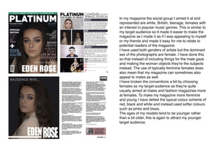
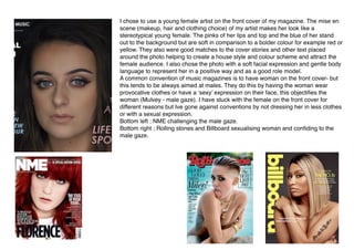
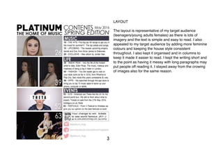
Question 2
How does your media product represent particular social groups?


In my magazine the social group I aimed it at and
represented are white, British, teenage, females with
an interest in popular music genres. This is similar to
my target audience so it made it easier to make the
magazine as I made it as if I was appealing to myself
or my friends and made it easy for me to relate to
potential readers of the magazine.
I have used both genders of artists but the dominant
sex of the photographs are female. I have done this
so that instead of including things for the male gaze
and making the woman objects they're the subjects
instead. The use of typically feminine females does
also mean that my magazine can sometimes also
appeal to males as well.
I have broken the conventions a bit by choosing
females as my target audience as they're quite
usually aimed at males and fashion magazines more
at females. To make my magazine more feminine
and young I have defied the typical colour scheme of
red, black and white and instead used softer colours
such as pinks and blues.
The ages of my models tend to be younger rather
than a bit older, this is again to attract my younger
target audience.


I chose to use a young female artist on the front cover of my magazine. The mise en
scene (makeup, hair and clothing choice) of my artist makes her look like a
stereotypical young female. The pinks of her lips and top and the blue of her stand
out to the background but are soft in comparison to a bolder colour for example red or
yellow. They also were good matches to the cover stories and other text placed
around the photo helping to create a house style and colour scheme and attract the
female audience. I also chose the photo with a soft facial expression and gentle body
language to represent her in a positive way and as a good role model.
A common convention of music magazines is to have woman on the front cover- but
this tends to be always aimed at males. They do this by having the woman wear
provocative clothes or have a ‘sexy’ expression on their face, this objectifies the
woman (Mulvey - male gaze). I have stuck with the female on the front cover for
different reasons but Ive gone against conventions by not dressing her in less clothes
or with a sexual expression.
Bottom left : NME challenging the male gaze.
Bottom right ; Rolling stones and Billboard sexualising woman and confiding to the
male gaze.


SHOT TYPES
In almost all of the pictures, I used eye line shots, the subject is staring
directly down the lens of the camera. This then creates direct mode of
dress which creates a relationship between the audience and artist (uses
and gratifications theory). Direct mode of address also allows the
females in my magazine to be subjects not objects as there facial
expressions are more easily read and the eye contact creates gives the
artist a sense of confidence and power. As females are my target
audience I want to empower the woman in the magazine and portray
them as positive role models.
I mainly used mid shots / medium
close ups in my photographs, this
allows the reader to read the body
language and facial expression of the
artist. It also enables the reader to
establish the importance of the main
feature artists in my magazine. The
image, on my front cover and one
page on my two page spread, took up
the whole page completely, this shows
that the main artist (female) is the most
important part of the magazine and
may draw in my young female target
audience as they can spot people they
can relate to more easily (as the
images are larger).
In my double page spread I am again representing British female teenager/
young adult. I have achieved this by the mise en scene, her wave hair,
makeup and pink clothing. She has a passive expression on her face but
with the use of direct mode of address she is seen as the subject rather than
an object. The expression on her face and costume is typical of that of my
target audience (young females) this will
help them to easily relate to her.
(26) She is looking at the camera which
creates direct mode of address and allows
her not to be objectified. She is wearing
similar hair and makeup to what would be
fashionable to my target audience which
helps them to relate to her.
(63) I added this medium long shot in to
change up the page and add a bit of
variety. The prop used in the image adds a
good representation of younger females
and isn't something stereotypically related
to teenagers like smoking or drinking.
The original image would of used direct
mode of address but I decided to place the text over his
eyes as i found many DJs had digital art added onto
there images. He is also the only male in the magazine
as I wanted to appeal more to a female audience and in
my research found that woman tended to appeal more to
woman when it came to magazines rather then men. 

LAYOUT
The layout is representative of my target audience
(teenagers/young adults females) as there is lots of
imagery and the text is simple and easy to read. I also
appealed to my target audience by adding more feminine
colours and keeping the house style consistent
throughout. I also kept it organised and in columns to
keep it made it easier to read. I kept the writing short and
to the point as having it messy with long paragraphs may
put people off reading it. I stayed away from the crowing
of images also for the same reason. 

IDEOLOGY
Finally, throughout the production of my magazine I prioritised the reception theory with the ability to relate
between the readers and similar aged artists featured in my magazine. This helps the reader to create a
personal relationship with the artist therefor draws in dans and can create regular readers and a loyal fan
base for Platinum. The younger artists with similar fashion choices as my target audience, of young females,
may make the readers want to read about them as they more likely relate to the artist and aspire to be them. I
did by the shot positioning using confident, friendly faces and close shots creating direct mode of address as
well the informality of the text especially when it is put in conversation form on the two page spread. This is
similar to other music magazines such as Billboard but also fashion magazines such as Marie Clair that grab
the audiences attention by relating to their target audiences. By doing this it also means that the audience is
in their comfort zone when reading the magazine.

Question 2

  • 1.
    Question 2 How doesyour media product represent particular social groups? 

  • 2.
    In my magazinethe social group I aimed it at and represented are white, British, teenage, females with an interest in popular music genres. This is similar to my target audience so it made it easier to make the magazine as I made it as if I was appealing to myself or my friends and made it easy for me to relate to potential readers of the magazine. I have used both genders of artists but the dominant sex of the photographs are female. I have done this so that instead of including things for the male gaze and making the woman objects they're the subjects instead. The use of typically feminine females does also mean that my magazine can sometimes also appeal to males as well. I have broken the conventions a bit by choosing females as my target audience as they're quite usually aimed at males and fashion magazines more at females. To make my magazine more feminine and young I have defied the typical colour scheme of red, black and white and instead used softer colours such as pinks and blues. The ages of my models tend to be younger rather than a bit older, this is again to attract my younger target audience.
  • 3.
    
 I chose touse a young female artist on the front cover of my magazine. The mise en scene (makeup, hair and clothing choice) of my artist makes her look like a stereotypical young female. The pinks of her lips and top and the blue of her stand out to the background but are soft in comparison to a bolder colour for example red or yellow. They also were good matches to the cover stories and other text placed around the photo helping to create a house style and colour scheme and attract the female audience. I also chose the photo with a soft facial expression and gentle body language to represent her in a positive way and as a good role model. A common convention of music magazines is to have woman on the front cover- but this tends to be always aimed at males. They do this by having the woman wear provocative clothes or have a ‘sexy’ expression on their face, this objectifies the woman (Mulvey - male gaze). I have stuck with the female on the front cover for different reasons but Ive gone against conventions by not dressing her in less clothes or with a sexual expression. Bottom left : NME challenging the male gaze. Bottom right ; Rolling stones and Billboard sexualising woman and confiding to the male gaze.
  • 4.
    
 SHOT TYPES In almostall of the pictures, I used eye line shots, the subject is staring directly down the lens of the camera. This then creates direct mode of dress which creates a relationship between the audience and artist (uses and gratifications theory). Direct mode of address also allows the females in my magazine to be subjects not objects as there facial expressions are more easily read and the eye contact creates gives the artist a sense of confidence and power. As females are my target audience I want to empower the woman in the magazine and portray them as positive role models. I mainly used mid shots / medium close ups in my photographs, this allows the reader to read the body language and facial expression of the artist. It also enables the reader to establish the importance of the main feature artists in my magazine. The image, on my front cover and one page on my two page spread, took up the whole page completely, this shows that the main artist (female) is the most important part of the magazine and may draw in my young female target audience as they can spot people they can relate to more easily (as the images are larger).
  • 5.
    In my doublepage spread I am again representing British female teenager/ young adult. I have achieved this by the mise en scene, her wave hair, makeup and pink clothing. She has a passive expression on her face but with the use of direct mode of address she is seen as the subject rather than an object. The expression on her face and costume is typical of that of my target audience (young females) this will help them to easily relate to her. (26) She is looking at the camera which creates direct mode of address and allows her not to be objectified. She is wearing similar hair and makeup to what would be fashionable to my target audience which helps them to relate to her. (63) I added this medium long shot in to change up the page and add a bit of variety. The prop used in the image adds a good representation of younger females and isn't something stereotypically related to teenagers like smoking or drinking. The original image would of used direct mode of address but I decided to place the text over his eyes as i found many DJs had digital art added onto there images. He is also the only male in the magazine as I wanted to appeal more to a female audience and in my research found that woman tended to appeal more to woman when it came to magazines rather then men. 

  • 6.
    LAYOUT The layout isrepresentative of my target audience (teenagers/young adults females) as there is lots of imagery and the text is simple and easy to read. I also appealed to my target audience by adding more feminine colours and keeping the house style consistent throughout. I also kept it organised and in columns to keep it made it easier to read. I kept the writing short and to the point as having it messy with long paragraphs may put people off reading it. I stayed away from the crowing of images also for the same reason. 

  • 7.
    IDEOLOGY Finally, throughout theproduction of my magazine I prioritised the reception theory with the ability to relate between the readers and similar aged artists featured in my magazine. This helps the reader to create a personal relationship with the artist therefor draws in dans and can create regular readers and a loyal fan base for Platinum. The younger artists with similar fashion choices as my target audience, of young females, may make the readers want to read about them as they more likely relate to the artist and aspire to be them. I did by the shot positioning using confident, friendly faces and close shots creating direct mode of address as well the informality of the text especially when it is put in conversation form on the two page spread. This is similar to other music magazines such as Billboard but also fashion magazines such as Marie Clair that grab the audiences attention by relating to their target audiences. By doing this it also means that the audience is in their comfort zone when reading the magazine.