
Recommended
More Related Content
What's hot
What's hot (20)
Viewers also liked
Viewers also liked (15)
Similar to Poster making process
Similar to Poster making process (20)
Recently uploaded
Recently uploaded (20)
Poster making process
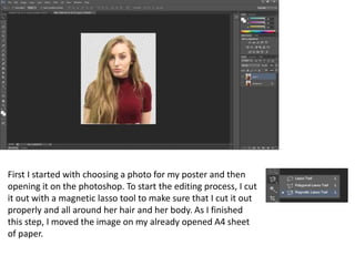
- 1. First I started with choosing a photo for my poster and then opening it on the photoshop. To start the editing process, I cut it out with a magnetic lasso tool to make sure that I cut it out properly and all around her hair and her body. As I finished this step, I moved the image on my already opened A4 sheet of paper.
- 2. After this, I started ‘experimenting’ on where to put the image and where it is going to look good and effective for a poster. At first, I thought I’d have three of the same images where the middle one stands out more than the other two at the sides but then I realised because I have some writing to do on this poster, I will have to do something with the middle image but leave the side images (shown in the next slide).
- 3. After playing with the photoshop tools and what I can do with the photo, I decided to include this abstract effect where the middle photo is still there but can not fully be seen. In my opinion, it creates a lot of effect as it looks a bit confusing, yet interesting at the same time. I chose that my colour scheme for this poster will be something like red, pink, orange. These colours are quite war and they look good with each other as well as stand out on a white background.
- 4. Then I started adding some text onto this and when I did my font style research, I found that the font that my artist’s name is written in is quite a suitable font for my poster so I decided to use it. Also, I needed to make sure that it stands out and looks effective so I used two different colours, black and red, to do this.
- 5. For an effective poster, I had to add the dates which gives my audience extra detail about this event and it’s important as the dates can always be seen on advertisements of a musical events. However, it was a struggle deciding where to put it because I wanted to make sure that it looks good on it and doesn’t stand out as much. I thought maybe the use of bold font would look good but it looked out of place instead so the struggle of where to place it still continued.
- 6. Then I tried to experiment by putting the dates underneath the name of the artist and not in bold letters and I think it looks quite eye-catching and effective as the audience is obviously going to read the artist’s name so when they look at that, they will automatically also look at the dates that are near it.
- 7. For audience’s knowledge, I needed to add what the event is and why I’m advertising it so I added a rectangle shape as well as ‘The World Tour’ in bold, capital letters which in my opinion stands out a lot and is very significant because it’s another thing that needs to catch audience’s attention.
- 8. To make sure that the white background doesn’t look too blank, I added circles of different, yet suitable colours, mostly red, orange/yellow and dark purple. I did this by using an ellipse tool and decreased an opacity to about 8%-25% so the circles are just in the background rather than stand out.
- 9. Social media is a very important convention on a poster as it tells the audience where and how further information can be found which on these social media websites. I added this information at the bottom of the page and added three most popular social media website logos to make it stand out a bit more so the audience does see that contacting the producers wouldn’t be that difficult.