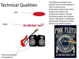
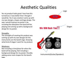
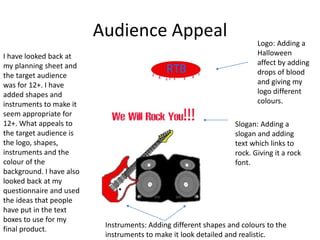
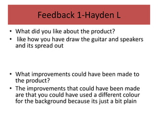
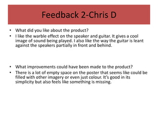
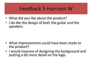
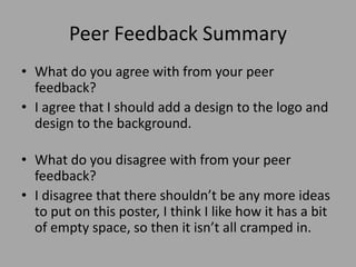
Personal Project
Evaluation
Sam Massie
Production Process Evaluation
Research
• Strengths:
• Knowing what colours I want to use for my poster.
• Knowing the different types of fonts.
• Knowing what characters/background design I wanted to use.
By coming up with different designs for my poster and finding out how I want to lay it out. Using images to put
together to create my poster. Going onto a website and finding what kind of fonts I want for the logo/slogan.
Weakness:
Not knowing what kind of logo I wanted for the band.
Not knowing what the logo should be called.
Not knowing what design to go for the background.
What I could have done better was to come up with a better design for the logo of my poster. Knowing how to
improve my shapes for my logo. Trying to come up with a better slogan.
To make the poster look more trendy and go into more detail by including times and date when the band will
play on the poster. Showing different colours for the background of the poster. Coming up with more designs to
fill the poster to make the poster more detailed.
Planning
• Strengths:
• Knowing how I want to layout my designs by using images.
• Adding examples of fonts to the text.
• Adding a colour pallet to show what types of colours I’m going to be using.
By showing what kind of ideas I could use for my poster by looking at the colours that I am going to be using.
Knowing what types of fonts I want to include for the text.
Weakness:
Not knowing what type of design I want for the background of my poster.
Not knowing whether I should include a time/date for my poster.
Not knowing whether to spend so much time on the logo by including different colours, fonts and shapes to the
logo.
What I could have done better was to include a background design for my poster, adding colour/shapes for the
background. Next time adding dates/times for when the band will be playing.
The effects that all of this would have on my poster is more details, more colours, more shapes and a
description saying about who’s playing and what time/day the band will be playing. Adding designs of the
bands.
Time Management
• Yes I managed my time well, I had plenty of time to complete my product.
• I had more time to include any other designs for my poster. In my time I
had left I checked just to make sure that there were no mistakes.
• I would have included colour to the background or maybe a design for the
background of the poster. I could of added a better design for my logo of
my product. I could of more shapes and to the poster, I was thinking of
adding the when/date for when the band will be playing.
Technical Qualities
The difference between this
product and my final product is
that my product has
instruments whereas the other
product has shapes. My
product has colours whereas
the other product has rainbow
colours. My poster is Halloween
band poster whereas the other
poster is an ordinary poster.
Logo
Slogan
Instruments( guitar
and speakers).
Aesthetic Qualities
Yes my product looks great I love how this
turned out, it was better than I though it
would be. Yes it was creative I came up with
my own designs, shapes and logo design. The
way I would improve my poster is by
including the date/place the band will be
playing and coming up with a background
design for my poster.
Strengths:
The strengths of creating this product was
coming up with my own designs for the
instruments are the band’s logo. Knowing
what kind of slogan I want for my product.
Weakness:
Not including a time/place for when the
band will be playing. Not including a
background design for my poster. Possibly
adding some more shapes for the band’s
logo.
Logo
Slogan
Instruments(Guitar/Speakers)
Audience Appeal
I have looked back at
my planning sheet and
the target audience
was for 12+. I have
added shapes and
instruments to make it
seem appropriate for
12+. What appeals to
the target audience is
the logo, shapes,
instruments and the
colour of the
background. I have also
looked back at my
questionnaire and used
the ideas that people
have put in the text
boxes to use for my
final product.
Logo: Adding a
Halloween
affect by adding
drops of blood
and giving my
logo different
colours.
Slogan: Adding a
slogan and adding
text which links to
rock. Giving it a rock
font.
Instruments: Adding different shapes and colours to the
instruments to make it look detailed and realistic.
Peer
Feedback
Feedback 1-Hayden L
• What did you like about the product?
• like how you have draw the guitar and speakers
and its spread out
• What improvements could have been made to
the product?
• The improvements that could have been made
are that you could have used a different colour
for the background because its just a bit plain
Feedback 2-Chris D
• What did you like about the product?
• I like the warble effect on the speaker and guitar. It gives a cool
image of sound being played. I also like the way the guitar is leant
against the speakers partially in front and behind.
• What improvements could have been made to the product?
• There is a lot of empty space on the poster that seems like could be
filled with other imagery or even just colour. It’s good in its
simplicity but also feels like something is missing.
Feedback 3-Harrison W
• What did you like about the product?
• I do like the design of both the guitar and the
speakers.
• What improvements could have been made to
the product?
• I would improve of designing the background and
putting a bit more detail on the logo.
Peer Feedback Summary
• What do you agree with from your peer
feedback?
• I agree that I should add a design to the logo and
design to the background.
• What do you disagree with from your peer
feedback?
• I disagree that there shouldn’t be any more ideas
to put on this poster, I think I like how it has a bit
of empty space, so then it isn’t all cramped in.
Peer Feedback Summary
The changes I would make to my poster would be: the
background, designing the logo and adding more colour. I think I
should add a background design because it would make the
poster stand out for the audience. I would add a different design
for the logo because I created the logo out of simple shapes and
added colour. I think the logo could have a better font to it and a
better colour for the background of the logo. I think I should add
more colour for the poster and I was thinking of next time adding
colour to the poster to make it stand out for the audience.
Colours that represent a band.

7. evaluation (12)

  • 1.
  • 2.
  • 3.
    Research • Strengths: • Knowingwhat colours I want to use for my poster. • Knowing the different types of fonts. • Knowing what characters/background design I wanted to use. By coming up with different designs for my poster and finding out how I want to lay it out. Using images to put together to create my poster. Going onto a website and finding what kind of fonts I want for the logo/slogan. Weakness: Not knowing what kind of logo I wanted for the band. Not knowing what the logo should be called. Not knowing what design to go for the background. What I could have done better was to come up with a better design for the logo of my poster. Knowing how to improve my shapes for my logo. Trying to come up with a better slogan. To make the poster look more trendy and go into more detail by including times and date when the band will play on the poster. Showing different colours for the background of the poster. Coming up with more designs to fill the poster to make the poster more detailed.
  • 4.
    Planning • Strengths: • Knowinghow I want to layout my designs by using images. • Adding examples of fonts to the text. • Adding a colour pallet to show what types of colours I’m going to be using. By showing what kind of ideas I could use for my poster by looking at the colours that I am going to be using. Knowing what types of fonts I want to include for the text. Weakness: Not knowing what type of design I want for the background of my poster. Not knowing whether I should include a time/date for my poster. Not knowing whether to spend so much time on the logo by including different colours, fonts and shapes to the logo. What I could have done better was to include a background design for my poster, adding colour/shapes for the background. Next time adding dates/times for when the band will be playing. The effects that all of this would have on my poster is more details, more colours, more shapes and a description saying about who’s playing and what time/day the band will be playing. Adding designs of the bands.
  • 5.
    Time Management • YesI managed my time well, I had plenty of time to complete my product. • I had more time to include any other designs for my poster. In my time I had left I checked just to make sure that there were no mistakes. • I would have included colour to the background or maybe a design for the background of the poster. I could of added a better design for my logo of my product. I could of more shapes and to the poster, I was thinking of adding the when/date for when the band will be playing.
  • 6.
    Technical Qualities The differencebetween this product and my final product is that my product has instruments whereas the other product has shapes. My product has colours whereas the other product has rainbow colours. My poster is Halloween band poster whereas the other poster is an ordinary poster. Logo Slogan Instruments( guitar and speakers).
  • 7.
    Aesthetic Qualities Yes myproduct looks great I love how this turned out, it was better than I though it would be. Yes it was creative I came up with my own designs, shapes and logo design. The way I would improve my poster is by including the date/place the band will be playing and coming up with a background design for my poster. Strengths: The strengths of creating this product was coming up with my own designs for the instruments are the band’s logo. Knowing what kind of slogan I want for my product. Weakness: Not including a time/place for when the band will be playing. Not including a background design for my poster. Possibly adding some more shapes for the band’s logo. Logo Slogan Instruments(Guitar/Speakers)
  • 8.
    Audience Appeal I havelooked back at my planning sheet and the target audience was for 12+. I have added shapes and instruments to make it seem appropriate for 12+. What appeals to the target audience is the logo, shapes, instruments and the colour of the background. I have also looked back at my questionnaire and used the ideas that people have put in the text boxes to use for my final product. Logo: Adding a Halloween affect by adding drops of blood and giving my logo different colours. Slogan: Adding a slogan and adding text which links to rock. Giving it a rock font. Instruments: Adding different shapes and colours to the instruments to make it look detailed and realistic.
  • 9.
  • 10.
    Feedback 1-Hayden L •What did you like about the product? • like how you have draw the guitar and speakers and its spread out • What improvements could have been made to the product? • The improvements that could have been made are that you could have used a different colour for the background because its just a bit plain
  • 11.
    Feedback 2-Chris D •What did you like about the product? • I like the warble effect on the speaker and guitar. It gives a cool image of sound being played. I also like the way the guitar is leant against the speakers partially in front and behind. • What improvements could have been made to the product? • There is a lot of empty space on the poster that seems like could be filled with other imagery or even just colour. It’s good in its simplicity but also feels like something is missing.
  • 12.
    Feedback 3-Harrison W •What did you like about the product? • I do like the design of both the guitar and the speakers. • What improvements could have been made to the product? • I would improve of designing the background and putting a bit more detail on the logo.
  • 13.
    Peer Feedback Summary •What do you agree with from your peer feedback? • I agree that I should add a design to the logo and design to the background. • What do you disagree with from your peer feedback? • I disagree that there shouldn’t be any more ideas to put on this poster, I think I like how it has a bit of empty space, so then it isn’t all cramped in.
  • 14.
    Peer Feedback Summary Thechanges I would make to my poster would be: the background, designing the logo and adding more colour. I think I should add a background design because it would make the poster stand out for the audience. I would add a different design for the logo because I created the logo out of simple shapes and added colour. I think the logo could have a better font to it and a better colour for the background of the logo. I think I should add more colour for the poster and I was thinking of next time adding colour to the poster to make it stand out for the audience. Colours that represent a band.

Editor's Notes

  • #4 What were the strengths of your research? How did your research help your product? What were the weaknesses of your research? What could you have done better/improve? What effect would this have had on your product?
  • #5 What were the strengths of your planning? How did your planning help your product? What were the weaknesses of your planning? What could you have done better/improve? What effect would this have had on your product?
  • #6 Did you manage your time well? Did you complete your project on time or would your products have improved with additional time? What would you have done if you had more time to produce your work?
  • #7 Compare your work to similar existing products and discuss the similarities and differences Put your final piece(s) in the centre of a page alongside an existing product Use text boxes and arrows
  • #8 Does your work look good? Was it creative? What aspects of your game’s visuals do you like? What would you improve? How would you improve it? Discuss the strengths and weaknesses Put your final piece(s) in the centre of a page and analyse them Use text boxes and arrows
  • #9 How have you appealed to your target audience? What specific bits of content would appeal to your target audience. Refer to your findings from your questionnaire. Put your final piece(s) in the centre of a page and analyse them Use text boxes and arrows
  • #15 What changes would you make to your product based upon your peer feedback and why?