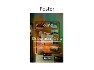
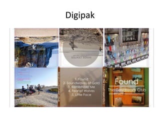
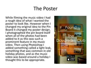
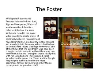
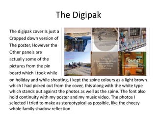
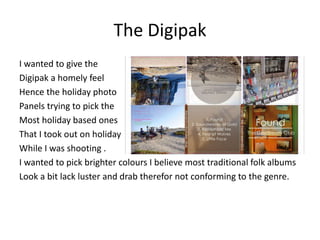
2. How effective is the combination
of your main product with ancillary
texts?
Explain how effectively you have combined
visual aspects of your music video with print
productions. Focus on how you have utilised
a particular brand style.
Music Video
https://www.youtube.com/watch?v=ZIbNo2lj8vc
Poster
Digipak
The Task
The purpose of the digipak and poster combined
with the music video was to overall to create
pieces that would promote our unsigned artist,
trying to create a overall package that I believe
that would best present my artist. As my artist is
unsigned and doesn’t get a great deal of
coverage so I have to try envisage a style in
which I believe will best represent them.
Introduction
As my music video was the first media product
this would create the overriding theme of my
other ancillary tasks and in doing this it will keep
an element of synergy. However in doing some
research into the folk genre there is only ever a
vague similarity between them, and that could
only be between the digipak and the poster.
The Poster
While filming the music video I had
a rough idea of what I wanted the
poster to look like. However when I
changed my original idea to the Pin
Board it changed my poster design.
I photographed the pin board itself
when all of the photos had been
added to it as this was such a
prominent feature in my music
video. Then using Photoshop I
added something called a light leak,
something that was common in old
holiday photos, and as the music
video was based around a holiday I
thought this to be appropriate.
The Poster
This light leak style Is also
featured in Mumford and Sons,
Sigh No More poster, Whom of
which are other folk artists.
I also kept the font the same
as the one I used in the music
video in order to create a level of
continuity between my poster and
my ancillary tasks, I also kept my font centralised
as I also did this in the music video. I decided not
to create a fake record label logo however as one
of the things that The Daydream Club have been
trying to do is to ‘make it’ without the use of one
in the first place and I thought I should justify that
with not including one I have created. I also
included on the poster the iTunes and the Google
Play insignia as these are now the most
prominent form of buying music rather than a
record/music shop such as HMV.
The Digipak
The digipak cover Is just a
Cropped down version of
The poster, However the
Other panels are
actually some of the
pictures from the pin
board which I took while
on holiday and while shooting. I kept the spine colours as a light brown
which I had picked out from the cover, this along with the white type
which stands out against the photos as well as the spine. The font also
hold continuity with my poster and my music video. The photos I
selected I tried to make as stereotypical as possible, like the cheesy
whole family shadow reflection.
The Digipak
I wanted to give the
Digipak a homely feel
Hence the holiday photo
Panels trying to pick the
Most holiday based ones
That I took out on holiday
While I was shooting .
I wanted to pick brighter colours I believe most traditional folk albums
Look a bit lack luster and drab therefor not conforming to the genre.
Conclusion
I believe my ancillary tasks add to my main product
as they are all intertwined with each other and all
feature something from the music video itself
which I believe isn’t often with folk artists. I believe
they like the music video itself reflect the overall
message of ‘Found’ and happiness and have tried to
make them as easily identifiable as possible as well
without conforming to the folk genre to much
putting my own unique spin on it. In doing this it
creates a more original package which I think fits
my artists image well.

A2 Media 2.How effective is the combination of your main product with ancillary texts? First Draft

  • 1.
    2. How effectiveis the combination of your main product with ancillary texts? Explain how effectively you have combined visual aspects of your music video with print productions. Focus on how you have utilised a particular brand style.
  • 2.
  • 3.
  • 4.
  • 5.
    The Task The purposeof the digipak and poster combined with the music video was to overall to create pieces that would promote our unsigned artist, trying to create a overall package that I believe that would best present my artist. As my artist is unsigned and doesn’t get a great deal of coverage so I have to try envisage a style in which I believe will best represent them.
  • 6.
    Introduction As my musicvideo was the first media product this would create the overriding theme of my other ancillary tasks and in doing this it will keep an element of synergy. However in doing some research into the folk genre there is only ever a vague similarity between them, and that could only be between the digipak and the poster.
  • 7.
    The Poster While filmingthe music video I had a rough idea of what I wanted the poster to look like. However when I changed my original idea to the Pin Board it changed my poster design. I photographed the pin board itself when all of the photos had been added to it as this was such a prominent feature in my music video. Then using Photoshop I added something called a light leak, something that was common in old holiday photos, and as the music video was based around a holiday I thought this to be appropriate.
  • 8.
    The Poster This lightleak style Is also featured in Mumford and Sons, Sigh No More poster, Whom of which are other folk artists. I also kept the font the same as the one I used in the music video in order to create a level of continuity between my poster and my ancillary tasks, I also kept my font centralised as I also did this in the music video. I decided not to create a fake record label logo however as one of the things that The Daydream Club have been trying to do is to ‘make it’ without the use of one in the first place and I thought I should justify that with not including one I have created. I also included on the poster the iTunes and the Google Play insignia as these are now the most prominent form of buying music rather than a record/music shop such as HMV.
  • 9.
    The Digipak The digipakcover Is just a Cropped down version of The poster, However the Other panels are actually some of the pictures from the pin board which I took while on holiday and while shooting. I kept the spine colours as a light brown which I had picked out from the cover, this along with the white type which stands out against the photos as well as the spine. The font also hold continuity with my poster and my music video. The photos I selected I tried to make as stereotypical as possible, like the cheesy whole family shadow reflection.
  • 10.
    The Digipak I wantedto give the Digipak a homely feel Hence the holiday photo Panels trying to pick the Most holiday based ones That I took out on holiday While I was shooting . I wanted to pick brighter colours I believe most traditional folk albums Look a bit lack luster and drab therefor not conforming to the genre.
  • 11.
    Conclusion I believe myancillary tasks add to my main product as they are all intertwined with each other and all feature something from the music video itself which I believe isn’t often with folk artists. I believe they like the music video itself reflect the overall message of ‘Found’ and happiness and have tried to make them as easily identifiable as possible as well without conforming to the folk genre to much putting my own unique spin on it. In doing this it creates a more original package which I think fits my artists image well.