1C – Graphic Designs
By Haseeb Patel
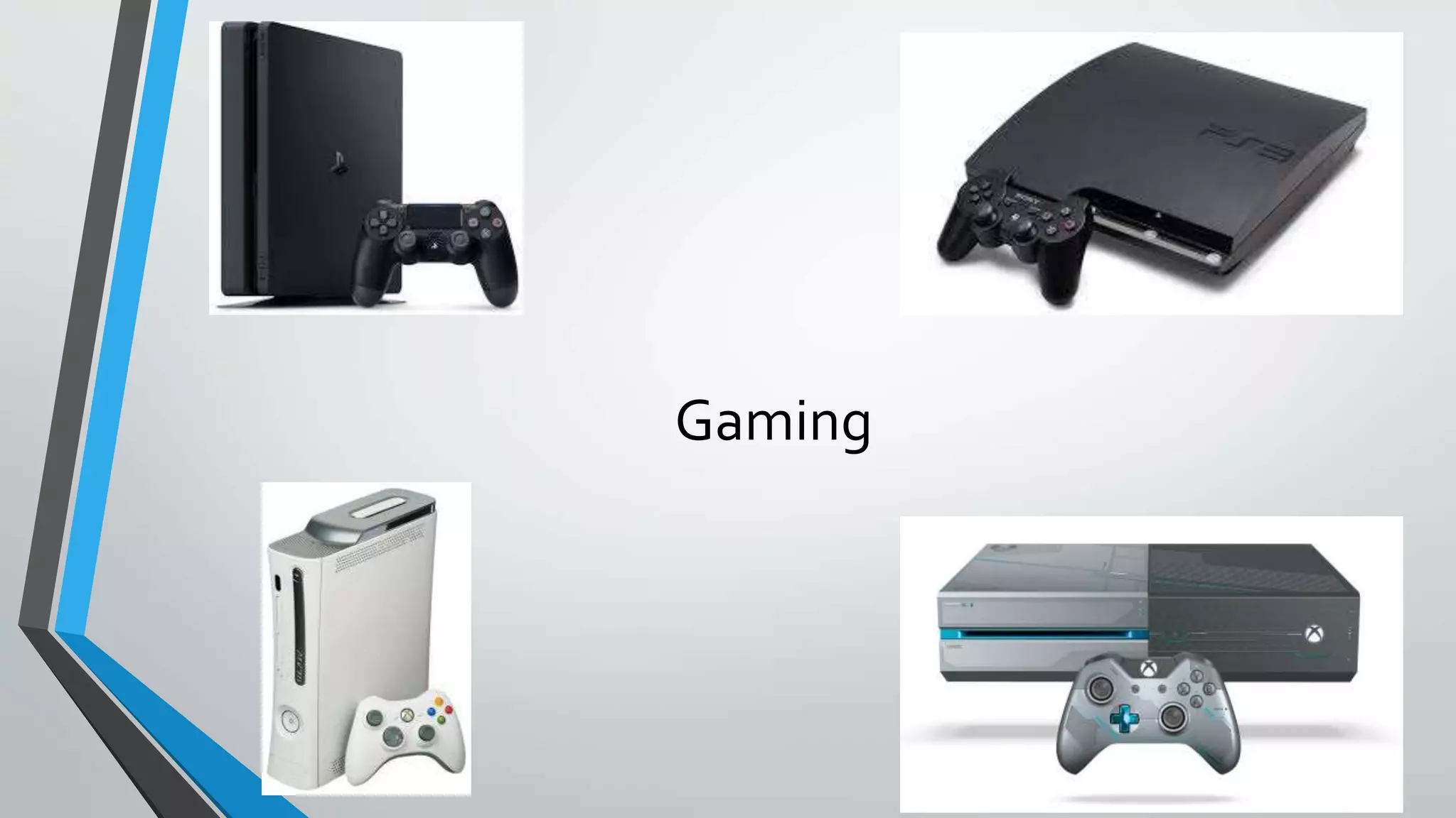
Gaming
GrandTheft AutoV (Gameplay)
• Grand Theft AutoV has shown amazing gameplay due to things like the quality of the graphics made to allow the game to move around. In
GTAV, its is a story mode game which allows the user to play missions.Whilst this is happening, the game automatically shows a little
tutorial of how to play for example clicking the appropriate buttons, what each of the buttons do, or simply for the game to allow the user to
be given an instruction for example to do a mission and the game will automatically allow the specific mission or to do list to be shown using
text in the center of the screen.
• The game also has a map to allow the user to be aware of where he is going, this is the main part of the game which cannot be missed as if
there was no map or blip then the user will find it extremely hard to find specific things like missions or places in the game such as gun shops
as well as clothes shops. In the old Grand Theft Auto, they did not have blips for the user to move around and so on, this was a disadvantage
as in the early 2000’s the graphics were not as good as they are today.
• In the top right corner, there is a section where it shows how much money and wealth each character has, this is good as it allows the user to
know how much money they have so they are able to buy different things in the games such as things like the cars as well as clothes,The
money is shown as Grand Theft Auto supplies missions for the user to complete and earn money.
• Lastly at the top left hand corner there will be instruction on what different things have been included In the game, certain news that have
been included such as unlocking cars etc.
GrandTheft AutoV (The Game Cover)
• Within theGrandTheft Auto series of games which were made for it, the typography has always been the same for each game made, this is because the
grand theft auto series would like to be original and is a game which has been distributed worldwide,The GrandTheftAutoCompany is like its own brand
in which many people will question the fact that the owner would have possibly changed the typography which could allow a lot of money being
distributed into the company for this loss whether the audience does not like the game cover and so on.
• TheGrandTheft Auto company also has a different amount of layers used to describe each gameplay or character used inside the game. For example
there are numerous of pictures used to show the characters, the cars as well as any other additional feature a game would bring to attract the audience.
As you can see, the pictures have been displayed using a black outline shown for simple reasons like the style as well as the fact that it just generally
looks good the way it has all been layered out like the composition.
• The colours which have been used for the front cover of the game are things like the different times of weather.This makes the colour of the background
for each image very different to seize as well as the fact that it suits the look of the cover in general.The text has been shown with a white piece of text as
well as a black outline as it can make the text stand out and very clear to read.The colours are all faded out in different sets of images.This is to allow all
the picture to conjoined and combined to make it look as if it is seen as one big poster.
• Within the front cover of the game there is a specific place where the point of focus is found and developed to make the game cover stand out and to
make the game itself the #1 game of 2013.The point of focus is seen at the typography as it is seen in the middle of the game cover and is also special
because the GrandTheftAutoCompany has distributed all their games within the same text so the target audience will know what to expect from the
game due to the fact that it has been made in the past.
GrandTheft Auto (Blurb)
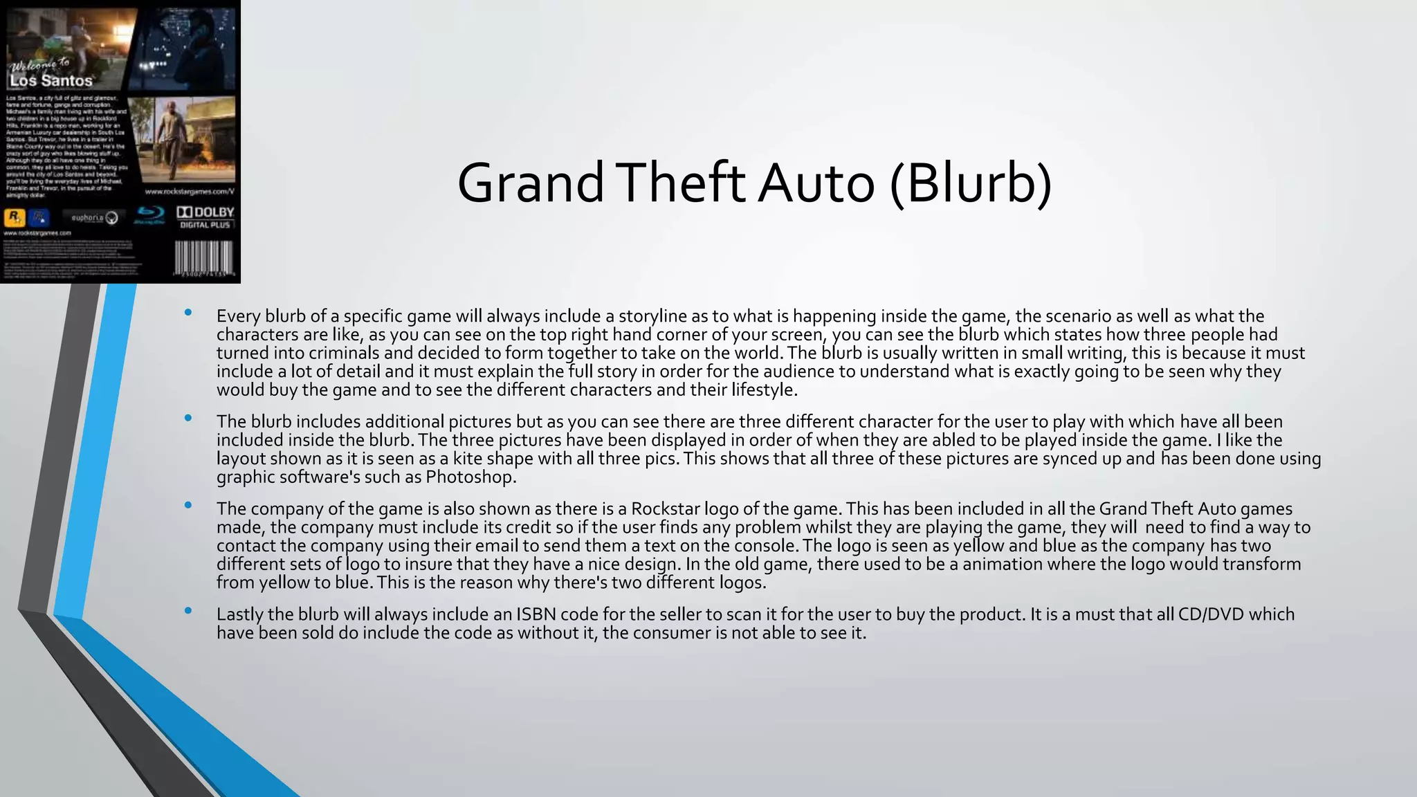
• Every blurb of a specific game will always include a storyline as to what is happening inside the game, the scenario as well as what the
characters are like, as you can see on the top right hand corner of your screen, you can see the blurb which states how three people had
turned into criminals and decided to form together to take on the world.The blurb is usually written in small writing, this is because it must
include a lot of detail and it must explain the full story in order for the audience to understand what is exactly going to be seen why they
would buy the game and to see the different characters and their lifestyle.
• The blurb includes additional pictures but as you can see there are three different character for the user to play with which have all been
included inside the blurb.The three pictures have been displayed in order of when they are abled to be played inside the game. I like the
layout shown as it is seen as a kite shape with all three pics.This shows that all three of these pictures are synced up and has been done using
graphic software's such as Photoshop.
• The company of the game is also shown as there is a Rockstar logo of the game.This has been included in all the Grand Theft Auto games
made, the company must include its credit so if the user finds any problem whilst they are playing the game, they will need to find a way to
contact the company using their email to send them a text on the console.The logo is seen as yellow and blue as the company has two
different sets of logo to insure that they have a nice design. In the old game, there used to be a animation where the logo would transform
from yellow to blue.This is the reason why there's two different logos.
• Lastly the blurb will always include an ISBN code for the seller to scan it for the user to buy the product. It is a must that all CD/DVD which
have been sold do include the code as without it, the consumer is not able to see it.
Moving Images
WWE (Text)
• WWE is aTV show which includes a lot of graphic editing technique used within them, for example in the introduction, there seems to be an
animation of the introduction to show us what theTV show is called for the new people that may involve interest in things such as theWWE.
The colour or the specific moving image has been made in red.The WWE company have two different shows, the second one is similar to this
one, however the design shown in the other one is created in blue.
• The typography used for this was the text usually made for things like stencils. I think the editors have chosen this text to keep it plain and
simple but to also make it slightly complicated as at the beginning of the show, the editor must have used after effects to make a short
introduction of the text moving sing professional edits as well as graphics such as adobe. As you can see there is a design at the back of the
text which shows different screws and different sets of technology.This is shown by the use of the interactivity of the short intro where it
shows the brand name going into the screws and the different sets of technology shown.
• The intro used of thisTV show is shown at least 9 times but the first time it is shown, includes a lot of things such as pictures and videos of
different people that work in theWWE.
WWE (Pay per view designs)
• This is a design made for matches that take places on special occasion or otherwise known as a pay per view match.The design they have
used for this is based around things like effect in the background or as well as green screen due to the fact that the two people shown in the
image are both transparent to the background hence why green screening images is the only way they were able to manage to take pictures
of the superstars and apply them to the poster making them blend in with the text.
• They have also used different sets of typography for different things, this makes the poster more detail and more eye catching to view, for
example, where it says ‘summer slam’ is the name of the show and it simply is a normal design used with text such as bubble writing.This
makes the text stand out in a way. And beside it we have standard text used to show the detail of the match, this is important as the people
need to be aware of what they are watching.
• They have also used various colours for this such as blue, blue is mainly seen for this specific image as it shows various things like coolness
and to not keep the match heated up.There are also other colours used such as yellow which is seen as a intermediate colour. It is seen in the
middle but it is not seen as the heat is rising.This tells the user/audience that it may not be a serious fight due to the different colours used
for the design.
WWE (Banner/Flyers/Posters)
• The posters which are used for theWWE may seem similar but however it is largely different due to the fact that the pay per view designs
can only be published and seen on the actual show as well as different number of audiences watching the show to gain a wide range of
knowledge of what is coming.The poster is seen as the base of the material where it is distributed towards the audience can be seen in
different shops as well as the live show itself which can also distribute tickets and so on.
• There is a lot of detail shown on this specific poster which describes a lot about the show. As you can see there is a man on the poster.This
could mean that he is hosting the event which is been distributed to the audience. Also there is a wide range of typography used to allow the
audience to be aware of what is what and to also make the design more easier to read and more attractive. No one would want to see a plain
black text used for the design as it would be boring to read. A lot of effect has been shown as well.The editor has used software's such as
Photoshop and many more.
• There is a lot of different sets of colour used for this specific poster, the different colours which have been used are colours such as red, blue
as well as white.The reason why the text red and blue have been shown is to create an impact to the audience that it is too unpredictable for
them to understand what is going to happen next and so on.
Websites
YouTube (Design)
• YouTube is a website which has been around for over a decade and a lot has changed during its time.Things like the layout of the website as
well as many things such as interactivity as well as accessibility to make it the most popular website it is today.YouTube has started in 2005
and as you can see from the image, this is what it looks like in its time. Many wonder and believe that there was not much to do as it had
recently came out. But things like audio as well as videos were abled to be watched and to be uploaded.They were the only two feature
YouTube had which made it unpopular in its time.
• Then it got to a stage where the consumers were able to make different designs such as the thumbnail for the audience to view and to click
onto the video.This had occurred later on when more people had technology by their side.The thumbnails were to be abled to be edited on
different software's such as Photoshop to make the videos more attractive and to be able to click it due to the specific images taken by the
user/consumers.
• They were also many pop-up shown within the early stages of releasing the website, as you can see there are tons of advertisement shown
within the image taken to show pop ups which are seen as passive viewing.This meant that even the consumers did not have full control of
their own account until it reached to a stage where people had access to technology such as smartphones, less pop-ups were shown by then
but allow adverts to be shown whenever the audience were able to click onto the video. However this is still seen as passive view but now,
the consumers do have full access to their website making different changes.
YouTube (Layout)
• The layout ofYouTube is shown in many ways, there are many things which can be done onYouTube such as uploading a video or many other
things such as checking how much money you are making on the video you make which are getting uploaded.These little things turn into a
vast majority of detail which allows the website to gain more attraction as well as audience. There are also different things which can be done
such as editing the channel name and to also check out the channel history whether the channel is healthy or not, receiving copyright strikes
and more.
• But the layout itself, there are many things which are displayed. As you can see in the image, there is a number of different amount of things
the user is able to click on such as things like community.These things all have something which is based aroundYouTube.The thing i dislike
about the website is that the colours which have been chosen seems too plain to the website, however this has been covered due to the
different access of things we can do on the website.
• The typography which has been used for this is simply basic text and is written in small font, however there are many more things which
makes the website more exciting to view.These are things such as the hovering on top of the text.This makes it very easy for the viewer to
know what specific page he/she is viewing.
YouTube (Colour)
• The colour of theYouTube website does not seem to show just like any ordinary website, however there are many pages as well as tabs which
do need to read from theYouTube community such as articles and webpages.There are also different channels which need to be viewed
which is consumer generated content.These are things such as what the specific person is making to entertain its audience. So the colour of
the banners as well as the logo has been covered up by the design used in the website as there are over a billion channels to view upon and
majority of them have different designs shown onto their banner.
• YouTube has their own specific category where the audience are able to upload their own videos and to be apart of theYouTube team. Or
example, whoever produces high quality gaming videos.TheYouTube team is able to pick the specific person and upload their video onto the
specific category such as gaming.
• The graphic design shown in this is that there are many channels which are lead to beautiful designs and these designs can be made on
website or if it’s a professional website,The best place to make it is Photoshop as it shows the most amount of tools.
Comparison
• The different sectors all involve graphic design shown within them, however they are highly different in their own way.
• Gaming:The gaming sector involves many things such as the use of posters as well as flyer to allow its product to be distributed, however it
does not show certain specific things that websites do as well as some moving images which is the use of consumer generated content.The
specific game which the user is playing is strictly made for them and they are not able to access and the use of credit that they have design or
made the specific game.
• Moving Images: Moving images are there to entertain their audience by simply creating a show and the user is able to watch it.This is very
different to the other two sectors as with a moving image.There is no other interactivity other than the fact that the specific audience is
viewing the show.This makes the moving image sector different from the rest.
• Websites:The websites are made for all sorts. It can be made for things like viewing a specific website, playing games on a website, it can
almost be anything the user wants it to and is the reason why it is so popular in today society and generation. However as mentioned above,
the website is the only sector out of the three which allows consumer generated content which simply means that the audience is able to
take part in creating and distributing their products.

1 c – graphic designs (1)

  • 1.
    1C – GraphicDesigns By Haseeb Patel
  • 2.
  • 3.
    GrandTheft AutoV (Gameplay) •Grand Theft AutoV has shown amazing gameplay due to things like the quality of the graphics made to allow the game to move around. In GTAV, its is a story mode game which allows the user to play missions.Whilst this is happening, the game automatically shows a little tutorial of how to play for example clicking the appropriate buttons, what each of the buttons do, or simply for the game to allow the user to be given an instruction for example to do a mission and the game will automatically allow the specific mission or to do list to be shown using text in the center of the screen. • The game also has a map to allow the user to be aware of where he is going, this is the main part of the game which cannot be missed as if there was no map or blip then the user will find it extremely hard to find specific things like missions or places in the game such as gun shops as well as clothes shops. In the old Grand Theft Auto, they did not have blips for the user to move around and so on, this was a disadvantage as in the early 2000’s the graphics were not as good as they are today. • In the top right corner, there is a section where it shows how much money and wealth each character has, this is good as it allows the user to know how much money they have so they are able to buy different things in the games such as things like the cars as well as clothes,The money is shown as Grand Theft Auto supplies missions for the user to complete and earn money. • Lastly at the top left hand corner there will be instruction on what different things have been included In the game, certain news that have been included such as unlocking cars etc.
  • 4.
    GrandTheft AutoV (TheGame Cover) • Within theGrandTheft Auto series of games which were made for it, the typography has always been the same for each game made, this is because the grand theft auto series would like to be original and is a game which has been distributed worldwide,The GrandTheftAutoCompany is like its own brand in which many people will question the fact that the owner would have possibly changed the typography which could allow a lot of money being distributed into the company for this loss whether the audience does not like the game cover and so on. • TheGrandTheft Auto company also has a different amount of layers used to describe each gameplay or character used inside the game. For example there are numerous of pictures used to show the characters, the cars as well as any other additional feature a game would bring to attract the audience. As you can see, the pictures have been displayed using a black outline shown for simple reasons like the style as well as the fact that it just generally looks good the way it has all been layered out like the composition. • The colours which have been used for the front cover of the game are things like the different times of weather.This makes the colour of the background for each image very different to seize as well as the fact that it suits the look of the cover in general.The text has been shown with a white piece of text as well as a black outline as it can make the text stand out and very clear to read.The colours are all faded out in different sets of images.This is to allow all the picture to conjoined and combined to make it look as if it is seen as one big poster. • Within the front cover of the game there is a specific place where the point of focus is found and developed to make the game cover stand out and to make the game itself the #1 game of 2013.The point of focus is seen at the typography as it is seen in the middle of the game cover and is also special because the GrandTheftAutoCompany has distributed all their games within the same text so the target audience will know what to expect from the game due to the fact that it has been made in the past.
  • 5.
    GrandTheft Auto (Blurb) •Every blurb of a specific game will always include a storyline as to what is happening inside the game, the scenario as well as what the characters are like, as you can see on the top right hand corner of your screen, you can see the blurb which states how three people had turned into criminals and decided to form together to take on the world.The blurb is usually written in small writing, this is because it must include a lot of detail and it must explain the full story in order for the audience to understand what is exactly going to be seen why they would buy the game and to see the different characters and their lifestyle. • The blurb includes additional pictures but as you can see there are three different character for the user to play with which have all been included inside the blurb.The three pictures have been displayed in order of when they are abled to be played inside the game. I like the layout shown as it is seen as a kite shape with all three pics.This shows that all three of these pictures are synced up and has been done using graphic software's such as Photoshop. • The company of the game is also shown as there is a Rockstar logo of the game.This has been included in all the Grand Theft Auto games made, the company must include its credit so if the user finds any problem whilst they are playing the game, they will need to find a way to contact the company using their email to send them a text on the console.The logo is seen as yellow and blue as the company has two different sets of logo to insure that they have a nice design. In the old game, there used to be a animation where the logo would transform from yellow to blue.This is the reason why there's two different logos. • Lastly the blurb will always include an ISBN code for the seller to scan it for the user to buy the product. It is a must that all CD/DVD which have been sold do include the code as without it, the consumer is not able to see it.
  • 6.
  • 7.
    WWE (Text) • WWEis aTV show which includes a lot of graphic editing technique used within them, for example in the introduction, there seems to be an animation of the introduction to show us what theTV show is called for the new people that may involve interest in things such as theWWE. The colour or the specific moving image has been made in red.The WWE company have two different shows, the second one is similar to this one, however the design shown in the other one is created in blue. • The typography used for this was the text usually made for things like stencils. I think the editors have chosen this text to keep it plain and simple but to also make it slightly complicated as at the beginning of the show, the editor must have used after effects to make a short introduction of the text moving sing professional edits as well as graphics such as adobe. As you can see there is a design at the back of the text which shows different screws and different sets of technology.This is shown by the use of the interactivity of the short intro where it shows the brand name going into the screws and the different sets of technology shown. • The intro used of thisTV show is shown at least 9 times but the first time it is shown, includes a lot of things such as pictures and videos of different people that work in theWWE.
  • 8.
    WWE (Pay perview designs) • This is a design made for matches that take places on special occasion or otherwise known as a pay per view match.The design they have used for this is based around things like effect in the background or as well as green screen due to the fact that the two people shown in the image are both transparent to the background hence why green screening images is the only way they were able to manage to take pictures of the superstars and apply them to the poster making them blend in with the text. • They have also used different sets of typography for different things, this makes the poster more detail and more eye catching to view, for example, where it says ‘summer slam’ is the name of the show and it simply is a normal design used with text such as bubble writing.This makes the text stand out in a way. And beside it we have standard text used to show the detail of the match, this is important as the people need to be aware of what they are watching. • They have also used various colours for this such as blue, blue is mainly seen for this specific image as it shows various things like coolness and to not keep the match heated up.There are also other colours used such as yellow which is seen as a intermediate colour. It is seen in the middle but it is not seen as the heat is rising.This tells the user/audience that it may not be a serious fight due to the different colours used for the design.
  • 9.
    WWE (Banner/Flyers/Posters) • Theposters which are used for theWWE may seem similar but however it is largely different due to the fact that the pay per view designs can only be published and seen on the actual show as well as different number of audiences watching the show to gain a wide range of knowledge of what is coming.The poster is seen as the base of the material where it is distributed towards the audience can be seen in different shops as well as the live show itself which can also distribute tickets and so on. • There is a lot of detail shown on this specific poster which describes a lot about the show. As you can see there is a man on the poster.This could mean that he is hosting the event which is been distributed to the audience. Also there is a wide range of typography used to allow the audience to be aware of what is what and to also make the design more easier to read and more attractive. No one would want to see a plain black text used for the design as it would be boring to read. A lot of effect has been shown as well.The editor has used software's such as Photoshop and many more. • There is a lot of different sets of colour used for this specific poster, the different colours which have been used are colours such as red, blue as well as white.The reason why the text red and blue have been shown is to create an impact to the audience that it is too unpredictable for them to understand what is going to happen next and so on.
  • 10.
  • 11.
    YouTube (Design) • YouTubeis a website which has been around for over a decade and a lot has changed during its time.Things like the layout of the website as well as many things such as interactivity as well as accessibility to make it the most popular website it is today.YouTube has started in 2005 and as you can see from the image, this is what it looks like in its time. Many wonder and believe that there was not much to do as it had recently came out. But things like audio as well as videos were abled to be watched and to be uploaded.They were the only two feature YouTube had which made it unpopular in its time. • Then it got to a stage where the consumers were able to make different designs such as the thumbnail for the audience to view and to click onto the video.This had occurred later on when more people had technology by their side.The thumbnails were to be abled to be edited on different software's such as Photoshop to make the videos more attractive and to be able to click it due to the specific images taken by the user/consumers. • They were also many pop-up shown within the early stages of releasing the website, as you can see there are tons of advertisement shown within the image taken to show pop ups which are seen as passive viewing.This meant that even the consumers did not have full control of their own account until it reached to a stage where people had access to technology such as smartphones, less pop-ups were shown by then but allow adverts to be shown whenever the audience were able to click onto the video. However this is still seen as passive view but now, the consumers do have full access to their website making different changes.
  • 12.
    YouTube (Layout) • Thelayout ofYouTube is shown in many ways, there are many things which can be done onYouTube such as uploading a video or many other things such as checking how much money you are making on the video you make which are getting uploaded.These little things turn into a vast majority of detail which allows the website to gain more attraction as well as audience. There are also different things which can be done such as editing the channel name and to also check out the channel history whether the channel is healthy or not, receiving copyright strikes and more. • But the layout itself, there are many things which are displayed. As you can see in the image, there is a number of different amount of things the user is able to click on such as things like community.These things all have something which is based aroundYouTube.The thing i dislike about the website is that the colours which have been chosen seems too plain to the website, however this has been covered due to the different access of things we can do on the website. • The typography which has been used for this is simply basic text and is written in small font, however there are many more things which makes the website more exciting to view.These are things such as the hovering on top of the text.This makes it very easy for the viewer to know what specific page he/she is viewing.
  • 13.
    YouTube (Colour) • Thecolour of theYouTube website does not seem to show just like any ordinary website, however there are many pages as well as tabs which do need to read from theYouTube community such as articles and webpages.There are also different channels which need to be viewed which is consumer generated content.These are things such as what the specific person is making to entertain its audience. So the colour of the banners as well as the logo has been covered up by the design used in the website as there are over a billion channels to view upon and majority of them have different designs shown onto their banner. • YouTube has their own specific category where the audience are able to upload their own videos and to be apart of theYouTube team. Or example, whoever produces high quality gaming videos.TheYouTube team is able to pick the specific person and upload their video onto the specific category such as gaming. • The graphic design shown in this is that there are many channels which are lead to beautiful designs and these designs can be made on website or if it’s a professional website,The best place to make it is Photoshop as it shows the most amount of tools.
  • 14.
    Comparison • The differentsectors all involve graphic design shown within them, however they are highly different in their own way. • Gaming:The gaming sector involves many things such as the use of posters as well as flyer to allow its product to be distributed, however it does not show certain specific things that websites do as well as some moving images which is the use of consumer generated content.The specific game which the user is playing is strictly made for them and they are not able to access and the use of credit that they have design or made the specific game. • Moving Images: Moving images are there to entertain their audience by simply creating a show and the user is able to watch it.This is very different to the other two sectors as with a moving image.There is no other interactivity other than the fact that the specific audience is viewing the show.This makes the moving image sector different from the rest. • Websites:The websites are made for all sorts. It can be made for things like viewing a specific website, playing games on a website, it can almost be anything the user wants it to and is the reason why it is so popular in today society and generation. However as mentioned above, the website is the only sector out of the three which allows consumer generated content which simply means that the audience is able to take part in creating and distributing their products.