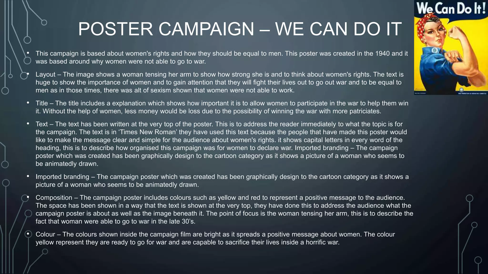
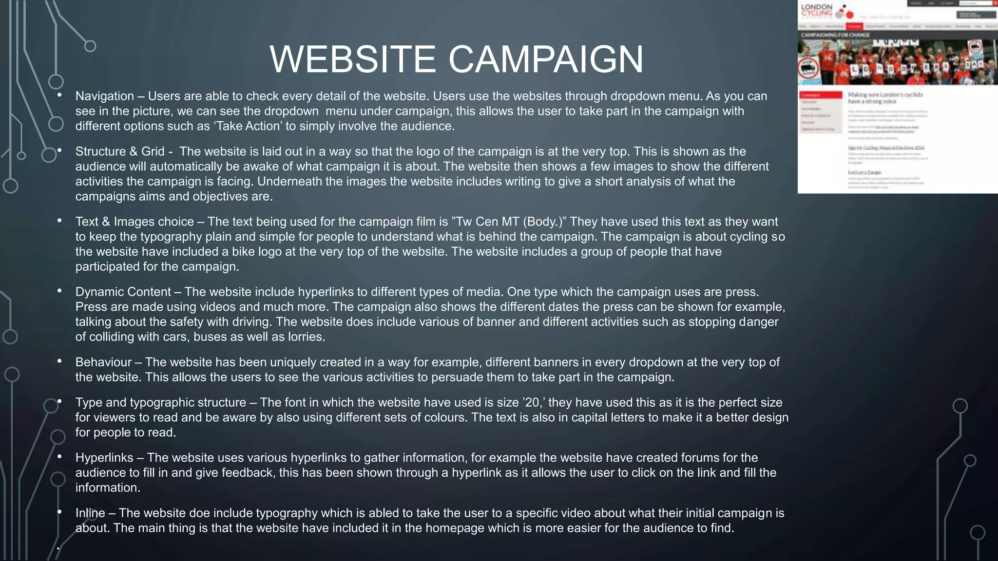
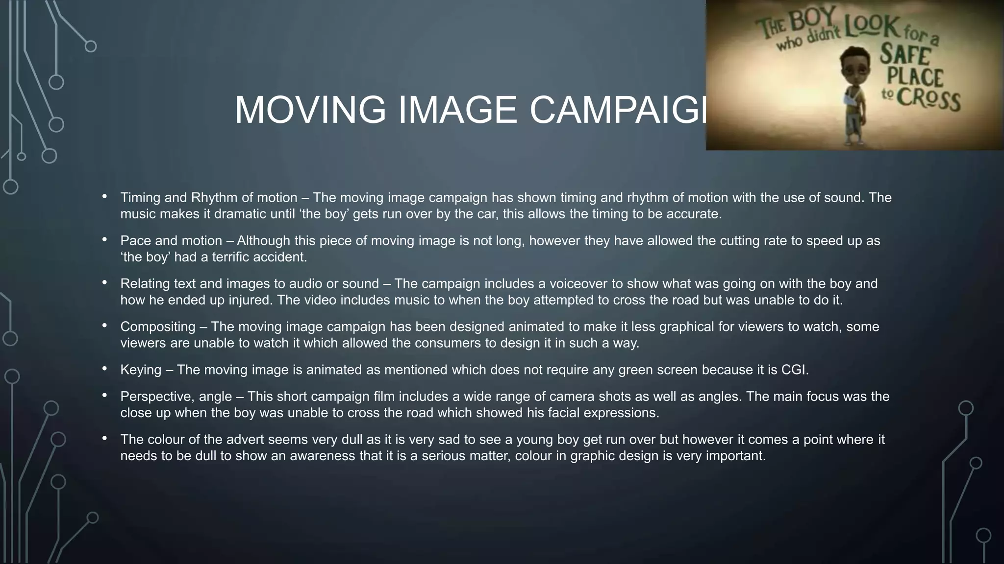
THE TECHNICAL ELEMENTS OF
GRAPHIC DESIGN
BY HASEEB PATEL
POSTER CAMPAIGN – WE CAN DO IT
• This campaign is based about women's rights and how they should be equal to men. This poster was created in the 1940 and it
was based around why women were not able to go to war.
• Layout – The image shows a woman tensing her arm to show how strong she is and to think about women's rights. The text is
huge to show the importance of women and to gain attention that they will fight their lives out to go out war and to be equal to
men as in those times, there was alt of sexism shown that women were not able to work.
• Title – The title includes a explanation which shows how important it is to allow women to participate in the war to help them win
it. Without the help of women, less money would be loss due to the possibility of winning the war with more patriciates.
• Text – The text has been written at the very top of the poster. This is to address the reader immediately to what the topic is for
the campaign. The text is in ‘Times New Roman’ they have used this text because the people that have made this poster would
like to make the message clear and simple for the audience about women's rights. it shows capital letters in every word of the
heading, this is to describe how organised this campaign was for women to declare war. Imported branding – The campaign
poster which was created has been graphically design to the cartoon category as it shows a picture of a woman who seems to
be animatedly drawn.
• Imported branding – The campaign poster which was created has been graphically design to the cartoon category as it shows a
picture of a woman who seems to be animatedly drawn.
• Composition – The campaign poster includes colours such as yellow and red to represent a positive message to the audience.
The space has been shown in a way that the text is shown at the very top, they have done this to address the audience what the
campaign poster is about as well as the image beneath it. The point of focus is the woman tensing her arm, this is to describe the
fact that woman were able to go to war in the late 30’s.
• Colour – The colours shown inside the campaign film are bright as it spreads a positive message about women. The colour
yellow represent they are ready to go for war and are capable to sacrifice their lives inside a horrific war.
WEBSITE CAMPAIGN
• Navigation – Users are able to check every detail of the website. Users use the websites through dropdown menu. As you can
see in the picture, we can see the dropdown menu under campaign, this allows the user to take part in the campaign with
different options such as ‘Take Action’ to simply involve the audience.
• Structure & Grid - The website is laid out in a way so that the logo of the campaign is at the very top. This is shown as the
audience will automatically be awake of what campaign it is about. The website then shows a few images to show the different
activities the campaign is facing. Underneath the images the website includes writing to give a short analysis of what the
campaigns aims and objectives are.
• Text & Images choice – The text being used for the campaign film is ”Tw Cen MT (Body.)” They have used this text as they want
to keep the typography plain and simple for people to understand what is behind the campaign. The campaign is about cycling so
the website have included a bike logo at the very top of the website. The website includes a group of people that have
participated for the campaign.
• Dynamic Content – The website include hyperlinks to different types of media. One type which the campaign uses are press.
Press are made using videos and much more. The campaign also shows the different dates the press can be shown for example,
talking about the safety with driving. The website does include various of banner and different activities such as stopping danger
of colliding with cars, buses as well as lorries.
• Behaviour – The website has been uniquely created in a way for example, different banners in every dropdown at the very top of
the website. This allows the users to see the various activities to persuade them to take part in the campaign.
• Type and typographic structure – The font in which the website have used is size ’20,’ they have used this as it is the perfect size
for viewers to read and be aware by also using different sets of colours. The text is also in capital letters to make it a better design
for people to read.
• Hyperlinks – The website uses various hyperlinks to gather information, for example the website have created forums for the
audience to fill in and give feedback, this has been shown through a hyperlink as it allows the user to click on the link and fill the
information.
• Inline – The website doe include typography which is abled to take the user to a specific video about what their initial campaign is
about. The main thing is that the website have included it in the homepage which is more easier for the audience to find.
•
MOVING IMAGE CAMPAIGN
• Timing and Rhythm of motion – The moving image campaign has shown timing and rhythm of motion with the use of sound. The
music makes it dramatic until ‘the boy’ gets run over by the car, this allows the timing to be accurate.
• Pace and motion – Although this piece of moving image is not long, however they have allowed the cutting rate to speed up as
‘the boy’ had a terrific accident.
• Relating text and images to audio or sound – The campaign includes a voiceover to show what was going on with the boy and
how he ended up injured. The video includes music to when the boy attempted to cross the road but was unable to do it.
• Compositing – The moving image campaign has been designed animated to make it less graphical for viewers to watch, some
viewers are unable to watch it which allowed the consumers to design it in such a way.
• Keying – The moving image is animated as mentioned which does not require any green screen because it is CGI.
• Perspective, angle – This short campaign film includes a wide range of camera shots as well as angles. The main focus was the
close up when the boy was unable to cross the road which showed his facial expressions.
• The colour of the advert seems very dull as it is very sad to see a young boy get run over but however it comes a point where it
needs to be dull to show an awareness that it is a serious matter, colour in graphic design is very important.
COMPARISON
• The poster campaign shows different graphic styles compared to the others as it looks closely at the message to make people
think outside the box about their own opinion about the image. It is also different to others as it makes people think about things
like motivation and life lessons that need to be taught. Posters are different to moving image campaign as it is able to be touched
rather than watched. This is an advantage as the poster can be distributed to the audience whereas a moving image and a
website cannot. Also older people do not have access to technology as such which has been delivered today which means that a
lot of their target audience will suffer as they cannot look at the campaign video.
• The website campaign is different to the other graphic designs as it involves a lot of reading which explains the idea of what is
going on. The website can be accessed anywhere around the web and is information which is stored on a computer/laptop. The
advantage with a website is that due to the fact it is accessed on the web, it can never be lost which is the only differences of a
website campaign which a poster campaign does not have. However the difference between a website campaign and a moving
image is that the website campaign can be access by the user. The user has full control over it and can click on what he wants.
• A moving image is different to all of them as it is an interactive product. This explains the message to the audience in a video.
Due to the fact that it is interactive, it means that it automatically outline the other two campaigns as the moving image campaign
can be watched rather than read, this means that the audience do not need to do any work other than the fact of trying to figure
out the meaning of the video.

The technical elements of graphic design 1

  • 1.
    THE TECHNICAL ELEMENTSOF GRAPHIC DESIGN BY HASEEB PATEL
  • 2.
    POSTER CAMPAIGN –WE CAN DO IT • This campaign is based about women's rights and how they should be equal to men. This poster was created in the 1940 and it was based around why women were not able to go to war. • Layout – The image shows a woman tensing her arm to show how strong she is and to think about women's rights. The text is huge to show the importance of women and to gain attention that they will fight their lives out to go out war and to be equal to men as in those times, there was alt of sexism shown that women were not able to work. • Title – The title includes a explanation which shows how important it is to allow women to participate in the war to help them win it. Without the help of women, less money would be loss due to the possibility of winning the war with more patriciates. • Text – The text has been written at the very top of the poster. This is to address the reader immediately to what the topic is for the campaign. The text is in ‘Times New Roman’ they have used this text because the people that have made this poster would like to make the message clear and simple for the audience about women's rights. it shows capital letters in every word of the heading, this is to describe how organised this campaign was for women to declare war. Imported branding – The campaign poster which was created has been graphically design to the cartoon category as it shows a picture of a woman who seems to be animatedly drawn. • Imported branding – The campaign poster which was created has been graphically design to the cartoon category as it shows a picture of a woman who seems to be animatedly drawn. • Composition – The campaign poster includes colours such as yellow and red to represent a positive message to the audience. The space has been shown in a way that the text is shown at the very top, they have done this to address the audience what the campaign poster is about as well as the image beneath it. The point of focus is the woman tensing her arm, this is to describe the fact that woman were able to go to war in the late 30’s. • Colour – The colours shown inside the campaign film are bright as it spreads a positive message about women. The colour yellow represent they are ready to go for war and are capable to sacrifice their lives inside a horrific war.
  • 3.
    WEBSITE CAMPAIGN • Navigation– Users are able to check every detail of the website. Users use the websites through dropdown menu. As you can see in the picture, we can see the dropdown menu under campaign, this allows the user to take part in the campaign with different options such as ‘Take Action’ to simply involve the audience. • Structure & Grid - The website is laid out in a way so that the logo of the campaign is at the very top. This is shown as the audience will automatically be awake of what campaign it is about. The website then shows a few images to show the different activities the campaign is facing. Underneath the images the website includes writing to give a short analysis of what the campaigns aims and objectives are. • Text & Images choice – The text being used for the campaign film is ”Tw Cen MT (Body.)” They have used this text as they want to keep the typography plain and simple for people to understand what is behind the campaign. The campaign is about cycling so the website have included a bike logo at the very top of the website. The website includes a group of people that have participated for the campaign. • Dynamic Content – The website include hyperlinks to different types of media. One type which the campaign uses are press. Press are made using videos and much more. The campaign also shows the different dates the press can be shown for example, talking about the safety with driving. The website does include various of banner and different activities such as stopping danger of colliding with cars, buses as well as lorries. • Behaviour – The website has been uniquely created in a way for example, different banners in every dropdown at the very top of the website. This allows the users to see the various activities to persuade them to take part in the campaign. • Type and typographic structure – The font in which the website have used is size ’20,’ they have used this as it is the perfect size for viewers to read and be aware by also using different sets of colours. The text is also in capital letters to make it a better design for people to read. • Hyperlinks – The website uses various hyperlinks to gather information, for example the website have created forums for the audience to fill in and give feedback, this has been shown through a hyperlink as it allows the user to click on the link and fill the information. • Inline – The website doe include typography which is abled to take the user to a specific video about what their initial campaign is about. The main thing is that the website have included it in the homepage which is more easier for the audience to find. •
  • 4.
    MOVING IMAGE CAMPAIGN •Timing and Rhythm of motion – The moving image campaign has shown timing and rhythm of motion with the use of sound. The music makes it dramatic until ‘the boy’ gets run over by the car, this allows the timing to be accurate. • Pace and motion – Although this piece of moving image is not long, however they have allowed the cutting rate to speed up as ‘the boy’ had a terrific accident. • Relating text and images to audio or sound – The campaign includes a voiceover to show what was going on with the boy and how he ended up injured. The video includes music to when the boy attempted to cross the road but was unable to do it. • Compositing – The moving image campaign has been designed animated to make it less graphical for viewers to watch, some viewers are unable to watch it which allowed the consumers to design it in such a way. • Keying – The moving image is animated as mentioned which does not require any green screen because it is CGI. • Perspective, angle – This short campaign film includes a wide range of camera shots as well as angles. The main focus was the close up when the boy was unable to cross the road which showed his facial expressions. • The colour of the advert seems very dull as it is very sad to see a young boy get run over but however it comes a point where it needs to be dull to show an awareness that it is a serious matter, colour in graphic design is very important.
  • 5.
    COMPARISON • The postercampaign shows different graphic styles compared to the others as it looks closely at the message to make people think outside the box about their own opinion about the image. It is also different to others as it makes people think about things like motivation and life lessons that need to be taught. Posters are different to moving image campaign as it is able to be touched rather than watched. This is an advantage as the poster can be distributed to the audience whereas a moving image and a website cannot. Also older people do not have access to technology as such which has been delivered today which means that a lot of their target audience will suffer as they cannot look at the campaign video. • The website campaign is different to the other graphic designs as it involves a lot of reading which explains the idea of what is going on. The website can be accessed anywhere around the web and is information which is stored on a computer/laptop. The advantage with a website is that due to the fact it is accessed on the web, it can never be lost which is the only differences of a website campaign which a poster campaign does not have. However the difference between a website campaign and a moving image is that the website campaign can be access by the user. The user has full control over it and can click on what he wants. • A moving image is different to all of them as it is an interactive product. This explains the message to the audience in a video. Due to the fact that it is interactive, it means that it automatically outline the other two campaigns as the moving image campaign can be watched rather than read, this means that the audience do not need to do any work other than the fact of trying to figure out the meaning of the video.