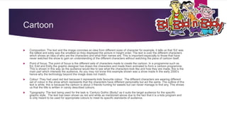
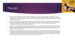
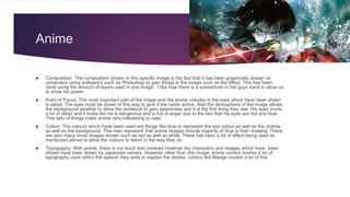
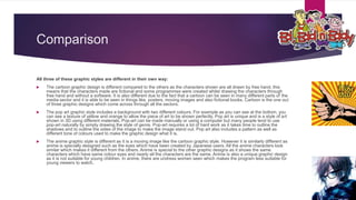
1B – Graphic Styles
BY HASEEB PATEL
Cartoon
 Composition: The text and the image connotes an idea from different sizes of character for example, it tells us that ‘Ed’ was
the tallest and eddy was the smallest so they displayed the picture in height order. The text is over the different characters
which shows an idea of who are the characters and what their names are. This is important especially to those that have
never watched the show to gain an understanding of the different characters without watching the piece of cartoon itself.
 Point of focus: The point of focus is the different sets of characters made to create the cartoon. In a programme such as
Ed, Edd and Eddy the graphic designer has drawn the characters and made them animated to form a cartoon programme.
This is shown in this way as the audience would like to see what the characters look like and how they are made, this is the
main part which interests the audience. As you may not know this example shown was a show made in the early 2000’s
hence why the technology beyond the image does not match.
 Colour: They had used red text because it represents kids favourite colour. The different characters are wearing different
set of colour in the show which represents that the characters have different personality but act the same. The outline of the
text is white, this is because the cartoon is about 3 friends hunting for sweets but can never manage to find any. This shows
us that the title is written in candy described colours.
 Typography: The text being used for the task is ‘Century Gothic (Body)’ as it suits the target audience for the specific
graphic style. The text has been shown as red and white as mentioned above due to the fact that it is a kids program and
is only meant to be used for appropriate colours to meet its specific standards of audience.
Pop-Art
 Composition: The text and the image blend in together in a way as it creates the same design/pattern. In the
image, it shows a dotted design on the thumb, similarly it also states the same design on the text. The thumb has
been seen as a massive figure due to the fact that the person who has possibly made the poster wants to spread
awareness of positivity.
 Point of Focus: The most important part of this image is the positivity shown in the image. As it has been drawn,
the user has drawn the boldness of the image to show its importance. Also the point of focus is seen through out
the whole poster. Due to the fact that it is a pop-art poster, it is shown in 3D which tells the audience its
confidences for the poster to stay happy and positive.
 Colour: In pop art, the colours shown is similar in each image. For example, in the picture above it shows us that
yellow is commonly used in graphic designs such as pop art. However it is not always shown in every pop-art as
they also show different colours. Within the pop-art graphic design, the posters need one specific colour for it to
blend in with the entire poster.
 Typography: The typography which is used in the pop-art sector of graphic design is text such as handwriting
based. This is because the poster has been design with free hand so the person who has made this had written it
in bubble handwriting to suit the pop-art factor. The typography is shown not as big as the image as it is shown
as an opinion. What I mean by this is that not everyone is happy in this world as some people suffer from poverty
as well as things like depression so a matter of opinion does not count.
Anime
 Composition: The composition shown in this specific image is the fact that it has been graphically design on
computers using software's such as Photoshop to gain things in the image such as the effect. This has been
done using the amount of layers used in one image. I like how there is a screwdriver in the guys hand to allow us
to show his power.
 Point of Focus: The most important part of the image and the anime industry is the eyes which have been drawn
in detail. The eyes must be drawn in this way to give it the name anime. Also the atmosphere of the image allows
the background weather to allow the audience to gain awareness and it is the first thing they see. His eyes involv
a lot of detail and it looks like he is dangerous and is full of anger due to the fact that his eyes are red and blue.
This sets of things make anime very interesting to read.
 Colour: The colours which have been used are things like blue to represent the eye colour as well as the clothes
as well as the background. This may represent that anime images include majority of blue in their drawing. There
are also many more images shown such as red as well as white. There has been a lot of effect being used as
mentioned above to allow the colours to blend in the way they do.
 Typography: With anime, there is not much text involved however the characters and images which have been
shown have been drawn by Japanese owners. However other than this image, anime comics involve a lot of
typography used within the speech they write to explain the stories, comics like Manga involve a lot of this.
Comparison
All three of these graphic styles are different in their own way:
 The cartoon graphic design is different compared to the others as the characters shown are all drawn by free hand, this
means that the characters made are fictional and some programmes were created whilst drawing the characters through
free hand and without a software. It is also different due to the fact that a cartoon can be seen in many different parts of the
media sector and it is able to be seen in things like, posters, moving images and also fictional books. Cartoon is the one out
of three graphic designs which come across through all the sectors.
 The pop art graphic style includes a background with two different colours. For example as you can see at the bottom, you
can see a texture of yellow and orange to allow the piece of art to be shown perfectly. Pop art is unique and is a style of art
shown in 3D using different materials. Pop-art can be made manually or using a computer but many people tend to use
pop-art naturally by simply drawing the style of genre. Pop-art requires a lot of hard work as it takes time to outline the
shadows and to outline the sides of the image to make the image stand out. Pop art also includes a pattern as well as
different tone of colours used to make the graphic design what it is.
 The anime graphic style is different as it is a moving image like the cartoon graphic style. However it is similarly different as
anime is specially designed such as the eyes which have been created by Japanese users. All the anime characters look
similar which makes it different from the others. Anime is special to the other graphic designs as it shows the same
characters which have same colour eyes and nearly all the characters are the same. Anime is also a unique graphic design
as it is not suitable for young children. In anime, there are undress women seen which makes the program less suitable for
young viewers to watch.

1 b – graphic styles

  • 1.
    1B – GraphicStyles BY HASEEB PATEL
  • 2.
    Cartoon  Composition: Thetext and the image connotes an idea from different sizes of character for example, it tells us that ‘Ed’ was the tallest and eddy was the smallest so they displayed the picture in height order. The text is over the different characters which shows an idea of who are the characters and what their names are. This is important especially to those that have never watched the show to gain an understanding of the different characters without watching the piece of cartoon itself.  Point of focus: The point of focus is the different sets of characters made to create the cartoon. In a programme such as Ed, Edd and Eddy the graphic designer has drawn the characters and made them animated to form a cartoon programme. This is shown in this way as the audience would like to see what the characters look like and how they are made, this is the main part which interests the audience. As you may not know this example shown was a show made in the early 2000’s hence why the technology beyond the image does not match.  Colour: They had used red text because it represents kids favourite colour. The different characters are wearing different set of colour in the show which represents that the characters have different personality but act the same. The outline of the text is white, this is because the cartoon is about 3 friends hunting for sweets but can never manage to find any. This shows us that the title is written in candy described colours.  Typography: The text being used for the task is ‘Century Gothic (Body)’ as it suits the target audience for the specific graphic style. The text has been shown as red and white as mentioned above due to the fact that it is a kids program and is only meant to be used for appropriate colours to meet its specific standards of audience.
  • 3.
    Pop-Art  Composition: Thetext and the image blend in together in a way as it creates the same design/pattern. In the image, it shows a dotted design on the thumb, similarly it also states the same design on the text. The thumb has been seen as a massive figure due to the fact that the person who has possibly made the poster wants to spread awareness of positivity.  Point of Focus: The most important part of this image is the positivity shown in the image. As it has been drawn, the user has drawn the boldness of the image to show its importance. Also the point of focus is seen through out the whole poster. Due to the fact that it is a pop-art poster, it is shown in 3D which tells the audience its confidences for the poster to stay happy and positive.  Colour: In pop art, the colours shown is similar in each image. For example, in the picture above it shows us that yellow is commonly used in graphic designs such as pop art. However it is not always shown in every pop-art as they also show different colours. Within the pop-art graphic design, the posters need one specific colour for it to blend in with the entire poster.  Typography: The typography which is used in the pop-art sector of graphic design is text such as handwriting based. This is because the poster has been design with free hand so the person who has made this had written it in bubble handwriting to suit the pop-art factor. The typography is shown not as big as the image as it is shown as an opinion. What I mean by this is that not everyone is happy in this world as some people suffer from poverty as well as things like depression so a matter of opinion does not count.
  • 4.
    Anime  Composition: Thecomposition shown in this specific image is the fact that it has been graphically design on computers using software's such as Photoshop to gain things in the image such as the effect. This has been done using the amount of layers used in one image. I like how there is a screwdriver in the guys hand to allow us to show his power.  Point of Focus: The most important part of the image and the anime industry is the eyes which have been drawn in detail. The eyes must be drawn in this way to give it the name anime. Also the atmosphere of the image allows the background weather to allow the audience to gain awareness and it is the first thing they see. His eyes involv a lot of detail and it looks like he is dangerous and is full of anger due to the fact that his eyes are red and blue. This sets of things make anime very interesting to read.  Colour: The colours which have been used are things like blue to represent the eye colour as well as the clothes as well as the background. This may represent that anime images include majority of blue in their drawing. There are also many more images shown such as red as well as white. There has been a lot of effect being used as mentioned above to allow the colours to blend in the way they do.  Typography: With anime, there is not much text involved however the characters and images which have been shown have been drawn by Japanese owners. However other than this image, anime comics involve a lot of typography used within the speech they write to explain the stories, comics like Manga involve a lot of this.
  • 5.
    Comparison All three ofthese graphic styles are different in their own way:  The cartoon graphic design is different compared to the others as the characters shown are all drawn by free hand, this means that the characters made are fictional and some programmes were created whilst drawing the characters through free hand and without a software. It is also different due to the fact that a cartoon can be seen in many different parts of the media sector and it is able to be seen in things like, posters, moving images and also fictional books. Cartoon is the one out of three graphic designs which come across through all the sectors.  The pop art graphic style includes a background with two different colours. For example as you can see at the bottom, you can see a texture of yellow and orange to allow the piece of art to be shown perfectly. Pop art is unique and is a style of art shown in 3D using different materials. Pop-art can be made manually or using a computer but many people tend to use pop-art naturally by simply drawing the style of genre. Pop-art requires a lot of hard work as it takes time to outline the shadows and to outline the sides of the image to make the image stand out. Pop art also includes a pattern as well as different tone of colours used to make the graphic design what it is.  The anime graphic style is different as it is a moving image like the cartoon graphic style. However it is similarly different as anime is specially designed such as the eyes which have been created by Japanese users. All the anime characters look similar which makes it different from the others. Anime is special to the other graphic designs as it shows the same characters which have same colour eyes and nearly all the characters are the same. Anime is also a unique graphic design as it is not suitable for young children. In anime, there are undress women seen which makes the program less suitable for young viewers to watch.