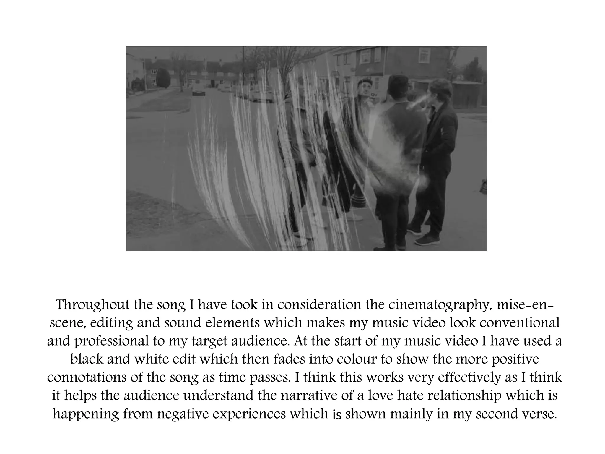
My A2 media music video has a strong love story narrative from my artists
point of view, where it explores the heart ache what people face in day to day
life therefore enabling the audience to relate to the music video. The video
takes the audience on a path of her journey and how she is coping with her
heart ache following on to her making progress and moving on her own way.
Clips of each verse
Overall, I think that my music video is effective from the typical conventions I
have used to make it similar to other existing artists under the same genre as
mine (pop/ballad) in the full sequence I have used cuts, fades, layering over of
opacity and different framed angles of close up shots and extreme close up shot
which also is reflect through my digi pack so we are able to see her emotions as
the song is portrayed to be very emotional and meaningful this has enable me
to achieve the look of a real music video and helped me achieve the aim I was
specifically looking for. Also the speed and timings of my filming edits as
consistent and match the timings of the song which is presents to be slow with
slightly faster parts nearer the end of the song.
Throughout the song I have took in consideration the cinematography, mise-en-
scene, editing and sound elements which makes my music video look conventional
and professional to my target audience. At the start of my music video I have used a
black and white edit which then fades into colour to show the more positive
connotations of the song as time passes. I think this works very effectively as I think
it helps the audience understand the narrative of a love hate relationship which is
happening from negative experiences which is shown mainly in my second verse.
However…in my opinion I don’t think the second verse of my music video was as
effective as the other verses as I came across problems when using final pro cut
and I believe it looks to contrasted compared to other well done verses. If I was to
re do my music video again I would change the location of my second verse to
somewhere where the lighting was better and where I was able to film to my full
potential as the crowd shots are seen to be not as well as constructed as other
scenes. I also think this scene is too fast compared to the beat and the over verses
of the song, as the background crowd is shown the more happy to show that he
has moved on and having fun however may look better also being slow.
I think my digi pack is very effective for my music product as I researched
the typical conventions which is located on a CD case and added them onto
my own when designing the overall piece, from my research I have also
found out that the images used in a CD pack reflect on the main element of
the product this is why I have chosen particular colours, fonts and images
within when thinking about the conventions; main image, inside lyric
booklet, 2 disc, track list, copyright information, other images, barcode, title
of song/album, name of artist.
Overall I think that my CD digi pack is very effective as it links with the song’s effects and edits which I
created and also links with the tone and representations of the lyrics. My product has a black and white
effect over the images with bold bright colours for the typography on the text, which connote the
negative and positive aspects of the song. This shows to the audience what the songs are going to be like
before consuming the main song in the CD- This is why the music video song ‘Clown’ is the first on the
track list to show the importance of it, therefore showing the representations straight away. I think the
choice of my fonts were very effective also, as they where very bold and clear to see furthermore
illustrating that at some point of the song she shines through being ‘bold’ in herself, the images I chose
where images that tied into my music video and some shots that appeared in my music video to show the
link between both my final product and digi pack.
If I was to improve my digi pack I would possibly change some images such as
the inside booklet image and the CD disc images to different locations where I
have previously filmed such as priory road. With the cars and sky in the
background, this would help the digi pack link to more elements of the music
video. However this would change the overall look that I have been trying to
create for my artist in the digi pack and the music video.
This is my promotional poster where I have used the same and similar fonts for the text to
show the continuous through the music video, CD pack and poster. This is the same for
the colour and the black and white theme however in my poster I have used one main
image which is in colour layered over the top of black and white to give a more unrealistic
outlook this is to reflects the business and amount of feelings that are involved in my
music video. I have gone for purples and blues to reflect the sky as that is one of the main
elements in the colour sequence of my music video.
Here is the black and white aspect of my music poster and the coloured aspects of my
music video, this is to show the dramatic contrast that it has compared to each other
also reflecting the bold bright text on the CD pack and the shift of emotions in the music
video. I think this works very well as there is clear links in all my products therefore
showing what has been made and what is being promoted. I have made the blue and
purple stand out in the middle image to show reference to the typography colour
throughout all products. Also the reason why the black and white images are in the
corner and are smaller elements is to show that, that is her old feelings and memories
and that she has moved on.
If I was to improve my promotional poster I would make the overall
elements look a lot lighter as the layering of the images have made
certain elements look very dark compared to others, this makes it look
slightly different to the CD pack. However this helps lift the text on top
so it is easier to understand and shows the main focus of the poster.
Overall I think all three of my products (CD pack, Poster and Music video)
is very effective all together as I have stated the choice of font, colour,
brightness and contrast, images and composition relate back to the music
video therefore showing a simple obvious link when looking at all three.
From my research I found out that colours on CD covers reflect the overall
album chosen which also ties in well with my track list as all the tracks are
very emotional and meaningful in some way others are just more upbeat
than others.
The images being in black and white has been effective as makes the hint
of colour stand out dramatically and show the change in song once
consumed, this also makes the three products look like movement of
colour from lack of it to more of it just like the music video its self.

Evaluation question 2

  • 2.
    My A2 mediamusic video has a strong love story narrative from my artists point of view, where it explores the heart ache what people face in day to day life therefore enabling the audience to relate to the music video. The video takes the audience on a path of her journey and how she is coping with her heart ache following on to her making progress and moving on her own way. Clips of each verse
  • 3.
    Overall, I thinkthat my music video is effective from the typical conventions I have used to make it similar to other existing artists under the same genre as mine (pop/ballad) in the full sequence I have used cuts, fades, layering over of opacity and different framed angles of close up shots and extreme close up shot which also is reflect through my digi pack so we are able to see her emotions as the song is portrayed to be very emotional and meaningful this has enable me to achieve the look of a real music video and helped me achieve the aim I was specifically looking for. Also the speed and timings of my filming edits as consistent and match the timings of the song which is presents to be slow with slightly faster parts nearer the end of the song.
  • 4.
    Throughout the songI have took in consideration the cinematography, mise-en- scene, editing and sound elements which makes my music video look conventional and professional to my target audience. At the start of my music video I have used a black and white edit which then fades into colour to show the more positive connotations of the song as time passes. I think this works very effectively as I think it helps the audience understand the narrative of a love hate relationship which is happening from negative experiences which is shown mainly in my second verse.
  • 5.
    However…in my opinionI don’t think the second verse of my music video was as effective as the other verses as I came across problems when using final pro cut and I believe it looks to contrasted compared to other well done verses. If I was to re do my music video again I would change the location of my second verse to somewhere where the lighting was better and where I was able to film to my full potential as the crowd shots are seen to be not as well as constructed as other scenes. I also think this scene is too fast compared to the beat and the over verses of the song, as the background crowd is shown the more happy to show that he has moved on and having fun however may look better also being slow.
  • 6.
    I think mydigi pack is very effective for my music product as I researched the typical conventions which is located on a CD case and added them onto my own when designing the overall piece, from my research I have also found out that the images used in a CD pack reflect on the main element of the product this is why I have chosen particular colours, fonts and images within when thinking about the conventions; main image, inside lyric booklet, 2 disc, track list, copyright information, other images, barcode, title of song/album, name of artist.
  • 7.
    Overall I thinkthat my CD digi pack is very effective as it links with the song’s effects and edits which I created and also links with the tone and representations of the lyrics. My product has a black and white effect over the images with bold bright colours for the typography on the text, which connote the negative and positive aspects of the song. This shows to the audience what the songs are going to be like before consuming the main song in the CD- This is why the music video song ‘Clown’ is the first on the track list to show the importance of it, therefore showing the representations straight away. I think the choice of my fonts were very effective also, as they where very bold and clear to see furthermore illustrating that at some point of the song she shines through being ‘bold’ in herself, the images I chose where images that tied into my music video and some shots that appeared in my music video to show the link between both my final product and digi pack.
  • 8.
    If I wasto improve my digi pack I would possibly change some images such as the inside booklet image and the CD disc images to different locations where I have previously filmed such as priory road. With the cars and sky in the background, this would help the digi pack link to more elements of the music video. However this would change the overall look that I have been trying to create for my artist in the digi pack and the music video.
  • 9.
    This is mypromotional poster where I have used the same and similar fonts for the text to show the continuous through the music video, CD pack and poster. This is the same for the colour and the black and white theme however in my poster I have used one main image which is in colour layered over the top of black and white to give a more unrealistic outlook this is to reflects the business and amount of feelings that are involved in my music video. I have gone for purples and blues to reflect the sky as that is one of the main elements in the colour sequence of my music video.
  • 10.
    Here is theblack and white aspect of my music poster and the coloured aspects of my music video, this is to show the dramatic contrast that it has compared to each other also reflecting the bold bright text on the CD pack and the shift of emotions in the music video. I think this works very well as there is clear links in all my products therefore showing what has been made and what is being promoted. I have made the blue and purple stand out in the middle image to show reference to the typography colour throughout all products. Also the reason why the black and white images are in the corner and are smaller elements is to show that, that is her old feelings and memories and that she has moved on.
  • 11.
    If I wasto improve my promotional poster I would make the overall elements look a lot lighter as the layering of the images have made certain elements look very dark compared to others, this makes it look slightly different to the CD pack. However this helps lift the text on top so it is easier to understand and shows the main focus of the poster.
  • 12.
    Overall I thinkall three of my products (CD pack, Poster and Music video) is very effective all together as I have stated the choice of font, colour, brightness and contrast, images and composition relate back to the music video therefore showing a simple obvious link when looking at all three. From my research I found out that colours on CD covers reflect the overall album chosen which also ties in well with my track list as all the tracks are very emotional and meaningful in some way others are just more upbeat than others. The images being in black and white has been effective as makes the hint of colour stand out dramatically and show the change in song once consumed, this also makes the three products look like movement of colour from lack of it to more of it just like the music video its self.