
Recommended
More Related Content
What's hot
What's hot (20)
Viewers also liked
Viewers also liked (20)
Similar to Double page spread analysis billboard magazine
Similar to Double page spread analysis billboard magazine (20)
Recently uploaded
Recently uploaded (20)
Double page spread analysis billboard magazine
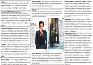
- 1. Layout- In termsof the layout,there isn'tmuchthat can be saidon thisdouble page spread.Inthiscase I couldn't reallyidentifya'grid'but, I couldidentifysomething similarinthe columnandhowthat was layoutas it seemedtohave little sub-headingsandparagraphs. Column widthand positioning- The columnsare a veryimportantpart forthe textsastheyare one of the thingsthat can helpthe readerunderstandthe texteasier. In thiscase,the columnshave a setwidthto a certain space that theyhave been allotted.Forthisdouble page spread,the widthof the columnsaren'tverywide because if theywere biggertheywouldn'tfitbutalso,theyare positionedinacertainplace touse the space available in the shot. Font and type size- Unlike someof the othertext that isin thismagazine,theyuse aserif onthese pages.A serif fontisa fontwithfancy feet.The effectof thisfontis that itmakesthe magazine seemabitmore professional whichcan add to the appeal of the magazine as thenthe audience feelliketheyare investingtheirmoneywell.I believethatthismakesup forthe fact thatthe fontsize is quite small asif it wasjustsmall and sansserif,readers may notbe attractedto read the article. Colours- A lot of the coloursthat we see on these pages are natural coloursinthe imageswhichare due tothings like lighting,decorations, props.AlsoknownasMise-en- scene whichtalksabouteverythinginthe contextof the shot.Although,we dosee the colourredwhichisto coloursome of the text.Thismakesthe textstandoff the page comparedto the simple,blacktextthatiscommonly shown. Use of space- The creatorsof thismagazine have clearlyutilisedthe space available andhave usedthe text to coverthat space that has beenleftbythe imagestaken. Thismakesit easierforusto focuson certainthings. Mainimage(s) and use of images- The main image(s) isthe image thathasgrabs most of the reader'sattention.The twomainimagesthatwe have linktothe "Music'sMen of Style".Inthe contextof the use of images,we cansee that the two people in the images(Mark RonsonandAdam Lambert) are clearlykeyfiguresinthe musicindustry.Theyare also obviouslyknownfortheirfashionhence the factthat theyhave beenaccreditedforthissectionof the magazine. Branding- The mainthingthat helpsuswiththe brandingisthe sectiononAdam Lambert.I pickedthis out specificallyashe isthe personwhoisthe main image of the front coverand isalsomentionedinthe contentspage.Thiskeepsthe focusonhimspecifically and the fact that one of the mainparts of thismusic magazine isthe fashionside,whichisclearlystatedin one of the coverlines. Language/text- Intermsof language,the editors of the magazine have againused3rd person. Ibelieve that thisaddressesthe audience betterthanother narratives.Theyalsouse a lotof formal,persuasive language.The effectof thistype of language isthatit gagesthe attentionof the readersbutalso maintains that throughoutthe article.SomethingthatIfound that isquite unusual isa Drop cap. A Drop cap is where the firstletterof the article.The effectof thisis that itstarts off the article andstarts the ball rolling. The image and the textare alsokeyparts of these pagesas theyconnote eachother.In thiscase,the textavailable ismainlytalkingaboutthe subjectinthe image whichisuseful forthe audience astheycan relate betweenthe textandthe images.Finally, anotherthingthat I wouldlike totalkaboutare Captions.We can see the captionsas little textboxes and they containinformationaboutwhatthe subject iswearing. Page numbers- Onbothpages,the page numbersare at the bottomof the pages.By havingthe page numbers,itcan helpwithidentifyingcertainarticlesfromthe recommendationsonthe contentspage. Design- Intermsof design,like I've saidbefore,theyhave usedthe space available verywell.One the mainthingsthey have keptthe same is keepingthe imagesthe biggestpartof the pagesas these are one of the thingsthat are usedfor brandingandbrand identity. Mainheadline- The mainheadline islikeaMastheadbut usuallylinkstothe article athand.In thiscase,the main headlinesare above the namesof the artistsand are coloured. The colour makesthe mainheadlinesstandouta lotmore as theylinkwiththe article andgive a brief,one wordoverview of the subjectwhichhelpsthe audience male anassumption of whotheyare.