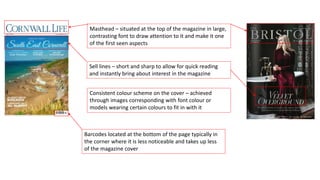
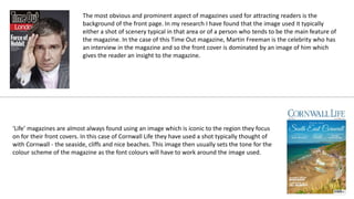
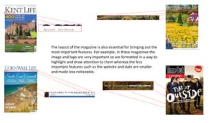
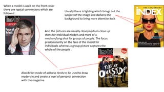
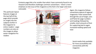
Main Task Analysis
Sell lines – short and sharp to allow for quick reading
and instantly bring about interest in the magazine
Masthead – situated at the top of the magazine in large,
contrasting font to draw attention to it and make it one
of the first seen aspects
Barcodes located at the bottom of the page typically in
the corner where it is less noticeable and takes up less
of the magazine cover
Consistent colour scheme on the cover – achieved
through images corresponding with font colour or
models wearing certain colours to fit in with it
The most obvious and prominent aspect of magazines used for attracting readers is the
background of the front page. In my research I have found that the image used it typically
either a shot of scenery typical in that area or of a person who tends to be the main feature of
the magazine. In the case of this Time Out magazine, Martin Freeman is the celebrity who has
an interview in the magazine and so the front cover is dominated by an image of him which
gives the reader an insight to the magazine.
‘Life’ magazines are almost always found using an image which is iconic to the region they focus
on for their front covers. In this case of Cornwall Life they have used a shot typically thought of
with Cornwall - the seaside, cliffs and nice beaches. This image then usually sets the tone for the
colour scheme of the magazine as the font colours will have to work around the image used.
The layout of the magazine is also essential for bringing out the
most important features. For example, in these magazines the
image and logo are very important so are formatted in a way to
highlight and draw attention to them whereas the less
important features such as the website and date are smaller
and made less noticeable.
Also the pictures are usually close/medium-close up
shots for individual models and more of a
medium/long shot for groups of people. The focus
predominantly on the face of the model for
individuals whereas a group picture captures the
whole of the people .
When a model is used on the front cover
there are typical conventions which are
followed…
Usually there is lighting which brings out the
subject of the image and darkens the
background to bring more attention to it
Also direct mode of address tends to be used to draw
readers in and create a level of personal connection
with the magazine.
- Bold yellow
background –
everything else
contrasts to this which
enables it to stand out
- Black and white font
colour consistent on
cover and ties in with
black clothing of
model
- Predominant blue
and white scheme
carried on from
image through to
the font colour
- Blue on whit and
white on blue
creates consistency
and contrast
- Black/grey colour
scheme which also
fits in with
magazine’s logo
- Model’s clothing
fits in with colour
scheme – sell lines
also follow suit to
create consistency
I have found that magazines carry a house style throughout and it is used in
order to provide identity within the magazine and its name. The colours,
more often than not, compliment each other and any bold and outstanding
colour would be used minimally and usually for promotion. The mastheads
or sell lines to tend to be contrasting to enable emphasis and draw
attention to them however the colour combinations do still allow for
professionalism and realism within the magazine.
The number of different colours used tends to be minimal from what I have
found in my research. This is achieved through doings things such as having
all masthead font the same colour and then having straplines and subtitles
in blue, for example.
Another typical convention I have found with my research into regional magazines is
advertising near the front of the magazine. Usually this is featured on the next double
spread page after the front cover with a single company taking the whole spread by
itself for advertising. These adverts are typically dominated with a single large image
accompanied by smaller amounts of text in contrasting fonts to still make it noticeable.
Brand names and prices are typically included here. This allows the reader to remember
the image and small passages of text helps to anchor this into their memory. In some
cases however, the advertisements can go on for two whole double page spreads at the
beginning of the magazine which, in turn, pushes the contents page(s) further back into
the magazine. In other circumstances there are two different advertisements featured
on one page each as opposed to taking over two pages.
A double page spread advertisement
typically features one large or a selection of
smaller images across the spread of both
pages.
Information with regards to
contact and websites are usually
situated at the bottom of the page
in a contrasting and noticeable font
which can be easily identified.
Supporting
information is
smaller and in
a short,
concise
format for
quick reading
Brand names are large and noticeable in a
bold contrasting font to draw attention to
them
Alternatively to a double page spread for one
advertisement, some magazines adopt a layout which fits
multiple adverts onto the two pages
The same conventions
apply when it comes to
supporting text which is
small in font size, short
and concise
Throughout my research I found that there was the most variance between
magazine when it came to their layout and style of their contents page. Common
codes and conventions are still applied in all cases but the way in which they were
portrayed varied greatly. The most obvious characteristic I found was that there was
no set ‘trend’ for the layout of the contents page most noticeably whether or not it
was on a double page spread and each magazine constructed their page very
specifically to their house style and targeted audience.
The font used is typical of the ‘Life’
magazines as it is in sans serif and in
black to contrast with the white
background with bolder font used for
the headings to allow easier navigation.
The following supporting text is then in
a smaller font but in far less quantity to
make for quick reading.
More images are used here in Cornwall
Life’s contents page and this gives a
quicker visual insight as to what the
magazines contains.
This contents page in
‘Buckinghamshire Life’
magazine portrays many
common features of a
regional magazine contents
page. The font used is sans
serif and in black to
contrast with the white
background with bolder
font used for the headings
to allow easier navigation.
This helps to create a
professional look, relevant
as well to the target
demographic.
Furthermore any
supporting
information is short
and concise to
allow more ease for
the reader as they
will not necessarily
be paying a lot of
attention to it.
Large header for name of page – eyes are
drawn to it and easily noticed – QR code
as well as webpage link and twitter link
which is relevant to the younger target
audience making their accessibility and
connectivity with the magazine easier and
better
Larger, bold font to
highlight page
number and subject
of that page making
navigation quicker
and easier
Smaller supporting
text in both font
size and quantity –
quick and short
details about what
the story entails to
entice readers
Half of the page is taken up by an
advertisement which differs from
other advertisements found near
the beginning of the magazine in a
sense that there is a lot more text
involved with less imagery –
potentially down to the nature of
what is being advertised – the
name of the company is still large
and bold to be easily seen with
contact information available as
well
Contents page title is far smaller than what I have commonly found in my
research and therefore challenges common conventions – there is more
emphasis on the issue of the magazine as this font is far larger and more
noticeable
This particular layout
features images at
the top half of the
page which provide
an insight into the
subjects further in
the magazine to
entice readers – page
numbers are also on
the images to allow
easier navigation fro
readers
Again, this magazine follows
conventions typical of regional
magazines I have researched
through the use of larger, sans
serif fonts for page numbers
and headings followed by
smaller, short amounts of font
for supporting text to again
increased reading speed and
ease
Social media links available
for more accessibility and
connectivity with the
magazine

Main Task - Magazine Analysis

  • 1.
  • 2.
    Sell lines –short and sharp to allow for quick reading and instantly bring about interest in the magazine Masthead – situated at the top of the magazine in large, contrasting font to draw attention to it and make it one of the first seen aspects Barcodes located at the bottom of the page typically in the corner where it is less noticeable and takes up less of the magazine cover Consistent colour scheme on the cover – achieved through images corresponding with font colour or models wearing certain colours to fit in with it
  • 3.
    The most obviousand prominent aspect of magazines used for attracting readers is the background of the front page. In my research I have found that the image used it typically either a shot of scenery typical in that area or of a person who tends to be the main feature of the magazine. In the case of this Time Out magazine, Martin Freeman is the celebrity who has an interview in the magazine and so the front cover is dominated by an image of him which gives the reader an insight to the magazine. ‘Life’ magazines are almost always found using an image which is iconic to the region they focus on for their front covers. In this case of Cornwall Life they have used a shot typically thought of with Cornwall - the seaside, cliffs and nice beaches. This image then usually sets the tone for the colour scheme of the magazine as the font colours will have to work around the image used.
  • 4.
    The layout ofthe magazine is also essential for bringing out the most important features. For example, in these magazines the image and logo are very important so are formatted in a way to highlight and draw attention to them whereas the less important features such as the website and date are smaller and made less noticeable.
  • 5.
    Also the picturesare usually close/medium-close up shots for individual models and more of a medium/long shot for groups of people. The focus predominantly on the face of the model for individuals whereas a group picture captures the whole of the people . When a model is used on the front cover there are typical conventions which are followed… Usually there is lighting which brings out the subject of the image and darkens the background to bring more attention to it Also direct mode of address tends to be used to draw readers in and create a level of personal connection with the magazine.
  • 6.
    - Bold yellow background– everything else contrasts to this which enables it to stand out - Black and white font colour consistent on cover and ties in with black clothing of model - Predominant blue and white scheme carried on from image through to the font colour - Blue on whit and white on blue creates consistency and contrast - Black/grey colour scheme which also fits in with magazine’s logo - Model’s clothing fits in with colour scheme – sell lines also follow suit to create consistency I have found that magazines carry a house style throughout and it is used in order to provide identity within the magazine and its name. The colours, more often than not, compliment each other and any bold and outstanding colour would be used minimally and usually for promotion. The mastheads or sell lines to tend to be contrasting to enable emphasis and draw attention to them however the colour combinations do still allow for professionalism and realism within the magazine. The number of different colours used tends to be minimal from what I have found in my research. This is achieved through doings things such as having all masthead font the same colour and then having straplines and subtitles in blue, for example.
  • 7.
    Another typical conventionI have found with my research into regional magazines is advertising near the front of the magazine. Usually this is featured on the next double spread page after the front cover with a single company taking the whole spread by itself for advertising. These adverts are typically dominated with a single large image accompanied by smaller amounts of text in contrasting fonts to still make it noticeable. Brand names and prices are typically included here. This allows the reader to remember the image and small passages of text helps to anchor this into their memory. In some cases however, the advertisements can go on for two whole double page spreads at the beginning of the magazine which, in turn, pushes the contents page(s) further back into the magazine. In other circumstances there are two different advertisements featured on one page each as opposed to taking over two pages.
  • 8.
    A double pagespread advertisement typically features one large or a selection of smaller images across the spread of both pages. Information with regards to contact and websites are usually situated at the bottom of the page in a contrasting and noticeable font which can be easily identified. Supporting information is smaller and in a short, concise format for quick reading Brand names are large and noticeable in a bold contrasting font to draw attention to them
  • 9.
    Alternatively to adouble page spread for one advertisement, some magazines adopt a layout which fits multiple adverts onto the two pages The same conventions apply when it comes to supporting text which is small in font size, short and concise
  • 10.
    Throughout my researchI found that there was the most variance between magazine when it came to their layout and style of their contents page. Common codes and conventions are still applied in all cases but the way in which they were portrayed varied greatly. The most obvious characteristic I found was that there was no set ‘trend’ for the layout of the contents page most noticeably whether or not it was on a double page spread and each magazine constructed their page very specifically to their house style and targeted audience.
  • 11.
    The font usedis typical of the ‘Life’ magazines as it is in sans serif and in black to contrast with the white background with bolder font used for the headings to allow easier navigation. The following supporting text is then in a smaller font but in far less quantity to make for quick reading. More images are used here in Cornwall Life’s contents page and this gives a quicker visual insight as to what the magazines contains.
  • 12.
    This contents pagein ‘Buckinghamshire Life’ magazine portrays many common features of a regional magazine contents page. The font used is sans serif and in black to contrast with the white background with bolder font used for the headings to allow easier navigation. This helps to create a professional look, relevant as well to the target demographic. Furthermore any supporting information is short and concise to allow more ease for the reader as they will not necessarily be paying a lot of attention to it.
  • 13.
    Large header forname of page – eyes are drawn to it and easily noticed – QR code as well as webpage link and twitter link which is relevant to the younger target audience making their accessibility and connectivity with the magazine easier and better Larger, bold font to highlight page number and subject of that page making navigation quicker and easier Smaller supporting text in both font size and quantity – quick and short details about what the story entails to entice readers Half of the page is taken up by an advertisement which differs from other advertisements found near the beginning of the magazine in a sense that there is a lot more text involved with less imagery – potentially down to the nature of what is being advertised – the name of the company is still large and bold to be easily seen with contact information available as well
  • 14.
    Contents page titleis far smaller than what I have commonly found in my research and therefore challenges common conventions – there is more emphasis on the issue of the magazine as this font is far larger and more noticeable This particular layout features images at the top half of the page which provide an insight into the subjects further in the magazine to entice readers – page numbers are also on the images to allow easier navigation fro readers Again, this magazine follows conventions typical of regional magazines I have researched through the use of larger, sans serif fonts for page numbers and headings followed by smaller, short amounts of font for supporting text to again increased reading speed and ease Social media links available for more accessibility and connectivity with the magazine