Task 2 - contents page
•Download as DOCX, PDF•
0 likes•138 views
The document analyzes the typography, layout, color, image, language, and conventions used in a magazine contents page. It notes that the headline and subheadings are larger fonts to stand out, and the rest of the text is smaller and sans-serif. The layout follows the natural flow of the eye, with the masthead first and a central image. Dark red and black colors are used for contrast. The image is a close-up of a woman to show makeup details. Formal language is used to appeal to older readers. Standard conventions include larger header fonts and column-based layout.
Report
Share
Report
Share

Recommended
Form research
The document provides guidance on formatting magazine columns and layout. It recommends using different column widths and numbers of columns for different stories to avoid rigidity and encourage creativity. While columns can provide order, the document advises mixing up the formatting to make the magazine more visually interesting and engaging for readers. It also emphasizes treating each story as a separate unit and focusing on readability.
Double page spread: Working Progress
Here is my double page spread of my music magazines and what I have done step by step I have MWSnapped the images.
Magazine front cover and contents page analysis
The document analyzes magazine front covers and contents pages. It discusses various design elements like mastheads, backgrounds, images, cover lines, and splashes and how they are used to attract readers. The masthead is the biggest text placed in the center top to identify the magazine. Images are used to create social interaction and cover lines in bold colors advertise the articles. Splashes near the top offer exclusive content to encourage purchases. Fonts, colors, and layouts are designed to clearly present information and guide readers through the magazine.
Media analysis
The document provides an analysis of the design elements used across the covers and interior pages of three music magazines: Clash, Dazed, and Fader. It examines the layout, typography, imagery and other stylistic choices made for the mastheads, covers, contents pages, and articles. Key points of comparison highlighted include the use of color palettes, grid structures, image sizes, and formatting of body text. The document aims to understand design conventions and how different magazines approach visual storytelling.
Codes and conventions of magazines
The document discusses some common codes and conventions used in magazine design. It describes features like the masthead, main cover image, sell lines, and target audience elements used on the front cover. It also summarizes typical elements of the contents page like additional images, summaries, subtitles and page numbers. Finally, it outlines layout aspects of double page spreads, including the use of large images, pull quotes, and social media links.
Detailed Analysis 2
The document analyzes various design elements of a Kerrang! magazine issue. The cover uses bright colors and bold font to grab attention representing the rock genre. The cover image is the main focus to convince readers to buy the issue. The contents page uses capitalized mastheads and images to engage readers in what's inside without being purely text. Feature pages employ large mastheads, spanning images, and simple structures to orient readers through the magazine. The register balances formality of information with an informal tone to speak directly to readers.
Similar products
The document analyzes and compares the layout, design elements, and aesthetics of three magazine contents pages. For the first magazine, the layout balances a lot of information visually while keeping a minimal color scheme. The second magazine has a very plain and minimal design with limited text and images. The third magazine has the busiest design with vibrant colors, central title, local advertisements, and emphasis on visuals over text to present regional information.
Media cover analysisiss
The magazine uses a consistent red, white, and blue color scheme to provide clarity. Important information like the masthead is in red while less important details are in white. This helps draw the reader's eye. The language is formal without slang to appeal to a broad audience. A headline about the band Arctic Monkeys will attract fans to buy the issue. Sans serif fonts are used to clearly convey information. Photos feature band members to engage readers interested in music news.
Media cover analysisiss
The magazine uses a consistent red, white, and blue color scheme to make the layout clear without being busy. Important information like the masthead is in red while less important details are in white. The language is formal without slang to appeal to a broad audience. A headline about the band Arctic Monkeys would attract fans to buy the issue. San serif fonts are used to clearly convey information.
Progress report
The document discusses plans for a new magazine aimed at the underground music scene. Initially, the target audience was class C1-D, but the creator realized a broader B-E audience would allow for more diverse content and design. They want a simple, sophisticated layout with minimal text on the clean, striking front cover featuring a close-up photo. Several magazine covers are shown as influences, with messier designs deemed less sophisticated. The title font will be condensed to fit longer names yet remain impactful.
Progress report
The document discusses plans for a new magazine aimed at an underground music audience. Initially, the target income bracket was C1-D, but it was expanded to B-E to broaden content options and allow a simpler, more sophisticated design. The front cover will keep writing to a minimum and feature a close-up photo. Sample magazine covers demonstrating simple, sleek styles that portray sophistication are provided for inspiration. The chosen font will be sans serif, bold, and condensed to make long titles impactful while taking up little space.
Task 3
The document discusses different types of writing found in digitally published products such as newspapers and game instruction manuals. For newspapers, it notes they use formal third-person writing, include humorous sections to change moods, and have set layouts with specific sections always in the same location. Game instruction manuals contain steps written in third-person to clearly explain gameplay, often include images to visually demonstrate, and newer manuals explain through in-game videos rather than lengthy text.
Textual analysis 2
This document analyzes the front cover, sell lines, main image, house style, contents page, and text of Spin Magazine. Some key points made:
- The front cover uses eye-catching images and sells lines to attract readers. Sell lines are in uppercase and use buzzwords.
- The main image takes up most of the cover and is professionally shot. A 3-color palette is used.
- Sections like contents follow the house style with the masthead and consistent layout. Images draw readers in.
- The body text is concise and uses techniques like pull quotes and columns for readability.
Nme contents analysis
The document summarizes the layout and design of a magazine contents page. The masthead at the top features the magazine logo and name in bold white font against a black background to create a masculine feel. In the center is a tilted image of a woman by a tour bus to relate to the tour theme of that issue. Below the masthead in smaller font is the date. The page is divided into thirds with three columns of text and the central image following conventional magazine design. The main feature is the editor's letter in the inverse color scheme with page numbers and comments about the issue's content to provide context for the central image and theme. The informal language used in the letter suggests a younger, less educated audience suited to the
NME contents page analysis
My analysis of NME contents page, talking about the codes and conventions and why they have been used
Review Of A Kerrang Cover
The document provides an analysis of the cover of Kerrang magazine issue 1536 from September 27, 2014. It examines the main image on the cover, which depicts a musician looking directly at the camera. Several aspects of the image are analyzed, including the lighting, background, and body language displayed. The document also summarizes the layout of the cover, including the prominent placement of the main headline in bold text above the main image, the use of additional smaller images, and how the text and images are positioned around the page to draw attention to the central focal point.
Analysing Contents Pages
The document analyzes and compares the layouts of two magazine contents pages. The first page uses a three-column layout that clearly separates sections. It includes branding elements, page numbers, and an advertisement placed strategically. The second page from Vibe magazine features a large celebrity image and separates article types with less text-based details over multiple pages. Overall, the first page has a cleaner, more informative structure while the second relies more on images than information.
Analyses of contents pages
The document summarizes the key elements of a magazine contents page layout. It discusses how the contents page is structured using columns to make it easier to read. It also notes how elements like the magazine heading, date line, section headings and article names/synopses are used to identify the publication, set it in time, and entice readers to learn more about certain articles. The main image is also described as a way to attract readers' eyes to a featured article. Consistent branding elements and color schemes help the contents page feel recognizable to regular readers.
main media codes
The document analyzes conventions used in regional magazine covers, noting things like:
- Font styles that appeal to different target audiences (serif vs san serif)
- Placement of images, text, and other design elements
- Use of color schemes, sizing of text, and layouts that guide the eye and intrigue readers
- Vague story titles that create intrigue and encourage readers to learn more
Q1
This production uses and develops conventions of existing magazine media forms. It follows common conventions such as using a masthead, cover lines, tag lines, and prominent cover images to attract readers. The house style uses contrasting red, black, and white colors. Inside, it numbers articles clearly and lays out features and columns neatly. Double page spreads separate questions and answers with color and include anchor text, pull quotes, and images on the left for easy reading. While conforming to magazine standards, it challenges conventions through some unique design choices.
Double page analysis 3
The document provides guidelines for designing magazine articles, including:
1) Using a consistent colour scheme that matches the cover to help readers identify the article and develop a house style without overusing colors.
2) Including page numbers to allow readers to locate features after viewing the table of contents.
3) Laying out articles with more images than text when the target audience prefers less text, taking up most of the page with a close-up image and half a page for the title to engage readers.
Task 3
The magazine masthead is slightly covered by the main image, showing it is well known and does not always need to be fully visible. The large, bold, colorful masthead draws the reader's eye to recognize the iconic logo. The sans serif font indicates a medium to low brow audience. Cover lines are mainly on the left to be the first thing seen on shelves. The bright red background and white main image stand out against each other to attract attention. Traditional magazine elements like the logo, limited color palette, labeled sections, and separated main articles make it easy for readers to find desired content. An important flash article uses yellow to stand out drastically from the rest of the page. The editors devoted a full page to an intriguing
NME Contents
The document discusses the design elements used on the contents page of the magazine "NME". Key design choices include:
1) The masthead is prominently displayed in red sans-serif font at the top left to strengthen the brand identity and attract an indie audience.
2) The page title also uses sans-serif font in white on black to stand out and appeal to indie readers.
3) Page numbers are in red sans-serif font to draw attention and indicate article locations quickly.
4) Subheadings use different case and font styles to distinguish importance levels clearly.
5) A consistent color scheme of red, black, and white with strong contrast creates visual cohesion across the magazine
JOURNALISM 2 - TASK 1D
The document provides positive feedback on the layout and design elements of a magazine page profile on an artist named Rose. These elements include translucent shapes overlaying the background image, differentiated text colors for questions and body text, a large pull quote in the center of the page to draw attention, and consistent color schemes between the image and text. Informational elements like the title, drop cap, note banner, and page number are also effectively incorporated into the overall design.
Double page spread overview
The document discusses conventions used in double page spreads in music magazines like NME. It notes that headlines are always used to introduce articles and large, prominent images are featured. Text is typically placed in a column on the bottom right in a simple, readable font. Layouts are tailored to each article but maintain a consistent style. Images cover more than half the page to draw readers in and connect them to the topic. Both simple and more elaborate designs are used depending on the article. Together, these elements create NME's recognizable rock and roll brand identity.
Double page spread analysis
The document analyzes the layout and design of several magazine double-page spreads. It notes that the first spread uses a black and white color scheme with gold accents to create an edgy look that matches the article's topic. The main text is situated in a single column for a neat, professional appearance. Images and text are also well-balanced across the two pages. The second spread effectively separates text into columns and uses different fonts and sizes to guide the reader. However, the third spread is less effective with a wide image, small hard-to-read text in multiple columns, and a lack of energy. Based on this analysis, the conclusion is that the first two spreads are better designed with readable text sizes, column
Billboard Magazine Contents page Deconstruction
I deconstructed a contents page of a similar music genre to my media product, to help me understand the forms and convention of a music magazine.
Dps analysis
The document discusses various design elements used in magazine layouts, including a main image to draw focus, consistent fonts for neatness, equal column widths for readability, larger grab quotes and headings to attract attention, supporting images, and basic structural elements like page numbers. The layout aims to engage readers through visual hierarchy and organization of content.
Magazine analysis
This document analyzes the cover and contents page of three different magazines. For the first magazine, the cover uses light pink colours and a simple image of Katy Perry to appeal to women. The contents page has a more professional design with various images and sections of text. The second magazine cover features Adele in red, white and black colours to seem bold. The contents page continues this colour scheme and professional layout. The third magazine cover has Katy Perry in pink matching the background. Both pages prioritize the large central image with minimal other design elements or text to draw attention to the main story.
Task 2 analysis of nme music magazine
This document analyzes various elements of an issue of the music magazine NME, including the front cover, contents page, and a double page spread. The summary is as follows:
The front cover features the typical masthead and cover lines to attract readers. It uses a close-up image of a rap artist against a graffiti background to target a young, "rebel" audience. The contents page continues the simple, informal style with one-word section titles and a travel case background image. The double page spread employs a grid layout with many images, including a large photo of artist Dizzee Rascal spray painting, to maintain a visual and chaotic "party" atmosphere through its design.
More Related Content
What's hot
Media cover analysisiss
The magazine uses a consistent red, white, and blue color scheme to make the layout clear without being busy. Important information like the masthead is in red while less important details are in white. The language is formal without slang to appeal to a broad audience. A headline about the band Arctic Monkeys would attract fans to buy the issue. San serif fonts are used to clearly convey information.
Progress report
The document discusses plans for a new magazine aimed at the underground music scene. Initially, the target audience was class C1-D, but the creator realized a broader B-E audience would allow for more diverse content and design. They want a simple, sophisticated layout with minimal text on the clean, striking front cover featuring a close-up photo. Several magazine covers are shown as influences, with messier designs deemed less sophisticated. The title font will be condensed to fit longer names yet remain impactful.
Progress report
The document discusses plans for a new magazine aimed at an underground music audience. Initially, the target income bracket was C1-D, but it was expanded to B-E to broaden content options and allow a simpler, more sophisticated design. The front cover will keep writing to a minimum and feature a close-up photo. Sample magazine covers demonstrating simple, sleek styles that portray sophistication are provided for inspiration. The chosen font will be sans serif, bold, and condensed to make long titles impactful while taking up little space.
Task 3
The document discusses different types of writing found in digitally published products such as newspapers and game instruction manuals. For newspapers, it notes they use formal third-person writing, include humorous sections to change moods, and have set layouts with specific sections always in the same location. Game instruction manuals contain steps written in third-person to clearly explain gameplay, often include images to visually demonstrate, and newer manuals explain through in-game videos rather than lengthy text.
Textual analysis 2
This document analyzes the front cover, sell lines, main image, house style, contents page, and text of Spin Magazine. Some key points made:
- The front cover uses eye-catching images and sells lines to attract readers. Sell lines are in uppercase and use buzzwords.
- The main image takes up most of the cover and is professionally shot. A 3-color palette is used.
- Sections like contents follow the house style with the masthead and consistent layout. Images draw readers in.
- The body text is concise and uses techniques like pull quotes and columns for readability.
Nme contents analysis
The document summarizes the layout and design of a magazine contents page. The masthead at the top features the magazine logo and name in bold white font against a black background to create a masculine feel. In the center is a tilted image of a woman by a tour bus to relate to the tour theme of that issue. Below the masthead in smaller font is the date. The page is divided into thirds with three columns of text and the central image following conventional magazine design. The main feature is the editor's letter in the inverse color scheme with page numbers and comments about the issue's content to provide context for the central image and theme. The informal language used in the letter suggests a younger, less educated audience suited to the
NME contents page analysis
My analysis of NME contents page, talking about the codes and conventions and why they have been used
Review Of A Kerrang Cover
The document provides an analysis of the cover of Kerrang magazine issue 1536 from September 27, 2014. It examines the main image on the cover, which depicts a musician looking directly at the camera. Several aspects of the image are analyzed, including the lighting, background, and body language displayed. The document also summarizes the layout of the cover, including the prominent placement of the main headline in bold text above the main image, the use of additional smaller images, and how the text and images are positioned around the page to draw attention to the central focal point.
Analysing Contents Pages
The document analyzes and compares the layouts of two magazine contents pages. The first page uses a three-column layout that clearly separates sections. It includes branding elements, page numbers, and an advertisement placed strategically. The second page from Vibe magazine features a large celebrity image and separates article types with less text-based details over multiple pages. Overall, the first page has a cleaner, more informative structure while the second relies more on images than information.
Analyses of contents pages
The document summarizes the key elements of a magazine contents page layout. It discusses how the contents page is structured using columns to make it easier to read. It also notes how elements like the magazine heading, date line, section headings and article names/synopses are used to identify the publication, set it in time, and entice readers to learn more about certain articles. The main image is also described as a way to attract readers' eyes to a featured article. Consistent branding elements and color schemes help the contents page feel recognizable to regular readers.
main media codes
The document analyzes conventions used in regional magazine covers, noting things like:
- Font styles that appeal to different target audiences (serif vs san serif)
- Placement of images, text, and other design elements
- Use of color schemes, sizing of text, and layouts that guide the eye and intrigue readers
- Vague story titles that create intrigue and encourage readers to learn more
Q1
This production uses and develops conventions of existing magazine media forms. It follows common conventions such as using a masthead, cover lines, tag lines, and prominent cover images to attract readers. The house style uses contrasting red, black, and white colors. Inside, it numbers articles clearly and lays out features and columns neatly. Double page spreads separate questions and answers with color and include anchor text, pull quotes, and images on the left for easy reading. While conforming to magazine standards, it challenges conventions through some unique design choices.
Double page analysis 3
The document provides guidelines for designing magazine articles, including:
1) Using a consistent colour scheme that matches the cover to help readers identify the article and develop a house style without overusing colors.
2) Including page numbers to allow readers to locate features after viewing the table of contents.
3) Laying out articles with more images than text when the target audience prefers less text, taking up most of the page with a close-up image and half a page for the title to engage readers.
Task 3
The magazine masthead is slightly covered by the main image, showing it is well known and does not always need to be fully visible. The large, bold, colorful masthead draws the reader's eye to recognize the iconic logo. The sans serif font indicates a medium to low brow audience. Cover lines are mainly on the left to be the first thing seen on shelves. The bright red background and white main image stand out against each other to attract attention. Traditional magazine elements like the logo, limited color palette, labeled sections, and separated main articles make it easy for readers to find desired content. An important flash article uses yellow to stand out drastically from the rest of the page. The editors devoted a full page to an intriguing
NME Contents
The document discusses the design elements used on the contents page of the magazine "NME". Key design choices include:
1) The masthead is prominently displayed in red sans-serif font at the top left to strengthen the brand identity and attract an indie audience.
2) The page title also uses sans-serif font in white on black to stand out and appeal to indie readers.
3) Page numbers are in red sans-serif font to draw attention and indicate article locations quickly.
4) Subheadings use different case and font styles to distinguish importance levels clearly.
5) A consistent color scheme of red, black, and white with strong contrast creates visual cohesion across the magazine
JOURNALISM 2 - TASK 1D
The document provides positive feedback on the layout and design elements of a magazine page profile on an artist named Rose. These elements include translucent shapes overlaying the background image, differentiated text colors for questions and body text, a large pull quote in the center of the page to draw attention, and consistent color schemes between the image and text. Informational elements like the title, drop cap, note banner, and page number are also effectively incorporated into the overall design.
Double page spread overview
The document discusses conventions used in double page spreads in music magazines like NME. It notes that headlines are always used to introduce articles and large, prominent images are featured. Text is typically placed in a column on the bottom right in a simple, readable font. Layouts are tailored to each article but maintain a consistent style. Images cover more than half the page to draw readers in and connect them to the topic. Both simple and more elaborate designs are used depending on the article. Together, these elements create NME's recognizable rock and roll brand identity.
Double page spread analysis
The document analyzes the layout and design of several magazine double-page spreads. It notes that the first spread uses a black and white color scheme with gold accents to create an edgy look that matches the article's topic. The main text is situated in a single column for a neat, professional appearance. Images and text are also well-balanced across the two pages. The second spread effectively separates text into columns and uses different fonts and sizes to guide the reader. However, the third spread is less effective with a wide image, small hard-to-read text in multiple columns, and a lack of energy. Based on this analysis, the conclusion is that the first two spreads are better designed with readable text sizes, column
Billboard Magazine Contents page Deconstruction
I deconstructed a contents page of a similar music genre to my media product, to help me understand the forms and convention of a music magazine.
Dps analysis
The document discusses various design elements used in magazine layouts, including a main image to draw focus, consistent fonts for neatness, equal column widths for readability, larger grab quotes and headings to attract attention, supporting images, and basic structural elements like page numbers. The layout aims to engage readers through visual hierarchy and organization of content.
What's hot (20)
Similar to Task 2 - contents page
Magazine analysis
This document analyzes the cover and contents page of three different magazines. For the first magazine, the cover uses light pink colours and a simple image of Katy Perry to appeal to women. The contents page has a more professional design with various images and sections of text. The second magazine cover features Adele in red, white and black colours to seem bold. The contents page continues this colour scheme and professional layout. The third magazine cover has Katy Perry in pink matching the background. Both pages prioritize the large central image with minimal other design elements or text to draw attention to the main story.
Task 2 analysis of nme music magazine
This document analyzes various elements of an issue of the music magazine NME, including the front cover, contents page, and a double page spread. The summary is as follows:
The front cover features the typical masthead and cover lines to attract readers. It uses a close-up image of a rap artist against a graffiti background to target a young, "rebel" audience. The contents page continues the simple, informal style with one-word section titles and a travel case background image. The double page spread employs a grid layout with many images, including a large photo of artist Dizzee Rascal spray painting, to maintain a visual and chaotic "party" atmosphere through its design.
Smash hits contents page analysis-
The document analyzes the design elements of a magazine contents page targeted at young females. It discusses the use of varied fonts, colors, and sizes to draw attention. Celebrity quotes are used to seem casual and relateable. Subheadings add context while breaking conventions by placing the title at the bottom. The central image features a band to excite readers, and snowy details give it a Christmas theme. Page numbers stand out in different colors to entice readers to learn more inside. Though layout breaks the rule of thirds, varied randomly placed images and text intrigue readers.
MOJO DPS
The document summarizes the design elements of a magazine double page spread. It describes the use of a drop cap to indicate the beginning of an article, a large black and white photo of an indie artist to illustrate the article, and main text in sans serif columns to segment and ease reading. It also mentions a pull quote in red to entice readers to the article, a red, white, and black color scheme for cohesion across pages, and bottom left page numbers and the magazine name for navigation and branding.
Analysis of front covers contents and double 2
This document provides an analysis of front covers, contents pages, and double page spreads from various magazines. Key points analyzed include color schemes, layouts, images, headings, subheadings, and text formatting. Specific magazines discussed include NME, Rolling Stone, The Fly, and others. Analysis focuses on how design elements are used to attract readers' attention and convey information effectively.
Front cover analysis opens
The document provides an analysis of magazine front covers, contents pages, and double page spreads. Key conventions highlighted include using headlines, images, and quotes to attract readers' attention. Columns of text never crossing the centerline improves readability. Consistent color schemes and fonts representing the magazine's genre are also discussed. Main images and stories are prominently featured to entice readers to learn more.
jkkghContents page analysis
The document analyzes the design of a magazine contents page. It discusses the typography, layout, colors, images, language, and conventions used. The headline font stands out from the smaller body text for readability. The layout strategically places important sections like the billboard charts. Images of celebrities featured in the magazine help engage the target audience. Simple black, white, and gray colors along with occasional blue keep the design modern, stylish, and help the content stand out to readers. Abbreviated language in the descriptions makes the page easier to read.
Annotations
The document analyzes magazine covers and layouts. It summarizes the design elements of two music magazines - NME and Q Magazine. For NME, it describes the cover featuring Lily Allen, including the masthead, cover lines, images, colors, and other graphics. For the contents page, it analyzes the layout, images, and sections. For a double page article, it examines the title design, images, and text formatting. For Q Magazine, it provides a similar summary of the cover featuring Florence Welch and the contents page layout. The document analyzes the visual design choices for both magazines.
Conents
The document analyzes and compares the contents pages of two electronic dance music magazines, DJ Magazine and Mixmag. For DJ Magazine, the summary focuses on the title being small and out of place to draw attention to the featured content. Images are evenly sized to give equal significance to each feature. A wide range of EDM-related images ensure there is something for all readers. For Mixmag, the summary notes the symmetrical layout with larger center images guiding the eye around the page. Images take up most space to primarily engage visual readers. Both magazines utilize color schemes, fonts, layouts and images to attract their target audiences.
Four mixed genre contents pages
The document analyzes the layout, design elements, and effectiveness of magazine contents pages. It discusses typography, copy, color palette, images, and other visual elements. For one magazine, it notes the headline is in different colors, larger text identifies the magazine. The text has a pink background for color contrast. Another magazine's layout is described as cluttered with too much information everywhere. The document provides tips on effective magazine design, such as limited text to intrigue readers and not give away too much information.
Magazine analysis
The document provides an analysis of the design elements used across magazine covers and contents pages. It examines aspects like mastheads, color palettes, photography, plugs, barcodes, and layouts. Key points made include the use of color and positioning to draw attention to important elements, short plugs to intrigue readers without giving too much away, and consistent formatting and fonts to create a recognizable brand identity across issues. Overall, the document discusses how magazines employ visual design strategies to effectively showcase content and appeal to audiences.
Analysis of contents pages and double page spreads
The document analyzes the codes and conventions used in contents pages and double page spreads across four magazines: NME, Q, Mojo, and The Fly. It describes common elements like logos, issue dates, images, titles, and fonts used and how they guide the reader. However, it also notes variations between the magazines, such as Clash using a double-page contents spread instead of a single page and splitting pages into multiple columns. The goal of these design choices is to effectively organize information and draw readers in using visual elements like prominent images and titles.
In style front cover
The magazine cover features a mid-shot photograph of a celebrity model to attract readers. Her hair is blown back to look flawless against the high key lighting. Text plugs for interior articles appear reversed out on her shirt and hair without obscuring her face. The color scheme is pink, white, and black throughout, with the exception of some light pink text that is difficult to read. The basic layout supports new readers in locating key information like the issue date and main coverline text.
Deconstructions
The document provides an analysis of the front covers and contents pages of three different magazines:
1) A regional football magazine called "The Mag" focusing on Newcastle United FC. The front cover features Newcastle player Yohan Cabaye and emphasizes the local identity.
2) A national football magazine called "FourFourTwo" aimed at a wide audience. The front cover images six players from different teams but looks unprofessional.
3) An alternative regional magazine called "The Crack" based in the northeast of England covering lifestyle and arts topics. The front cover has a bright, quirky design but some elements look unprofessional.
Q magazine analysis
The document analyzes the design elements of a magazine cover and pages. It notes that the large central image on the cover draws the reader in and the band member making eye contact further engages the viewer. Throughout the magazine, a consistent color palette of red, white, black and grey is used to maintain the publication's style. Headers, pull quotes and multiple columns are design techniques employed to guide the reader through articles and content in a clear, accessible manner. The overall presentation is effective at attracting potential buyers by standing out on shelves through vibrant colors and enticing cover lines that communicate what the magazine offers.
Contents pages
The document analyzes several music magazine contents pages to identify best practices for design. Key findings include using taboo language to appeal to younger readers, incorporating many images over text for easy scanning, employing mid/close-up shots to convey emotion, and advertising in bright boxes to draw attention. Varied fonts, integration of photos with text, and balancing information across the page are also important. Analyzing real contents pages provided valuable insights into techniques that engage readers and will inform the design of the author's own contents page.
Magazine analysis
The document analyzes the layout and design elements of magazine covers. It discusses various components like the masthead, headlines, images, and pricing and how they are used to attract readers. The masthead uses a bold, large font in a bright color to stand out. Headlines also use bold, large fonts and catch the eye. Main images usually feature celebrities to draw interest. Pricing and barcodes provide necessary purchasing information. Overall, the covers aim to attract readers through eye-catching design and celebrity features.
Magazine analysis
The document analyzes the layout and design elements of magazine covers. It discusses various components like the masthead, headlines, images, and pricing and how they are used to attract readers. The masthead uses a bold, large font in a bright color to stand out. Headlines also use bold, large fonts and catch the eye. Main images usually feature celebrities to draw interest. Pricing and barcodes provide purchase information. Overall, the covers aim to attract readers through eye-catching design and celebrity content.
Music Magazine Research (Unfinished)
The document summarizes key aspects of three magazine cover pages and three contents pages from Q Magazine aimed at younger audiences. Some common informal design elements across the covers included overlapping images, bright colors, and sans-serif fonts. The contents pages showed a mix of formal and informal elements, with categorized listings but also full bleed images and brief article summaries to attract readers. Both covers and contents incorporated conventions like branding and labeling images to aid navigation.
Magazine Deconstructions
This drum magazine contents page appeals to its audience through repeated drum imagery and references. Articles are clearly listed with page numbers in bold
Similar to Task 2 - contents page (20)
Analysis of contents pages and double page spreads
Analysis of contents pages and double page spreads
More from chloegray
Homework 4 contents page survey
Kelly Webb and Alice Clark provided feedback on a contents page, agreeing that the use of colors, layout, and images were attractive and clear. They thought the contents page followed a house style and suited the R&B genre through its visual elements and context.
Homework 4 - front cover survey
The document provides feedback on a magazine front cover draft. It summarizes that the front cover uses an eye-catching mixture of fonts, sizes, and colors, with the masthead in red. The feedback notes that the colors work well together and the choice of fonts are sophisticated, varied, and don't clash. Finally, it indicates that the magazine layout follows a conventional route for the eye and genre.
Front cover draft survey
This document requests feedback on a magazine front cover draft by asking 4 questions: 1) overall first impressions, 2) thoughts on the use of colors, 3) opinions on the fonts used, and 4) assessment of the layout. The respondent is asked to provide likes and dislikes for each element to help improve the draft cover design.
Contents page - Draft
The document is a magazine that discusses celebrity news, relationships, concerts, and social media trends. It includes stories about Beyonce and Lady Gaga arguing on Twitter, a memorial party for Biggie Smalls, and relationship troubles between Kim Kardashian and Kanye West. It also previews concert coverage, the top ten music chart which may include Beyonce, and ways to win prizes or look like Beyonce. A featured article interviews R&B artist Chloe Fernandez about her new album and boyfriend.
Focus group interview 3
The focus group discussed their perceptions of the R&B genre. They associated it with fresh, hip hop music and artists like Beyonce and Kanye West. They thought the artists would have unique styles characterized by tight jeans and baggy jumpers. Common colors associated with R&B were reds, blacks, and whites. The group was familiar with Billboard magazine but felt it was too similar to a pop magazine. They expected the cover of an R&B magazine to feature a close-up photo of an artist dressed up and the magazine contents to include celebrity gossip, fashion, concerts, and new music releases.
Focus group interview 2
According to a focus group interview about R&B music, participants associated the genre with soulful music and artists like Jay-Z from the past. They thought modern R&B artists would have an up-to-date but distinctive style with an edge. Participants also associated R&B with dark colors and expected magazine covers of this genre to feature full-length photos of artists facing the camera.
Focus group interview 1
In a focus group about an R&B music magazine, participants associated the genre with old school music and artists like Beyonce and Eminem. They thought the magazine would have a classy, retro style with deep colors and white. Participants were familiar with and liked the similar magazine Billboard. They expected the magazine cover to feature a close-up photo of an artist against a plain background and articles on the latest celebrity fashion, concerts, and gossip stories.
Task 11 - Contents Page Draft 1
The document provides a list of page numbers and contents, captions for photos indicating what is pictured and the corresponding page, and notices about people featured in pictures and where to find their stories. It also includes editors notes and a signature.
Task 13 - Pitch
This document outlines a pitch for a new R&B music magazine. The magazine would focus exclusively on R&B artists both current and classic. The target audience would be 16-24 year olds of both sexes. The first issue would feature profiles of major R&B artists and the latest industry gossip, songs, concert reviews, and a feature story on a new girl band. Advertisements would promote celebrity fashion, perfumes, and new music releases. The magazine aims to fill an open niche by being the first publication solely dedicated to the R&B genre.
Task 7 - Results
The majority of respondents to a survey were male and 16 years old. Most people who answered liked a particular band and wanted to see concert information in a magazine. While music interests, favorite colors, and magazine content preferences varied between respondents, the majority preferred plain fonts.
Homework 2 - Institutions Research
Billboard is published by Prometheus Global Media, a New York City-based business media company formed in 2009 by the Nielsen Company. Prometheus Global Media owns and operates several major entertainment industry trade publications including Billboard, Adweek, and The Hollywood Reporter. Their target audience is primarily males aged 14-24 from socio-economic groups ABC1 due to their magazines' male-oriented content. Prometheus Global Media has cross-media ownership across magazines, television programs, and awards shows. They are a subsidiary owned by the global financial services firm Guggenheim Partners.
Task 6 - Summary of analysis
Music magazines have distinctive features that identify their brand and genre. These include a unique masthead font, cover images and lines to preview stories, and pull-out posters of featured artists. They also contain pages listing the current top 40 songs and articles about concert tours. Music magazines draw in readers through their use of personal language and promises of exciting revelations about artists. They employ visual elements like many images and busy pages to engage readers alongside the written content.
Task 12 - Photography plan
The document outlines plans for a school magazine photo shoot featuring five teenage girls portraying a girl band. It discusses using a plain white wall as the backdrop for its similarity to Rolling Stone magazine. The girls will wear different stylish outfits and heels to look older but stay within the same sophisticated style. Makeup will be natural with smoky eyes to draw attention. Photos will include long shots of all the girls together and mid shots of some individually, along with shots of other artists for the contents page. Body language and poses should convey attitude and confidence to portray the band as young adults. Lighting will be bright to seem happy and appeal to the target audience. No props will be used to maintain a simple plain style.
Task 5 - Double Page Spread
The document analyzes and makes assumptions about a woman featured on a double page spread. It suggests that she seems confident based on her body language and pose, embracing her figure in a skimpy bodysuit and high heels. While the fonts used give her a girly feel, the contrasting colors of pink, black and white make her seem like an empowered yet provocative woman.
Task 11 - Front Cover Draft 1
The front cover draft layout features a large background photo of an artist. Lines are arranged in a column going down the side of the cover. The cover includes the title and basic information about the contents.
Task 5 - contents page
The language and images on the magazine contents page portray the featured people, including the man, in a positive light by using words like "sweet" and showing them as smart, presentable, and happy. The man's body language, with his chin slightly raised, suggests he has high status within the magazine. His formal, smart clothing also indicates he is of higher class. The simple fonts and minimalist colors create an uplifting and friendly vibe, making the people seem like everyday, normal individuals.
Task 4 - Contents Page
The document discusses how the language, colors, images, and content on a contents page appeal to the target audience. The language uses complex phrases that match the audience's intellectual level. The colors are subtle and don't clash. The images feature people around the same age as the audience so they can relate to them. The content covers relatable topics like national affairs and popular celebrities that most people will want to read about.
More from chloegray (20)
Recently uploaded
EASY TUTORIAL OF HOW TO USE G-TEAMS BY: FEBLESS HERNANE
Using Google Teams (G-Teams) is simple. Start by opening the Google Teams app on your phone or visiting the G-Teams website on your computer. Sign in with your Google account. To join a meeting, click on the link shared by the organizer or enter the meeting code in the "Join a Meeting" section. To start a meeting, click on "New Meeting" and share the link with others. You can use the chat feature to send messages and the video button to turn your camera on or off. G-Teams makes it easy to connect and collaborate with others!
LORRAINE ANDREI_LEQUIGAN_HOW TO USE TELEGRAM
Telegram is a messaging platform that ushers in a new era of communication. Available for Android, Windows, Mac, and Linux, Telegram offers simplicity, privacy, synchronization across devices, speed, and powerful features. It allows users to create their own stickers with a user-friendly editor. With robust encryption, Telegram ensures message security and even offers self-destructing messages. The platform is open, with an API and source code accessible to everyone, making it a secure and social environment where groups can accommodate up to 200,000 members. Customize your messenger experience with Telegram's expressive features.
原版制作(Hull毕业证书)赫尔大学毕业证Offer一模一样
学校原件一模一样【微信:741003700 】《(Hull毕业证书)赫尔大学毕业证》【微信:741003700 】学位证,留信认证(真实可查,永久存档)原件一模一样纸张工艺/offer、雅思、外壳等材料/诚信可靠,可直接看成品样本,帮您解决无法毕业带来的各种难题!外壳,原版制作,诚信可靠,可直接看成品样本。行业标杆!精益求精,诚心合作,真诚制作!多年品质 ,按需精细制作,24小时接单,全套进口原装设备。十五年致力于帮助留学生解决难题,包您满意。
本公司拥有海外各大学样板无数,能完美还原。
1:1完美还原海外各大学毕业材料上的工艺:水印,阴影底纹,钢印LOGO烫金烫银,LOGO烫金烫银复合重叠。文字图案浮雕、激光镭射、紫外荧光、温感、复印防伪等防伪工艺。材料咨询办理、认证咨询办理请加学历顾问Q/微741003700
【主营项目】
一.毕业证【q微741003700】成绩单、使馆认证、教育部认证、雅思托福成绩单、学生卡等!
二.真实使馆公证(即留学回国人员证明,不成功不收费)
三.真实教育部学历学位认证(教育部存档!教育部留服网站永久可查)
四.办理各国各大学文凭(一对一专业服务,可全程监控跟踪进度)
如果您处于以下几种情况:
◇在校期间,因各种原因未能顺利毕业……拿不到官方毕业证【q/微741003700】
◇面对父母的压力,希望尽快拿到;
◇不清楚认证流程以及材料该如何准备;
◇回国时间很长,忘记办理;
◇回国马上就要找工作,办给用人单位看;
◇企事业单位必须要求办理的
◇需要报考公务员、购买免税车、落转户口
◇申请留学生创业基金
留信网认证的作用:
1:该专业认证可证明留学生真实身份
2:同时对留学生所学专业登记给予评定
3:国家专业人才认证中心颁发入库证书
4:这个认证书并且可以归档倒地方
5:凡事获得留信网入网的信息将会逐步更新到个人身份内,将在公安局网内查询个人身份证信息后,同步读取人才网入库信息
6:个人职称评审加20分
7:个人信誉贷款加10分
8:在国家人才网主办的国家网络招聘大会中纳入资料,供国家高端企业选择人才
HOW TO USE THREADS an Instagram App_ by Clarissa Credito
This tutorial presentation offers a beginner-friendly guide to using THREADS, Instagram's messaging app. It covers the basics of account setup, privacy settings, and explores the core features such as close friends lists, photo and video sharing, creative tools, and status updates. With practical tips and instructions, this tutorial will empower you to use THREADS effectively and stay connected with your close friends on Instagram in a private and engaging way.
Your LinkedIn Success Starts Here.......
In order to make a lasting impression on your sector, SocioCosmos provides customized solutions to improve your LinkedIn profile.
https://www.sociocosmos.com/product-category/linkedin/
UR BHATTI ACADEMY AND ONLINE COURSES.pdf
UR BHatti Academy dedicated to providing the finest IT courses training in the world. Under the guidance of experienced trainer Usman Rasheed Bhatti, we have established ourselves as a professional online training firm offering unparalleled courses in Pakistan. Our academy is a trailblazer in Dijkot, being the first institute to officially provide training to all students at their preferred schedules, led by real-world industry professionals and Google certified staff.
The Evolution of SEO: Insights from a Leading Digital Marketing Agency
Explore the latest trends in Search Engine Optimization (SEO) and discover how modern practices are transforming business visibility. This document delves into the shift from keyword optimization to user intent, highlighting key trends such as voice search optimization, artificial intelligence, mobile-first indexing, and the importance of E-A-T principles. Enhance your online presence with expert insights from Digital Marketing Lab, your partner in maximizing SEO performance.
EASY TUTORIAL OF HOW TO USE REMINI BY: FEBLESS HERNANE
Using Remini is easy and quick for enhancing your photos. Start by downloading the Remini app on your phone. Open the app and sign in or create an account. To improve a photo, tap the "Enhance" button and select the photo you want to edit from your gallery. Remini will automatically enhance the photo, making it clearer and sharper. You can compare the before and after versions by swiping the screen. Once you're happy with the result, tap "Save" to store the enhanced photo in your gallery. Remini makes your photos look amazing with just a few taps!
快速办理(BCR毕业证书)加州大学河滨分校毕业证文凭证书一模一样
学校原件一模一样【微信:741003700 】《(BCR毕业证书)加州大学河滨分校毕业证文凭证书》【微信:741003700 】学位证,留信认证(真实可查,永久存档)原件一模一样纸张工艺/offer、雅思、外壳等材料/诚信可靠,可直接看成品样本,帮您解决无法毕业带来的各种难题!外壳,原版制作,诚信可靠,可直接看成品样本。行业标杆!精益求精,诚心合作,真诚制作!多年品质 ,按需精细制作,24小时接单,全套进口原装设备。十五年致力于帮助留学生解决难题,包您满意。
本公司拥有海外各大学样板无数,能完美还原。
1:1完美还原海外各大学毕业材料上的工艺:水印,阴影底纹,钢印LOGO烫金烫银,LOGO烫金烫银复合重叠。文字图案浮雕、激光镭射、紫外荧光、温感、复印防伪等防伪工艺。材料咨询办理、认证咨询办理请加学历顾问Q/微741003700
【主营项目】
一.毕业证【q微741003700】成绩单、使馆认证、教育部认证、雅思托福成绩单、学生卡等!
二.真实使馆公证(即留学回国人员证明,不成功不收费)
三.真实教育部学历学位认证(教育部存档!教育部留服网站永久可查)
四.办理各国各大学文凭(一对一专业服务,可全程监控跟踪进度)
如果您处于以下几种情况:
◇在校期间,因各种原因未能顺利毕业……拿不到官方毕业证【q/微741003700】
◇面对父母的压力,希望尽快拿到;
◇不清楚认证流程以及材料该如何准备;
◇回国时间很长,忘记办理;
◇回国马上就要找工作,办给用人单位看;
◇企事业单位必须要求办理的
◇需要报考公务员、购买免税车、落转户口
◇申请留学生创业基金
留信网认证的作用:
1:该专业认证可证明留学生真实身份
2:同时对留学生所学专业登记给予评定
3:国家专业人才认证中心颁发入库证书
4:这个认证书并且可以归档倒地方
5:凡事获得留信网入网的信息将会逐步更新到个人身份内,将在公安局网内查询个人身份证信息后,同步读取人才网入库信息
6:个人职称评审加20分
7:个人信誉贷款加10分
8:在国家人才网主办的国家网络招聘大会中纳入资料,供国家高端企业选择人才
STUDY ON THE DEVELOPMENT STRATEGY OF HUZHOU TOURISM
ABSTRACT: Huzhou has rich tourism resources, as early as a considerable development since the reform and
opening up, especially in recent years, Huzhou tourism has ushered in a new period of development
opportunities. At present, Huzhou tourism has become one of the most characteristic tourist cities on the East
China tourism line. With the development of Huzhou City, the tourism industry has been further improved, and
the tourism degree of the whole city has further increased the transformation and upgrading of the tourism
industry. However, the development of tourism in Huzhou City still lags far behind the tourism development of
major cities in East China. This round of research mainly analyzes the current development of tourism in
Huzhou City, on the basis of analyzing the specific situation, pointed out that the current development of
Huzhou tourism problems, and then analyzes these problems one by one, and put forward some specific
solutions, so as to promote the further rapid development of tourism in Huzhou City.
KEYWORDS:Huzhou; Travel; Development
Lifecycle of a GME Trader: From Newbie to Diamond Hands
Your phone buzzes with a Reddit notification. It's the WallStreetBets forum, a cacophony of memes, rocketship emojis, and fervent discussions about Gamestop (GME) stock. A spark ignites within you - a mix of internet bravado, a rebellious urge to topple the hedge funds (remember Mr. Mayo?), and maybe that one late-night YouTube rabbit hole about tendies. You decide to YOLO (you only live once, right?).
Ramen noodles become your new best friend. Every spare penny gets tossed into the GME piggy bank. You're practically living on fumes, but the dream of a moonshot keeps you going. Your phone becomes an extension of your hand, perpetually glued to the GME ticker. It's a roller-coaster ride - every dip a stomach punch, every rise a shot of adrenaline.
Then, it happens. Roaring Kitty, the forum's resident legend, fires off a cryptic tweet. The apes, as the GME investors call themselves, erupt in a frenzy. Could this be it? Is the rocket finally fueled for another epic launch? You grip your phone tighter, heart pounding in your chest. It's a wild ride, but you're in it for the long haul.
Dominate Reddit Discussions.............
Dominate Reddit Discussions: Become a top Reddit influencer with our proven methods. Learn More.
https://www.sociocosmos.com/product-category/reddit/
Project Serenity — 33% Life-time Commissions.docx
Project Serenity is an innovative initiative aimed at transforming urban environments into sustainable, self-sufficient communities. By integrating green architecture, renewable energy, smart technology, sustainable transportation, and urban farming, Project Serenity seeks to minimize the ecological footprint of cities while enhancing residents' quality of life. Key components include energy-efficient buildings, IoT-enabled resource management, electric and autonomous transportation options, green spaces, and robust waste management systems. Emphasizing community engagement and social equity, Project Serenity aspires to serve as a global model for creating eco-friendly, livable urban spaces that harmonize modern conveniences with environmental stewardship.
HOW TO USE FACEBOOK _ by Clarissa Credito
This tutorial presentation provides a step-by-step guide on how to use Facebook, the popular social media platform. In simple and easy-to-understand language, this presentation explains how to create a Facebook account, connect with friends and family, post updates, share photos and videos, join groups, and manage privacy settings. Whether you're new to Facebook or just need a refresher, this presentation will help you navigate the features and make the most of your Facebook experience.
HMS Facebook Stories All V1 06092024.docx
The conversations on Facebook from the Herringswell Manor School group from 2009 to the first half of 2024
Recently uploaded (15)
EASY TUTORIAL OF HOW TO USE G-TEAMS BY: FEBLESS HERNANE
EASY TUTORIAL OF HOW TO USE G-TEAMS BY: FEBLESS HERNANE
HOW TO USE THREADS an Instagram App_ by Clarissa Credito
HOW TO USE THREADS an Instagram App_ by Clarissa Credito
The Evolution of SEO: Insights from a Leading Digital Marketing Agency
The Evolution of SEO: Insights from a Leading Digital Marketing Agency
EASY TUTORIAL OF HOW TO USE REMINI BY: FEBLESS HERNANE
EASY TUTORIAL OF HOW TO USE REMINI BY: FEBLESS HERNANE
STUDY ON THE DEVELOPMENT STRATEGY OF HUZHOU TOURISM
STUDY ON THE DEVELOPMENT STRATEGY OF HUZHOU TOURISM
Lifecycle of a GME Trader: From Newbie to Diamond Hands
Lifecycle of a GME Trader: From Newbie to Diamond Hands
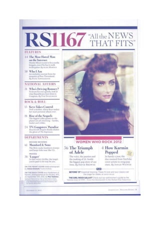
Task 2 - contents page
- 2. Typography – The typography in the contents page is mainly serif, but with some bits in san serif. The headline for the magazine is the largest text on the whole cover, this is to make it distinctive and stand out from all of the others. The subheadings down the left side of the page are also in a larger font size than the rest of the text but not as big as the masthead and are bold. This would be so that people could easily scan the page and find what they are looking for so they can flick to the right page. The rest of the text is in a small font size and is san-serif, this is because it is not as relevant to the rest, it is just extra information. Layout – The contents page follows the route of the eye. In the primary optical area is the masthead, you would notice this first. In the centre of the contents page is an image, this would be a focal point, something for people to look at rather than read. In the terminal area is the exclusives box, it includes the extras which are in the magazine. They would have put these last so that the audience are still pleased with the stories right until the end. The layout is very organised, it is separated by columns and lists, these break the page up so that the writing isn’t in one large chunk, this would be boring for the audience. This makes the contents page orderly and clean appealing more to the older generation as it is clear to read. Colour – The colours used on the contents page are faded blacks and reds. These colours were probably used as they are all in good contrast and look good together. The red colour draw attention to the masthead and the subheadings making them distinctive and memorable. The dark colours worn by the model in the image makes her look mysterious and appealing. Image – The image is a close up of the woman Amy Heidermann, they probably used a close up so you could see the details of her make-up and how appealing she is. She isn’t looking directly at the camera which creates a sense of mystery and attitude. She has her hair and make-up done so it shows she takes care of her appearance and would probably appeal to young females as they want to be like her. Language – The language used in the magazine cover is very in depth, and is ‘proper’ English as such, there is no slang, this would be because the magazine is designed for the older generation, they wouldn’t want to be reading an article designed for teens. They use capturing subheadings, they use words which entice the readers to ask questions, which makes them interested and want to read the full story. Conventions - There are many conventions featured on the contents page; one being that the masthead and subheadings are in a larger font that the rest of the plain text. Another convention is that the page is split up by columns, this is commonly used as its an easy buy effective way of breaking up the text.