The document summarizes the key aspects of a Kerrang magazine cover and contents pages focused on the rock music genre. It analyzes the typography, colors, images, layout, language, and conventions used. Sans-serif fonts in black, white, yellow and red are used to give the magazine a hard rock look. Images of rock celebrities and a cluttered layout are intended to attract the target audience of teenagers and younger adults. The informal language and conventional design elements establish it as a typical rock music magazine.
Instructions for Submissions thorugh G- Classroom.pptxJheel Barad
This presentation provides a briefing on how to upload submissions and documents in Google Classroom. It was prepared as part of an orientation for new Sainik School in-service teacher trainees. As a training officer, my goal is to ensure that you are comfortable and proficient with this essential tool for managing assignments and fostering student engagement.
Palestine last event orientationfvgnh .pptxRaedMohamed3
An EFL lesson about the current events in Palestine. It is intended to be for intermediate students who wish to increase their listening skills through a short lesson in power point.
The Indian economy is classified into different sectors to simplify the analysis and understanding of economic activities. For Class 10, it's essential to grasp the sectors of the Indian economy, understand their characteristics, and recognize their importance. This guide will provide detailed notes on the Sectors of the Indian Economy Class 10, using specific long-tail keywords to enhance comprehension.
For more information, visit-www.vavaclasses.com
2024.06.01 Introducing a competency framework for languag learning materials ...Sandy Millin
http://sandymillin.wordpress.com/iateflwebinar2024
Published classroom materials form the basis of syllabuses, drive teacher professional development, and have a potentially huge influence on learners, teachers and education systems. All teachers also create their own materials, whether a few sentences on a blackboard, a highly-structured fully-realised online course, or anything in between. Despite this, the knowledge and skills needed to create effective language learning materials are rarely part of teacher training, and are mostly learnt by trial and error.
Knowledge and skills frameworks, generally called competency frameworks, for ELT teachers, trainers and managers have existed for a few years now. However, until I created one for my MA dissertation, there wasn’t one drawing together what we need to know and do to be able to effectively produce language learning materials.
This webinar will introduce you to my framework, highlighting the key competencies I identified from my research. It will also show how anybody involved in language teaching (any language, not just English!), teacher training, managing schools or developing language learning materials can benefit from using the framework.
How to Make a Field invisible in Odoo 17Celine George
It is possible to hide or invisible some fields in odoo. Commonly using “invisible” attribute in the field definition to invisible the fields. This slide will show how to make a field invisible in odoo 17.
Ethnobotany and Ethnopharmacology:
Ethnobotany in herbal drug evaluation,
Impact of Ethnobotany in traditional medicine,
New development in herbals,
Bio-prospecting tools for drug discovery,
Role of Ethnopharmacology in drug evaluation,
Reverse Pharmacology.
How to Create Map Views in the Odoo 17 ERPCeline George
The map views are useful for providing a geographical representation of data. They allow users to visualize and analyze the data in a more intuitive manner.
We all have good and bad thoughts from time to time and situation to situation. We are bombarded daily with spiraling thoughts(both negative and positive) creating all-consuming feel , making us difficult to manage with associated suffering. Good thoughts are like our Mob Signal (Positive thought) amidst noise(negative thought) in the atmosphere. Negative thoughts like noise outweigh positive thoughts. These thoughts often create unwanted confusion, trouble, stress and frustration in our mind as well as chaos in our physical world. Negative thoughts are also known as “distorted thinking”.
This is a presentation by Dada Robert in a Your Skill Boost masterclass organised by the Excellence Foundation for South Sudan (EFSS) on Saturday, the 25th and Sunday, the 26th of May 2024.
He discussed the concept of quality improvement, emphasizing its applicability to various aspects of life, including personal, project, and program improvements. He defined quality as doing the right thing at the right time in the right way to achieve the best possible results and discussed the concept of the "gap" between what we know and what we do, and how this gap represents the areas we need to improve. He explained the scientific approach to quality improvement, which involves systematic performance analysis, testing and learning, and implementing change ideas. He also highlighted the importance of client focus and a team approach to quality improvement.
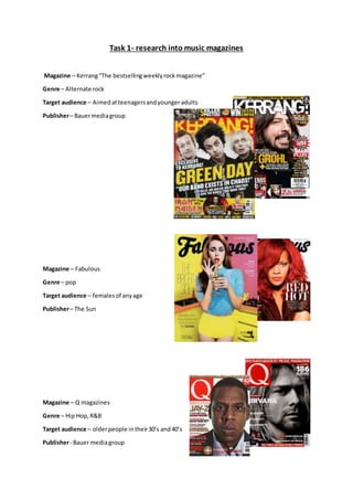
1. Task 1- research into music magazines
Magazine – Kerrang“The bestsellingweeklyrockmagazine”
Genre – Alternate rock
Target audience – Aimedatteenagersandyoungeradults
Publisher– Bauermediagroup
Magazine – Fabulous
Genre – pop
Target audience – femalesof anyage
Publisher– The Sun
Magazine – Q magazines
Genre – Hip Hop,R&B
Target audience – olderpeople intheir30’s and40’s
Publisher- Bauer mediagroup
2. Task 2 - Detailed analysis of music magazine
The genre of musicmagazine thatI have chosentoresearchabout isrock.
Front cover
Typography
The font stylesacross the frontcoverare sans
serif.These fontshave beenusedtogive the
magazine a harderand more rockerlook. Sans-
serif isa more relaxedfontandthe musicwhichis
inKerrang magazine isnotthe relaxedtype asis
more heavyand sharp. The boldtextdrawsin
attentionthisisdone byhavinga lotof different
fontsizeslayereduponeachother. The master
headand headlinesthisisbecause thisiswhere
the audience lookfirsttodetermineif the
magazine isworthbuying,ornot.The genre being
rock needstobe dark, but alsoneedstostandout
thisiswhy contrastingfontcoloursare usedthisis
mostlywhite textonblackbackgroundsoryellow
texton blackbackgrounds.These coloursare
conventional forthe rockgenre ona front
magazine cover. The majorityof thistextis
capitalisedgivingitaloudand more energeticfeel
whichsitsthe rock genre verywell.
Colour
The main coloursusedonthisfrom coverare; black,white,yellowandred.
Black isassociatedwithpower,elegance,formality,death,evil,andmystery.Blackisamysterious
colourassociatedwithfearandthe unknown.Itusuallyhasa negative connotation(blacklist,black
humour,'blackdeath').Blackdenotesstrengthandauthority;itisconsideredtobe a veryformal,
elegant, andprestigious colour. Inheraldry,blackisthe symbol of grief.
White isassociatedwithlight,goodness,innocence,purity,andvirginity.Itisconsideredtobe the
colourof perfection.Whitemeanssafety,purity,andcleanliness.Asopposedtoblack,white usually
has a positive connotation.White canrepresentasuccessful beginning.Inheraldry,white depicts
faithand purity.HoweverIfeel itisjustusedtocontrast againstthe blackbackgroundas this
contrast worksveryeffectively.
Yellowisthe colourof sunshine.It'sassociatedwithjoy,happiness,intellect,andenergy.Yellow
producesa warmingeffect,arousescheerfulness,stimulatesmental activity,andgeneratesmuscle
energy.Yellow isoftenassociatedwithfood.Bright,pure yellow isanattentiongetter,whichisthe
reasontaxicabsare paintedthiscolour.Whenoverused,yellow mayhave adisturbingeffect;itis
3. knownthat babiescrymore in yellow rooms.Yellow isseenbeforeothercolourswhenplaced
againstblack;thiscombinationisoftenusedtoissue awarning.Inheraldry,yellow indicateshonour
and loyalty.Laterthe meaningof yellowwasconnectedwithcowardice.Ithinkthatthe designartist
choose yellowtogradto audience, itcouldalsobe an issue warningdue tothe explicitlanguage in
the majorityof rock songs.
Redis the colourof fire andblood,soit isassociatedwithenergy,war,danger,strength,power,
determinationaswell aspassion,desire,andlove.Redisaveryemotionallyintensecolour.It
enhances humanmetabolism, increasesrespirationrate,andraisesbloodpressure.Ithasveryhigh
visibility,whichiswhystopsigns,stoplights,andfire equipmentare usuallypaintedred.Inheraldry,
redis usedto indicate courage.Itisa colourfoundin manynational flags. Energyisthe main
connotationIget fromthe red onthe frontof thismagazine.
Image
The imagesappeal tothe audience becausetheyare imagesof celebritieswhomake musicforthat
genre.The artistsfeaturedare;
Nirvanasfrontman Kurt Cobain
All Time Low
Paramore
GuitaristSlashwithMylesKennedy
Thisis nota lotof imageshoweverthe image of KurtCobainisratherlargerand impliesthatitisthe
mainstory inthe magazine thisislikelytobe atleasta double page spread inthe magazine.
These celebritiesare all respectedinthe rockgenre.The mainshoton thismagazine isof Kurt
Cobainandis a mid-shothowevertheyare large enoughforthe audience tosee them.Thisislikely
to make people buyitbecause if theirfavouritecelebritiesare featuredtheywill wanttoreadthe
magazine tosee why.
Layout
As we can see fromthe coverthis front page has a cluttered
layout.The effectsof thismake the magazine have afunlookto it,
it alsomakesitlookas thoughthere isa large amountof content
available toreadmeaningitsmore costeffecttothe consumer.
From the image onthe rightwe can see that the coverfollowsthe
route of eye technique,thisiswhere the mainbulkof the
informationisinaZ formation. The principle of thirdsisalsoused
thisisa veryeffective techniqueforwhenthismagazine of on
storesshelfs.The isbecause whenonshelvesonlypartscan be
seeneitherthe leftthirdwherethe bigonthe name will be a
shownto showthat itsKerrangmagazine orthe topbannerwhich
showsParamore are in the magazine, thisisa technique usedby
the producerto make the magazine more popularandgain
audience coverage.
4. Language/Mode of address
The language usedonthe frontcoveris positive aboutthe magazinecontentanexampleof a
positive wordusedis“greatest”.The wordsalsolookgoodonthe page and scream outto the
audience thatitis an excitingmagazine,thisisdone bythe use of exclamationmarksorthe headline
and physiographicsbandnamesonthe lefthandside. The mode of addressisinformal Iknow this
because of the language usedsuchas “sickest”,thiswill appeal tothe audience because this
magazine shouldn’treadlikeatextbookor somethingalike.The tone of the magazine isveryupbeat
and lively,thisiscreatedformthe use of imagesandpatchesof brightcolours,thisisveryappealing
to the target audience andveryconventional forarock magazine,Kerrangmake all theirdesigns
similartothisone.
Conventions
Thismagazine isveryconventional formychosengenre. The colourblackisveryconventionalfora
rock magazine thisisbecause rocker are seento be people wholike dark colours,redisalsoa
conventional couldbecause itsymbolisesthe angerinthe rockmusicand oftenthe angerthe
rockersholdwithinthem.The masterheadgoingthe whole wayacrossthe widthof the magazine is
alsousedinabundance withrock magazine show thatthe noise producedislargerthanlife.The
informal textisalsopopularandconventionalinarock magazine,the story/contentswiththe
magazine are alsoconventional asitgoesoverpastevents,withthe industry.The people name
droppingisalsoconventional because if theydidn’tdothisitwouldbe as effective towardsthe
target audience.
Contents page
Typography
Typography
All of fonton the contentspage issans-
serif. Thisassuresthatthe sharp edgy
lookisconsistentacrossthe whole
magazine.There isa lotof texton this
age showingthatthe magazine is
crammedfull withexcitingmaterial. The
wayin whichthe headingsappearinthis
page makesit excitingandappealingto
the audience asit makesthe contents
seemexciting. The autographfontatthe
bottomof the page,to the leftstands
out andgivesa unique rockstar lookto
it.Similarlytothe frontpage there isuse
of an exclamationmarkwhichimplies
loudmusicand excitingcontext.
5. Colour
Thisis a contentspage froma differentKerrangissue howeveritstill usesthe same coloursasthe
previousone did,these are black,white,yellowandred. Blackisthe maincolourinthe image
coveringalmostthe tophalf of the page. The white isused as a good contrastingbackground
againstthe black andred textwhichisthe informationsectionof the contentspage.the yellow and
redare usedas textcoloursbecause theycontrastwell andappeal tothe rock genre,redisa very
appropriate colourforthe rock genre because of isconnotationof anger. The highlightedyellow
headingsconnote fun,thiswillattractreaderstothese pages.
Image
The numberof imagesonthe contentspage islimitedcomparedtothe amountonthe frontcover.
Thisallowsthe audience toappreciate the tidierlayoutinside, howeveritalsoshowsthe articles
that have an image withthem,andthis couldmean theyhave largerimportance withinthe
magazine. The large image at the top of the page isof rock legendSlash,thissetsthe rockgenre and
appealstothe target audience.There isalsosmallerimagesof otherkerrangmagazines,thisis an
advertisingsubscriptionforthe magazine itself. The mainimage onthe page isSlash it’sa close upof
hisface and parts of hisupperbody,thisisa dark image butshowsoff what he iswearingthiscould
appeal tothe audience if theywanttotry and lookmore like arock star. The otherimagesof male
celebritiesare alsomidshots,thisisveryconventional withthe rockgenre onthe contentspage,
and alsofrontcover,I will incorporate thisinmyfinal piece.
Layout
The layoutof the contentspage iscluttered;howeveritisslightlymore organisedthan the front
cover,a reasonfor thisisbox outsare usedthisallowsdifferentarticlestobe separated. This
magazine doesn'tuse the principleof thirds,howeveritdoesusedroute of eye, andthis wasalso
usedon the frontcover. It is likelythatthe route of eye isusedtocarry the audience intothe
magazine,thisallowsthemtosee the content, andthis alsogivesagoodflow throughoutthe
magazine.The wayinwhichthe page islaidoutis to encourage the audience toview the pages
whichtake up more space on thispage thisis done byrelatedimagesandpage numbersbythese
images. The layoutisinhalf the top half holdsthe majorityof the image,whilstthe bottomhalf
holdsthe textandinformation.
Language/Mode of address
The language usedforthe headingsisverylaidbackand approachable. Thisisdone bynot beingtoo
formal.The wordsusedare onesthatwouldbe familiartothe targetaudience meaningthatthey
are more likelytobuyitas theywill understanditanditwill be appropriatelyaimedatthem.The
wordchoice is alsoaimedtowardsthe rock audience,anexample isthe word"gig"thisisoftenused
insteadof showor performance inthe rockgenre. The majorityof the page comesacross in an
informal manor,thisallowspeople toreaditat theirfree will andalsotostopthe magazine coming
across like abroadsheetnewspaper,the informal appearanceis more funtoread and more
interestingintermsof appearance.
6. Conventions
Thisis a very conventional contentspage forthe rock genre. Itis alsoconventionalforKerrangto
have thislayout.Thislayoutmustbe successful otherwise theywouldn'tbe usingitas consistentlyas
theydo socurrently.The colouruse is very conventionaldue totheirrepresentations.The images
are alsoconventional tothisgenre because theyare midshotsandclose-upsthisallowsthe
audience tosee whothe photoisof, the audience are more likelytobuythe magazine if their
favourite celebritiesare include within itscontents. The amountof imagesisalsoconventionalas
theyare neededbutthere shouldbe lessthanonthe frontcover of the magazine. Thisisa very
typical contentspage forthe rock genre and alsothe for magazine Kerrangthemselves.
Double page spread
Typography
Most the fontson this
double page are sansserif,
thisgivesthe page a
masculine lookandfeel toit,
whichisappropriate because
of whatthe page isinforming
the readerabout. The part
that isn'tsans serif isthe
headline,serif isusedhereto
make the letteringeasierto
distinguishandisalsomore
visuallypleasingtothe eye.
A droppedcapital isalso
usedon thisdouble page
spread.There are several
differentfontsandfontsizes
usedon thisspread,this
givesita bold and interesting
look.The textisin bothred
and blackwhichaddscolour
to the page and contrasts
well withthe image onthe
pages.
7. Colour
The three colourson thisdouble page are;blackredand white.These three coloursare oftenused
for the hiphopgenre howeverinthiscase itis beingusedforrock.The redusedfor CoreyTayloris
givingconnotationthathe isan angry person,thisissuitable forthe angrylyricshe singsinthe
bandswhichhe’sin.The colourscontrast well againsteachotherandcomplementeachotherwell.
The white representpuritythiscouldbe because the page isaskingquestions,meaningthe answers
that he gives are honestandpure.
Image
There isone image withthisdouble page spread.The image onthe pagesisof CoreyTaylor,thisis
because thisparticulararticle isabouthim.The image isa mid-shotof him, fromthisimage we can
see CoreyTaylorstophalf.The image coversthe whole of the rightpage andalso comesoverthe
leftpage,itisconventional forthislayouttoappearina rock genre magazine.The leatherjacketin
the image isverystereotypical of arock star and the genre. These three colourstogethercanappear
quite aggressive,thisishowrockmusiccan come across towardsthe audience,rockersare also
consideredtobe aggressive people. The image isof CoreyTaylorwhoisleadvocalistof Slipknot,
thisappealstothe audience because Slipknotare arock brand appealingtomychosengenre.
Layout
The layoutis 60% image and the otherbeing40% text.The layoutisorganisedaseverythinghasa
designatedarea. The layoutistidiercomparedtothe contentspage andthe frontcover thisgivesa
professionalfeel tothe readerandcouldbe more appealingtothe targetaudience.Ifindthatthis
audience isexcitingandit’salsoveryconventionalforthisgenre,andmusicmagazinesingeneral.
Language/Mode of address
The mode of addressforthisdouble page spreadisformal,howeveritstill comesacrossina chatty
informal way.One wayinwhichitappearsis the use of language,awordusedon the double page
spreadis“pro” thisisshort forprofessional,if the magazine wantedtocome acrossformallythe
wordprofessional wouldbe usedinreplacementtoit.The language usedis familiartowhatthe
target audience are usedto,thismakesitmore appealing.
Conventions
Thisis a veryconventional double page spread formychosengenre.The coloursare verypopular
because of whattheyconnote can relate tothe rock genre andthe differentlyrics.The layoutwith
the image takingup a whole page isconventionalforthe rockgenre and all musicmagazinesin
general.Thisallowsthe audience tosee whothe celebrityisandcan alsoinfluencethemonthe
clothingtheywearsotheycan be more like theiricons.