The document analyzes the design of a magazine contents page. It discusses the typography, layout, colors, images, language, and conventions used. The headline font stands out from the smaller body text for readability. The layout strategically places important sections like the billboard charts. Images of celebrities featured in the magazine help engage the target audience. Simple black, white, and gray colors along with occasional blue keep the design modern, stylish, and help the content stand out to readers. Abbreviated language in the descriptions makes the page easier to read.
Madiwala Call Girls: 🍓 7737669865 🍓 High Profile Model Escorts | Bangalore Es...
jkkghContents page analysis
1. Contents page
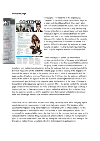
Typography- The headline of the page saying
“contents” is the main font on the contents page. It’s
in a san serif stencil type of font. It has a very plain
font so it is noticeable to the reader and it is effective
because it stands out more and is very eye-catching.
The rest of the font is in a small basic serif font; this is
effective as it gives the contrast between the serif
and san serif font. It is a simple font compared to the
title page, this makes the description of the contents
of the magazine easier to read and see better. If it
was in a difficult font to read the audience are more
likely to not bother reading it which may mean they
won’t buy the magazine as there not intrigued to it.
Layout-The layout is broken up into different
sections; on the left third of the page is the billboard
charts. This is one of the first places that the audience
are going to look so will illustrate to them what’s in
the charts so it makes it stand out more telling the audience that is an important part of the
billboard magazine. On the rest of the contents page is what is actually in the magazine. In
terms of the route of the eye. In the primary optical area is a line of photographs with the
page numbers they have been on. This is one of the first things that the audience will see in
terms of the route of the eye and due to the audience appealing to them celebrities it will
mean they will want to look at the magazine more. In the central of the route of the eye is
the contents of the cover and a picture of a women. This is the centre point of the contents
page and the information follows the route of the eye which makes it more eye-catching. In
the terminal area is short descriptions of events and online websites. This is the last thing
that the audience would see on this page therefore that means it will stick into their head
more and encourage them to look into more detail about these events.
Colour-The colours used in this are very basic. They are mainly black, white and grey. By the
use of plain simple colours makes it look more stylish and modern. The black and white
signifies the magazine being more modern and fashionable; this is effective choice for this
type of magazine as it clearly illustrates that is aimed at older teenagers and adults. The
contrast of the black and white makes the description of the contents stand out more so it is
noticeable to the audience. They also use parts of the contents in a blue; for example some
parts of the cover lines are in a blue font. By having the consistent colours and adding in the
blue colour makes it more visual and attractive to the specific target audience.
2. Images- The images on this magazine contents page are various celebrities and people who
are featured in the magazine issue. For example at the top of the page is a small picture of
Janelle Monae then the page number next to her. By having these celebrities like Janelle on
the contents allows the audience to be inspired by her and makes them want to look in the
magazine more as they idolise her. By having these types of celebrities on the contents
page, it relates to the genre of the magazine cover and gives it an impression of being very
sophisticated and stylish. For two of the top images they use a close up shot of the celebrity.
This is effective as it focuses on the subject rather than what’s around it so it is more
noticeable and eye-catching. However the image next to the contents page is a long shot;
this is an effective shot for next to the contents page because you can see their whole body
and allows the audience to be captivated by it as they can see her whole costume. The
costume in which are used in the contents page are quite smart costumes such as the latest
trends and suit and ties. This would appeal to the demographics of the billboard magazine
because it is quite modern clothing so it gives the impression of sophisticated and stylish
magazine issue.
Languages- The language used on this contents page is in an article abbreviated way; such
as “bklyn rocks” is in an article form. This is effective way of describing the contents because
it makes it more likely for the audience to read it rather than in long descriptions. By having
the key words of that topic on the contents page will engage the audience into the rest of
the magazine making them want to look at it.
Conventions-