
More Related Content
What's hot
What's hot (20)
Viewers also liked
Similar to Detailed analysis
Similar to Detailed analysis (20)
Recently uploaded
Recently uploaded (20)
Detailed analysis
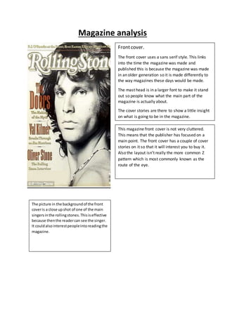
- 1. Magazine analysis Frontcover. The front cover uses a sans serif style. This links into the time the magazine was made and published this is because the magazine was made in an older generation so it is made differently to the way magazines these days would be made. The mast head is in a larger font to make it stand out so people know what the main part of the magazine is actually about. The cover stories are there to show a little insight on what is going to be in the magazine. This magazine front cover is not very cluttered. This means that the publisher has focused on a main point. The front cover has a couple of cover stories on it so that it will interest you to buy it. Also the layout isn’t really the more common Z pattern which is most commonly known as the route of the eye. The picture in the backgroundof the front coveris a close upshot of one of the main singersinthe rollingstones.Thisiseffective because thenthe readercan see the singer. It couldalsointerestpeopleintoreadingthe magazine.
- 2. Thisis a contentspage froma rollingstonesmagazine. Thisis a goodcontentspage because ithas a clear layoutwhichmeansitiseasyto read and to follow. Thisis generallythe waycontentsare laidoutbecause thentheyare easyto follow sothisisa goodcontents page. The contentspage includespicturesbecausethenit givesthe readerbetterunderstandingof what happens.Alsoitaddsbetterstoryto the page because it showsthe groupswhatwill playingonthe tour. The writingwhatis onthe contentspage showseasily whatis goingto happensopeople willenjoyreading because theywon’thave toworkout whatis goingon. Thisis an advantage because mostpeople justwantto readthe magazine andnothave to work thingsout. The font type isserif whichmakesit seemsophisticated.Thissuggeststhat the contentspage isfor an older audience.Thissuggeststhe writeris tryingto targeta more knowledgeable groupof people. The coloursof the contents page show a clearsplitindifferenttypesof fontand sizes.Italsoshowsthe differencein headings.The coloursstandoutwhich couldsuggesta difference in importance.
- 3. Thisis double page spreadformarollingstones magazine. Thisis an effective double page spreadbecauseitwill getthe reader’s attentionbecause itisa bigarticle ona band.Alsoitshowsa picture of the groupthe article isaboutso evenif the readerdoesn’tknow whotheyare theywill have some recognitionwhotheyare by lookingatthe picture.By puttingthe picture andtextona different page showsthat the textisabout the personthe previouspage soif the readerwantsto knowanythingaboutthe group thenmaybe the informationwhatthey wanttoknowisin the text. The drop cap at the start of the article getsthe reader’sattention because itstandsout fromall the test soas soonas the readerturns the page theywill see itandinmightintrigue the readerenoughto readthrough the whole article. The headingsare sans serif butthe actual textis serif thissuggestsa difference ismeaningorenthusiasm. The headline isinalarger fontwhichmakesitstandout from everythingelse.The headline isalso sansserif soitismore masculine so thisalsomakesitstand out more because itisbolder.The subheadingsare alsoinserif soitmakesitstand outmore.This is effectbecause thenpeople will readthe subheadingssoif theywant to readthe resttheycan. The picture is takenfromstraightinfront of the group. Thisiseffect because itshowseverybodyfromthe group.The picture isalsoa mediumshot.Thisiseffective becauseitcanget everybodyin the picture insteadof onlyconcentratingonone person.