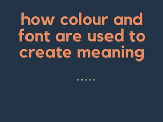
The document discusses the importance of font and color choice in communicating intended messages to audiences. It notes that sans serif fonts tend to look cleaner in body text while serif fonts are clearer to read and widely used in magazines. For magazines, a serif font like Droid Serif would be suitable. Fonts can indicate time periods and help pieces appear older or more recent. Script fonts imply sophistication while display fonts are bold and draw attention, making them good for mastheads. Handlettered fonts add a personal touch. Color choice also communicates meanings, with primary colors seeming younger and neutrals appearing more mature.
How to Create Map Views in the Odoo 17 ERPCeline George
The map views are useful for providing a geographical representation of data. They allow users to visualize and analyze the data in a more intuitive manner.
How to Make a Field invisible in Odoo 17Celine George
It is possible to hide or invisible some fields in odoo. Commonly using “invisible” attribute in the field definition to invisible the fields. This slide will show how to make a field invisible in odoo 17.
The French Revolution, which began in 1789, was a period of radical social and political upheaval in France. It marked the decline of absolute monarchies, the rise of secular and democratic republics, and the eventual rise of Napoleon Bonaparte. This revolutionary period is crucial in understanding the transition from feudalism to modernity in Europe.
For more information, visit-www.vavaclasses.com
This is a presentation by Dada Robert in a Your Skill Boost masterclass organised by the Excellence Foundation for South Sudan (EFSS) on Saturday, the 25th and Sunday, the 26th of May 2024.
He discussed the concept of quality improvement, emphasizing its applicability to various aspects of life, including personal, project, and program improvements. He defined quality as doing the right thing at the right time in the right way to achieve the best possible results and discussed the concept of the "gap" between what we know and what we do, and how this gap represents the areas we need to improve. He explained the scientific approach to quality improvement, which involves systematic performance analysis, testing and learning, and implementing change ideas. He also highlighted the importance of client focus and a team approach to quality improvement.
Operation “Blue Star” is the only event in the history of Independent India where the state went into war with its own people. Even after about 40 years it is not clear if it was culmination of states anger over people of the region, a political game of power or start of dictatorial chapter in the democratic setup.
The people of Punjab felt alienated from main stream due to denial of their just demands during a long democratic struggle since independence. As it happen all over the word, it led to militant struggle with great loss of lives of military, police and civilian personnel. Killing of Indira Gandhi and massacre of innocent Sikhs in Delhi and other India cities was also associated with this movement.
Students, digital devices and success - Andreas Schleicher - 27 May 2024..pptxEduSkills OECD
Andreas Schleicher presents at the OECD webinar ‘Digital devices in schools: detrimental distraction or secret to success?’ on 27 May 2024. The presentation was based on findings from PISA 2022 results and the webinar helped launch the PISA in Focus ‘Managing screen time: How to protect and equip students against distraction’ https://www.oecd-ilibrary.org/education/managing-screen-time_7c225af4-en and the OECD Education Policy Perspective ‘Students, digital devices and success’ can be found here - https://oe.cd/il/5yV
The Art Pastor's Guide to Sabbath | Steve ThomasonSteve Thomason
What is the purpose of the Sabbath Law in the Torah. It is interesting to compare how the context of the law shifts from Exodus to Deuteronomy. Who gets to rest, and why?
Model Attribute Check Company Auto PropertyCeline George
In Odoo, the multi-company feature allows you to manage multiple companies within a single Odoo database instance. Each company can have its own configurations while still sharing common resources such as products, customers, and suppliers.
2. why are
fonts
important
?
using the right font is an
important element in
sending your intended
message to your
intended audience in a
form they can
understand. its
important to use colour
and font to your
advantage and appeal to
the audience before they
even read the magazine
#1
3. sans
international
projects
looks more modern
they dont have any
flourishes at the end of
strokes
no details
small decorative flourish
at the end of strokes
sans serif fonts are used
regularly because of how
clean they tend to look in
those main text areas
4. in my magazine..
I would use a serif style font. This is
because they are clearer and easier
to read than sans. They are also
widely used in magazine and books
already.
An example of a serif style font I
would use is Droid Serif.
Droid Serif
PT Serif
Fonts are important as they can signifiy time period. They can make an article appear older or
more recent, depending on what they are
5. script font
Script font can be used to make a
piece of writing look more
sophisticated. They are
commonly used on wedding
invites, certificates and
prestigious documents.
When they are used, it is
purposely to make an article look
more polished and clean cut.
They hold gravitas.
I don't think that script font
would suit my magazine as script
fonts would appeal to
sophisticated and mature people,
whereas my magazine would not.
6. display
font
Display font is only used for
the masthead. It is chunky
and bold, and designed to
make a point. It is used for
the masthead as it intends to
draw in the reader.
It makes emphasis and
stands out. Display fonts are
generally used for movie
posters and advertisements
7. display
font
this would be appropriate for
a magazine masthead-
this would not be, because it is not
big and bold and does not stand
out
RADIKAL
Radikal
8. handlettered font
Handlettered fonts are often used in
letters from the editor, to build a
relationship. They add a human
touch and give the magazine a 'real
life' feel. It makes the magazine look
like it has been written by real
people and makes it more rustic.
9. size matters...
Thick. Black. Big. All font needs to
stand out when appropriate inorder
to catch the readers attention and
do its job properly ie; a masthead
would need to be big enough to
draw people in, but not dominate
the whole frontcover.
MAGAZINE
MAGAZINE
The first title is more appropriate as it is
bigger and a darker colour, helping it to
stand out
10. colour
This connotes
harmony and calm.
It also may be
argued it connotes
envy and jealousy.
Has connotations of
purity and
innocence. It is a
clean and good
colour. Often seen as
'perfection'
Connotes fire and
blood, and is a
passionate colour.
Connotes hate,but
also sometimes love.
11. colour
Colours can communicate meaning. for instance,
more primary colours will appeal more to a younger
audience because they have connotations of being
playful and young, where as neutral colours will
appeal to a more mature audience.
Darker colours could be more linked with a rock
music genre, where as pinks and purples more
associated with pop magazines.