SlideShare a Scribd company logo
1 of 5
Mojo is an idiom which means magic charm, magic power, or spell. The colours used are black and white, this is a very classic look which makes that masthead
prominent on the page. Having a prominent masthead is essential to a magazine as when attracting an audience the magazine needs to stand out as it is in
competition with many other magazines of it genre.
The masthead also has red typography on the front of it, this colour against the black and the white stands out without over powering the main word. As the red
statement says “The Music Magazine” it tells the audience exactly what there going to get in the magazine and doesn’t leave them second guessing. The masthead
also has a 3D shadowing effect on the word Mojo, this subtly makes the title look as if it ‘popping’ out of the magazine.
The red writing is written in a serif font this emphasises on the contrast between the word “Mojo” and “The Music Magazine. As these two fonts are very diverse
from each other, it implies this magazine has a variety of different bands and musicians. Because of this diverse image, more people are more likely to want to buy the
magazine as it is likely to have something that will appeal to them inside.
Q’s masthead is very iconic and well known amongst many people, it is clearly displayed as it is always in a red box in the top of the page not only does this make
current Q fans able to find and access the magazine quickly. But It also stands out to new possible readers as it is clearly defined and looks unique to other
magazines it could be contending with.
Q’s bright red background and serif font Q is recognisable worldwide, this masthead never changes for Q, excluding certain special episodes, which gives them
self promotion as its iconic. Although this masthead is very simplistic; it still manages to have a professional edgy style. The letter Q itself has many different
possible meanings which could explain why this letter has been used as a symbol. Q could connote to queen meaning this magazine company is at the top of its
category and is recognised. However most commonly Q is known as symbolising a record player and the tail of the Q acts as the tone arm.
Due to the colours and design used the masthead doesn’t appeal to aim towards a certain gender as the colour red is very unisex, this helps widens Q’s target
audience as they are not aiming for a small section of people. However this unisex approach could change depending on what celebrity is used to sell the
magazine on the front image.
Kerrang’s masthead can change colour sometimes depending on what type of magazine its on, for example if the colours are very bright on the page, e.g.
yellow; also if there was a special addition of the magazine the masthead maybe different. Although this shows variation and can widen Kerrang’s audience, It
does however make it harder to spot on the magazine shelf if the masthead can change sometimes.
However saying that, Kerrang often stick to the black background and white typography. These contrasting colours are very bold and go with a lot of other
colours therefor Kerrang are able to be more lenient on what type of images they use for there front cover. To add to that the way the work is written is as if it
in chalk. The letters do not have defined edges which gives the overall appearance an edgy appeal. Also expanding on the idea that the writing looks as if it is
written in chalk could connote the idea that this magazine is very old and classic; it’s your typical music magazine sticking to the traditional codes and
conventions.
The word Kerrang itself comes from the onomatopoeic word that initially came from the sound that is made when playing a power chord on a distorted electric
guitar. This could link to the genre that this magazine aims to meet, electric guitar often corresponding to rock and metal music; this is also expressed through
the images and colours.
Billboard is another magazine masthead that changes slightly depending on what image the company have chosen as their front cover image, for example some on
some of their magazines they change the typing to white instead of black if it works better with the overall appearance, as shown by the image above. Although in
Kerrang this could’ve been a problem; in Billboard it is less of one. This is because the colours in the middle of the letters remain the same.
The colours that are used to fill the centre of the letters always remain the same no matter what the image on the front cover is. This makes an iconic colour
scheme which cam always be associated with the masthead. This can help attract an audience as the colours will stand out when on a magazine shelf. As well as
changing through the colour of the typography of the masthead also varies in thickness on certain magazines.
Most of the time the word Billboard has a capital at the start, however can be lower cases in some cases. Usually Billboard use a lower case letter if the magazine
front cover has a different format. By then adding a lower case letter it emphasises the idea that this issue is different to others and can be seen as more informal
as there is no capital letter.
We love pop is the only gender specified music magazine that I have analysed. You can tell that this magazine is aimed for girls by the way the heart is colour
pink/purple. This is stereotypically a colour that is associated with girls, especially young girls. The masthead itself is also in a speech bubble which insinuates
that someone is saying it. This is a tool used to attract young people as they are more likely to be persuaded to want a magazine due to someone saying they
love it.
To add to that this is the only masthead where it uses more that one word in the main title. “We love pop” is a statement which tells the audience the
magazine is based on popular music, (which is again mainly what younger children listen to). Similar to Kerrang and Billboard the colours of the masthead
change depending on the issue, however the design in the speech bubble always remains the same. Therefor it is easy to recognise for younger generations.
Also the masthead is always in the same place on every magazine making it easy for younger children to acknowledge.
As they have used the colour pink/purple, not only does that connote girls but it also connotes creativity and nurturing, giving off a positive effect.

More Related Content

What's hot

Mojo magazine analysis
Mojo magazine analysis Mojo magazine analysis
Mojo magazine analysis Najat Hachem
 
Magazine contents analysis
Magazine contents analysisMagazine contents analysis
Magazine contents analysisBrowner97
 
Analysis of music magazine one nme
Analysis of music magazine one nmeAnalysis of music magazine one nme
Analysis of music magazine one nmealishalumsden
 
Analysis of professional magazine covers.pptx
Analysis of professional magazine covers.pptxAnalysis of professional magazine covers.pptx
Analysis of professional magazine covers.pptxaaroncarter111
 
NME Music magazine analysis
NME Music magazine analysisNME Music magazine analysis
NME Music magazine analysisNajat Hachem
 
Deconstruction of magazines
Deconstruction of magazinesDeconstruction of magazines
Deconstruction of magazinesLauren Holyoak
 
Contents analysis
Contents analysisContents analysis
Contents analysisjackahern11
 
Deconstruction of magazines 2
Deconstruction of magazines 2Deconstruction of magazines 2
Deconstruction of magazines 2Lauren Holyoak
 
School magazine analysis
School magazine analysisSchool magazine analysis
School magazine analysisKlarasa098
 
media studies Magazine cover analysis
media studies Magazine cover analysis media studies Magazine cover analysis
media studies Magazine cover analysis shrutiramnath1
 
Magazine front cover analysis
Magazine front cover analysis Magazine front cover analysis
Magazine front cover analysis ellyjeffrey
 
Magazine front cover analysis
Magazine front cover analysisMagazine front cover analysis
Magazine front cover analysisshaniajay
 
Analysis of cover page
Analysis of cover pageAnalysis of cover page
Analysis of cover pageKlarasa098
 
Analaysius of front cover
Analaysius of front coverAnalaysius of front cover
Analaysius of front coverbeth_media
 

What's hot (19)

Mojo magazine analysis
Mojo magazine analysis Mojo magazine analysis
Mojo magazine analysis
 
Magazine contents analysis
Magazine contents analysisMagazine contents analysis
Magazine contents analysis
 
Classic Rock
Classic Rock Classic Rock
Classic Rock
 
Analysis of music magazine one nme
Analysis of music magazine one nmeAnalysis of music magazine one nme
Analysis of music magazine one nme
 
Magazine analysis
Magazine analysis Magazine analysis
Magazine analysis
 
Analysis of professional magazine covers.pptx
Analysis of professional magazine covers.pptxAnalysis of professional magazine covers.pptx
Analysis of professional magazine covers.pptx
 
NME Music magazine analysis
NME Music magazine analysisNME Music magazine analysis
NME Music magazine analysis
 
Deconstruction of magazines
Deconstruction of magazinesDeconstruction of magazines
Deconstruction of magazines
 
Contents analysis
Contents analysisContents analysis
Contents analysis
 
Deconstruction of magazines 2
Deconstruction of magazines 2Deconstruction of magazines 2
Deconstruction of magazines 2
 
School magazine analysis
School magazine analysisSchool magazine analysis
School magazine analysis
 
Evaluation 1
Evaluation 1Evaluation 1
Evaluation 1
 
DPS
DPSDPS
DPS
 
media studies Magazine cover analysis
media studies Magazine cover analysis media studies Magazine cover analysis
media studies Magazine cover analysis
 
Magazine front cover analysis
Magazine front cover analysis Magazine front cover analysis
Magazine front cover analysis
 
Magazine front cover analysis
Magazine front cover analysisMagazine front cover analysis
Magazine front cover analysis
 
Analysis of cover page
Analysis of cover pageAnalysis of cover page
Analysis of cover page
 
A2exsw
A2exswA2exsw
A2exsw
 
Analaysius of front cover
Analaysius of front coverAnalaysius of front cover
Analaysius of front cover
 

Viewers also liked

Viewers also liked (6)

Cover lines copy
Cover lines copyCover lines copy
Cover lines copy
 
Colour scheme
Colour schemeColour scheme
Colour scheme
 
Masthead design 2
Masthead design 2Masthead design 2
Masthead design 2
 
Artist mise-en-scene
Artist mise-en-sceneArtist mise-en-scene
Artist mise-en-scene
 
Screenshots mag
Screenshots magScreenshots mag
Screenshots mag
 
Used images
Used imagesUsed images
Used images
 

Similar to Mojo

Magazine research really official [recovered]
Magazine research really official [recovered]Magazine research really official [recovered]
Magazine research really official [recovered]Karis Hays
 
Magazine research really official [recovered]
Magazine research really official [recovered]Magazine research really official [recovered]
Magazine research really official [recovered]eleanorwaring1
 
Front cover analysis.
Front cover analysis.Front cover analysis.
Front cover analysis.AmyShields00
 
Existing Mastheads Analysis
Existing Mastheads AnalysisExisting Mastheads Analysis
Existing Mastheads Analysisellagreyx
 
Masthead research
Masthead researchMasthead research
Masthead researchKyleR99
 
Analysing Music Magazines
Analysing Music MagazinesAnalysing Music Magazines
Analysing Music Magazinessophialeiper
 
Researching and analysing magazines
Researching and analysing magazinesResearching and analysing magazines
Researching and analysing magazinesabigailmusic
 
Task 5 – deciding which genre and style
Task 5 – deciding which genre and styleTask 5 – deciding which genre and style
Task 5 – deciding which genre and styleAS Media Column D
 
Task 5 – deciding which genre and style
Task 5 – deciding which genre and styleTask 5 – deciding which genre and style
Task 5 – deciding which genre and styleAS Media Column D
 
Task 5 – deciding which genre and style
Task 5 – deciding which genre and styleTask 5 – deciding which genre and style
Task 5 – deciding which genre and styleAS Media Column D
 
Colour and font
Colour and fontColour and font
Colour and fontEva Clarke
 
Magazine analysis
Magazine analysisMagazine analysis
Magazine analysisjudytakulpa
 
Masthead anaylsis
Masthead anaylsisMasthead anaylsis
Masthead anaylsiseilisbell
 
Magazine Front Cover Analysis.
Magazine Front Cover Analysis.Magazine Front Cover Analysis.
Magazine Front Cover Analysis.Raychelleshaw
 
Classic fm analysis
Classic fm analysisClassic fm analysis
Classic fm analysisLD7
 

Similar to Mojo (20)

Mastheads analysis
Mastheads analysisMastheads analysis
Mastheads analysis
 
Magazine research really official [recovered]
Magazine research really official [recovered]Magazine research really official [recovered]
Magazine research really official [recovered]
 
Textual Analysis
Textual AnalysisTextual Analysis
Textual Analysis
 
Magazine research really official [recovered]
Magazine research really official [recovered]Magazine research really official [recovered]
Magazine research really official [recovered]
 
Front cover analysis.
Front cover analysis.Front cover analysis.
Front cover analysis.
 
Existing Mastheads Analysis
Existing Mastheads AnalysisExisting Mastheads Analysis
Existing Mastheads Analysis
 
Masthead research
Masthead researchMasthead research
Masthead research
 
Analysing Music Magazines
Analysing Music MagazinesAnalysing Music Magazines
Analysing Music Magazines
 
Existing mastheads
Existing mastheadsExisting mastheads
Existing mastheads
 
Researching and analysing magazines
Researching and analysing magazinesResearching and analysing magazines
Researching and analysing magazines
 
Case study
Case studyCase study
Case study
 
Task 5 – deciding which genre and style
Task 5 – deciding which genre and styleTask 5 – deciding which genre and style
Task 5 – deciding which genre and style
 
Task 5 – deciding which genre and style
Task 5 – deciding which genre and styleTask 5 – deciding which genre and style
Task 5 – deciding which genre and style
 
Task 5 – deciding which genre and style
Task 5 – deciding which genre and styleTask 5 – deciding which genre and style
Task 5 – deciding which genre and style
 
ANALYSIS OF FRONT COVERS
ANALYSIS OF FRONT COVERSANALYSIS OF FRONT COVERS
ANALYSIS OF FRONT COVERS
 
Colour and font
Colour and fontColour and font
Colour and font
 
Magazine analysis
Magazine analysisMagazine analysis
Magazine analysis
 
Masthead anaylsis
Masthead anaylsisMasthead anaylsis
Masthead anaylsis
 
Magazine Front Cover Analysis.
Magazine Front Cover Analysis.Magazine Front Cover Analysis.
Magazine Front Cover Analysis.
 
Classic fm analysis
Classic fm analysisClassic fm analysis
Classic fm analysis
 

Recently uploaded

AIM of Education-Teachers Training-2024.ppt
AIM of Education-Teachers Training-2024.pptAIM of Education-Teachers Training-2024.ppt
AIM of Education-Teachers Training-2024.pptNishitharanjan Rout
 
What is 3 Way Matching Process in Odoo 17.pptx
What is 3 Way Matching Process in Odoo 17.pptxWhat is 3 Way Matching Process in Odoo 17.pptx
What is 3 Way Matching Process in Odoo 17.pptxCeline George
 
80 ĐỀ THI THỬ TUYỂN SINH TIẾNG ANH VÀO 10 SỞ GD – ĐT THÀNH PHỐ HỒ CHÍ MINH NĂ...
80 ĐỀ THI THỬ TUYỂN SINH TIẾNG ANH VÀO 10 SỞ GD – ĐT THÀNH PHỐ HỒ CHÍ MINH NĂ...80 ĐỀ THI THỬ TUYỂN SINH TIẾNG ANH VÀO 10 SỞ GD – ĐT THÀNH PHỐ HỒ CHÍ MINH NĂ...
80 ĐỀ THI THỬ TUYỂN SINH TIẾNG ANH VÀO 10 SỞ GD – ĐT THÀNH PHỐ HỒ CHÍ MINH NĂ...Nguyen Thanh Tu Collection
 
Play hard learn harder: The Serious Business of Play
Play hard learn harder:  The Serious Business of PlayPlay hard learn harder:  The Serious Business of Play
Play hard learn harder: The Serious Business of PlayPooky Knightsmith
 
How to Add New Custom Addons Path in Odoo 17
How to Add New Custom Addons Path in Odoo 17How to Add New Custom Addons Path in Odoo 17
How to Add New Custom Addons Path in Odoo 17Celine George
 
On National Teacher Day, meet the 2024-25 Kenan Fellows
On National Teacher Day, meet the 2024-25 Kenan FellowsOn National Teacher Day, meet the 2024-25 Kenan Fellows
On National Teacher Day, meet the 2024-25 Kenan FellowsMebane Rash
 
NO1 Top Black Magic Specialist In Lahore Black magic In Pakistan Kala Ilam Ex...
NO1 Top Black Magic Specialist In Lahore Black magic In Pakistan Kala Ilam Ex...NO1 Top Black Magic Specialist In Lahore Black magic In Pakistan Kala Ilam Ex...
NO1 Top Black Magic Specialist In Lahore Black magic In Pakistan Kala Ilam Ex...Amil baba
 
Transparency, Recognition and the role of eSealing - Ildiko Mazar and Koen No...
Transparency, Recognition and the role of eSealing - Ildiko Mazar and Koen No...Transparency, Recognition and the role of eSealing - Ildiko Mazar and Koen No...
Transparency, Recognition and the role of eSealing - Ildiko Mazar and Koen No...EADTU
 
The basics of sentences session 3pptx.pptx
The basics of sentences session 3pptx.pptxThe basics of sentences session 3pptx.pptx
The basics of sentences session 3pptx.pptxheathfieldcps1
 
How to Add a Tool Tip to a Field in Odoo 17
How to Add a Tool Tip to a Field in Odoo 17How to Add a Tool Tip to a Field in Odoo 17
How to Add a Tool Tip to a Field in Odoo 17Celine George
 
Tatlong Kwento ni Lola basyang-1.pdf arts
Tatlong Kwento ni Lola basyang-1.pdf artsTatlong Kwento ni Lola basyang-1.pdf arts
Tatlong Kwento ni Lola basyang-1.pdf artsNbelano25
 
PANDITA RAMABAI- Indian political thought GENDER.pptx
PANDITA RAMABAI- Indian political thought GENDER.pptxPANDITA RAMABAI- Indian political thought GENDER.pptx
PANDITA RAMABAI- Indian political thought GENDER.pptxakanksha16arora
 
Python Notes for mca i year students osmania university.docx
Python Notes for mca i year students osmania university.docxPython Notes for mca i year students osmania university.docx
Python Notes for mca i year students osmania university.docxRamakrishna Reddy Bijjam
 
Spellings Wk 4 and Wk 5 for Grade 4 at CAPS
Spellings Wk 4 and Wk 5 for Grade 4 at CAPSSpellings Wk 4 and Wk 5 for Grade 4 at CAPS
Spellings Wk 4 and Wk 5 for Grade 4 at CAPSAnaAcapella
 
HMCS Max Bernays Pre-Deployment Brief (May 2024).pptx
HMCS Max Bernays Pre-Deployment Brief (May 2024).pptxHMCS Max Bernays Pre-Deployment Brief (May 2024).pptx
HMCS Max Bernays Pre-Deployment Brief (May 2024).pptxEsquimalt MFRC
 
Accessible Digital Futures project (20/03/2024)
Accessible Digital Futures project (20/03/2024)Accessible Digital Futures project (20/03/2024)
Accessible Digital Futures project (20/03/2024)Jisc
 
Economic Importance Of Fungi In Food Additives
Economic Importance Of Fungi In Food AdditivesEconomic Importance Of Fungi In Food Additives
Economic Importance Of Fungi In Food AdditivesSHIVANANDaRV
 
Graduate Outcomes Presentation Slides - English
Graduate Outcomes Presentation Slides - EnglishGraduate Outcomes Presentation Slides - English
Graduate Outcomes Presentation Slides - Englishneillewis46
 
Unit 3 Emotional Intelligence and Spiritual Intelligence.pdf
Unit 3 Emotional Intelligence and Spiritual Intelligence.pdfUnit 3 Emotional Intelligence and Spiritual Intelligence.pdf
Unit 3 Emotional Intelligence and Spiritual Intelligence.pdfDr Vijay Vishwakarma
 

Recently uploaded (20)

AIM of Education-Teachers Training-2024.ppt
AIM of Education-Teachers Training-2024.pptAIM of Education-Teachers Training-2024.ppt
AIM of Education-Teachers Training-2024.ppt
 
What is 3 Way Matching Process in Odoo 17.pptx
What is 3 Way Matching Process in Odoo 17.pptxWhat is 3 Way Matching Process in Odoo 17.pptx
What is 3 Way Matching Process in Odoo 17.pptx
 
80 ĐỀ THI THỬ TUYỂN SINH TIẾNG ANH VÀO 10 SỞ GD – ĐT THÀNH PHỐ HỒ CHÍ MINH NĂ...
80 ĐỀ THI THỬ TUYỂN SINH TIẾNG ANH VÀO 10 SỞ GD – ĐT THÀNH PHỐ HỒ CHÍ MINH NĂ...80 ĐỀ THI THỬ TUYỂN SINH TIẾNG ANH VÀO 10 SỞ GD – ĐT THÀNH PHỐ HỒ CHÍ MINH NĂ...
80 ĐỀ THI THỬ TUYỂN SINH TIẾNG ANH VÀO 10 SỞ GD – ĐT THÀNH PHỐ HỒ CHÍ MINH NĂ...
 
Play hard learn harder: The Serious Business of Play
Play hard learn harder:  The Serious Business of PlayPlay hard learn harder:  The Serious Business of Play
Play hard learn harder: The Serious Business of Play
 
How to Add New Custom Addons Path in Odoo 17
How to Add New Custom Addons Path in Odoo 17How to Add New Custom Addons Path in Odoo 17
How to Add New Custom Addons Path in Odoo 17
 
On National Teacher Day, meet the 2024-25 Kenan Fellows
On National Teacher Day, meet the 2024-25 Kenan FellowsOn National Teacher Day, meet the 2024-25 Kenan Fellows
On National Teacher Day, meet the 2024-25 Kenan Fellows
 
NO1 Top Black Magic Specialist In Lahore Black magic In Pakistan Kala Ilam Ex...
NO1 Top Black Magic Specialist In Lahore Black magic In Pakistan Kala Ilam Ex...NO1 Top Black Magic Specialist In Lahore Black magic In Pakistan Kala Ilam Ex...
NO1 Top Black Magic Specialist In Lahore Black magic In Pakistan Kala Ilam Ex...
 
Transparency, Recognition and the role of eSealing - Ildiko Mazar and Koen No...
Transparency, Recognition and the role of eSealing - Ildiko Mazar and Koen No...Transparency, Recognition and the role of eSealing - Ildiko Mazar and Koen No...
Transparency, Recognition and the role of eSealing - Ildiko Mazar and Koen No...
 
VAMOS CUIDAR DO NOSSO PLANETA! .
VAMOS CUIDAR DO NOSSO PLANETA!                    .VAMOS CUIDAR DO NOSSO PLANETA!                    .
VAMOS CUIDAR DO NOSSO PLANETA! .
 
The basics of sentences session 3pptx.pptx
The basics of sentences session 3pptx.pptxThe basics of sentences session 3pptx.pptx
The basics of sentences session 3pptx.pptx
 
How to Add a Tool Tip to a Field in Odoo 17
How to Add a Tool Tip to a Field in Odoo 17How to Add a Tool Tip to a Field in Odoo 17
How to Add a Tool Tip to a Field in Odoo 17
 
Tatlong Kwento ni Lola basyang-1.pdf arts
Tatlong Kwento ni Lola basyang-1.pdf artsTatlong Kwento ni Lola basyang-1.pdf arts
Tatlong Kwento ni Lola basyang-1.pdf arts
 
PANDITA RAMABAI- Indian political thought GENDER.pptx
PANDITA RAMABAI- Indian political thought GENDER.pptxPANDITA RAMABAI- Indian political thought GENDER.pptx
PANDITA RAMABAI- Indian political thought GENDER.pptx
 
Python Notes for mca i year students osmania university.docx
Python Notes for mca i year students osmania university.docxPython Notes for mca i year students osmania university.docx
Python Notes for mca i year students osmania university.docx
 
Spellings Wk 4 and Wk 5 for Grade 4 at CAPS
Spellings Wk 4 and Wk 5 for Grade 4 at CAPSSpellings Wk 4 and Wk 5 for Grade 4 at CAPS
Spellings Wk 4 and Wk 5 for Grade 4 at CAPS
 
HMCS Max Bernays Pre-Deployment Brief (May 2024).pptx
HMCS Max Bernays Pre-Deployment Brief (May 2024).pptxHMCS Max Bernays Pre-Deployment Brief (May 2024).pptx
HMCS Max Bernays Pre-Deployment Brief (May 2024).pptx
 
Accessible Digital Futures project (20/03/2024)
Accessible Digital Futures project (20/03/2024)Accessible Digital Futures project (20/03/2024)
Accessible Digital Futures project (20/03/2024)
 
Economic Importance Of Fungi In Food Additives
Economic Importance Of Fungi In Food AdditivesEconomic Importance Of Fungi In Food Additives
Economic Importance Of Fungi In Food Additives
 
Graduate Outcomes Presentation Slides - English
Graduate Outcomes Presentation Slides - EnglishGraduate Outcomes Presentation Slides - English
Graduate Outcomes Presentation Slides - English
 
Unit 3 Emotional Intelligence and Spiritual Intelligence.pdf
Unit 3 Emotional Intelligence and Spiritual Intelligence.pdfUnit 3 Emotional Intelligence and Spiritual Intelligence.pdf
Unit 3 Emotional Intelligence and Spiritual Intelligence.pdf
 

Mojo

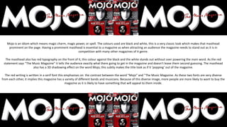
  • 1. Mojo is an idiom which means magic charm, magic power, or spell. The colours used are black and white, this is a very classic look which makes that masthead prominent on the page. Having a prominent masthead is essential to a magazine as when attracting an audience the magazine needs to stand out as it is in competition with many other magazines of it genre. The masthead also has red typography on the front of it, this colour against the black and the white stands out without over powering the main word. As the red statement says “The Music Magazine” it tells the audience exactly what there going to get in the magazine and doesn’t leave them second guessing. The masthead also has a 3D shadowing effect on the word Mojo, this subtly makes the title look as if it ‘popping’ out of the magazine. The red writing is written in a serif font this emphasises on the contrast between the word “Mojo” and “The Music Magazine. As these two fonts are very diverse from each other, it implies this magazine has a variety of different bands and musicians. Because of this diverse image, more people are more likely to want to buy the magazine as it is likely to have something that will appeal to them inside.
  • 2. Q’s masthead is very iconic and well known amongst many people, it is clearly displayed as it is always in a red box in the top of the page not only does this make current Q fans able to find and access the magazine quickly. But It also stands out to new possible readers as it is clearly defined and looks unique to other magazines it could be contending with. Q’s bright red background and serif font Q is recognisable worldwide, this masthead never changes for Q, excluding certain special episodes, which gives them self promotion as its iconic. Although this masthead is very simplistic; it still manages to have a professional edgy style. The letter Q itself has many different possible meanings which could explain why this letter has been used as a symbol. Q could connote to queen meaning this magazine company is at the top of its category and is recognised. However most commonly Q is known as symbolising a record player and the tail of the Q acts as the tone arm. Due to the colours and design used the masthead doesn’t appeal to aim towards a certain gender as the colour red is very unisex, this helps widens Q’s target audience as they are not aiming for a small section of people. However this unisex approach could change depending on what celebrity is used to sell the magazine on the front image.
  • 3. Kerrang’s masthead can change colour sometimes depending on what type of magazine its on, for example if the colours are very bright on the page, e.g. yellow; also if there was a special addition of the magazine the masthead maybe different. Although this shows variation and can widen Kerrang’s audience, It does however make it harder to spot on the magazine shelf if the masthead can change sometimes. However saying that, Kerrang often stick to the black background and white typography. These contrasting colours are very bold and go with a lot of other colours therefor Kerrang are able to be more lenient on what type of images they use for there front cover. To add to that the way the work is written is as if it in chalk. The letters do not have defined edges which gives the overall appearance an edgy appeal. Also expanding on the idea that the writing looks as if it is written in chalk could connote the idea that this magazine is very old and classic; it’s your typical music magazine sticking to the traditional codes and conventions. The word Kerrang itself comes from the onomatopoeic word that initially came from the sound that is made when playing a power chord on a distorted electric guitar. This could link to the genre that this magazine aims to meet, electric guitar often corresponding to rock and metal music; this is also expressed through the images and colours.
  • 4. Billboard is another magazine masthead that changes slightly depending on what image the company have chosen as their front cover image, for example some on some of their magazines they change the typing to white instead of black if it works better with the overall appearance, as shown by the image above. Although in Kerrang this could’ve been a problem; in Billboard it is less of one. This is because the colours in the middle of the letters remain the same. The colours that are used to fill the centre of the letters always remain the same no matter what the image on the front cover is. This makes an iconic colour scheme which cam always be associated with the masthead. This can help attract an audience as the colours will stand out when on a magazine shelf. As well as changing through the colour of the typography of the masthead also varies in thickness on certain magazines. Most of the time the word Billboard has a capital at the start, however can be lower cases in some cases. Usually Billboard use a lower case letter if the magazine front cover has a different format. By then adding a lower case letter it emphasises the idea that this issue is different to others and can be seen as more informal as there is no capital letter.
  • 5. We love pop is the only gender specified music magazine that I have analysed. You can tell that this magazine is aimed for girls by the way the heart is colour pink/purple. This is stereotypically a colour that is associated with girls, especially young girls. The masthead itself is also in a speech bubble which insinuates that someone is saying it. This is a tool used to attract young people as they are more likely to be persuaded to want a magazine due to someone saying they love it. To add to that this is the only masthead where it uses more that one word in the main title. “We love pop” is a statement which tells the audience the magazine is based on popular music, (which is again mainly what younger children listen to). Similar to Kerrang and Billboard the colours of the masthead change depending on the issue, however the design in the speech bubble always remains the same. Therefor it is easy to recognise for younger generations. Also the masthead is always in the same place on every magazine making it easy for younger children to acknowledge. As they have used the colour pink/purple, not only does that connote girls but it also connotes creativity and nurturing, giving off a positive effect.