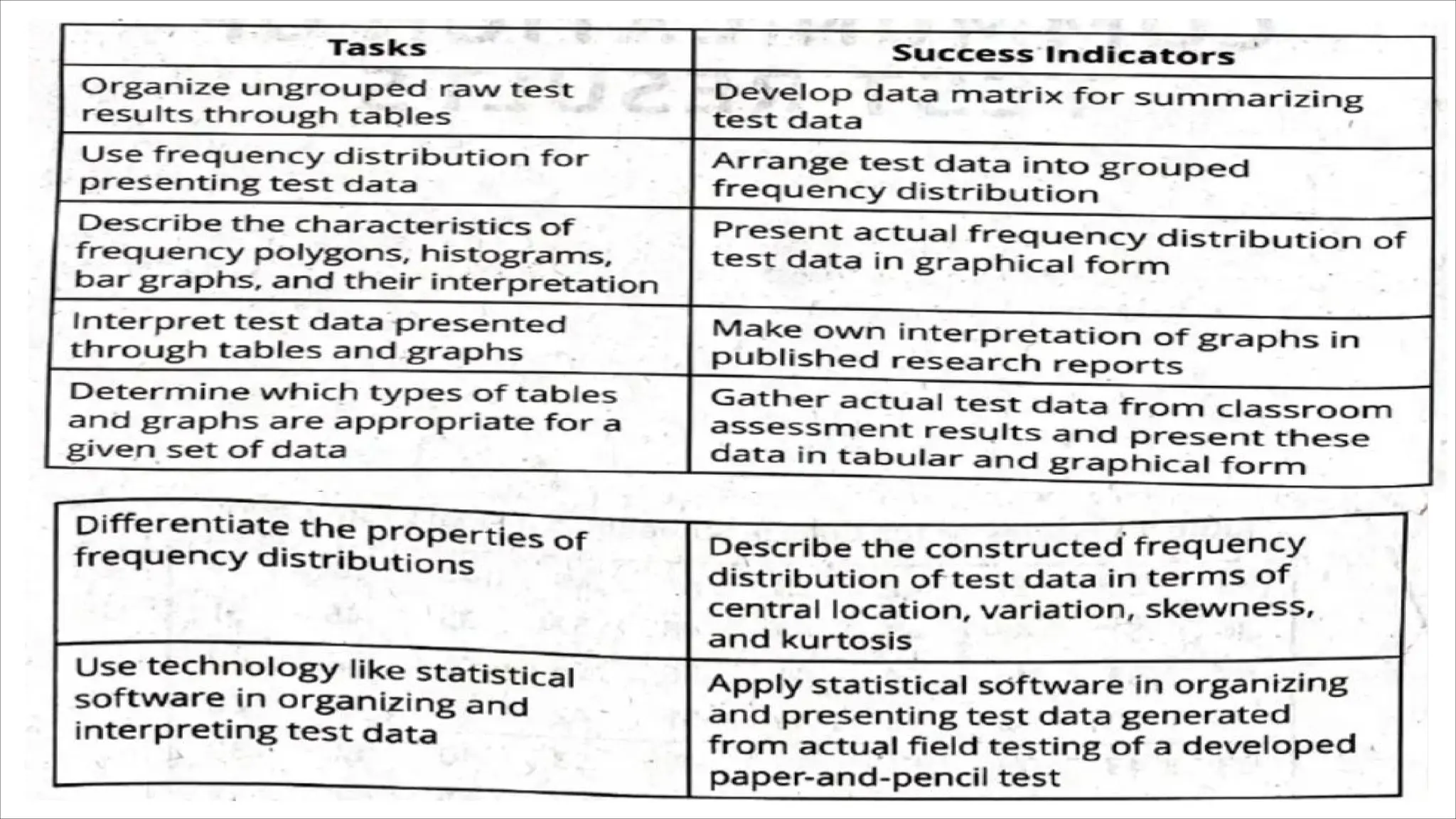
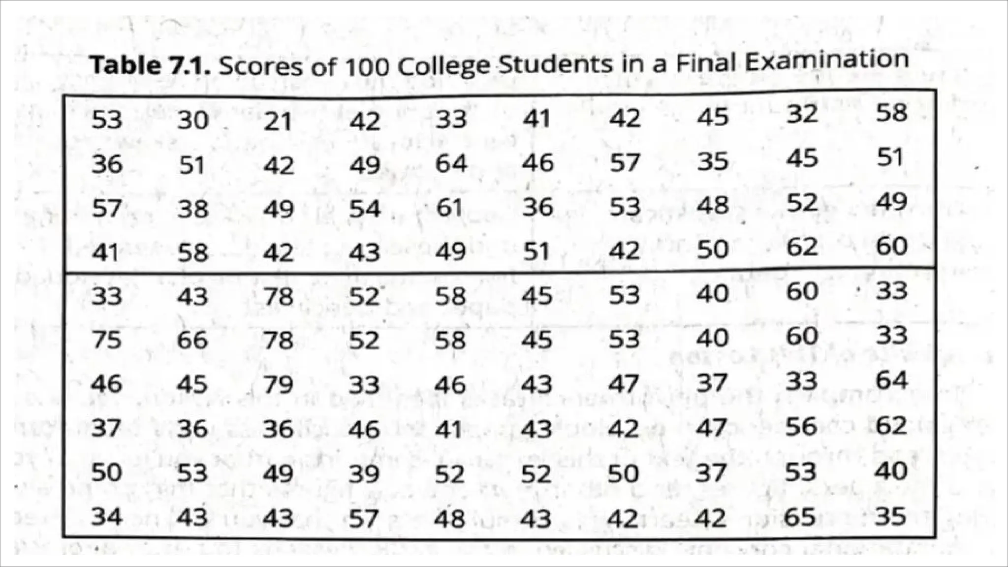
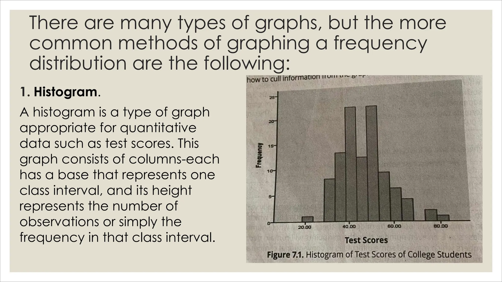
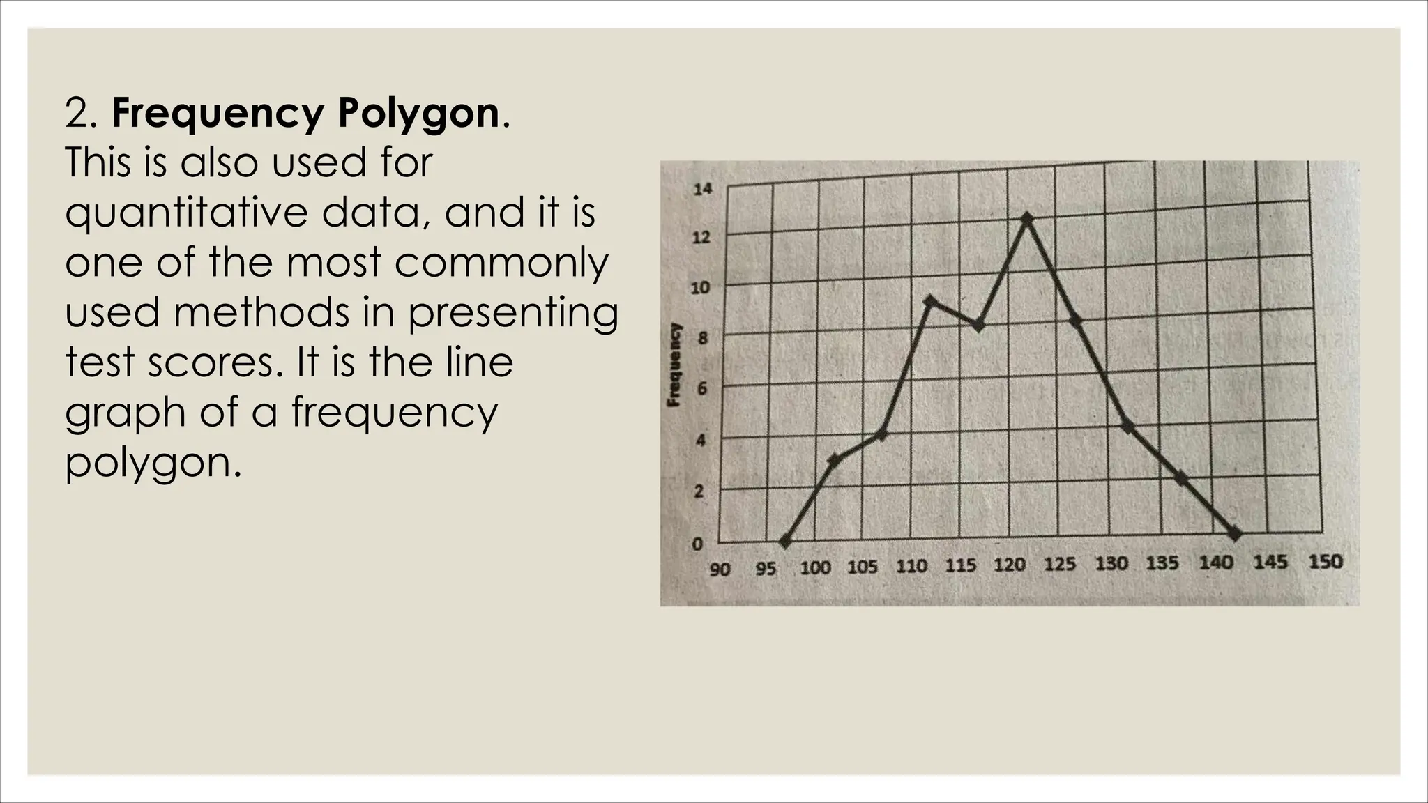
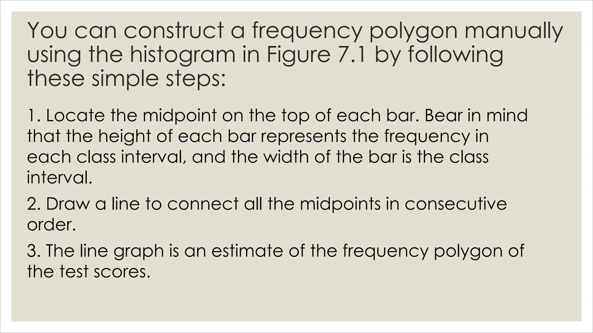
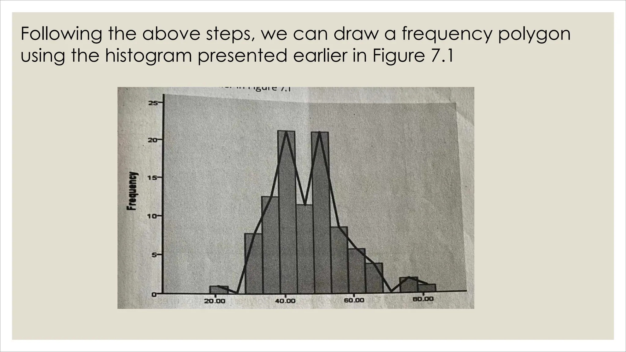
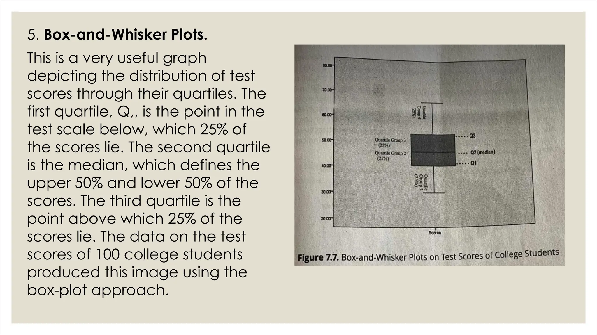
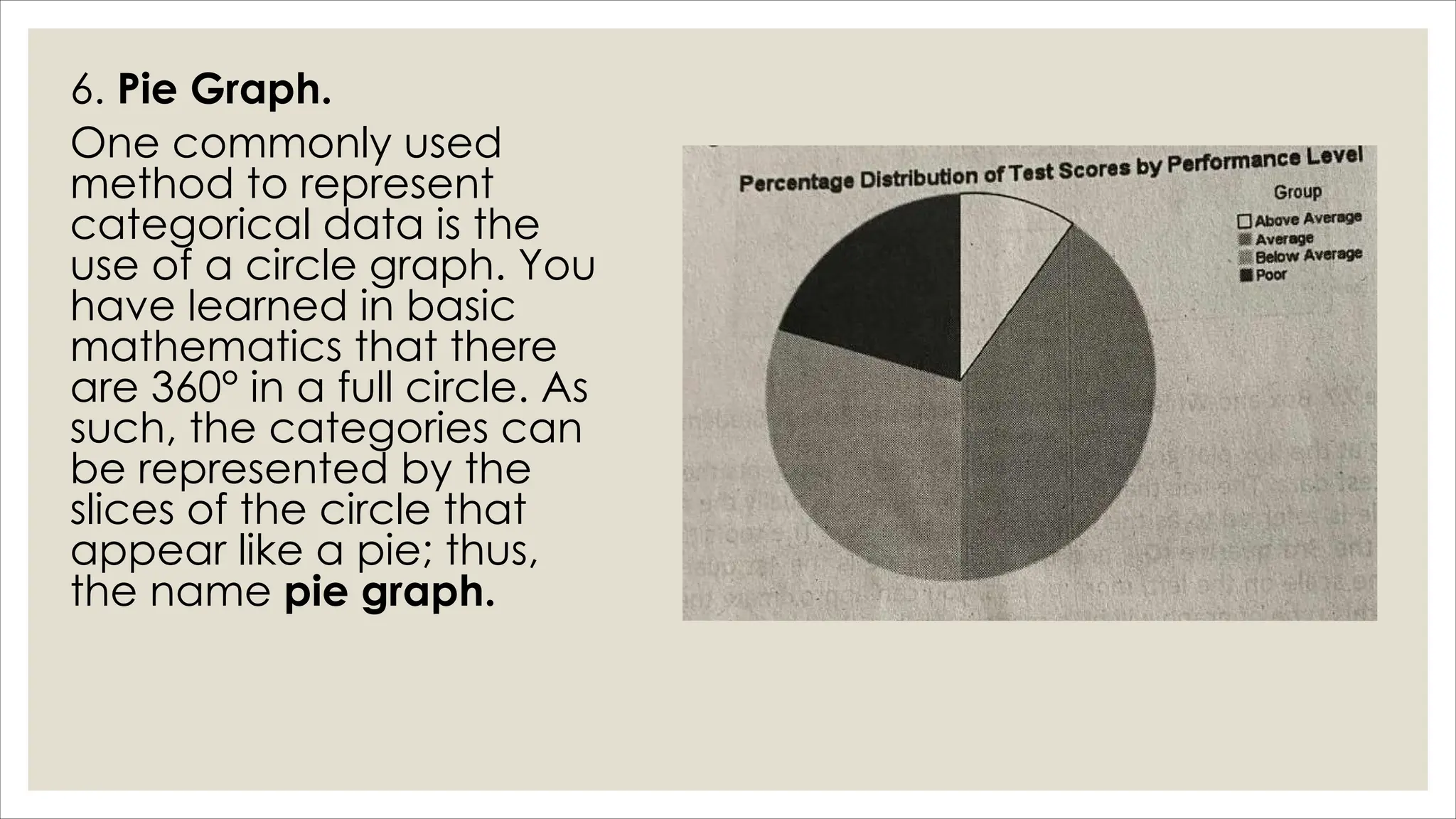
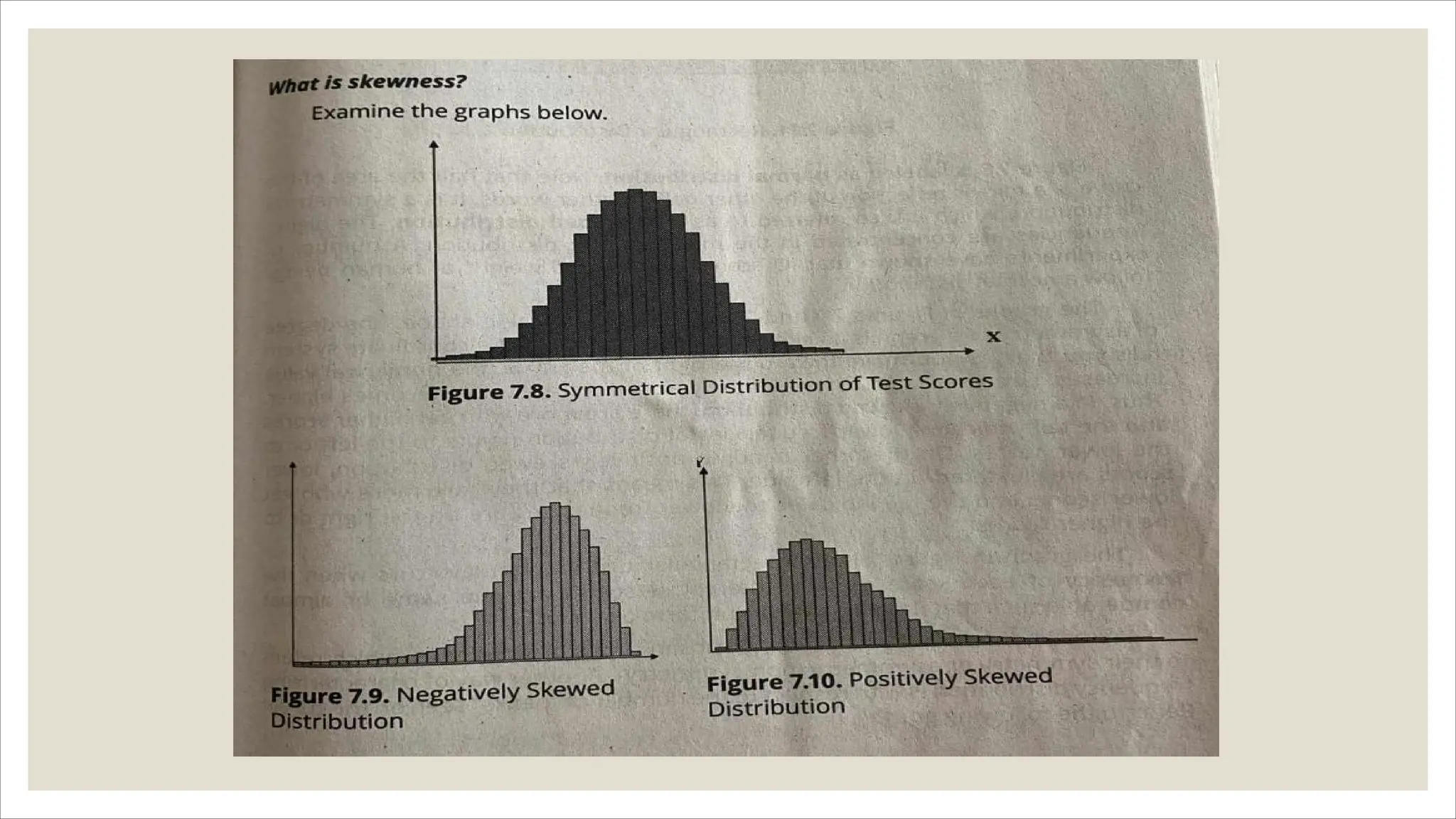
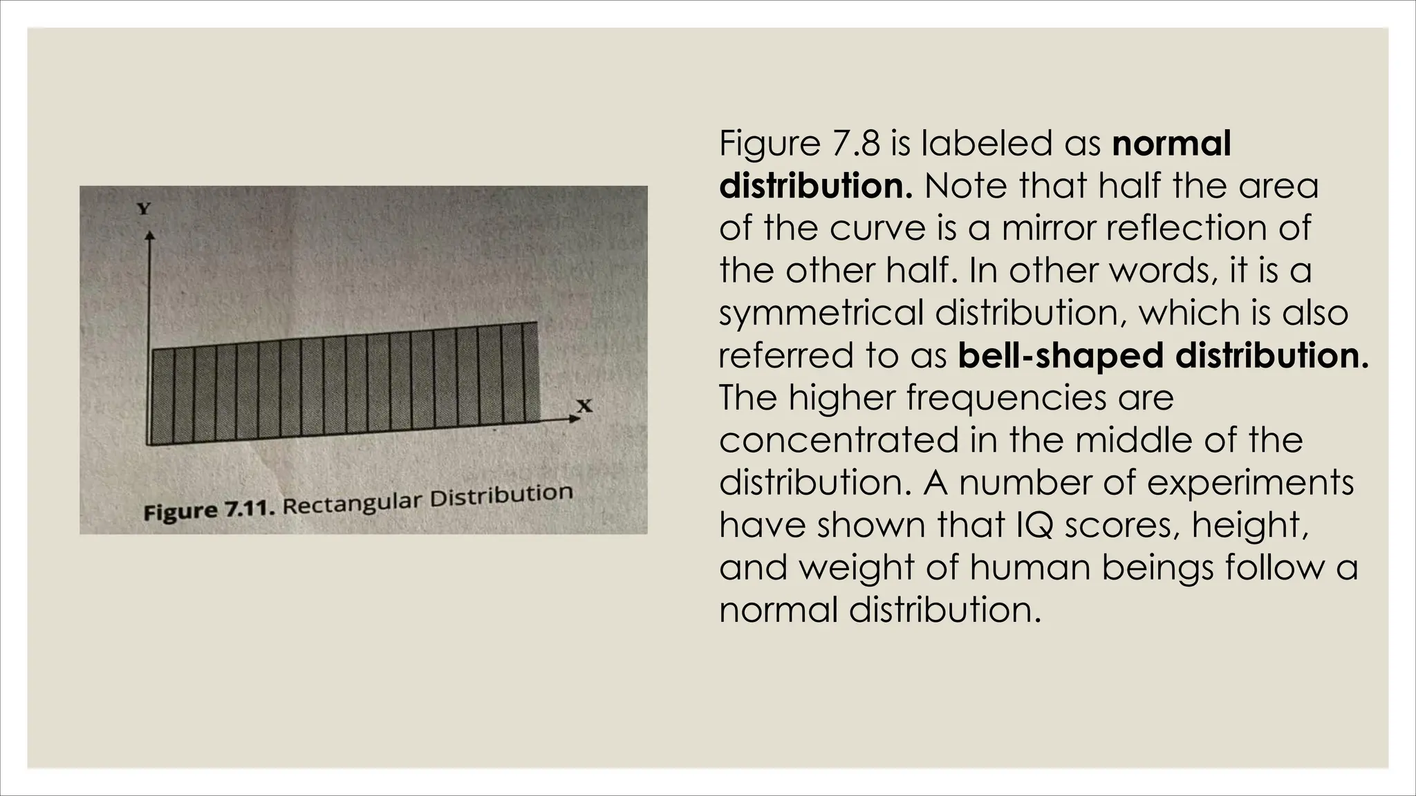
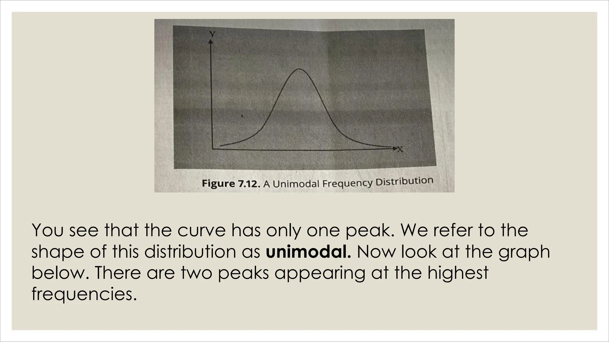
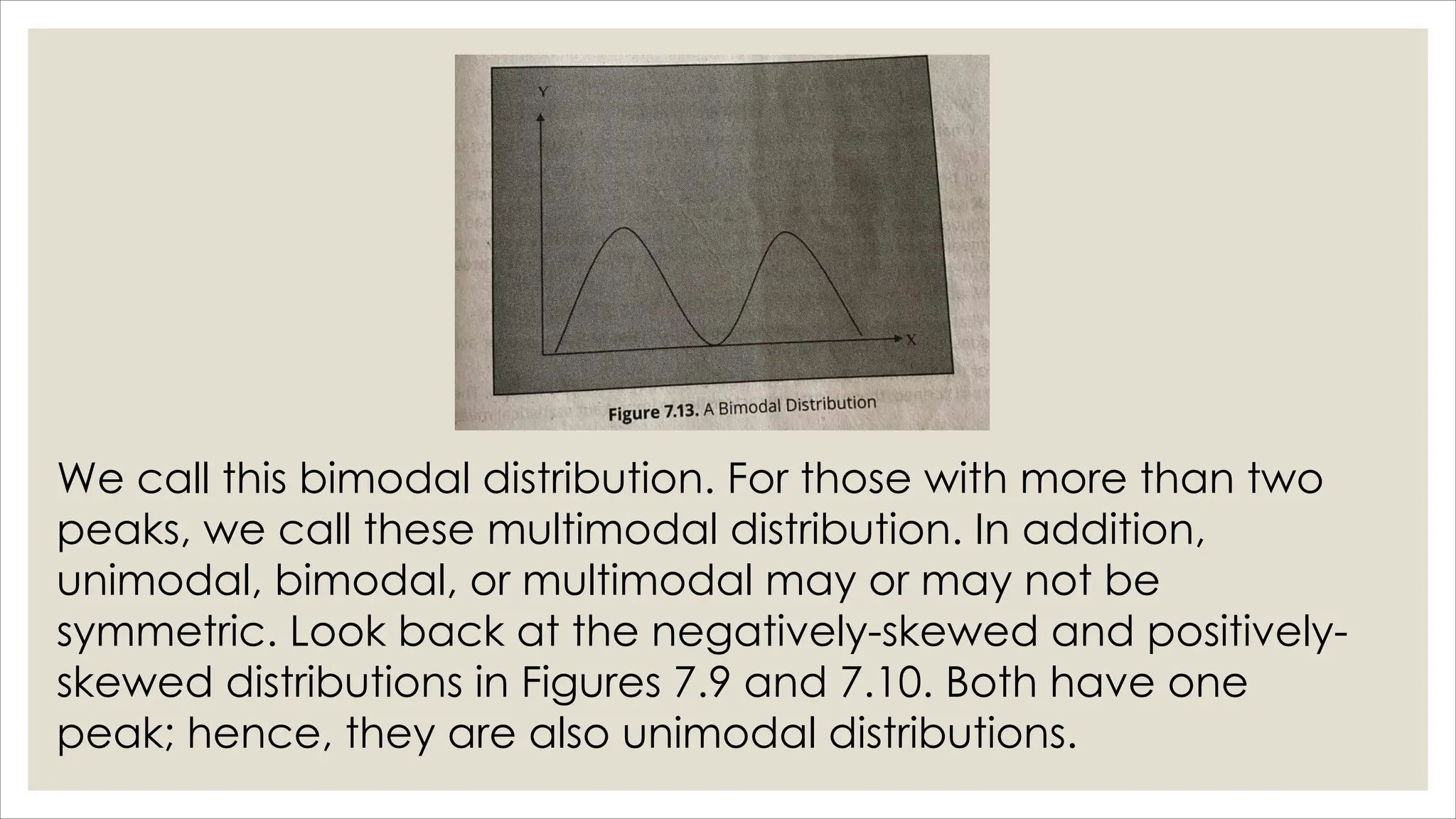
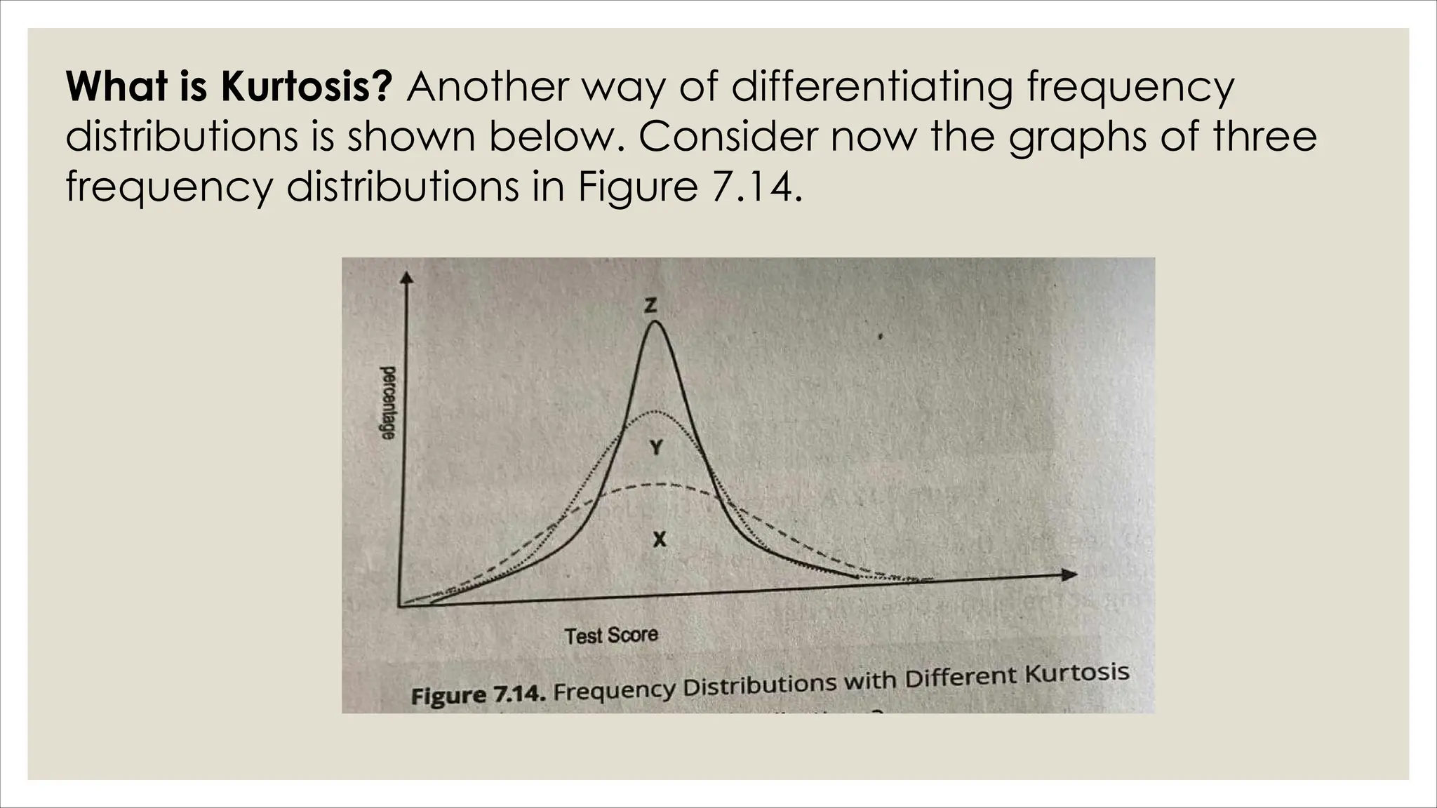
ORGANIZATION,
UTILIZATION, AND
COMMUNICATION OF
TEST RESULTS
Desired Significant Learning
Outcomes
In this lesson, you are expected to:
•Organize test data using tables and graphs
and
•Interpret frequency distribution of test data.
Significant Culminating Performance
Task and Success Indicators
•At the end of this lesson, you are expected to
present in an organized manner the test data
collected from existing database or from those
pilot tested in any of the assessment tools
implemented in the earlier lessons. Your success
in this performance task will be determined if you
have done the following:
Prerequisite of This Lesson
◦To accomplish the performance tasks identified
in this lesson, you should have gained
confidence in developing paper-and-pencil
tests in different forms. As you read through the
text of this lesson, it is important that you let go of
your fear of numbers, figures, and other
mathematical figures that may come along
during the discussions.
How do we organize and present
ungrouped data through tables?
◦As you can see in Table 7.1, the test scores
presented as a simple list of raw scores. Raw
scores are easy to get because these are scores
that are obtained from administering a test, a
questionnaire, or any inventory rating scale to
measure knowledge, skills, or other attributes of
interest.
Table 7.2 is a simple frequency random
arrangement of raw scores in Table 7.1. Table 7.2
is a simple frequency distribution that shows an
ordered arrangement The listing of scores can be
in descending or ascending order. You create this
table by simply tallying the scores. There is no
grouping of scores but a recording of the
frequency in a single test score.
◦Apparently, the data presented in Tables 7.1 and
7.2 have been condensed as a result of
grouping of scores. Table 7.3 illustrates a
grouped frequency distribution of test scores. The
wide range of scores listed in Table 7.2 has been
reduced to 12 class intervals with an interval size
of 5. Let us consider again cumulative
percentage in the 5th row of the class interval of
55-59, which is 87. We say that, 87 percent of the
students got a score below 60.
Following are some conventions in presenting test
data grouped in frequency distribution:
◦ 1. As much as possible, the size of the class intervals should be equal. Class
intervals that are multiples of 5, 10, 100, etc. are often desirable. At times,
when large gaps exist in the data and unequal class intervals are used,
such intervals may cause inconvenience in the preparation of graphs and
computation of certain descriptive statistical measures. The following
formula can be useful in estimating the necessary class interval:
◦ i=H-L
C
where I = size of the class intervals
H = highest test score
L= lowest test score
C= number of classes
2. Start the class interval at a value which is a multiple of
the class width. In Table 7.3, we used the class interval of
5 such that we start with the class value of 20, which is a
multiple of 5 and where 20-24 includes the lowest test
score of 21, as seen in Table 7.1.
3. As much as possible, open-ended class intervals should
be avoided, e.g., 100 and below or 150 and above.
These will cause some problems in graphing and
computation of descriptive statistical measures.
How do we present test data
graphically?
◦You must be familiar with the saying, “A picture is
worth a thousand words.” In a similar vein, “a
graph can be worth a hundred or a thousand
numbers.” The use of tables may not be enough
to give a clear picture of the properties of a
group of test scores.
There are many types of graphs, but the more
common methods of graphing a frequency
distribution are the following:
1. Histogram.
A histogram is a type of graph
appropriate for quantitative
data such as test scores. This
graph consists of columns-each
has a base that represents one
class interval, and its height
represents the number of
observations or simply the
frequency in that class interval.
Basic steps in SPSS application include the
following:
• Step 1. Open the Data Editor window. It is understood that
the data has already been entered into the Data editor,
following the data entry process. The assumption here is that
you already know the basics of entering data into a
statistical program.
◦ Step 2. On the menu bar, click Analyze, then go to Descriptive
Statistics, then to Frequencies. This brings up the Frequencies
dialog box as seen below.
Step 3. To make a historgram,
do the following steps:
• Open the Data Editor
• On the menu bar, click on
Graphs Legacy Dialogs
Histogram
• Click OK
2. Frequency Polygon.
This is also used for
quantitative data, and it is
one of the most commonly
used methods in presenting
test scores. It is the line
graph of a frequency
polygon.
You can construct a frequency polygon manually
using the histogram in Figure 7.1 by following
these simple steps:
1. Locate the midpoint on the top of each bar. Bear in mind
that the height of each bar represents the frequency in
each class interval, and the width of the bar is the class
interval.
2. Draw a line to connect all the midpoints in consecutive
order.
3. The line graph is an estimate of the frequency polygon of
the test scores.
Following the above steps, we can draw a frequency polygon
using the histogram presented earlier in Figure 7.1
3. Cumulative Frequency Polygon. This graph is quite different
from a frequency polygon because the cumulative
frequencies are plotted. In addition, you plot the point above
the exact limits of the interval. As the such, a cumulative
polygon gives a picture of the number of observations that fall
below a certain score instead of the frequency within a class
interval.
Figure 7.3.1 Cumulative frequency polygon
of test score of college students
Figure 7.3.2 Cumulative frequency polygon
of test score of college students
4. Bar Graph.
This graph is often used to present
frequencies in categories of a
qualitative variable. It looks very
similar to a histogram, constructed
in the same manner, but spaces
are placed in between the
consecutive bars. The columns
represent the categories and the
height of each bar as in a
histogram represents the
frequency. If experimental data
are graphed, the independent
variable in categories is usually
plotted on the x-axis, while the
dependent variable is the test
score on the y-axis.
5. Box-and-Whisker Plots.
This is a very useful graph
depicting the distribution of test
scores through their quartiles. The
first quartile, Q,, is the point in the
test scale below, which 25% of
the scores lie. The second quartile
is the median, which defines the
upper 50% and lower 50% of the
scores. The third quartile is the
point above which 25% of the
scores lie. The data on the test
scores of 100 college students
produced this image using the
box-plot approach.
6. Pie Graph.
One commonly used
method to represent
categorical data is the
use of a circle graph. You
have learned in basic
mathematics that there
are 360° in a full circle. As
such, the categories can
be represented by the
slices of the circle that
appear like a pie; thus,
the name pie graph.
Figure 7.8 is labeled as normal
distribution. Note that half the area
of the curve is a mirror reflection of
the other half. In other words, it is a
symmetrical distribution, which is also
referred to as bell-shaped distribution.
The higher frequencies are
concentrated in the middle of the
distribution. A number of experiments
have shown that IQ scores, height,
and weight of human beings follow a
normal distribution.
The graphs in Figures 7.9 and 7.10 are asymmetrical in shape. The degree of
asymmetry of a graph is its skewness. Basic principle of a coordinate
system tells you that, as you move toward the right of the x-axis, the
numerical value increases. Likewise, as you move up the y-axis, the scale
value becomes higher. Thus, in a negatively-skewed distribution, there are
more who get higher scores and the tail, indicating lower frequencies of
distribution points to the left or to the lower scores. On the other hand, in
positively-skewed distribution, lower scores are clustered on the left side.
This means that there are more who get lower scores and the tail indicates
the lower frequencies are on the right or to the higher scores.
The graph in Figure 7.11 is a rectangular distribution. It occurs when the
frequency of each score or class interval of scores are the same or almost
comparable such that it is also called a uniform distribution.
You see that the curve has only one peak. We refer to the
shape of this distribution as unimodal. Now look at the graph
below. There are two peaks appearing at the highest
frequencies.
We call this bimodal distribution. For those with more than two
peaks, we call these multimodal distribution. In addition,
unimodal, bimodal, or multimodal may or may not be
symmetric. Look back at the negatively-skewed and positively-
skewed distributions in Figures 7.9 and 7.10. Both have one
peak; hence, they are also unimodal distributions.
What is Kurtosis? Another way of differentiating frequency
distributions is shown below. Consider now the graphs of three
frequency distributions in Figure 7.14.
Thank you for LisTening!
Reporters:
Crislyn Macabenta
Farah Mae Titoy
Princes Aize Ompad

ORGANIZATION, UTILIZATION, AND COMMUNICATION OF TEST RESULTSProf-ed-7.pdf

  • 1.
  • 2.
    Desired Significant Learning Outcomes Inthis lesson, you are expected to: •Organize test data using tables and graphs and •Interpret frequency distribution of test data.
  • 3.
    Significant Culminating Performance Taskand Success Indicators •At the end of this lesson, you are expected to present in an organized manner the test data collected from existing database or from those pilot tested in any of the assessment tools implemented in the earlier lessons. Your success in this performance task will be determined if you have done the following:
  • 5.
    Prerequisite of ThisLesson ◦To accomplish the performance tasks identified in this lesson, you should have gained confidence in developing paper-and-pencil tests in different forms. As you read through the text of this lesson, it is important that you let go of your fear of numbers, figures, and other mathematical figures that may come along during the discussions.
  • 7.
    How do weorganize and present ungrouped data through tables? ◦As you can see in Table 7.1, the test scores presented as a simple list of raw scores. Raw scores are easy to get because these are scores that are obtained from administering a test, a questionnaire, or any inventory rating scale to measure knowledge, skills, or other attributes of interest.
  • 9.
    Table 7.2 isa simple frequency random arrangement of raw scores in Table 7.1. Table 7.2 is a simple frequency distribution that shows an ordered arrangement The listing of scores can be in descending or ascending order. You create this table by simply tallying the scores. There is no grouping of scores but a recording of the frequency in a single test score.
  • 11.
    ◦Apparently, the datapresented in Tables 7.1 and 7.2 have been condensed as a result of grouping of scores. Table 7.3 illustrates a grouped frequency distribution of test scores. The wide range of scores listed in Table 7.2 has been reduced to 12 class intervals with an interval size of 5. Let us consider again cumulative percentage in the 5th row of the class interval of 55-59, which is 87. We say that, 87 percent of the students got a score below 60.
  • 12.
    Following are someconventions in presenting test data grouped in frequency distribution: ◦ 1. As much as possible, the size of the class intervals should be equal. Class intervals that are multiples of 5, 10, 100, etc. are often desirable. At times, when large gaps exist in the data and unequal class intervals are used, such intervals may cause inconvenience in the preparation of graphs and computation of certain descriptive statistical measures. The following formula can be useful in estimating the necessary class interval: ◦ i=H-L C where I = size of the class intervals H = highest test score L= lowest test score C= number of classes
  • 13.
    2. Start theclass interval at a value which is a multiple of the class width. In Table 7.3, we used the class interval of 5 such that we start with the class value of 20, which is a multiple of 5 and where 20-24 includes the lowest test score of 21, as seen in Table 7.1. 3. As much as possible, open-ended class intervals should be avoided, e.g., 100 and below or 150 and above. These will cause some problems in graphing and computation of descriptive statistical measures.
  • 14.
    How do wepresent test data graphically? ◦You must be familiar with the saying, “A picture is worth a thousand words.” In a similar vein, “a graph can be worth a hundred or a thousand numbers.” The use of tables may not be enough to give a clear picture of the properties of a group of test scores.
  • 15.
    There are manytypes of graphs, but the more common methods of graphing a frequency distribution are the following: 1. Histogram. A histogram is a type of graph appropriate for quantitative data such as test scores. This graph consists of columns-each has a base that represents one class interval, and its height represents the number of observations or simply the frequency in that class interval.
  • 16.
    Basic steps inSPSS application include the following: • Step 1. Open the Data Editor window. It is understood that the data has already been entered into the Data editor, following the data entry process. The assumption here is that you already know the basics of entering data into a statistical program.
  • 17.
    ◦ Step 2.On the menu bar, click Analyze, then go to Descriptive Statistics, then to Frequencies. This brings up the Frequencies dialog box as seen below.
  • 18.
    Step 3. Tomake a historgram, do the following steps: • Open the Data Editor • On the menu bar, click on Graphs Legacy Dialogs Histogram • Click OK
  • 19.
    2. Frequency Polygon. Thisis also used for quantitative data, and it is one of the most commonly used methods in presenting test scores. It is the line graph of a frequency polygon.
  • 20.
    You can constructa frequency polygon manually using the histogram in Figure 7.1 by following these simple steps: 1. Locate the midpoint on the top of each bar. Bear in mind that the height of each bar represents the frequency in each class interval, and the width of the bar is the class interval. 2. Draw a line to connect all the midpoints in consecutive order. 3. The line graph is an estimate of the frequency polygon of the test scores.
  • 21.
    Following the abovesteps, we can draw a frequency polygon using the histogram presented earlier in Figure 7.1
  • 22.
    3. Cumulative FrequencyPolygon. This graph is quite different from a frequency polygon because the cumulative frequencies are plotted. In addition, you plot the point above the exact limits of the interval. As the such, a cumulative polygon gives a picture of the number of observations that fall below a certain score instead of the frequency within a class interval.
  • 23.
    Figure 7.3.1 Cumulativefrequency polygon of test score of college students Figure 7.3.2 Cumulative frequency polygon of test score of college students
  • 24.
    4. Bar Graph. Thisgraph is often used to present frequencies in categories of a qualitative variable. It looks very similar to a histogram, constructed in the same manner, but spaces are placed in between the consecutive bars. The columns represent the categories and the height of each bar as in a histogram represents the frequency. If experimental data are graphed, the independent variable in categories is usually plotted on the x-axis, while the dependent variable is the test score on the y-axis.
  • 26.
    5. Box-and-Whisker Plots. Thisis a very useful graph depicting the distribution of test scores through their quartiles. The first quartile, Q,, is the point in the test scale below, which 25% of the scores lie. The second quartile is the median, which defines the upper 50% and lower 50% of the scores. The third quartile is the point above which 25% of the scores lie. The data on the test scores of 100 college students produced this image using the box-plot approach.
  • 27.
    6. Pie Graph. Onecommonly used method to represent categorical data is the use of a circle graph. You have learned in basic mathematics that there are 360° in a full circle. As such, the categories can be represented by the slices of the circle that appear like a pie; thus, the name pie graph.
  • 29.
    Figure 7.8 islabeled as normal distribution. Note that half the area of the curve is a mirror reflection of the other half. In other words, it is a symmetrical distribution, which is also referred to as bell-shaped distribution. The higher frequencies are concentrated in the middle of the distribution. A number of experiments have shown that IQ scores, height, and weight of human beings follow a normal distribution.
  • 30.
    The graphs inFigures 7.9 and 7.10 are asymmetrical in shape. The degree of asymmetry of a graph is its skewness. Basic principle of a coordinate system tells you that, as you move toward the right of the x-axis, the numerical value increases. Likewise, as you move up the y-axis, the scale value becomes higher. Thus, in a negatively-skewed distribution, there are more who get higher scores and the tail, indicating lower frequencies of distribution points to the left or to the lower scores. On the other hand, in positively-skewed distribution, lower scores are clustered on the left side. This means that there are more who get lower scores and the tail indicates the lower frequencies are on the right or to the higher scores. The graph in Figure 7.11 is a rectangular distribution. It occurs when the frequency of each score or class interval of scores are the same or almost comparable such that it is also called a uniform distribution.
  • 31.
    You see thatthe curve has only one peak. We refer to the shape of this distribution as unimodal. Now look at the graph below. There are two peaks appearing at the highest frequencies.
  • 32.
    We call thisbimodal distribution. For those with more than two peaks, we call these multimodal distribution. In addition, unimodal, bimodal, or multimodal may or may not be symmetric. Look back at the negatively-skewed and positively- skewed distributions in Figures 7.9 and 7.10. Both have one peak; hence, they are also unimodal distributions.
  • 33.
    What is Kurtosis?Another way of differentiating frequency distributions is shown below. Consider now the graphs of three frequency distributions in Figure 7.14.
  • 34.
    Thank you forLisTening! Reporters: Crislyn Macabenta Farah Mae Titoy Princes Aize Ompad