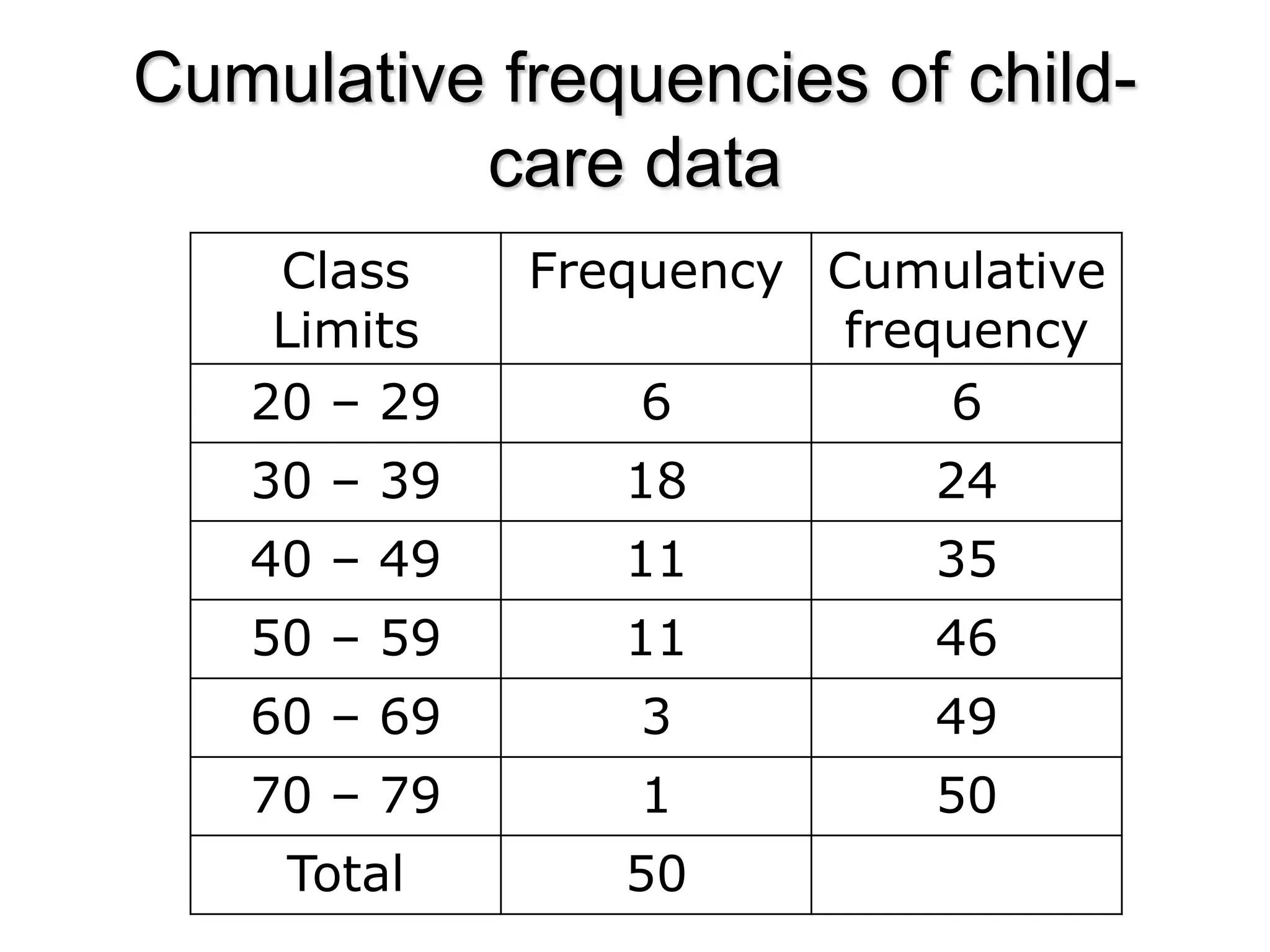
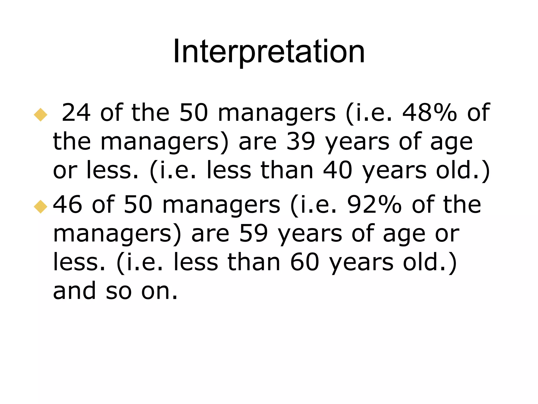
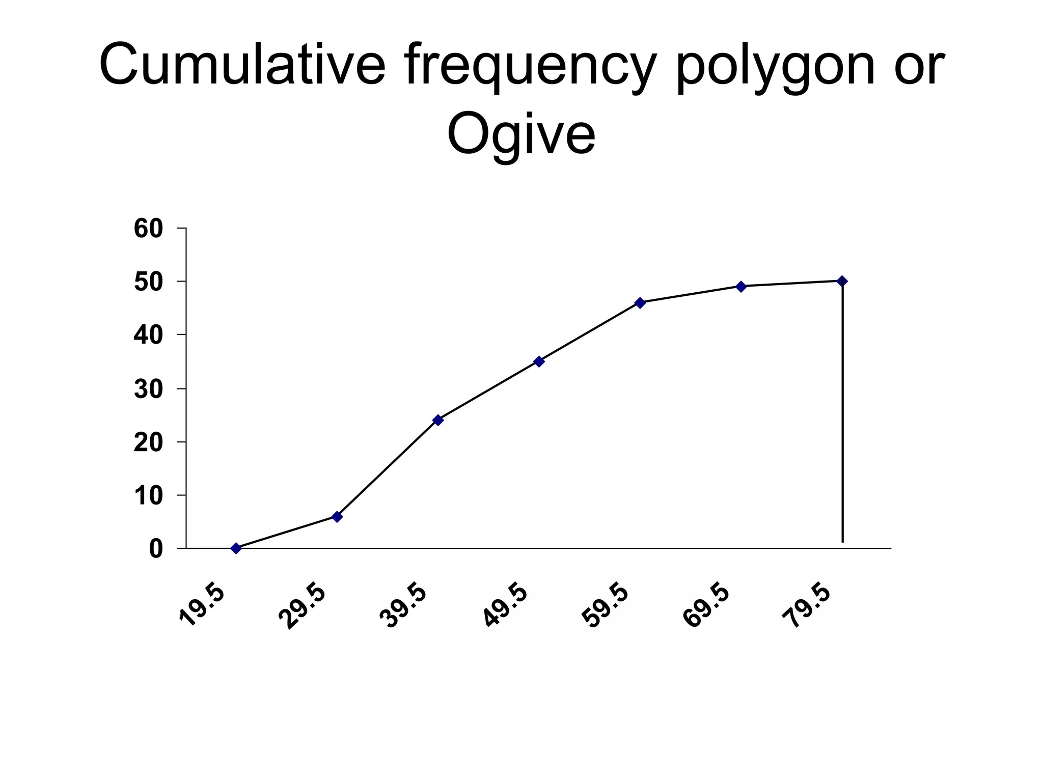
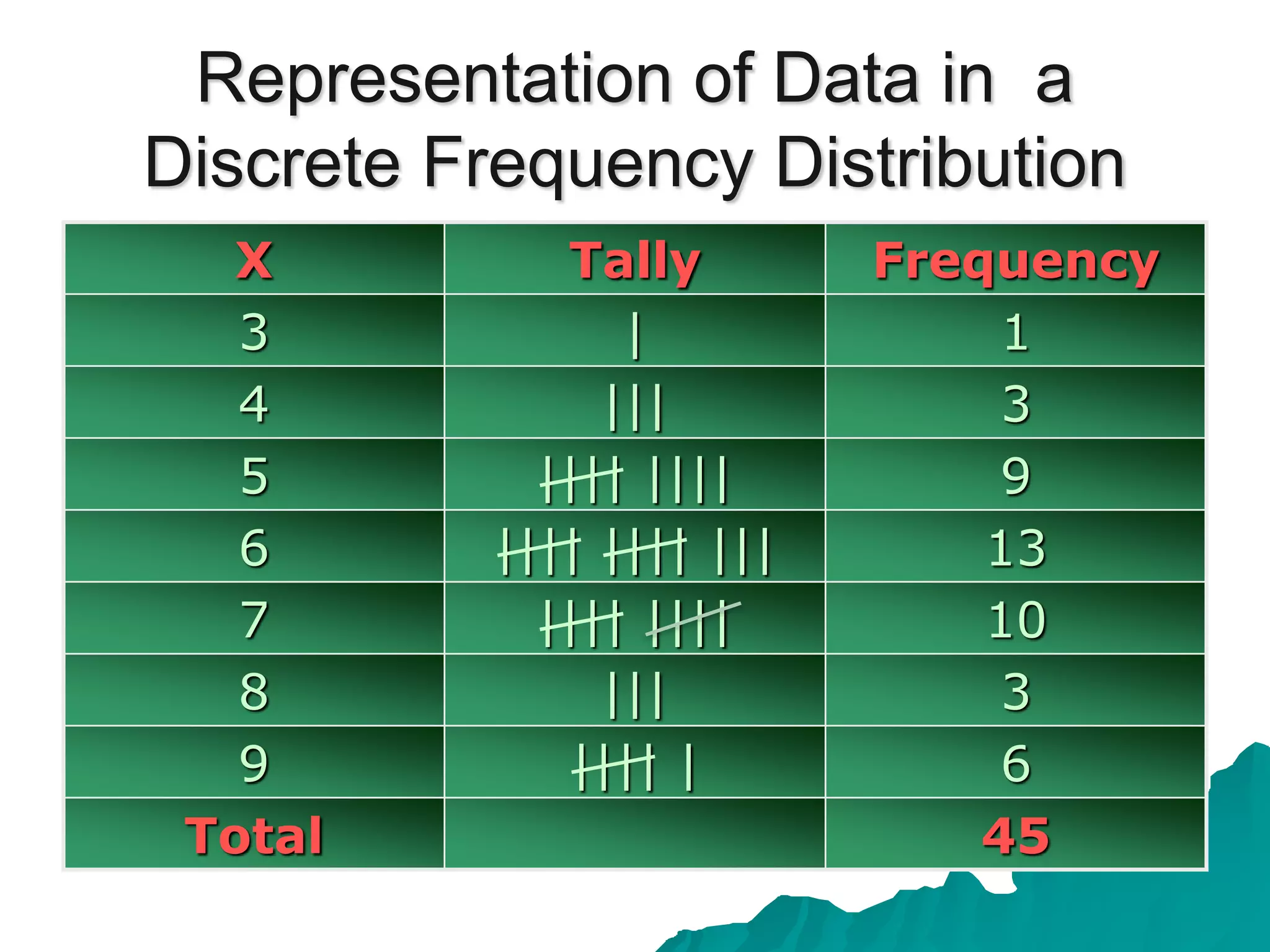
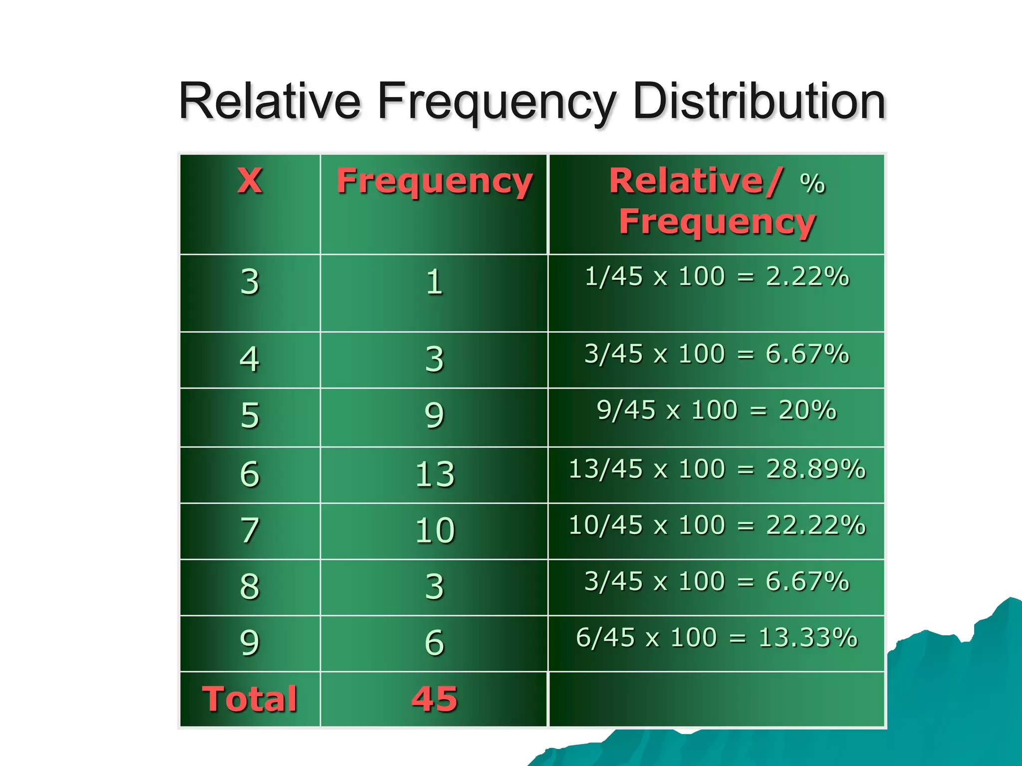
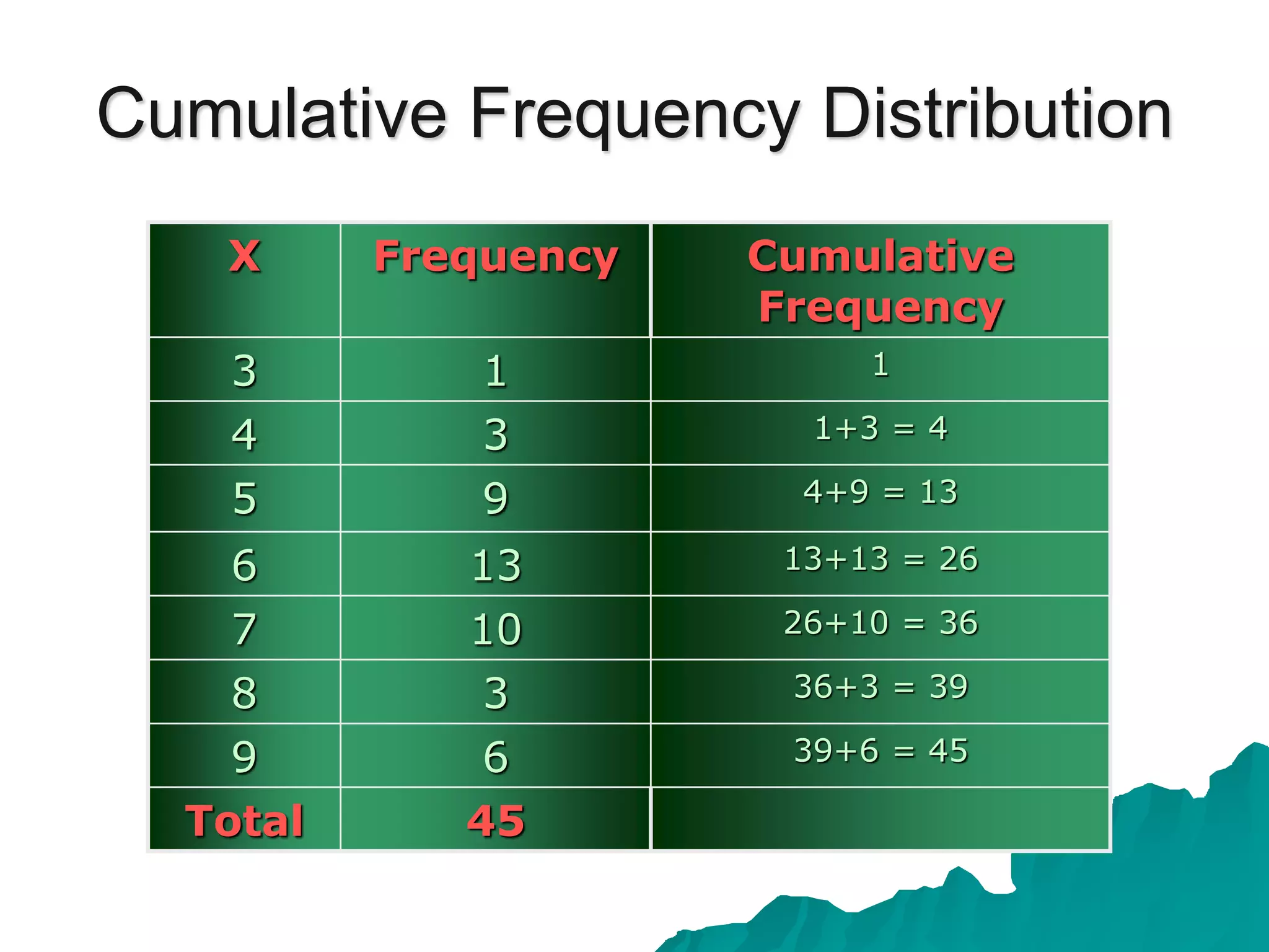
Frequency distribution, types of frequency distribution.
Ungrouped frequency distribution
Grouped frequency distribution
Cumulative frequency distribution
Relative frequency distribution
Relative cumulative frequency distribution
Graphical representation of frequency distribution
I. Representation of Grouped data
1.Line graphs
2.Bar diagrams
a) Simple bar diagram
b)Multiple/Grouped bar diagram
c)Sub-divided bar diagram.
d) % bar diagram
3. Pie charts
4.Pictogram
II. Graphical representation of ungrouped data
1, Histogram
2.Frequency polygon
3.Cumulative change diagram
4. Proportional change diagram
5. Ratio diagram
Topic: Frequency Polygon
Student Name: Kubra
Class: B.Ed. 2.5
Project Name: “Young Teachers' Professional Development (TPD)"
"Project Founder: Prof. Dr. Amjad Ali Arain
Faculty of Education, University of Sindh, Pakistan
Brief description of the concepts related to correlation analysis. Problem Sums related to Karl Pearson's Correlation, Spearman's Rank Correlation, Coefficient of Concurrent Deviation, Correlation of a grouped data.
SAMPLING ; SAMPLING TECHNIQUES – RANDOM SAMPLING (SIMPLE RANDOM SAMPLING)Navya Jayakumar
SAMPLING ; SAMPLING TECHNIQUES – RANDOM SAMPLING
(SIMPLE RANDOM SAMPLING)
Sampling means the process of selecting a part of the population
A population is a group people that is studied in a research. These are the members of a town, a city, or a country.
It is difficult for a researcher to study the whole population due to limited resources
E.G.. Time, cost and energy
Hence the researcher selects a part of the population for his study, rather than selecting the whole population. This process is known as sampling
Also known as Random Sampling
A type of sampling where each member of the population has a known probability of being selected in the sample
When a population is highly homogeneous, its each member has a known chance of being selected in the sample
The extend of homogeneity of a population usually depends upon the nature of the research. E.g.: who are the target respondents of the research
Lecture 2 Organizing and Displaying Data.pptxshakirRahman10
Objectives:
Apply two methods (frequency distribution and graphs) for organizing, summarizing and presenting the data
Construct the frequency table for individual and grouped data
Explore the different graphical representation appropriate for the particular variable scales
Presentation of Data:
Statistical data including (qualitative & quantitative) are generally presented by:
Tables
Frequency table
Graphs
Histogram
Frequency Polygon
Bar Graph
Pie Chart
Frequency Table:
A frequency distribution is the organization of raw data in table form, using classes and frequencies.
It is a method to organize, summarize and present the data in a meaningful way.
Each individual value (in case of smaller range) and each class interval (in case of larger range) is referred to as a ‘class’.
The number of data values contained in a specific class is the ‘frequency’.
Relative Frequency:
Represents the relative percentage to total cases of any class interval. It is obtained by dividing the number of cases in each class interval by the total number of cases and multiplying by 100.
Cumulative Frequency:
Cumulative frequencies are used to show how many data values are accumulated up to and including a specific class.
Cumulative Relative Frequency:
Gives the proportion of individuals having a measurement less than or equal to the upper boundary of the class interval.
Class Boundaries:
Class boundaries are used to separate the classes so that there are no gaps in the frequency distribution.
Mostly used in case of continuous data.
Graphical Presentation of the Data:
Another way of summarizing data is by use of graphs.
Gives a nice overview of the essential features of the dataset.
Should be self explanatory, with a descriptive title, labeled axes and indication of the units of observation.
Histogram:
The Histogram is a graph that displays the data by using contiguous vertical bars of various heights to represent the frequencies of the classes.
It is used to summarize continuous data.
It consists of horizontal axis which depicts the class interval and a vertical axis which depicts the frequency (or relative frequency) of observations.
Frequency Polygon:
Another commonly used type of graph used to display continuous data only.
Superior to histogram (can compare two frequency distribution)
Formed by joining the midpoints of histogram column tops
Bar Charts:
Convenient graphical device that is used for displaying nominal or ordinal data (example gender, ethnicity, treatment category) and discrete variables.
Pie Chart:
A pie chart is a way of summarizing a set of qualitative data.
This type of chart is a circle divided into a series of segments.
Each segment represents a particular category. The area of each segment is the same proportion of a circle as the category is of the total data set.
We know that frequency distributions serve useful purposes but there are many situations that require other type of data summarizations. What we need in many instances is the ability to summarize the data by means of a single number called a descriptive measure. Descriptive measures may be computed from the data of a sample or the data of a population.
Types of Graphs
(i) Graph of time series or Historigram
(ii) Histogram
(iii) Frequency polygon
(iv) Frequency curve
(v) Cumulative Frequency polygon or Ogive
Historigram
A Historigram is constructed by taking time along X-axis and the value of the variable along Y-axis. Points are plotted and are then connected by straight line segments to get the Historigram.
This slides introduce the descriptive statistics and its differences with inferential statistics. It also discusses about organizing data and graphing data.
QUARTILES, DECILES AND PERCENTILES(2018)sumanmathews
THIS TOPIC GIVES A STEP BY STEP METHOD TO CALCULATE QUARTILES, DECILES AND PERCENTILES FOR A GROUPED AND DISCRETE FREQUENCY DISTRIBUTION.
IT WOULD BE A QUICK AND EASY METHOD TO LEARN FOR GRADE 11 MATH STUDENTS AND COLLEGE STUDENTS LEARNING STATISTICS.
SO WATCH THE ENTIRE VIDEO TODAY.
Similar to CUMULATIVE FREQUENCY POLYGON or OGIVE (20)
Premium MEAN Stack Development Solutions for Modern BusinessesSynapseIndia
Stay ahead of the curve with our premium MEAN Stack Development Solutions. Our expert developers utilize MongoDB, Express.js, AngularJS, and Node.js to create modern and responsive web applications. Trust us for cutting-edge solutions that drive your business growth and success.
Know more: https://www.synapseindia.com/technology/mean-stack-development-company.html
Digital Transformation and IT Strategy Toolkit and TemplatesAurelien Domont, MBA
This Digital Transformation and IT Strategy Toolkit was created by ex-McKinsey, Deloitte and BCG Management Consultants, after more than 5,000 hours of work. It is considered the world's best & most comprehensive Digital Transformation and IT Strategy Toolkit. It includes all the Frameworks, Best Practices & Templates required to successfully undertake the Digital Transformation of your organization and define a robust IT Strategy.
Editable Toolkit to help you reuse our content: 700 Powerpoint slides | 35 Excel sheets | 84 minutes of Video training
This PowerPoint presentation is only a small preview of our Toolkits. For more details, visit www.domontconsulting.com
LA HUG - Video Testimonials with Chynna Morgan - June 2024Lital Barkan
Have you ever heard that user-generated content or video testimonials can take your brand to the next level? We will explore how you can effectively use video testimonials to leverage and boost your sales, content strategy, and increase your CRM data.🤯
We will dig deeper into:
1. How to capture video testimonials that convert from your audience 🎥
2. How to leverage your testimonials to boost your sales 💲
3. How you can capture more CRM data to understand your audience better through video testimonials. 📊
Implicitly or explicitly all competing businesses employ a strategy to select a mix
of marketing resources. Formulating such competitive strategies fundamentally
involves recognizing relationships between elements of the marketing mix (e.g.,
price and product quality), as well as assessing competitive and market conditions
(i.e., industry structure in the language of economics).
B2B payments are rapidly changing. Find out the 5 key questions you need to be asking yourself to be sure you are mastering B2B payments today. Learn more at www.BlueSnap.com.
In the Adani-Hindenburg case, what is SEBI investigating.pptxAdani case
Adani SEBI investigation revealed that the latter had sought information from five foreign jurisdictions concerning the holdings of the firm’s foreign portfolio investors (FPIs) in relation to the alleged violations of the MPS Regulations. Nevertheless, the economic interest of the twelve FPIs based in tax haven jurisdictions still needs to be determined. The Adani Group firms classed these FPIs as public shareholders. According to Hindenburg, FPIs were used to get around regulatory standards.
Tata Group Dials Taiwan for Its Chipmaking Ambition in Gujarat’s DholeraAvirahi City Dholera
The Tata Group, a titan of Indian industry, is making waves with its advanced talks with Taiwanese chipmakers Powerchip Semiconductor Manufacturing Corporation (PSMC) and UMC Group. The goal? Establishing a cutting-edge semiconductor fabrication unit (fab) in Dholera, Gujarat. This isn’t just any project; it’s a potential game changer for India’s chipmaking aspirations and a boon for investors seeking promising residential projects in dholera sir.
Visit : https://www.avirahi.com/blog/tata-group-dials-taiwan-for-its-chipmaking-ambition-in-gujarats-dholera/
Anny Serafina Love - Letter of Recommendation by Kellen Harkins, MS.AnnySerafinaLove
This letter, written by Kellen Harkins, Course Director at Full Sail University, commends Anny Love's exemplary performance in the Video Sharing Platforms class. It highlights her dedication, willingness to challenge herself, and exceptional skills in production, editing, and marketing across various video platforms like YouTube, TikTok, and Instagram.
Understanding User Needs and Satisfying ThemAggregage
https://www.productmanagementtoday.com/frs/26903918/understanding-user-needs-and-satisfying-them
We know we want to create products which our customers find to be valuable. Whether we label it as customer-centric or product-led depends on how long we've been doing product management. There are three challenges we face when doing this. The obvious challenge is figuring out what our users need; the non-obvious challenges are in creating a shared understanding of those needs and in sensing if what we're doing is meeting those needs.
In this webinar, we won't focus on the research methods for discovering user-needs. We will focus on synthesis of the needs we discover, communication and alignment tools, and how we operationalize addressing those needs.
Industry expert Scott Sehlhorst will:
• Introduce a taxonomy for user goals with real world examples
• Present the Onion Diagram, a tool for contextualizing task-level goals
• Illustrate how customer journey maps capture activity-level and task-level goals
• Demonstrate the best approach to selection and prioritization of user-goals to address
• Highlight the crucial benchmarks, observable changes, in ensuring fulfillment of customer needs
Personal Brand Statement:
As an Army veteran dedicated to lifelong learning, I bring a disciplined, strategic mindset to my pursuits. I am constantly expanding my knowledge to innovate and lead effectively. My journey is driven by a commitment to excellence, and to make a meaningful impact in the world.
3.0 Project 2_ Developing My Brand Identity Kit.pptxtanyjahb
A personal brand exploration presentation summarizes an individual's unique qualities and goals, covering strengths, values, passions, and target audience. It helps individuals understand what makes them stand out, their desired image, and how they aim to achieve it.
3.0 Project 2_ Developing My Brand Identity Kit.pptx
CUMULATIVE FREQUENCY POLYGON or OGIVE
1. The graph of a cumulative frequency
distribution is called a CUMULATIVE
FREQUENCY POLYGON or OGIVE. A
ogive is obtained by marking off the upper
class boundaries of the various classes
along the X-axis and the cumulative
frequencies along the y-axis, as shown
below:
CUMULATIVE
FREQUENCY POLYGON
or OGIVE
2. Example
The following table contains the ages
of 50 managers of child-care centers
in five cities of a developed country.
Construct the cumulative frequency
distribution and the cumulative
frequency polygon (ogive).
3. Ages of a sample of managers
of Urban child-care centers
42 26 32 34 57
30 58 37 50 30
53 40 30 47 49
50 40 32 31 40
52 28 23 35 25
30 36 32 26 50
55 30 58 64 52
49 33 43 46 32
61 31 30 40 60
74 37 29 43 54
Convert this data into Frequency Distribution.
5. Cumulative Frequency
The cumulative frequency is the
running total of the frequencies
through the total.
The cumulative frequency for each
class interval is the frequency for
that class interval added to the
preceding cumulative total.
6. Cumulative frequencies of child-
care data
Class
Limits
Frequency Cumulative
frequency
20 – 29 6 6
30 – 39 18 24
40 – 49 11 35
50 – 59 11 46
60 – 69 3 49
70 – 79 1 50
Total 50
7. Interpretation
24 of the 50 managers (i.e. 48% of
the managers) are 39 years of age
or less. (i.e. less than 40 years old.)
46 of 50 managers (i.e. 92% of the
managers) are 59 years of age or
less. (i.e. less than 60 years old.)
and so on.
9. Example
Suppose we walk in the nursery
class of a school and we count the no.
of Books and copies that 45 students
have in their bags.
Suppose the no. of books and copies are
9,9,3,5,4,7,6,7,5,6,5,5,8,7,5,5,6,6,6,9,6,
7,6,6,4,5,5,6, 6,6,6,7, 7,8, 5,8,8, 7, 9,
9,7, 8,7,7,9,.
10. Representation of Data in a
Discrete Frequency Distribution
X Tally Frequency
3 | 1
4 ||| 3
5 |||| |||| 9
6 |||| |||| ||| 13
7 |||| |||| 10
8 ||| 3
9 |||| | 6
Total 45
12. Relative Frequency Distribution
X Frequency Relative/ %
Frequency
3 1 1/45 x 100 = 2.22%
4 3 3/45 x 100 = 6.67%
5 9 9/45 x 100 = 20%
6 13 13/45 x 100 = 28.89%
7 10 10/45 x 100 = 22.22%
8 3 3/45 x 100 = 6.67%
9 6 6/45 x 100 = 13.33%
Total 45
13. Cumulative Frequency Distribution
X Frequency Cumulative
Frequency
3 1 1
4 3 1+3 = 4
5 9 4+9 = 13
6 13 13+13 = 26
7 10 26+10 = 36
8 3 36+3 = 39
9 6 39+6 = 45
Total 45
Editor's Notes
WE TAKE UPPER CLASS BOUNDARIES OF ALL THE CLASSES ALONG X AXIS BUT WE ALSO TAKE LOWER CLASS BOUNDARY OF FRST CLASS AND CONSIDER ITS FREQUENCY ZERO TO CLOSS THE CUTVE TOMAKE A POLYGON.