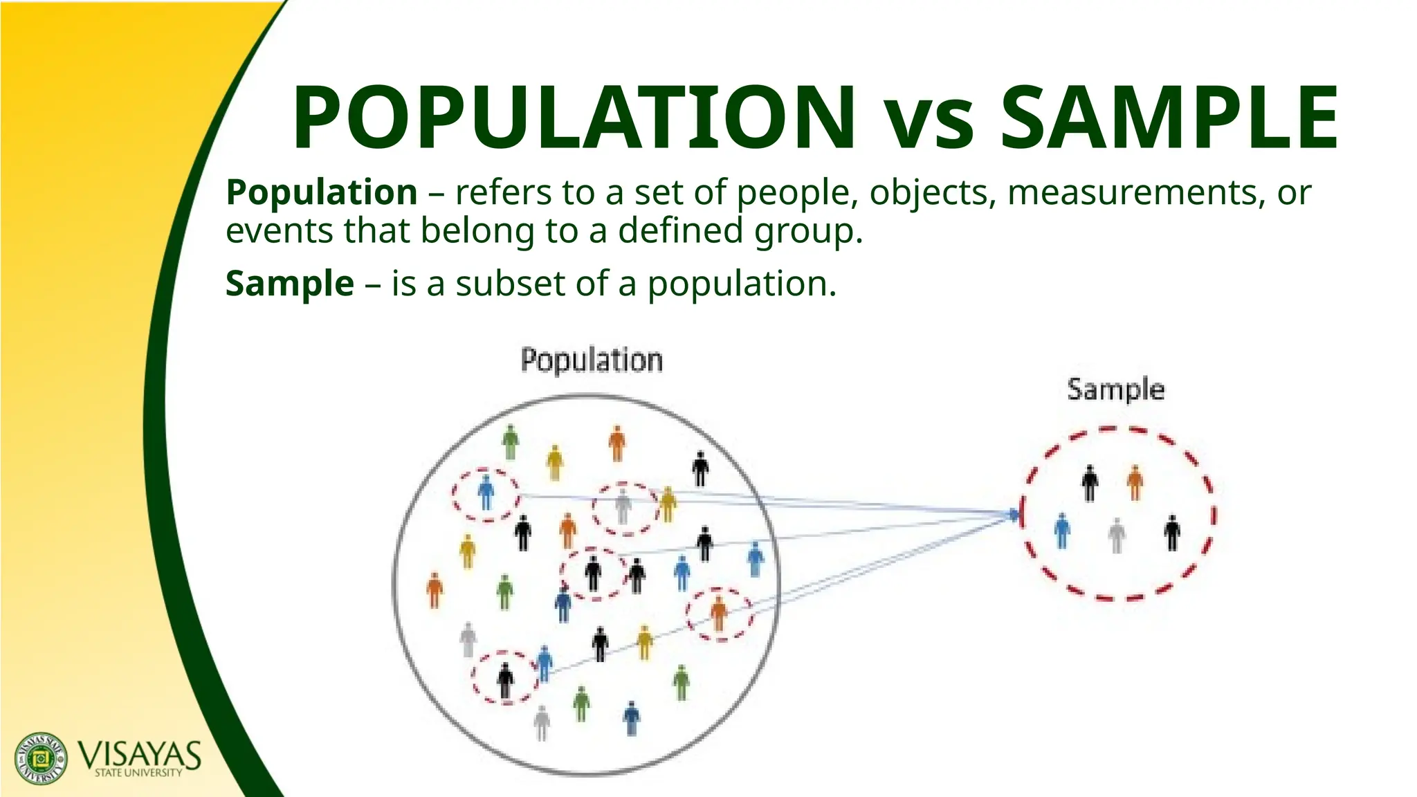
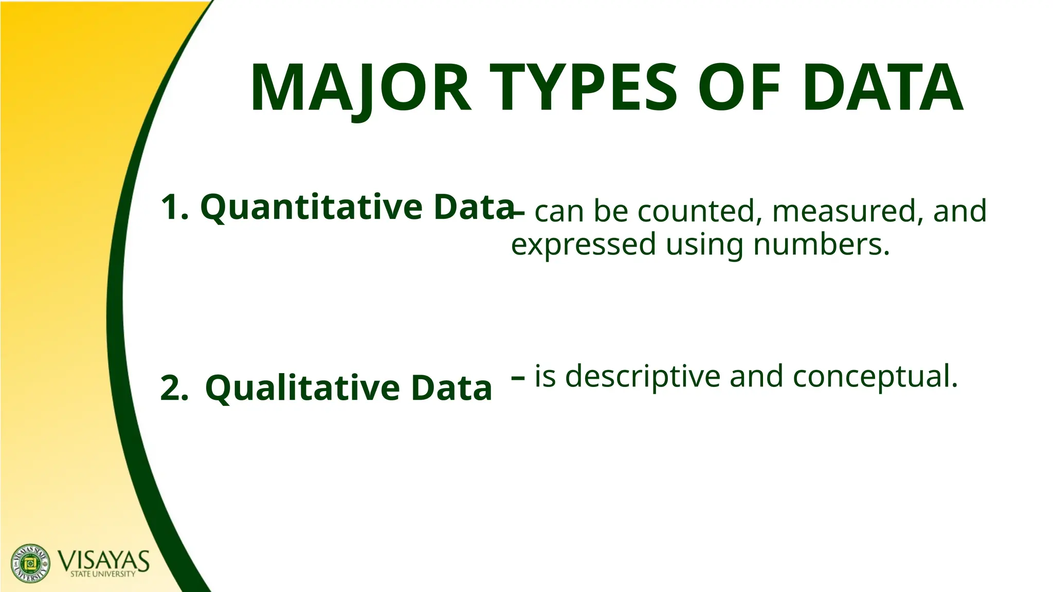
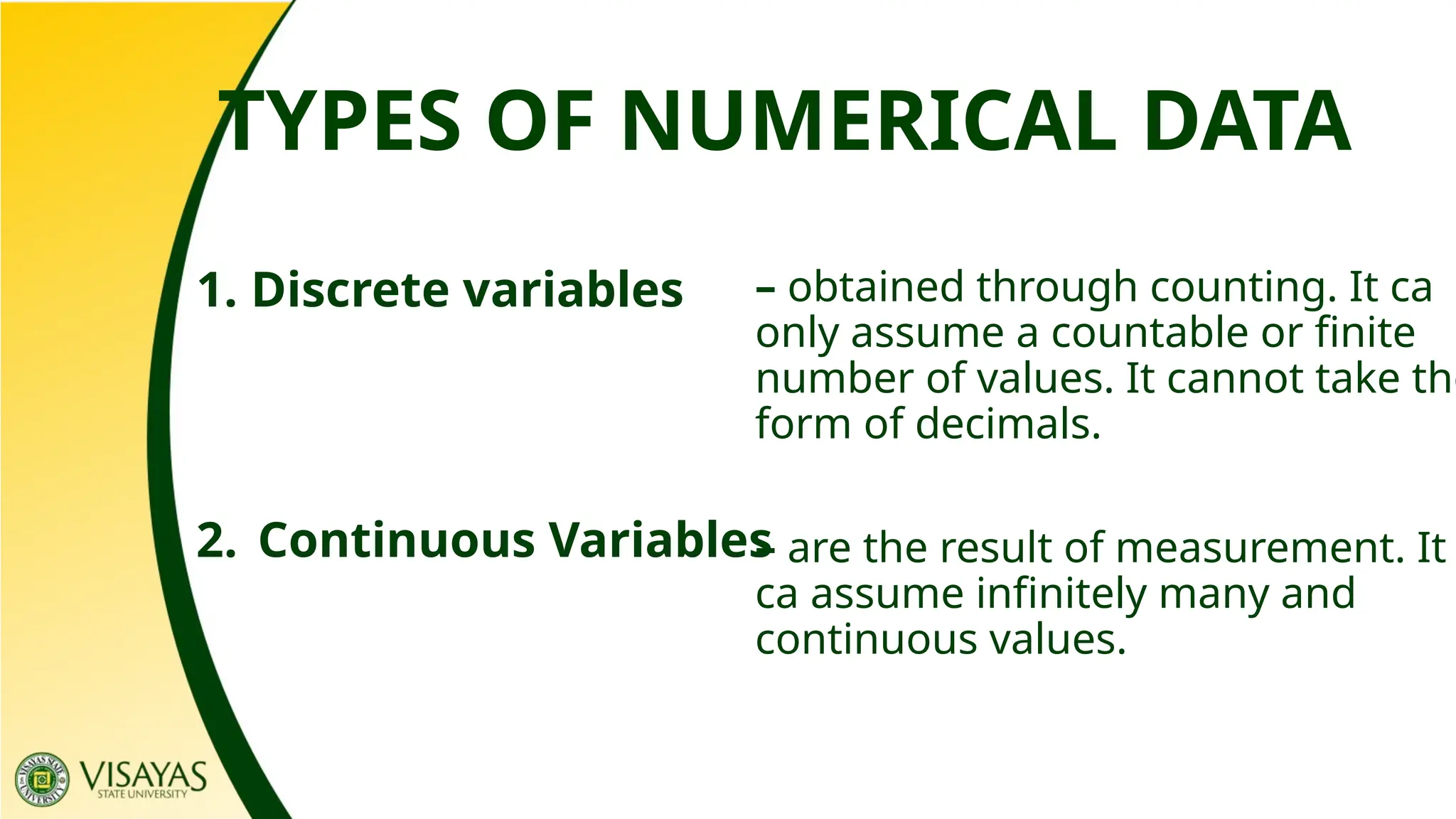
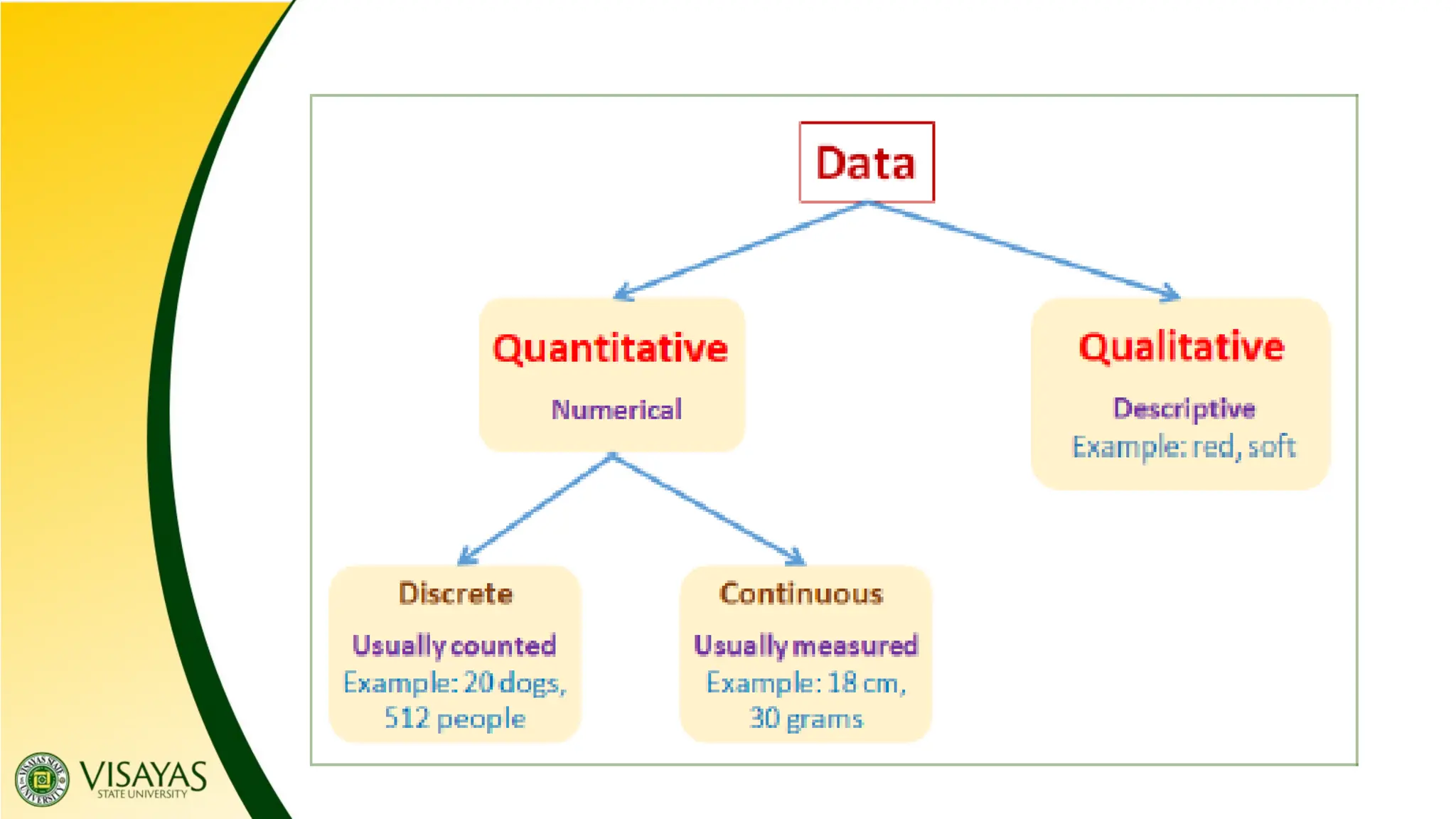
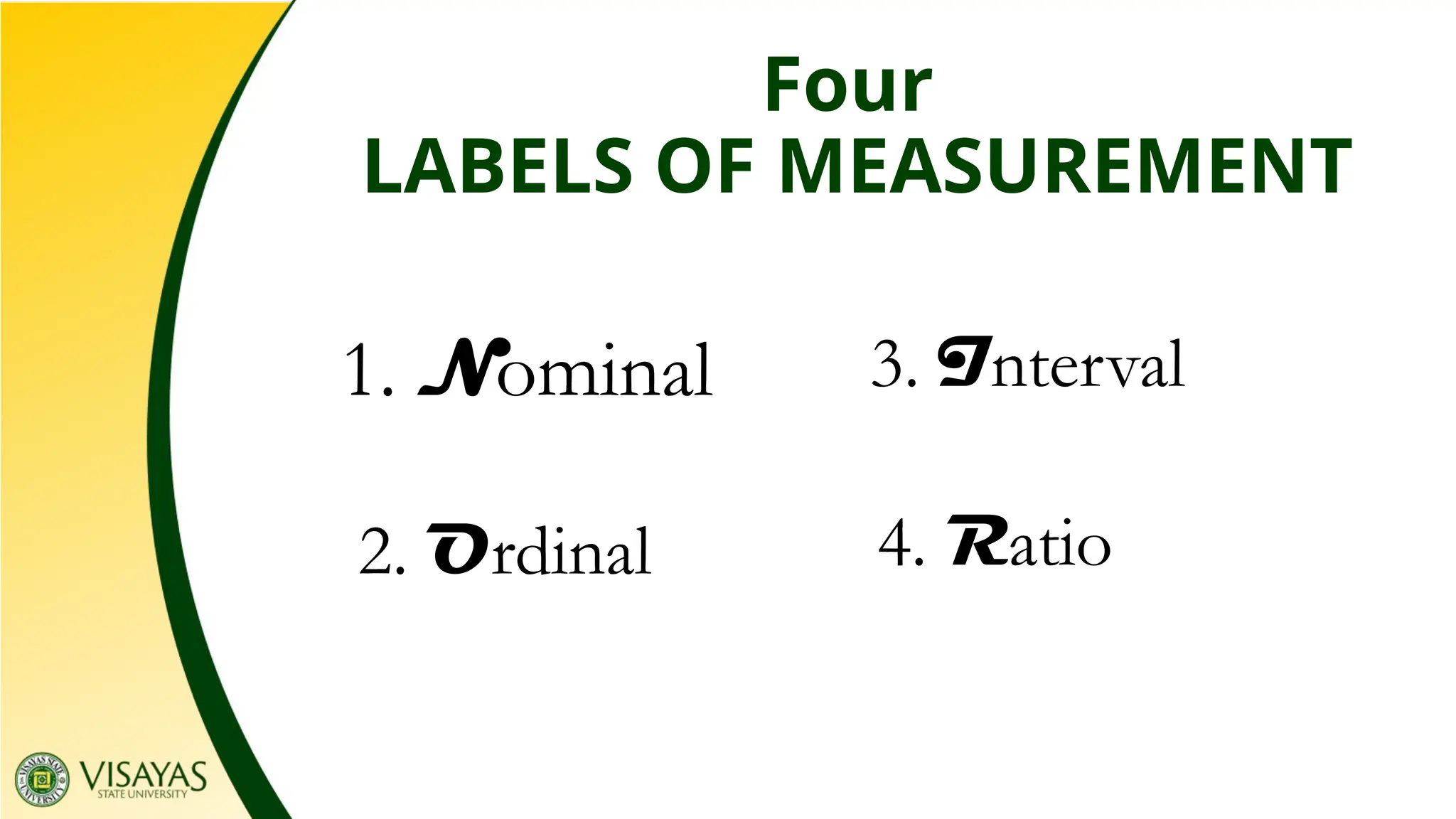
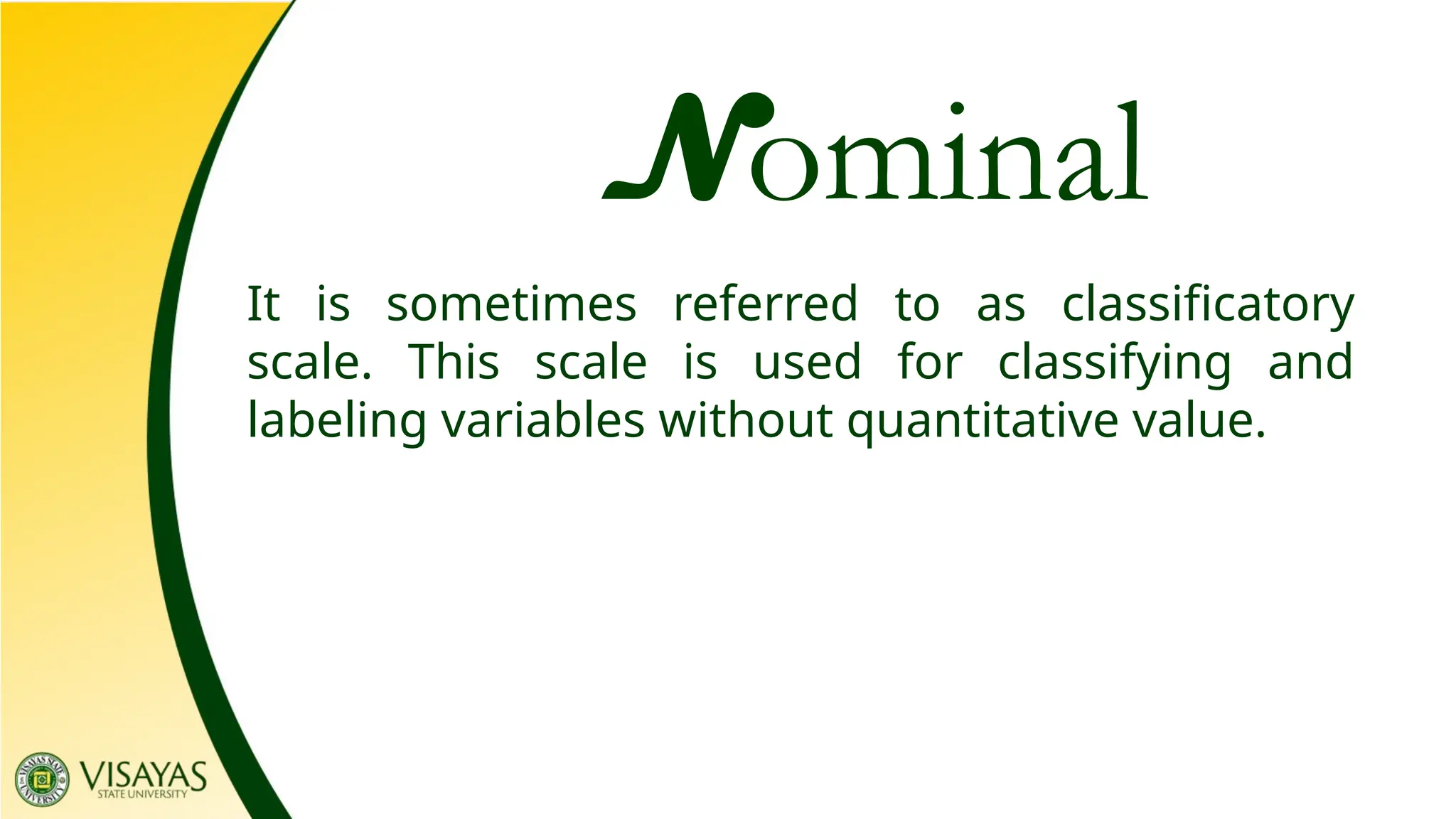
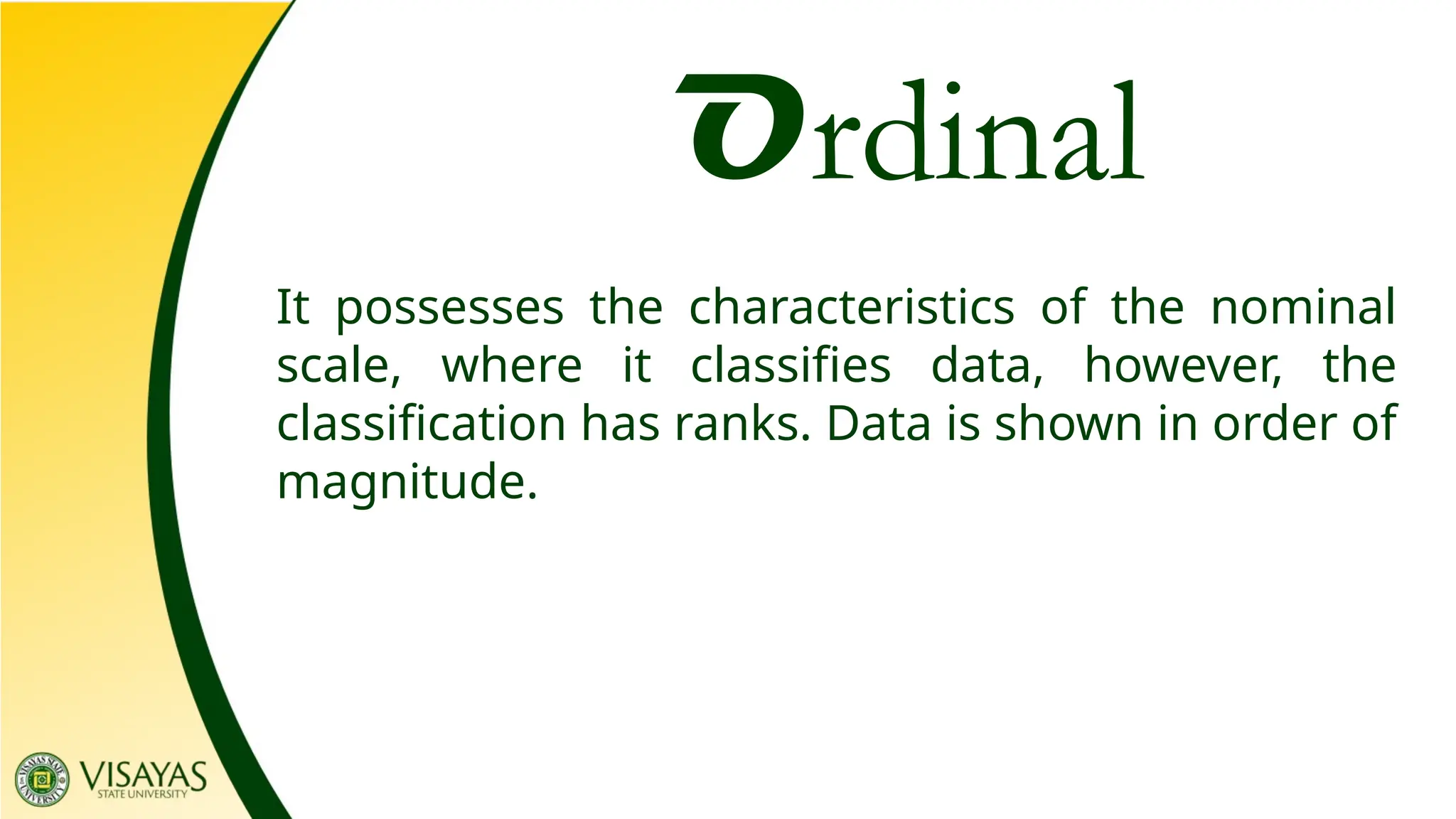
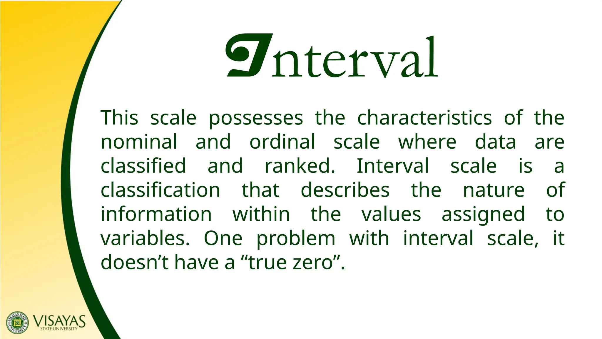
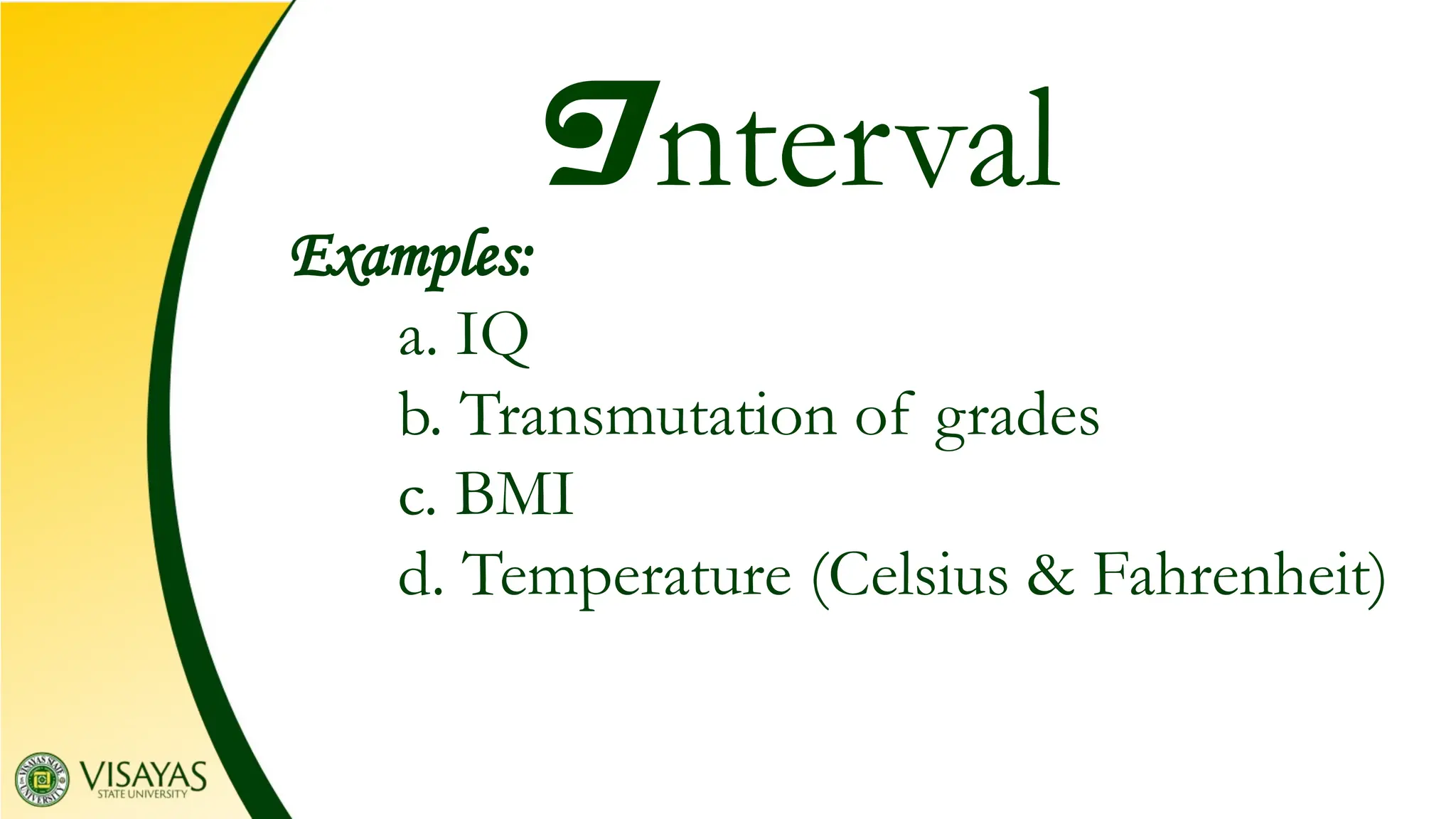
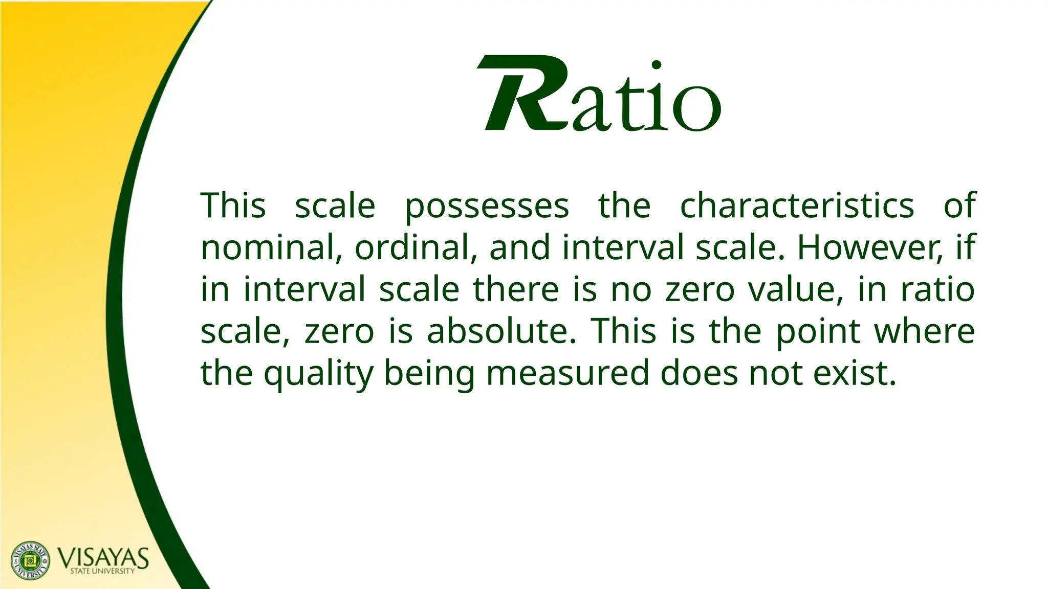
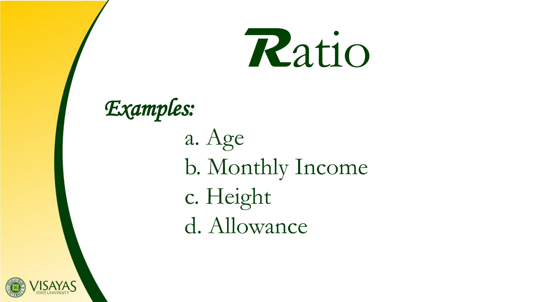
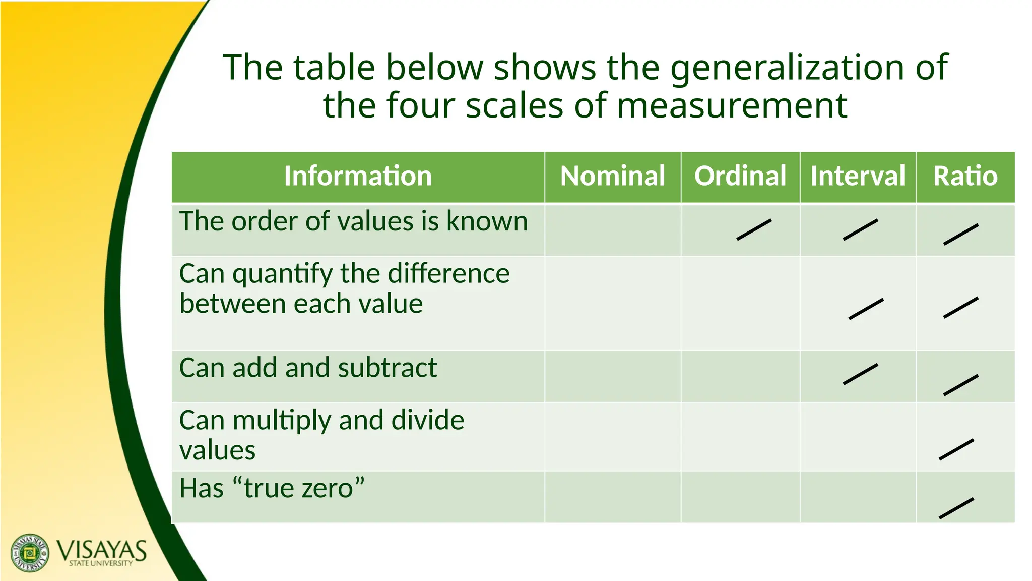
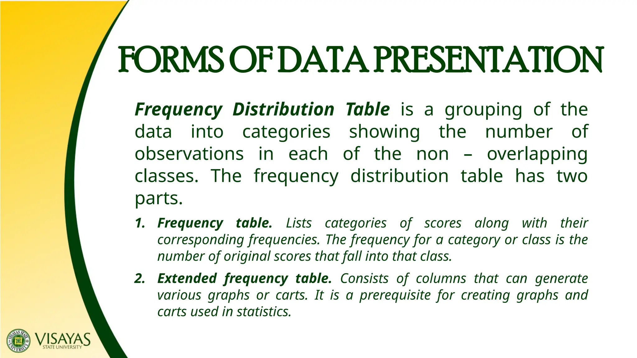
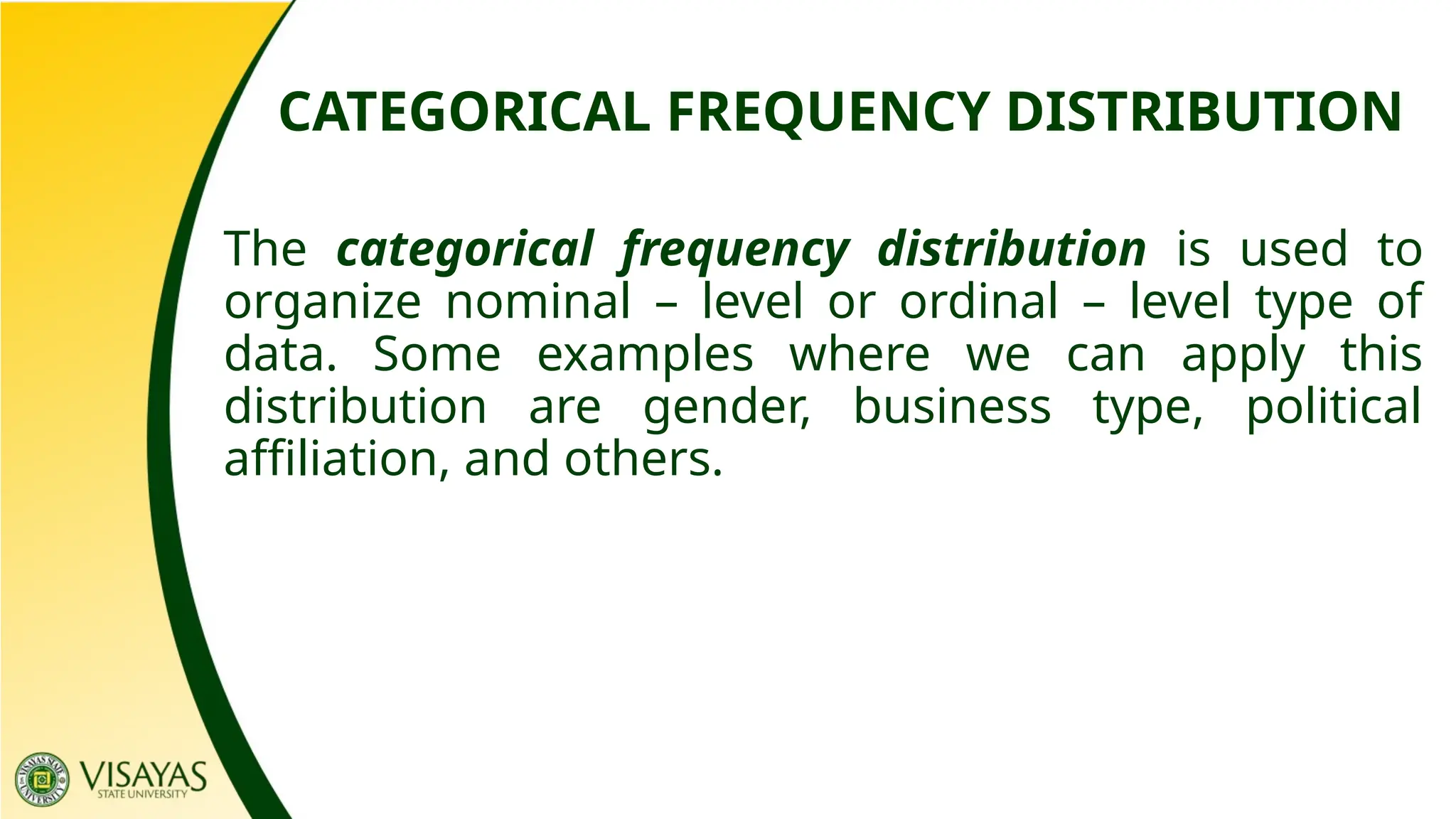
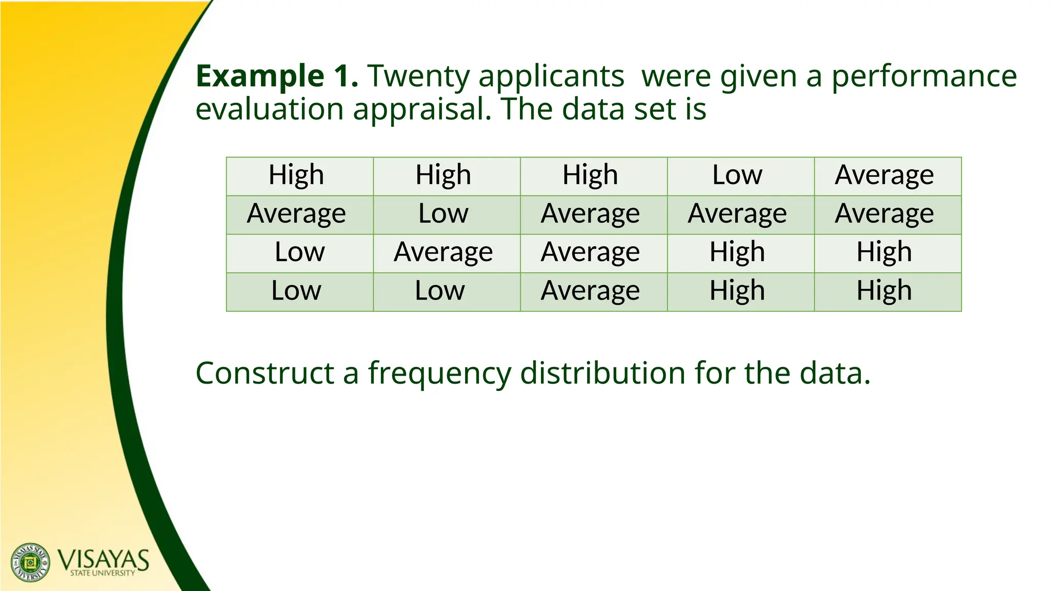
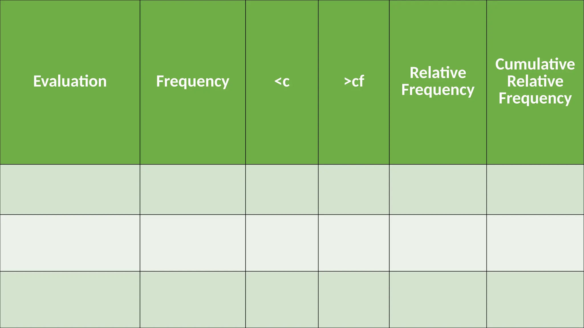
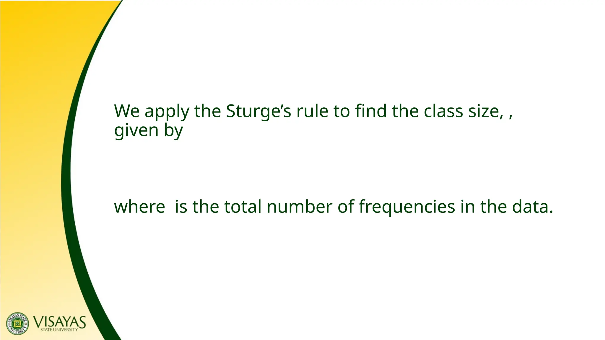
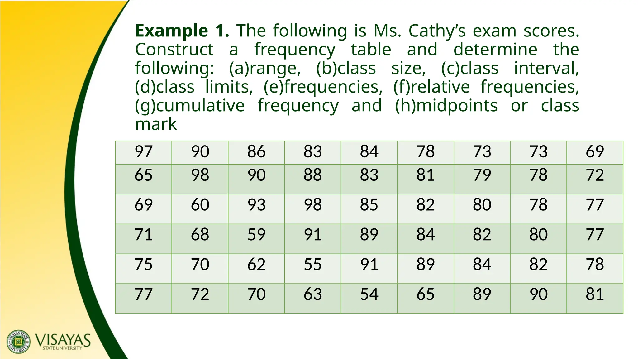
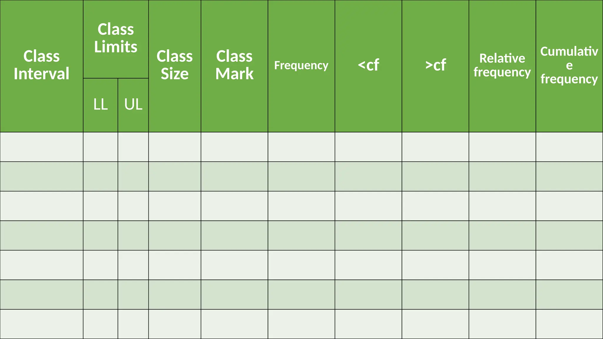
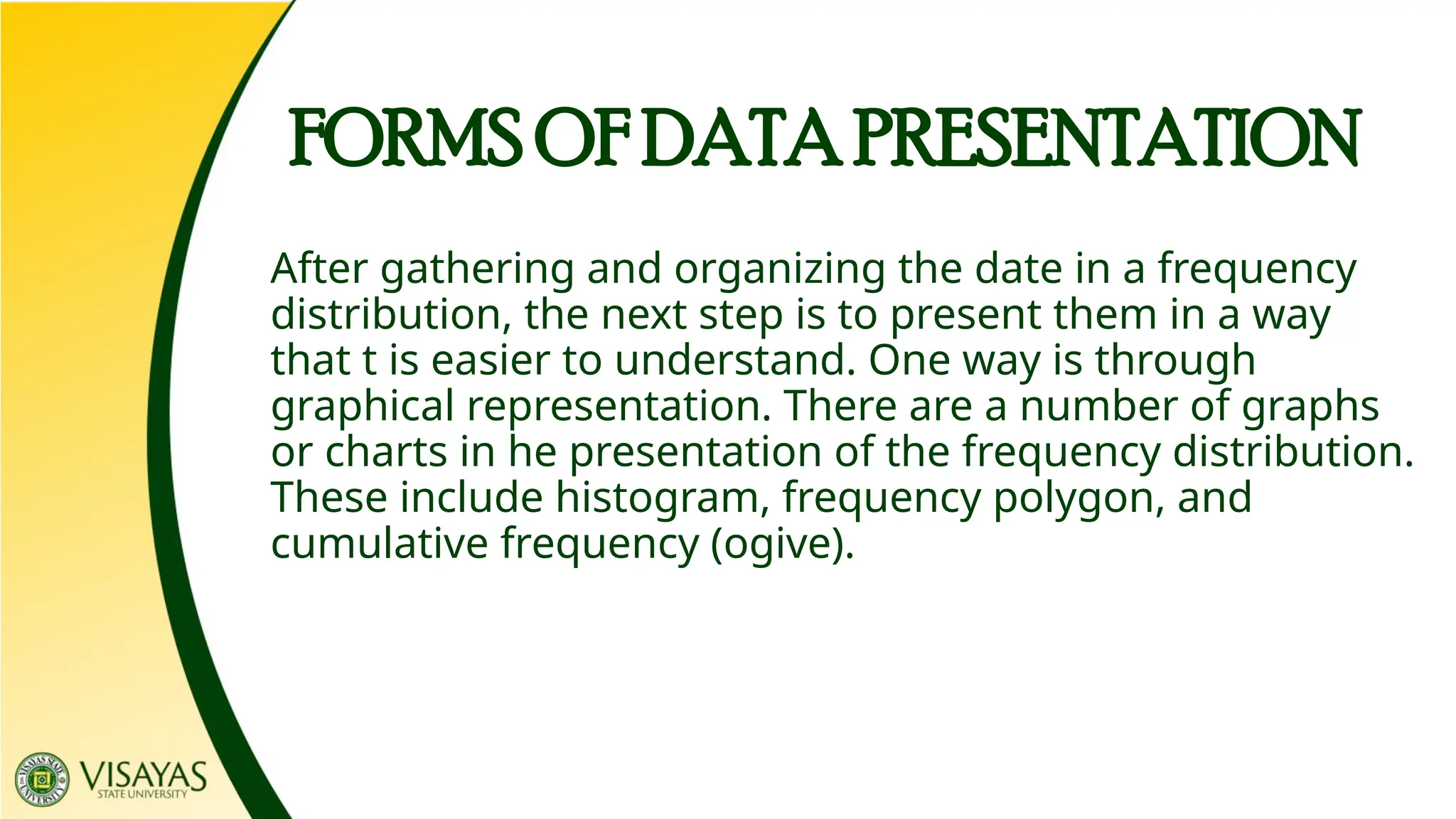
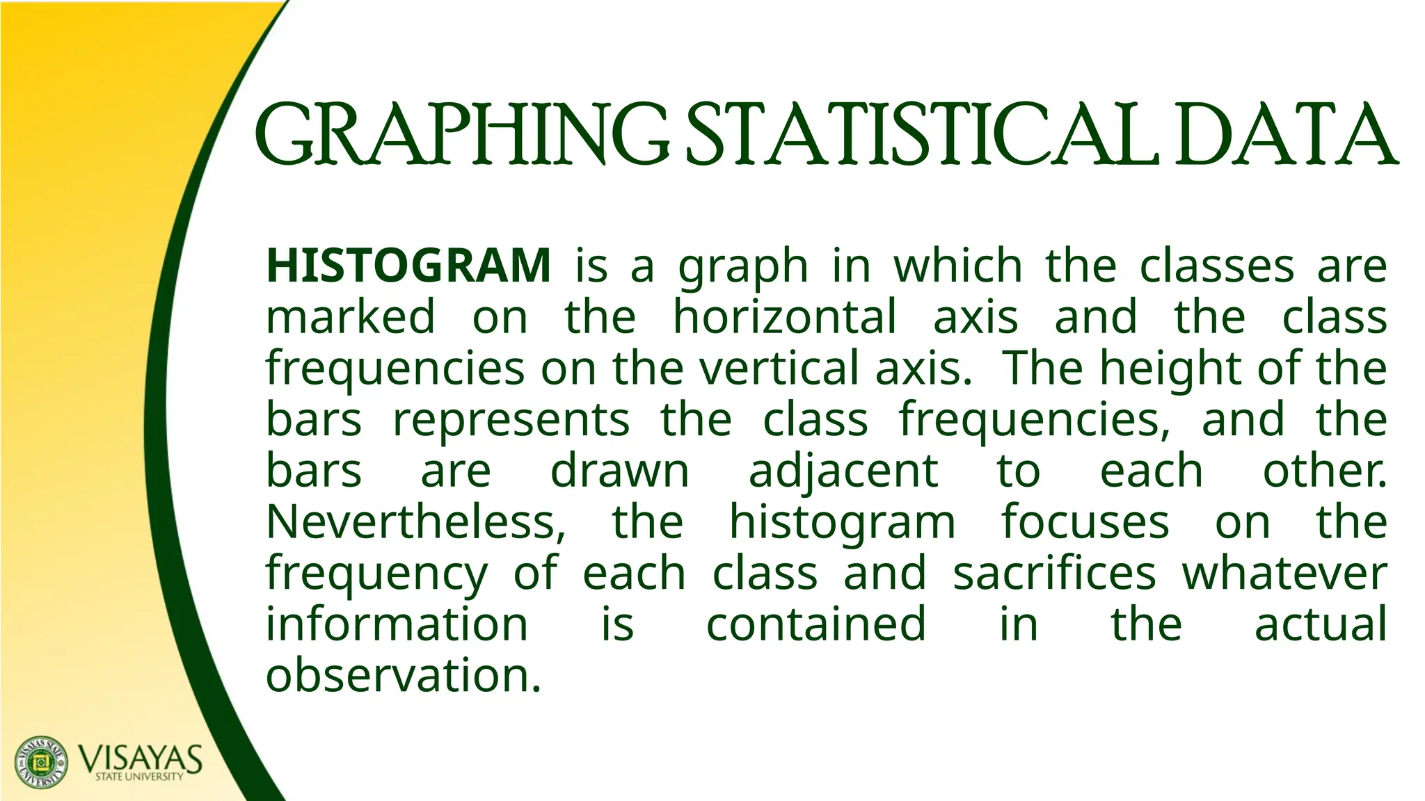
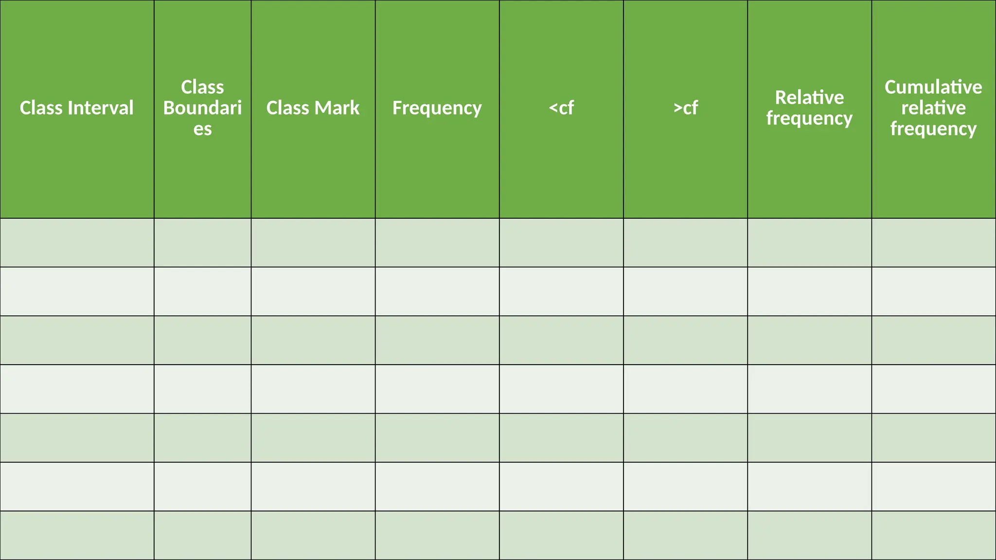
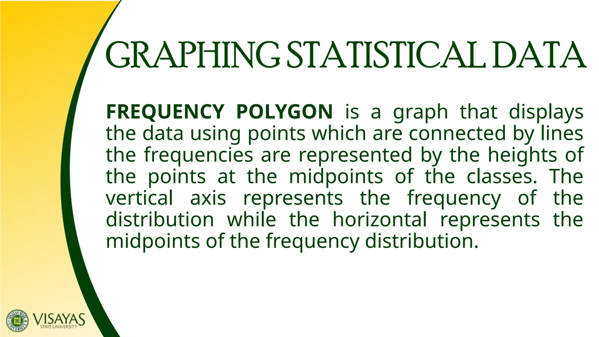
LESSON 3.1
DATA GATHERING AND ORGANIZING DATA
DATA MANAGEMENT
DATA COLLECTION
Data collection is the process of gathering and
measuring information about variables on study
established systematic procedure, which then enable to
answer relevant questions at hand and evaluate
outcomes.
POPULATION vs SAMPLE
Population – refers to a set of people, objects, measurements, or
events that belong to a defined group.
Sample – is a subset of a population.
MAJOR TYPES OF DATA
1. Quantitative Data
2. Qualitative Data
– can be counted, measured, and
expressed using numbers.
– is descriptive and conceptual.
TYPES OF NUMERICAL DATA
1. Discrete variables
2. Continuous Variables
– obtained through counting. It ca
only assume a countable or finite
number of values. It cannot take the
form of decimals.
– are the result of measurement. It
ca assume infinitely many and
continuous values.
Four
LABELS OF MEASUREMENT
1. Nominal
2. Ordinal
3. Interval
4. Ratio
Nominal
It is sometimes referred to as classificatory
scale. This scale is used for classifying and
labeling variables without quantitative value.
Examples:
a. Eye color
b. Gender
c. VSU Dormitories
d. Degree Programs
Nominal
Ordinal
It possesses the characteristics of the nominal
scale, where it classifies data, however, the
classification has ranks. Data is shown in order of
magnitude.
Examples:
a. Educational Attainment
b. Instructor’s Evaluation
c. Emotion
d. Organizational Structure
Ordinal
Interval
This scale possesses the characteristics of the
nominal and ordinal scale where data are
classified and ranked. Interval scale is a
classification that describes the nature of
information within the values assigned to
variables. One problem with interval scale, it
doesn’t have a “true zero”.
Examples:
a. IQ
b. Transmutation of grades
c. BMI
d. Temperature (Celsius & Fahrenheit)
Interval
Ratio
This scale possesses the characteristics of
nominal, ordinal, and interval scale. However, if
in interval scale there is no zero value, in ratio
scale, zero is absolute. This is the point where
the quality being measured does not exist.
Examples:
a. Age
b. Monthly Income
c. Height
d. Allowance
Ratio
The table below shows the generalization of
the four scales of measurement
Information Nominal Ordinal Interval Ratio
The order of values is known
Can quantify the difference
between each value
Can add and subtract
Can multiply and divide
values
Has “true zero”
FORMS OF DATA PRESENTATION
Frequency Distribution Table is a grouping of the
data into categories showing the number of
observations in each of the non – overlapping
classes. The frequency distribution table has two
parts.
1. Frequency table. Lists categories of scores along with their
corresponding frequencies. The frequency for a category or class is the
number of original scores that fall into that class.
2. Extended frequency table. Consists of columns that can generate
various graphs or carts. It is a prerequisite for creating graphs and
carts used in statistics.
CATEGORICAL FREQUENCY DISTRIBUTION
The categorical frequency distribution is used to
organize nominal – level or ordinal – level type of
data. Some examples where we can apply this
distribution are gender, business type, political
affiliation, and others.
Example 1. Twenty applicants were given a performance
evaluation appraisal. The data set is
Construct a frequency distribution for the data.
High High High Low Average
Average Low Average Average Average
Low Average Average High High
Low Low Average High High
Evaluation Frequency <c >cf
Relative
Frequency
Cumulative
Relative
Frequency
GROUP FREQUENCY DISTRIBUTION
A grouped frequency distribution is used
when the range of the data set is large; the
data must be group into classes whether it is
categorical data or interval data. For interval
data the class is more than one unit in width.
GUIDELINES FOR FREQUENCY TABLES
1. Class intervals should not overlap. Classes are
mutually exclusive.
2. Classes should continue throughout the
distribution with no gaps. Include all classes.
3. All classes should have the same width.
4. Class widths should be “convenient” numbers.
5. Use 5-20 classes.
6. Make lower or upper limits multiples of the
width.
We apply the Sturge’s rule to find the class size, ,
given by
where is the total number of frequencies in the data.
Example 1. The following is Ms. Cathy’s exam scores.
Construct a frequency table and determine the
following: (a)range, (b)class size, (c)class interval,
(d)class limits, (e)frequencies, (f)relative frequencies,
(g)cumulative frequency and (h)midpoints or class
mark
97 90 86 83 84 78 73 73 69
65 98 90 88 83 81 79 78 72
69 60 93 98 85 82 80 78 77
71 68 59 91 89 84 82 80 77
75 70 62 55 91 89 84 82 78
77 72 70 63 54 65 89 90 81
54 65 70 75 78 81 84 89 91
55 65 71 77 78 82 84 89 91
59 68 72 77 79 82 84 89 93
60 69 72 77 80 82 85 90 97
62 69 73 78 80 83 86 90 98
63 70 73 78 81 83 88 90 98
Class
Interval
Class
Limits
Class
Size
Class
Mark
Frequency <cf >cf Relative
frequency
Cumulativ
e
frequency
LL UL
After gathering and organizing the date in a frequency
distribution, the next step is to present them in a way
that t is easier to understand. One way is through
graphical representation. There are a number of graphs
or charts in he presentation of the frequency distribution.
These include histogram, frequency polygon, and
cumulative frequency (ogive).
FORMS OF DATA PRESENTATION
HISTOGRAM is a graph in which the classes are
marked on the horizontal axis and the class
frequencies on the vertical axis. The height of the
bars represents the class frequencies, and the
bars are drawn adjacent to each other.
Nevertheless, the histogram focuses on the
frequency of each class and sacrifices whatever
information is contained in the actual
observation.
GRAPHING STATISTICAL DATA
Example 1. The following is Ms. Cathy’s exam scores. Make a
frequency distribution table.
Construct a histogram.
97 90 86 83 84 78 73 73 69
65 98 90 88 83 81 79 78 72
69 60 93 98 85 82 80 78 77
71 68 59 91 89 84 82 80 77
75 70 62 55 91 89 84 82 78
77 72 70 63 54 65 89 90 81
Class Interval
Class
Boundari
es
Class Mark Frequency <cf >cf Relative
frequency
Cumulative
relative
frequency
GRAPHING STATISTICAL DATA
FREQUENCY POLYGON is a graph that displays
the data using points which are connected by lines
the frequencies are represented by the heights of
the points at the midpoints of the classes. The
vertical axis represents the frequency of the
distribution while the horizontal represents the
midpoints of the frequency distribution.
Example 1. The following is Ms. Cathy’s exam scores. Make a
frequency distribution table.
Construct a frequency polygon.
97 90 86 83 84 78 73 73 69
65 98 90 88 83 81 79 78 72
69 60 93 98 85 82 80 78 77
71 68 59 91 89 84 82 80 77
75 70 62 55 91 89 84 82 78
77 72 70 63 54 65 89 90 81
GRAPHING STATISTICAL DATA
CUMULATIVE FREQUENCY POLYGON (OGIVE) is a
graph that displays the cumulative frequencies for
the classes in a frequency distribution. The vertical
axis represents the cumulative frequency of the
distribution while the horizontal axis represents the
class mark of the frequency distribution.
Example 1. The following is Ms. Cathy’s exam scores. Make a
frequency distribution table.
Construct a cumulative frequency polygon.
97 90 86 83 84 78 73 73 69
65 98 90 88 83 81 79 78 72
69 60 93 98 85 82 80 78 77
71 68 59 91 89 84 82 80 77
75 70 62 55 91 89 84 82 78
77 72 70 63 54 65 89 90 81
Lesson-3.1-Data-Gathering-and-Organizing-Data.pptx

Lesson-3.1-Data-Gathering-and-Organizing-Data.pptx

  • 1.
    LESSON 3.1 DATA GATHERINGAND ORGANIZING DATA DATA MANAGEMENT
  • 2.
    DATA COLLECTION Data collectionis the process of gathering and measuring information about variables on study established systematic procedure, which then enable to answer relevant questions at hand and evaluate outcomes.
  • 3.
    POPULATION vs SAMPLE Population– refers to a set of people, objects, measurements, or events that belong to a defined group. Sample – is a subset of a population.
  • 4.
    MAJOR TYPES OFDATA 1. Quantitative Data 2. Qualitative Data – can be counted, measured, and expressed using numbers. – is descriptive and conceptual.
  • 5.
    TYPES OF NUMERICALDATA 1. Discrete variables 2. Continuous Variables – obtained through counting. It ca only assume a countable or finite number of values. It cannot take the form of decimals. – are the result of measurement. It ca assume infinitely many and continuous values.
  • 7.
    Four LABELS OF MEASUREMENT 1.Nominal 2. Ordinal 3. Interval 4. Ratio
  • 8.
    Nominal It is sometimesreferred to as classificatory scale. This scale is used for classifying and labeling variables without quantitative value.
  • 9.
    Examples: a. Eye color b.Gender c. VSU Dormitories d. Degree Programs Nominal
  • 10.
    Ordinal It possesses thecharacteristics of the nominal scale, where it classifies data, however, the classification has ranks. Data is shown in order of magnitude.
  • 11.
    Examples: a. Educational Attainment b.Instructor’s Evaluation c. Emotion d. Organizational Structure Ordinal
  • 12.
    Interval This scale possessesthe characteristics of the nominal and ordinal scale where data are classified and ranked. Interval scale is a classification that describes the nature of information within the values assigned to variables. One problem with interval scale, it doesn’t have a “true zero”.
  • 13.
    Examples: a. IQ b. Transmutationof grades c. BMI d. Temperature (Celsius & Fahrenheit) Interval
  • 14.
    Ratio This scale possessesthe characteristics of nominal, ordinal, and interval scale. However, if in interval scale there is no zero value, in ratio scale, zero is absolute. This is the point where the quality being measured does not exist.
  • 15.
    Examples: a. Age b. MonthlyIncome c. Height d. Allowance Ratio
  • 16.
    The table belowshows the generalization of the four scales of measurement Information Nominal Ordinal Interval Ratio The order of values is known Can quantify the difference between each value Can add and subtract Can multiply and divide values Has “true zero”
  • 17.
    FORMS OF DATAPRESENTATION Frequency Distribution Table is a grouping of the data into categories showing the number of observations in each of the non – overlapping classes. The frequency distribution table has two parts. 1. Frequency table. Lists categories of scores along with their corresponding frequencies. The frequency for a category or class is the number of original scores that fall into that class. 2. Extended frequency table. Consists of columns that can generate various graphs or carts. It is a prerequisite for creating graphs and carts used in statistics.
  • 18.
    CATEGORICAL FREQUENCY DISTRIBUTION Thecategorical frequency distribution is used to organize nominal – level or ordinal – level type of data. Some examples where we can apply this distribution are gender, business type, political affiliation, and others.
  • 19.
    Example 1. Twentyapplicants were given a performance evaluation appraisal. The data set is Construct a frequency distribution for the data. High High High Low Average Average Low Average Average Average Low Average Average High High Low Low Average High High
  • 20.
    Evaluation Frequency <c>cf Relative Frequency Cumulative Relative Frequency
  • 21.
    GROUP FREQUENCY DISTRIBUTION Agrouped frequency distribution is used when the range of the data set is large; the data must be group into classes whether it is categorical data or interval data. For interval data the class is more than one unit in width.
  • 22.
    GUIDELINES FOR FREQUENCYTABLES 1. Class intervals should not overlap. Classes are mutually exclusive. 2. Classes should continue throughout the distribution with no gaps. Include all classes. 3. All classes should have the same width. 4. Class widths should be “convenient” numbers. 5. Use 5-20 classes. 6. Make lower or upper limits multiples of the width.
  • 23.
    We apply theSturge’s rule to find the class size, , given by where is the total number of frequencies in the data.
  • 24.
    Example 1. Thefollowing is Ms. Cathy’s exam scores. Construct a frequency table and determine the following: (a)range, (b)class size, (c)class interval, (d)class limits, (e)frequencies, (f)relative frequencies, (g)cumulative frequency and (h)midpoints or class mark 97 90 86 83 84 78 73 73 69 65 98 90 88 83 81 79 78 72 69 60 93 98 85 82 80 78 77 71 68 59 91 89 84 82 80 77 75 70 62 55 91 89 84 82 78 77 72 70 63 54 65 89 90 81
  • 25.
    54 65 7075 78 81 84 89 91 55 65 71 77 78 82 84 89 91 59 68 72 77 79 82 84 89 93 60 69 72 77 80 82 85 90 97 62 69 73 78 80 83 86 90 98 63 70 73 78 81 83 88 90 98
  • 26.
    Class Interval Class Limits Class Size Class Mark Frequency <cf >cfRelative frequency Cumulativ e frequency LL UL
  • 27.
    After gathering andorganizing the date in a frequency distribution, the next step is to present them in a way that t is easier to understand. One way is through graphical representation. There are a number of graphs or charts in he presentation of the frequency distribution. These include histogram, frequency polygon, and cumulative frequency (ogive). FORMS OF DATA PRESENTATION
  • 28.
    HISTOGRAM is agraph in which the classes are marked on the horizontal axis and the class frequencies on the vertical axis. The height of the bars represents the class frequencies, and the bars are drawn adjacent to each other. Nevertheless, the histogram focuses on the frequency of each class and sacrifices whatever information is contained in the actual observation. GRAPHING STATISTICAL DATA
  • 29.
    Example 1. Thefollowing is Ms. Cathy’s exam scores. Make a frequency distribution table. Construct a histogram. 97 90 86 83 84 78 73 73 69 65 98 90 88 83 81 79 78 72 69 60 93 98 85 82 80 78 77 71 68 59 91 89 84 82 80 77 75 70 62 55 91 89 84 82 78 77 72 70 63 54 65 89 90 81
  • 30.
    Class Interval Class Boundari es Class MarkFrequency <cf >cf Relative frequency Cumulative relative frequency
  • 32.
    GRAPHING STATISTICAL DATA FREQUENCYPOLYGON is a graph that displays the data using points which are connected by lines the frequencies are represented by the heights of the points at the midpoints of the classes. The vertical axis represents the frequency of the distribution while the horizontal represents the midpoints of the frequency distribution.
  • 33.
    Example 1. Thefollowing is Ms. Cathy’s exam scores. Make a frequency distribution table. Construct a frequency polygon. 97 90 86 83 84 78 73 73 69 65 98 90 88 83 81 79 78 72 69 60 93 98 85 82 80 78 77 71 68 59 91 89 84 82 80 77 75 70 62 55 91 89 84 82 78 77 72 70 63 54 65 89 90 81
  • 35.
    GRAPHING STATISTICAL DATA CUMULATIVEFREQUENCY POLYGON (OGIVE) is a graph that displays the cumulative frequencies for the classes in a frequency distribution. The vertical axis represents the cumulative frequency of the distribution while the horizontal axis represents the class mark of the frequency distribution.
  • 36.
    Example 1. Thefollowing is Ms. Cathy’s exam scores. Make a frequency distribution table. Construct a cumulative frequency polygon. 97 90 86 83 84 78 73 73 69 65 98 90 88 83 81 79 78 72 69 60 93 98 85 82 80 78 77 71 68 59 91 89 84 82 80 77 75 70 62 55 91 89 84 82 78 77 72 70 63 54 65 89 90 81

Editor's Notes

  • #8 Nominal is the easiest to understand among the type of data. Nominal sounds like name.
  • #10 In this scale, the value between intervals don’t have meaning.