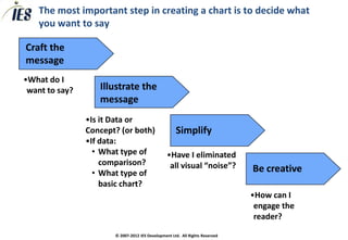
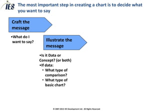
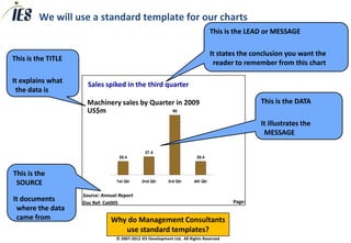
CONSULTING TOOLKIT

     Communicating your recommendation

     Saying it with Charts


© 2007-2012 IESIES Development Ltd. All Ltd. Reserved
       © 2007-2012 Development Rights All Rights Reserved
Over the years, humans have expressed themselves in many
different ways…………


                                                                       Sales spiked in the third quarter
                                                                       Machinery sales by Quarter in 2009
                                                                                                90
                                                                       US$m


                                                                                          27.4
                                                                                20.4                          20.4


                                                                               1st Qtr   2nd Qtr   3rd Qtr   4th Qtr


                                                                      Source: Annual Report
                                                                      Doc Ref: Cat005                                  Page:

                                                                                       Powerpoint Chart
               © 2007-2012 IES Development Ltd. All Rights Reserved
Charts are the key medium of professional business written
      communication, so mastery will improve your career prospects


   To communicate your recommendations and the rationale
    clearly, your charts will need to be:

       •   Designed to illustrate the message you want to convey
       •   Easy to read
       •   Professional
       •   Engaging
       •   And sometimes even creative


                         © 2007-2012 IES Development Ltd. All Rights Reserved
Charts are the key medium of professional business written
   communication, so mastery will improve your career prospects

A “GAME” PLAN FOR COMMUNICATION


      G oal                What result do you want from your presentation?


      A udience            Who are the audience, what are their concerns and agenda?


      Message              What is the key message of your presentation?


      E   ngagement
                           How are you going to grab and hold their interest?


                   © 2007-2012 IES Development Ltd. All Rights Reserved
Presentations must be designed to fit the situation

   TYPES OF PRESENTATION

                                                                   Factual
                               Private Equity

                                   M&A Proposal                                                    Tour Guide

                                        Consulting


         Data Heavy                                                                                             Data Light
                                        Case Study
                                                                             Board Update

                                             Business                             Sales Pitch
                      Our                Recommendation
                      Focus                                                            Analyst Meeting
                                           Business Plan
                                                                                           Recognition/Awards


                                                                  Emotional
Source: Professor MacEachern                © 2007-2012 IES Development Ltd. All Rights Reserved
The most important step in creating a chart is to decide what
    you want to say

Craft the
message
•What do I
 want to say?      Illustrate the
                   message
                •Is it Data or
                Concept? (or both)                   Simplify
                •If data:
                  • What type of                 •Have I eliminated
                    comparison?                   all visual “noise”?
                  • What type of                                              Be creative
                    basic chart?
                                                                              •How can I
                                                                               engage the
                                                                               reader?
                       © 2007-2012 IES Development Ltd. All Rights Reserved
The most important step in creating a chart is to decide what
    you want to say

Craft the
message
•What do I
 want to say?


                     © 2007-2012 IES Development Ltd. All Rights Reserved
Writing a good message is a very valuable skill you will build
       with practice and feedback


   Your message should….

       ….be the one thing you want your audience to remember about
         the chart
       ….stand-alone, even without the rest of the chart
       ….be one line, or at maximum two lines long
       ….be written in a full sentence
       ….be as punchy as you can make it
       ….include key numbers where appropriate
       ….fit directly into your storyline

                   •Only one message per chart!!!
                        © 2007-2012 IES Development Ltd. All Rights Reserved
Your chart-making skills will improve with practice


CLASS EXERCISE


In pairs, craft messages for these charts


                      © 2007-2012 IES Development Ltd. All Rights Reserved
The most important step in creating a chart is to decide what
    you want to say

Craft the
message
•What do I
 want to say?      Illustrate the
                   message
                •Is it Data or
                Concept? (or both)
                •If data:
                  • What type of
                    comparison?
                  • What type of
                    basic chart?


                       © 2007-2012 IES Development Ltd. All Rights Reserved
There are three broad types of chart

                                           TEXT
                                           •   This is the main point
                                                           •     This is a sub-point
                                                                       -       This backs up the sub-point
                                                                       -       This backs up the sub-point
                                                                       -       This backs up the sub-point


DATA                                                                                                         CONCEPT


   1st Qtr   2nd Qtr   3rd Qtr   4th Qtr


                                           © 2007-2012 IES Development Ltd. All Rights Reserved
Use the layout to help communicate concept charts
TYPES OF CONCEPT CHART


        WHEN                                WHERE


                  © 2007-2012 IES Development Ltd. All Rights Reserved
There are 6 basic forms of data chart

                                                                                                  45
                                                                                                  40
                                                                                                  35
                                                                                                  30
                                                                                                  25
                                                                                                  20
                                                                                                  15
                                                                                                  10
                                                                                                   5
                                                                                                   0
   1st Qtr   2nd Qtr   3rd Qtr     4th Qtr
                                             COLUMN                               LINE                 1st Qtr       2nd Qtr   3rd Qtr   4th Qtr


   4th
   Qtr

   3rd
   Qtr

   2nd
                                              BAR                                            PIE
   Qtr


1st Qtr


                                                      TABLE                       DOT (X-Y)
                                                 Size     Share
                                                                                   100
                           Segment A             180      25%
                                                                                    80
                           Segment B             65       15%
                                                                                    60
                           Segment C             105      5%
                                                                                    40

                                                                                    20

                                                                                     0
                                                                                         0    2        4         6        8     10


                                             © 2007-2012 IES Development Ltd. All Rights Reserved
To determine what sort of data chart to use, first consider what
        sort of comparison you are making

You can compare:
       • Components
       • Items
       • Across Time
       • Frequency
       • Correlation
   What type of comparison are these?
       • Outsourcing is 25% cheaper than in-house production
       • Sales drop 25% for every 10% increase in price
       • We have a market share of 25%
       • Revenue has grown 25% over the last 2 years
       • Average tenure of staff is 3 years, with 80% between 1 and 5 years
                           © 2007-2012 IES Development Ltd. All Rights Reserved
Choose a chart that matches the data you want to show
       FINDING THE RIGHT CHART


020910 Chris Doran
                          © 2007-2012 IES Development Ltd. All Rights Reserved   14
The most important step in creating a chart is to decide what
    you want to say

Craft the
message
•What do I
 want to say?      Illustrate the
                   message
                •Is it Data or
                Concept? (or both)                   Simplify
                •If data:
                  • What type of                 •Have I eliminated
                    comparison?                   all visual “noise”?
                  • What type of
                    basic chart?


                       © 2007-2012 IES Development Ltd. All Rights Reserved
After you have drafted your chart, you should try to simplify to
illustrate the message with the least visual “noise”


                 © 2007-2012 IES Development Ltd. All Rights Reserved
Try to reduce numbers, stack rankings to make it easy on the eye
and use shading/colour to highlight the message


                © 2007-2012 IES Development Ltd. All Rights Reserved
Simplify your charts as much as possible, so the message “jumps
out”
• Cut out all visual “noise”
   – Data/Numbers that does not illustrate the message
   – Duplication (e.g. numbers and a scale)
   – Make numbers easy to digest (e.g. $6.3m, not $6274966)
   – Attract the eye to key information – e.g. C.A.G.R %

• Keep wording to the point, avoid complex phrases

• Use consistent, professional fonts and layouts

• Use layout, diagrams and pictures rather than text
           Your job is to require the reader do the LEAST
             POSSIBLE WORK to understand the chart!
                  © 2007-2012 IES Development Ltd. All Rights Reserved
You know you have a good chart when your granny can
          understand the point within 10 seconds


020910 Chris Doran
                         © 2007-2012 IES Development Ltd. All Rights Reserved   19
The most important step in creating a chart is to decide what
    you want to say

Craft the
message
•What do I
 want to say?      Illustrate the
                   message
                •Is it Data or
                Concept? (or both)                   Simplify
                •If data:
                  • What type of                 •Have I eliminated
                    comparison?                   all visual “noise”?
                  • What type of                                              Be creative
                    basic chart?
                                                                              •How can I
                                                                               engage the
                                                                               reader?
                       © 2007-2012 IES Development Ltd. All Rights Reserved
We will use a standard template for our charts
                                                                                   This is the LEAD or MESSAGE

                                                                                   It states the conclusion you want the
This is the TITLE
                                                                                    reader to remember from this chart

It explains what
                      Sales spiked in the third quarter
 the data is
                     Machinery sales by Quarter in 2009                                            This is the DATA
                     US$m                     90


                                                                                                   It illustrates the
                                                                                                    MESSAGE

                                                27.4
                                   20.4                                   20.4


This is the
 SOURCE                           1st Qtr     2nd Qtr       3rd Qtr      4th Qtr


                    Source: Annual Report
It documents        Doc Ref: Cat005                                                       Page:
 where the data
 came from                     Why do Management Consultants
                                  use standard templates?
                                  © 2007-2012 IES Development Ltd. All Rights Reserved

Consulting toolkit saying it with charts

  • 1.
    CONSULTING TOOLKIT Communicating your recommendation Saying it with Charts © 2007-2012 IESIES Development Ltd. All Ltd. Reserved © 2007-2012 Development Rights All Rights Reserved
  • 2.
    Over the years,humans have expressed themselves in many different ways………… Sales spiked in the third quarter Machinery sales by Quarter in 2009 90 US$m 27.4 20.4 20.4 1st Qtr 2nd Qtr 3rd Qtr 4th Qtr Source: Annual Report Doc Ref: Cat005 Page: Powerpoint Chart © 2007-2012 IES Development Ltd. All Rights Reserved
  • 3.
    Charts are thekey medium of professional business written communication, so mastery will improve your career prospects  To communicate your recommendations and the rationale clearly, your charts will need to be: • Designed to illustrate the message you want to convey • Easy to read • Professional • Engaging • And sometimes even creative © 2007-2012 IES Development Ltd. All Rights Reserved
  • 4.
    Charts are thekey medium of professional business written communication, so mastery will improve your career prospects A “GAME” PLAN FOR COMMUNICATION G oal What result do you want from your presentation? A udience Who are the audience, what are their concerns and agenda? Message What is the key message of your presentation? E ngagement How are you going to grab and hold their interest? © 2007-2012 IES Development Ltd. All Rights Reserved
  • 5.
    Presentations must bedesigned to fit the situation TYPES OF PRESENTATION Factual Private Equity M&A Proposal Tour Guide Consulting Data Heavy Data Light Case Study Board Update Business Sales Pitch Our Recommendation Focus Analyst Meeting Business Plan Recognition/Awards Emotional Source: Professor MacEachern © 2007-2012 IES Development Ltd. All Rights Reserved
  • 6.
    The most importantstep in creating a chart is to decide what you want to say Craft the message •What do I want to say? Illustrate the message •Is it Data or Concept? (or both) Simplify •If data: • What type of •Have I eliminated comparison? all visual “noise”? • What type of Be creative basic chart? •How can I engage the reader? © 2007-2012 IES Development Ltd. All Rights Reserved
  • 7.
    The most importantstep in creating a chart is to decide what you want to say Craft the message •What do I want to say? © 2007-2012 IES Development Ltd. All Rights Reserved
  • 8.
    Writing a goodmessage is a very valuable skill you will build with practice and feedback  Your message should…. ….be the one thing you want your audience to remember about the chart ….stand-alone, even without the rest of the chart ….be one line, or at maximum two lines long ….be written in a full sentence ….be as punchy as you can make it ….include key numbers where appropriate ….fit directly into your storyline •Only one message per chart!!! © 2007-2012 IES Development Ltd. All Rights Reserved
  • 9.
    Your chart-making skillswill improve with practice CLASS EXERCISE In pairs, craft messages for these charts © 2007-2012 IES Development Ltd. All Rights Reserved
  • 10.
    The most importantstep in creating a chart is to decide what you want to say Craft the message •What do I want to say? Illustrate the message •Is it Data or Concept? (or both) •If data: • What type of comparison? • What type of basic chart? © 2007-2012 IES Development Ltd. All Rights Reserved
  • 11.
    There are threebroad types of chart TEXT • This is the main point • This is a sub-point - This backs up the sub-point - This backs up the sub-point - This backs up the sub-point • This is a sub-point - This backs up the sub-point - This backs up the sub-point - This backs up the sub-point • This is a sub-point - This backs up the sub-point - This backs up the sub-point - This backs up the sub-point DATA CONCEPT 1st Qtr 2nd Qtr 3rd Qtr 4th Qtr © 2007-2012 IES Development Ltd. All Rights Reserved
  • 12.
    Use the layoutto help communicate concept charts TYPES OF CONCEPT CHART WHEN WHERE © 2007-2012 IES Development Ltd. All Rights Reserved
  • 13.
    There are 6basic forms of data chart 45 40 35 30 25 20 15 10 5 0 1st Qtr 2nd Qtr 3rd Qtr 4th Qtr COLUMN LINE 1st Qtr 2nd Qtr 3rd Qtr 4th Qtr 4th Qtr 3rd Qtr 2nd BAR PIE Qtr 1st Qtr TABLE DOT (X-Y) Size Share 100 Segment A 180 25% 80 Segment B 65 15% 60 Segment C 105 5% 40 20 0 0 2 4 6 8 10 © 2007-2012 IES Development Ltd. All Rights Reserved
  • 14.
    To determine whatsort of data chart to use, first consider what sort of comparison you are making You can compare: • Components • Items • Across Time • Frequency • Correlation  What type of comparison are these? • Outsourcing is 25% cheaper than in-house production • Sales drop 25% for every 10% increase in price • We have a market share of 25% • Revenue has grown 25% over the last 2 years • Average tenure of staff is 3 years, with 80% between 1 and 5 years © 2007-2012 IES Development Ltd. All Rights Reserved
  • 15.
    Choose a chartthat matches the data you want to show FINDING THE RIGHT CHART 020910 Chris Doran © 2007-2012 IES Development Ltd. All Rights Reserved 14
  • 16.
    The most importantstep in creating a chart is to decide what you want to say Craft the message •What do I want to say? Illustrate the message •Is it Data or Concept? (or both) Simplify •If data: • What type of •Have I eliminated comparison? all visual “noise”? • What type of basic chart? © 2007-2012 IES Development Ltd. All Rights Reserved
  • 17.
    After you havedrafted your chart, you should try to simplify to illustrate the message with the least visual “noise” © 2007-2012 IES Development Ltd. All Rights Reserved
  • 18.
    Try to reducenumbers, stack rankings to make it easy on the eye and use shading/colour to highlight the message © 2007-2012 IES Development Ltd. All Rights Reserved
  • 19.
    Simplify your chartsas much as possible, so the message “jumps out” • Cut out all visual “noise” – Data/Numbers that does not illustrate the message – Duplication (e.g. numbers and a scale) – Make numbers easy to digest (e.g. $6.3m, not $6274966) – Attract the eye to key information – e.g. C.A.G.R % • Keep wording to the point, avoid complex phrases • Use consistent, professional fonts and layouts • Use layout, diagrams and pictures rather than text Your job is to require the reader do the LEAST POSSIBLE WORK to understand the chart! © 2007-2012 IES Development Ltd. All Rights Reserved
  • 20.
    You know youhave a good chart when your granny can understand the point within 10 seconds 020910 Chris Doran © 2007-2012 IES Development Ltd. All Rights Reserved 19
  • 21.
    The most importantstep in creating a chart is to decide what you want to say Craft the message •What do I want to say? Illustrate the message •Is it Data or Concept? (or both) Simplify •If data: • What type of •Have I eliminated comparison? all visual “noise”? • What type of Be creative basic chart? •How can I engage the reader? © 2007-2012 IES Development Ltd. All Rights Reserved
  • 22.
    We will usea standard template for our charts This is the LEAD or MESSAGE It states the conclusion you want the This is the TITLE reader to remember from this chart It explains what Sales spiked in the third quarter the data is Machinery sales by Quarter in 2009 This is the DATA US$m 90 It illustrates the MESSAGE 27.4 20.4 20.4 This is the SOURCE 1st Qtr 2nd Qtr 3rd Qtr 4th Qtr Source: Annual Report It documents Doc Ref: Cat005 Page: where the data came from Why do Management Consultants use standard templates? © 2007-2012 IES Development Ltd. All Rights Reserved