The Language of Art > The Visual Elements The Ingredients for a Great Composition
What are the elements of art?
What are the elements of art? The Elements of Art are the “parts”  that artists use to make art.  Value Color Line Shape Mass Texture
Line Line is the path made by a moving point; a connected and continuous series of points.  Lines can be measured by  length, width,  and  weight .  They can be long, short, thick, thin, dotted or solid.  And, lines can be directional
Directional Lines Vertical Horizontal Diagonal Curvilinear
Horizontal Lines  are generally restful, like the horizon, where the sky meets land. Gary Freeman.  View Of King’s Mountain   acrylic,  2008
Vertical lines  seem to be reaching, so they may seem inspirational like tall majestic trees or church steeples
Diagonal and curvilinear lines  tend to create more  movement and tension. Gary Freeman.  Ancient Oak   mixed media on panel, 2009
Implied Line A line that is completed by the viewer. Closure  is a concept that accounts for how the viewer perceives a discontinuous line as being continuous. Leonardo.  The Virgin of the Rocks
Outline  describes the outer edge of a shape
Leonardo da Vinci Proportion of the Human Figure c. 1490, pen and ink Contour lines describe the  outer edge of  a form.  Contour Line
Construction lines  are very measured, geometric, directional and angular.  They tend to appear to be man-made because of their precision.
Lines can be  expressive .  They may show excitement, anger, calmness, tension, happiness and many other feelings.  Because of this, some are said to be expressive.
Jackson Pollock Abstract Expressionism
Stippling  is the use of dots to create shading.  This is accomplished by placing dots very  close together  to create dark  values and  farther apart to  create lighter values. Using Line to Create Depth and Texture
Using Line to Create Depth and Texture Elizabeth Catlett.  Sharecropper   (1968)  color linocut Modeling  on a two-dimensional surface is the illusion of volume through the use of shading. Hatching  is the use of fine parallel lines to represent shading.
Cross-hatching   is the use of irregular  lengths of parallel lines  that cross over each  other diagonally.  The closer together  the lines are placed,  the darker the value. Using Line to Create Depth and Texture
Shape Shape is an area occupying space in a composition. Shape can be defined by a line or an area of value, color, or texture.  Shapes are  two-dimensional  (2-D) which means there are two ways they can be measured.  You can measure its  HEIGHT  and its  WIDTH .
Formal Concepts > Elements of Art > Shape > Organic and Geometric Organic shapes are natural shapes which can be symmetrical and asymmetrical.  Geometric shapes are ‘man-made’ or mechanical shapes, mathematically deduced, with clear, straight, sharp edges.
Types of Shape Geometric shapes  might be used to indicate solidity or rigidity.  Organic shapes  may be used to create a more relaxed, natural and fluid feeling.  Objective shapes  have a powerful associative effect, referring to objects in the real world. Nonobjective shapes  can suggest a sense of artificiality or novelty when they are used abstractly in a non-representational work of art.
Geometric shapes  have smooth, even edges and are measurable.  The include the square, the circle, the triangle and  the rectangle.
Geometric Shapes Piet Mondrian.  Composition with Red, Blue, and Yellow (1930)  oil on canvas
Organic or biomorphic shapes  have more free-flowing edges and are usually found in nature like leaves or  clouds. Gary Freeman.  Red Oak   Weather Change  acrylic on canvas
Matisse,  cut paper
Shape as Icon  Some shapes carry with them immediate  objective associations.  Examples: Christian Cross Jewish Star of David Chinese yin yang. “ Shape is a powerful visual element, and the representation of shape is a powerful design tool.”
Shape Botticelli.    The Birth of Venus  (detail)  (c. 1482)  oil on canvas Elements of Art >
Sandro Botticelli Botticelli.  The Birth of Venus  (detail)  (c. 1482)  oil on canvas
Figure-Ground Reversal
Positive and Negative Shapes Positive shapes - the objects or figure on which the viewer focuses. Negative shapes - the empty space (or the space filled with other imagery) left over in the art work.
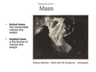
Mass A form has implied mass. It is a shape that appears to be  three-dimensional  (3-D).  It has  HEIGHT, WIDTH, and DEPTH  - which is the 3 rd  dimension.  Depth shows the volume or mass of the object.  Forms are defined by  contour lines .
Elements of Art > Mass Actual mass   has measurable volume and weight. Implied mass   is the illusion of volume and weight. Edward Steichen.  Rodin with His Sculptures  photograph
Turning  Shapes  into  Forms A triangle becomes a cone or a pyramid A square becomes a cube
Turning Shapes into Forms David Smith. Untitled (1954) ink, tempera The word  volume  refers to the mass  of a three-dimensional work.     David Smith. Cubi XX (1964)  welded steel, UCLA
Turning  Shapes  into  Forms A rectangle can become a box or a cylinder In order to turn a circle into a sphere, you must shade it.  You can’t add another side to it!
Value  is the lightness and darkness of areas in a composition. Similar or related terms: light, key, contrast, highlight, shading, shadow, modeling, mid-tone, heightening, chiaroscuro Modeling  on a two-dimensional surface is the illusion of volume through the use of shading. Value Leonardo.  Virgin and Child with St. Anne,  cartoon,  sanguine and heightened with white chalk
Value Scale of Grays Two values or colors, side by side, interact with one another and change our perception accordingly.  The effect of this interaction is called  simultaneous contrast .
Value Modeling  makes forms appear more real because it imitates natural light. You create the illusion of a  highlight ,  shadow ,  reflected light , and  cast shadow . A  light source  is where the light is coming from, the darkest shadow areas are always on the opposite side of the light.
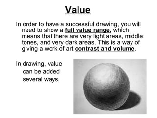
Value In order to have a successful drawing, you will need to show a  full value range ,  which means that there are very light areas, middle tones, and very dark areas. This is a way of giving a work of art  contrast and volume .  In drawing, value  can be added  several ways.
Ways to add  value : Cross-hatching   is when you use irregular  lengths of parallel lines  that cross over each  other diagonally.  The closer together  the lines are placed,  the darker the value.
Ways to add value: Stippling  is the use of dots to create shade.  This is accomplished by placing dots very  close together  to create dark  values and  farther apart to  create lighter values.
Ways to add value: Soft shading is when you use pencil or charcoal to create soft gradation from one value to the next creating a full value range.
Value  in  Painting Chiaroscuro   is a type of modeling that has a soft gradation of value over the form. Tenebrism  is a type of modeling that has a sharp contrast in value that gives a spot-light effect on the subject. Leonardo da Vinci.  Virgin of the Rocks  oil on panel,  1486,  Louvre, Paris
Color The visual sensation resulting from the reflection of wave lengths of light from differing surfaces  Color can add interest and reality to artwork.  The use of a color wheel helps us to  understand color theory more effectively.
Triadic Color Wheel
Newton and the Color Spectrum Our modern understanding of light and color began with  Isaac Newton  (1642-1726) and a series of experiments that he published in 1672.  He was the first to understand the rainbow and he used a prism to refract white light into its component colors.  These colors are:  R ed,  O range,  Y ellow,  G reen,  B lue,  I ndigo  and  V iolet  Remember the anagram: ROY G BIV
The Three Properties of Color Hue  – the color name Value  – the lightness or darkness of the color. Yellow is the lightest in value; violet is the darkest.  Intensity  – the saturation of color, purity, chroma, brightness/dullness
Victor Vasarely.   Orion  (1956)    cut paper
Color Pigments Primary colors:  Red ,  Yellow  and  Blue These color pigments are primary for two reasons: They can’t be made by mixing They can be mixed to make all the other colors on the color wheel
Lichtenstein Primary Colors
Secondary Colors When you mix two primary colors together, you get a secondary color.  For example: Red and Yellow =  Orange Red and Blue =  Violet Yellow and Blue =  Green
Intermediate Colors When you mix a primary and a secondary color together you get an intermediate (or tertiary) color.  For example: Red and Orange= Red-Orange Yellow and Green=Yellow-Green Blue and Green=Blue-Green Red and Violet=Red-Violet Yellow and Orange=Yellow-Orange Blue and Violet=Blue-Violet
When you use only one color plus its  tints and shades, you are using a  monochromatic  color scheme A  tint  is a color plus white A  shade   is a color plus black Color Relationships
Color Relationships Colors are related based on how  they are arranged on the color wheel: 3-7 colors on either side of a primary creates an  analogous color scheme
Triadic  color schemes uses three colors  that are equally spaced apart on the color wheel Color Relationships
Color Relationships Two colors that are directly opposite each other  complementary colors
Complementary Colors Vincent Van Gogh,  Night Cafe
Color Relationships A  Split-Complementary color scheme  is a complementary color and the two colors on either side of its compliment.
Color Relationships Colors with red or yellow in them are considered to be warm.  Cool colors are colors with blue in them.  WARM COOL
Warm  colors are those that have Reds, Yellows and Oranges. Warm colors seem to advance (or come forward) in an artwork. Cool  colors are those that have Blues, Greens, and Violets.  Cool colors seem to recede (or move backward) in an artwork. Color Relationships
Cool colors with warm accents Romare Bearden.  J Mood  (c. 1985)  paper collage
Local versus Optical Color Local Color - the actual color of objects as created by the light the surfaces reflect under normal lighting condition.  Optical color - our perceptions of color, which can vary with lighting conditions.
CLAUDE MONET.  Haystack at Sunset near Giverny  (1891).  Oil on canvas.  2 9” x  3 7” .
Colors are expressive Colors can convey emotion and feelings. Blue is calming. Red  is exciting or passionate. Yellow  is energizing. It is important that artists understand the  effects of color when they are trying to get  the viewers of their art to feel a particular way.
Expressive Colors Van Gogh  The Night Café  (1888) oil on canvas
The Elements of Art > Texture Texture is the surface character  of an object.  Three basic types of texture –    actual, visual, and simulated.
Actual Texture  (Tactile or Real) is the way the surface of an object actually feels. Examples would be sandpaper, cotton balls, tree bark, puppy fur, etc.
Visual Texture   is the illusion of texture on a flat surface.  This is the type of texture that artists render when they draw and paint.  Visual textures may look soft, smooth, fuzzy, or rough.  Even to the point of  trompe l’oeil  – the French phrase that means “trick the eye.” Leonardo.  Mona Lisa  oil on wood
RACHEL RUYSCH. Flower Still Life (after 1700) Oil on Canvas. 29 3/4” x 23 7/8”.
Meret Oppenheim.  Object (1936) Fur-Covered Cup, Saucer, and Spoon   Camille Claudel’s  The Waltz Creating  simulated texture… subversive texture Transition from smooth skin  to rough, bumpy, rippling base
DAVID GILHOOLY.  Bowl of Chocolate Moose  (1989). Ceramic. 10 ” x  6 ” x  7 ”
Elements of Art > Texture >   Impasto  Impasto  is the actual, thick texture of the paint as applied by an artist. Vincent Van Gogh.  Irises  (1889)  oil on canvas
Guitar, Sheet Music, and Glass.   paper, gouache, charcoal Elements of Art > Texture > Collage Pablo Picasso –  The first artist to attach paper and other materials to  his art work.
The Elements of Art in Review The Elements of Art are the “tools” that artists use to make art.  They are the basic “foundation” of a good composition Value Color  Line   Shape  Texture  Mass
Components of Art Unity Order/Oneness Subject Form Content Principles of Design Harmony Emphasis Proportion Balance Economy Rhythm Variety Elements of Art Value Color Line Shape Texture Mass
SPACE The environment in which all things exist. Objects exist in Three-dimensional space. Some art is truly 3D like sculpture and architecture.  And some art just tries to depict space on a 2D surface.
Overlapping You can create the illusion of depth  by overlapping objects.
Relative Size and Linear Perspective The further objects are from us the smaller they look.  Things that are closer to us look larger and things that are further away look smaller.  Artists use different techniques like relative size and linear perspective to create the illusion of depth in a piece of art.  NI ZAN. Rongxi Studio (Late Yuan/Early Ming dynasty, 1372 CE). Hanging scroll; ink on paper. H: 29   1⁄4 ”
The Illusion of Depth Vanishing point - The point at which parallel lines cone together, or converge. Horizon - the line where the line of sight stops and on which the artist often places the vanishing point.  Vantage point - where (or the height) the viewer is looking from. One-point perspective - when parallel lines in a picture come together at one point, the vanishing point, on the horizon line.  Two-point perspective - when parallel lines in a picture come together at 2 different points on the horizon line.
RAFFAELLO SANZIO (RAPHAEL).  PHILOSOPHY, or SCHOOL OF ATHENS (1509-1511). Linear Perspective in The School of Athens.
GUSTAVE CAILLEBOTTE. Paris Street: Rainy Day *1877). Oil on Canvas. 83 1/2” 108 1/4”. Perspective in Caillebottoes’s Paris Street: Rainy Day.
Atmospheric Perspective (Also called aerial perspective.) Texture gradient - closer objects are perceived as having rougher or more detailed surfaces.  Brightness gradient - distant objects are less intense.
SYLVIA PLIMACK MANGOLD.  Schunnemunk Mountain  (1979). Oil on canvas. 60 ” x  80   1⁄8 ” .
Time and Motion Actual Motion: Kinetic Art - art that moves.  Example: Mobiles Photography
ALEXANDER CALDER. Untitled (1972). East Building mobile.
Implied Motion Stopped Time - a style of art that “stops time” in order to imply motion. Time implied & Motion Implied - Some works try to imply that  motion or time has occurred.
GIANLORENZO BERNINI.  Apollo and Daphne  (1622–1624). Marble. 7 ’ 6 ” .
The Illusion of Motion There is a difference between implied motion and the illusion of motion.  One implies that the motion has already occurred and the other indicates that the motion is happening right now.  Examples: Early photographic experiments of multiple exposures of motion. The blurring of shapes and the repetition of linear patterns blurring the contours of a figure.  Blurring outlines to create the illusion of  motion. Op Art !
THOMAS EAKINS.  Man Pole Vaulting  (c. 1884).   Photograph.
UMBERTO BOCCIONI.  Dynamism of a Soccer Player  (1913). Oil on canvas. 6 ’ 4   1⁄8 ” x  6 ’ 7   1⁄8 ” .
BERNHARD JOHANNES AND ANNA BLUME.  Kitchen Tantrums  (1986–1987). Photo-piece. 51   1⁄8 ” x  35   7 / 8 ” .
Op Art  Op Art - Optical Art, is based on creating optical sensations of movement through the repetition and manipulation of color, shape, and line. Afterimage - when we look at a color for a long period of time and then look away you may briefly see the  opposite color due to fatigue of the cornea in the eyes.
Fig. 2-76. P.65 BRIDGET RILEY. Gala. (1974). Acrylic on canvas. 5’ 2 3/4” square.
Other Ways of Creating the Illusion of Motion Cinematography and video Stroboscopic motion (Real movement involves illusion)