Downloaded 150 times
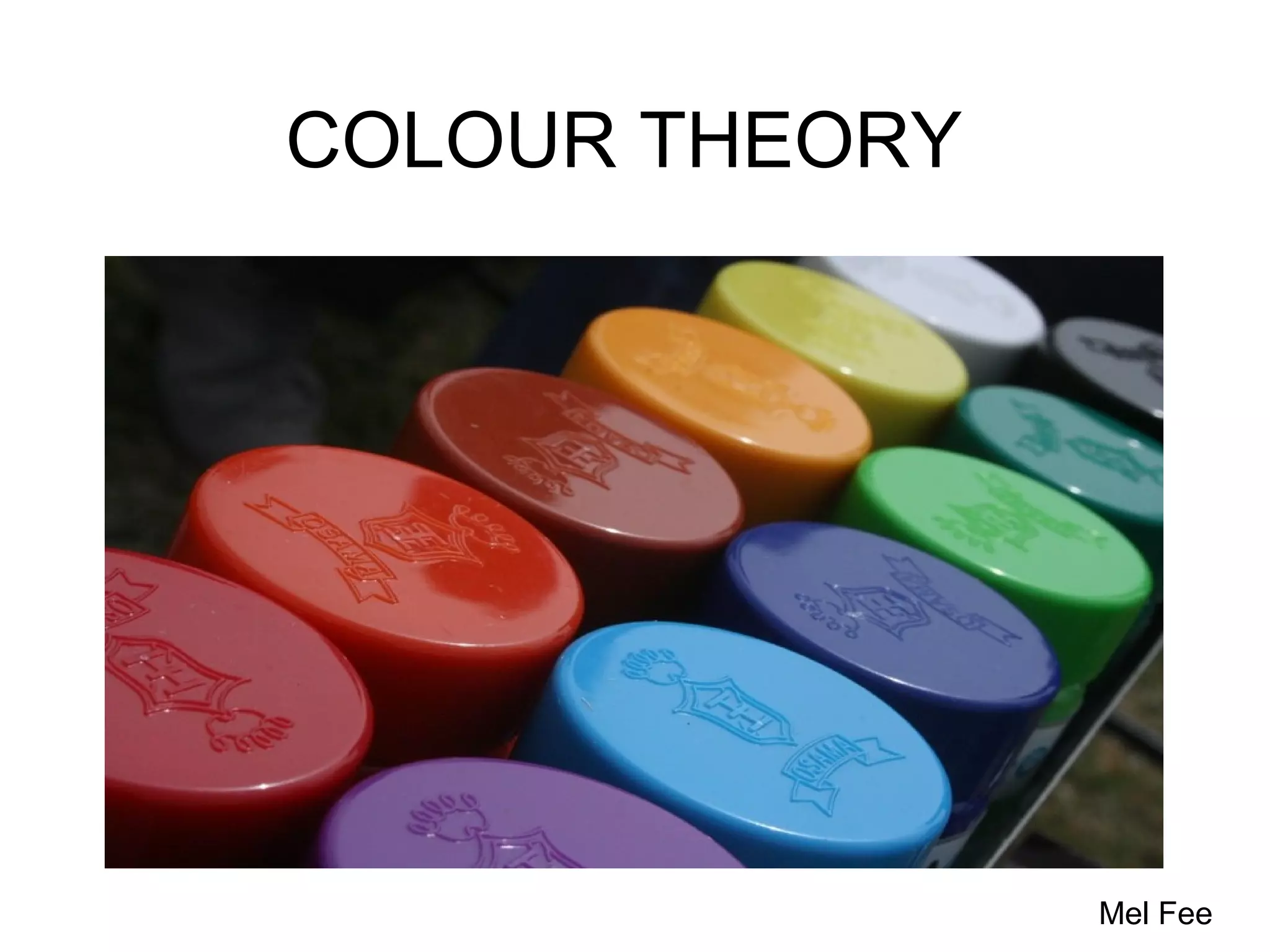
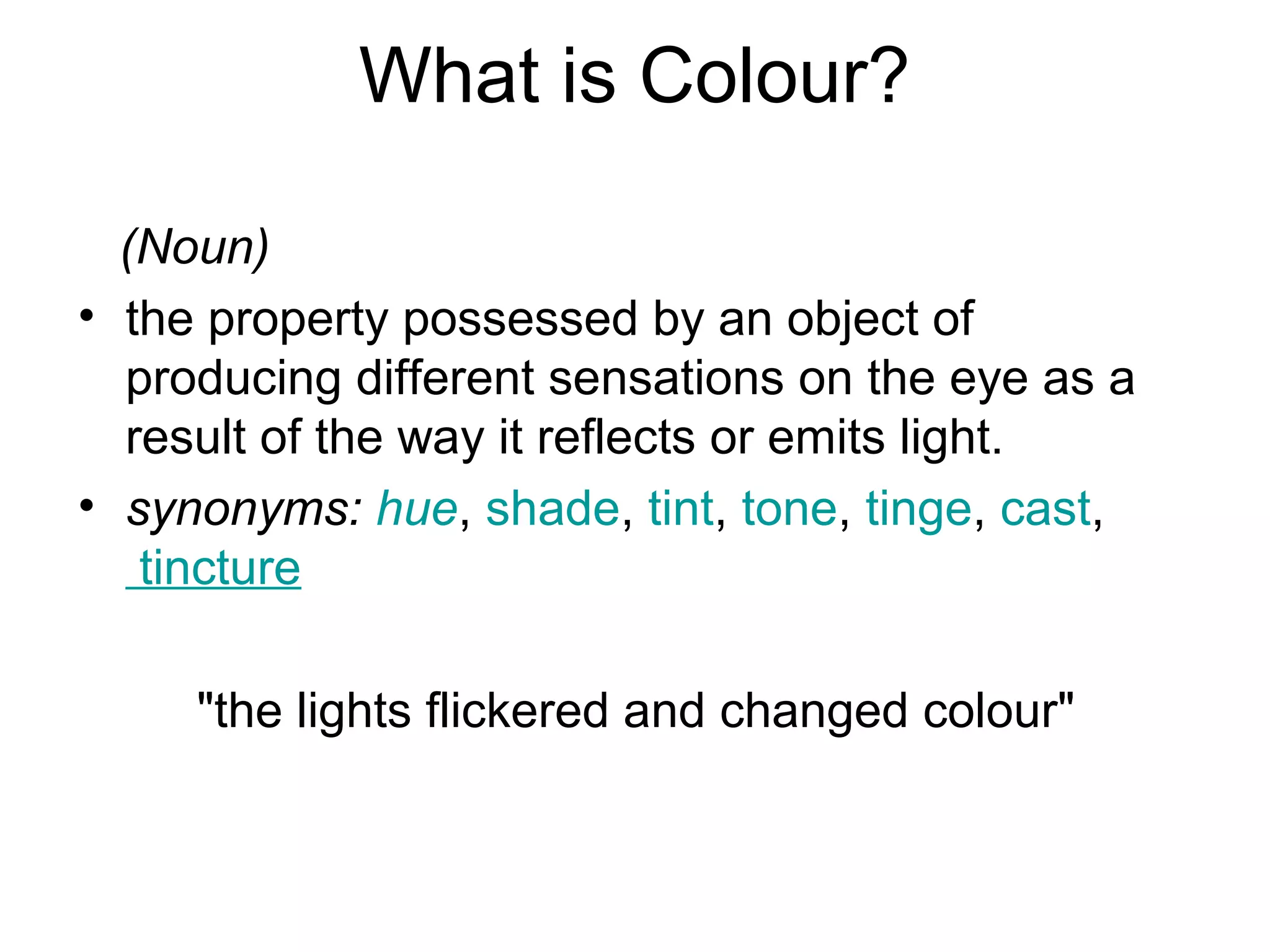


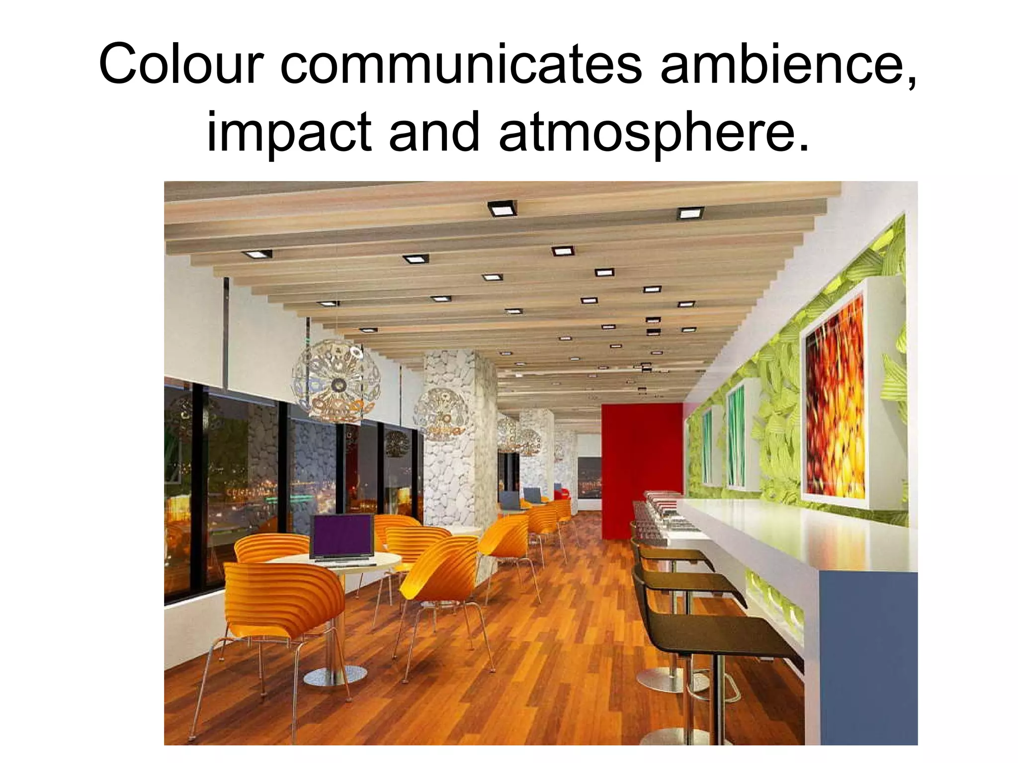
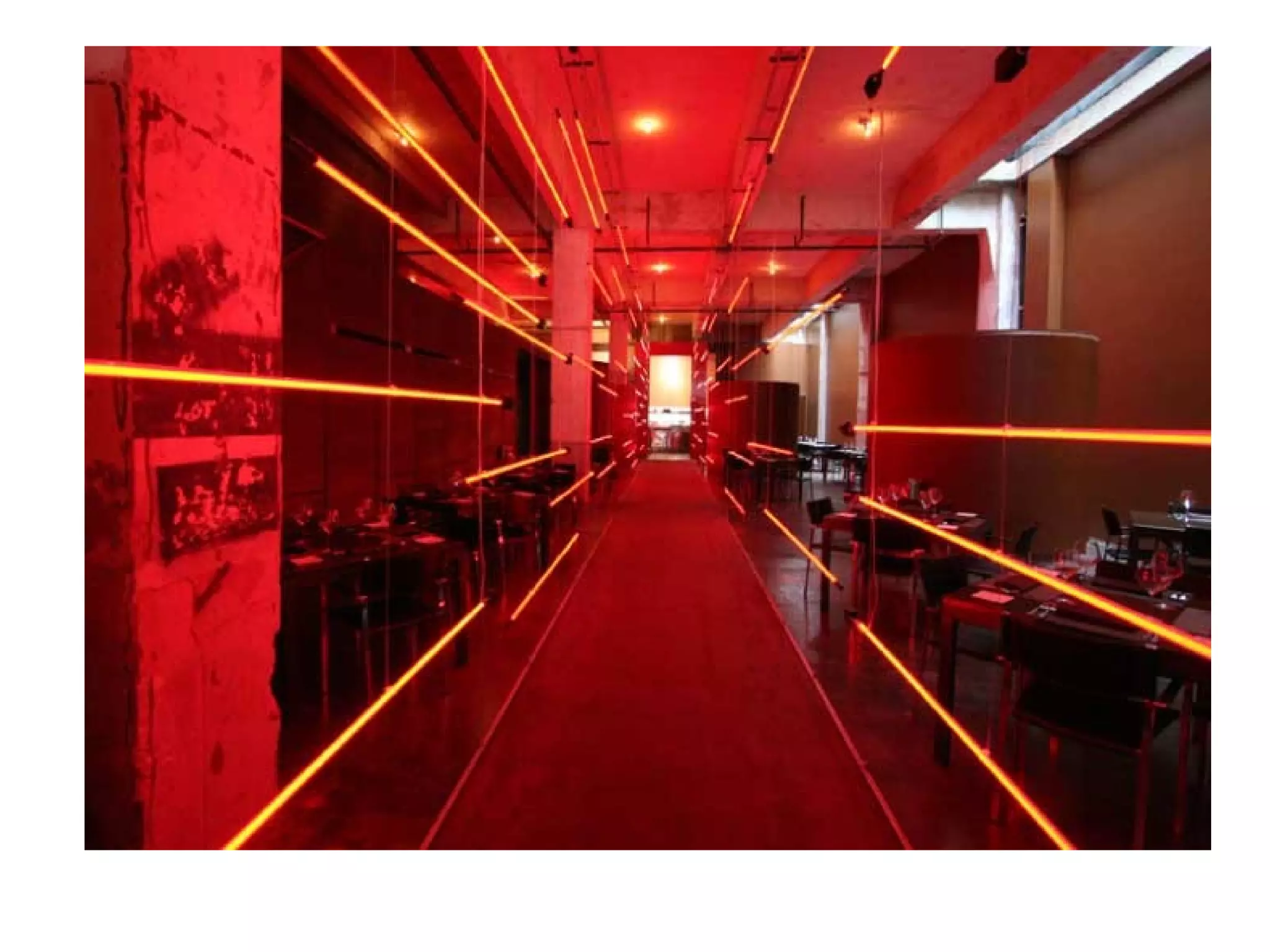
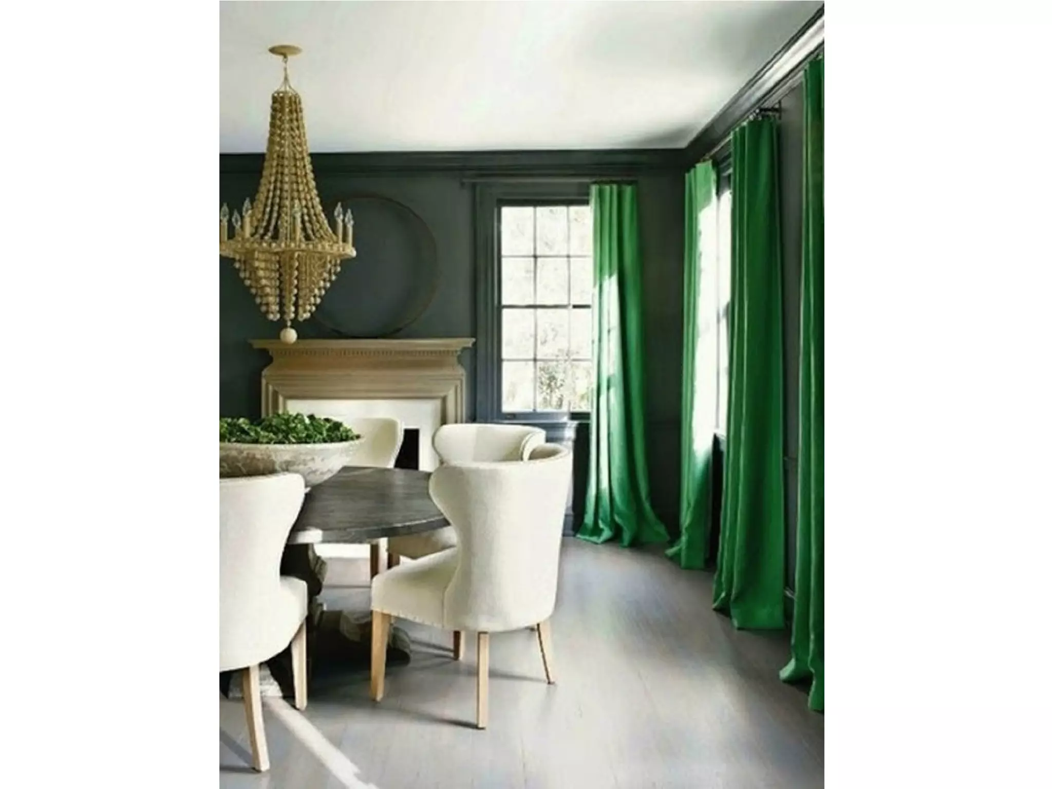
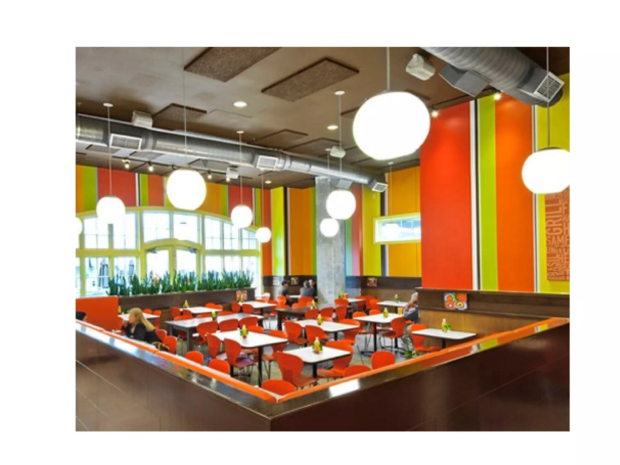
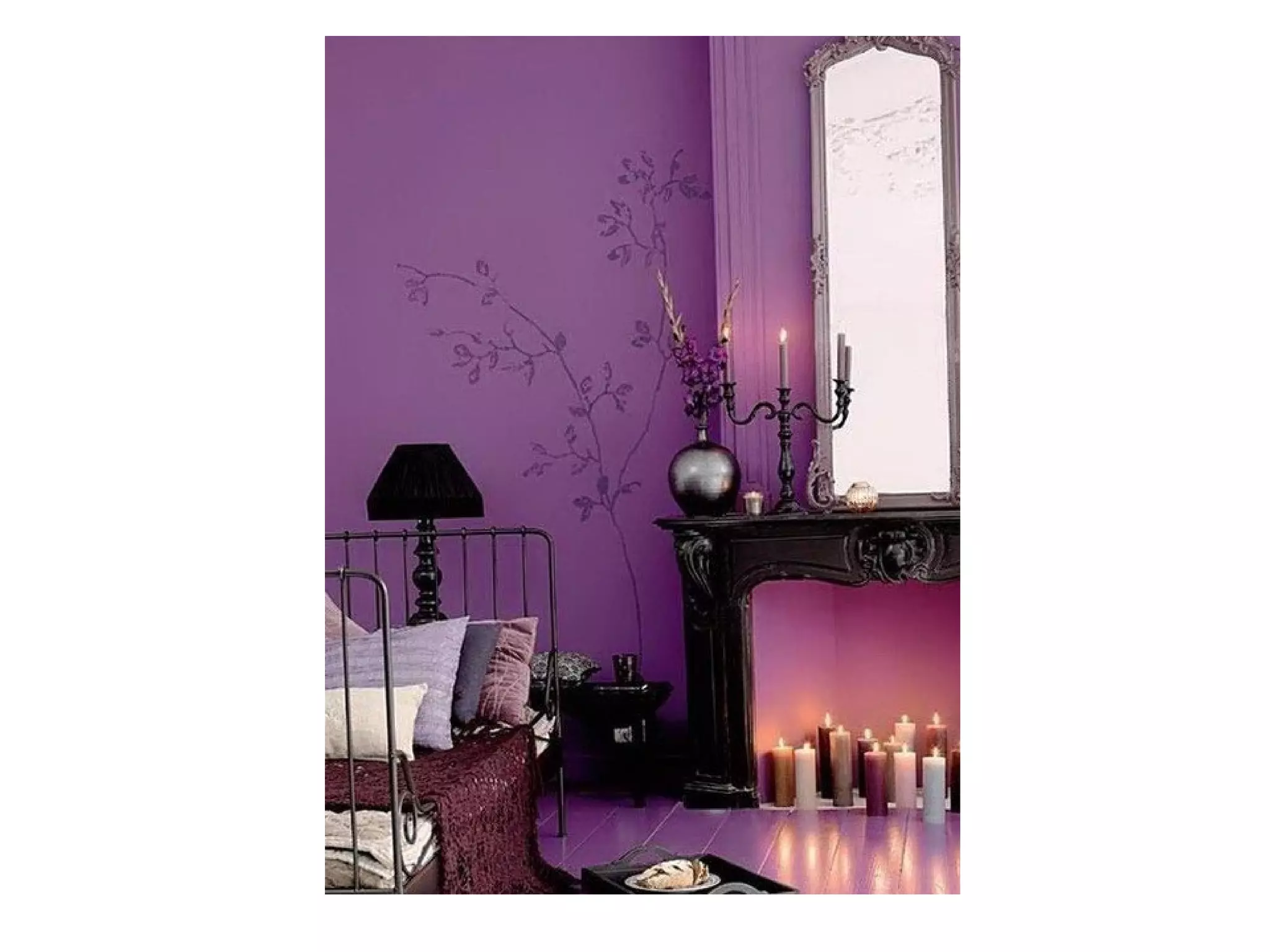


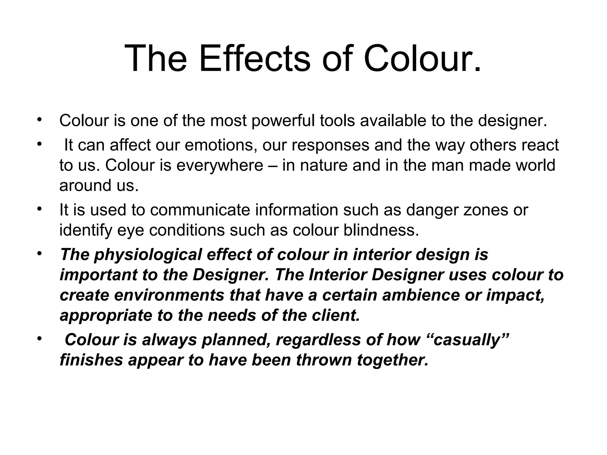
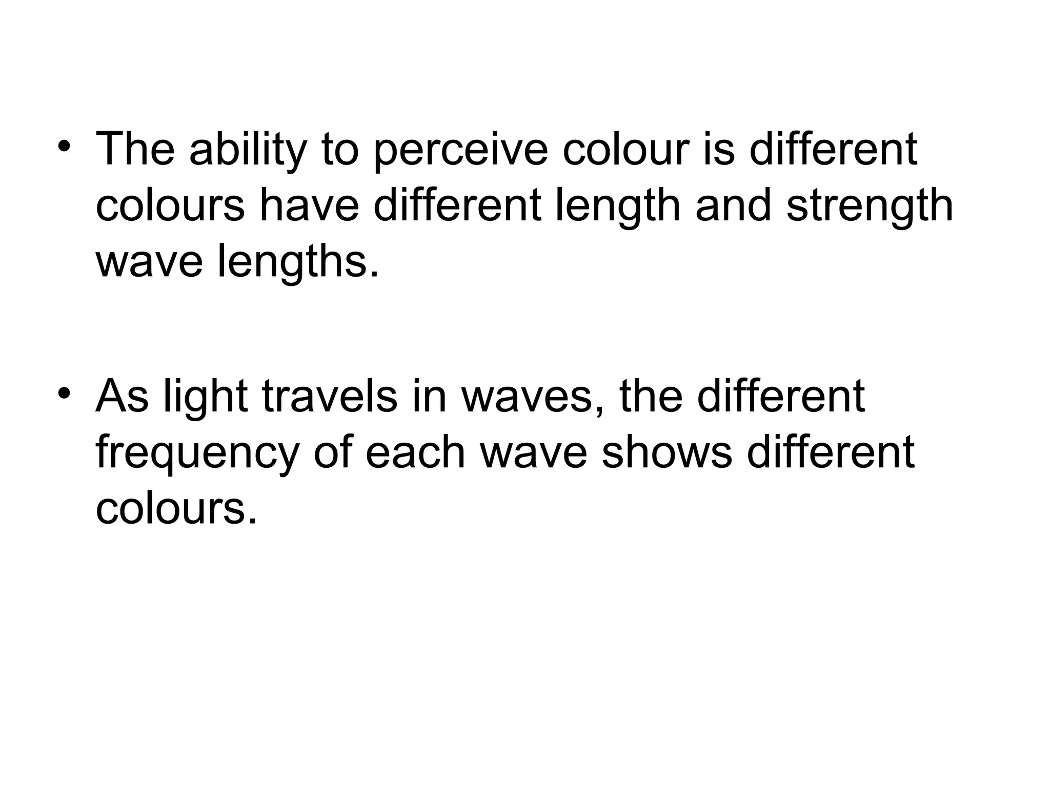
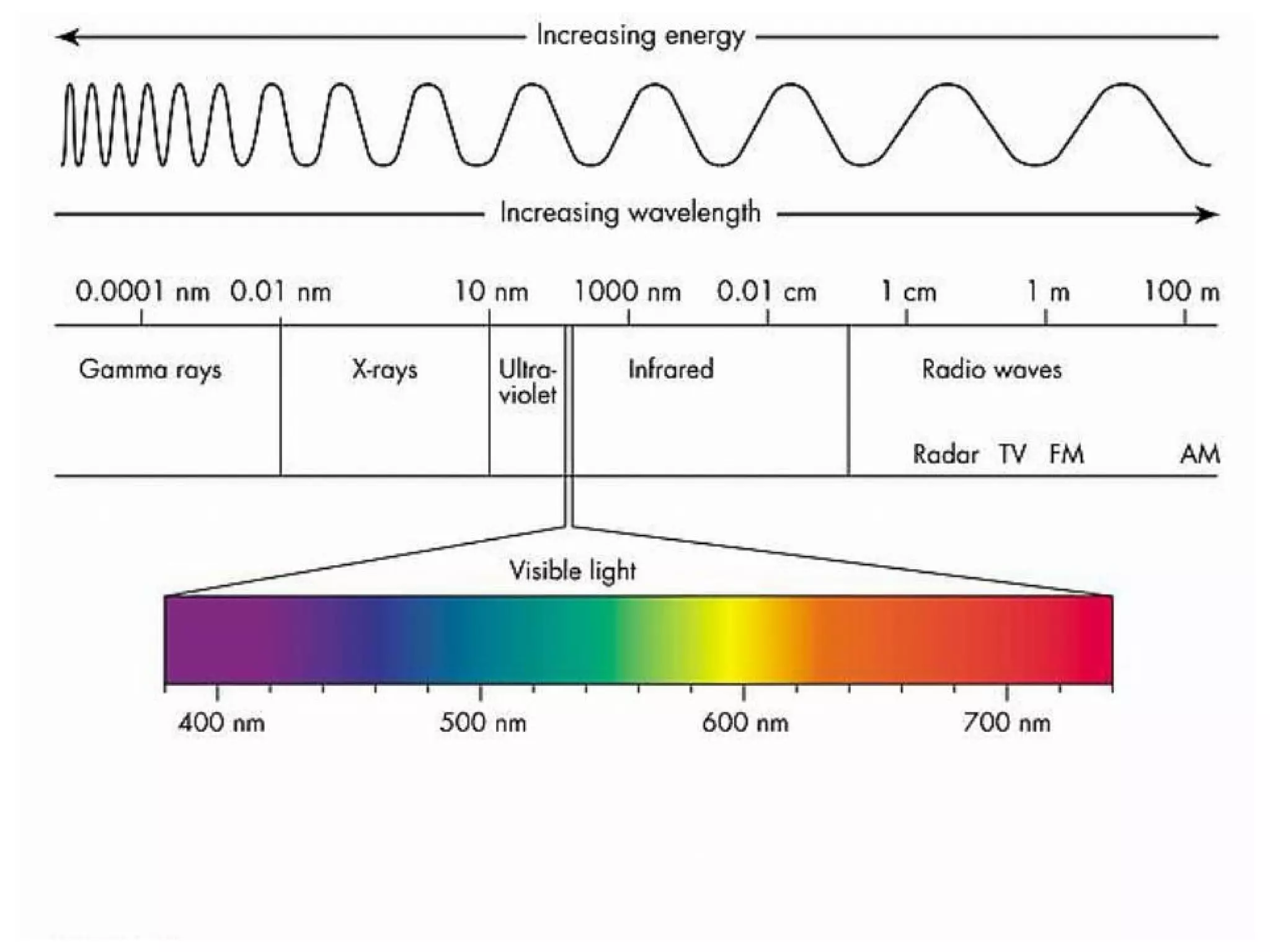
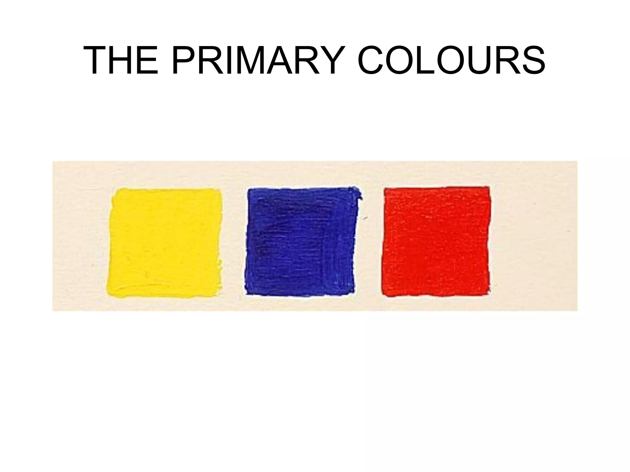
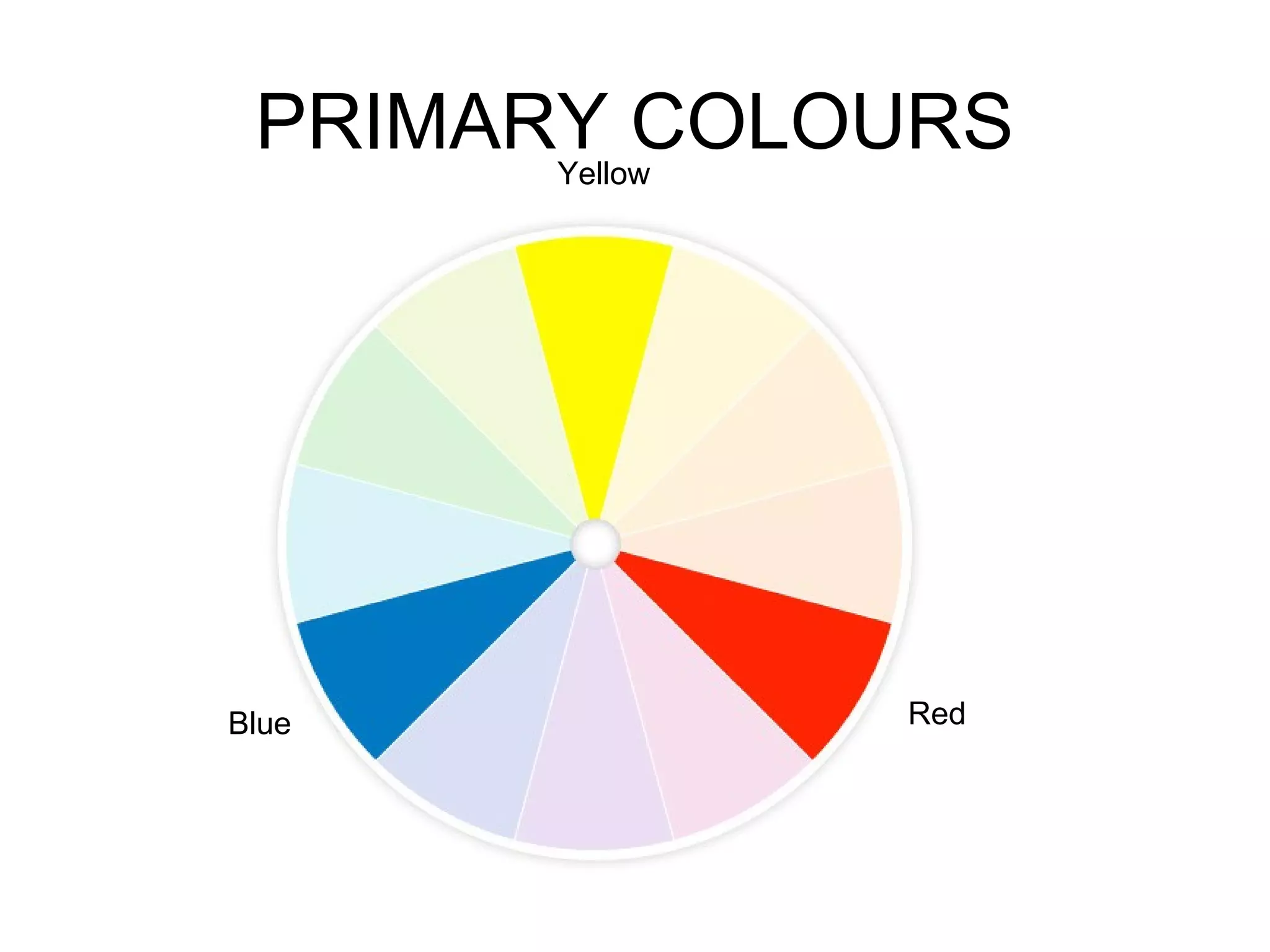
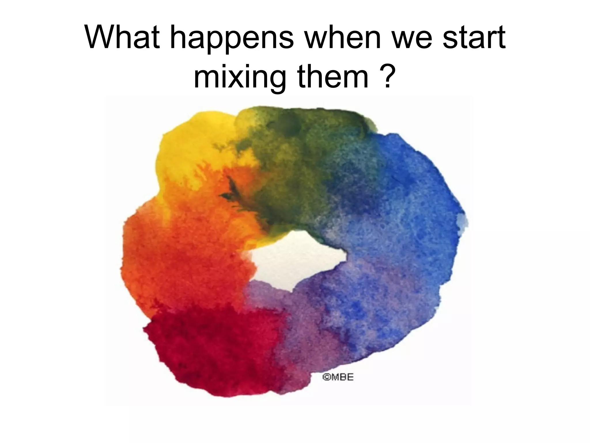

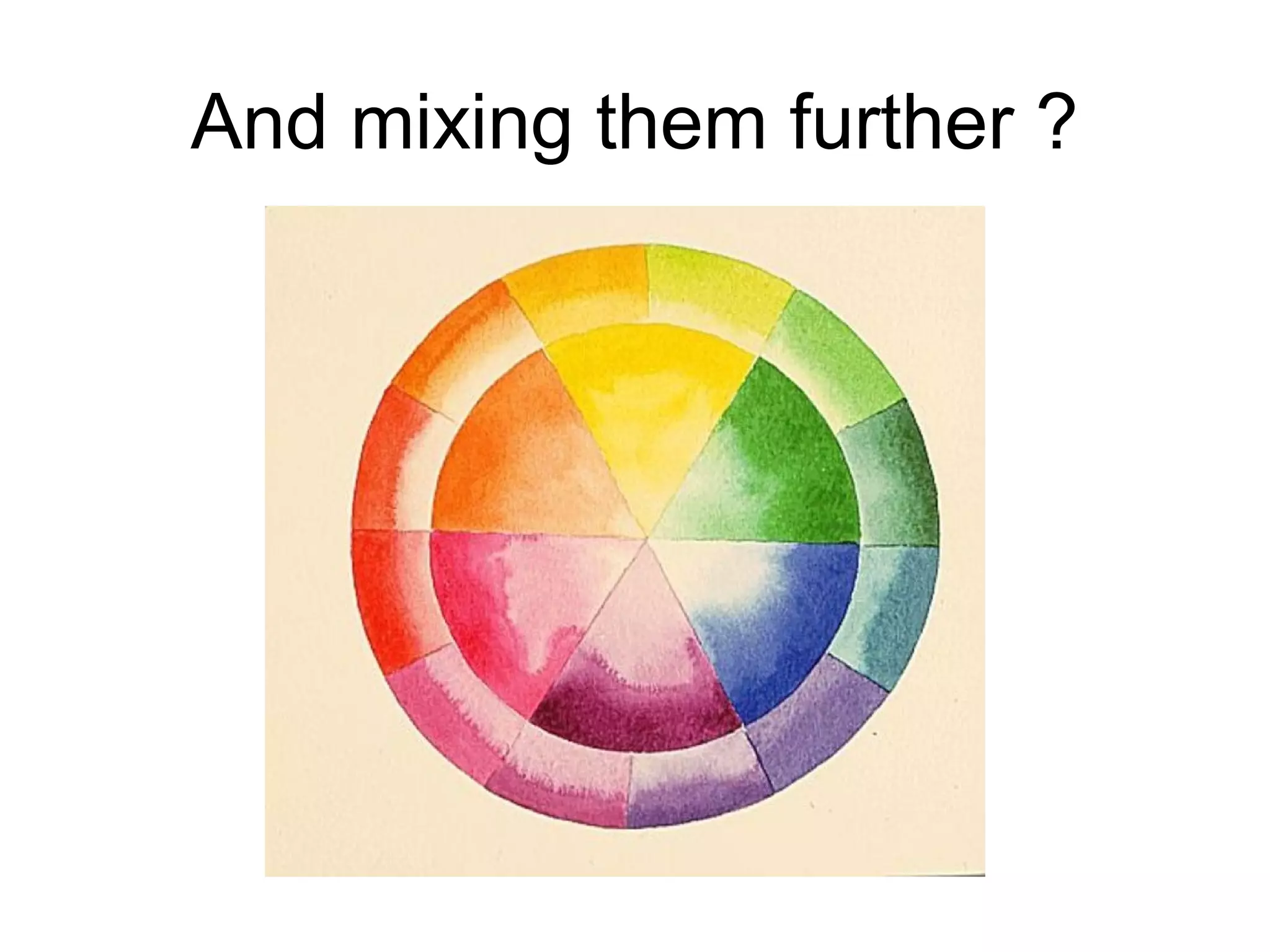
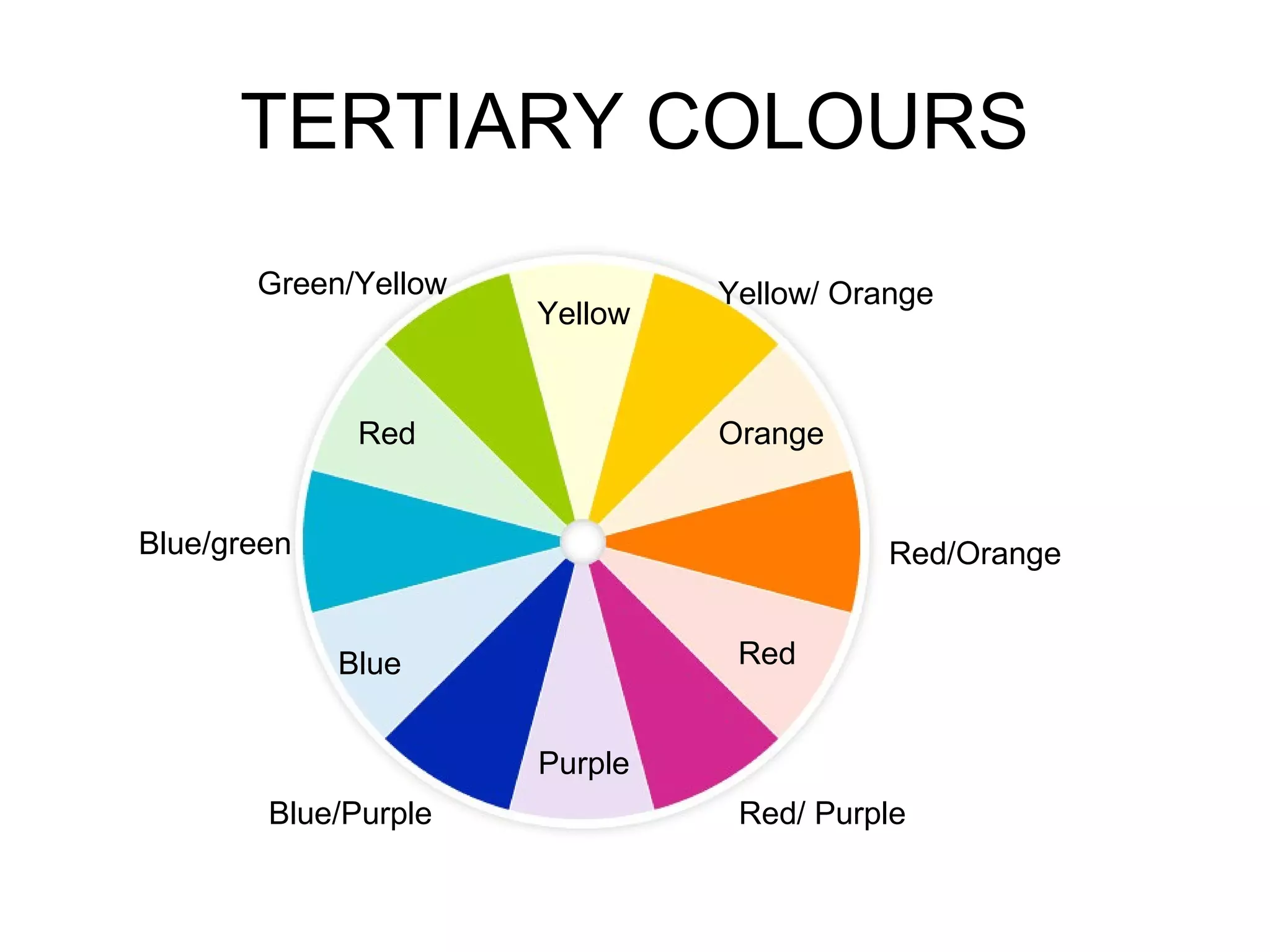


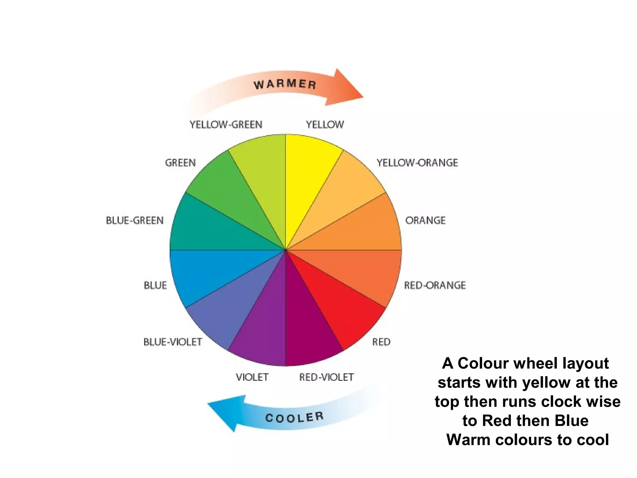
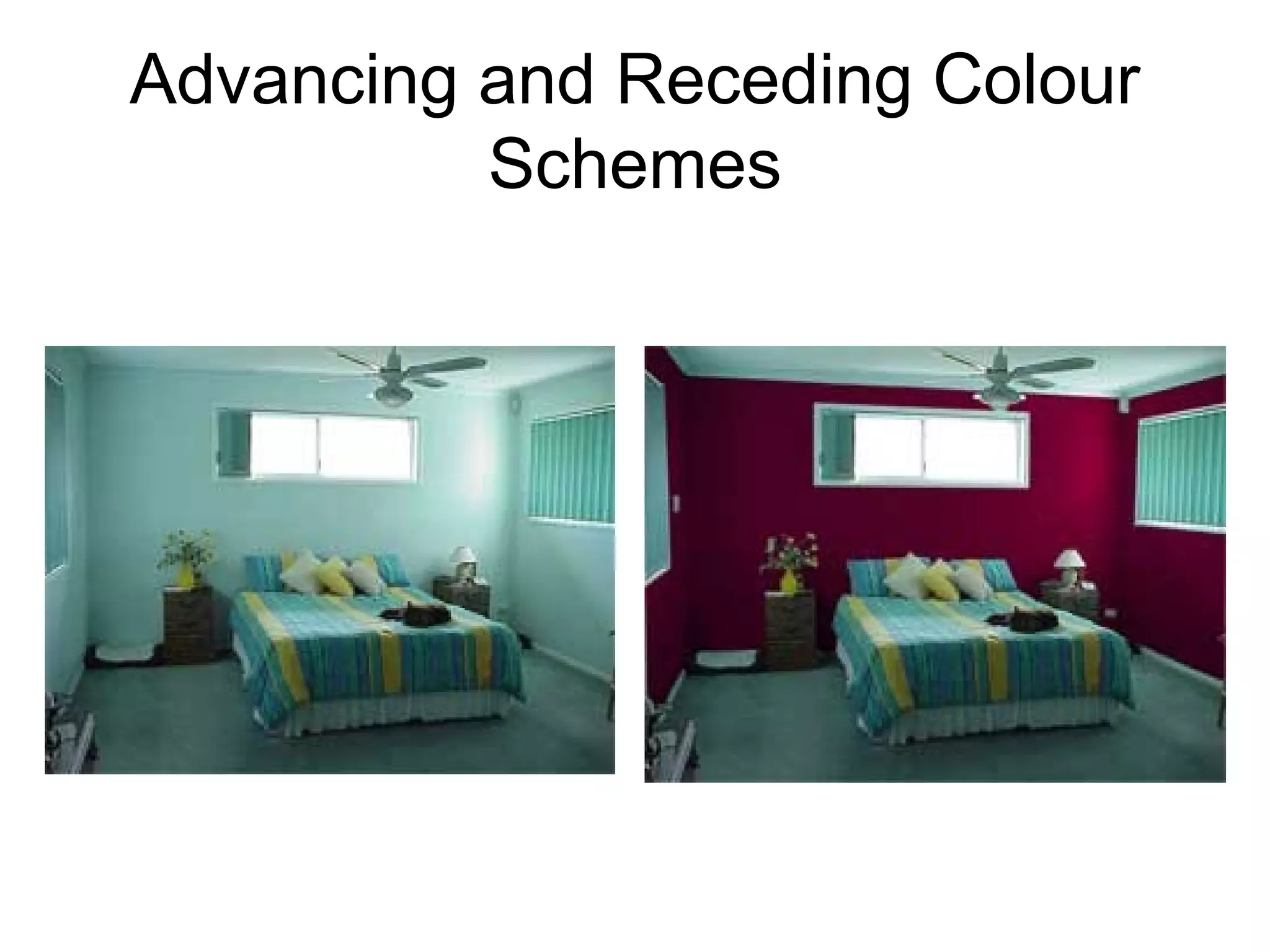
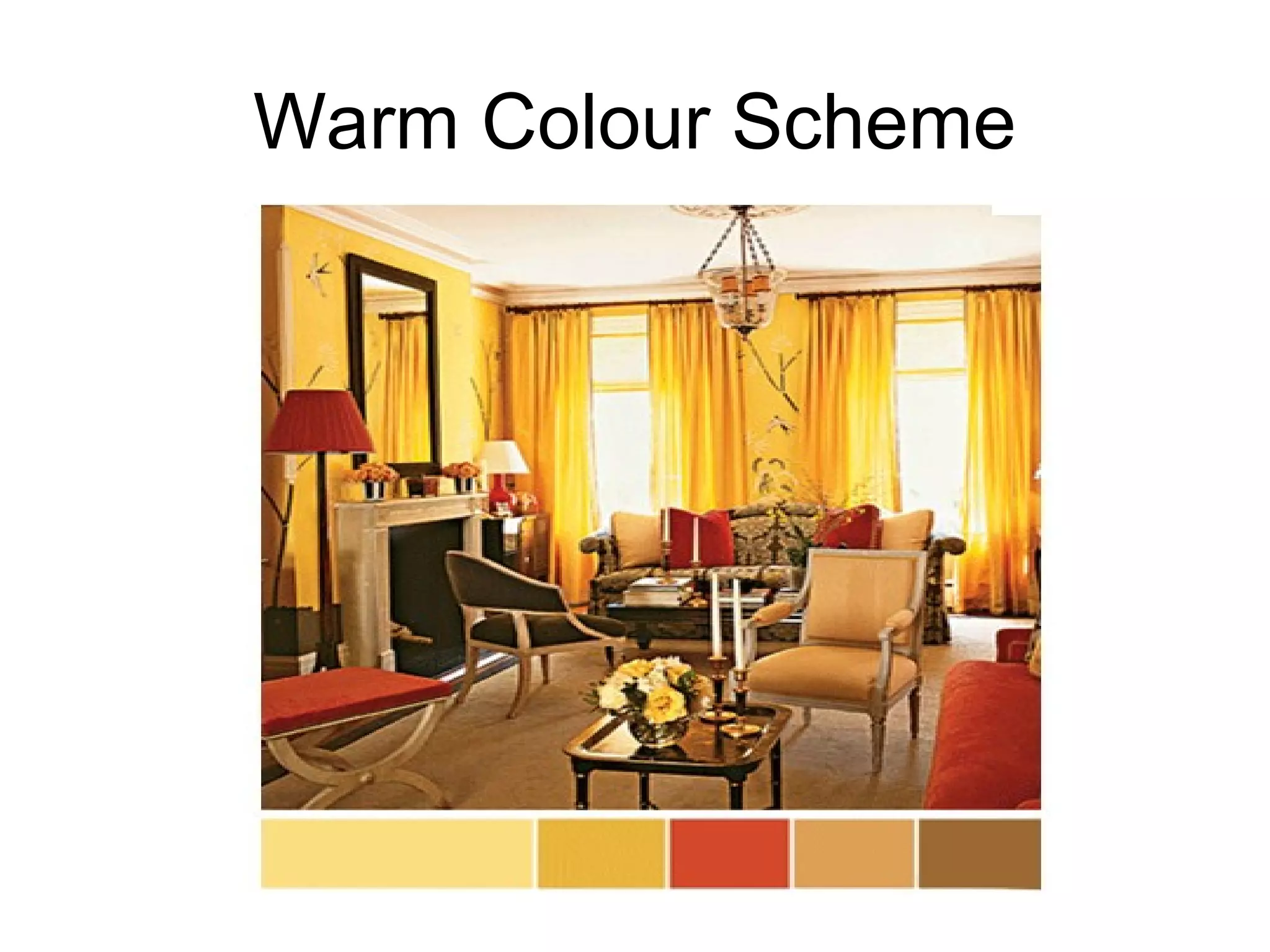

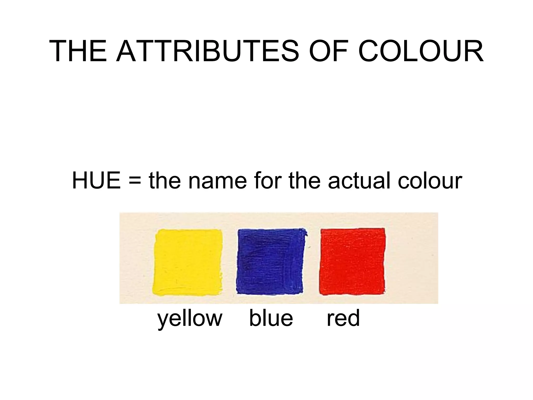
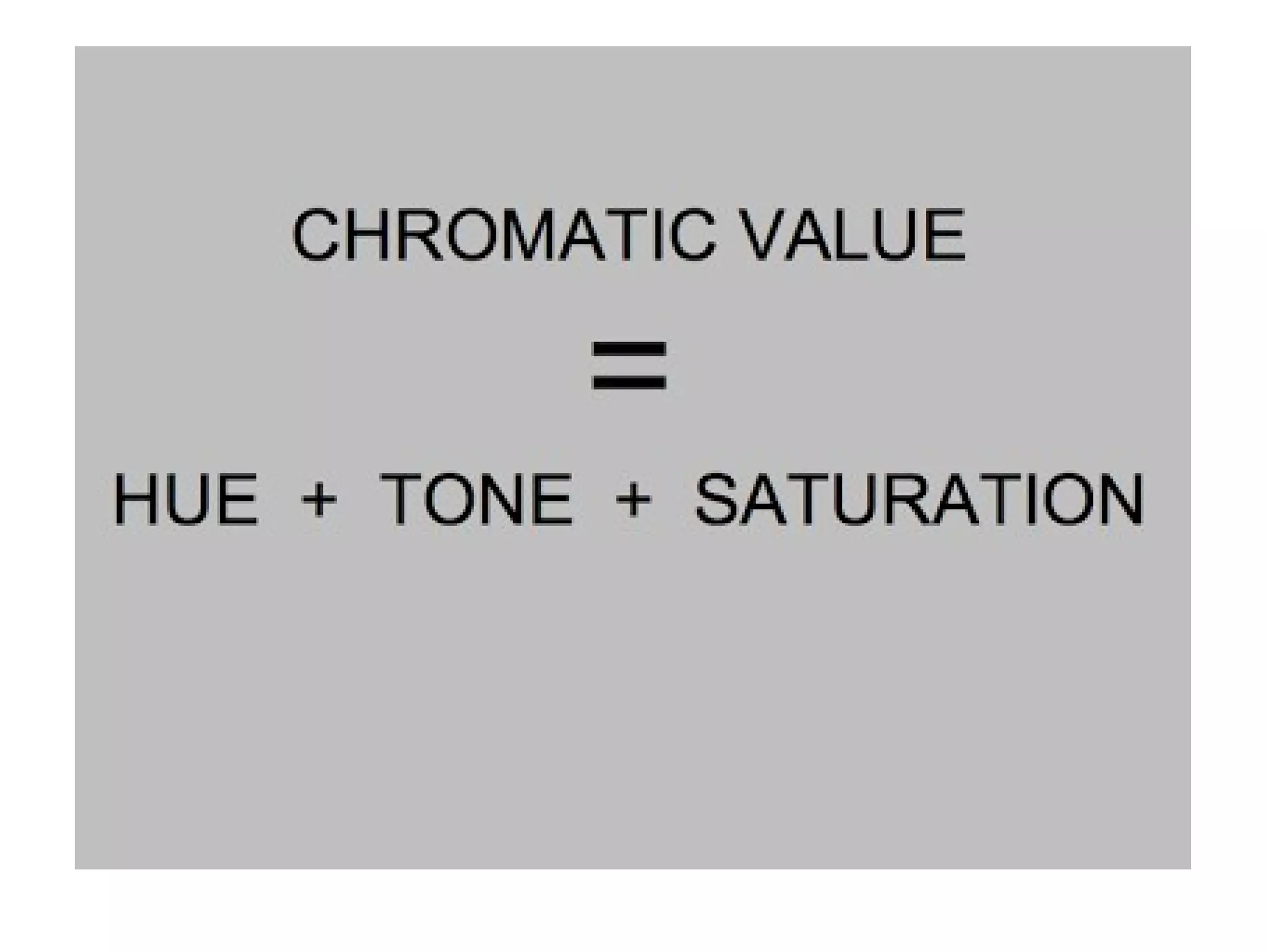
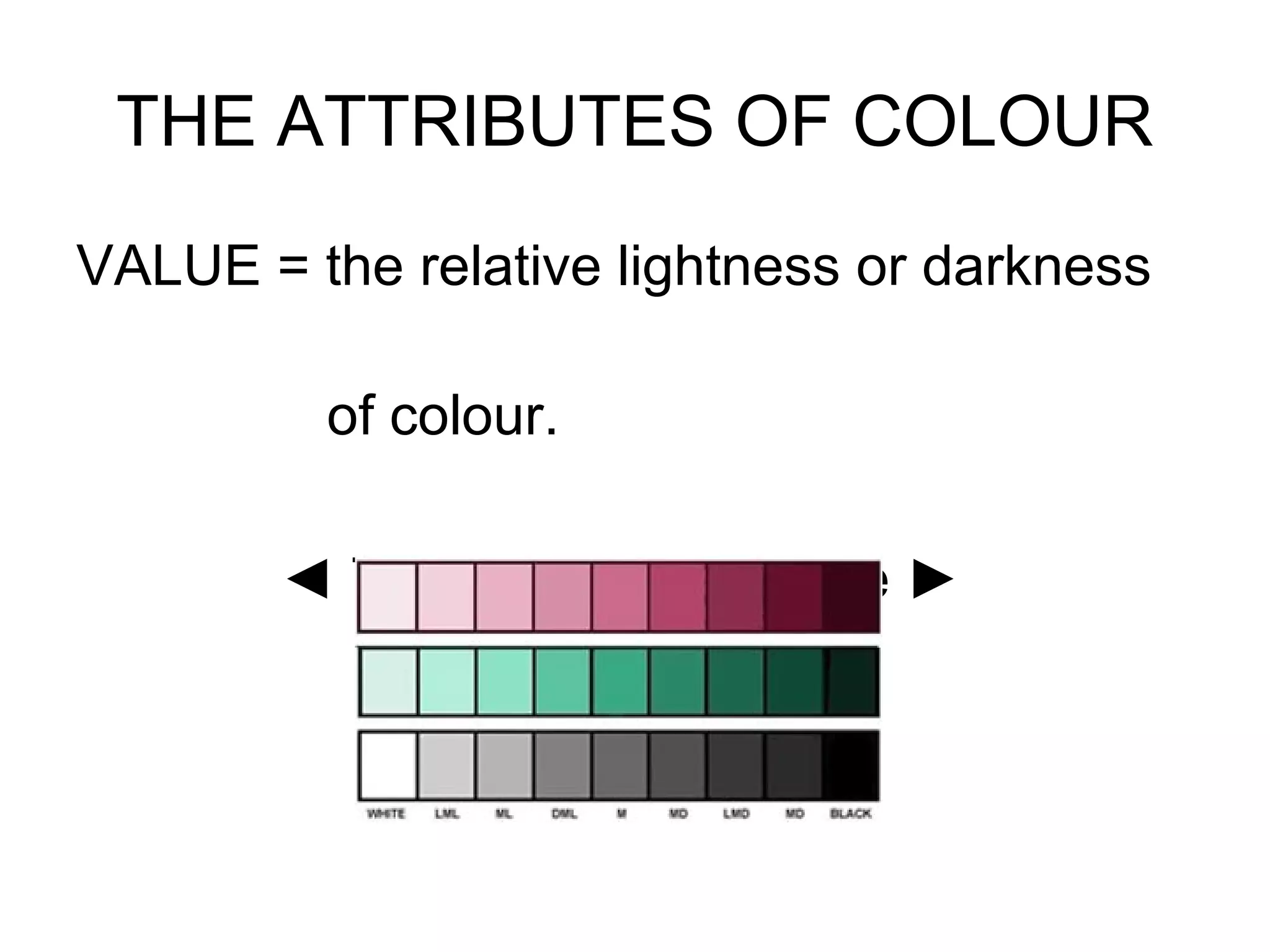

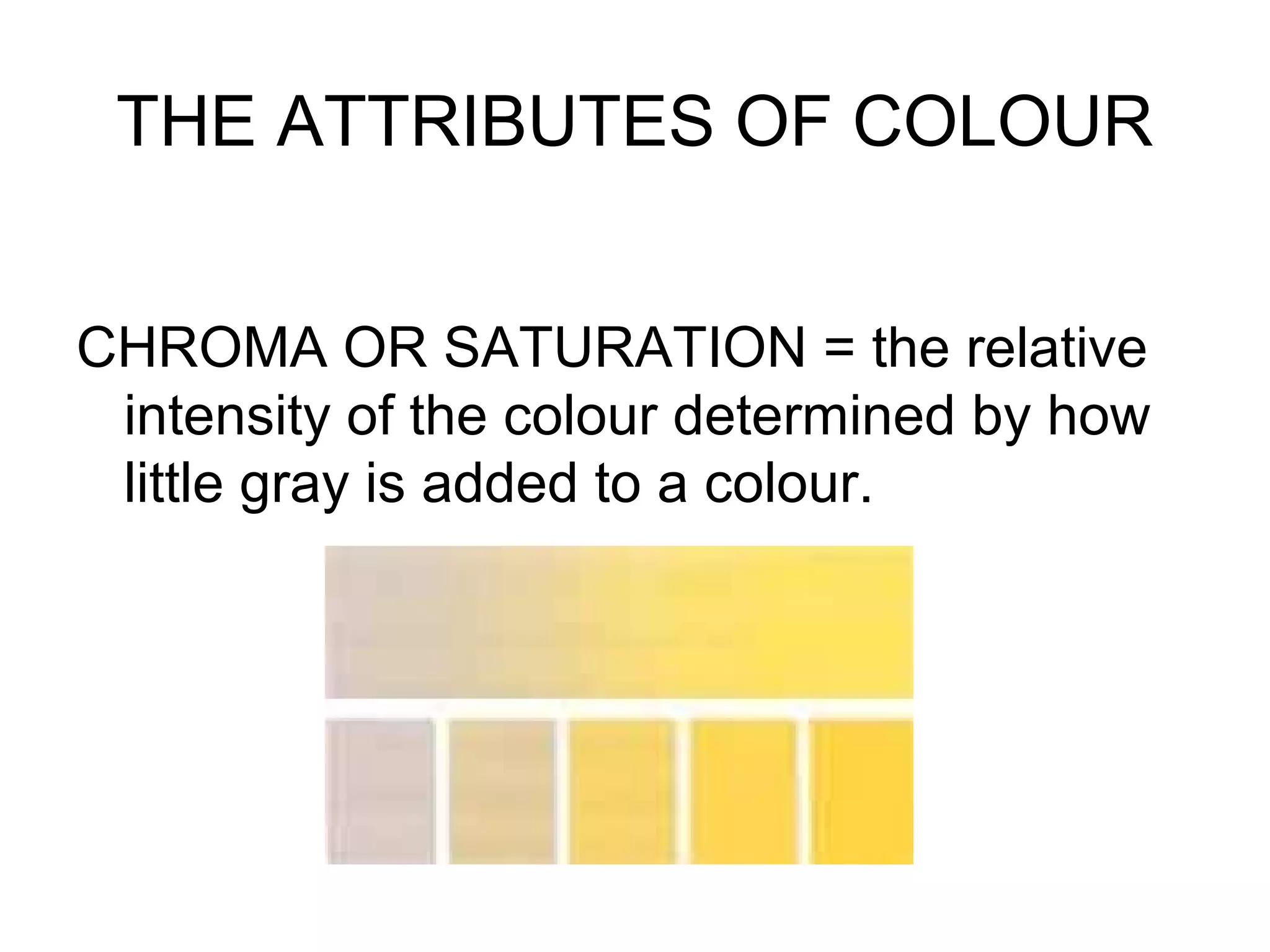

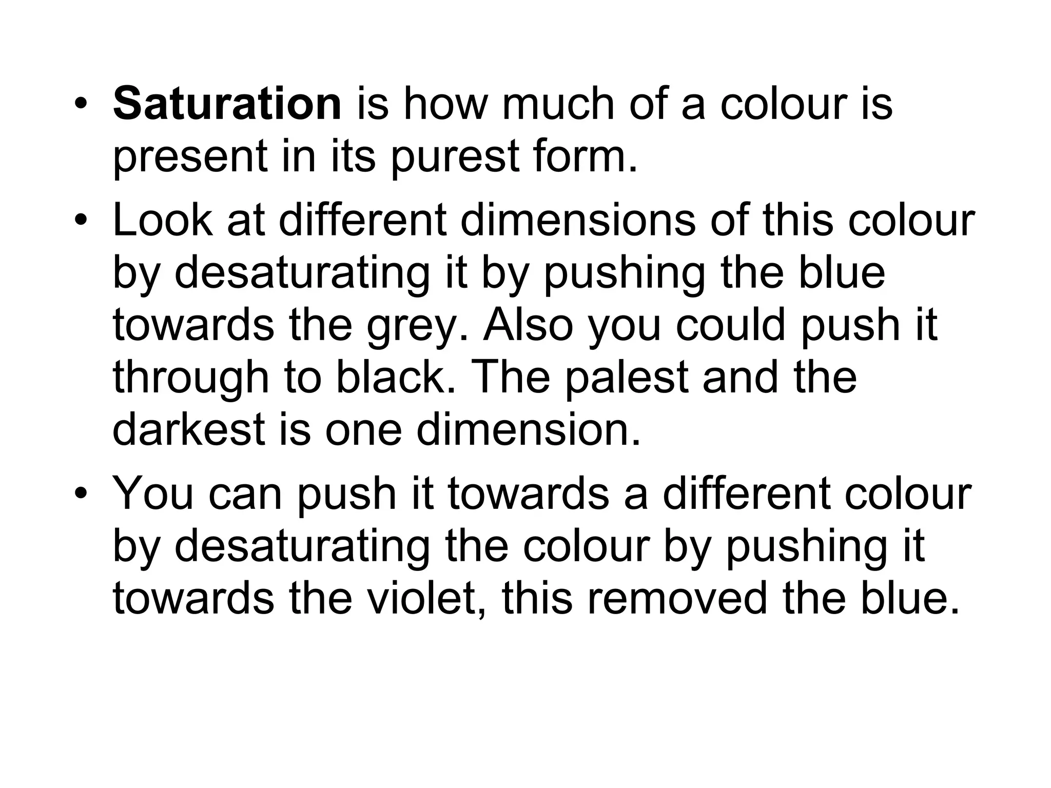
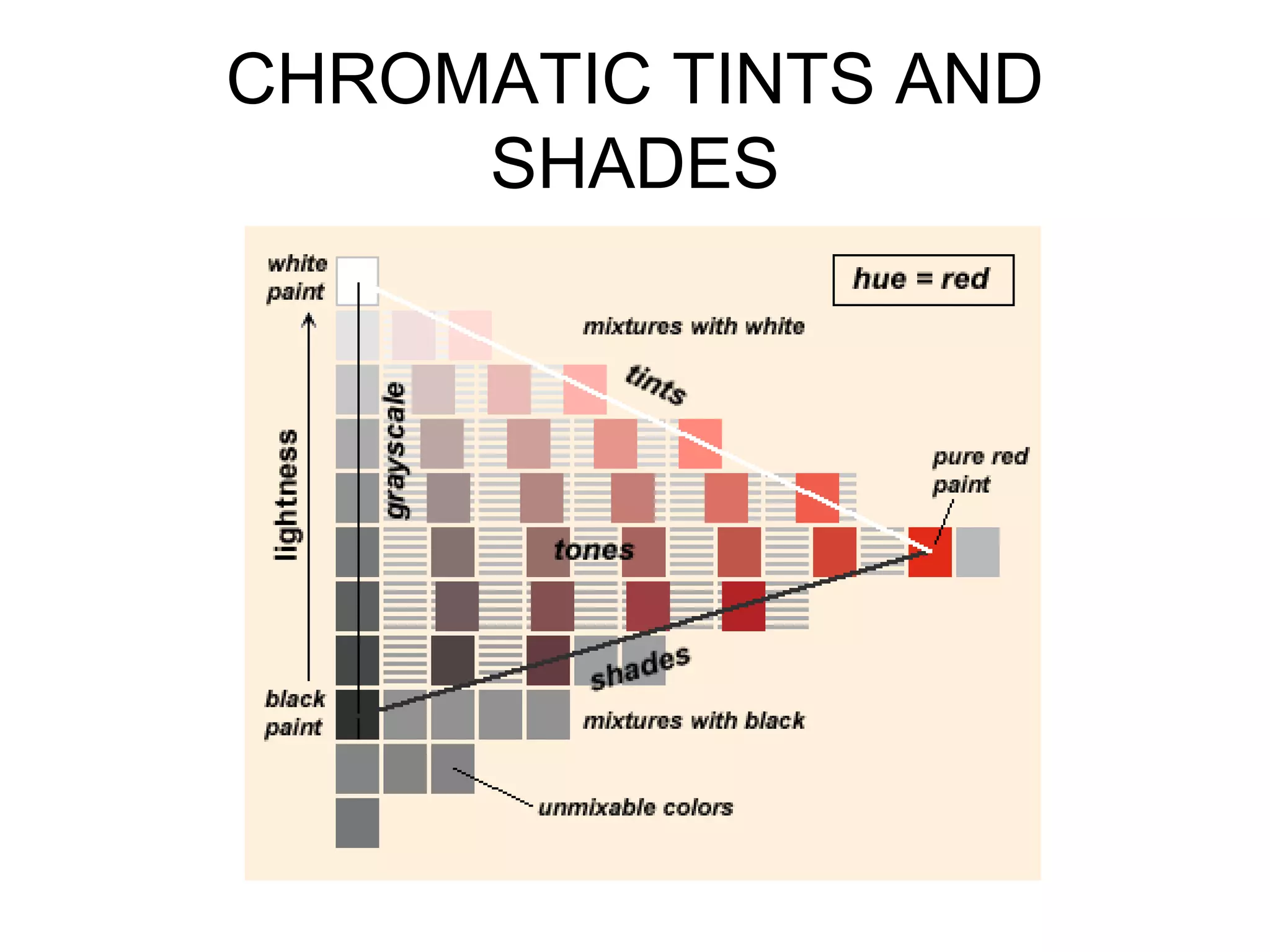
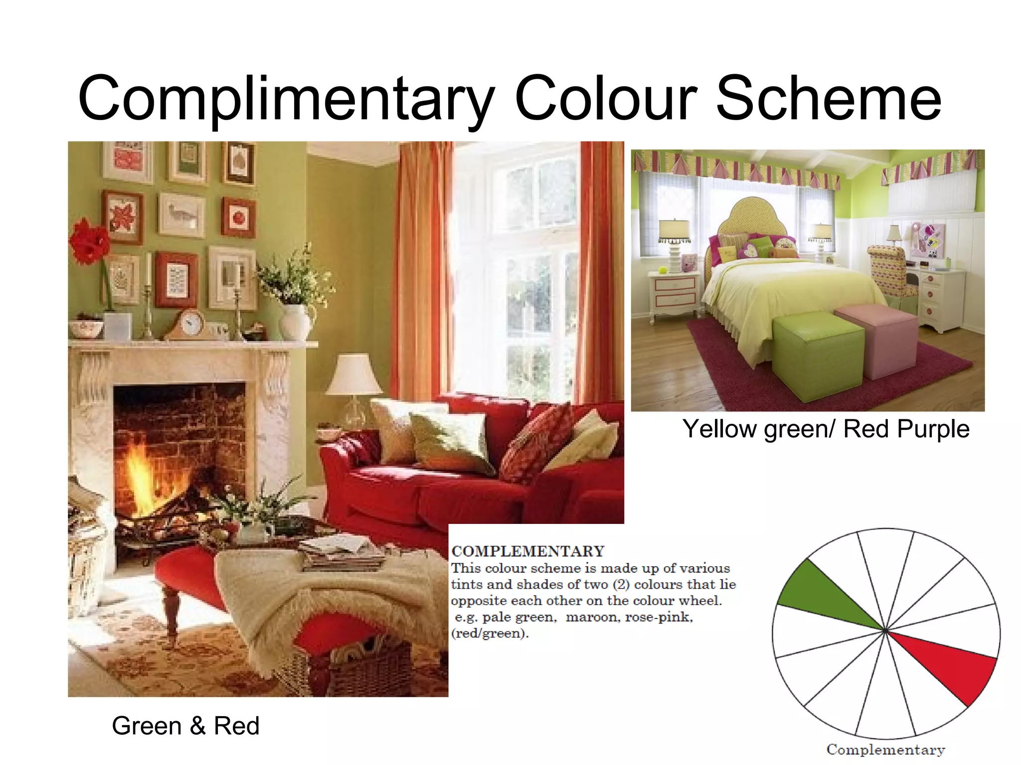
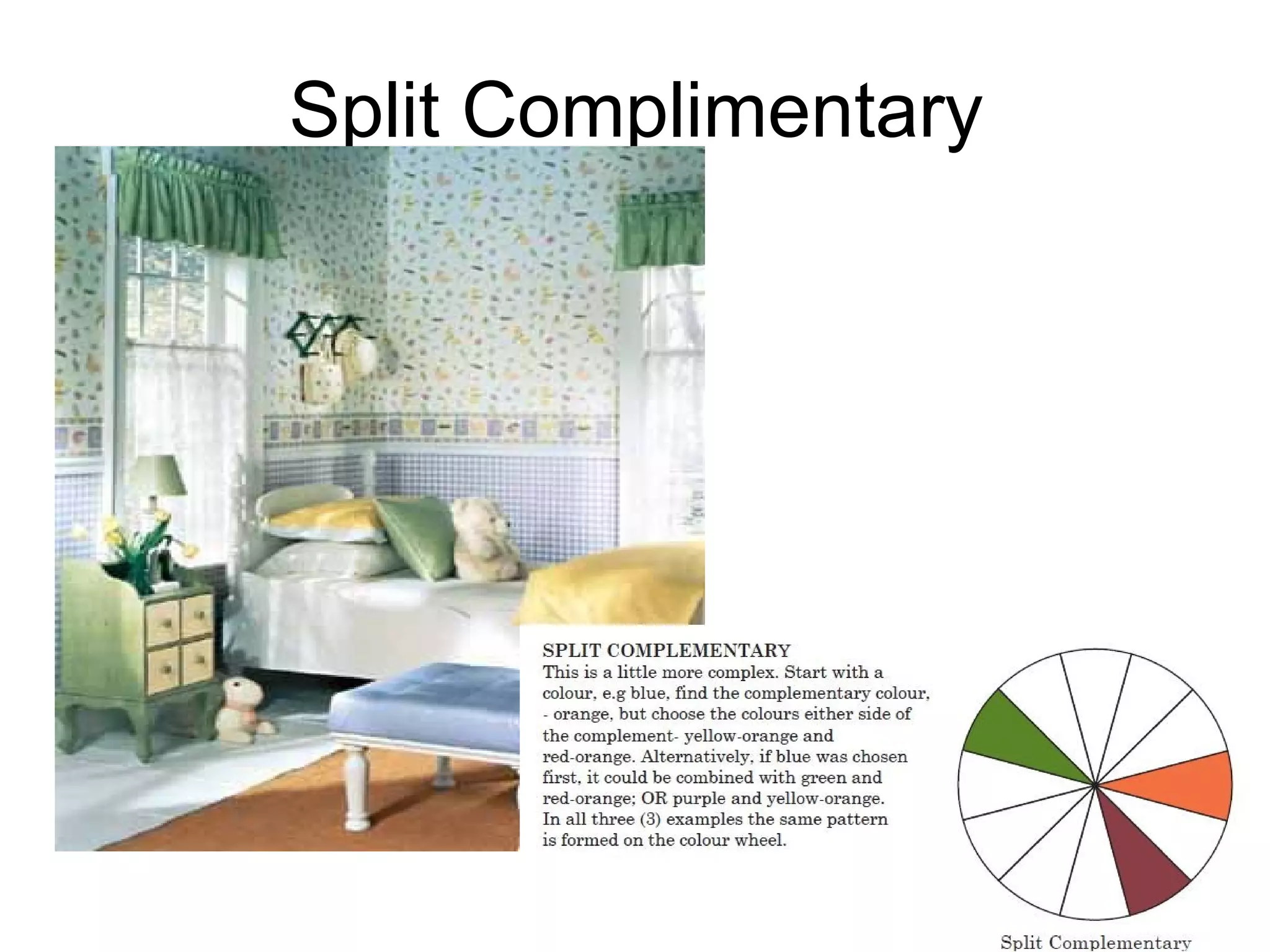
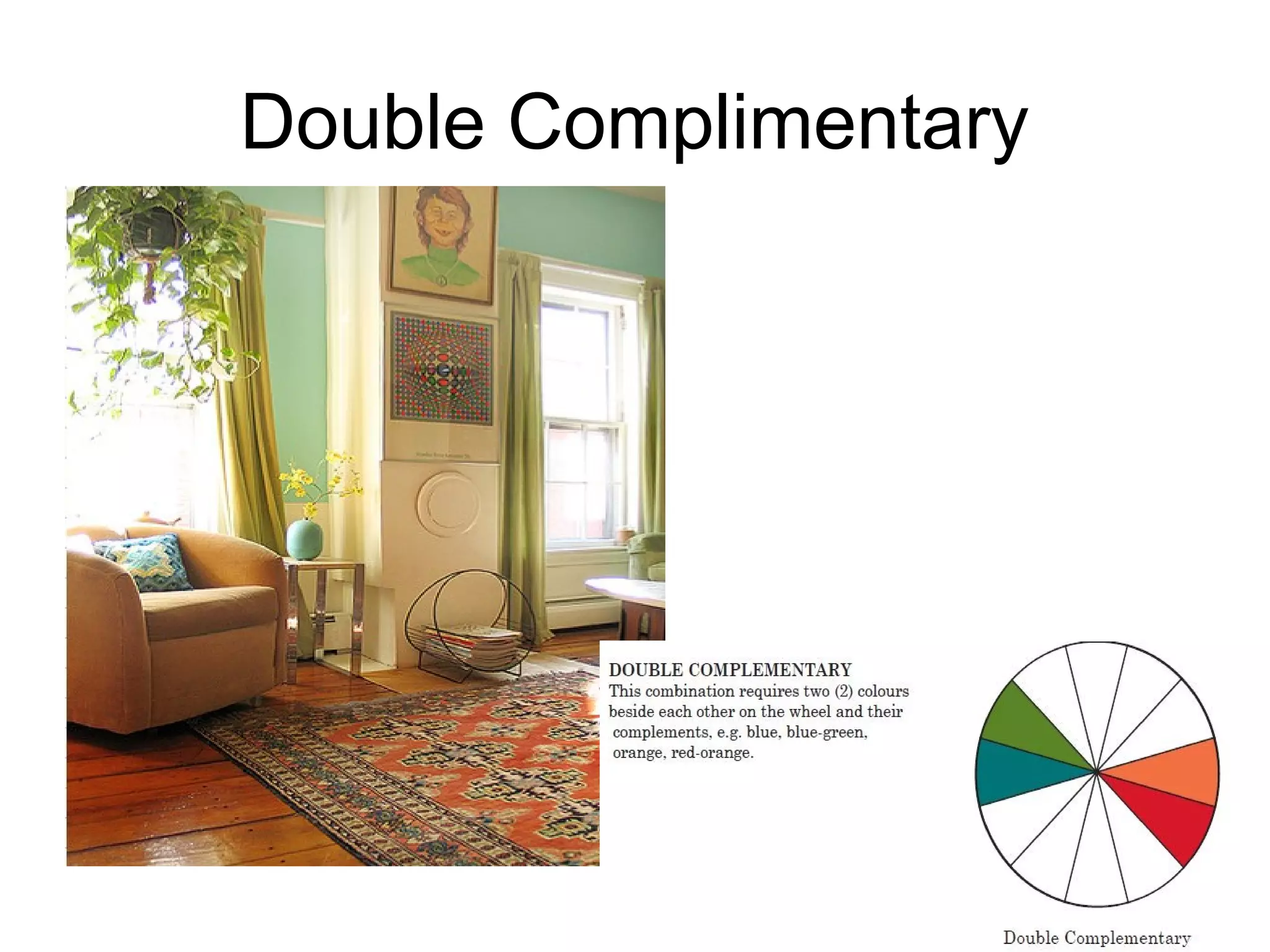
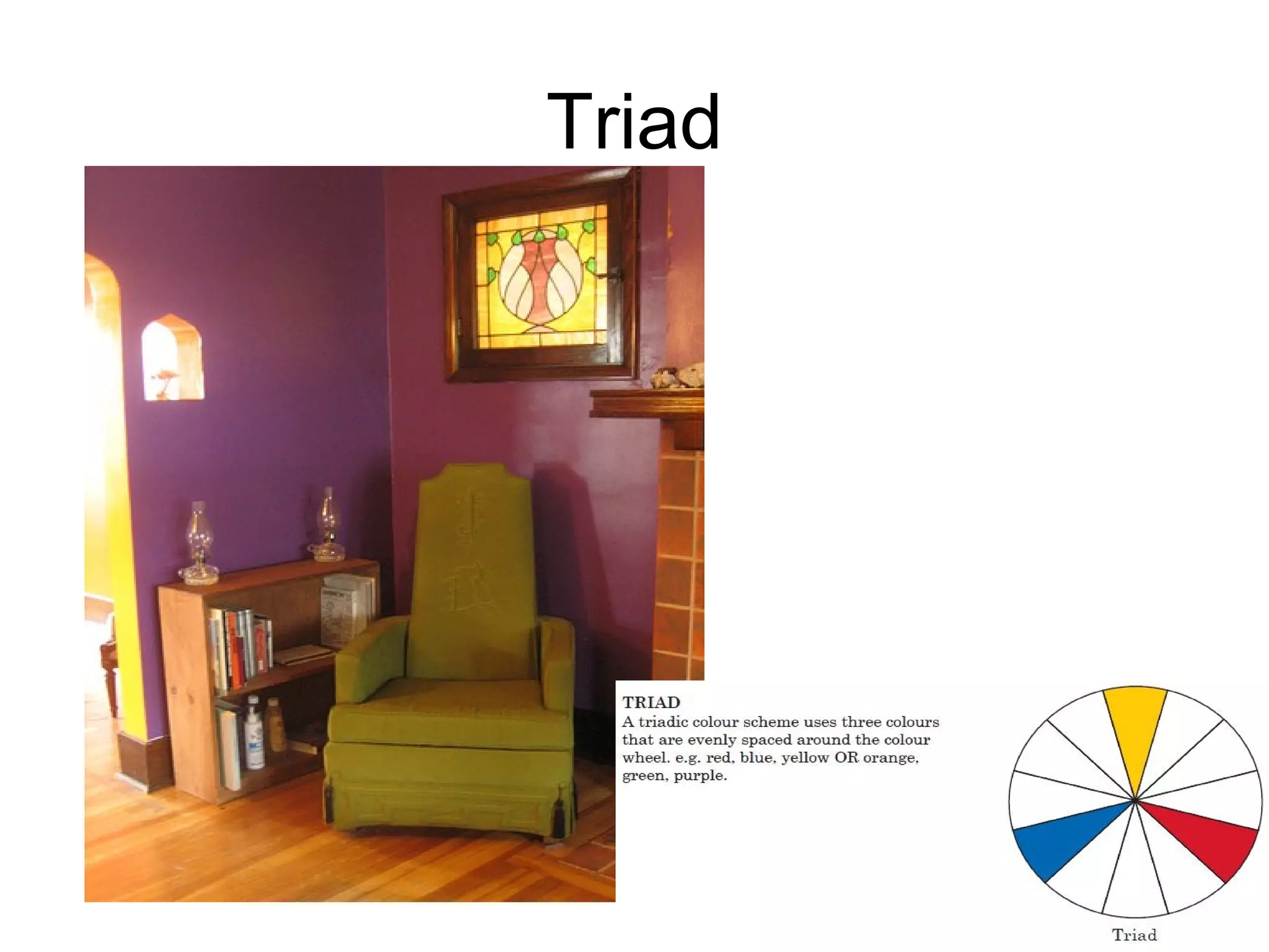


The document discusses colour theory, including the nature of colour, how humans perceive it, and how it can be described. It explains that colour is the property of reflecting or emitting light of different wavelengths. It then covers primary and secondary colours, colour wheels, warm and cool colours, tints and shades, the Munsell system of colour notation, and different colour schemes. The effects of colour are outlined, noting how colour can impact emotions. The document emphasizes that interior designers use colour intentionally to create certain atmospheres for different spaces and functions.


