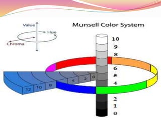
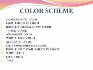
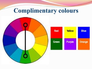
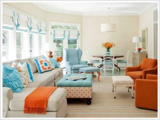
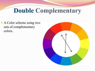
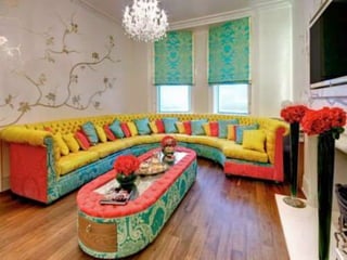
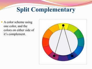
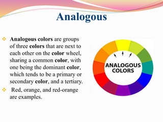
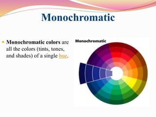
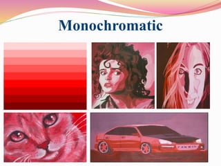
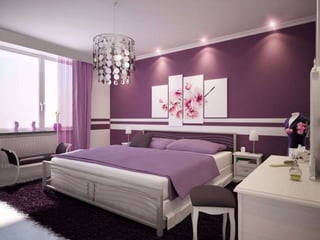
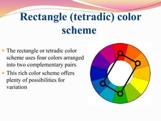
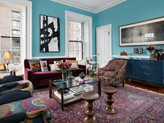
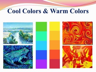
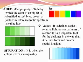
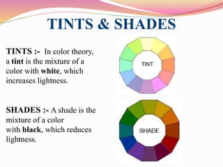
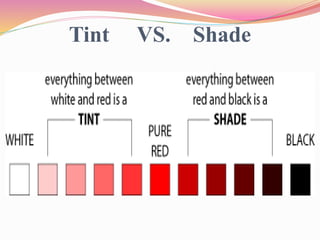
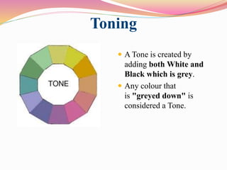
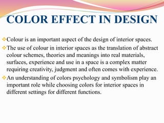
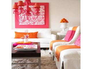
This document discusses color theory and how color and lighting affect interior design. It defines color as the visual perceptual property arising from the spectrum of light reflected or emitted by an object. The document outlines color schemes including monochromatic, complementary, analogous, and split complementary. It discusses how hue, value, and saturation impact color perception and how tints, tones and shades are created. The document also addresses how lighting impacts color appearance and can be used to manipulate mood. Color and lighting are presented as important artistic elements that designers consider for their psychological and physical effects.
3. INTRODUCTION
The property possessed by an object of producing
different sensations on the eye as a result of the way it
reflects or emits light is known as color.
Color is the aspect of things that is caused by differing
qualities of light being reflected or emitted by them.
To see color, you have to have light. When light shines on
an object some colors bounce off the object and others are
absorbed by it. Our eyes only see the colors that are
bounced off or reflected
4. What is colour?
Colour is the aspect of things that is caused by differing
qualities of light being reflected or emitted by them.
To see colour, you have to have light. When light shines on an
object some colours bounce off the object and others are
absorbed by it.
Our eyes only see the colours
that are bounced off or reflected.
5. Invension of colour???
He was NEWTON who first realized that white light is made
up of the colours of the rainbow in 1664 with the help of
PRISM.
Then Newton made the colour wheel.
6. Newton introduced the term ‘color spectrum’ and although the
spectrum appears continuous, with no distinct boundaries
between the colors, he chose to divide it into seven: red, orange,
yellow, green, blue, indigo, and violet.
7. Newton showed that every color has a unique angle of refraction
that can be calculated using a suitable prism.
He saw that all objects appear to be the same color as the beam
of colure light that illuminates them, and that a beam of colure
light will stay the same color no matter how many times it is
reflected or refracted.
This led him to conclude that color is a property of the light that
reflects from objects, not a property of the objects themselves.
8. Colour wheel
A color circle, based on red, yellow and blue, is traditional in the
field of art. Sir Isaac Newton developed the first circular diagram
of colors in 1666.Since then, scientists
and artists have studied and designed
numerous variations of this concept.
Differences of opinion about the
validity of one format over
another continue to provoke
debate. In reality, any color circle
or color wheel which presents a
logically arranged sequence of pure
hues has merit.
9. Primary Colors
Primary Colors:- Red, yellow
and blue In traditional color
theory (used in paint and
pigments), primary colors are
the 3 pigment colors that cannot
be mixed or formed by any
combination of other colors.
All other colors are derived
from these 3 hues.
10. Secondary Colors
Secondary Colors:-
Green, orange and
purple These are the
colors formed by
mixing the Two
primary colors.
11. Tertiary Colors
Tertiary Colors:- Yellow-orange, red-orange, red-purple,
blue-purple, blue-green & yellow-green These are the
colors formed by mixing a primary and a secondary color.
They take their name from the 2 mixed colors.
12. MUNSHELL COLOUR
THEORY
In sir Munsell color system is a color space that specifies colors
based on three color dimensions: hue, value and saturation It was
created by Professor Albert H. Munsell in the first decade of the
20th century as the official color system for soil research in the
1930s.
Several earlier color order systems had placed colors into a three-
dimensional color solid of one form or another, but Munsell was
the first to separate hue, value, and Chroma into perceptually
uniform and independent dimensions, and he was the first to
systematically illustrate the colors in three-dimensional space.
13.
14. Munsell’s system, particularly the later renovations, is based on
rigorous measurements of human subjects’ visual response to
color, putting it on a firm experimental scientific basis. Because
of this basis in human visual perception, Munsell’s system has
outlasted its contemporary color models, and it is still in wide
use today
15. COLOR SCHEME
1. MONOCROMATIC COLOR
2. COMPLEMENTARY COLOR
3. DOUBLE COMPLEMENTARY COLOR
4. TRIADIC COLOR
5. ANALOGOUS COLOR
6. WARM & COOL COLOR
7. ACROMATIC COLOR
8. SPLIT COMPLEMENTARY COLOR
9. DOUBLE SPLIT COMPLEMENTARY COLOR
10. WARM COLOR
11. COOL COLOR
12. TONS
16. Complimentary colours
Complementary colours are pairs of colours which, when placed
next to each other, they create the strongest contrast for those
particular two colours.
Like the contrast between black and white.
Complementary colours are located directly across from each
other on the colour wheel.
21. Split Complementary
A color scheme using
one color, and the
colors on either side of
it’s complement.
22.
23. Analogous
Analogous colors are groups
of three colors that are next to
each other on the color wheel,
sharing a common color, with
one being the dominant color,
which tends to be a primary or
secondary color, and a tertiary.
Red, orange, and red-orange
are examples.
28. Rectangle (tetradic) color
scheme
The rectangle or tetradic color
scheme uses four colors arranged
into two complementary pairs.
This rich color scheme offers
plenty of possibilities for
variation
29.
30. Achromatic
It is a one that lacks hues such
as white, grey and black, and
achromatic color is a color
which has even the slightest
amount of hue. Achromatic
colors (white, grey and black)
have lightness but no hue or
saturation. They can be created
by mixing complementary
colors together.
33. Warm Colors:-Warm colors
(reds, yellows and oranges)
are known as advancing colors
Cool Colors :- Cool colors
(blues, greens and violets)
are known as receding colors.
Cool Colors & Warm Colors
35. HUE :-The property of light by
which the color of an object is
classified as red, blue, green, or
yellow in reference to the spectrum
is called hue.
Value :- It is defined as the
relative lightness or darkness of
a color. It is an important tool
for the designer in the way that
it defines form and creates
spatial illusions
SITURATION :- It is when the
colour leaves its originality.
36. TINTS & SHADES
TINTS :- In color theory,
a tint is the mixture of a
color with white, which
increases lightness.
SHADES :- A shade is the
mixture of a color
with black, which reduces
lightness.
38. Toning
A Tone is created by
adding both White and
Black which is grey.
Any colour that
is "greyed down" is
considered a Tone.
39. COLOR EFFECT IN DESIGN
Colour is an important aspect of the design of interior spaces.
The use of colour in interior spaces as the translation of abstract
colour schemes, theories and meanings into real materials,
surfaces, experience and use in a space is a complex matter
requiring creativity, judgment and often comes with experience.
An understanding of colors psychology and symbolism play an
important role while choosing colors for interior spaces in
different settings for different functions.
40. FACTS ABOUT COLOURS
Colour manipulates the mood or feeling of any Human Being
Colour has been proven to evoke specific physical and
psychological responses within our bodies.
Light colour are airy and, they make rooms feel larger and
brighter.
Dark colour are Sophisticated and Warm and they make rooms
feel intimate.
41.
42. LIGHTING EFFECT IN
DESIGN
The color you see for an object depends on the mix of light
frequencies that reach your eye. That mix, in turn, depends on
two things
1. The frequencies that the object absorbs.
2. The frequencies in the original light source.
Colour varies according to both the quality and type of natural
light and the same colour can often appear quite different from
room to room, at different times of the day and even depending
on the time of year. At Farrow & Ball we think this variance is
beautiful, but we know it can add an extra level of complexity to
your choice
43.
44. FACTS ABOUT LIGHTING
Lighting manipulates the mood or feeling of any interior
Lighting can alter responses from the mind and body
Lighting is considered artistic: decorative, dramatic
Natural lighting gives less expense.
With the help of natural light a room gets fresh air.
Lighting gives a timeless styles.
45. The amount of sunlight a room gets is the first thing to consider
when coming up with a lighting plan for your home. The
quality of natural light in a room can depend on several things
such as the time of day, the weather, and the season. You've
probably noticed that certain rooms in your home are brighter,
or even hotter, than others.
These are factors of natural light. When you think about adding
artificial lighting to a room, consider how much or how little
natural light the room gets so that you can find the right balance
of functionality and aesthetics
46.
47. Conclusion
An design depends upon the size & space of any room.
A colour usually depends upon the natural light coming in the
room so sometimes according to it a designer has to decorate the
room.
Colour plays an important part in Graphic Communication.
Colour can make a graphic look realistic.